Sunday, December 27, 2020

How averaging absolute temperatures goes wrong - use anomalies

There has been a series of posts at WUWT by Andy May on SST averaging, initially comparing HADSST with ERSST. They are here, here, here, here, and here. Naturally I have been involved in the discussions; so has John Kennedy. There has also been Twitter discussion.My initial comment was here
"Just another in an endless series of why you should never average absolute temperatures. They are too inhomogeneous, and you are at the mercy of however your sample worked out. Just don’t do it. Take anomalies first. They are much more homogeneous, and all the stuff about masks and missing grids won’t matter. That is what every sensible scientist does.
 ..."

The trend was toward HADSST and a claim that SST had been rather substantially declining this century (based on that flaky averaging of absolute temperatures). It was noted that ERSST does not show the same thing. The reason is that HADSST has missing data, while ERSST interpolates. The problem is mainly due to that interaction of missing cells with the inhomogeneity of T.

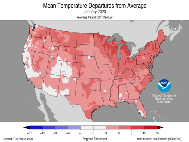
Here is one of Andy's graphs:


In these circumstances I usually repeat the calculation that was done replacing the time varying data with some fixed average for each location to show that you get the same claimed pattern. It seems to me obvious that if unchanging data can produce that trend, then the trend is not due to any climate change (there is none) but to the range of locations included in each average, which is the only thing that varies. However at WUWT one meets an avalanche of irrelevancies - maybe the base period had some special property, or maybe it isn't well enough known, the data is manipulated etc etc. I think this is silly, because they key fact is that some set of unchanging temperatures did produce that pattern. So you certainly can't claim that it must have been due to climate change. I set out that in a comment here, with this graph:


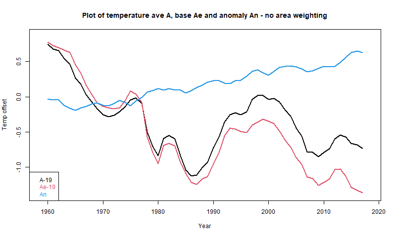
Here A is Andy's average, An is the anomaly average, and Ae is the average made from the fixed base (1961-90) values. Although no individual location in Ae is changing, it descends even faster than A.

So I tried another tack. Using base values is the simplest way to see it, but one can just do a partition of the original arithmetic, and along the way find a useful way of showing the components of the average that Andy is calculating. I set out a first rendition of that here. I'll expand on that here, with a more systematic notation and some tables. For simplicity, I will omit area weighting of cells, as Andy did for the early posts.

Breakdown of the anomaly difference between 2001 and 2018

Consider three subsets of the cell/month entries (cemos):
  • Ra is the set with data in both 2001 and 2018 (Na cemos)
  • Rb is the set with data in 2001 but not in 2018 (Nb cemos)
  • Rc is the set with data in 2018 but not in 2001 (Nc cemos)
I'll mark sums S of cemo data with a 1 for 2001, 2 for 2018, and an a,b,c if they are sums for a subset. I use a similar notation for averages with A plus suffices. I'll set out the notation and some values in a table:

Set dataNWeights20012018
2001 or 2018N=18229S1, A1=S1/(Na+Nb)=19.029S2,A2=S2/(Na+Nc)=18.216
Ra 2001 and 2018 Na=15026Wa=Na/N=0.824S1a, A1a=S1a/Na=19.61S2a, A2a=S2a/Na=19.863
Rb 2001 but not 2018 Nb=1023Wb=Nb/N=0.056S1b, A1b=S1b/Nb=10.52S2b=0
Rc 2018 but not 2001Nc=2010Wc=Nc/N=0.120S1c=0S2b, A2b=S2b/Nb=6.865


I haven't given values for the sums S, but you can work them out from the A and N. The point is that they are additive, and this can be used to form Andy's A2-A1 as a weighted sum of the other averages. From additive S:
S1=S1a+S1b and S2=S2a+S2c
or
A1*(Na+Nb)=A1a*Na+A1b*Nb, or
A1*N=A1a*Na+A1b*Nb+A1*Nc
and similarly
A2*N=A2a*Na+A2c*Nc+A2*Nb
Differencing
(A2-A1)*N=(A2a-A1a)*Na-(A1b-A2)*Nb+(A2c-A1)*Nc
or, dividing by N

A2-A1=(A2a-A1a)*Wa-(A1b-A2)*Wb+(A2c-A1)*Wc

That expresses A2-A1 as the weighted sum of three terms relating to Ra, Rb and Rc respectively. Looking at these individually
  • (A2a-A1a)=0.253 are the differences between the data points known for both years. They are the meaningful change measures, and give a positive result
  • (A1b-A2)=-7.696. The 2001 readings in Rb have no counterpart in 2018, and so no information about increment. Instead they appear as the difference with the 2018 average A2. This isn't a climate change difference, but just reflects whether the points in R2 were from warm or cool places/seasons.
  • (A2b-A1)=12.164. Likewise these Rc readings in 2018 have no balance in 2001, and just appear relative to overall A1.
Note that the second and third terms are not related to CC increases and are large, although this is ameliorated by their smallish weighting. The overall sum that, with weights, makes up the difference is
A2-A1 = 0.210 + 0.431 -1.455 = -0.813
So the first term representing actual changes is overwhelmed by the other two, which are biases caused by the changing cell population. This turns a small increase into a large decrease.

So why do anomalies help

I'll form anomalies by subtracting from each cemo the 2001-2018 mean for that cemo (chosen to ensure all N cemo's have data there). The resulting table has the same form, but very different numbers:

Set dataNWeights20012018
2001 or 2018N=18229S1, A1=S1/(Na+Nb)=-.116S2,A2=S2/(Na+Nc)=0.136
Ra 2001 and 2018 Na=15026Wa=Na/N=0.824S1a, A1a=S1a/Na=-0.118S2a, A2a=S2a/Na=0.137
Rb 2001 but not 2018 Nb=1023Wb=Nb/N=0.056S1b, A1b=S1b/Nb=-0.084S2b=0
Rc 2018 but not 2001Nc=2010Wc=Nc/N=0.120S1c=0S2b, A2b=S2b/Nb=0.130


The main thing to note is that the numbers are all much smaller. That is both because the range of anomalies is much smaller than absolute temperatures, but also, they are more homogeneous, and so more likely to cancel in a sum. The corresponding terms in the weighted sum making up A2-A1 are

A2-A1 = 0.210 + 0.012 + 0.029 = 0.251

The first term is exactly the same as without anomalies. Because it is the difference of T at the same cemo, subtracting the same base from each makes no change to the difference. And it is the term we want.

The second and third spurious terms are still spurious, but very much smaller. And this would be true for any reasonably choice of anomaly base.

So why not just restrict to Ra?

where both 2001 and 2018 have values? For a pairwise comparison, you can do this. But to draw a time series, that would restrict to cemos that have no missing values, which would be excessive. Anomalies avoid this with a small error.

However, you can do better with infilling. Naive anomalies, as used un HADCRUT 4 say, effectively assign to missing cells the average anomaly of the remainder. It is much better to infill with an estimate from local information. This was in effect the Cowtan and Way improvement to HADCRUT. The uses of infilling are described here (with links).


Tuesday, December 15, 2020

GISS November global up by 0.25°C from October.

The GISS V4 land/ocean temperature anomaly was 1.13°C in November 2020, up from 0.88°C in October. That compares with a 0.188deg;C rise in the TempLS V4 mesh index. It was the warmest November in the record.

Jim Hansen's update, with many more details, is here. He thinks that it is clear that 2020 will pass 2016 as hottest year.

As usual here, I will compare the GISS and earlier TempLS plots below the jump.

Saturday, December 5, 2020

November global surface TempLS up 0.188°C from October.

The TempLS mesh anomaly (1961-90 base) was 0.891deg;C in November vs 0.703°C in October. This rise was a little greater than the rise in the NCEP/NCAR reanalysis base index, which was 0.145°C. The UAH satellite data for the lower troposphere was little changed from October (but October was very warm). The Eastern Pacific ENSO region was cool.

It was the warmest month since November 2018, the second warmest November in the record (just behind 2015), and makes it likely that in this record, 2020 will be warmer than 2016, and hence the warmest full year in the record. The mean to November is 0.873°C, vs 2016 0.857, so December only has to be moderately warm for that to happen - in fact 0.681°C would be enough. I see the betting odds on that event are only 42% - or course they are not based on TempLS.

Housekeeping note
For the last six years I have made three global temperature postings every month - the NCEP results, then the TempLS results, and finally the comparison with GISS. But recently the GHCN data are posted so promptly that they are available almost as soon as NCEP. So I will in future merge the first two postings; no separate posting for NCEP.


There was a cool region in N Canada, but warm in the USA. Mainly, it was very warm in the Arctic, with an adjacent very warm region right across Eurasia. Most of the rest of the land was warm, including Antarctica. There was a cool area in central Asia.

Here is the temperature map, using the LOESS-based map of anomalies.


As always, the 3D globe map gives better detail.

Saturday, November 14, 2020

GISS October global down by 0.09°C from September.

The GISS V4 land/ocean temperature anomaly was 0.9°C in October 2020, down from 0.99°C in September. That compares with a 0.154deg;C fall  in the TempLS V4 mesh index. It was the fourth warmest October in the record (shared with 2017).

Jim Hansen's update, with many more details, is here. He thinks that it is likely that 2020 will equal 2016 as hottest year. For those who like that sort of thing, there is a betting market on that "horse race" here.

As usual here, I will compare the GISS and earlier TempLS plots below the jump.

Friday, November 6, 2020

October global surface TempLS down 0.153°C from September.

The TempLS mesh anomaly (1961-90 base) was 0.705deg;C in October vs 0.858°C in September. This drop was greater than the drop in the NCEP/NCAR reanalysis base index, which was 0.072°C. The UAH satellite data for the lower troposphere fell by only 0.03°C.

It was the coolest month since November 2018.

There was a cool region in Canada and central USA, and another band from Iran to China, via central Asia. Antarctica was more cool than warm. There was a big warm area across Eurasia and the adjacent Arctic, down through E Europe, Near East and into Egypt. Another warm area in central S America.

Here is the temperature map, using the LOESS-based map of anomalies.


As always, the 3D globe map gives better detail.

Wednesday, November 4, 2020

NCEP/NCAR reanalysis October 2020 surface temperature down 0.072°C from September.

The Moyhu NCEP/NCAR index came in at 0.278°C in October, following 0.35°C in September, on a 1994-2013 anomaly base. That is still the second warmest month since May.

The main warm area was the Arctic adjacent to Siberia, and also a band through East Europe and the Near East. North America was cool, and also a band through central Asia, from Iran to China. The SE Pacific was also cool.


Thursday, October 15, 2020

GISS September global up by 0.13°C from August.

The GISS V4 land/ocean temperature anomaly was 1.0°C in September 2020, up from 0.87°C in August. That compares with a 0.095deg;C rise (now 0.115°C) in the TempLS V4 mesh index. As with TempLS, it was the warmest September in the record.

As usual here, I will compare the GISS and earlier TempLS plots below the jump.

Monday, October 5, 2020

September global surface TempLS up 0.095°C from August.

The TempLS mesh anomaly (1961-90 base) was 0.837deg;C in September vs 0.742°C in August. This rise was less than the rise in the NCEP/NCAR reanalysis base index, which was 0.203°C. The UAH satellite data for the lower troposphere also rose more, by 0.14°C.

It was the warmest September in the TempLS record; next was 2016 at 0.781°C.

Again N Siberia and the adjacent Arctic Ocean was very warm. There was also warmth in the Near East, including E Mediterranean, and in Antarctica. There was a cool region in Central Asia; N America was split between a warm West and cool central and East. S America was warm.

Here is the temperature map, using the LOESS-based map of anomalies.


As always, the 3D globe map gives better detail.

Saturday, October 3, 2020

NCEP/NCAR reanalysis September 2020 global surface temperature up 0.203°C from August.


The Moyhu NCEP/NCAR index came in at 0.35°C in September, following 0.147°C in August, on a 1994-2013 anomaly base. The rise was enough to counter recent monthly falls, making it the warmest month since April. The temperature was fairly even during the month, with no major spikes.

The main warm regions were Siberia and the adjacent Arctic and most of Europe except the Atlantic seaboard. Greenland was cold, and much of N America except the Pacific coast. The main other cool region was the Eastern Pacific. The Antarctic was mixed.


Tuesday, September 15, 2020

GISS August global down by 0.05°C from July.

The GISS V4 land/ocean temperature anomaly was 0.85°C in August 2020, down from 0.90°C in July. That compares with a 0.049deg;C fall in the TempLS V4 mesh index. Jim Hansen's report is here, discussing how 2020 is becoming less lokely to catch 2016 as hottest year. 2020 had the fourth warmest August in the record, behind 2016, 2017 and 2019.

As usual here, I will compare the GISS and earlier TempLS plots below the jump.

Sunday, September 6, 2020

August global surface TempLS down 0.049°C from July.

The TempLS mesh anomaly (1961-90 base) was 0.725deg;C in August vs 0.774°C in July. This drop was less than the fall in the NCEP/NCAR reanalysis base index, which was 0.067°C. The UAH satellite data for the lower troposphere showed a smaller fall of 0.01°C.

There was a warm spot in N Central Siberia, and general warmth in the Americas, except for a region in the Mississippi area. Europe and N Africa were warm. Antarctica was mixed.

Here is the temperature map, using the LOESS-based map of anomalies.


As always, the 3D globe map gives better detail.

Saturday, September 5, 2020

NCEP/NCAR reanalysis August 2020 surface temperature down 0.067°C from July.

The Moyhu NCEP/NCAR index came in at 0.147°C in August, following 0.214°C in July, on a 1994-2013 anomaly base. July was well down on earlier months, so that continues a fairly cool period.

Central Siberia and the Arctic were warm, as was the Western USA. Antarctica was mixed, and there was a general band of cool across Asian mid-latitudes.


Saturday, August 15, 2020

GISS July global down by 0.03°C from June.

The GISS V4 land/ocean temperature anomaly was 0.89°C in July 2020, down from 0.92°C in June. That compares with a 0.039deg;C fall in the TempLS V4 mesh index. As with TempLS, Gistemp still had July tied with 2019 as the warmest July in the record. Jim Hansen's report is here.

As usual here, I will compare the GISS and earlier TempLS plots below the jump.

Tuesday, August 4, 2020

July global surface TempLS down 0.039°C from June.

The TempLS mesh anomaly (1961-90 base) was 0.75deg;C in July vs 0.789°C in June. This drop was less than the fall in the NCEP/NCAR reanalysis base index, which was 0.1°C. The UAH satellite data for the lower troposphere showed a small rise of 0.01°C.

Rather surprisingly, despite now three successive and substantial monthly falls, July 2020 was still the second warmest July in the record, not far behind 2019 (0.824°C).

Although I noted doubts about NCEP/NCAR's recent results, the pattern of anomalies was qualitatively similar to that of TempLS. Cool in a band extending N from India to the Arctic, and in N China/Japan. Cool in Argentina and S Atlantic, Scandinavia and in Alaska. Warm in Antarctica and E Canada/NE USA, and also around the Mediterranean, and in a band from Iraq through W Russia.

Here is the temperature map, using the LOESS-based map of anomalies.


As always, the 3D globe map gives better detail.


Monday, August 3, 2020

NCEP/NCAR reanalysis July 2020 surface temperature down 0.01°C from June.

The Moyhu NCEP/NCAR index came in at 0.214°C in July, following 0.214°C in June, on a 1994-2013 anomaly base. June was well down on earlier months, so that makes a fairly cool period. I should mention that Karsten Haustein has commented that NCEP/NCAR seems to have gone off the rails. Certainly the recent cooling is more extreme than in other indices.

The main difference this month was that the heat seems to have gone from Siberia; most of Asia was cool, as was Northern Europe. A lot of Antarctica was relatively, but the South Atlantic was cold.

In blog housekeeping, I should warn that I have been intermittently restricting comments. This is because of a very persistent and annoying spammer. I hope it won't last too long, although I fear Google is not maintaining Blogger as enthusiastically as it once did.


Tuesday, July 14, 2020

GISS June global down by 0.11°C from May.

The GISS V4 land/ocean temperature anomaly was 0.93°C in June 2020, down from 1.04°C in May. That compares with a 0.076deg;C fall in the TempLS V4 mesh index. As with TempLS, Gistemp still had June tied with 2019 as the warmest June in the record. Jim Hansen's report is here.

As usual here, I will compare the GISS and earlier TempLS plots below the jump.

Tuesday, July 7, 2020

June global surface TempLS down 0.076°C from May.

The TempLS mesh anomaly (1961-90 base) was 0.779deg;C in June vs 0.855°C in May. This drop was less than the fall in the NCEP/NCAR reanalysis base index, which was 0.114°C. The UAH satellite data for the lower troposphere also showed a fall of 0.11°C.

Rather surprisingly, despite two successive and substantial monthly falls, June 2020 was still the warmest June in the record, just ahead of 2019 (0.775°C). Because of the small margin, this status may change with late data.

The great warmth of E Siberia persists, although W Russia was cool, in a belt extending down to India. Much of Europe was warm, as was Antarctica.

Here is the temperature map, using the LOESS-based map of anomalies.


As always, the 3D globe map gives better detail.


Saturday, July 4, 2020

NCEP/NCAR reanalysis June 2020 surface temperature down 0.114°C from May.

The Moyhu NCEP/NCAR index came in at 0.223°C in June, following 0.337°C in May, on a 1994-2013 anomaly base. May was already down from April, so the warm start to 2020 has definitely faded. Still, the June average was similar to June 2017 and 2018. The UAH TLT satellite temperature also declined by 0.11°C

The most notable feature was a band of cool from India north to the Arctic ocean. Generally Russia did not continue the remarkable warmth of the year to May. There was a warm band from Iran to Norway, through E Europe, and a cool strip north of the Mediterranean. Antarctica seems mostly warm.


Saturday, June 13, 2020

GISS May global down by 0.12°C from April.

The GISS V4 land/ocean temperature anomaly was 1.02°C in May 2020, down from 1.14°C in April. That compares with a 0.165deg;C fall in the TempLS V4 mesh index. As with TempLS, it was the warmest May in the record, despite the fall from April. Jim Hansen's report is here, with this graph of months in the last few years showing what happened here.


As usual here, I will compare the GISS and earlier TempLS plots below the jump.

Wednesday, June 10, 2020

May global surface TempLS down 0.17°C from April.

The TempLS mesh anomaly (1961-90 base) was 0.844deg;C in May vs 1.014°C in April. This drop was larger the fall in the NCEP/NCAR reanalysis base index, which was 0.064°C. ERA5 showed a near-identical fall of 0.07 °C. By contrast again, the UAH satellite data for the lower troposphere showed a rise of 0.16°C.

Other reports on the reanalysis emphasised that despite the fall from April, it was still the warmest May in the record. That is true for TEmpLS too (just); May 2016 anomaly was 0.825°C.

The most prominent feature is again a very warm N Siberia, extending into the Arctic. By contrast N America except for the Pacific coast, and Eastern Europe were cool.

Last month I commented on the timing of posting, noting that now a lot of GHCN V4 data becomes available very promptly, and then there is a trickle of late data, which can sometimes have an outsize effect on the result. That creates a dilemma about whether to wait. That month the late data did not make much difference. This month the flow of data has been similar; we have 8599 stations to date, but there may be 1000 more to come, eventually. There has been little new data in the last three days. So we'll see.

Here is the temperature map, using the LOESS-based map of anomalies.


As always, the 3D globe map gives better detail.


Wednesday, June 3, 2020

NCEP/NCAR reanalysis May 2020 surface temperature down 0.064°C from April.

The Moyhu NCEP/NCAR index came in at 0.337°C in May, following 0.401°C in April, on a 1994-2013 anomaly base. It makes May the coolest month since January 2019.

Karsten Haustein commented that NCEP/NCAR had been showing some strange effects in March/April not seen in ERA5, say, and this could be part of a spurious cooling. There has been some disparity also with TempLS and other surface measures. I think the primary value of this NCEP/NCAR index has been to show changes over short time periods. I don't compare over long periods or calculate long term records. The reason is that I don't think reanalysis offers long term homogeneity; there is a changing mix of instrumentation, for example. This oddity may be a case in point that means one should not make too much of a one-time shift.

The map shows most of N America very cool, and also Northern Europe and a band from Iran to China. Warm patches in Arctic and N central Siberia. Australia cool, Antarctica mostly warm. We'll see if that is borne out by other indices. The BoM agrees Australia was cool.

Update: The UAH satellite temperatures are out; they showed a rise of 0.16°C. The map is here. It is a similar pattern, but cold places are not nearly as cold as the reanalysis, and the warm places warmer.


Thursday, May 14, 2020

GISS April global down by 0.03°C from March.

The GISS V4 land/ocean temperature anomaly was 1.16°C in April 2020, down from 1.19°C in March. That compares with a 0.054°C rise in the TempLS V4 mesh index.

There is a recent oddity with GHCN V4 monthly, in that in the last 24 hours a lot of station data has gone missing. This has happened before, and gets fixed (thanks, GHCN). It shows an effect in Moyhu data in a disagreement between the report data and the overall table. The latter uses the current data with gaps. I hope that GISS has not been affected by this. My reporting system rejects new data if the total number of stations reduces by more than a small threshold.

As usual here, I will compare the GISS and earlier TempLS plots below the jump.

Monday, May 11, 2020

Plotting COVID19 daily data - finding peak rate and halving time.

This post is an update to my earlier post showing daily new cases and new deaths of Covid19 data from Johns Hopkins. The details are as for that post, but I want to explain two additions to the plots, which I think contain useful data. But first I'll show the updated plot (same as shown on the April 1 post; you need to click a radio button to get started). The explanation will follow:


The new items are the blue and green lines. The blue lines are just a 7-day moving average of the daily data. The data needs smoothing, and the 7-day average is chosen because the reporting of both cases and deaths often has a strong weekly influence (weekends). Following the blue lines often seems to tell something about whether the daily values are going up or down, even where the daily data is too noisy to tell.

The green lines, with the associated green axis on the right, are a more ambitious diagnostic. Our ABC has been promoting a "one number you need to watch" which is a little bit like the R reproduction number of epidemiology. They plot the ratio of current value to the average of the last five, and say that progress is being made when this number is less than 1.

I think that is useful, but far too noisy. It is related to the slope of the logarithm, and I would like to calculate that more scientifically. The particular reason for log is that the curves usually start with an exponential rise, and often end with an exponential decay. These will be linear for the logs, and can be well estimated by regression.

You can take it, then, that the green line is that estimate of slope of log, but I have scaled it to fit another interpretation, which is the number of doublings per week, or the reciprocal of the time to doubling. So a value of 1 means doubling once a week; 2 means doubling twice (4x). Negative values are halving; -1 means halving once a week, which would be a very good situation. A value of -0.5 means it halves once every two weeks. A significant place to watch is where it crosses from positive (increasing) to negative.

I'll say a little about the numerics of this. Clearly smoothing is required, which means that each point represents information from a stretch of data. My basic technique for a smoothed derivative is LOESS - a regression weighted close to each point. But before differentiating the logarithm, it is necessary to smooth in the linear domain. The reason is that a main kind of error is in the day to which the data is ascribed. Error here should have only a moderate effect, because smoothing will conserve the data and diminish the effect of the displacement. But smoothing the log does not conserve. A worst, and rather common case, is where no data is recorded at all, so the log would be infinite. Of course it is also possible in the tails that there really were no cases/deaths that day.

A preliminary linear smoothing will mitigate that, and I use again a seven day moving average, to attenuate the weekend effect. I then take the logarithm (base 2) and do the weighted linear regression on that, with the trend coefficient treated as the derivative. The weighting is a binomial distribution half-width 9.

You'll see that the green curves start out generally positive. In fact they don't really mean much until the red data shows several/day. I have tried to remove meaningless derivative data, but it isn't very exact, so I err on the side of inclusion. Data often rises to an early peak, where the green line crosses the zero horizontal, and then may seem to bump along on a plateau, where it oscillates. If the green line remains decidedly negative, then one can say that the epidemic is receding, and the average value represents the halvings/week.

To give an example of the interpretation, here is the US death toll data data:

At About March 25, the blue curve (smooth) was curving steadily upward, and the green curve was at about 1, which means doubling once a week. Then the blue curve shows a peak at about April 14. That is where the green curve crosses zero, a stationary point, neither up nor down. Later in April, the blue has a slow bumpy decline, and the green curve shows a value of about 0.9, which means halving about every 10 weeks. The green curve looks better at the end, but unfortunately this is the most uncertain part, since the derivative is estimated with one sided (old) data only.

Here is the plot of new cases for Germany:

Again there is a near exponential increase at the beginning, with a doubling more than weekly (green>1). Again a peak in the blue at about March 28th, where the green crosses zero. But then the blue goes decidedly downward, and the green settles to about 0.7, which means halving about every two weeks. The daily values have a bump at the end, which brings the green up to zero, suggesting the decline might have ended. Again, unfortunately, this is the least reliable part of the curve.


Saturday, May 9, 2020

April global surface TempLS up 0.054°C from March.

The TempLS mesh anomaly (1961-90 base) was 1.010deg;C in April vs 0.947°C in March. This was similar to the rise in the NCEP/NCAR reanalysis base index, which was 0.045°C.

The prominent feature was a warm Arctic, extending into central Siberia, surrounded by a band of cool, in N America (except W USA) and from E Europe via N India to China. Warmish almost everywhere else, including W Europe.

I might comment here on my timing of posting. I maintain the latest numbers here, before and after posting. They become meaningful as soon as ERSST is posted, usually about the 4th. At that stage the large majority of the land data is also in (about 85%). But then the rate of new land data slows to a trickle, so there is a temptation to post at that point. In the previous two months, I did so, but the late data made a surprisingly large difference. This month, I held off for a while, but the result increased by only 0.01°C. I'll keep monitoring this.

Here is the temperature map, using the LOESS-based map of anomalies.


As always, the 3D globe map gives better detail.


Sunday, May 3, 2020

NCEP/NCAR reanalysis surface temperature up 0.045°C April 2020.

The Moyhu NCEP/NCAR index came in at 0.401°C in April, following 0.356°C in March, on a 1994-2013 anomaly base. It comes after a big drop from February, so temperatures are still around the mid-2019 average.

The main pattern is a warm Arctic/central Siberia, with a surrounding ring of cool, from Norway through Iran to China. Most of N America was cold. Antarctica was relatively warm.


Tuesday, April 14, 2020

GISS March global down by 0.06°C from February.

The GISS V4 land/ocean temperature anomaly was 1.19°C in March 2020, down from 1.25°C in February. That compares with a 0.15deg;C fall first reported in the TempLS V4 mesh index (now 0.09°C with later data).

As usual here, I will compare the GISS and earlier TempLS plots below the jump.

Sunday, April 5, 2020

March global surface TempLS down 0.151°C from February.

The TempLS mesh anomaly (1961-90 base) was 0.898deg;C in March vs 1.049°C in February. This was less than the fall in the NCEP/NCAR reanalysis base index, which was 0.2°C.

The prominent feature, as with the winter months, was a band of warmth stretching from Eastern Europe through to E Siberia and China. While most of the US was warm, N Canada was cold, as was Antarctica and South Asia.

Here is the temperature map, using the LOESS-based map of anomalies.


As always, the 3D globe map gives better detail.

Saturday, April 4, 2020

NCEP/NCAR reanalysis surface temperature down 0.2°C March 2020.

The Moyhu NCEP/NCAR index came in at 0.356°C in March, following 0.554°C in February, on a 1994-2013 anomaly base. It marks the end of a three month period of warmth. It began with a deep dip, of a kind that is common historically, but rare recently. There was only a partial recovery, and it was the coolest month since last June..

As with the warm months, the main feature was a band of warmth from Eastern Europe right across Russia and Siberia. But Canada and the adjacent Arctic was cold, as was Antarctica. South Asia,, too, was cool. The warm blob to the East of New Zealand persists.


Wednesday, April 1, 2020

Covid19 - graphs of daily data - turning the corner?

Everyone seems to want to write about Covid-19 lately. Unlike most of the world, I am not an expert on epidemiology. But I have been anxiously looking at graphs of recent data to see if the social distancing measures are turning the tide. Like most people, I look at the Worldometer site. But I'd sometimes like to drill down a bit, and also to get all the graphs in one place. The main source of collected information seems to be the Johns Hopkins Github repository. So I looked into it.
My interest is in the point of inflection of the growth curves. So I have plotted here not the cumulative totals but the daily increments. They are noisier but give an earlier marker of change.
So here are the graphs. I hope to keep them updated daily. You can choose to see daily new cases or deaths. Just click on the radio button next to a country name. The buttons on the yellow backed line let you choose states or provinces of the named country. The bottom table (nations) entries are arranged in diminishing order of total cases as at the most recent day. Be aware that the y scale changes to fit each data displayed.

Some details:
Hong Kong is currently included with China, which is how the source does it. I'll probably separate it in the future. HK is mainly responsible for the recent rise in China cases - you can see it listed as a province of China.
Johns Hopkins separated US data from their global time series table, saying that they would post a corresponding US table. But AFAICS, they haven't yet done that. So I had to add up the US data from the daily reports (by county!), which may lead to some minor discrepancies. One is that I have omitted the numbers from the Princess cruise ships which were listed separately.
I have omitted some data that Johns Hopkins recorded for the Diamond Princess and Grand Princess cruises. They handled it in a messy way, splitting it up among countries and states. This will cause some minor discrepancies with WorldOMeter data. I have also not included in the US total some minor regions like Northern Marianas.

Friday, March 13, 2020

GISS February global up by 0.09°C from January.

The GISS V4 land/ocean temperature anomaly was 1.26°C in February 20120 up from 1.10°C in January. That compares with a 0.053deg;C rise first reported in the TempLS V4 mesh index (now 0.073°C with later data). It was the second warmest February in the GISS record, just 0.11°C behind than the El Niño 2016, for which February was the peak.

As usual here, I will compare the GISS and earlier TempLS plots below the jump.

Friday, March 6, 2020

USA Temperatures; comparison of Moyhu results with NOAA.

This is a continuation of my earlier post on ConUS temperatures. I'll compare the time series results with those of the NOAA datasets ClimDiv and USCRN. My series are labelled GHCN_a, for the calculation using GHCNM V4 adjusted, GHCN_u for unadjusted, and MoyCRN for my calculation using CRN data. The data is as in the previous post. I'll start with the period 2005-2019, since this is where there is USCRN data. I'll use that period for the anomaly base throughout. Here is a graph of the various time series:

They are so close that the differences are hard to see. It is easier with a 12-month running mean, mainly because the y-axis doesn't have to cover such a large range:
You can see that they are still very close, with some small difference between CRN and the other data. I can quantify this with a table of standard deviation of differences (unsmoothed data):


2005-2019 USCRNCLIMDIVGHCN_aGHCN_uMoyCRN
USCRN00.0910.0980.1030.058
CLIMDIV0.09100.0270.0290.092
GHCN_a0.0980.02700.010.096
GHCN_u0.1030.0290.0100.099
MoyCRN0.0580.0920.0960.0990
Trend3.1031.9571.9581.762.616

The very close results are between GHCN adjusted and unadjusted. Here the stations and the methods are the same, so the only difference is the adjustment of the data. And it is very small. The difference between the GHCNs and NOAA's ClimDiv is larger, but still very small.
The two CRNs show a larger difference again, but the largest is between the CRN groups and the others. As I said in the last post, I don't think this reflects different accuracy of the stations; CRN are presumably better. It reflects the dominance of location uncertainty in the spatial averages. That is, how much spread would you see if you measured at different places. Or, how well do you real think the infilling represents the unmeasured regions. Of course, the different coverage gives a check; I showed in the last post a difference plot in one month between the sparse CRN and the dense ClimDiv.

I have also shown the trends, in °C/century. These are very uncertain on such a short period, and you might be surprised at their size, since the plot doesn't reflect that by eye. But a trend of 2 °C/Cen rises only 0.3°C in this period. The closeness reflects that shown in the sd table. I don't think much should be made of the fact that CRN shows a higher trend.

Over a longer period, the CRN results do not cover, and the other data diverge more. The different adjustment policies start to show. Here is the period since 1900. I'm now using a 5 year running mean to make the differences clearer:

Now there is an obvious difference between the adjusted and unadjusted. My GHCN_a still agrees quite well with ClimDiv. Again the differences can be quantified in the reduced table of standard deviations:

1900-2019 CLIMDIVGHCN_aGHCN_u
CLIMDIV00.0640.257
GHCN_a0.06400.23
GHCN_u0.2570.230
Trend0.840.8280.371

The trends (in °C/Cen) again tell the story. Adjustment makes a big difference, as was noted back in USHCN V1. USHCN did both homogenisation and explicit TOBS adjustment, and I believe ClimDiv, which replaced it, does the same. GHCN relies on the pairwise homogenisation to cover the TOBS effect, and on this accounting it seems to do that very well.

Of course, some would say that this means that more than half the (modest) ConUS warming is created by adjustments. The proper scientific view is that unadjusted readings had a spurious cooling bias, which should be corrected. The sources of this are real and known:
  • TOBS - it makes a substantial difference whether daily reading of a a min-max thermometer is done in the afternoon, where it tends to double-count warm days, or in the morning, where it double counts cool minima. The times of reading are known, and the pettern is a shift toward morning reading. This is a quantifiable cooling bias, and must be adjusted for. It isn't optional.
  • Measurement changes - firstly improved screening, and then MMTS, both produced lower readings. These can be identified as abrupt changes relative to neighbours, and again must be corrected.

Next steps

I plan to set this analysis up as a regular calculation, as with TempLS global, and post the results on the data page. I have now done a similar analysis for Australia, which I'll also write about. I'll also work on a page of maps of past months, and possibly seasons and years.


Thursday, March 5, 2020

February in ConUS - surface anomalies mostly warm - new graphics.

This post follows one here where I described a new way of calculating an average temperature for a region like ConUS (USA, lower 48 states) and showed comparative graphics for January 2020. I use GHCN V4 data, and there is now enough out to do a February post. It was warm like January, in most parts. I'll link below to a set of numerical data for ConUS for all months since 1900.

I use 2005-2019 as the base period for anomalies, to make possible comparison with USCRN. But I won't show USCRN here, because the greater station numbers in GHCN give a better result. Probably in production I'll revert to the WMO base of 1981-2010. I use GHCN unadjusted here; visually, it makes no difference. Here is the result for February 2020:


I realised that I could also usefully compare this graphic with the WebGL global plots that I show as the data comes in. These are the most detailed early depictions of the data. Here is a zoomed extract from that source:


Both plots have the property that the color at each station is correct at that point, and elsewhere is interpolated. The WebGL plot is based on triangular mesh with linear interpolation; the new plot uses the Laplace infilling, which is smoother.

Next I'll show the corresponding plots for 2019. At some stage I'll set up a page which goes back further. This one is done in the usual style where the buttons below let you cycle through the months.

Historical results and comparisons.

I'll post soon with an analysis of comparison with other data. I'll post a link to the table here. The table shows the NOAA data for ClimDiv and USCRN, and my corresponding averages using data from GHCN V4 adjusted, unadjusted and USCRN. All results have been set to anomaly base 2005-2018.

Wednesday, March 4, 2020

February global surface TempLS up 0.053°C from January.

The TempLS mesh anomaly (1961-90 base) was 1.032deg;C in February vs 0.979°C in January. This was a contrast to the NCEP/NCAR reanalysis base index, which barely changed. It makes it the second warmest February in the record, just behind the El Niño 2016 at 1.133°C. That is remarkable, because in this index February was the warmest month of that very stong El Niño.

The prominent feature, as with January, was a huge band of warmth stretching from Europe through to E Siberia and China. Again N America was also warm, except for Alaska (cold). Greenland and the Arctic archipelago were also cool. Africa and S America were mostly warm, Antarctica mixed.

Here is the temperature map, using the LOESS-based map of anomalies.


As always, the 3D globe map gives better detail.


Tuesday, March 3, 2020

NCEP/NCAR reanalysis monthly surface temperature unchanged in February 2020.

The Moyhu NCEP/NCAR index came in at 0.554°C in February, following 0.552°C in January, on a 1994-2013 anomaly base. With December even warmer, that is a sustained period of warmth.

As with January, the main feature was a band of warmth from Europe right across Russia and Siberia. Again there was a complementary cold band across Arctic North America and Greenland. Elsewhere mixed, with cool seas around S America, and a cool region in the Sahara.


Thursday, February 27, 2020

USA Temperatures; averaging and graphics methods.

I have for many years been experimenting with methods for calculating average surface temperature anomalies from collections of station readings (including sea surface from grid, regarded as stations). I describe the history here. In the early days, I tried to calculate the averages for various countries and continents. With the coarse grids I was using at the time, and later meshes, I found the results unsatisfactory, and of limited scientific importance.

So I put more effort into developing global methods. There is a rather mathematical survey of these here. Briefly, there are six main types:

  • The conventional grid analysis, averaging the measurements within each cell, and then getting an area-weighted average of the cells. I think this is very unsatisfactory since either the grid is very coarse, or there are cells with no data.
  • Triangular mesh, with the sites as nodes. This has been my mainstay. But it is not very good at following national boundaries.
  • A method where spherical harmonics are fitted and then integrated. This is now implemented as a general method for improving otherwise weak methods. The structure is instructive, but again, intrinsically global.
  • A LOESS method, described here This has the characteristic of gathering information from as wide a net as needed; useful when stations get sparse, but not a respecter of boundaries.
  • Most recently, a method using FEM shape functions. I think this may be best, in terms of getting the best representation on a relatively coarse grid. Again, not so good for boundaries, but it has as a special case, one of my earlier methods:
  • Grid with infill (eg an early version here). The weakness of conventional gridding is that it does not use local information to estimate missing cells, and so the grid must be kept fairly coarse. But I have worked out a way of doing that systematically, which then allows much finer gridding. And that does have the incidental benefit of tracking national and land boundaries. It also allows a good graphics scheme. I'll say more about it in the next section. In this text, I'm using blue colors for the more technical text.

Infilling and diffusion - the Laplace equation.

The logical expression of using neighbour information is that empty cells should be assigned the average temperature of their neighbours. For an isolated cell, or maybe a few, you can do this directly. But with clumps of empty cells, some may have no known neighbours at all. But you can still maintain the requirement; a solution procedure is needed to make it happen.

The idealization of this is the Laplace differential equation, solved with Dirichlet boundary conditions expressing the known cells, and zero gradient (Neumann) conditions at the boundaries (not needed for the globe). That equation would describe a physical realisation in which a sheet of metal was kept insulated but held at the appropriate temperatures in specified locations. The temperatures in between would, at equilibrium, vary continuously according to the Laplace equation.

This is a very basic physical problem, and methods are well established for solving. You just write a huge set of linear equations linking the variables - basically, one for each cell saying that it should be the average of the neighbours. I used to solve that system just by letting it play out as a diffusion, but faster is to use conjugate gradients.

Once the data-free cells are filled, the whole grid can be integrated by taking the area-weighted average of the cell values.

In one dimension, requiring each unknown value to be the average of its neighbours would lead to linear interpolation. Solving the Laplace equation is thus the 2D analogue of linear interpolation.

Graphics and gridding the region

I mentioned the usefulness for graphics. I just draw a point of the appropriate color for each cell. For ConUS (contiguous) I typically use grid cells of about 20km edge, giving about 20000 for the country, and so quite good resolution. I will give examples shortly.

As far as getting a grid of the US, say, one might look on public data for a lat/lon land mask. There is a lot of choice for physical land, but I found it harder for ational boundaries. But anyway, there is another consideration; projection. A lat/lon grid is not isotropic. N-S neighbours are further away than E-W. Proper use of the Laplace equation would require allowance for this. And anyway, good graphics would require an equal area projection.

So I decided to make a map, after projection, using the R maps package. I can extract a specification of the US as a complex polygon. I remap the data, first onto a sphere, then project that on to a plane tangent to the sphere at the US center (I used 37N, 97W). Then I output that on a suitable small scale as a BMP file (uncompressed), and read off the pixels. That gives a regular grid, not lat/lon, which is very close to isotropic - cells are close to square (see notes below).

The task of mapping requires another solution of the Laplace equation, applied to the cell averages of the station anomalies.

Data sources

I was interested to see the result for ConUS because GHCN V4 monthly has a dense network of nearly 12000 US stations. I used both the unadjusted and adjusted versions. There is also the data from USCRN. Here I use just the 115 commissioned stations, for which some were reporting in 2002, but I use only since 2005, when there were enough to try for a regional average. These stations are evenly distributed, and of high quality, with almost no missing (monthly) data recently. But they are sparse.

NOAA posts monthly averages ClimDiv and USCRN which I can use for comparison. I'll do that in detail in my next post. GISS posts unfortunately only annual averages, but I can use that for a check. I'll talk more about NOAA's graphics below. They feature the anomaly graph in their national climate reports, although they describe them as "Average Temperature Departures" from an absolute spatial average, so it may not be the same thing.

An example - USCRN

For the graphics I solve the Laplace equation on a finer mesh of about 10x10 km. The plot of the solution for USCRN shows the good and bad features of the Laplace interpolation method:


The stations are shown with small dots. With this, and the next plot, you can remove the stations and the state borders with the checkboxes top right. Mostly the interpolation is smooth, with a few that stand out creating a small dimple. The color actually at the station is in this image exact. There are just 115 stations, so that is a fairly good result. The anomaly base is 2005-2019, which is what is available with USCRN, and so I use the same base when comparing with GHCN.

Now here is a plot of the same month, with the much more numerous GHCN V4 data (5263 stations reporting)

Obviously there is much more detail, not resolved by the CRN infill. The integral is almost identical (1.694 vs 1.689). I'm using unadjusted GHCN data here, although it makes very little difference. I think the results show very good spatial concordance between the GHCN stations, and that the patterns that they reveal are signiicant.

Comparison with NOAA

I mentioned that NOAA publishes anomaly maps in the monthly National Climate Reports (January 2020). Here is their plot:


Here is my plot, now using the colors (almost) and levels of the NOAA plot. I also use the same anomaly base (20th century) and now use adjusted GHCN, although again, it makes very little difference over recent times. Temperatures now in Fahrenheit.


It's pretty similar. Mine is a little cooler on the west coast. The agreement is not because of identical data, as the ClimDiv set used by NOAA is somewhat more extensive.

I've shown a smoothing factor; 0.25 is essentially no smoothing. Here is a plot which smooths out some of the speckles without changing the result substantially


Next steps

I'll post very soon a much more detailed comparison of time series. Generally, my GHCN based averages agree very well with the NOAA Climdiv series since 2005; the agreement with the CRN average, both my GHCN and Climdiv, is not as close. In earlier times, the effects of differing adjustment do start to show through. I think the inferior agreement of the CRN average emphasises that the main error in regional temperature averaging is not station imperfections, but coverage uncertainty. The finer grade GHCN shows how a different location of the CRN sites, no matter how good they are, would give a different result.

I started looking at the US results because they are often misused by sceptics, and I wanted a good independent method of checking on the sometimes opaque NOAA procedures.

I'll probably add monthly updates to the latest data page. I'll do something similar with Australia.

Some technical notes on implementation.

1. It took a while to get the Laplace operator right. I do the following steps:

  1. Make an nx4 matrix of the neighboring values for the n stations. Calculate the row sums (not means).
  2. Make a diagonal consisting of the number of items in each row. Add B ( a large number, say 100) to the cells with data.
  3. Make another vector with B's on the cells with data, 0 elsewhere.
  4. The symmetric part of the implementation is done by multiplying the coefficients from 2 by the values, and subtract the rowsums from row 1.
  5. This is then scaled by the inverse of the diagonal, and right multiplied by the vector from 3. These operations can be deferred; the conjugate gradient iteration, which requires symmetry, should be done on the symmetric part and the scaling later.

I needed a scheme to deal with the imperfect coast alignment (and possibly inaccurate lat/lon in the GHCN inventory). Some stations are out to sea. I linked them with the nearest (usually adjacent) cell in the US grid. The Channel Islands of California resisted this process, and I had to omit them.

I use a TempLS-like convergence to get the station normals (offsets). They are not necessarily the same as those used in the global calculation. It is an independent analysis. It takes only a minute or so for the GHCN case (CG iterations are about 30-100 per month); CRN is longer, because there is more infilling to do. Those numbers are for the 20 km cells; 0 km are much slower.

Islands without data can be a problem, since they make the solution indeterminate, which slows the iterative solution. I added a very small number (1e-6) to the diagonal, which fixes the island solution at zero (anomaly). Fortunately this was a rare problem.

I described above the way I projected the US onto the plane. I rotated the spherical coords so that the centre (37N 97W), was at (0N, 0E), which is the (0,0,-1) 3D point. Then I projected onto the z=-1 plane from the point (0,0,2). This minimises the distortion near the centre, which is to say, for most of the USA.


Update: In comments, MMM suggested a difference plot between CRN and GHCN would be interesting. I agree. Although the differences are not large, they do not seem to be random. Here is the plot:


Saturday, February 15, 2020

GISS January global up by 0.08°C from December.

The GISS V4 land/ocean temperature anomaly was 1.18°C in January 2019, up from 1.10°C in December. That compares with a 0.047deg;C rise first reported in the TempLS V4 mesh index (now 0.079°C with later data). It was the warmest January in the GISS record, just 0.01°C warmer than the El Niño 2016.

As usual here, I will compare the GISS and earlier TempLS plots below the jump.

Wednesday, February 5, 2020

January global surface TempLS up 0.047°C from December.

The TempLS mesh anomaly (1961-90 base) was 0.951deg;C in January vs 0.904°C in December 2019. This was contrary to the 0.035°C fall in the NCEP/NCAR reanalysis base index. It makes it easily the second warmest January in the record, just behind the El Niño 2016 at 1.011°C.

The prominent feature was a huge band of warmth stretching from Europe through to E Siberia and China. N America was also warm, except for Alaska (cold). Greenland and the Arctic archipelago were also cool. Africa was rather cool, Antarctica mixed.

Here is the temperature map, using the LOESS-based map of anomalies.


As always, the 3D globe map gives better detail.


Tuesday, February 4, 2020

More trouble with Australian bushfire statistics.

I wrote last month about a fallacy that was entering the discussion of extent of bushfires in Australia. The very bad forest fires that we have been having have burned about 10 million hectares in SE Australia. That is a huge amount historically, and is an area larger than Hungary or Portugal (or Indiana). It is quite large proportion of our temperate forest, where many people live, and overlaps with a lot of agriculture.

Wikipedia keeps a list of past bushfires in which areas are quoted, and has often been used as a source. I noted that their list caused confusion, because along with forest fires they had included, for random reasons, just a few years with extraordinarily high totals, which are not otherwise known as bad bushfire years. One in particular was 1974/5, with a total of 117 million ha. Inferences have been drawn from this. However, the comparisons are spurious, because Wiki included in that year the huge areas that are regularly burnt in the northern savanna scrublands. Although that was an unusually large year, figures of 20-30 million hectares reported are common. I emphasised that it was important to separate these fires, which have little adverse impact, from the hugely destructive temperate forest fires in statistics for comparison.

Unfortunately the situation has got worse, and I think all Australian bushfire area statistics should now be regarded with scepticism. The Wikipedia list has got totally out of hand. I entered discussion there, pointing out that 1969 had an area burnt in the Northern Territory equal to that of 1974. This was intended as a reductio ad absurdum, but all it achieved was that that total was included too, making another year to be quoted for its extreme fires. And 1974/5 is a total mess, with not only the huge total but also the separate state totals, and then a collection of NSW fires.

But it is now worse again, in that the 2019/20 total has been boosted to 18.6 million ha, by inclusion of this year's NT fires (6.8 million ha). That totally corrupts the statistics. 6.8 was actually a low number for NT; next year it could easily be more than 20 million ha, and we will be told that 2019/20 was nothing in comparison.

And now I find that it is not just Wiki but the Australian Gov't Dept of Home Affairs which has put out numbers using similar arithmetic. I don't know why DHA is publishing bushfire stats at all, but I am very suspicious, because its minister is Peter Dutton, the conservative enforcer in the Cabinet, and I don't think he has the accurate appreciation of bushfire severity as a prime aim. I think the prospects of Wiki and similar sources getting it right are now bad, and the statistics are best ignored.

Reliability of savanna fire statistics

I think the savanna stats should be kept separate, because they represent very low impact fires, where there is no real effort at suppression. But I also think the numbers are very dubious. They are taken from a worldwide database compiled by Giglio et al (paper here) and based on satellite MODIS observations. As far as I can tell from the paper, they mostly rely on monitoring the actual flames, rather than deciding on the burnt appearance afterwards. So the translation of that into area burnt involves some guesswork, and then there is the question of what burnt even means where the vegetation is sparse. (See comment below by WT)

And sparse it often is. At WUWT a post displayed this map of the 2001 fire distribution in Australia:


By contrast here is a Wiki map of the named desert regions


As you can see, the area burnt includes a lot of desert, including the Great Sandy Desert, Tanami Desert, Gibson Desert. Whether these could really be said to have meaningfully burned, there is no useful comparison of a hectare of such desert with one of temperate forest in NSW.

Update: I found a survey paper on savanna fires in Australia here.


Monday, February 3, 2020

NCEP/NCAR reanalysis down 0.035°C in January 2020.

The Moyhu NCEP/NCAR index fell from 0.587°C in December to 0.552°C in January, on a 1994-2013 anomaly base. December was warm, so that still makes January the second-warmest month since last March.

Europe and all of Russia were warm. So was N America, except for Alaska, which was cold. N Africa was cool. Greenland and adjacent Arctic was cool; Antarctica was mixed. There was still warm blob SE of New Zealand.


Thursday, January 16, 2020

GISS December global up by 0.11°C from November.

The GISS V4 land/ocean temperature anomaly rose by 0.11°C from November to December 2019 (1.0 to 1.11°C). That compared with a 0.083deg;C rise in the TempLS V4 mesh index (now 0.093°C with later data). AS with TempLS, it was the second warmest December in the GISS record, only 0.05°C lower than 2015.

That completes the data for 2019, and you can read the joint NOAA/GISS presentation here. Their results were in close agreement, and both agreed with TempLS that it was the second warmest year after 2016, and not far behind. GISS and NOAA both said it was 0.04°C behind. TempLS put the difference at 0.034deg;C.

RealClimate has a post here.

The overall pattern was similar to that in TempLS, as shown below.

As usual here, I will compare the GISS and earlier TempLS plots below the jump.

Friday, January 10, 2020

A trap with bushfire area statistics in Australia

While discussing the current very bad bushfires in Australia, I have been getting into comparisons with the areas burnt in previous years. This year is very large - currently often quoted as about 10.7 Million hectares. That is huge relative to some previous bad years - eg 1939 at 2 M ha. But I sometimes encounter claims of other monster fires in the past. One is the bogus 5 M ha attributed to the 1851 fires in Victoria. But another one I encountered was the claim of 117 M Ha in 1974/5 at Roy Spencer's blog. These do seem to dwarf the present fires.

Now I had encountered this year in fire statistics before. 1974 was a very wet winter in much of Australia, and in the following December, there were large fires in western NSW, an arid region, where the unusual winter growth burned vigorously. There is a contemporary account here. The area was quite large, 4.5 M ha has been quoted, and homes were lost and six people killed. So I thought that was what is meant.

But Roy Spencer quoted over 100 M Ha. The total area of NSW is 81 M ha. California and Texas together are about 108 M ha. I didn't believe it. But he had a plot of Wiki data:


and indeed the table did list numbers like 45 M ha for the Northern Territory in that year, total 117 M ha. Now I remember the NSW fires, but I didn't remember any stories about such a huge conflagration, which as they noted, is about 15% of the country.

One source quoted was this report to the Government following the 2003 fires (a sort of poor man's Royal Commission). I was at this stage being harried by commenter harry at WUWT, who helpfully pointed to this document, which was part of the Commonwealth Yearbook for 1995 (ABS). Now I am not a fan of these government stats sources for this sort of data, since I don't think they do much scholarly inquiry, but just take figures at face value. But this was marked as contributed by Phil Cheney of CSIRO, who I used to know by reputation, who was a doughty warrior for prescribed burning. So there should be something to it.

"harry" then pointed me to this informative document about NT and in particular its savanna fires. I knew these were regular and large, but I did not realise how large, or at least how large were the quoted areas. It did say that 45 M ha were burnt in 1974. But it also gave this table of particularly large fire years:


So 1974 was large, but not exceptional. That is why I hadn't heard of it. But now there is a curiosity. The 45 M ha for 1969 would also easily qualify for the Wiki list of big fires, as would the other years. But as Roy's graph shows, 1974 stands alone.

I think this probably does come back to Phil Cheney's doc, and indicates the haphazard way these numbers are collected. I think Phil was just using 1974 to illustrate how the northern savanna burnings were large but different to the forest burnings. But it is a number, and so it goes into collections like Wiki's. He didn't mention 1969, so it doesn't.

I looked up more references on savanna regions. This paper gives some general averages:
StateAnnual average area burnt M ha savanna
NT18.1
WA10.6
Qld8.56

And there is the dilemma. These numbers would dwarf most years of temperate forest burning. But that is what we want to know about, so they must be separated. This is not being done systematically. In particular, there is the random inclusion of savanna data for 1974/5 in the Wiki list.

Wiki gives 10.7 M ha as the area burnt by the current season's fires. That does not seem to include savanna, but one has to be vigilant, and a further complication is that some of the forest fires have been close to the tropic in Qld (even Mareeba is mentioned).

Anyway, I think the message for the moment is to be aware of the distinction between temperate forest fires and the fires of the savanna, and also the occasional flare-ups in the arid regions, which are really something different. I hope Wiki will wake up to this too.


Thursday, January 9, 2020

Murdoch's mendacious myth-building on bushfires and arson.

While arguing at Wattsupwiththat I started to encounter a run of claims that 183 people had been arrested for arson in connection with the ongoing bushfires in Australia. They cited this article in Murdoch's Australian, with the headline "Bushfires: Firebugs fuelling crisis as national arson arrest toll hits 183". So I read the article.

The headline seems immediately misleading. The story actually says
  "NSW police data shows that since November 8, 24 people have been arrested for deliberately starting bushfires, while 184 people have been charged or cautioned for bushfire-related offences."

An earlier version had said
“183 people have been charged or cautioned for bushfire-related offences since November 8", which seems to be where the headline 183 came from. But "charged or cautioned for bushfire-related offences" is very different from being arrested for arson. Australia rightly has draconian laws on fire safety in hot weather, and many of these offences relate to home barbecues, dropping cigarette butts, or fireworks.

Quite a lot has now been written on this story. Ketan Joshi has an informative Twitter thread. Snopes refutes an Infowars version of the story. Sou at HotWhopper has a lot to say on the real causes of the bushfires, and on the widespread attempts to push the "it was arsonists" line.
There is another Twitter thread by Jason Wilson, in which he notes that the story was even pushed by Trump Jr.

The prompt for the articles was this statement by NSW Police. It says:
"Since Friday 8 November 2019, legal action – which ranges from cautions through to criminal charges – has been taken against 183 people – including 40 juveniles – for 205 bushfire-related offences. 
 Of note:
 - 24 people have been charged over alleged deliberately-lit bushfires
 - 53 people have had legal actions for allegedly failing to comply with a total fire ban, and
 - 47 people have had legal actions for allegedly discarding a lighted cigarette or match on land."

Note that the Australian text is already inflating. They have (later) boosted the 183 to 184, and counted the "arson" charges separately to the 183. But there is, or seems to be, a subtlety missed in the discussion. The headline now says "Bushfires: Firebugs fuelling crisis as national arson arrest toll hits 183"

. The word "national" has been added. The original version, as shown in the screenshot by Joshi and preserved in the URL, did not have it. And indeed, the article does list a number of allegations in other states, although they add to 172, not 183.

At this point, I note that a very similar story appeared in the Trump-supporting Epoch Times, headed "Police Take Legal Action Against More Than 180 in Australia for Alleged Bushfire-Related Offenses"
But from the URL, the original headline was the familiar "nearly-200-people-arrested-in-australia-for-deliberately-lighting-bushfires". They appended a correction:
"Correction: A previous version of this article, in the headline, incorrectly stated the actions police took against 183 people for alleged bushfire-related offenses in Australia. Police have taken legal action against them. The Epoch Times regrets the error."
They do acknowledge that the original headline misrepresented the NSW Police report.

Not so the Australian. They just changed the headline to  switch the basis of the claim from NSW to national, even though the arithmetic doesn't add up. So I looked a little further.

The Oz said
"Queensland police say 101 people have been picked up for setting fires in the bush, 32 adults and 69 juveniles.

In Tasmania, where fires have sprung up in the north of the state and outside Hobart, four were caught setting fire to vegetation. Victoria reported 43 charged for 2019."


I can't find out much more about the Qld figure, which would have to be more than half the national claim. "Setting fires in the bush" is not necessarily arson; it could be campfires, BBQs, farmers burning off. But I did dig into the Victorian figure.

I found it is based on the Crime Statistics Agency data. The specific offences are under B12, in a table you can download here. There were 21 charges of "INTENTIONALLY CAUSE A BUSHFIRE", 21 of "RECKLESSLY CAUSE A BUSHFIRE", and one of "RECK SPREAD FIRE TO VEGETATION-PROP OTHR". Only the first charge seems to be properly described as arson. But there may be more than one of these charges per incident, or per person. So I looked up this table, which said that there were 32 incidents, not 43. I could not find the number of offenders; the tables don't seem to have that data.
Update:
I found more information about the Victorian data in this CSA table, which lists incidents, with action taken. For year to Sep 2019, there were 34 B12 incidents, for which:
1. 16 charges were laid
2. 7 no charges laid
3. 11. unsolved.
This seems inconsistent with the other table saying 43 charges were laid (which Murdoch used). It may be that a lot of those 43 were withdrawn.

But of course the key fact is that this CSA data relates to the previous whole year, Oct 2018-Sept 2019. There is no overlap with this season's fires, which in Victoria did not start until after September.

So there it is. The Australian tried to beat up a NSW police statement into a "nearly 200 arson arrests" story. When that wouldn't hold, they just tried to reframe it as a national total. But the data doesn't say that at all.

Update: I see that the NY Times has a new analysis of the role of the Murdoch press in dishonestly promoting the arson (and "greenies wouldn't allow hazard reduction burns") narratives, with a link to Timothy Graham's QUT analysis of the role of bots in promoting the story.

Update: There is another article in the Telegraph which covers a lot of the same ground, but clarifies the Qld matter:
"The claim 101 people in Queensland have been arrested for arson this summer has also been circulated. 


However, Queensland police said the figure includes a broader range of fire offences, including breaching of total fire bans, and was not a total of arrests, but a total of “police enforcement actions”.


Queensland police told local media that of the total reported bushfires in the state between 10 September and 8 January, around 10 per cent are believed to have been deliberately lit."


 The cover-up is also based on lies.

Update
I have plotted by year the number of "deliberately start bush fire" (code 411G) offences on Victoria for the last decade (doesn't include this year). There is no recent uptick, in fact the opposite.


Update
From the Melbourne Age:

""Police are aware of a number of posts circulating in relation to the current bushfire situation, however currently there is no intelligence to indicate that the fires in East Gippsland and north-east Victoria have been caused by arson or any other suspicious behaviour," a police spokeswoman said.

 The CFA incident controller in Bairnsdale, Brett Mitchell, backed up that statement on Thursday, saying that none of the recent fires in the East Gippsland area have been started by arson."

Update from The Age
"A News Corp employee has accused the organisation of a "misinformation campaign" filled with "irresponsible" and "dangerous" coverage of the national bushfire crisis, urging executive chairman Michael Miller to think about the "big picture".
...
"I have been severely impacted by the coverage of News Corp publications in relation to the fires, in particular the misinformation campaign that has tried to divert attention away from the real issue which is climate change to rather focus on arson (including misrepresenting facts)," she said."


Update: Here is an AFP factcheck. Like many such, they still have it only part right. They say
"The claim is false; while more than 380 people have been arrested for fire related offenses, including breaking recently imposed and widespread fire bans" They haven't been arrested. I haven't seen any police statistics on arrests; they list charges and cautions. A lot of charges would have been on summons. It's worth remembering that there are two false aspects to the Murdoch story - 1) all those people were arrested, and 2) they were charged with arson. I have seen a lot of factchecks that checks only one part.

But the fact check does go further into other state statistics.


Tuesday, January 7, 2020

December global surface TempLS up 0.083°C from November.

The TempLS mesh anomaly (1961-90 base) was 0.899deg;C in December vs 0.816°C in November. This was less the 0.17°C rise in the NCEP/NCAR reanalysis base index. This makes it easily the second warmest December in the record, after the El Niño 2015. That ensured that 2019 is the second warmest year after 2016 (averaging 0.823°C vs 0.857 for 2016).

The prominent feature was the warmth of E Europe to Central Asia, extending further right through Europe and the Middle East. There was a band of cool from N India through to E Siberia. The US was quite warm, also the Chukchi Sea and Greenland/Canadian Archipelago, mostly, but a band of cool through Yukon and N Alaska. The Arctic generally was warm, and the Antarctic laso mostly warm. Australia was hot, as expected. there were two warm Pacific blobs, one NE and one East of NZ.

Here is the temperature map, using the LOESS-based map of anomalies.


As always, the 3D globe map gives better detail.