Friday, August 30, 2019

Mapping projections for climate data

When I first planned to post sets of climate data, usually temperature, as color maps, I thought about what kind of projection to use. There is some general discussion here. I decided to mostly settle for simple lat/lon or equirectangular plotting for routine use, but making use of Javascript active facilities to present an actual sphere (simply projected on the screen) where better geometry was needed. I first used a small set of views which the user could switch between, and then a HTML 5 version in which the user could choose an arbitrary view of the sphere by clicking on a small map. Then I moved on to WebGL globes which could be dragged by mouse. This has been further developed using a general WebGL facility which simplifies coding and data input and gives useful default capabilities. Incidentally, I still find the key map a useful way of controlling the globe.

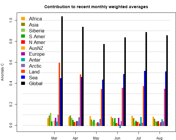
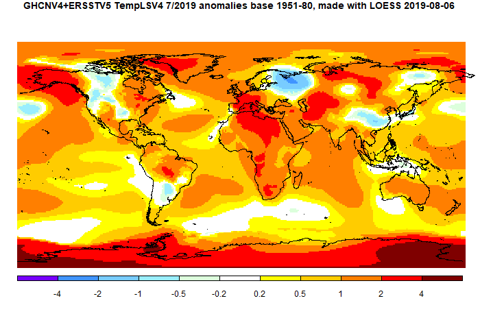
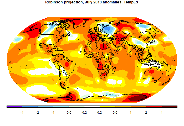
But I have come back to thinking about plane projections. One reason is that I post images on Twitter, where I can't use Javascript. Another is that I compare TempLS output with GISS and other indices, and often their default presentation is with some other projection. So I have looked at schemes such as Mollweide and Robinson, the latter being used by GISS and others.

This has linked in with another aspect of what I do, which is using Platonic solids as a basis for gridding for integration of temperature, and perhaps for graphics. As a by-product, I showed some equal area projections based on the cubed sphere. I have recently been using icosahedral grids in the same way, and that yields equal area maps with even less distortion, but which are also particularly informative for these applications.

So in this post I want to touch on some of these points. First the conventional projections.

Mollweide and Robinson

These are of course well-established. But I found the Wiki versions of the implementation unnecessarily hard to implement, so I'll describe in an appendix some simple approximating formulae. The Mollweide projection achieves equal area at a cost of some distortion near poles. Equal area can be desirable, as for example in not exaggerating the weather variations near poles. One particular use I will describe is in displaying the extent of coverage of temperature stations. Here is a typical map:


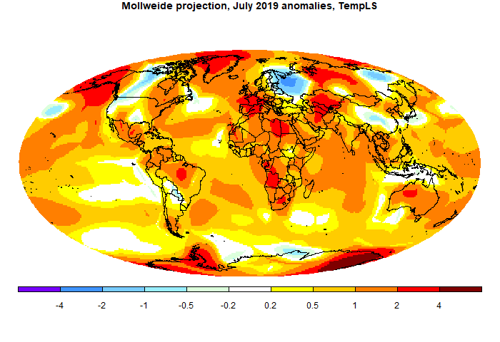
I am not a fan of the Robinson projection. It is billed as a compromise, but I think it is thus neither fish nor fowl. It is not much closer to equal area than lat/lon, and it does little to reduce distortion. It seems to be popular because it seems not unfamiliar to people used to equirectangular. However, it should be easy to implement, so there is little to lose by using it. I say should be, but in fact they make a considerable rigmarole, presenting a table of numbers to be used, and even fussing about how to interpolate. This may be because there are still ownership issues, although there seem to be no restrictions on use. Anyway, I'll describe my way of implementing in the appendix.


Icosahedral projection

I'm developing yet another method of integration, based on FEM on an icosahedral mesh. I'll post soon. But meanwhile it makes for an interesting projection.


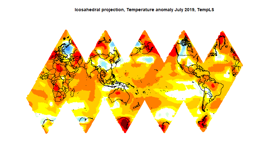
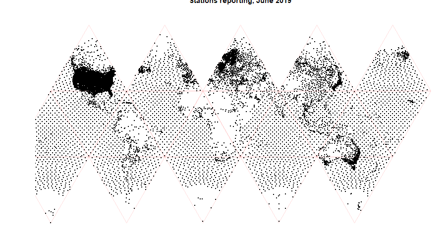
It is very close to equal area. This is achieved at the expense of more numerous cuts. It is not so easy to figure out, and may not be the best projection for this purpose. But it is more useful for showing the distribution of stations, where area density is more critical. I'm using it to see reasons for possible failure of an integration scheme based on icosahedra. Here is the plot:


What next?

I'll try using the Robinson projection for the regular TempLS reports, mainly to make it easier to compare with others. I'll probably also occasionally show a Mollweide projection.

Appendix - calculation methods

As I mentioned, I found the Wiki versions surprisingly clunky, so I spent some time developing simpler ways. I need that partly because I have to be able to reverse. When I show a color plot, I need to define a grid of points on the projection, map back to the sphere for interpolation, and then bring the colors back.

Both the Mollweide and Robinson projections have a similar simple basis. There is one mapping of latitudes from old to new, and then a formula for scaling the longitudes. Latitudes remain as horizontal lines. So two functions of a single variable (each) need to be approximated. There is a little difficulty with singularity in the Mollweide.

In each case, the latitude transform is an odd function (about zero latitude), and the longitude scale is even. I require the approximation to be exact at the equator and poles, and a least squares fit elsewhere. So generally, if the original coordinates are (x,y), x=longitude, angles in right angle units, and the projection coords are (X,Y), the mapping is

Y=f(y)=y+y(1-y²)(a₀ +a₁y² +a₂y4 +...)
X=x*g(y); g(y)=1-d*y²+y²(1-y²)(b₀ +b₁y² +b₂y4 +...)
The inverses are
y=F(Y)=Y+Y(1-Y²)(c₀ +c₁Y² +c₂Y4 +...)
x=X/g(y)

For the Robinson projection I find the coefficients by fitting to the data tabulated by Wiki. d is just what is needed to get X right at y=1, so = 1-X there. From the table, that is d = 1-0.5322 = 0.4678.

The coefficients are, to four terms:
a:0.11230.1890-0.17220.2326
b: -0.0885-0.35680.8331-1.0023
c: 0.1782-0.66871.1220-0.8133


The Mollweide formula relates f(y) in terms of an intermediate variable a :
Y=sin(a)
2a+sin(2a)=π sin(π/2 y)}}
So I generate a sequence of values of a between 0 and π/2, and hence y and Y sequences that I can use for fitting, to get f and F. But first there is a wrinkle near y=1; the expansion of the second equation there relates (1-a)³ on the left to (1-y)², and it is necessary to take fractional powers. The simplest thing to do is to first transform
z=sqrt(1-(1-y²)^(4/3))
and then do the expansion in z. Then it is necessary to map back again
Y=sqrt(1-(1-z²)^(3/4))

However, a simplification is now that the function g(y) is just sqrt(1-y²). And d=1. So the series are:
a:(0.06818,0.01282,-0.01077,0.01949)
c: (-0.06395,-0.0142,0.00135,-0.0085)
All these approximations give considerably better than three sig fig accuracy, which means error much less than a pixel.


Friday, August 16, 2019

GISS July global up 0.01°C from June.

The GISS V4 land/ocean temperature anomaly rose 0.01°C in July. The anomaly average was 0.93°C, up from June 0.92°C. It compared with a 0.061°C rise in TempLS V4 mesh I originally posted a 0.33°C rise, but this drifted upward with late data). As with TempLS, it was the warmest July in the GISS record, also by a considerable margin (0.08°C warmer than 2016).

The overall pattern was similar to that in TempLS. Hot in Africa and most of Europe, extending into Central Asia. Cool in NW Russia. Coolish in much of N America, but warm in Alaska, extending across Bering Strait. Warm in Greenland, mixed in Antarctica.

As usual here, I will compare the GISS and earlier TempLS plots below the jump.

Friday, August 9, 2019

Active WebGL plot of decadal regional temperature trends using ERSST V5 and GHCN V4

I have maintained a page of local trends over periods that users could choose. It was based on GHCN V3, and mesh display, and can still be seen here. But I need to upgrade to GHCN V4, and I have decided to update to LOESS graphics as well. But there is one further upgrade - instead of a choice of a fixed number of intervals ending in present, you can now choose any period of decades back to 1900. The maths of this is quite interesting, and I'll say more below. The new page is here, with the link in the page list top right.

The plot itself is the usual WebGL trackball. You can drag the globe around, or more quickly relocate by clicking on the small map above. Clicking on the plot shows the trend for the chosen period at that location. You can choose periods with the buttons on the right. The endpoints are colored, so the start state of 1980 and 2020 means the period will be Jan 1980 to Dec 2019, with missing months suitably handled. If you click outside the range, the range will extend; if you click inside, the red color will move to your choice. If you wanted to move the pink end, click the pink button to make it red. When you have chosen, click the Show button at the top to get the new plot. The average global trend for the period will show at the bottom as well.

Methods

As usual, the sphere is a trackball that you drag into position, or you can quickly set by clicking on the small map at the top. Beside that map are checkboxes which let you switch the objects displayed. The icosahedral mesh and nodes are initially not shown.

The map is created by first getting monthly averages on the 5762 icosahedral nodes, as described here and here. The trends are then calculated on those nodes. The LOESS method takes a weighted local linear regression on the closest station/SST data, even if it is not close at all. In Antarctica, for example, before 1960 that generally means ocean data. So trends for Antarctica for early times should be ignored. Elsewhere, there is loss of resolution according to station data, but it is still reasonably based. GHCN V4, of course, has much better coverage than V3.

Note that the color scheme is centered for zero trend, but the range varies with the length of period.

Discussion

I think there is a lot to learn from the graphic, and I'll write a more detailed post. For example, recent periods show the extent to which warming dominates the Arctic, but if you look at the most recent decade, it's more mixed, with pronounced cooling over Greenland and the Canadian islands, but warming around Bering Strait. In earlier periods The warming extends to N Siberia as well.

It's interesting to look at the period 1910-1940, often used by skeptics to say that AGW is refute. It's often accompanied by a whinge about how that warming is being suppressed, often showing a plot of Hansen in 1981 or NCAR in 1974 to claim that their warming has been watered down since.

But this plot shows what was happening. Again Arctic warming dominates, and to a lesser extent, N America and N Atlantic. But the S Hemisphere and most oceans show very little warming. Those earlier plots were land only, with data heavily weighted to the N Hemisphere. The reduced warming in later calculations have the advantage of this knowledge.

I originally started out here to do a corresponding plot of the differences between GHCN V3 and V4, and that will be an upcoming post. It is working - just a little more checking.

Trend methods

I'll just say a little about the data handling here. I try to keep the volume of data down; not so much for my web storage, but because of download time. So I used moments. The zero'th moment of numbers yₖ with location is just the sum. The first central moment is the sum Σ(k-kₒ)yₖ, where kₒ is trhe mean. And the trend is just the first central moment, normalised by division by the moment of a unit trend.

There is a trick with moments familiar from calculating angular momentum, say. To get the moment of some bodies, you can just add the moments of their masses (zeroth moments) at their centres of mass, and add in the central first moments of each body. So here, I can just calculate and transmit the zero'th and first moments of the decades, and then I can work out the trend for any sequence of decades.


Tuesday, August 6, 2019

July global surface TempLS up 0.033°C from June.

The TempLS mesh anomaly (1961-90 base) was 0.813deg;C in July vs 0.78°C in June. This is a little more than the 0.018°C rise in the NCEP/NCAR reanalysis base index.

In contrast to the reanalysis, though, it did make it the warmest July in the record, and by a significant margin - 0.744°C in 2016 was next. The prospect of July being warmest has started a number of "hottest month ever" stories. I don't join in that, because it is only true if you add the seasonal cycle that makes NH summer the global peak. There are good reasons why we quote anomalies rather than absolute temperatures, so deviating for this claim can only cause confusion. In any case the seasonal cycle is predictable; the news is the anomaly. And July was nowhere near the highest anomaly of all months. Last March, for example, was 0.982°C.

Interestingly, the increase was due mostly to an SST rise, as was last month. Rising SST tends to continue for longer periods. On land, Much of North America was cool, except Alaska, and some of E Canada. S Europe was warm, but there was a cool spot in NW Russia. There was a warm band through central Asia to Iran and on to the Sahara. Antarctica was mostly warm.

Update 15 Aug Readers following the TempLS report may have noticed some unexpected variations in the July average. About 4 days ago the mesh version dropped to about the June level, and more seriously, the SST dropped back. TempLS LOESS was unaffected, as were the maps and graphics. The reason was that I had been tinkering with the cross product library routine that the mesh area weighting uses. I have fixed that, and now the surprise is that August is now 0.061°C warmer that July, rather than the posted 0.033°C. But I think that is genuine - it had been drifting higher before the sudden drop.

I'll show the bar chart of contributions; these are basically temperatures weighted by area. Africa and Antarctica were most responsible for the rise.


Here is the temperature map, using the LOESS-based map of anomalies.


Saturday, August 3, 2019

July NCEP/NCAR global surface anomaly up 0.018°C from June

The Moyhu NCEP/NCAR index rose from 0.354°C in June to 0.372°C in July, on a 1994-2013 anomaly base. This index fell last month when most others rose, so it remains on the cool side. While there is much talk of July being the hottest ever, allowing for the seasonal cycle, in this NCEP/NCAR index it was behind 2016 at 0.414°C.

North America was mostly cool, except Alaska. S Europe was warm, but E Europe and W Russia were cool. There was a warm band through central Asia to Iran. Antarctica had both very warm and very cool patches, the cool being mostly ocean.


Thursday, August 1, 2019

Unadjusted GHCN V3 and V4 global differences due to coverage, not content.

In yesterday's post I did a graphical study of the differences of GHCN V3 and V4 anomalies for June 2019. The idea was to try to pin down what caused a small discrepancy in the global average for that month. Clive Best has been looking at this, and thinks there may be a systematic change in reported temperatures between versions. My conclusion was that the difference was not because V4 was reporting higher temperatures, but that the greater coverage fixed a problem in V3 that in sparsely covered areas, sea temperatures would have an influence on land. I should add that this is a potential problem in TempLS and in Clive's similar code based on triangle mesh. I think these are very good methods, but the main codes do have one feature that they process land and sea separately, which should reduce this effect.

Clive sought to establish a link by finding a common set of V3 and V4, and seeing whether the difference persisted. I wasn't sure of this, because while there may be a common inventory, the stations in any one month won't correspond. I proposed a test in which the locations of GHCN V3 stations reporting in a month would have values interpolated (by mesh) from the V4 result. But they would then be analysed using the V3 mesh. I suspected that the result would be closer to V3 than V4, which would indicate that the difference was due to the reduced coverage, rather than a discrepancy between the temperature levels of the measures.

I'm reporting on that here. To summarise what I did - I had results from a run of the mesh method for both V3 and V4, reported here. From the V4 directory, I copied the node locations Z4, the anomalies A4, the weights W4, and I rebuilt the mesh M4. TempLS does integration by calculating weights, so the global average is the scalar product W4.A4. From the V3 directory, I copied the locations Z3 and weights W3. Then I linearly interpolated A4 onto Z3, using the mesh M4, giving result Aa. The "hybrid average" is then the scalar product W3.Aa, and it is being compared with W4.A4 and W3.A3.

So here is the first plot. I am presenting them as difference plots, because, as you can see from the plots here, the differences are small and hard to see against the full range of variation of the anomalies. Here is a plot of the last 30 months, with unadjusted data.


The V4 plot seems to jump around more, and clearly the V3 plot is a better match. In reality, the V3 anomaly fluctuates just as much as V4, if not more, but the hybrid tracks better with V3. I'll show another plot of the last 60 Junes:


There are more interesting features here. back to about 1990, the hybrid fairly closely tracks V3, with quite a lot of variability between V3 and V4, mostly with V4 warmer. But before 1990 V4 calms down, and only occasional spurts from V3, now not tracked by the hybrid. It's hard to know what to make of this; except for V3 excursions, both V4 and V3 seem in agreement with the hybrid, and so with each other.

The story is slightly different with adjusted data, V3 and v4. Here is the plot of the last 30 months:


The V3 difference still jumps around a lot less, but there is a fairly persistent offset of up to 0.02°F. This might reasonably be attributed to an effect of homogenisation. Finally, here are the adjusted data averages differenced over the last 60 Junes.


The adjusted pattern reflects the same interesting features as the unadjusted, with big differences between V4 and V3, and the hybrid mostly tracking V3, but with a departure during the last decade. Before 1990, less variation generally, with no obvious tendency for the hybrid to preferentially track V3.

The purpose of this post was to give some quantitative backing to the effects on the average that might be expected from the patterns shown in the last post. The adherence of the unadjusted data hybrid to v3 does not support the idea that there is a recent decades bias in the V4 measured data relative to V3. The performance of adjusted data does suggest a small effect arising from the V4 data, with some rather interesting behaviour going back before 1990 (for Junes).