Wednesday, August 31, 2011

JAXA Ice extent and JS

Everyone's eyes seem to be on the progress of the Acrtic ice melt. I've been posting daily data and plots here from the IJIS Site. I include an expanded section of the current region. However, there are different time regions that peoiple might like to look at more closely (eg September), and rather than a lot of different plots, I thought a JS-enhanced interactive plot might help. I'll use it on the daily site, but you can try it here.

There is an extra legend, top middle, describing four different time periods. Just click on the one you want to see.


Tuesday, August 16, 2011

A Javascript worldview for surface temp.

You may have noticed that I generally prefer simple spherical (orthographic) projections for displaying global fields. Even though it takes several projections to convey all the information.

But I use lat/lon maps for comparisons, and more recently, Hammer projections for comparison with NOAA and MP.

Spherical projections take up space, but this can be resolved by creating a poor man's Google Earth (OK, GE is free) with Javascript. In the plot below, of the July temperature data using GISS's colors and baseline (1951-80), you'll see a pattern of squares, top left. This corresponds to eight views. The directions are as if the earth was encased in a cube, with one apex above the N pole. The views are from the directions of the eight corners. N Pole is the square at the top, the next three are around near the Tropic of Cancer, etc. Just click - the red square marks where you are.
Picture below the jump


Below the jump - same for NOAA


This time, for variety, I've positioned the views differently. The viewing cube is tangent to the pole, so the foci are points along a N and S latitude, at about 40°. The squares to click on follow that pattern.(Due to a slight inadequacy in the current JS, please don't click on this one before clicking on the top one).

Sunday, August 14, 2011

GISS spatial map, July 2011

I said I'd compare the GISS spatial map for July 2011 with the TempLS fitted spherical harmonic version when the GISS map appeared. That has now happened. The patterns are similar, though TempLS seems to be somewhat warmer. That is partly because of the smoothing - some of the cold spots are localised, and tend to get smoothed over. Anyway, pictures below the jump.


Here is the GISS plot:


And below is the plot that I showed here:


I've tried hard to match the colors and levels, and I don't think they are the major source of the differences, although my corresponding colors, theoretically an exact match, do seem fainter in the PNG rendition. I think part is the smoothing.  The actual patterns are very similar.

In my lat/lon plot TempLS cuts out the parts near the poles (eg below 60°S), because of the distortion. But you can see them in the Hammer projection here and I'll be showing full spherical projections (with some Javascript) in my next post. TempLS shows a major warm spot around the South Pole - but based on very few stations. GISS has some of that too, but the projection makes it hard to see.


Update. MP has commented that NOAA/NCDC also has a plot out. below is the graph that he linked, and below that is my graph, in similar colors (supplied by MP) which I showed in the previous post. It's of special interest because NCDC is using essentially the same global data combination (GHCNv3/ERSST).


Saturday, August 13, 2011

Comparisons of TempLS with reader MP's July 2011 plots.


In previous posts I've described the TempLS reconstruction of July 2011 global surface temperature. I noted also the new GISS average, and said that a comparison of the spatial plot would await GISS posting.

Commenter MP has been producing very impressive spatial plots using a Matlab script. I posted his movie of recent UAH LT temperatures here. In comments below you'll find the stills, and a wealth of other images linked by MP.

He has also done plots of GISS results, using GISS gridded data. I'll show below the jump his plots, and my spherical harmonics based reconstruction for comparison.


Here is MP's plot for July 2011. The two below are the GISS results, and are therefore directly comparable, with due allowance for the different color schemes.


Because it's grid-based, a larger interpolation length (1200km) fills more cells but lowers the resolution. For comparison, here is the TempLS plot, which is based on a spherical harmonics least squares fit, and so has even more smoothing:

MP, if you could send me your color scheme (looks like NOAA) I could use it instead of GISS (Update - done, thanks MP - mine looks like a lava lamp version now). In my previous post I used the full 1960-2011 period for the anomaly base, but I've reconfigured here to 1981-2010 to match MP. I've used a Hammer projection here - in my next post I'll show spherical projections augmented by javascript navigation, and using a 1951-1980 base to compare with GISS.

MP has also posted UAH


and RSS zonal plots.


Here is his full set of UAH monthly maps from Jan 2009 to Jul 2011.


GISS July temp up 0.09°C.


Thursday, August 11, 2011

Global surface temp for July - no change.

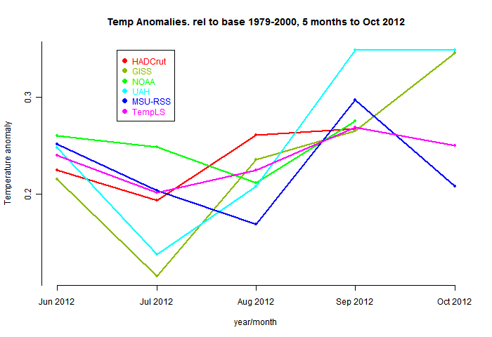
OK, that's the new TempLS result. The other surface indices haven't reported yet. Here is the plot comparing indices for the last four months, with all index anomalies relative to 1979-2000. Update - the linked image here is periodically updated, so it shows new figures as they arrive. GISS for July has been added.

And here is how the warmth was spread around:

Update - I haven't been properly clear here on anomaly bases. For the time series plots I used 1979-2000, so I could plot them all on one graph. For the spatial plot, I actually used the default - the average for the whole period, which was 1960-2011. Since I'm using GISS colors, it would be better to use the GISS period which is 1951-80. That will require exrending the calc back 10 years. It doesn't make much difference to the color plot; the change will be small relative to the range of monthly means, and one could simply adjust the color scale zero, leaving the plot unchanged.

There's a lot more to say about how this was done. Obviously, I'm using fairly early information. But the coverage is pretty good. We'll soon see how it holds up against the major indices. Details below the jump.


I used a combination of GHCN V3 and ERSST v3b. I ws waiting for HADSST2, which the previous month was based on, mainly because I am more familiar with it. But the ERSST data came out on Aug 3, and seems fairly complete. Maybe some numbers will change. The GHCN file was ghcnm.v3.0.0.20110809, dated 9 Aug, though apparently posted on 10th.

The ERSST data has 2x2° resolution. That's a bit more than I need, and would tend to swamp the land stations, so I amalgamated cells to 4x4°. Total land and sea station numbers were good - 4000 (2102 sea, 1898 land), compared with 4084 in June and 4262 in May. It seems that when all stations have reported, totals currently are about 4500 (land and sea).

Here is the plot of the last 48 months. You can find these plots and the numbers (not set to the 1979-2000 base) at the regular current data site.


Some more details - I used, in TempLS V2.2, the weighting scheme that I've called type zero, with equal area cells. I ran the reconstruction from 1960, to get the normals. The shaded plot is made using 140 spherical harmonics.

Here is the pattern of stations that have reported so far. As previously, the equal area cells used for weighting are shown in blue if they contain stations that reported in July, else yellow. You can click to enlarge.


Tuesday, August 2, 2011

Global surface temperature coverage.

Global surface temperature coverage.

There have been articles in the blogosphere in recent years with titles something like "the dying of thermometers", and showing a plot something like this on the variation of GHCN stations over the years.

Raw station numbers aren't a good guide. GHCN was originally a grant-funded archiving exercise. It did not focus on even coverage - they largely archived what was available. The ongoing version of GHCN (since the mid 90's) relies on the submission of CLIMAT forms by countries, and this seems to be rationalised by area.

I was looking into the statistics of the cell weighting schemes I described in the previous post, and realised that these provided a good quantification of coverage over the years. In cell weighting I divide the surface into cells and calculate the number of stations reporting in each cell in each month. Empty cells represent coverage failure, so I've catalogued their occurrence. They are therefore a measure of coverage over time. Below the jump, I'll show how the global coverage of CRUTEM3, GHCN and HADSST2 has varied over the years. It has been generally improving.


My original aim was to compare the lat/lon cell scheme with the equal area scheme (see previous post). I did a run from 1900 to 2010, computing for each month the sum of weights as a fraction of what they would have been with every cell reporting. This is, put another way, the area of reporting cells as a fraction of total. As a reminder of the schemes and the empty-cell pattern, here are the two schemes. The stations shown are those that reported in April 2009; the yellow cells had no reporting stations. You can click to see double-size.


So for the CRUTEM3 analysis I plotted the time sequence of the fractional area occupied by the blue cells:


The graph shows both the monthly pattern and a 12-month running average. There is a lot of seasonality in the readings.

Commenting first on the weighting methods, yes, as expected the equal area method, tagged as 0, gives better coverage. Of course, this figure has to be balanced against resolution - either method would give perfect cover with large enough cells. But in this case, both have the same 5x5° cells at the equator, which is small enough to expect that variations within the area would not be large.

On total coverage, the effects of the two world wars on SST measurement are very evident. Otherwise, while coverage might be said to have peaked about 1980, it has been fairly even since. The big post-1988 decline in station numbers is associated with a small reduction in cover. You can see that expanded in this graph:

Looking more into the seasonality, here is an expanded plot from a period when it was very pronounced. It peaks around Dec-Jan. That may be due to better Southern Ocean SST coverage - a very large area.

CRUTEM3-GHCNV3 comparison

There isn't much to say here about total cover - GHCN very slightly greater. I'll show scheme 2 - the other is the same. In the legend, Giss means GHCNV3.

The actual pattern of empty cells may be of interest - here is a comparison of GHCN and CRUTEM3 for weighting style 0, for April 2009, as in the previous post: Remember both are using HADSST2, so don't expect any difference at sea:

GHCN Stations April 2009CRUTEM 3 Stations April 2009

Monday, August 1, 2011

Cell weighting schemes for the Earth.

I referred in my CRUTEM3 based reconstruction to two separate weighting schemes, involving dividing the Earth into cells in two different ways. I'll say more about that here. It also tells more about the strengths and weaknesses of the CRUTEM3 data set.


Purpose of weighting.

I'll illustrate this with the conventional scheme for creating cells by 5°x5° lat/lon blocks:


You can see that the stations are unevenly distributed. This is a land/sea analysis using the new CRUTEM3 data set with HADSST2, and the stations marked are those that reported in April 2009. The "stations" in the sea are gridcells for HADSST2, which is also on a 5°x5° grid.

It would be most undesirable to include the stations unweighted - then areas that happened to have many stations reporting would unduly influence the estimate of what is supposed to be a global average. In fact, the usual way of getting areas to balance equally is to add up area averages, over the cells that you see.

TempLS takes a slightly different view, but functionally it is very similar. The cells are weighted according to the inverse of their area density, as well as can be estimated. And the simplest estimate is stations per cell, adjusted for area.

Empty cells

As you can see, in any month quite a lot of cells (marked in yellow) are empty. Conventionally, they are just left out of the sum. TempLS does that in effect too. But this detracts from the purpose of weighting. Leaving them out does not mean no effect; instead, it is as if they were included, but assigned the average global anomaly for that month.

What should be done is to include them with the best estimate of their likely value. A better estimate is something derived from nearby stations. Many cells are empty in the Arctic, for example, and that leads to the relatively high trend there being underrepresented in the global average.

Remedies

The first remedy is to use a different scheme which has a smaller empty cell area. I will describe a simple one. I've described previously a more complex one. It is fairly time-consuming, though.

In V2.2 I have developed another, in conjunction with an equal-cell area division. Nearby cells are assigned extra weight to make up for what the empty cells are missing. This weight is transferred to the stations.

The solution method emulates diffusion. Empty cells transfer weight to their neighbors. Those that have cells keep the weight, but some will have gone to empty cells. So it is transferred again. About four cycles of this gets most of the weight to occupied cells.

There is a trick there. It's like explicit solution of numerical diffusion by "relaxation", and it can be accelerated by over-relaxation. In each step, about 4/3 times the weight is removed - ie empty cells go negative. But they get some from their neighbors.

Implementation

As I mentioned in my earlier post, this is available, and I tried it for the CRUTEM data. The answers were more different than for the simple schemes. This may be correct, but I'm checking.

Anyway, in this post, I mainly wanted to show more about the empty cell issue and how a new cell scheme can help. So here are some more views of problem areas. Africa is bad - S America actually seems better covered in CRUTEM than in GHCN. But maybe April 2009 was a good month.


Somalian pirates seem to be making a dent in SST measures.


The new scheme

The simple scheme is not good near the poles. The elements get small, so the few stations that are there are assigned small weighting. The area uncovered is proportionally greater.

The new scheme retains 5° latitude bands, but divides with fewer cells per band away from the equator. So each cell looks like the 5x5 equatorial block. That's pretty good up to 85°N. Then the last circle is divided into three.

One interesting geometry fact I learnt while doing this. If you slice a sphere equally (by thickness of slice) then the sphere surface area in each slice is equal. The rind from the equator and the near circle at the pole are the same.

This scheme does not have equal thicknesses, but it makes the calculation of cell area easy. Just work out what the thickness of each lat band is (cos lat), and divide that by the number of cells in the band.

OK, so here are the pictures:


Using these cells without diffusion was method 0 of the previous post.

There are many ways a sphere could be divided, but you need a good scheme for then deciding into which cell an arbitrary point (station) falls. With this scheme, you just decide with lat band it is, and then which of the equal divisions of longitude it falls into.


First TempLS CRUTEM3 reconstructions.

I've run TempLS V2.2 reconstructions using recently released CRUTEM station data. I've written about the station data here and here.

There are many comparisons I could do. For this post, I'll start by comparing the already published CRUTEM3 averages with the GISS equivalent. Then I'll show monthly averages calculated direectly (by TempLS) from the new data, compared with the published averages. Personally, I think the land/sea averages are much more significant, so I'll show the corresponding results there, using HADSST2 data.

As a general observation, I would say that my land reconstruction tracks fairly well, but rises significantly over the last decade. The TempLS calc makes no adjustments for UHI or anything else. The Land/Sea average shows the same tendency, but much less so.
Update - Steven Mosher has posted his RghcnV3 reconstruction from CRUTEM3 data, which showed similar recent variations,

All anomaly plots are set to a 1961-90 base period. I have used two weighting methods. Method 2 is just by inverse station density calculated from 5x5 lat/lon "rectangles". Method 0 is calculated using equal area rectangles, equivalent to 5x5 at the equator. This method, new in V2.2, is intended to be used with a scheme to redistribute weighting when cells are empty. That actually gave results which were noticeably different. I think it is actually the right thing to do, so the differencemay well be an improvement, but I need to check more to see that it isn't just a mistake.


Sources

CRUTEM3 data CRUTEM3 Ave HADCRUT3
GISS Land GISS Land/Sea HADSST2

Comparison of Giss and Crutem3 Land Indices

Crutem3 is the published CRUTEM average. TempLS reconstruction starts in the nexr section.


Comparison of Crutem3 ave with TempLS Land reconstruction

As mentioned, two weighting schemes were used and are indicated with _0 and _2 respectively. Smoothing is done with 12-month and 60-month moving averages.


Recent monthly deviation:


Tracking peaks:

Comparison of HADCRUT3 ave with TempLS Land/Sea reconstruction

These are Land/Sea reconstructions, and TempLS uses HADSST2 sea surface temp data on a 5x5 degree grid.In the legend, CruSST is the TempLS reconstruction, Hadcrut3 the published average.


Unsmoothed monthly