I wrote a post earlier this month updating a general facility for using WebGL for making interactive Earth plots, Google-Earth style. I have now created a web page here which I hope to maintain which documents it. The page is listed near the bottom of the list at top right. I expect to be using the facility a lot in future posts. It has new features since the last post, but since I don't think anyone else has used that yet, I'll still call the new version V2. It should be compatible with the earlier.
Friday, March 31, 2017
Tuesday, March 28, 2017
More ructions in Trump's EPA squad.
As a follow-up to my previous post on the storming out of David Schnare, there is a new article in Politico suggesting that more red guards are unhappy with their appointed one. It seems the "endangerment finding" is less endangered than we thought.
But Pruitt, with the backing of several White House aides, argued in closed-door meetings that the legal hurdles to overturning the finding were massive, and the administration would be setting itself up for a lengthy court battle.
A cadre of conservative climate skeptics are fuming about the decision — expressing their concern to Trump administration officials and arguing Pruitt is setting himself up to run for governor or the Senate. They hope the White House, perhaps senior adviser Stephen Bannon, will intervene and encourage the president to overturn the endangerment finding.
Monday, March 27, 2017
Interesting EPA snippet.
From Politico:
Update Here is the storyat Schnare's home base at E&E.
Update - as William points out below, I had my E&Es mixed up. Here is Schnare at his E&E announcing his appointment. But they have not announced his departure.
Revitalizing the beleaguered coal industry and loosening restrictions on emissions was a cornerstone of Trump’s pitch to blue collar voters. Yet, two months into his presidency, Trump loyalists are accusing EPA Administrator Scott Pruitt of moving too slowly to push the president’s priorities.David Schnare, a former EPA lawyer, has been most notable for his unsuccessful lawsuits (often with Christopher Horner) seeking emails of Michael Mann and others. Here he is celebrating at WUWT his appointment to the Trump transition team.
Earlier this month, David Schnare, a Trump appointee who worked on the transition team, abruptly quit. According to two people familiar with the matter, among Schnare’s complaints was that Pruitt had yet to overturn the EPA’s endangerment finding, which empowers the agency to regulate greenhouse gas emissions as a public health threat.
Schnare’s departure was described as stormy, and those who’ve spoken with him say his anger at Pruitt runs deep.
"The backstory to my resignation is extremely complex,” he told E&E News, an energy industry trade publication. “I will be writing about it myself. It is a story not about me, but about a much more interesting set of events involving misuse of federal funds, failure to honor oaths of office, and a lack of loyalty to the president."
Other Trump loyalists at EPA complain they’ve been shut out of meetings with higher-ups and are convinced that Pruitt is pursuing his own agenda instead of the president’s. Some suspect that he is trying to position himself for an eventual Senate campaign. (EPA spokespersons did not respond to requests for comment.)
Update Here is the story
Update - as William points out below, I had my E&Es mixed up. Here is Schnare at his E&E announcing his appointment. But they have not announced his departure.
Wednesday, March 22, 2017
Global average, integration and webgl.
Another post empowered by the new WebGL system. I've made some additions to it which I'll describe below.
I have written a lot about averaging global temperatures. Sometimes I write as a sampling problem, and sometimes from the point of view of integration.
A brief recap - averaging global temperature at a point in time requires estimating temperatures everywhere based on a sample (what has been measured). You have to estimate everywhere, even if data is sparse. If you try to omit that region, you'll either end up with a worse estimate, or you'll have to specify the subset of the world to which your average applies.
The actual averaging is done by numerical integration, which generally divides the world into sub-regions and estimates those based on local information. The global result always amounts to a weighted average of the station readings for that period (month). It isn't always expressed so, but I find it useful to formulate it so, both conceptually and practically. The weights should represent area.
In TempLS I have used four different methods. In this post I'll display with WebGL, for one month, the weights that each uses. The idea is to see how well each does represent area, and how well they agree with each other. I have added some capabilities to the WebGL system, which I will describe.
I should emphasise that the averaging process is statistical. Errors tend to cancel out, both within the spatial average and when combining averages over time, when calculating trends or just drawing meaningful graphs. So there is no need to focus on local errors as such; the important thing is whether a bias might accumulate. Accurate integration is the best defence against bias.
The methods I have used are:
The methods are compared numerically in this post. Here I will just display the weights for comparison in WebGL.
I have written a lot about averaging global temperatures. Sometimes I write as a sampling problem, and sometimes from the point of view of integration.
A brief recap - averaging global temperature at a point in time requires estimating temperatures everywhere based on a sample (what has been measured). You have to estimate everywhere, even if data is sparse. If you try to omit that region, you'll either end up with a worse estimate, or you'll have to specify the subset of the world to which your average applies.
The actual averaging is done by numerical integration, which generally divides the world into sub-regions and estimates those based on local information. The global result always amounts to a weighted average of the station readings for that period (month). It isn't always expressed so, but I find it useful to formulate it so, both conceptually and practically. The weights should represent area.
In TempLS I have used four different methods. In this post I'll display with WebGL, for one month, the weights that each uses. The idea is to see how well each does represent area, and how well they agree with each other. I have added some capabilities to the WebGL system, which I will describe.
I should emphasise that the averaging process is statistical. Errors tend to cancel out, both within the spatial average and when combining averages over time, when calculating trends or just drawing meaningful graphs. So there is no need to focus on local errors as such; the important thing is whether a bias might accumulate. Accurate integration is the best defence against bias.
The methods I have used are:
- Grid cell averaging (eg 5x5 deg). This is where everyone starts. Each cell is estimated as an average of the datapoints within it, and weighted by cell area. The problem is cells that have no data. My TempLS grid method follows HADCRUT in simply leaving these out. The problem is that the remaining areas are effectively infilled with the average of the points measured, which is often inappropriate. I continue to use it because it has often very closely tracked NOAA and HADCRUT. But the problem with empty cells is serious, and is what Cowtan and Way sought to repair.
- My preferred method now is based on irregular triangulation, and standard finite element integration. Each triangle is estimated by the average of its nodes. There are no empty areas.
- I have also sought to repair the grid method by estimating the empty cells based on neighboring cells. This can get a bit complicated, but works well.
- An effective and elegant method is based on spherical harmonics. The nodes are fitted with a set of harmonics, based on least squares regression. Then in integrating this approximation, all except the first go to zero. The integral is just the coefficient of the constant.
The methods are compared numerically in this post. Here I will just display the weights for comparison in WebGL.
Friday, March 17, 2017
Temperature residuals and coverage uncertainty.
A few days ago I posted an extensive ANOVA-type analysis of the successive reduction of variance as the spatial behaviour of global temperatures was more finely modelled. This is basically a follow-up to show how the temperature field can be partitioned into a smooth part with known reliable interpolation, and a hopefully small residue. Then the size of the residue puts a limit on the coverage uncertainty.
I wrote about coverage uncertainty in January. It's the uncertainty about what would happen if one could measure in different places, and is the main source of uncertainty in the monthly global indices. A different and useful way of seeing it is as the uncertainty that comes with interpolation. Sometimes you see sceptic articles decrying interpolation as "making up data". But it is the complement of sampling, which is how we measure. You can only measure anything at a finite number of places. You infer what happens elsewhere by interpolation; that can't be avoided. Just about everything we know about the physical world, or economic for that matter, is deduced from a finite number of samples.
The standard way of estimating coverage uncertainty was used by Brohan et al 2006. They took a global reanalysis and sampled at sets of places correponding to possible station distributions. The variability of the resulting averages was the uncertainty estimate. The weakness is that the reanalysis may have different variability to the real world.
I think analysis of residuals gives another way. If you have a temperature anomaly field T, you can try to separate it into a smoothed part s and a residual e:
T = s + e
If s is constructed in such a way that you expect much less uncertainty of interpolation than T, then the uncertainty has been transferred to e. That residual is meor intractable to integrate, but you have an upper bound based on its amplitude, and that is an upper bound to coverage uncertainty.
So below the jump, I'll show how I used a LOESS type smoothing for s. This replaces points but a low-order polynomial weighted regression, and the weighting is by a function decaying with distance, in my case exponentially, with characteristic distance t (ie exp(-|x}/r). With r very high, one can be very sure of interpolation (of s), but the approximation will not be very good, so e will be large, and contains a lot of "signal" - ie what you want to include in the average, which will then be inaccurate. If the distance is very small, the residual will be small too, but there will be a lot of noise still in s. I seek a compromise where s is smooth enough, and e is small enough. I'll show the result of various r values for recent months, focussing on Jan 2017. I'll also show WebGL plots of the smooths and residuals.
I should add that the purpose here is not to get a more accurate integral by this partition. Some of the desired integrand is bound to end up in e. The purpose is to get a handle on the error.
Thursday, March 16, 2017
GISS up by 0.18°C, now 1.1°C!
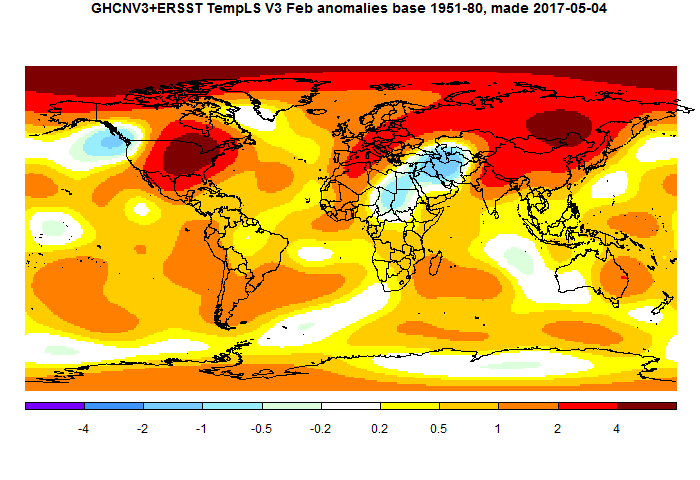
GISS has posted a report on February temperature, though it isn't in their posted file data yet. It was 1.10°C, up by 0.18°C. That rise is a bit more that the 0.13°C shown by TempLS mesh. It also makes February a very warm month indeed, as the GISS article says. It's the second warmest February in the record - Feb 2016 was at the peak of the El Nino. And it is equal to December 20165, which was also an El Nino month, and warmer than any prior month, of any kind.
I'll show the plot below the jump. It shows a lot of warmth in N America and Siberia, and cool in the Middle East.
As I noted in the previous post, TempLS had acquired a bug in the treatment of GHCN data that was entered and later removed (usually flagged). This sometimes caused late drift in the reported numbers. It has been fixed. Last month is up by 0.03°C on initial report.
Wednesday, March 15, 2017
Making an even SST mesh on the globe.
I have been meaning to tidy up the way TempLS deals with the regular lat/lon SST grid on the globe. I use ERSST, which has a 2x2° grid. This is finer than I need; it gives the sea much more coverage tha the land gets, and besides being overkill, it distorts near coasts, making them more marine. So I had reduced it to a regular 4x4 grid, and left it at that.
But that has problems near the poles, as you can see in this image:
The grid packs in lots of nodes along the upper latitudes. This is ugly, inefficient, and may have distorting effects in making the polar region more marine than it should, although I'm not sure about that.
So I looked for a better way of culling nodes to get a much more even mesh. The ideal is to have triangles close to equilateral. I have been able to get it down to something like this:
I don't think there is much effect on the resulting average, mainly because SST is still better resolved than land. But it is safer, and looks more elegant.
And as an extra benefit, in comparing results I found a bug in TempLS that had been puzzling me. Some, but not all, months had been showing a lot of drift after the initial publication of results. I found this was due to my system for saving time by storing meshed weights for past months. The idea is that if the station mix changes, the weights will be recalculated. But for nodes which drop out (mostly through acquiring a quality flag) this wasn't happening. I have fixed that.
Below the jump, I'll describe the algorithm and show a WebGL mesh in the new system.
Sunday, March 12, 2017
Residuals of monthly global temperatures.
I have frequently written about the task of getting a global average surface temperature as one of spatial integration, as here or here. But there is more to be said about the statistical aspect. It's a continuation of what I wrote here about spatial sampling error. In this post, I'll follow a path rather like ANOVA, with a hierarchy of improving approximations leading to smaller and more random residuals. I'll also follow through on my foreshadowed more substantial application of the new WebGL system, to show how the residuals do change over the surface.
So the aims of this post are:
- To see how various levels of approximation reduce the variance
- To see graphically how predictability is removed from the residuals. The idea here is that if we can get to iid residuals in known locations, that distribution should be extendable to unknown locations, giving a clear basis for estimation of coverage uncertainty.
- To consider the implications for accurate estimation of global average. If each approximation is itself integrable, then the residuals make a smaller error. However, unfortunately, they also become themselves harder to integrate, since smoothness is deliberately lost.
Friday, March 10, 2017
January HADCRUT and David Rose.
Yet another episode in the lamentable veracity of David Rose and the Daily Mail. Sou covered a kerfuffle last month when Rose proclaimed in the Sunday Mail:
"The ‘pause’ is clearly visible in the Met Office’s ‘HadCRUT 4’ climate dataset, calculated independently of NOAA.
Since record highs caused last year by an ‘el Nino’ sea-warming event in the Pacific, HadCRUT 4 has fallen by more than half a degree Celsius, and its value for the world average temperature in January 2017 was about the same as January 1998."
This caused John Kennedy, of the Met Office, to note drily:
Rose was writing 19 Feb, and Hadcrut does indeed take much longer to come out. But it is there now, and was 0.741°C for the month. That was up quite a lot from December, in line with GISS (and Moyhu TempLS). It was a lot warmer than January 1998, at 0.495°C. And down just 0.33°C from the peak in Feb 2016.
And of course it was only last December that David Rose was telling us importantly that "New official data issued by the Met Office confirms that world average temperatures have plummeted since the middle of the year at a faster and steeper rate than at any time in the recent past".
In fact, January was warmer than any month since April 2016, except for August at 0.77°C.
Update. David Rose was echoed by GWPF, who helpfully provided this graph, sourced to Met Office, no less:
I've added a circle with red line to show where January 2017 actually came in. I don't know where their final red dot could have come from. Even November, the coldest month of the 2016, was 0.524°C, still warmer that Jan 1998.
Wednesday, March 8, 2017
Moyhu WebGL interactive graphics facility, V2.
As mentioned in the previous post, I've been working on a new version of a WebGL graphics facility that I first posted three years ago. Then it was described as a simplified access to WebGL plotting of data on a sphere, using the active and trackball facilities. It could work from a fairly simple user-supplied data file. I followed up with an even simpler grid-based version, which included a text box where you could just paste in the lat/lon grid data values and it would show them on an active sphere.
So now there is an upgrade, which I'll call V2. Again, it consists of just three files; an HTML stub MoyGLV2.html, a functional JavaScript file called MoyGLV2.js, and a user file, with a user name. The names and locations of the JS files are declared in the html. Aside from that, users just amend the user file, which consists of a set of data statements in Javascript. JS syntax is very like C, but the syntax needed here is pretty universal. The user files must be set before the MoyGLV2.js or equivalent in the HTML.
The main new features are:
I'll set out the data requirements below the jump, and some information on the controls (which haven't changed much. Finally I'll give a grid example, with result, and also below that the code for palette demo from the last post. The zip-file which contains code and example data is here. There is only about 500 lines of JS, but I've included sample data.
So now there is an upgrade, which I'll call V2. Again, it consists of just three files; an HTML stub MoyGLV2.html, a functional JavaScript file called MoyGLV2.js, and a user file, with a user name. The names and locations of the JS files are declared in the html. Aside from that, users just amend the user file, which consists of a set of data statements in Javascript. JS syntax is very like C, but the syntax needed here is pretty universal. The user files must be set before the MoyGLV2.js or equivalent in the HTML.
The main new features are:
- The merging of the old grid input via a new GRID type, which only requires entry of the actual data.
- An extension of the user input system that came with the grid facility. A variety of items can now be put in via text box (which has a 16000 char limit).
- A multi-data capability. Each property entered can now be an array. radio buttons appear so that the different instances can be selected. This is very useful for making comparisons.
- A flat picture capability. The motivation was to show spheres in 3D, but the infrastructure is useful for a lat/lon projection as well.
- A compact notation for palettes, with color ramps.
I'll set out the data requirements below the jump, and some information on the controls (which haven't changed much. Finally I'll give a grid example, with result, and also below that the code for palette demo from the last post. The zip-file which contains code and example data is here. There is only about 500 lines of JS, but I've included sample data.
February global surface temperature up 0.106°C.
TempLS mesh posted another substantial rise in February, from 0.737°C to 0.843°C. This follows the earlier very similar rise of 0.09°C in the NCEP/NCAR index, and smaller rises in the satellite indices. Exceeding January, February was record warm by any pre-Nino16 standards.It was warmer (in anomaly) than any month before October 2015.
TempLS grid also rose by 0.11°C. The breakdown plot showed the main contributions from Siberia and N America, with Arctic also warm. The map shows those features, and also cold in the Middle East.
Sunday, March 5, 2017
Playing with palettes in WebGL earth plotting.
Three years ago, I described a simplified access to WebGL plotting of data on a sphere, using the active and trackball facilities. It could work from a fairly simple user-supplied data file. I don't know if anyone actually used it, but I certainly did. It is the basis for most of my WebGL work. I followed up with an even simpler grid-based version, which included a text box where you could just insert the lat/lon grid data values and it would show them on an active aphere.
I've been updating this mechanism, and I'll post a new version description in a few days, and also a more substantive application. But this post just displays a visual aspect that users may want to play with.
I almost always use rainbow palettes, and they are the default in the grid program. But they are deprecated in some quarters. I think they are the most efficient, but it is good to explore alternatives. One feature of the new system is that you can show and switch between multiple plots; another is that the textbox system for users to add data has been extended.
The plot below shows January 2016 anomalies, as I regularly plot here. On the top right, you'll see a set of radio buttons. Each will show the same plot in a different color scheme. The abbreviations expand in a title on the left when you click. They are just a few that I experimented with. The good news is, you can insert your own palettes. I'll explain below the plot.
As usual, the Earth is a trackball, and dragging right button vertically will zoom. Clicking brings up data for the nearest station. "Orient" rotates current view to map orientation.
In the new scheme, you can alter data by choosing the correct category in the dropdown menu top right, and then pasting the data into the text box, and then clicking "Apply". There is a shortened format for palettes. Colors are represented by an RGB triple between 0 and 1 (this is the GL custom). 0,0,0 is black, 1,0,0 is red. So you can enter a comma-separated set of numbers in groups of four. The first three are the RGB, and the fourth is the number of colors that ramp to the next one. The total length should be 256. The last set of four needs a final integer for format, but it can be anything. The series should be in square brackets, indicating a Javascript array. Here is a table of the data I used:
Array of data | Description |
[[1,0,0,64, 1,1,0,64, 0,1,0,64, 0,1,1,64, 0,0,1,64] | Rainbow spectrum |
[1,0,0,96, 1,1,0,80, 0,1,0,48, 0,1,1,32, 0,0,1,64] | Rainbow tinged red |
[1,0,0,32, 1,1,0,48, 0,1,0,80, 0,1,1,96, 0,0,1,64] | Rainbow tinged blue |
[1,0,0,64, 1,1,0,64, 1,1,1,64, 0,1,1,64, 0,0,1,64] | Red, yellow white and blue |
[1,0,0,128, 1,1,1,128, 0,0,1,1], | Red white and blue |
[0.62,0.32,0.17,128, 0.7,0.7,0.3,128, 0.4,.6,.2,1] | Earth: brown to olive |
[0.62,0.32,0.17,128, 0.7,0.7,0.3,104, 0.4,.6,.2,24, 0,0,1,1] | Earthy with blue |
[1,1,1,256, 0,0,0,1] | White to Black |
You can enter a similar sequence in the text box and see what it looks like. It will replace the currently selected palate. You can even change the button label by selecting "short", or the label top left by selecting "long", in each case entering your phrase with quotes in the text box.
Friday, March 3, 2017
NCEP/NCAR rises again by 0.09°C in February
It's getting very warm again. January was warmer than any month before October 2015 in the MOyhu NCEP/NCAR reanalysis index. February was warmer again, and is warmer than Oct/Nov 2015, and behind only Dec-April in the 2015/6 El Nino. And it shows no downturn at end month.
Karsten also had a rise of 0.1°C from GFS/CFSR. UAH V6 is up by 0.05°C. And as I noted in the previous post, Antarctic sea ice reached a record low level a few days ago.
Wednesday, March 1, 2017
Record low sea ice minimum in Antarctica
I've been tracking the Antarctic Sea Ice. It has been very low since about October, and a new record looked likely. Today I saw in our local paper that the minimum has been announced. And indeed, it was lowest by a considerable margin. The Moyhu radial plot showed it thus:
The NSIDC numbers do show that there is still melting, but if so, it won't last much longer. The Arctic seems to be at record low levels again also, which may be significant for this year's minimum.
Subscribe to:
Posts (Atom)