Just over a year ago, the GWPF announced an inquiry into global temperature adjustments. There would be a panel of experts, chaired by Professor Terence Kealey. It was exuberantly promoted in the Telegraph - "Top Scientists Start To Examine Fiddled Global Warming Figures". Terms of reference were promulgated, and submissions called for, deadline June 30th. I made a submission, and wrote more about the process here.
As said there, the GWPF did mount a news page here. About three weeks after the submissions deadline, the panel said that they would not write a report, but would aim to write papers etc. The last update here was Sept 29, 2015.
So after a year, what has happened? Nothing more to report. The inquiry web pages are still up; submissions have not been published. No further news.
I have been reporting occasionally on progress; maybe I'll report again on the next anniversary, unless there is news in the meantime. But it sure doesn't sound like they have found those "Fiddled Global Warming Figures".
Friday, April 29, 2016
Friday, April 22, 2016
Averaging temperature data improves accuracy.
I've been arguing again at WUWT. It's a bizarre but quite interesting thread. There is a contrarian meme that asks how global averages can be quoted to maybe two-decimal accuracy, when many of the thermometers might have resolved to just one degree. I tried to deal with that here, showing that adding noise of 1°C amplitude to monthly averages made very little difference to the global average.
But the meme persists, and metrology handbooks get quoted - here a JGCM guide. But the theory quoted is for a single measurement, where repeated measurements can't overcome lack of resolution. But that isn't what is happening in climate. Instead a whole lot of different measurements are averaged.
Of course, averaging does improve accuracy. That's why people incur cost to obtain large samples. In this post, I'll follow my comment at WUWT by taking 13 months of recent daily max in Melbourne, given by BoM to 1 decimal place, and show that if you round off that decimal, emulating a thermometer reading to nearest degree, the difference to the monthly average is only of order 0.05°C; far less than the reduction in resolution. But first, I'll outline some of the theory.
Wednesday, April 20, 2016
NOAA Global index still rising - new record.
Most indices dropped slightly from record February values. But as expected, the global NOAA index held up, and was even slightly warner, at 1.22°C vs 1.19 in Feb. That is the highest anomaly in the record for any month.
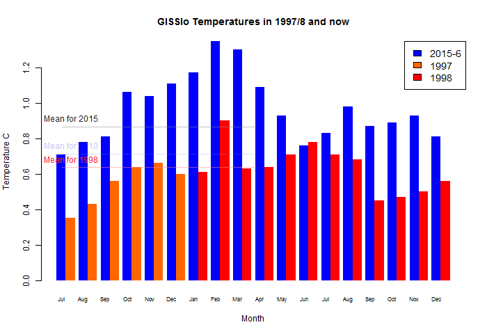
I'll show my now usual comparison with 1997/8::
There is a maintained collection of these plots that you can flick through here. In 1998, March fell back from the Feb peak, but here it has risen. HADsst3 is out too, with a rise, which is interesting. February SST dropped, causing some chatter about rapid El Nino decline, but this was premature. I'll show the comparison below the fold.
Saturday, April 16, 2016
March GISS down 0.06°C - hottest March in record.
GISS in March is out. The global average anomaly was 1.28°C; down 0.06°C from Feb, but by a long way the warmest March in the record (Sou has details, note the YTD map). The result is very close to TempLS mesh, which now shows a 0.04°C drop. TempLS rose quite a lot since announced; commenter Olof thinks that Sudan data pushed it up. The NCEP/NCAR index also dropped by 0.057°C.
Here is a plot of the comparison with 1998. In that year, March dropped a lot from the February peak, but then recovered somewhat.
I'll show the world GISS map below the fold. It shows the same general pattern as TempLS; a band of warmth from Europe through Russia to the East, and another through Alaska to central Canada, plus Arctic. General warmth in Africa, Australia and Brazil. Colder spots in Labrador, Argentina, Antarctica and the N Pacific.
Friday, April 8, 2016
Surface TempLS down 0.086°C in March, still second hottest
TempLS mesh, reported here (as of 8 April, 4359 stations), was down from 1.074°C in Feb to 0.988 in March (base 1961-90). This is comparable to the drop in the TLT satellite indices, and greater than the NCEP/NCAR index (0.057). TempLS grid dropped by only 0.037°C, which is similar to NCEP/NCAR. The TempLS anomaly is the second highest in the record, after February.
The spherical harmonics map is here:
Again unusually warm in Russia and most of N America (except Labrador strait region). Not so warm in Arctic, cold in Antarctica, and also cool in N Pacific.
The reason for the grid-mesh discrepancy is again the different coverage of the events at the poles. Both cooled, and the mesh algorithm covers that better. So GISS may well drop more than NOAA and HADCRUT.
Wednesday, April 6, 2016
Checking my NCEP/NCAR integration
Following my report of my integration of the NCEP/NCAR V1 reanalysis during March, commenter Steven D perceptively noticed a discrepancy with the ESRL PSD corresponding numbers. I'll talk more about these, as I hadn't been systematically using hem for checking, and they are useful. Anyway, the discrepancy wasn't huge - 0.782°C instead of 0.755, but it wasn't just integration error. It was natural to suspect a leap year problem.
Monday, April 4, 2016
A gadget for superimposing graphs
A hobby of mine is tinkering with Javascript programming to make various gadgets. And something I spend some time on is superimposing comparison curves on existing internet graphs. So I've made an interactive gadget to try to make this easier.
But this is a climate blog, so first I'll illustrate the task that prompted me to do this. In a recent WUWT post titled Collapse of the CAGW delusion, the final nail in the coffin seems to be this 2008 graph of Akasofu, which has bobbed up elsewhere at WUWT recently:
It's one of these plots based on 60-year cycle (with trend), so 2008 was supposed to be the peak, with downturn coming, though in Akasofu's version, still a longterm uptrend. The WUWT poster, though, had other ideas and added his green line forecasting a more sustained fall. I thought this is odd - he's forecasting from 2008 in 2016 - we can see what actually happened. So I added the thin red line of NOAA averages to date, which seems to be what they were using. And sure enough, it doesn't go way down, it goes way up, exceeding even the mocked IPCC forecast. Something collapsed there, but it wasn't AGW.
Anyway, that was done with the gadget I'll describe below the fold. It lets you align a plot with transparency on any underneath plot.
Sunday, April 3, 2016
Global NCEP/NCAR down by 0.057°C (updated); still hot
Update: Commenter Steven D has pointed out a leap year error in calculating anomalies. The March anomaly is now 0.783°C, not 0.755 as I had earlier calculated. So the drop is 0.057, not 0.085.
The NCEP/NCAR index that I calculate from their reanalysis was down by 0.085°C in March, from 0.84°C to 0.755 (anomaly base 1994-2013). February was very hot indeed, so March is still the second hottest in the record, and of course the hottest March. The early part was part of a warm peak, over 1°C. Around 9 March it dropped to about the levels of January, and pretty much stayed there, slowly bringing down the average.
You can see the regional story on the active sphere map. In the date selector on right, just click the black square at the head of the March column. In N America, the W and mid US were cool, but a band of warmth around the East coast, and through Canada to Alaska. The Arctic was warm, of course, and also a band through East to central Asia, although E Europe was cold. El Nino is still there, and elsewhere mixed.
There are other similar results. Karsten's GFS is down by just 0.02°C; UAH is down about 0.07°C. Ryan Maue reports a CFSR drop of 0.07°C. In all cases, March is still close to second hottest month ever. And the BoM tells us that Australia had the hottest March on record, even including the hottest day (for the country) on March 2 (outside summer!).
I expect to have useful TempLS surface measures in a week or so.
The pattern of a Feb peak, with drop in March and then some recovery, was also shown in various records in 1998. In fact, the similarity is striking, though I think probably coincidental in detail.
Subscribe to:
Posts (Atom)