Sunday, November 14, 2021

GISS October global temperature up by 0.07°C from September.

The GISS V4 land/ocean temperature anomaly was 0.99°C in October 2021, up from 0.92°C in September. This rise is less than the 0.114°C increase (now 0.13°C) reported for TempLS.

As usual here, I will compare the GISS and earlier TempLS plots below the jump.

Saturday, November 6, 2021

October global surface TempLS up 0.114°C from September.

The TempLS mesh anomaly (1961-90 base) was 0.903°C in October, up from 0.789°C in September. It was the second warmest October in the record, just ahead of 2019 and just behind 2015. Either of those rankings could change with further data. The NCEP/NCAR reanalysis base index rose by 0.064°C.

The most prominent feature is the warmth in N Canada and adjacent Arctic.
There was a cool band from Central Europe through to central Asia, and Antarctica and W USA were also also cool.
Here is the temperature map, using the LOESS-based map of anomalies.


As always, the 3D globe map gives better detail.

Wednesday, November 3, 2021

NCEP/NCAR global temperature index up 0.064°C in October

I no longer post regular reports on my NCEP/NCAR reanalysis index, but since Moyhu is in catch up mode, it seems a good time to note the significant rise that has happened in the three months that I have been away:


This is more marked than what is shown by the surface measures, and makes October comparable with the warm months of 2020.

I should also note that, possibly since Feb 2020 (leap year), there has been an error in the dating of my published results here; the dates shown were a day behind. The fault sometimes became obvious as when July 1 became June 31. Anyway I think it is fixed now.


Tuesday, November 2, 2021

TempLS global temperatures for July, August and September

Moyhu is back, and there is some catching up to do. The usual temperature post for October will appear soon. But to maintain continuity, although it is old news, here are the TempLS results for the three missing months, together with the GISS comparisons.

First, here is the graph usually shown here, which shows the comparison between TempLS and others in that time, to a common base


Nothing surprising; all datasets are in agreement except for UAH, with TempLS and GISS particularly close. The actual numbers for those months are shown here. Below are the maps of temperature, shown as usual using the GISS colors and base period:

TempLSGISS
July


August


September


Next I'll post a catch-up on the NCEP/NCAR daily data.


Thursday, July 15, 2021

Moyhu hiatus

I'll need to be away from my computer for a few months, so I won't be blogging much. In particular, the latest data page will probably be irregularly updated, if at all. Sorry about that, it will resume.

Wednesday, July 14, 2021

GISS June global temperature up by 0.06°C from May.

The GISS V4 land/ocean temperature anomaly was 0.85°C in June 2021, up from 0.79°C in May. This small rise is similar to the 0.01°C increase (now 0.03°C) reported for TempLS. Jim Hansen's report is here.

As usual here, I will compare the GISS and earlier TempLS plots below the jump.

Monday, July 5, 2021

June global surface TempLS up 0.01°C from May.

The TempLS mesh anomaly (1961-90 base) was 0.671°C in June, up from 0.661°C in May. It was the fifth warmest June in the record. The NCEP/NCAR reanalysis base index fell by a lot - 0.21°C, making June about as cold as February. This was not reflected in the TempLS result.

The most prominent feature is the warmth right through Europe to the Urals, extending through the Middle East and Africa. Also warm in China and the N America, except for SE USA and the Hudson Bay area. The main cold spot was Antarctica; also India and W Siberia.

Here is the temperature map, using the LOESS-based map of anomalies.


As always, the 3D globe map gives better detail.

Tuesday, June 15, 2021

GISS May global temperature up by 0.04°C from April.

The GISS V4 land/ocean temperature anomaly was 0.80°C in May 2021, up from 0.76°C in April. This small rise is similar to the 0.012°C increase reported for TempLS. Jim Hansen's report is here.

As usual here, I will compare the GISS and earlier TempLS plots below the jump.

Sunday, June 6, 2021

May global surface TempLS up 0.012°C from April.

The TempLS mesh anomaly (1961-90 base) was 0.67°C in May, up from 0.658°C in April. It was cool relative to recent Mays, although 2018 and 2015 were a little cooler.. The NCEP/NCAR reanalysis base index rose more - 0.089°C. However, it did not rise much in April, when TempLS did.

Cold patches in W Europe and Eastern US have been talked about. Also cold in India and N Canada. But it was warm in central Russia and much of the Arctic. Also in N Africa and the Middle East.

Here is the temperature map, using the LOESS-based map of anomalies.


As always, the 3D globe map gives better detail.

Friday, May 14, 2021

GISS April global temperature down by 0.14°C from March.

The GISS V4 land/ocean temperature anomaly was 0.74°C in April 2021, down from 0.88°C in March. This is similar to the 0.165°C decrease (now 0.134) reported for TempLS. Jim Hansen's report is here.

As usual here, I will compare the GISS and earlier TempLS plots below the jump.

Wednesday, May 5, 2021

April global surface TempLS down 0.165°C from March.

The TempLS mesh anomaly (1961-90 base) was 0.608°C in April, down from 0.773°C in March. That takes away much of the rise in March, and goes back to about the level in Dec/Jan, though warmer than February. It was the coolest April since 2013. The NCEP/NCAR reanalysis base index did not rise as much in March, and so did not fall in April, rising just 0.016°C. Again, April was about the level of Dec/Jan.

Many Moyhu readers will have experienced the cold patches, which were in Eastern US (also Alaska and NW Canada), Europe and most of Australia. There was also a cold band through Afghanistan/China. N Africa, S America, NE Canada and NW Siberia (and much of Arctic) were warm; Antarctica was cold.

Here is the temperature map, using the LOESS-based map of anomalies.


As always, the 3D globe map gives better detail.

Monday, May 3, 2021

CMIP6 comparing TOS with observed SST, and blended TOS/TAS with GISSlo

This post is a sequel to my recent post, which reviewed a claim by Dr Roy Spencer that the new round of CMIP6 modelling gave warming in the 1979-2020 period twice what was observed. One of the issues was that he had used TAS (surface air) instead of TOS (sea surface) to compare with observed SST. The data source he used, KNMI, does not at present have CMIP6 TOS results, so nor did I.

However, Gavin Schmidt noted that there was a new repository at University of Melbourne which had more results available, including TOS. This is a useful repository in which a lot of averaging is pre-done. The supporting paper by Nicholls et al is here. And indeed, it does have currently TOS results from 13 models, and also a wider range of TAS.

This makes it possible for me to update the plots of the last post, which used TAS restricted to ocean (following Roy), which I adjusted using the difference trend from CMIP5. But it also makes it possible to calculate the correct blend of TOS/TAS to match the commonly quoted land/ocean observed indices.

In 2015, Cowtan, Hausfather et al published a paper in which the noted that comparisons of modelled and observed frequently compared modelled TAS with observed land/ocean, which is not like with like. They created a blended CMIP5 set using TAS on land and TOS at sea. It makes a considerable difference. I do something similar here, but for the rather limited set posted so far.

CMIP6 and TOS

There are 10 models that provide TOS results, and this time I plot just the first for each model type. They are normalised so that the 1979-1983 average is zero, for each month. The result is


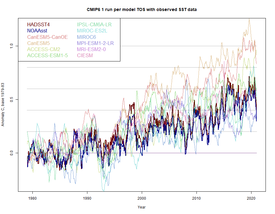
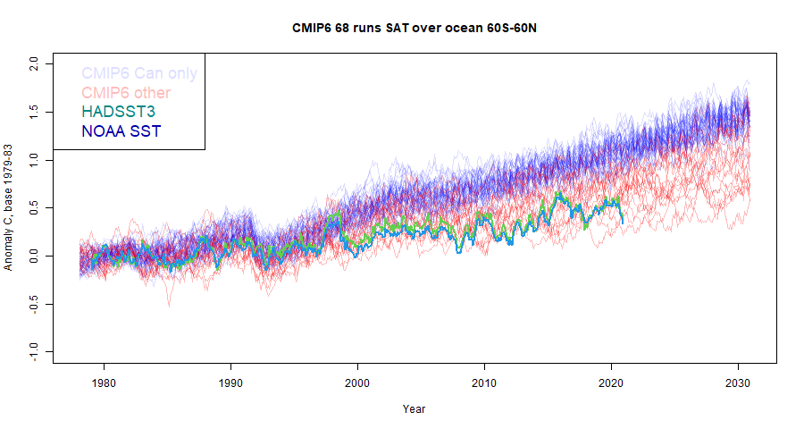
As before, the CanESM results, of which there are two, are clearly the most rapidly warming. If you exclude them, the observed is in the centre of the modelled range. For comparison, here is my previous plot in which I showed TAS with a trend adjustment from CMIP5 TAS/TOS:

Blending TOS/TAS to compare with observed land/ocean.

As said above, CMIP TAS results are often compared with modelled land/ocean, with much the same problems as in Roy Spencer's usage. Cowtan et al (2015) derived a combined TOS/TAS for CMIP5. They did a cell by cell calculation of the blend. I think it is arithmetically equivalent to use the posted land average TAS with TOS, provided the weighted combination uses the same land/sea mask to calculate areas as it did to average the temperature subsets. In this case, I used the areas that were provided with the TAS/TOS data (in the header), so I hope that is true. If not, it won't make a big difference. The land fraction was 0.287.

Update 5 May 2021. I made an error in the initial post; I used the wrong column blended with  sea TAS instead of land TAS. It makes a considerable difference, although the relative position of GISS is as originally described. The old plot is  <a href="https://s3-us-west-1.amazonaws.com/www.moyhu.org/2021/05/blend1.png">here</a>. The zip file linked below has been updated.

I blended always TOS/TAS runs that had the same variant number, although that common value may vary from model to model. Again, I chose one blend from each model, and compared with GISS land/ocean:

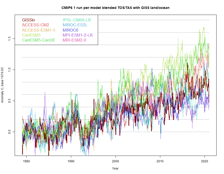
Again, the CanESM results warm fastest, and GISS sits on the warm side of the other results. For comparison, I plotted what would happen using TAS global alone, as is often done


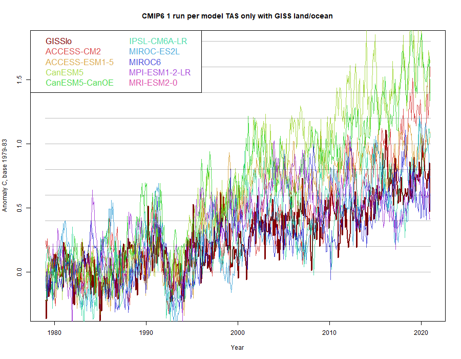
Even excluding CanESM, it now appears that modelled results run warmer than GISS. They are also a lot more variable. It is important to compare with the blend.

Data posted

I have posted a zipped csv file here, with blends for 102 runs from 1850 to 2101, with a readme file and some headers. Update 5 May 2021. I made an error in the initial post, see above. The file has been updated.


Thursday, April 29, 2021

No, global warming is not 50% of what CMIP6 models predict.

The title is a reference to a post by Dr Roy Spencer titled
"An Earth Day Reminder: “Global Warming” is Only ~50% of What Models Predict"
It was reposted at WUWT here. I commented at both places.

The title is somewhat misleading; the post treats a subset of SST (sea surface temperature), not global warming, and does not deal with a supposed failure of a prediction, but a possible discrepancy in SST in the years 1979-2020, as modelled in the latest round (CMIP6). Here is Dr Roy's main plot:


It isn't true, and the reasons are to do with the fact that only a small subset of CMIP6 results have yet appeared. Roy (and I) use the results posted by KNMI Explorer. The two key data problems are
  • Roy is using  near surface air temperatures (TAS) restricted to ocean. The CMIP version of SST is TOS, not yet posted for CMIP6. Both were posted for CMIP5 (see below), but TOS came later. I'll look at the CMIP5 results, and show how TOS and TAS differ considerably. CMIP5 TOS is quite close to observation in 1979-2020.
  • Although 68 simulations have been published for TAS, as used by Roy, 50 of those came from one model, CanESM5. This does weight the results toward high warming in that period (and others); if removed, the CMIP6 results are fairly consistent with CMIP5.

CMIP5 results for TOS and TAS, and compared with observations.

I have used the CMIP5 results for RCP4.5. The scenario should not matter for historic data, where the forcings are known. They have some influence in the years since about 2011.

Here is a graph of results:


I have given both the 60S-60N and 90S-90N results from CMIP5; Roy uses the former, which does avoid sea-ice complications. Like Roy, I have normalised so that the 1979-1983 average of all series are zero. For the trends, I have used an AR(1) model, since the residuals are clearly highly autocorrelated. HADSST3 is from here and NOAA SST from here. The multi-model means are as supplied by KNMI. There are a couple of things to unpack here
  • The correct CMIP5 set to compare is TOS 90S-90N, and that is quite close to HADSST3; the trend is 0.14°C/decade, vs 0.135 for HADSST3, with the difference much smaller than the σ's. NOAA SST is lower, but still well within the CI range.
  • TAS, as used by Roy for CMIP6, is substantially higher at 0.197°C/dec. However, Roy used the latitude range 60S-60N, for which TOS and TAS are closer.
So CMIP5 matched observed SST very well in this time range.

CMIP6 TAS data limitations

As said, posting of CMIP6 results is at a very early stage. For each scenario of TAS there are 68 simulations, but 50 are from the model CanESM5. In the following plot, analogous to Roy's above, I have shown the ssp585 Can results in faint blue, with other CMIP6 TAS (ocean 60S-60N) results in red. I have shown HADSST3 and NOAA SST for comparison.


Removing CaanESM5 does not change the profile very much, but does radically change the multi-model mean (not shown). But again, these are TAS results, and in CMIP5, there was a 0.022°C/decade trend differential for TOS. If that is subtracted here, we get


It is now clear that the observed results are well within the model range, being only a little below average.

Conclusion

The difference between modelled and observed is far less than Roy Spencer claims. For CMIP5, using the right model variable TOS, there is very little difference. And adjusting for the TOS-TAS difference in CMIP6, and being wary of the excessive weight given to one model, the observed SST is well within the model range.


Wednesday, April 14, 2021

GISS March global up by 0.22°C from February.

The GISS V4 land/ocean temperature anomaly was 0.88°C in March 2021, up from 0.66°C in February. This increase is similar to the 0.252°C increase reported for TempLS. Jim Hansen's report is here.

As usual here, I will compare the GISS and earlier TempLS plots below the jump.

Monday, April 5, 2021

March global surface TempLS up 0.252°C.

The TempLS mesh anomaly (1961-90 base) was 0.752deg;C in March, up from 0.5°C in February. That not only makes up for the steep drop going into February; it leaves March considerably warmer than Dec or Jan, getting back to the warmth of 2020. The NCEP/NCAR reanalysis also bounced back, but only to about January levels.

There were two prominent warm spots, in Canada/N US, where Feb was very cold, and in E Siberia/N China. N Europe was quite warm. The ENSO region seems to be fairly neutral.

Here is the temperature map, using the LOESS-based map of anomalies.


As always, the 3D globe map gives better detail.

Sunday, March 14, 2021

GISS February global down by 0.17°C from January.

The GISS V4 land/ocean temperature anomaly was 0.67°C in February 2021, down from 0.84°C in January. This matched the 0.2°C reduction reported for TempLS, although with further data that has shrunk to a 0.143C fall. Jim Hansen notes that it was historically cool, although the four Februarys in 2011-2014 were cooler.

As usual here, I will compare the GISS and earlier TempLS plots below the jump.

Friday, March 5, 2021

February global surface TempLS down 0.2°C; coolest month since Feb 2014.

The TempLS mesh anomaly (1961-90 base) was 0.442deg;C in February, down from 0.642°C in January. December and January were down about 0.2°C from earlier months, so that is getting quite cool. Last time it was this cool was Feb 2014, at 0.389°C. There was a smaller 0.08°C drop in the NCEP/NCAR reanalysis base index.

The prominent feature was a cold band in N America extending from Alaska to Texas. N Russia was also very cold. There was a warmer band to the south, from Centralk Asia into China. The Arctic was also relatively warm.

Here is the temperature map, using the LOESS-based map of anomalies.


As always, the 3D globe map gives better detail.

Saturday, February 13, 2021

GISS January global up by 0.06°C from December.

The GISS V4 land/ocean temperature anomaly was 0.86°C in January 2021, up from 1.10°C in December. TempLS however reported little change. Jim Hansen notes that it was much cooler than last year, being only the sixth warmest January in the record.

As usual here, I will compare the GISS and earlier TempLS plots below the jump.

Saturday, February 6, 2021

January global surface TempLS same as December (cool).

The TempLS mesh anomaly (1961-90 base) was 0.62deg;C in January, also 0.62°C in December. That followed a large drop from 0.877°C in November. There was a small 0.0008°C rise in the NCEP/NCAR reanalysis base index.

The prominent feature was a cold band through Siberia, extending into central Asia. The corresponding parts of N America were very warm. Eastern Europe was warm, extending into N Africa. Antarctica was cold.

Here is the temperature map, using the LOESS-based map of anomalies.


As always, the 3D globe map gives better detail.

Friday, January 15, 2021

GISS reports 2020 as warmest year (virtual tie with 2016).

GISS reports 2020 as warmest year (virtual tie with 2016).

The GISS V4 land/ocean temperature anomaly was 0.81°C in December 2020, down from 1.13°C in November. That made the 2020 average 1.02°C, to 2 decimals the same as 2016. NOAA, like TempLS, had 2020 very slightly behind (by 0.02°C, vs TempLS 0.005°C).

None of these differences are significant. I calculated that if just one week had been 0.26°C warmer in 2020, TempLS would have rated 2020 warmest. In mid-December, the daily average fell by about 0.4°C and stayed low. If that had been delayed by a week, that would have made the difference.

Jim Hansen's report, with many more details, is here.

As usual here, I will compare the GISS and earlier TempLS plots below the jump.

Wednesday, January 6, 2021

TempLS global surface 2020 just cooler than 2016 (virtual tie).

TempLS December 2020 results are in, and that makes a complete average for 2020. I had calculated that a December average anomaly (1961-90) of over 0.681°C would be enough to make 2020 the hottest year, which seemed quite likely, given the November average was 0.891°C and the lowest month of 2020 to date was 0.704°C. However, December was very cool, at 0.628°C, a drop of 0.263°C. That meant that 2020 averaged 0.852°C, whereas 2016 was 0.857°C. Here is a table of those TempLS anomaly averages:
Nov 20200.891Ave 20160.857
Dec 20200.628Ave 20200.852
Diff0.263Diff0.005

The TempLS result is based on 8603 land stations of GHCN V4 which have reported to date, along with ERSST. More (about 800) land stations will post results during January, and this will alter the result a little. An increase of 0.054°C needed to put 2020 ahead is possible, but not very likely. TempLS usually matches GISS NASA fairly well, but given the closeness, whether GISS 2020 comes out ahead is not predictable from this.

The cool December was foreshadowed in the NCEP/NCAR reanalysis tracking, which also showed a drop of 0.263°C. The first part of the month was warm, but after about ten days there was a drop of about 0.4°C, and no recovery.

The main very cool region was over Kazakhstan and parts of Russia nearby, with an extension over Mongolia and into China. The ENSO region of the Pacific coast, and also SE, was cool (La Nina). Elsewhere it was mostly (relatively) warm, especially around the Arctic, extending into Canada and Scandinavia. Most of Europe was warm, and also the Sahara.

Here is the temperature map, using the LOESS-based map of anomalies.


As always, the 3D globe map gives better detail.