Friday, March 25, 2016

Climate and statistical forecasting

About a month ago, there was a minor kerfuffle when the GWPF released a report from an econometrics Prof Terence Mills, titled

"STATISTICAL FORECASTING
How fast will future warming be?"

It got a run in the Murdoch and allied press. I wrote about it here. But it was obvious nonsense, and the fuss died down pretty quickly. I had said I would write up some more analysis, but interest subsided so quickly that I put it off. The actual warming, as Gavin quoted, had already made the forecast look silly, and there was more to say about the recent data.

But these intrusions of misplaced statistical pontification are an intermittent feature of the climate distraction. We had Beenstock and Reingewertz, which didn't exactly forecast, but claimed time series modelling proved the death of AGW. There was Ludecke et al, which was mainly very bad Fourier analysis, but did forecast (naturally) an imminent cooling based on the periodicity of the trigs functions used. And there was Keenan, pulling strings at the House of Lords to promote his Arima (3,1,0) model to claim great uncertainty about trend.

So I want to talk more about the place, if any, of statistical time series forecasting here.

Monday, March 21, 2016

Banned again

at WUWT. At least, it seems so. Since the Ides of March, my comments have been going to spam, and not reappearing. Nothing has been said, but that has precedent.

Update: Ah well, it seems now that it was all just a slip.
" I looked and he and some others were flagged unintentionally in an update to the spam list. That’s been fixed."

And it has. Thanks, John@EF for raising it there.

The recent occasion was the thread on “One graph proves that record high year of 2015 and record months of 2016 are not AGW driven”. This has been debunked by Sou, and by Tamino (twice). It's by Anthony Watts himself, and when I read it, I did not comment on the main claim, because basically, I couldn't make sense of it. It showed a plot of air temperature, tropical and global, and seemed to say that because tropical warmed first, that proved that El Nino, not AGW, was the driver of recent temperatures. I don't think the short term warming effect of El Nino is in dispute, and the earlier rise of tropical is no surprise.

My comment related to the plot initially shown. The wording seemed to suggest that this was the key graph, and no other explanation for its presence was given. The commentary starts here (first sub-thread). I didn't see the original plot posted (Sou shows it here), but AW had replaced it. But it was clear to me that the replacement plot wasn't temperature either. There was no Blob, for a start, and the W Pacific doesn't show any pattern like the blue stuff there. So I checked, and found the original. It was actually a plot of sea level from a Bob Tisdale post of June 2014 here, and he was illustrating with an animated GIF the passage of the Kelvin wave of that time.

So I pointed this out - the Wayback state of the post at that stage is here. The plot itself at that stage was just captioned "2015 ENSO event". AW rejected that, but I posted the original plot here, which made its status quite clear.

Quite a few hours later, the post was amended, with a more descriptive caption, an added plot of actual SST during the El Nino, and a Note at the bottom, saying
"Note: based on comments, the first ENSO event graph caption was updated to clarify it, and a second SST graph was added for those who prefer that representation of the ENSO event."
I don't know why the sea level plot remained; its relevance was never explained.

Then in that sub-thread came a confused comment from Stephen Richards. I replied to this, saying:
"Nick, go discuss with Ryan." It's nothing to do with Ryan. He didn't release that graph. It's from a Bob Tisdale post in June 2014. He put it there to show the effect of the Kelvin wave that was crossing the Pacific at the time.

I see that a new plot has been added below which is indeed of temperature, and is in 2015. But it would be useful to have some explanation of what the graphs are and why they are included.
But when I looked back a little later, it had disappeared. I tried again with another similar comment, but that just vanished, as did a comment I made on another thread. Other comments since, on other threads, met the same fate. None have appeared.

I've had something similar happen before. In January 2015, all my comments started going into moderation. Nothing was said; it just happened. I don't know why. Sometimes (mostly) they showed on submission with a line saying "awaiting moderation", but again, sometimes they just disappeared. They did, however, eventually get through. Mostly promptly, but sometimes with a delay so that they appeared only after active discussion had passed. So this time, I thought I should wait. I submitted a couple of other comments, but the same thing. Nothing appeared.

I could try emailing, but the last time I did that, and there was no reply. I could wait a bit longer, but the last moderation stretch went on for a year, so waiting can be problematic. On that occasion, I could at least post queries to, say, tips and notes. I did that then, asking what was going on, but just got the cryptic response [noted..mod]. I kept commenting, with delays, and odd things happened. People noticed that just mentioning my name sent their comments into moderation. In fact, the matter came to a head when not only my comments, but those that mentioned me, started going to spam, rather than moderation. One such incident here prompted the only substantive response (to my frequent mention in comments) from the moderators about the situation, saying
[Reply: it’s the same folder. Your comments are always approved. Lots of comments are delayed for one reason or another, some by Anthony and some by WordPress. Moderators don’t have that editing authority. ~mod.]
Yes, my comments were always approved, eventually, but they always went into moderation. A few days later, the matter came to a head here when Brandon Shollenberger found that his comments mentioning me disappeared, causing discussion. Later in that thread, for the first time in a year, my comments went through without moderation, and this continued until 15 March.

Anyway, it looks like I can't comment there any more. I used to quite enjoy the dialogues when better scientists like RG Brown were commenting. But that is a while ago - as Sou has been chronicling, scientific standards have gone down. So it's probably no great loss.

Update. I see there is discussion initiated by John@EF at WUWT. Silence from the management there, but Larry Kummer confirms that my name now sends posts into oblivion.

Friday, March 18, 2016

NOAA Global Feb record - ENSO comparison.

The NOAA Land/Ocean index rose from 1.05°C in jan to 1.21°C in Feb, relative to 20th Cen average. Their report is here. At 0.16, this is a slightly smaller rise than GISS or TempLS, which both rose a little over 0.2°C. The total effect is smaller again, in that the NOAA global dropped from Dec to Jan. Still, it was easily the hottest month in the record. Again, I think the reason why NOAA is showing a little less rise is because it under-represents the Arctic, which was very warm.

As with GISS, I'll show the updated comparison with 1997/8. Again, it tracks closely, even with the dip in Jan and the peak in Feb. GISS was tracking in the range 0.4-0.5°C above 1997/8; NOAA is around 0.4. Both GISS and NOAA show a drop in March, back to about January levels. This seems less likely this time; with about half the month gone, the NCEP/NCAR index is still above Feb, although the early hot spell has subsided. Of course, much could still happen. Here is the plot:


I gave a collection of these plots that you can flick through here. I have updated it.


Sunday, March 13, 2016

Huge rise in GISS in February - now 1.35°C.

GISS in Jan was 1.14°C, revised up from 1.13. We had been expecting a big rise - maybe to 1.3°C. But this rise of 0.21°C way exceeded expectations. And of course it is the hottest month ever, etc, and puts 2016 well on the way to being hottest year. As well as the surface TempLS, the reanalysis and satellite measures showed similar rises (satellites even higher).

Here is a plot of the comparison with 1998. In fact the jump was slightly less than the big Jan-Feb jump in that year, and just lately, the two sequences move in parallel, with 2016 0.4-0.5°C warmer.

I'll show the world GISS map below the fold. It shows the same general pattern as TempLS; a band of warmth from Europe through Russia to the East, and another through Alaska to central Canada, plus Arctic. I think part of the reason for GISS rising more than TempLS is that it had the Arctic warmer. As usual, the WebGL GHCN/ERSST plot has more detail.

Monday, March 7, 2016

TempLS up 0.196°C in February - new record.

Most GHCN data for February is now in - a few gaps like Greenland, Mexico, Peru. For TempLS mesh (report here) the anomaly average rose from 0.889°C to 1.085°C. January had dropped from December; but still, the February reading beat the previous record month of December by 0.115°C. TempLS grid had a similar rise, but from a lower January base.

This adds to the evidence that February was very warm indeed. The NCEP/NCAR index was up by a similar amount (0.175); the two satellite indices were up by about 0.3°C. Each, of course, highest in its record. I would expect comparable rises in the main surface indices (GISS, NOAA, HADCRUT). GISS, for example, could approach 1.3°C.

The heat was especially in a broad band from W Europe to E Siberia, with a branch down through China. Another branch from Alaska to US Midwest. I think the patterns around Canada/Greenland may change with more data coming in, with possible upside to the global total.

The breakdown plot shows heat almost everywhere, except for Antarctica. SST is very slightly down.

I'll show here the ENSO comparison with 1997/8. 2015/6 is similar in pattern to 1997/8, but nearly 0.5°C warmer. If the pattern continues, the peak warmth may continue till August or so. The plot is in the style of this post, which I'll update from time to time.


Thursday, March 3, 2016

Surface temp up 0.175°C, satellite temp even bigger rise

The Moyhu NCEP/NCAR index rose from 0.665°C in January to 0.84°C in February, continuing to set records. Similar rises are likely in the main surface indices. The base period for that index is 1994-2013, but reset to the 1951-80 period used by GISS, it would be 1.436°C (see the linked table, bottom left). Currently GISS has been running about 0.1°C cooler than NCEP/NCAR, on the same base. Here is the plot of the last year or so, daily:


A huge spike in recent days, again breaking records. The warmth was in Arctic, Canada/Alaska, East US, a large swathe of Cenral Asia, E Siberia, and still the ENSO Pacific region. Cool in Mid and W USA, and mixed in Antarctica.

The UAH V6 TLT index rose from 0.54 °C to 0.83 °C. Big rises are expected at this stage of an El Nino. RSS rose even more from 0.663 to 0.974°C. As predicted, this was enough to totally extinguish the "Pause" in both satellite TLT records. Some say the Pause may come back, but it's unlikely. Here is the basic math. For RSS, the mean since 1997 (a pause period) is 0.257°C. This will change, but slowly. The trend rises in proportion to the excess over this for each new month, and drops if it is less. There are going to be several months with an excess near 0.5. To negate that accumulation requires a set of months undershooting 0.257 by similar amounts, or some other way of reaching the total. In recent years, months near or below 0 have been rare.

Update. Karsten also has similar surface results, with GFS rising from 0.655 to 0.817°C and NCEP/NCAR T62 from 0.653 to 0.819°C, with anomaly base 1981-2010.


Tuesday, March 1, 2016

GWPF's "statistical forecast"

There was a flurry of articles in the usual Press places, about a statistical forecast of future temperatures sponsored by the GWPF (Murdoch, Express,Daily Mail). Blog reaction tended to focus on the total ignoring of physics, or, more frequently, the observation that:
"The GWPF paid Terence Mills, professor of applied statistics at Loughborough University, £3,000 to write the report."

Well, those are cogent criticisms. But time series analysis is a respectable enough endeavour, so I read the report to see if the GWPF got its money's worth.

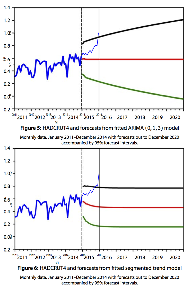
The answer is no, or maybe from their poiunt of view, yes. There are about 33 quite well-written pages, borrowing I suspect from lecture notes (nothing wrong with that). But the forecasts themselves are worthless. Gavin Schmidt tweeted the following test of the HADCRUT forecasts, which were from 2014, after just one year:

The thin blue line is 2015 information added by Gavin, and as you see, they are already outside the confidence intervals.

Now it might be said that briefly going beyond the CI's is note a complete refutation, though it very likely won't be brief. The real reason that the forecasts are worthless is that in every case they simply foretell that the expectation for the future is no change at all. The forecast is just constant after a few months, based on a very recent weighted average of data points. It has to be - that is built into the models. In fact, the author actually says this:
"The central aim of this report is to emphasise that, while statistical forecasting appears highly applicable to climate data, the choice of which stochastic model to fit to an observed time series largely determines the properties of forecasts of future observations and of measures of the associated forecast uncertainty, particularly as the forecast horizon increases."
It would be good if he had emphasised that more; it's true (my bold). But in fact what is emphasised is the forecast. And in the press, the slow growth of the forecast. But, as said, that is built in. His models are simply incapable of forecasting change. I'll show why.