Thursday, May 31, 2018

To see the month's GHCN coverage, patience is needed.

I often see on contrarian sites graphs, usually from NOAA, which are supposed to show how sparse is GHCN-M's coverage of land sites, as used by the major US temperature indices. The NOAA monthly reports usually show interpolated plots, but if you go to some legacy sites, you can get a plot like this:


It is a 5x5° grid, but it does look as if there are a lot of empty cells, particularly in Africa. But if you look at the fine print, it says that the map was made April 13. That is still fairly early in the month, but NOAA doesn't update. There is a lot of data still to come. Station coverage isn't ideal, but it isn't that bad.

I took issue with a similar graph from SPPI back in 2010. That was quite a high visibility usage (GISS this time). Fortunately GISS was providing updates, so I could show how using an early plot exaggerated the effect.

The issue of spread out arrival of data affects my posting of monthly TempLS results. I calculate a new monthly average temperature each night, for the current month. I post as soon as I can be reasonably confident, which generally means when the big countries have reported (China, Canada etc). I did comment around January that the temperatures were drifting by up to about 0.04°C after posting. I think that was a run of bad luck, but I have been a little more conservative, with stabler results. Anyway, I thought I should be more scientific about it, so I have been logging the arrival date of station data in GHCN-M.

So I'll show here an animation of the arrival of March 2018 data. The dates are when the station data first appears on the posted GHCN-M file. Click the bottom buttons to step through.


The colors go from red when new to a faded blue. The date is shown lower left.

The behaviour of the US is odd, and I'll look into it. About 500 stations post numbers in the last week of February. I presume these are interim numbers, but my logging didn't record changing values. Then another group of stations report mid April.

Otherwise much as expected. The big countries did mainly report by the 8th. A few medium ones, like South Africa, Mongolia, Iran and Sudan, were quite a lot later. But there is substantial improvement in overall coverage in the six weeks or so after April 1. Some of it is extra stations that arrive after a country's initial submission.

There certainly are parts of the world where more coverage would be useful, but it doesn't help to exaggerate the matter by showing incomplete sets. The good news from the TempLS experience is that, even with an early set, the average does not usually change much as the remaining data arrives. This supports the analysis here, for example, which suggests that far fewer stations, if reasonably distributed, can give a good estimate of the global integral.

Tuesday, May 29, 2018

Updating the blog index.

I wrote late last year about improving the blog topic index, which is top on the page list, to right. I've now tinkered a bit more. The main aim was to automate updates. This should now work, so the index should always be up to date.

The other, minor improvement was to add a topic called "Complete listing" This does indeed give a listing of all posts, with links, back to the beginning of the blog in 2009. It includes pages, too (at the bottom), so there are currently 751 in the list, organised by date.


Friday, May 25, 2018

New interactive updated temperature plotting.

As part of the Moyhu latest data page, I have maintained a daily updated interactive plotter. I explained briefly the idea of it here. There is a related and more elaborate annual plotter kept as a page here, although I haven't kept that updated.

I think interactive plotting is a powerful Javascript capability. You can move the curves around as you wish - expanding or contracting the scales. You can choose which of a large set of data offerings to show. You can smooth and form regression lines.

But the old version, shown with that old post, looks a bit raw. I found I was using it more for display graphs, so I have cleaned up the presentation, using PrintScreen on my PC, and pasting the result into Paint. I have also simplified the controls. I had been using draggable popup windows, which are elegant, but not so straightforward, and don't make it easy to expand facilities. So I have reverted to an old-fashioned control panel, in which I can now include options such as writing your own headings and y-axis label. There is now also the option of changing the anomaly base, and you can choose any smoothing interval. Here is how it looks, in a working version:


You can choose data by clicking checkboxes on the left. Dragging in the main plot area translates the plots; dragging the pointer under the x-axis changes the time scale, and dragging vertically left of the y-axis changes the y-scale. At bottom left (below the checkboxes), there is a legend, only partly visible. This reflects the colors and choice of data, and you can drag it anywhere. The idea is that you can place it on the plot when you want to capture the screen for later presentation.

The control panel has main rows for choosing the regression, smoothing and anomaly base. When you want to make a choice, first tick the relevant checkbox, and then enter data in the textboxes. Then yo make it work, click the top right run button. The change you make will apply either to all the curves, or just to one nominated on the top row, depending on the radio buttons top left. The nominated curve is by default the last one chosen, but you can vary this with the arrow buttons just left of the run button. However, the anomaly base can only be altered for all, and the color selection only for one.

Choosing regression over a period displays the line, and also the trend, in the legend box, in °C/century units. You can only have one trend line per dataset, but possibly with different periods. If you want to make a trend go away, just enter a date outside the data range (0 will do). You could also deselect and reselect the data.

Smoothing is just moving average, and you enter the period in months. Enter 1 for no smoothing (also the default).

There are two rows where you can enter your own text for the title and y-axis label. Click run to make it take effect. The title can include any HTML, eg bold, text-size etc. You can use heading tags, but that takes up room.

Color lets you choose from the colored squares. A choice takes effect immediately, for the nominated data only.

Generally keep the checkboxes in the control panel unchecked unless you are making a change.

For anomaly base, you can also enter an out of range year to get no anomaly modification at all. The plots are shown each with the suppliers base. I don't really recommend this, and it tends to get confused if you have already varied base choices.

There are two more buttons, on the right of the control panel. One is Trendback. This switches (toggles) to a style which was in the old version, and is described here, for example. It shows the trend from the time on the x-xis to present (last data) in °C/century. In that mode, it won't respond to the regression, smooth, or anomaly base properties. The other button is "Show data". This will make a new window with the numbers graphed on the screen. This can be quite handy for the trendback plots, for example. You can save the window to a file.

Here is how the plot might look if you drag the legend into place:


Thursday, May 17, 2018

GISS April global down 0.02°C from March.

The GISS land/ocean temperature anomaly  fell 0.02°C last month. The April anomaly average was 0.86°C, down slightly from March 0.88°C. The GISS report notes that it is still the third warmest April in the record. The fall is very similar to the 0.016°C fall, of TempLS Mesh, although the NCEP/NCAR index showed a slight rise.

The overall pattern was similar to that in TempLS. Cold in most of N America, and contrasting warmth in Europe. Warm in East Asia, especially arctic Siberia. Polar regions variable. Warm in S America and Australia, and for at least the third month, a curious pattern of warm patches along about 40°S.

As usual here, I will compare the GISS and previous TempLS plots below the jump.

Tuesday, May 15, 2018

Electronic circuit climate analogues - amplifiers and nonlinearity


This post is a follow-up to my previous post on feedback. The main message in that post was that, although talking of electronic analogues of climate feedback is popular in some quarters, it doesn't add anything mathematically. Feedback talk is just a roundabout way of thinking about linear equations.

Despite that, in this post I do want to talk more about electronic analogues. But it isn't much about feedback. It is about the other vital part of a feedback circuit - the amplifier, and what that could mean in a climate context. It is of some importance, since it is a basic part of the greenhouse effect.

The simplest feedback diagram (see Wiki) has three elements:


They are the amplifier, with gain AOL, a feedback link, with feedback fraction β, and an adder, shown here with a minus sign. The adder is actually a non-trivial element, because you have to add the feedback to the input without one overriding the other. In the electronic system, this generally means adding currents. Adding voltages is harder to think of directly. However, the block diagram seems to express gain of just one quantity, often thought of as temperature.

In the climate analogue, temperature is usually related to voltage, and flux to current. So there is the same issue, that fluxes naturally add, but temperature is the variable that people want to talk about. As mentioned last post, I often find myself arguing with electrical engineers who have trouble with the notion of an input current turning into an output voltage (it's called a transimpedance amplifier).

If you want to use electronic devices as an analogue of climate, I think a fuller picture of an amplifier is needed. People now tend to show circuits using op amps. These are elaborately manufactured devices, with much internal feedback to achieve high linearity. They are differential, so the operating point (see below) can be zero. I think it is much more instructive to look at the more primitive devices - valves, junction transistors, FETs etc. But importantly, we need a fuller model which considers both variables, voltage and current. The right framework here is the two port network.

I've reached an awkward stage in the text where I would like to talk simultaneously about the network framework, junction transistors, and valves. I'll have to do it sequentially, but to follow you may need to refer back and forth. A bit like a feedback loop, where each depends on the other. I'll go into some detail on transistors, because the role of the operating point, fluctuations and linearity, and setting the operating point are well documented, and a good illustration of the two port treatment. Then I'll talk about thermionic valves as a closer analogue of climate.
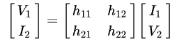
Two Port Network

Wiki gives this diagram:


As often, engineer descriptions greatly complicate some simple maths. Many devices can be cast as a TPN, but all it means is that you have four variables, and the device enforces two relations between them. If these are smooth and can be linearised, you can write the relation for small increments y as


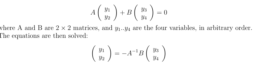
Wiki, like most engineering sources, lists many ways you could choose the variables for left and right. For many devices, some coefficients are small, so you will want to be sure that A is not close to singular. I'll show how this works out for junction transistors.

This rather general formulation doesn't treat the input and output variables separately. You can have any combination you like (subject to invertible A). For linearity, the variables will generally denote small fluctuations; the importance of this will appear in the next section.

The external circuitry will contribute extra linear equations. For example, a load resistor R across the output will add an Ohm's Law, V₂ = I₂R. Other arrangements could provide a feedback equation. With one extra relation, there is then just one free variable. Fix one, say an input, and everything else is determined.

Junction transistors

I'm showing the use of a junction transistor as amplifier because it is a well documented example of:
  • a non-linear device which has a design point about which fluctuations are fairly linear
  • a degree of degeneracy, in that it is dominated by a strong association between I₁ and I₂, with less dependence on V₂ and little variation in V₁. IOW, it is like a current amplifier, with amplification factor β.
  • there is simple circuitry that can stably establish the operating point.
Here from Wiki, is a diagram of a design curve, which is a representation of the two-port relation. It takes advantage of the fact that there is a second relation which is basically between I₁ and V₁, with V₁ restricted to a narrow range (about 0.6V for silicon).


The top corner shows the transistor with variables labelled; the three pins are emitter E, base B and collector C. In TPN terms, I₁ is the base current IB; I₂ is the current from collector to emitter IC, and V₂ is the collector to emitter voltage VCE. The curves relate V₂ and I₂ for various levels of I₁. Because they level off, the dependence is mainly between IC and IB. The load line in heavy black shows the effect of connecting the collector via a load resistor. This constrains V₂ and I₂ to lie on that line, and so both vary fairly linearly with I₁.

The following diagrams have real numbers and come from my GE transistor manual, 1964 edition, for a 2N 1613 NPN transistor. The left is a version of the design curves diagrammed above, but with real numbers. It shows as wavy lines a signal of varying amplitude as it might be presented as base current (top right) and appear as a collector voltage (below). The load resistor line also lets you place it on the y axis, where you can see the effect of current amplification, by a factor of about 100. The principal purpose of these curves is to show how non-linearity is expressed as signal clipping.


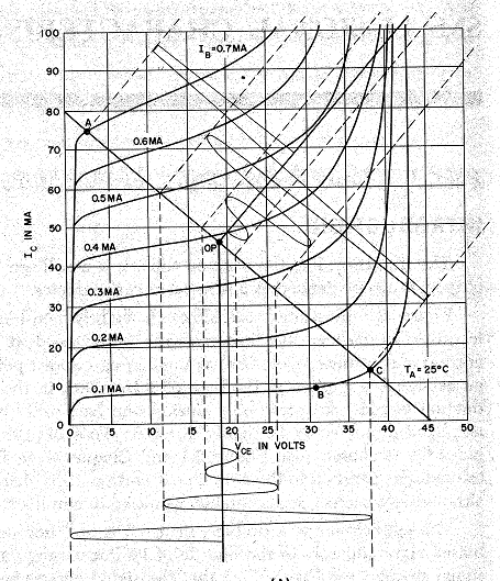
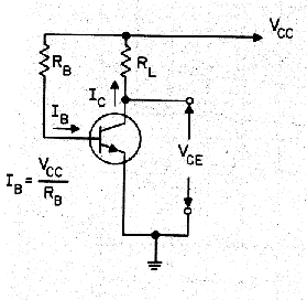
I have included the circuit on the right, a bias circuit, to show how the design operating point is achieved. The top rail is the power supply, and since the base voltage is near fixed at about 0,6V, the resistor RB determines the base current curve. The load RL determines the load line, so where these intersect is the operating point.

So let's see how this works out in the two-port formulation. We have to solve for two variables; the choice is the hybrid or h- parameters:


Hybrid suggests the odd combination; input voltage V₁ and output current I₂ are solved in terms of input current I₁ and output voltage V₂. The reason is that the coefficients are small, except for h₂₁ (also β). There is some degeneracy; there isn't much dependence at all on V₂, and V₂ is then not going to vary much.So these belong on the sides they are placed. I₂ and I₁ could be switched; that is called inverse hybrid (g-). I've used the transistor here partly as a clear example of degeneracy (we'll see more).

Thermionic valve and climate analogue

From Wiki comes a diagram of a triode


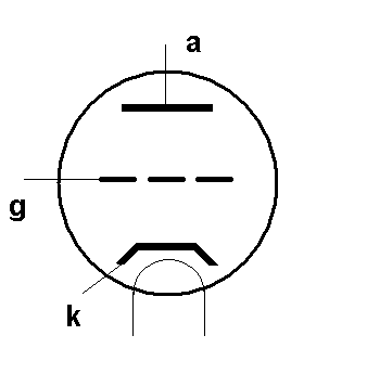
The elements are a heated cathode k in a vacuum tube, which can emit electrons, and an anode a, at positive voltage, to which they will move, depending on voltage. This current can be modulated by varying the voltage applied to the control grid g, which sits fairly close to the cathode.

I propose the triode here because it seems to me to be a closer analogue of GHGs in the atmosphere. EE's sometimes say that the circuit analogue of climate fails because they can't see a power supply. That is because they are used to fixed voltage supplies. But a current supply works too, and that can be seen with the triode. A current flows and the grid modulates it, appearing to vary the resistance. A FET is a more modern analogue, in the same way. And that is what happens in the atmosphere. There is a large solar flux, averaging about 240 W/m² passing through from surface to TOA, much of it as IR. GHGs modulate that flux.

A different two-port form is appropriate here. I₁ is negligible, so should not be on the right side. Inverse hyprid could be used, or admittance. It doesn't really matter which, since the outputs are likely to be related via a load resistor.

Climate amplifier

So thinking more about the amplifier in the climate analogue, first as a two port network. Appropriate variables would be V₁,I₁ as temperature and heat flux at TOA, and V₂, I₂ as temperature, upward heat flux at the surface. V₂ is regarded as an output, and so should be on the LHS, and I₁ as an input, on the right. One consideration is that I₂ is constrained as being the fairly constant solar flux at the surface, so it should be on the RHS. That puts V₁ on the left and pretty much leads to an impedance parameters formulation - a two variable form of Ohm's Law.

The one number we have here is the Planck parameter, which gives the sensitivity before feedback of V₂ to I₁ (or vice versa). People often think that this is determined by the Stefan-Boltzmann relation, and that does give a reasonably close number. But in fact it has to be worked out by modelling, as Soden and Held explain. Their number comes to about 3.2 Wm⁻²/K. This is a diagonal element in the two port impedance matrix, and is treated as the open loop gain of the amplifier. But the role of possible variation of the surface flux coefficient should alos be considered.

As my earlier post contended, mathematically at least, feedback is much less complicated than people think. The message of this post is that if you want to use circuit analogues of climate, a more interesting question is, how does the amplifier work?


Friday, May 11, 2018

TempLS monthly updates of global land and sea temperature

TempLS is a program I use to provide a monthly global land/ocean anomaly index, using unadjusted GHCNM V3 data for land, and ERSST V5 for SST. There is a summary article here. It is essentially a spatial integration, which reduces to an area-weighted average of the anomalies. My preferred method is to use an irregular triangular mesh to get the weights. It is then possible to separately sum with weights the stations of various regions. I have been doing this (as described here) for about three years as part of the monthly reporting. A typical plot for April is here

.

It shows the arithmetic contribution that each region makes to the published global average. It isn't itself a temperature of something; if you add all the continent colored bars shown, you get the land global amount, in red (that is new). And if you add land and SST you get the global, in black. Each bar is the weighted sum of locals divided by the global sum of weights. To get the regional average, the denominator would be the sum of weights for the region.

I plan now to more systematically post the land and SST averages, and also plots of regional averages. The SST will be particularly useful, because ERSST posts within a couple of days of the start of the month, so TempLS can produce a result much earlier than the alternatives. NOAA publishes a revision late in the month, but changes are usually small.

I have added TempLS_SST and TempLS_La to the sets normally displayed. You can find the numbers (anomaly base 1961-1990) under Land/SST in the maintained table of monthly data. There are trend plots in the Trend viewer. And they plots are available on the interactive plotter. Here is an example of recent data, compared with HADSST3 and NOAA SST:


I'll probably report the SST for each month in my first post for each month, along with the reanalysis average.

I'll show now the other possibilities in the monthly bar plot style. Showing the regional averages give sthis:


The regions are far more variable than the globals, which obscures the picture somewhat. Note the huge Arctic peaks. So I'll show also the progression of just the land, SST and globals. It is now practical to show more months. Here is the plot


It emphasises the variability of land relative to SST. This may be seen in better proportion by reverting to the first style, showing the contributions to the global average:


Again, red and blue (land and SST) add to the black total. It shows how monthly variations are dominated by the fluctuations on land. I'll find a way to include these extra graphs in the monthly reporting.


Thursday, May 10, 2018

April global surface TempLS down 0.016 °C from March.

The TempLS mesh anomaly (1961-90 base) fell a little, from 0.721°C in March to 0.705°C in April. This contrasts with a small 0.046°C rise in the NCEP/NCAR index, while the satellite TLT indices fell by a similar amount (UAH 0.04°C).

It was very cold in much of N America, except west, but very warm in Europe and E Siberia, and warm in East Asia generally. Also warm in Australia, Argentina, and once again a curious pattern of warm blobs around 40 °S. The Arctic and Antarctic were mixed.

Here is the temperature map. As always, there is a more detailed active sphere map here.


Friday, May 4, 2018

Feedback, climate, algebra and circuitry.

I've been arguing again at WUWT ( (more here)). It is the fourth of a series by Lord Monckton, claiming to have found a grave error in climate science, so it is now game over. My summary after three posts is here.

The claim is, of course, nonsense, and based on bad interpretation of notions of feedback. But I want to deal here with the general use of feedback theory in climate, and the mystery that electrical engineers who comment on this stuff like to make of it. The maths of feedback is trivial; just simple linear equations. And it is best to keep it that way.

A point I often make in commentary is that climate science really doesn't make much use of feedback theory at all. Critics invoke it a lot more. I continually encounter people who think that feedback is the basis of GCMs. I have to explain that, no, they do not form any part of the structure of GCMs, and cannot. A GCM is a solver for partial differential equations. That means it creates for each step a huge array of linear equations relating variables from neighboring cells. That isn't always obvious in the explicit methods they tend to use, but there is still an underlying matrix of coefficients. And because each row just related a few neighboring values, the matrix is sparse. This is an essential feature, because of the number of cells. But global averages, such as would come from a feedback expression, are not sparse. They connect everything. So they cannot fit within the discretised pde framework.

Linear equations and feedback

Problems described as feedback are really just linear equations, or systems of a few linear equations; usually one less equations than unknowns, so on elimination, one variable is expressed as a multiple of another. I described here how a feedback circuit could be analysed simply by writing linear current balance (Kirchhoff rule) equations at a few nodes. In climate, the same is done by balancing global and time average heat fluxes, usually at TOA.

The paper of Roe 2009 is often cited as the most completely feedback oriented analysis. I'll show its presentation table here:

It gives the appearance that ΔR is both input and output, because it is a flux that is conserrved. But the more conventional feedback view is that ΔT is the output. If we take the multi-feedback version of (c)
ΔT = λ₀(ΔR + ΣciΔT )
which I can rewrite setting c₀=-1/λ₀ as just
ΔR + c₀ΔT + ΣciΔT = 0

This is just the equilibrium heat flux balance at TOA since each of the ciΔT is a temperature-responsive flux. I have given the c₀ΔT special status, because it is the Planck term, representing radiation guaranteed by the Stefan-Boltzmann law (c₀ = -4ΔT).

Feedback reasoning and linear equations

Just resolving a linear equation is not a mathematical difficulty. So what is all the feedback talk about? Mainly, it is trying to see the equation as built up in parts. There is no math reason to do that, but people seem to want to do it. The process can be described thus:
  • Select (as in Roe above) a subset to refer to as the reference system. A logical set is the forcing and the necessary Planck response.
    ΔR + c₀ΔT + ΣcₖΔT = 0
    This is like a finite gain amplifier (c₀)
  • Express the other terms as feedbacks relative to c₀:
    ΔR + c₀ΔT *(1 - Σfₖ) = 0, fₖ = -cₖ/c₀
    The f's are then called the feedback coefficients. For stability (see next) they should sum to less than 1. Negative values make this more likely, and so are stabilising. As the coefficient of ΔT, diminishes, it increases the amount by which ΔT would have to change to keep balance. That is said to increase the gain, and creates a singular situation (of high gain) approaching zero.

Stability

If the singularity is passed (Σfₖ>1), and the coefficient of ΔT becomes positive, the system is unstable. The reason involves an extra bit of physics. Suppose total flux is out of balance. Then the region into which it flows will cool or heat. The coefficient here is, for a uniform material, called the heat capacity H, and is positive. For a complex region like the Earth surface, that is hard to quantify, but will still be positive. That is, heat added will make it warmer, not cooler. So the equation for temperature change following imbalance is
ΔR + cΔT = H*dΔT/dt
If c is positive, this has exponentially growing solutions, and so is unstable. For c negative, the solutions decay, and lead toward equilibrium.

It's often said that positive feedback is impossible, because it would mean instability. But in the above algebra, that is not true; the requirement is that Σfₖ>1. It is true if you choose a different reference system - just the forcing. That can only work in conjunction with a c₀ΔT where c is negative. Electrically, the reference system is then like an operational amplifier.

Summary so far

Systems often described using feedback terminology are really just linear equations (or systems). Feedback arguments do not yield anything beyond what elementary linear solving can do, including a stability criterion. But with linear algebra, you can identify the various steps of feedback reasoning if you want to.

Systems are not exactly linear

Roe points out that linear feedback is just the use of a first order Taylor Series expansion of a nonlinear relation. This is very direct seen as a linear system. If the forcing R is to be balanced by a flux F which is a function of T and variables u,v which depend on T, then to first order

dR = (∂F/∂T) dT + (∂F/∂u du/dT) dT + (∂F/∂v dv/dT) dT

each partial holding the other variables (from T,u,v) fixed. This gives the required linear relation with the bracketed terms becoming the c coefficients (but negative).

More advanced

There is a lot of approximation here. Not only linearity (usually OK) but also in the use of global averaging. But that doesn't mean linear analysis has to be discarded if you want to take account of these things. You can extend using an inexact Newton's method. Suppose we have the base system

R = F(u,v,T)

where again u and v are variables (like humidity) that depend on T. Suppose we have an initial state subscripted 0, and a perturbed state subscripted 1, of which R₁ is known. Then to first order

F(u₁,v₁,T₁) - R₁ = F(u₀,v₀,T₀) - R₁ + (∂F/∂T)₁ dT + (∂F/∂u du/dT)₁ dT + (∂F/∂v dv/dT)₁ dT = 0

This can be solved as before as a linear equation in dT. Then updating

T = T + dt, u = u + du/dT)₁ dT etc, we can solve again

F(u,v,T) - R₁ + (∂F/∂T)₁ dT + (∂F/∂u du/dT)₁ dT + (∂F/∂v dv/dT)₁ dT = 0

and iterating until F(u,v,T) - R₁. Note that I have not updated the partial derivatives, which are the feedback coefficients. That is what makes it an inexact Newton; convergence is a bit slower, but we probably don't have information to do that update.

So non-linearity is not a show-stopper; it just takes a little longer. This also allows you to work out a more complicated version of F, with, say, latitude variation. You can still use the simpler global feedback coefficients, so the extra trouble is only in the evaluation of F. The penalty will again be slower convergence, and it may even fail. But it gives a way to progress.


Thursday, May 3, 2018

April NCEP/NCAR global surface anomaly up by 0.046°C from March

In the Moyhu NCEP/NCAR index, the monthly reanalysis anomaly average rose from 0.331°C in March to 0.377°C in April, 2018, mainly due to a spike at the end of the month. It's the same rise and pattern as last month. The rises are not huge, but have been consistent since the low point in January, so that now April is the warmest month since May last year. This seems consistent with the fading of a marginal La Niña.

The big feature was cold in North America, except for the Pacific coast and Rockies. Much of Europe was warm, as was Australia. There was a lot of (relative) warmth in Antarctica, but the Arctic was patchy. Interactive map here.

The BoM says that ENSO is neutral, and likely to stay so for a few months.