TempLS is an R program that I have been running for some years at Moyhu. It computes a land/ocean temperature average in the style of Gistemp, HADCRUT or NOAA (see Wiki overview) In this post, I want to collect links to what I have written about it over the years, describe the methods, code and reporting, and something about the graphics. I'll then promote it to a maintained page. I'll start with a Table of Contents with links:
Tuesday, January 31, 2017
Friday, January 27, 2017
Global anomaly spatial sampling error - and why use anomalies?
In this post I want to bring together two things that I seem to be talking a lot about, especially in the wake of our run of record high temperatures. They are
The way to think about stated uncertainties is that they represent the range of results that could have been obtained if things had been done differently. And so the question is, which "things". This concept is made explicit in the HADCRUT ensemble approach, where they do 100 repeated runs, looking at each stage in which an estimated number is used, and choosing other estimates from a distribution. Then the actual spread of results gives the uncertainty. Brohan et al 2006 lists some of the things that are varied.
The underlying concept is sampling error. Suppose you conduct a poll, asking 1000 people if they will vote for A or B. You find 52% for A. The uncertainty comes from, what if you had asked different people? For temperature, I'll list three sources of error important in various ways:
1. Measurement error. This is what many people think uncertainties refer to, but it usually isn't. measurement errors become insignificant because of the huge number of data that is averaged. measurement error estimates what could happen if you had used different observers or instruments to make the same observation, same time, same place.
2. Location uncertainty. Ths is dominant for global annual and monthly averages.You measured in sampled locations - what if the sample changed? You measured in different places around the earth? Same time, different places.
3. Trend uncertainty, what we are talking about above. You get trend from a statistical model, in which the residuals are assumed to come from a random distribution, representing unpredictable aspects (weather). The trend uncertainty is calculated on the basis of, what if you sampled differently from that distribution? Had different weather? This is important for deciding if your trend is something that might happen again in the future. If it is a rare event, maybe. But it is not a test of whether it really happened. We know how the weather turned out.
So here I'm talking about location uncertainty. What if you had sampled in different places. And in this exercise I'll do just that. I'll choose subsets of 500 of the USHCN and see what answers we see. That is why USHCN is chosen - there is surplus information from the dense coverage.
So the spatial error is reduced by a factor of 8, to an acceptable value. The error of temperature alone, at 0.201, was quite unacceptable. But anomalies perform even better with area-weighting, which should always be used. Here I calculate state averages and then area-weight the states (as USHCN used to do):
Update: I had implemented the area-weighting incorrectly when I posted about an hour ago. Now I think it is right, and the sd's are further reduced, although now the absolute improves by slightly more than the anomalies.
For both absolute T and anomalies, the mean has gone up, but the SD has reduced. In fact T improves by a slightly greater factor, but is still rather too high. The anomaly sd is now very good.
Does the anomaly base matter? A little, which is why WMO recommends the latest 3 decade period. I'll repeat the last table with the 1951-90 base:
The T average is little changed, as expected. The small change reflects the fact that sampling 1000 makes the results almost independent of that random choice. But the anomaly mean is higher, reflecting warming. And the sd is a little higher, showing that subtracting a slightly worse estimate of the 2011 value (the older base) makes a less homogeneous set.
- What is the main component of the error that is quoted on global anomaly average for some period (month, year)? and
- Why use anomalies? (an old perennial, see also GISS, NOAA)
Using anomalies
I have been finding it necessary to go over some essentials of using anomalies. The basic arithmetic is- Compute some "normal" (usually a 30-year period time average for each month) for each station in the network,
- Form local anomalies by subtracting the relevant normal from each reading
- Average the anomalies (usually area-weighted)
Coverage error - spatial sampling error for the mean.
Indices like GISS and HADCRUT usually quote a monthly or annual mean with an uncertainty of up to 0.1°C. In recent years contrarians have seized on this to say that maybe it isn't a record at all - a "statistical tie" is a pet phrase, for those whose head hurts thinking about statistics. But what very few people understand is what that uncertainty means. I'll quote here from something I wrote at WUWT:The way to think about stated uncertainties is that they represent the range of results that could have been obtained if things had been done differently. And so the question is, which "things". This concept is made explicit in the HADCRUT ensemble approach, where they do 100 repeated runs, looking at each stage in which an estimated number is used, and choosing other estimates from a distribution. Then the actual spread of results gives the uncertainty. Brohan et al 2006 lists some of the things that are varied.
The underlying concept is sampling error. Suppose you conduct a poll, asking 1000 people if they will vote for A or B. You find 52% for A. The uncertainty comes from, what if you had asked different people? For temperature, I'll list three sources of error important in various ways:
1. Measurement error. This is what many people think uncertainties refer to, but it usually isn't. measurement errors become insignificant because of the huge number of data that is averaged. measurement error estimates what could happen if you had used different observers or instruments to make the same observation, same time, same place.
2. Location uncertainty. Ths is dominant for global annual and monthly averages.You measured in sampled locations - what if the sample changed? You measured in different places around the earth? Same time, different places.
3. Trend uncertainty, what we are talking about above. You get trend from a statistical model, in which the residuals are assumed to come from a random distribution, representing unpredictable aspects (weather). The trend uncertainty is calculated on the basis of, what if you sampled differently from that distribution? Had different weather? This is important for deciding if your trend is something that might happen again in the future. If it is a rare event, maybe. But it is not a test of whether it really happened. We know how the weather turned out.
So here I'm talking about location uncertainty. What if you had sampled in different places. And in this exercise I'll do just that. I'll choose subsets of 500 of the USHCN and see what answers we see. That is why USHCN is chosen - there is surplus information from the dense coverage.
Why use anomaly?
We'll see. What I want to show is that it dramatically reduces location sampling error. The reason is that the anomaly set is much more homogeneous, since the expected value everywhere is more or less zero. So there is less variation in switching stations in and out. So I'll measure the error with and without anomaly formation.USHCN example
So I'll look at the data for the 1218 stations in 2010, with an anomaly relative to the 1981-2010 average. In a Monte Carlo style, I make 1000 choices of 500 random stations, and find the average for 2011, first by just averaging station temperatures, and then the anomalies. The results (in °C) are:| Base 1981-2010, unweighted .. | Mean of means .. | s.d. of means |
| Temperatures | 11.863 | 0.201 |
| Anomalies | 0.191 | 0.025 |
So the spatial error is reduced by a factor of 8, to an acceptable value. The error of temperature alone, at 0.201, was quite unacceptable. But anomalies perform even better with area-weighting, which should always be used. Here I calculate state averages and then area-weight the states (as USHCN used to do):
Update: I had implemented the area-weighting incorrectly when I posted about an hour ago. Now I think it is right, and the sd's are further reduced, although now the absolute improves by slightly more than the anomalies.
| Base 1981-2010, area-weighted .. | Mean of means .. | s.d. of means |
| Temperatures | 12.102 | 0.137 |
| Anomalies | 0.101 | 0.016 |
For both absolute T and anomalies, the mean has gone up, but the SD has reduced. In fact T improves by a slightly greater factor, but is still rather too high. The anomaly sd is now very good.
Does the anomaly base matter? A little, which is why WMO recommends the latest 3 decade period. I'll repeat the last table with the 1951-90 base:
| Base 1951-80, area-weighted .. | Mean of means .. | s.d. of means |
| Temperatures | 12.103 | 0.138 |
| Anomalies | 0.620 | 0.021 |
The T average is little changed, as expected. The small change reflects the fact that sampling 1000 makes the results almost independent of that random choice. But the anomaly mean is higher, reflecting warming. And the sd is a little higher, showing that subtracting a slightly worse estimate of the 2011 value (the older base) makes a less homogeneous set.
So what to make of spatial sampling error?
It is significant (with 500 station subsets) for anomaly, and the reason why large datasets are sought. In terms of record hot years, I think there is a case for omitting it. It is the error if between 2015 and 2016 the set of stations had been changed, and that happened only to a very small extent. I don't think the theoretical possibility of juggling the station set between years is an appropriate consideration for such a record.Conclusion
Spatial sampling, or coverage error for anomalies is significant for ConUS. Reducing this error is why a lot of stations are used. It would be an order of magnitude greater without the use of anomalies, because of the much greater inhomogeneity, which is why one should never average raw temperatures spatially.Wednesday, January 25, 2017
Prospects for 2017.
Early last year I wrote a post called prospects for 2016. It was mainly tracking the progress of the El Nino, and I introduced the series of bar plots comparing corresponding months of 1997/8. I've kept updating those plots to end 2016.
Anyway, commenter Uli and others made good use of the thread to make and monitor predictions for 2016. Uli's prediction of 0.99°C at the time turned out to be exact, although the strength of the El Nino caused him to sometimes think a little higher. So I hope this will continue. Uli's main review comment is here.
For my own part, I don't claim any special insight, but I think substantial cooling from here is not very likely (but of course possible). For those who have been following NCEP/NCAR, it has been a wild ride in January:

Pretty warm at the moment. Sea ice, both N and S, has been fascinating too. After a long excursion way below historic levels, the Arctic has dropped back to the field for the moment. The Antarctic excursion was even more extreme, and is still well below other years. Here it is more interesting, because it is not far from the minimum. Again the earlier very high melting rate has not been maintained, but because of the coastline geometry, that is inevitable. A lot of shore doesn't have much ice left to melt (here is the movie.
So I'll leave the thread there open for comments through the year. Thanks, Uli and all.
Anyway, commenter Uli and others made good use of the thread to make and monitor predictions for 2016. Uli's prediction of 0.99°C at the time turned out to be exact, although the strength of the El Nino caused him to sometimes think a little higher. So I hope this will continue. Uli's main review comment is here.
For my own part, I don't claim any special insight, but I think substantial cooling from here is not very likely (but of course possible). For those who have been following NCEP/NCAR, it has been a wild ride in January:

Pretty warm at the moment. Sea ice, both N and S, has been fascinating too. After a long excursion way below historic levels, the Arctic has dropped back to the field for the moment. The Antarctic excursion was even more extreme, and is still well below other years. Here it is more interesting, because it is not far from the minimum. Again the earlier very high melting rate has not been maintained, but because of the coastline geometry, that is inevitable. A lot of shore doesn't have much ice left to melt (here is the movie.
So I'll leave the thread there open for comments through the year. Thanks, Uli and all.
Thursday, January 19, 2017
GISS fell 0.12°C in December; NOAA rose 0.04°C.
The contrasting directions are a result of the fading influence of polar warming. Basically, NOAA was down in November because it included the Siberian cold, but not the complementary Arctic warmth, while GISS was high then. The split in TempLS variants was similar, and BEST also dropped by about 0.06, similar to TempLS mesh. The drop in GISS was a little larger than I expected. HADCRUT 4 rose by about 0.07°C, under the same influence as NOAA and TempLS grid.
As noted in my earlier post today, GISS, NOAA and HADCRUT 4 did set records in 2016, GISS by a larger margin.
I'll show the regular GISS plot and TempLS comparison below the fold
As noted in my earlier post today, GISS, NOAA and HADCRUT 4 did set records in 2016, GISS by a larger margin.
I'll show the regular GISS plot and TempLS comparison below the fold
GISS and NOAA both find that 2016 was hottest year recorded.
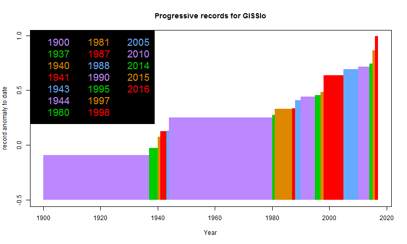
GISS and NOAA have jointly released their 2016 results. GISS's press release is here. NOAA's is here. I'll analyse the December results in a separate post, but for the moment, I'll just post the cumulative record plots:
GISS:
NOAA:
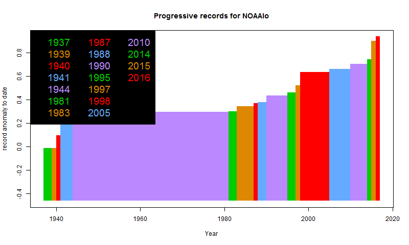
A fuller set of records for various indices is here, along with a discussion of UAH. The discussion of TempLS is here. Every index so far has reported a record year, and I expect the rest to do so. BEST also reported a record; BEST's report is here, and here is their cumulative record plot:

Update: Hot Whopper has more details.
Update. I see that HADCRUT 4 is out too, and they also had a record year, by a small margin. Here is their plot:
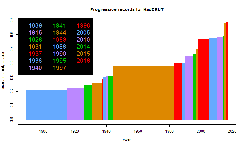
The complete set of these plots shown here is now fairly filled with complete data.
GISS:

NOAA:

A fuller set of records for various indices is here, along with a discussion of UAH. The discussion of TempLS is here. Every index so far has reported a record year, and I expect the rest to do so. BEST also reported a record; BEST's report is here, and here is their cumulative record plot:

Update: Hot Whopper has more details.
Update. I see that HADCRUT 4 is out too, and they also had a record year, by a small margin. Here is their plot:

The complete set of these plots shown here is now fairly filled with complete data.
Friday, January 6, 2017
First surface temperature 2016 record - TempLS.
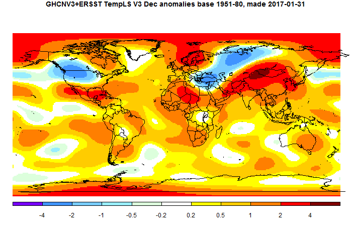
TempLS mesh was down a little in December, from 0.699°C in Nov to 0.653°C. That actually makes it the third warmest in the record, behind 2014 (just) and 2015. TempLS grid actually went up by about 0.04°C. As usual, this reflects differences at poles, which were not so warm in December. This affects TempLS mesh more, as it will GISS relative to NOAA/HADCRUT
The main map features are cold in N central Russia and NW America (but not Alaska), and big warmth around Central Asia.
But the main news is that it completes the year average, which was a record high at 0.807°C. All TempLS anomalies are relative to 1961-90 base years. 2016 beat the 2015 record of 0.728°C, so there shouldn't be much chatter about a "statistical tie". I have posted the series of cumulative records plots here. The plot for TempLS mesh is below. It shows a new color and level in each year a record was set.

TempLS grid was also a record at 0.776°C, vs 0.745°C for 2015. That's closer, reflecting again the fact that warmth at the poles was a feature of 2016, and is picked up more strongly by TempLS mesh. I expect that this will be reflected in the major indices, with GISS setting a record by a good margin, but NOAA and HADCRUT closer, In fact, HADCRUT is no sure thing, although I think the rise in TempLS grid this month increases the likelihood.
Data for RSS and UAH5.6 are also in. RSS V3.3 TLT dropped as did UAH V6, but still narrowly set a record for warmth in 2016. UAH5.6 had 2016 warmer by a more substantial margin. You can see the predicted record plots updated as data comes in here.
The main map features are cold in N central Russia and NW America (but not Alaska), and big warmth around Central Asia.

But the main news is that it completes the year average, which was a record high at 0.807°C. All TempLS anomalies are relative to 1961-90 base years. 2016 beat the 2015 record of 0.728°C, so there shouldn't be much chatter about a "statistical tie". I have posted the series of cumulative records plots here. The plot for TempLS mesh is below. It shows a new color and level in each year a record was set.

TempLS grid was also a record at 0.776°C, vs 0.745°C for 2015. That's closer, reflecting again the fact that warmth at the poles was a feature of 2016, and is picked up more strongly by TempLS mesh. I expect that this will be reflected in the major indices, with GISS setting a record by a good margin, but NOAA and HADCRUT closer, In fact, HADCRUT is no sure thing, although I think the rise in TempLS grid this month increases the likelihood.
Data for RSS and UAH5.6 are also in. RSS V3.3 TLT dropped as did UAH V6, but still narrowly set a record for warmth in 2016. UAH5.6 had 2016 warmer by a more substantial margin. You can see the predicted record plots updated as data comes in here.
Wednesday, January 4, 2017
UAH - first index with record warm 2016
if you don't count NCEP/NCAR. But UAH just scraped in, due to a drop of 0.21°C in December. I see Roy Spencer has now adopted the line "not statistically warmer". I guess we'll hear a lot of this. There will be indices that will never be "statistically warmer" while the temperatures go up and up.
Anyway, in previous years I have shown progressive record plots to show how the record has crept (or, sometimes recently, leapt) upward over the years. This year I wanted to take an advance peek. So I did a range of indices, infilling missing months with the minimum month for 2016. That is pretty conservative, although it would have overestimated UAH. I show the plots below. There is more explanation of the style here. This time I have headed the plots with an "Incomplete" and superimposed a pink cross if there was infilling. I'll maintain it, so when the results are all in, this will go away. Use the arrow buttons to flick through the datasets. I'll try to keep the most recent finalised showing first. With conservative infilling, all indices currently show a record, though some are close. Often, the margin is high if that for 2015 was low, and vice versa.
For the meaning of the headings, see the glossary here.
Tuesday, January 3, 2017
NCEP/NCAR December Down 0.09°C - coolest since June.
The Moyhu NCEP/NCAR index fell from 0.48°C in November to 0.391°C (June was 0.369°C). It was an up and down month, cool in the mid, but warm at the end.
I don't normally talk about long term records with reanalysis, because I don't think it is homogeneous enough. But I will note that successive annual averages for the last three years were 0.19, 0.33, and 0.531°C (anomaly base 1994-2013). So up by 0.2°C in 2016. This is an indicator of large margins in other indices. It also means that all months in 2016 were warmer than the 2015 average, including December. El Nino has gone, but it stayed warm.
A feature was again a band of cold from Cairo to Vladivistok through Russia, though most of Asia was warm. Also cold in Canada and north US, though not in the South. Warm in the Arctic - a pattern for the December quarter.
Sea ice in the Arctic became more normal, and the very fast melting in the Antarctic slowed, although still a lot less ice than in other years.
Subscribe to:
Posts (Atom)


