Thursday, July 31, 2014

That CO2 added to the air is ours

For some reason there has been an ongoing patter of theories about how the recent increase in CO2 in the air is due to natural causes, and nothing to do with the 400 Gt of fossil fuel that we have have brought to the surface and burnt.

I wrote here about the somewhat related "Temperature drives CO2" meme. And I wrote here a few days ago about a weird revival, involving a total misreading by blogger Hockey Schtick of a recent paper on local CO2 perturbations, and the vanishing of that thread.

Vanishing is a relative term nowadays, and sure enough, the story reappeared at WUWT as if nothing had happened. Various oddities ensued; HS turned up to say that his thread hadn't been canned; it was only resting. And the original author, Denica Bozhinova, turned up to say some of the things that had been disappeared at HS. Her paper had been grossly misinterpreted.

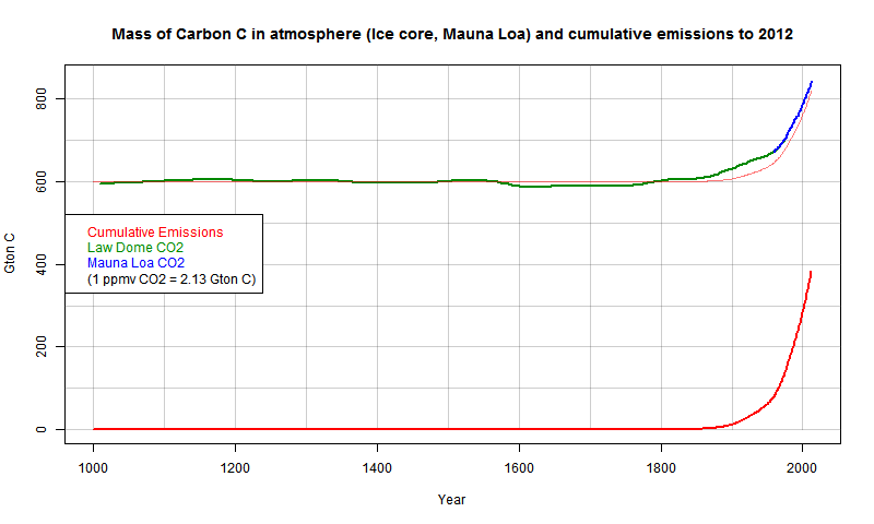
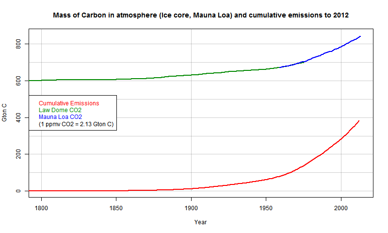
Anyway, the usual folk continued as if nothing had happened, with the usual story that natural fluxes greatly outweighed human. I responded thus. But the most direct refutation is the simple graph of mass changes over the years. This is too rarely seen, though there is a good article and plot at SkS, which I cited.

So I did my own. Emissions data (including cement making) is from CDIAC, including BP estimates for 2011 and 2012 (no 2013 yet). CO2 ice core data from Law Dome (Dethridge, via CDIAC), and recent from Mauna Loa Scripps, using annual averages. I converted ppmv to Gt C using the factor 1 ppm CO2 = 2.13 Gton C. I found the following units conversion table useful:
Gtons CGtons CO2ppmv CO2
1 Gton C=13.6660.433
1 Gton CO2=0.27210.128
1 ppmv CO2=2.137.811

Here is the plot:


Update - I've added a pale red echo of the emissions curve, displaced to match pre-industrial, and multiplied by the factor 0.57 used by Scripps (see below) to account for airborne fraction. You'll see that the air CO2 starts to rise a little earlier. This is likely the effect of land clearances.

It must be really hard to sell the story that the CO2 response is just natural variation, nothing to do with what we emitted. I'll show more plots below the jump.

Here's a plot just since 1800, for better resolution


And here is the SkS plot (units Gton CO2):


Here is a plot from Scripps Details here:


It shows how the curves superimpose with a constant airborne fraction factor. Smooth version here.


Sunday, July 27, 2014

Portal for Australian BoM AWS stations

This is another in a series of portals - lists of links designed to make datasets more easily accessed. I'm planning a master list to put up as a permanent page.

The Bureau of Meteorology has an extensive network of Australian AWS stations that report mostly every half hour. The current data covers about three days, and is arranged by states. Here is Victoria; on the top bar are links to the other state lists. These data are also aggregated as daily data, by the month. The files can be accessed from the current data, but there are quite a few steps. The data is of course unadjusted, and files for the last twelve or so months are displayed.

The portal gives a direct link for each station to the "latest" file, which is the daily data for the current month. At the bottom of the table there are links to the earlier months, and also to climate averages and extremes.

The table is arranged by states, and is searchable (Ctrl-F).


Thursday, July 24, 2014

Adjusting the past.


An oddity. About 36 hours ago I looked in on Paul Homewood's site, and saw this credulous post. I followed the link to ClimateChangeDispatch, which said:
"A new post on The Hockey Schtick reviews a new paper “that finds only about 3.75% [15 ppm] of the CO2 in the lower atmosphere is man-made from the burning of fossil fuels, and thus, the vast remainder of the 400 ppm atmospheric CO2 is from land-use changes and natural sources such as ocean outgassing and plant respiration.”"

It linked to the source, HockeySchtick. There I read an article discussing what seemed to be just a paper on local measurements of CO2 fluctuation as indicated by C14, along with the perturbing effect of nuclear reactor C14. But yes, HS made that claim, and there was a lively discussion involving sensible people like Ferdinand Engelbeen and David Appell saying sensible things about CO2. About 36 comments when I looked, but no-one seemed to notice that the paper just wasn't saying anything about global CO2. Along the way David Appell was banned for saying that the oceans were acidifying.

I saw later another credulous post at Bishop Hill, but here the commenters seemed to see through it fairly quickly. The post, with its links are still not modified.

Anyway, this morning, local time, I tried to follow a link, and got this:
"Sorry, the page you were looking for in this blog does not exist."

And sure enough, just vanished. No explanation, that I could see. Gone. But the linking pages still make their claims without modification.

I wonder if David Appell is still banned.


Sunday, July 20, 2014

Trends of gridded BEST and GISS shown with WebGL


This is a next stage in the display of Earth data with WebGL. It uses the general framework described here. BEST and GISS are temperature anomaly datasets, available on a 2° by 2° grid. In fact, BEST has 1° resolution, but I amalgamated cells to match GISS, mainly to alleviate download time. GISS uses ERSST ocean data.

For each cell, an OLS trend coefficient over time (°C/century) is calculated and shown with color shading. You can choose start and end years, from 1889 to 2013. Press "Plot New" when you have made a choice. The Earth is a trackball, as in Google Earth. You can press "Orient" to get it right way up.

When you click on any point, the location and trend are shown on the right.

BEST describe their methodology in various papers, access from here. GISS methods are described here, with links.


Update. I've implemented Carrick's suggestions - see below plot for details.


Update

Following Carrick's suggestions I have provided a new set of inputs, blue box on right. The simplest is "Level"; you can enter a level (eg 0) that you want to show in white. It isn't complete for contouring because in some gradients that level will be skipped. But it gives a guide.

The top window is marked mean,sd. The color scheme is set by two parameters, mean and sd of data. These are shown below the text box. If you enter two corresponding numbers in the text box, that will override. Two ways you might use this:
  • You can force two plots to have matching color levels. Just copy the numbers from one into the text box of the other.
  • If you really want to emphasise the transition through a certain level, choose that as the mean, and put in a fairly small sd. The result will be mainly red and blue, but showing the transition region (eg 0) in colors.
In both cases, when you have entered the numbers you want, click the Go button. This will implement and redraw. If you want to go back to the way things were, enter NaN as number data and click Go.

More on how it works

You can check the gallery for other similar WebGL interfaces.  There is a general discussion of WebGL here. You can zoom the plot by moving the pointer vertically with the right button pressed. Up is bigger.

Next

I'll include HADCRUT and NCDC grids and promote to a page, when it has ettled. HAD and NCDC only have 5° resolution. I'm also planning to make a gridded plot of just GISS anomalies as a maintained page, since GISS keeps data up to date.

Tuesday, July 15, 2014

June GISS Temp down by 0.14°C

GISS has posted its June estimate for global temperature anomaly (h/t JCH). It fell from 0.76°C in May to 0.62°C in June. TempLS declined, but only slightly.

China data for May is now in. It did not change the GISS number.

The comparison maps are below the jump.

Here is the GISS map:


And here, with the same scale and color scheme, is the earlier TempLS map:

With TempLS I commented on the lack of pronounced features this month, especially cool spots (except maybe Antarctica). This is true (relatively) for GISS too.

Previous Months

May
April
March
February
January 2014
December
November
October
September
August
July
June
May
April
March
February
January
December 2012
November
October
September
August
July
June
May
April
March
February
January
December 2011
November
October
September
August 2011

More data and plots

Sunday, July 13, 2014

TOBS pictured

This is a version of my TOBS nailed post, with graphics. The numbers come from my first post in the series, which took three years of hourly data from Boulder, Colorado, and looked at the effect of TOBS (time of observation) measures. That post is the place to look for detail on how it works. A post with much more data is here.

For now, I want to follow the recent post in relating TOBS to fundamentals. What is our measure of average temperature over a period? Sometimes people strenuously urge that the usual TAVG, the average of daily recorded min and max, should be replaced by a proper integral over the day. And they would be right, if we had the historic data. But we don't.

What we do have are records of min and max as recorded daily (at various times of day) by min/max thermometers. These give not the actual daily min/max, but the min/max in the preceding 24 hours (with regular resetting). So they are, averaged over time, a reasonable measure of average temperature, but a measure that depends on the time of observation.

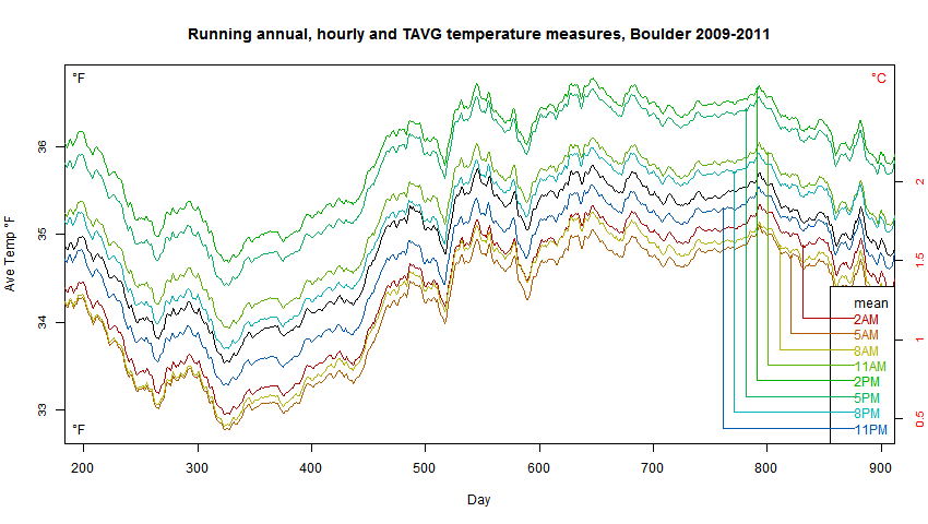
Let me show that with a plot of the three years of Boulder data. I have taken the mean of the hourly data, and compared with the measure that a notional observer would report from reading a min/max every day at at 2AM, or at 5AM and so until 11 pm. I show the 365 day centered running mean that you would get by each of these schemes. The running mean removes the seasonal cycle. The legend shows the colors, with a link to the respective curves. Left axis °F, right in °C. x-axis days after 31 Dec 2008.


So the various TAVG curves are reasonable measures, in that they track the black mean curve with a roughly constant offset. But the offsets are very dependent on time of obs.

If you stick with one such measure, the offset does not matter much. Its effect would go away on taking anomalies. But if you switch between measures (change TOBS), the effect can be large.

TOBS adjustment is effectively calibrating this measure, relative to a reference. If you change measures, you have to recalibrate.

When we refer to "raw" or "unadjusted" monthly data, it should be remembered that it is not just the original readings. It incorporates an averaging procedure. The outcome of that depends on the time of observation. If that changes, then it's a different measure, as much as if you changed to a differently calibrated thermometer.

Below the fold, I'll show some plots of monthly averages, and a difference plot that may make the stability of the TOBS dependence clearer.


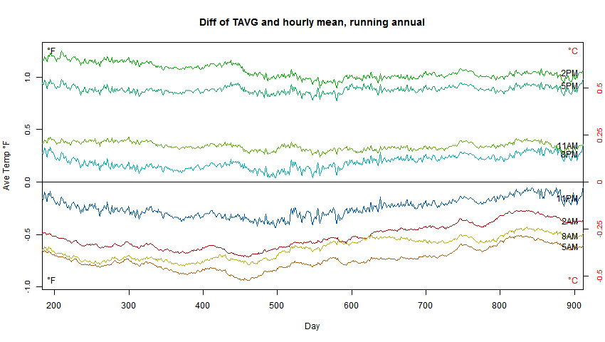
Here now is a version of the above plot shown as differences from the hourly mean. You can see that the curves generally remain in order as TOBS varies, but the spacing is not constant. TOBS adjustment will not be precise year-to-year. But fortunately for most applications, a number of years will be averaged. And there is a lot more hourly data available near most places, so an accurate mean adjustment can be derived.


The "coolest" measure is at 5am, when it often happens that a cold minimum is split and attributed to two separate days. 8am is similar but 11am is already on the warm side of neutral, and 2pm is the time most likely to split and double count warm afternoons, making a warm bias. 5pm is a bit less so, and 11 pm has a slight cool bias relative to hourly.

You may wonder about monthly means. I showed annual first, because the seasonal cycle is so large. In fact, although the various measures fluctuate a lot more, changing the axis to accommodate seasonality makes them look a lot smoother. Here is the plot:


The extra noise is apparent when plotting differences from the mean. Here is how it looks:


It's natural to look at that and say that we should have no truck with such noise. But it's part of the actual measure that we are using. That's how the min/max varies relative to the hourly mean, which we'd certainly use if we had a long record of it. One day we will.


Friday, July 11, 2014

TempLS global temp down 0.015°C in June

TempLS global land/ocean anomaly dipped very slightly in June; from 0.605°C to
0.59°C. That's still high. The May reading was slightly boosted by the late arriving China data. GISS is steady at 0.76°C, but I don't know if they have used the new data.

Again there are many (95) errors in the GHCN unadjusted file, detected by my new program which compares adjusted and unadjusted. No especially huge ones; Port Hardy for example is still getting its data from the frozen North, but even that is warming up a bit. The big problem area is Turkey, which seems to have an OK CLIMAT form, but GHCN has entered the April data. Still problems with Greenland.

Here is the spherical harmonics plot of temperature anomaly:


For once, no real cold spots, and not much very hot either.

Here is the map of the 4167 stations reporting:


Wednesday, July 9, 2014

Someone is wrong on the internet

again. More bad averaging and USHCN. This time, it arises following a very good post by Zeke Hausfather on USHCN adjustments. He showed this plot of the effect of infilling. It isn't much.

A blogger and commenter there, sunshinehours1, said, no, that's misleading information. And he shows how the average of estimated final less rises faster than the average of non-estimated.

It has been reblogged by Paul Homewood, and looks like it is getting around. But it's the same bungled methodology that Steven Goddard used. The stations in that average, plotted over the years, change substantially from year to year. They could be just be an increasing number of warmer stations. Since climate differences are large, it doesn't need a big imbalance to show up.

So the same refutation will work here. Simply work out the difference using just the climatology of the stations. No use of estimation, or indeed annual data. And you get the same result. It isn't telling you anything about the effect of estimation. It is just telling you about the changing nature of the stations being estimated.


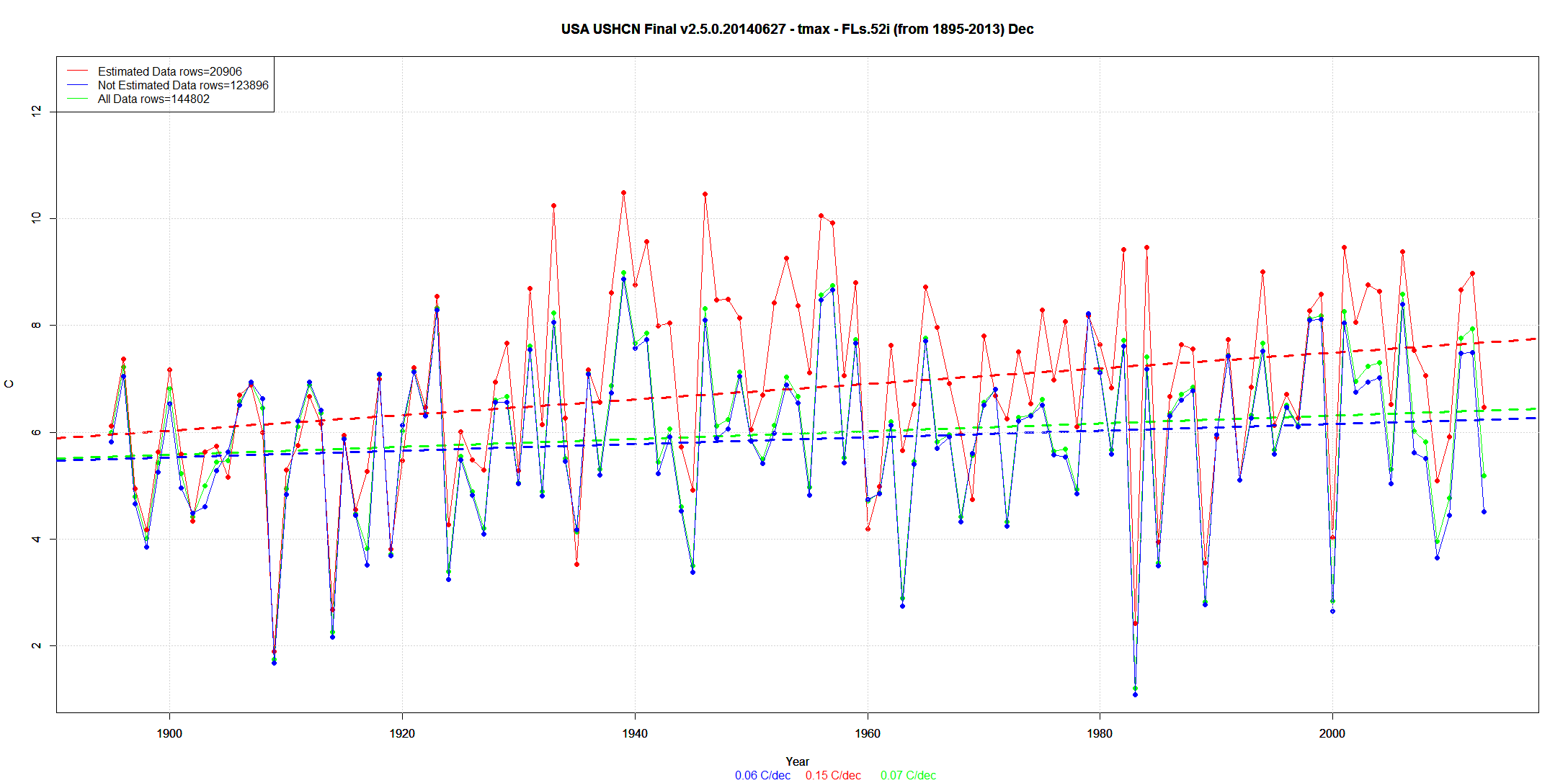
Sunshinehours (SH) prefers to work with Max data, and do individual months. He shows this plot:


It's bigger at the source. Red is average estimated, Blue is not estimated, and green is combined. My equivalent plot is below - I've omitted combined, since it is very close to "not estimated":


It looks the same, and the estimated sure seems to have a higher slope. So I'll plot the difference between them:


Yes, rising and positive. That's his result. But now I'll plot the same difference calculated with just climatology. To get that, I just average each station, for December, over the whole range of years, and substitute this constant value for the year-by-year data. So there is no issue of estimation. If the composition of the estimated wasn't changing, the result would be absolutely flat. But it isn't:


Instead it tracks the data-based difference very closely, with similar trend.

The difference between average estimated and average non-estimated, doesn't reflect estimation. It just reflects changes in the kind of stations that were being estimated. For some reason, they were more likely to be warmer. I don't know why, but they were. It's just the wrong way to do it.

My R code is here.


Tuesday, July 8, 2014

GHCN Adjustments are much larger in US than ROW.


ROW=Rest of World. I wrote two posts here and here on the overall effect of global GHCN adjustments on trends of various periods. It was a kind of sequel to my first ever Moyhu post here, which showed a similar histogram of the effect of V2 adjustments.

I was a little surprised that the positive bias had increased substantially, though still not huge. There has recently been a lot of talk about USHCN adjustments, and I did some plotting in my most recent post. GHCN v3 just uses USHCN, including the adjustment method, for its US data. So I thought the rise might well be partly due to the US component and TOBS.

It turns out that is true. I repeated the calc separating US and non-US data. I'm using just a simple average of the effects on trends - it should be area weighted. That's part of the reason why the US has a disproportionate effect in this simple average. Anyway, the trend differences caused by adjustment to stations with 60 years data were 0.0355 °C/decade for US, 0.0248 °C/decade for ROW, and 0.0284 °C/decade combined. More numbers and details below.

Incidentally, that previous post had a useful Google Maps gadget that lets you pick out groups of stations with big or small adjustments, rural/urban etc. I'll probably update it with more links and more intuitive logic.

The methods are as in the previous posts. I am really just applying a filter. It isn't exactly USHCN vs the rest, as I've included AK and HI in the US total.

There are three subgroups - stations that have histories with actual reports for at least
  1. 360 months (30 years)
  2. 540 months
  3. 720 months

US Stations only


Mean 0.0383 °C/Decade

Mean 0.038 °C/Decade

Mean 0.0355 °C/Decade

Non-US stations only


Mean 0.0232 °C/Decade

Mean 0.0247 °C/Decade

Mean 0.0248 °C/Decade

All GHCN Stations


Mean 0.031 °C/Decade

Mean 0.0303 °C/Decade

Mean 0.0284 °C/Decade

A notable difference is that quite a lot of non-US stations have zero trend effect, probably reflecting zero adjustment. So the y-axes are quite different in scale. But they would be anyway, because of the different numbers of stations.

Sunday, July 6, 2014

USHCN adjustments plotted for USA and States


There has been a lot of interest in USHCN adjustments. Paul Homewood has been tabulating data from various states, most recently Ohio. Steven Goddard has been getting publicity with various flaky graphs. In criticising one of these, I posted a plot of average US adjustments. In doing so, I followed SG's practice of a simple average across the USA. It would be better to use some kind of area weighting.

Zeke Hausfather has been writing a series at Lucia's, and there have been various posts at WUWT.

So I thought it would be useful to post a complete series of plots of the effects of USHCN adjustments on the individual states, and then an average of these weighted by state area. This should give similar results to gridding. So there is an active plot below the jump. Note that the results are in °F, which seems to be traditional for USHCN.

So here is the plot. It initially shows the area-weighted US average of USHCN annual final - raw (not including 2014). Below the plot, you'll see a table of state initials. Click on any of these to bring up that state.


Small states can be quite ragged. The larger states generally have rather smaller adjustments, which is why the area weighted adjustment variation is less, and also less than the simple average.

As to why the general trend is upward, I have a series of posts - you could start here. The big one is TOBS (Time of Observation adjustment), which compensates for a drift due to a shift from late to early theromoeter resetting. It made an artificial downtrend, so the correction trends up.

Update. The code is here. Steps are
Loop over states{
  Collect state raw and adjusted
  Loop over stations{
    Place differences in month x year array (NA if not both raw and final
    Average over months each year
  }
 Average over stations each year
 Add to array year x state
 Plot
}
Get area weighted average over states and plot


Friday, July 4, 2014

Polar plots NSIDC Sea Ice data


For some years now I have maintained a page of automatically updated data about surface (and LT) temperature and JAXA Arctic Sea Ice Extent. NSIDC now keeps a regular schedule with their Arctic and Antarctic Sea Ice Extent updates, so I'd like to include them.

The sources are: JAXAand NSIDC
. Note that the NSIDC files come in two parts, final (to late 2013) and nrt (from then to date).

I am simply extending the existing presentation which consists of a window of numerical data, and an active polar plot. Both now have radio buttons so you can choose from among the three datasets. The window also has an enlarge option. The table has recent data at the top, but if you scroll down, there is more.

As soon as it is working smoothly, I'll add this all to the regular page.

Here is the table. The enlarge button is a toggle.


JAXA Arctic
NSIDC NH NSIDC SHEnlarge


And here is the active polar plot of sea ice extent data. The radio buttons at the top change the dataset, with maybe a second or two to reload. Units are million sq km. You can click on the current region circle to get a magnification, or on any sector to see that part expanded. Clicking on the legend marks the year in dark; clicking on the central picture makes it go away. Details here.


I'm experimenting with adding dots to make the curves more distinct. The legend indicates both line and dot colour. I'm still trying to decide if it's a nett benefit.

NSIDC has data going back a lot further. I've currently stuck to the range as in JAXA, else the plot gets very cluttered.


Tuesday, July 1, 2014

Infilling, the graphics version

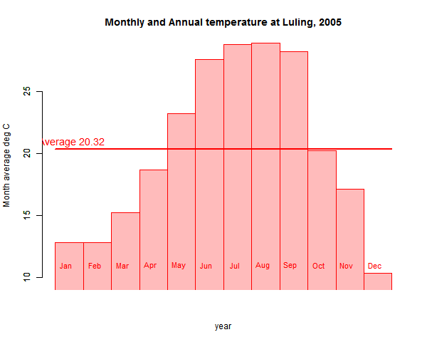
This follows on from my previous post, which set out a numerical version of the considerations in calculating an annual average of temperatures given monthly averages where one may be missing. I'm using this as an analogy of what USHCN does with missing data in its US spatial average. They infill the missing with a locally based estimate; I've been arguing with people who say that is wrong and they should just drop the data. I contend that infilling is fine, and dropping would be very bad. I set out the arithmetic to show what happens when you do that to February in the data for Luling, Texas 2005.

There I tracked what happens to the climatology and anomalies, which I think is revealing. Here I won't mention that breakdown, but just show graphically how infilling works for averaging the absolutes, and how just dropping doesn't.

First I just plot the monthly averages. The red line is the annual average. It's just the red area (down to zero, not shown), or the simple average of the months.


This time I'll drop June (the pplot works better with a central value). The old red plot is shown with the green overlay after dropping. The other months are stretched to cover the gap; it's the same as reweighting June to zero. The stretching reflects the fact that in averaging, each month is (hopefully) divided by 11. It's as if there were 11 months in the year.

Actually I reweighted June to not quite zero, so you see a slightly thicker vertical between May and July.


The red average is 20.32°C, as before; after dropping June it is 19.66. You can see why; the other months in effect stretch to fill the space, and there are more winter months to expand. So the area under the green is less.

Now we'll see what happens if we infill - we don't remove June, but replace it with the average of May and July:


Now everything is back in place, and only June has a slight area discrepancy. The averages are much closer: 20.32 and 20.18. The difference is 0.14 instead of 0.66.

Finally, if you don't like "fabricating" the June reading, just leave it out, but instead of stretching all months, stretch just May and July. That is the reweighting option. It looks like this:


In fact the result is exactly the same as infilling. That is, pictorially, my contention that infilling in an average is just reweighting. In fact, when you just leave out, you upweight the other months equally; here you reweight the nearby ones. They are upweighted preferentially because their values are more likely to resemble June's.

So once again, there are various ways you can handle missing data in an average, but where climatology varies the very worst is to just leave it out. That applies to stations on a surface as well as months in a year.