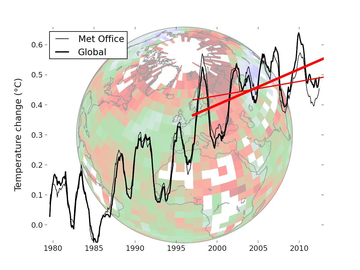
In previous posts here, here and here, I have been discussing issues in infilling cells in the HADCRUT 4 dataset, following a new much-discussed paper by Kevin Cowtan and Robert Way in QJRoyMetSoc. They used satellite data and kriging to extend the data; I looked at a much simpler approach of infilling with latitude averages from the same data (rather than the implicit infilling with global average). I found that it gave rather similar results, although with more limited effect.
Now I want to try it with the similar NOAA gridded data set which is used for their index. They give a detailed description at this download site. It is a similar 5°x5° grid, so the same analysis should work.
I show below first plots of both HADCRUT 4 and NOAA coverage. NOAA has greatly fewer gaps, but also fairly extensive omissions near the poles. Then I show the latitude breakdowns, with seasons. I have included the C&W and UAH plots for comparison.
Coverage plots
This is an active plot - you can choose dataset and view. It counts data in each cell/month from 1979 to 2012. Red is for no data, cyan is complete, and there is shading for intermittent data.NOAA N NOAA S HAD 4 N HAD 4 S |
NOAA coverage is more extensive than HADCRUT, with some odd inclusions (eg central Greenland) and omissions (S Pole). Still, I found using the latitude average method described in previous posts with smoothing parameter r=0.1, that I had to include an extra level of bands to get enough data for lat 85-90S.
Latitude average trends
This is a similar active plot to the one in the previous post. NOAA data replaces HADCRUT 4, and I have increased the width of those curves, since they are new. UAH and the C&W hybrid HADCRUT 4 result are included for comparison.Annual DJF MAM JJA SON |
(Update - again I made an error with latitude sign (the problem is that HADCRUT orders from N Pole, NOAA from S) So NOAA were reversed, Fixed now.)
The background stripes indicate the latitude bands; N pole is on the right. There's a faint red vertical marking multiples of 30°. In the centre is a little figure showing the global totals, on the same scale.
Here is a table of the global trends, 1997-2012 in C/decade:
| Season | NOAA | NOAA Av | HADCRUT 4 | HAD 4 Lat Av | UAH | C&W Hybrid |
| DJF | -0.0519 | -0.0049 | -0.0489 | 0.0097 | 0.0276 | 0.0536 |
| MAM | 0.0688 | 0.1123 | 0.066 | 0.1019 | 0.0639 | 0.1276 |
| JJA | 0.0629 | 0.0789 | 0.0892 | 0.0966 | 0.12 | 0.1187 |
| SON | 0.1084 | 0.1347 | 0.1081 | 0.1277 | 0.1575 | 0.1688 |
| Annual | 0.0485 | 0.0814 | 0.0539 | 0.0844 | 0.0936 | 0.1187 |
The results of NOAA and HADCRUT 4 are very similar, in effect on trend and in seasonal variation. Both show a substantial trend increase in trend over this period, as a result of simply using the appropriate latitude average to infill rather than the global.


