The GISS land/ocean temperature anomaly fell 0.06°C last month. The June anomaly average was 0.77°C, down from May 0.83°C. The GISS report notes that it is the equal third warmest June in the record. The decline contrasts with the virtually unchanged TempLS; the NCEP/NCAR index declined a little more. Satellite indices both rose a little.
The overall pattern was similar to that in TempLS. Very warm in N Central Siberia and Antarctica. Warm in most of N America, and also in Europe and Middle East. Rather cold in S America and Arctic.
As usual here, I will compare the GISS and previous TempLS plots below the jump.
Tuesday, July 17, 2018
Wednesday, July 11, 2018
Extended portal to the BoM station data.
I maintain a page of portals to various climate datasets, which sometimes just has a link, and sometimes something more active, giving what I think is more convenient access. The Australian Bureau of Meteorology has a large amount of well organised data on its site. There is a lot that you can get to via the Climate Data Online page. There is also station metadata, which I had previously made an access frame on the page. This is now extended, to gather together as much station data as I can in one place. So that includes metadata, station climate statistics, and detailed records of monthly average maxima (TMax) and minima (Tmin), and corresponding daily data. BoM does not provide Tmax+Tmin averages.
There are various notions of station here. BoM actually has a huge set, but many have rainfall data only, and those are omitted here. There is a subset that have AWS, and post data in a different way, to which I provide a separate portal button. Then there is the ACORN set, which is a set of 110 well maintained and documented stations, for which the data has been carefully homogenised. It starts in 1910. BoM seems proud of this, and the resulting publicity has led some to think that is all they offer. There is much more.
I've tried to provide the minimum of short cuts so that the relevant further choices can be made in the BoM environment. For example, asking for daily data will give a single year, but then you can choose other years. You can also, via BoM, download datafiles for individual stations, daily for all years, or in other combinations.
The BoM pages are very good for looking up single data points. They are not so good if you want to analyse data from many stations. Fortunately, all the data is also on GHCN Daily, for which I have a portal on the same page. It takes a while to get on top of their system - firstly generating the station codes, and then deciphering the bulky text file format. But it's there.
For the new portal, the top of the table looks like this:

If you click on the red-ringed button, it shows this:
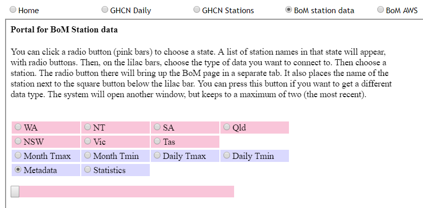
To get started, you need to choose a state. Then a list of stations, each with a radio button, will appear below. Then, from the lilac bar, you should choose a data type, eg daily Tmax. Then you can click on a station button. Your selection will appear in a new tab to which your browser takes you. From there you can makes further choices in the BoM system.
Your station choice will also appear beside the square button below the lilac (and above the stations). This button now has the same functionality as the station button below, so you don't have to scroll down to make new data choices. You can indeed make further data choices. These will make new tabs, to facilitate comparisons, but up to a max of the two most recent.
There are various notions of station here. BoM actually has a huge set, but many have rainfall data only, and those are omitted here. There is a subset that have AWS, and post data in a different way, to which I provide a separate portal button. Then there is the ACORN set, which is a set of 110 well maintained and documented stations, for which the data has been carefully homogenised. It starts in 1910. BoM seems proud of this, and the resulting publicity has led some to think that is all they offer. There is much more.
I've tried to provide the minimum of short cuts so that the relevant further choices can be made in the BoM environment. For example, asking for daily data will give a single year, but then you can choose other years. You can also, via BoM, download datafiles for individual stations, daily for all years, or in other combinations.
The BoM pages are very good for looking up single data points. They are not so good if you want to analyse data from many stations. Fortunately, all the data is also on GHCN Daily, for which I have a portal on the same page. It takes a while to get on top of their system - firstly generating the station codes, and then deciphering the bulky text file format. But it's there.
For the new portal, the top of the table looks like this:
If you click on the red-ringed button, it shows this:
To get started, you need to choose a state. Then a list of stations, each with a radio button, will appear below. Then, from the lilac bar, you should choose a data type, eg daily Tmax. Then you can click on a station button. Your selection will appear in a new tab to which your browser takes you. From there you can makes further choices in the BoM system.
Your station choice will also appear beside the square button below the lilac (and above the stations). This button now has the same functionality as the station button below, so you don't have to scroll down to make new data choices. You can indeed make further data choices. These will make new tabs, to facilitate comparisons, but up to a max of the two most recent.
Tuesday, July 10, 2018
WUWT and heat records.
I'm on the outer again at WUWT (update - seems OK now). The issue is recent heat records, which WUWT wants to challenge because of alleged inadequacies in the stations. Not that the thermometers were inaccurate, but that the environment was not representative of climate. My contention was that this was only relevant to climate science if scientists were using them as representative of climate, and for most of the stations at issue, they weren't.
Since I did quite a bit of reading about it, I thought I would set down the issues here. The basic point is that there are a large number of thermometers around the world, trying to measure the environment for various purposes. Few now are primarily for climate science, and even fewer historically. But they contain a lot of information, and it is the task of climate scientists to select stations that do contain useful climate information. The main mechanism for doing this is the archiving that produces the GHCN V3 set. People at WUWT usually attribute this to NASA GISS, because they provide a handy interface, but it is GHCN who select the data. For current data they rely on the WMO CLIMAT process, whereby nations submit data from what they and WMO think are their best stations. It is this data that GISS and NOAA use in their indices. The UKMO use a similar selection with CRUTEM, for their HADCRUT index.
At WUWT, AW's repeated complaint was that I don't care about accuracy in data collection (and am a paid troll, etc). That is of course not true. I spend a lot of time, as readers here would know, trying to get temperature and its integration right. But the key thing about accuracy is, what do you need to know? The post linked above pointed to airports where the sensor was close to the runways. This could indeed be a problem for climate records, but it is appropriate for their purpose, which is indeed to estimate runway temperature. The key thing here is that those airport stations are not in GHCN, and are not used by climate scientists. They are right for one task, and not used for the other.
I first encountered this WUWT insistence that any measurement of air temperature had to comply with climate science requirements, even if it was never used for CS, in this post on supposed NIWA data adjustments in Wellington. A station was pictured and slammed for being on a rooftop next to air conditioners. In fact the sataion was on a NIWA building in Auckland, but more to the point, it was actually an air quality monitoring station, run by the Auckland municipality. But apparently the fact that it had no relation to climate, or even weather, did not matter. That was actually the first complaint that I was indifferent to the quality of meteorological data.
A repeated wish at WUWT was that these stations should somehow be disqualified from record considerations. I repeatedly tried to get some meaning attached to that. A station record is just a string of numbers, and there will be a maximum. Anyone who has access to the numbers can work it out. So you either have to suppress the numbers, or allow that people may declare that a record has been reached. And with airport data, for example, you probably can't suppress the numbers, even if you wanted. They are measured for safety etc, and a lot of people probably rely on finding them on line.
Another thing to say about records is that, if rejected, the previous record stands. And it may have no better provenance than the one rejected. WUWT folk are rather attached to old records. Personally, I don't think high/low records are a good measure at all, since they are very vulnerable to error. Averages are much better. I think the US emphasis on daily records is regrettable.
The first two posts in the WUWT series were somewhat different, being regional hot records . So I'll deal with them separately.
As might be feared, this led in comments to accusations of dishonesty and incompetence at the UKMO, even though they had initiated and reported the investigation. But one might well ask, how could it happen that that could happen at a UKMO station?
Well, the answer is that it isn't a UKMO station. As the MO blog explained, the MO runs: "a network comprised of approximately 259 automatic weather stations managed by Met Office and a further 160 manual climate stations maintained in collaboration with partner organisations and volunteer observers" Motherwell is a manual station. It belongs to a partner organisation or volunteers (the MO helps maintain it). They have a scheme for this here. You can see there that the site has a rating of one star (out of five), and under site details, in response to the item "Reason for running the site" says, Education. (Not, I think, climate science).
So Motherwell is right down the bottom of the 400+ British stations. Needless to say, it is not in GHCN or CRUTEM, and is unlikely to ever be used by a climate scientist, at least for country-sized regional estimates.
So to disqualify? As I said above, you can only do this by suppressing the data, since people can work out for themselves if it beats the record. But the data has a purpose. It tells the people of Motherwell the temperature in their town, and it seems wrong to refuse to tell them because of its inadequacy for the purposes of climate science, which it will never be required to fulfil.
The WUWT answer to this is, but it was allowed to be seen as a setter of a record for Scotland. I don't actually think the world pays a lot of attention to that statistic, but anyway, I think the MO has the right solution. Post the data as usual (it's that or scrub the site), and if a record is claimed, vet the claim. They did that, rejected it, and that was reported and respected.
But "potentially bogus" is what they would call a weasel word. In fact, all that is known is that the site is an airport (not highly trafficked). There is speculation on where the sensor is located, and no evidence that any particular aircraft might have caused a perturbation. The speculated location is below (red ring).
It is actually 92m from the nearest airport tarmac, and 132 m from the nearest black rectangle, which are spaces where an aircraft might actually be parked. It seems to me that that is quite a long way (It is nearly 400 m to the actual runway), and if one was to be picky, the building at about 25m and the road at 38 m would be bigger problems. But these are not airport-specific problems.
A point this time is that Ouarglu is indeed a GHCN monthly station. For the reasons I have described, it does seem relatively well fitted for the role (assuming that the supposed location is correct).
But it is very odd to suggest that a station should be disqualified from expressing its own record high. That is just the maximum of those figures, so if you disqualify the record high, you must surely disqualify the station. But why only those that record a record high?
Anyway, the complaints came down to the following (click to enlarge):
There were also sites at UCLA and Santa Ana Fire Station, which were on rooftops. Now the first thing about these is that are frequently quoted local temperature sites, but apart from USC, none of them get into GHCN V3 currently (Burbank has data to 1966). So again, they aren't used for climate indices like GISS, NOSS or HADCRUT. But the fact that, whatever their faults, they are known to locals means that the record high, for that site, is meaningful to LA Times readership. And it is apparent from some of the WUWT comments that the suggestion that it was in fact very hot accords with their experience.
Again, the airport sites are clearly measuring what they want to measure - temperature on the runway. And climate scientists don't use them for that reason. UCLA seems to be there because it is next to an observatory. I don't know why the Fire Station needs a themometer on the roof, but I expect there is a reason.
As a general observation, I think it is a rather futile endeavour to try to suppress record highs on a generally hot day because of site objections. Once one has gone, another will step up. And while one record might conceivably be caused by, say, a chance encounter with a plane exhaust or aircon, it would be a remarkable coincidence for this to happen to tens of stations on the same day. Occam would agree that it was a very hot day, not a day when all the planes aligned.
Since I did quite a bit of reading about it, I thought I would set down the issues here. The basic point is that there are a large number of thermometers around the world, trying to measure the environment for various purposes. Few now are primarily for climate science, and even fewer historically. But they contain a lot of information, and it is the task of climate scientists to select stations that do contain useful climate information. The main mechanism for doing this is the archiving that produces the GHCN V3 set. People at WUWT usually attribute this to NASA GISS, because they provide a handy interface, but it is GHCN who select the data. For current data they rely on the WMO CLIMAT process, whereby nations submit data from what they and WMO think are their best stations. It is this data that GISS and NOAA use in their indices. The UKMO use a similar selection with CRUTEM, for their HADCRUT index.
At WUWT, AW's repeated complaint was that I don't care about accuracy in data collection (and am a paid troll, etc). That is of course not true. I spend a lot of time, as readers here would know, trying to get temperature and its integration right. But the key thing about accuracy is, what do you need to know? The post linked above pointed to airports where the sensor was close to the runways. This could indeed be a problem for climate records, but it is appropriate for their purpose, which is indeed to estimate runway temperature. The key thing here is that those airport stations are not in GHCN, and are not used by climate scientists. They are right for one task, and not used for the other.
I first encountered this WUWT insistence that any measurement of air temperature had to comply with climate science requirements, even if it was never used for CS, in this post on supposed NIWA data adjustments in Wellington. A station was pictured and slammed for being on a rooftop next to air conditioners. In fact the sataion was on a NIWA building in Auckland, but more to the point, it was actually an air quality monitoring station, run by the Auckland municipality. But apparently the fact that it had no relation to climate, or even weather, did not matter. That was actually the first complaint that I was indifferent to the quality of meteorological data.
A repeated wish at WUWT was that these stations should somehow be disqualified from record considerations. I repeatedly tried to get some meaning attached to that. A station record is just a string of numbers, and there will be a maximum. Anyone who has access to the numbers can work it out. So you either have to suppress the numbers, or allow that people may declare that a record has been reached. And with airport data, for example, you probably can't suppress the numbers, even if you wanted. They are measured for safety etc, and a lot of people probably rely on finding them on line.
Another thing to say about records is that, if rejected, the previous record stands. And it may have no better provenance than the one rejected. WUWT folk are rather attached to old records. Personally, I don't think high/low records are a good measure at all, since they are very vulnerable to error. Averages are much better. I think the US emphasis on daily records is regrettable.
The first two posts in the WUWT series were somewhat different, being regional hot records . So I'll deal with them separately.
Motherwell
The WUWT post is here, with a follow-up here. The story, reported by many news outlets, was briefly this. There was a hot day on June 28 in Britain, and Motherwell, near Glasgow, posted a temperature of 91.8°F, which seemed to be a record for Scotland. A few days later the UKMO, in a blog post, said that they had investigated this as a possible record, but rules it out because there was a parked vehicle with engine running (later revealed as an ice-cream truck) close by.As might be feared, this led in comments to accusations of dishonesty and incompetence at the UKMO, even though they had initiated and reported the investigation. But one might well ask, how could it happen that that could happen at a UKMO station?
Well, the answer is that it isn't a UKMO station. As the MO blog explained, the MO runs: "a network comprised of approximately 259 automatic weather stations managed by Met Office and a further 160 manual climate stations maintained in collaboration with partner organisations and volunteer observers" Motherwell is a manual station. It belongs to a partner organisation or volunteers (the MO helps maintain it). They have a scheme for this here. You can see there that the site has a rating of one star (out of five), and under site details, in response to the item "Reason for running the site" says, Education. (Not, I think, climate science).
So Motherwell is right down the bottom of the 400+ British stations. Needless to say, it is not in GHCN or CRUTEM, and is unlikely to ever be used by a climate scientist, at least for country-sized regional estimates.
So to disqualify? As I said above, you can only do this by suppressing the data, since people can work out for themselves if it beats the record. But the data has a purpose. It tells the people of Motherwell the temperature in their town, and it seems wrong to refuse to tell them because of its inadequacy for the purposes of climate science, which it will never be required to fulfil.
The WUWT answer to this is, but it was allowed to be seen as a setter of a record for Scotland. I don't actually think the world pays a lot of attention to that statistic, but anyway, I think the MO has the right solution. Post the data as usual (it's that or scrub the site), and if a record is claimed, vet the claim. They did that, rejected it, and that was reported and respected.
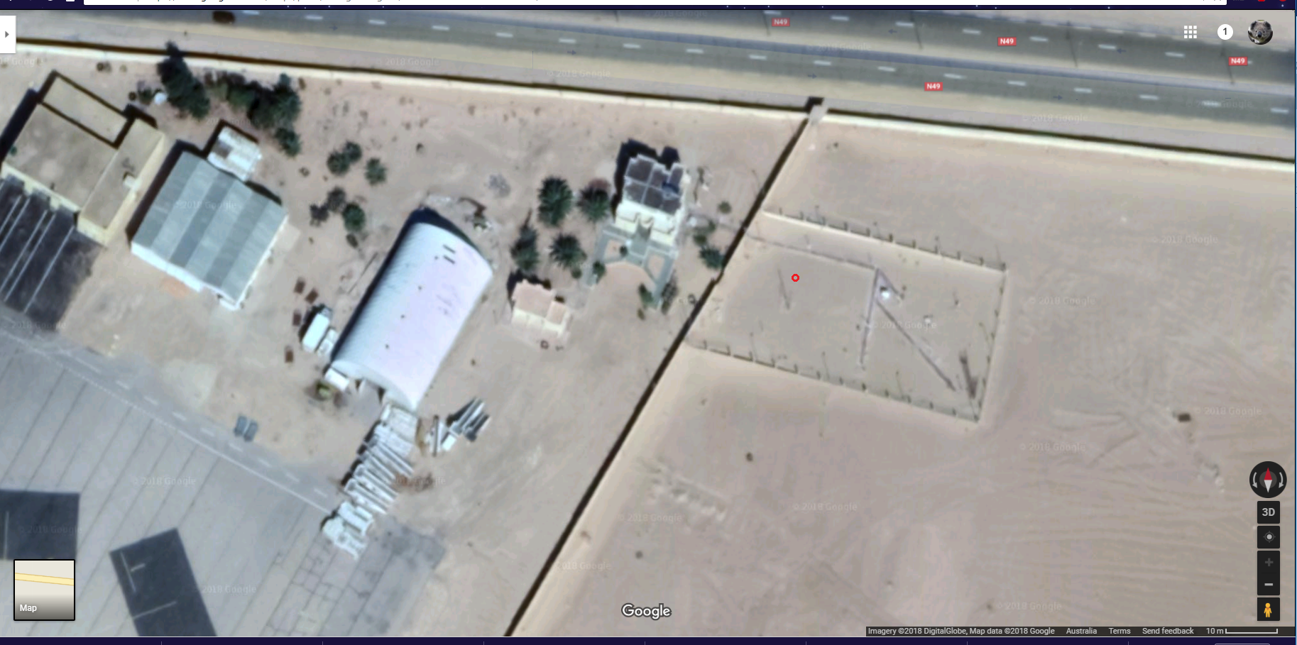
Ouarglu, Algeria
The WUWT post is here. On 5 July, this airport site posted a temperature of 124°F, said to be a record for Africa. There have been higher readings, but apparently considered unreliable. The WUWT heading was "Washington Post promotes another potentially bogus “all time high” temperature record"But "potentially bogus" is what they would call a weasel word. In fact, all that is known is that the site is an airport (not highly trafficked). There is speculation on where the sensor is located, and no evidence that any particular aircraft might have caused a perturbation. The speculated location is below (red ring).
It is actually 92m from the nearest airport tarmac, and 132 m from the nearest black rectangle, which are spaces where an aircraft might actually be parked. It seems to me that that is quite a long way (It is nearly 400 m to the actual runway), and if one was to be picky, the building at about 25m and the road at 38 m would be bigger problems. But these are not airport-specific problems.
A point this time is that Ouarglu is indeed a GHCN monthly station. For the reasons I have described, it does seem relatively well fitted for the role (assuming that the supposed location is correct).
Los Angeles
The final post (to now) was on high temperatures around Los Angeles on 6 and 7 July. Several places were said to have either reached their maximum ever, or the maximum ever for that day. The WUWT heading was "The all time record high temperatures for Los Angeles are the result of a faulty weather stations and should be disqualified"But it is very odd to suggest that a station should be disqualified from expressing its own record high. That is just the maximum of those figures, so if you disqualify the record high, you must surely disqualify the station. But why only those that record a record high?
Anyway, the complaints came down to the following (click to enlarge):
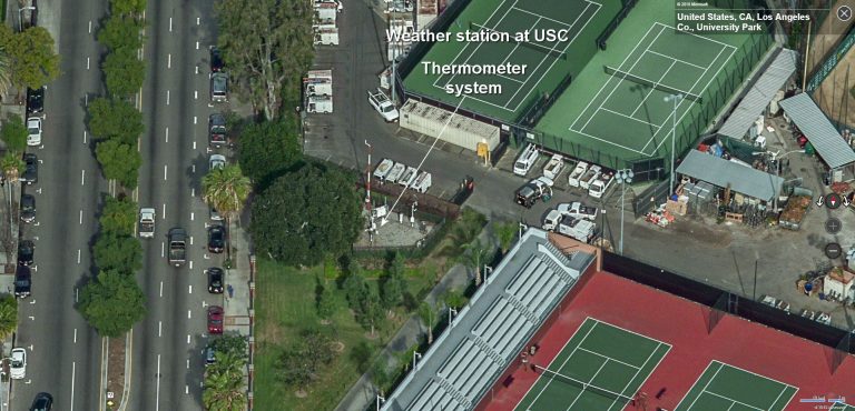 |  |  |  |
| USC | LA Power and Light | Van Nuys Airport | Burbank Airport |
There were also sites at UCLA and Santa Ana Fire Station, which were on rooftops. Now the first thing about these is that are frequently quoted local temperature sites, but apart from USC, none of them get into GHCN V3 currently (Burbank has data to 1966). So again, they aren't used for climate indices like GISS, NOSS or HADCRUT. But the fact that, whatever their faults, they are known to locals means that the record high, for that site, is meaningful to LA Times readership. And it is apparent from some of the WUWT comments that the suggestion that it was in fact very hot accords with their experience.
Again, the airport sites are clearly measuring what they want to measure - temperature on the runway. And climate scientists don't use them for that reason. UCLA seems to be there because it is next to an observatory. I don't know why the Fire Station needs a themometer on the roof, but I expect there is a reason.
As a general observation, I think it is a rather futile endeavour to try to suppress record highs on a generally hot day because of site objections. Once one has gone, another will step up. And while one record might conceivably be caused by, say, a chance encounter with a plane exhaust or aircon, it would be a remarkable coincidence for this to happen to tens of stations on the same day. Occam would agree that it was a very hot day, not a day when all the planes aligned.
Conclusion
People take the temperature of the air for various reasons, and there is no reason to think the measurement is inaccurate. The WUWT objection is that it is sometimes unrepresentative of local climate. The key question then is whether someone is actually trying to use it to represent local climate. They don't bother to answer that. The first place to look is whether it is included in GHCN. In most cases here, it isn't. Where it is, the stations seem quite reasonable.
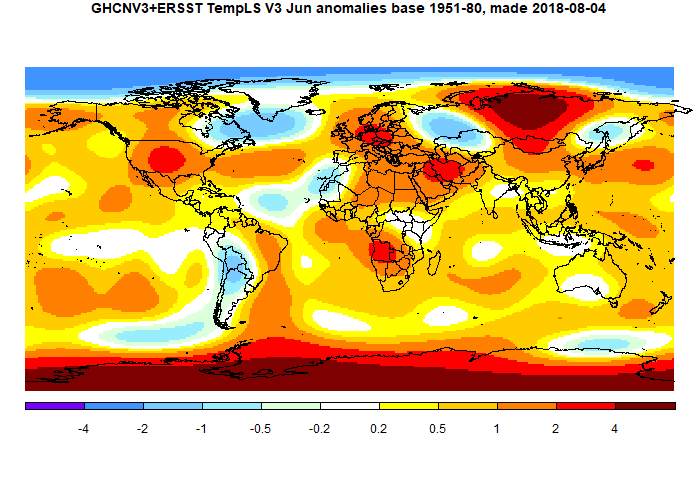
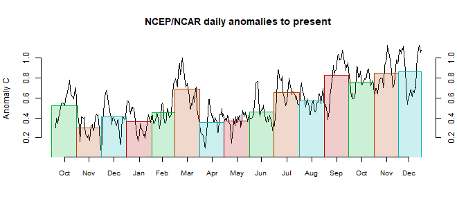
June global surface TempLS up 0.015 °C from May.
The TempLS mesh anomaly (1961-90 base) rose a little, from 0.679°C in May to 0.694°C in June. This is opposite to the 0.078°C fall in the NCEP/NCAR index, while the UAH satellite TLT index rose by a similar amount (0.03°C).
I've been holding off posting this month because, although it didn't take long to reach an adequate number of stations, there are some sparse areas. Australia in particular has only a few stations reporting, and Canada seems light too. Kazakhstan, Peru and Colombia are late, but that is not unusual. It is a puzzle, because Australia seems to have sent in a complete CLIMAT form, as shown at Ogimet. But, as said, I think there are enough stations, and it seems there may not be more for a while.
It was very warm in central Siberia and Antarctica, and quite warm in Europe US and most of Africa. Cold in much of S America, and Quebec/Greenland (and ocean).
Here is the temperature map. As always, there is a more detailed active sphere map here.
Tuesday, July 3, 2018
June NCEP/NCAR global surface anomaly down by 0.078°C from May
In the Moyhu NCEP/NCAR index, the monthly reanalysis anomaly average fell from 0.287°C in May to 0.209°C in June, 2018. That follows a similar fall last month, and makes June now the coldest month since July 2015. In the lower troposphere, UAH rose 0.03°C.
It was warm in most of N America, but cold in Quebec and Greenland. Moderate to cool just about everywhere else, including the poles. Active map here.
The BoM still says that ENSO is neutral, but with chance of El Niño in the (SH) spring.
Arctic sea ice is a bit confused for now. Jaxa has been off the air for nearly two weeks, said to be computer issues, but NSIDC is also odd. Much discussion at Neven's of satellite troubles.
Update: No sooner said than JAXA has come back on. Nothing much to report; 2018 is not far behind, but quite a few recent years are ahead. NSIDC reported a big day melt, which might have been a catch-up.
Monday, July 2, 2018
Hansen's 1988 prediction scenarios - numbers and details.
There has been a great deal of blog posting on the thirtieth anniversary of James Hansen's famous Senate testimony on global warming, and the accompanying 1988 prediction paper. I reviewed a lot of this in my previous post and I have since been in a lot of blog arguments. I suppose this has run its course for the moment, but there may be another round in 2020, since Hansen's prediction actually went to 2019.
Anyway, for the record, I would like to set down some clarification of what the scenarios for the predictions actually were, and what to make of them. Some trouble has been caused by Hansen's descriptions, which were not always clear. This is exacerbated by readers who interpret in terms of modern much discussed knowledge of tonnage emissions of CO2. This is an outgrowth of the UNFCC in early 1990's getting governments to agree to collect data on that. Although there were estimates made before 1988, they were without benefit of this data collection, and Hansen did not use them at all. I don't know if he was aware of them, but he in any case preferred the much more reliable CO2 concentration figures.
"One idiosyncrasy that you have to watch in Hansen's descriptions is that he typically talks about growth rates forthe increment , rather than growth rates expressed in terms of the quantity. Thus a 1.5% growth rate in the CO2 increment yields a much lower growth rate than a 1.5% growth rate (as an unwary reader might interpret)."
Hansen is consistent though. His conventions are
I'll just briefly summarise some of the misconceptions I battle in blogs:
The basic arithmetic for Scenario A is that, if a1, a2, a3 are successive annual averages of CO2 ppm, then
(a3-a2)/(a2-a1) = 1.015
or the linear recurrence relation a3 = a2 +1.015*(a2 - a1)
There is an explicit solution of this for scen_2, which is the set Steve Mc calculated:
CO2 ppm = 235 + 117.1552*1.015^n where n is the number of years after 1988. That generates the dataset.
The formula for the actual Hansen set is slightly different. Oddly, the increment ratio is now not 1.015, but 1.0151131. This obviously makes little difference in practice; I think it arises from setting the monthly increment to 0.125% and compounding monthly. However
1.00125^12 = 1.015104 which is close but not exact. Perhaps there was some rounding.
Anyway, with that factor, the revised formula for Scen_1 is
Scen A: CO2 ppm = 243.8100 + 106.1837*1.0151131^n
Scenario B is much more fiddly from 1988-2000, though a straight line thereafter. Hansen describes it thus
"In scenario B the growth of the annual increment of CO2 is reduced from 1.5% yr-1 today to 1% yr-1 in 1990, 0.5% yr-1 in 2000, and 0 in 2010; thus after 2010 the annual increment CO2 is constant, 1.9 ppmvyr-1".
It isn't much use me trying to write an explicit formula for that. All I can report is that Scen_1 does implement that. I also have to say that this definition is too fiddly; the difference between A and B after all that fussy stuff is only 0.44 ppm at year 2000.
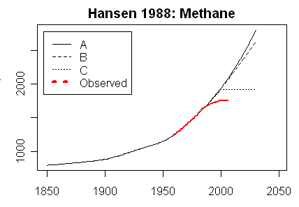
Scenario C is then CO2 ppm = 349.81 + 1.5*n for n=0:12; then constant at 367.81.
For comparison, Steve McIntyre showed graphs for his Scen_2, with data to 2008 only. There is no visual difference from scenario plots of Scen_1.
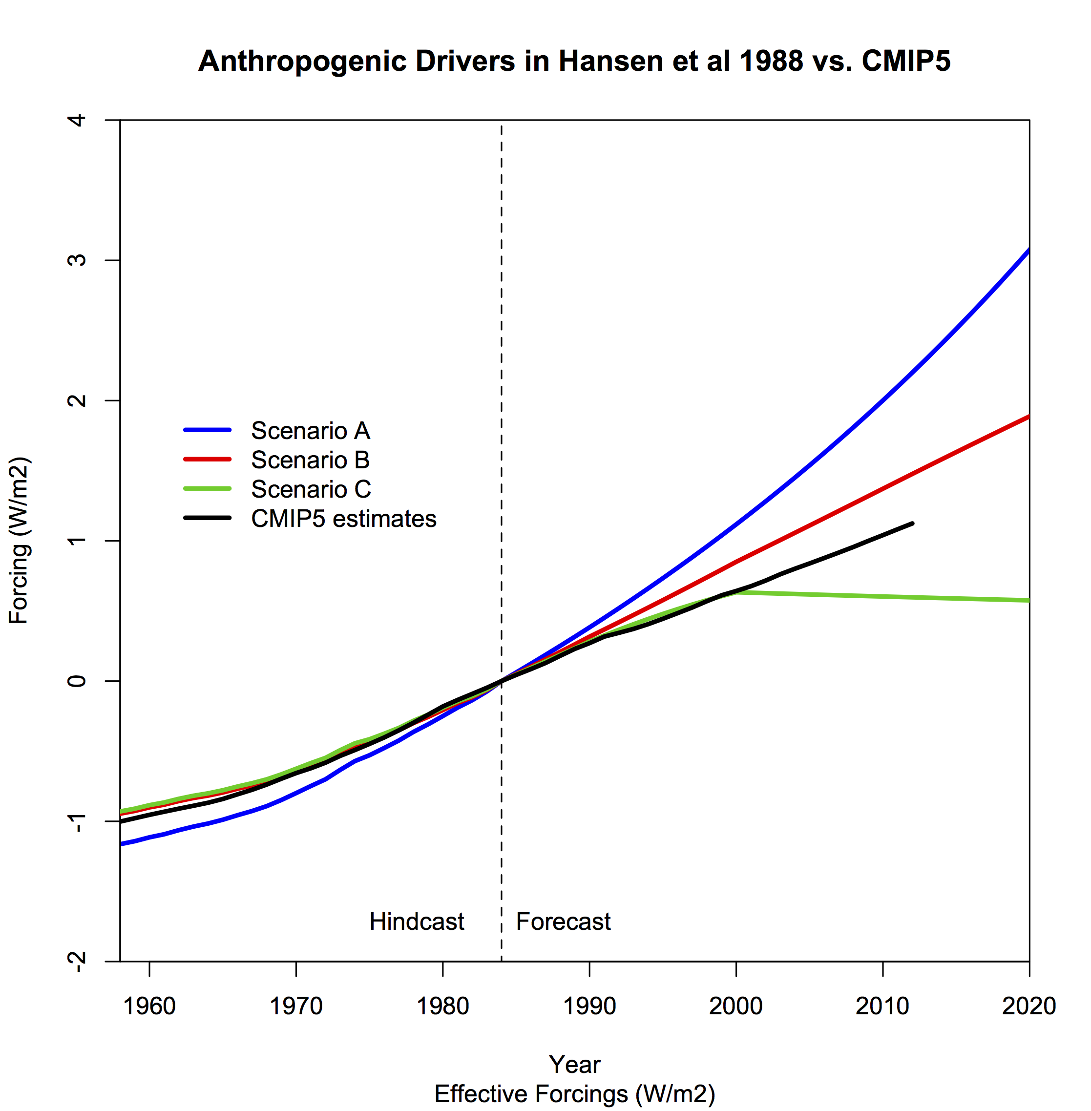
Gavin also gave this plot of forcing, which demonstrates that when put together, the outcome is between scenarios B and C. This was also Steve McIntyre's conclusion back in 2008.
And here is another forcings graph, this time from Eli's posts in 2006 linked above (click to enlarge):

Anyway, for the record, I would like to set down some clarification of what the scenarios for the predictions actually were, and what to make of them. Some trouble has been caused by Hansen's descriptions, which were not always clear. This is exacerbated by readers who interpret in terms of modern much discussed knowledge of tonnage emissions of CO2. This is an outgrowth of the UNFCC in early 1990's getting governments to agree to collect data on that. Although there were estimates made before 1988, they were without benefit of this data collection, and Hansen did not use them at all. I don't know if he was aware of them, but he in any case preferred the much more reliable CO2 concentration figures.
Sources
I discussed the sources and their origins in a 2016 post here. For this, let me start with a list of sources:- Hansen's 1988 prediction paper and a 1989 paper with more details, particularly concerning CFCs
- Some discussions from 10 years ago: Real Climate and Steve McIntyre (later here). SM's post on scenario data here. See also Skeptical Science
- A 2006 paper by Hansen, which reviews the predictions
- From that 2007 RC post, a link to data files - scenarios and predicted temperature. The scenarios are from the above 1989 paper. I'll call this data Scen_1
- A RealClimate page on comparisons of past projections and outcomes
- A directory of a slightly different data set from Steve McIntyre here, described here. I'll call that Scen_2. The post has an associated set of graphs. It seems that SM calculated these from Hansen's description.
- A recent Real Climate post with graphs of scenarios and outcomes, and also forcings.
- I have collected numerical ascii data in a zipfile online here. H88_scenarios.csv etc are Scen_1; hansenscenario_A.dat etc are Scen_2, and scen_ABC_temp.data.txt is the actual projection.
Hansen's descriptive language
The actual arithmetic of the scenarios is clear, as I shall show below. It is confirmed by the numbers, which we have. But it is true that he speaks of things differently to what we would now. Steve McIntyre noted one aspect when Hansen speaks of emissions increasing by 1.5%:"One idiosyncrasy that you have to watch in Hansen's descriptions is that he typically talks about growth rates forthe increment , rather than growth rates expressed in terms of the quantity. Thus a 1.5% growth rate in the CO2 increment yields a much lower growth rate than a 1.5% growth rate (as an unwary reader might interpret)."
Hansen is consistent though. His conventions are
- Emissions of CO2 are always spoken of in terms of % increase. Presumably this is because he uses tonnages for CFCs, where production data is better than air measurements, and % works for both. Perhaps he anticipated having CO2 tonnages some time in the future.
- So emissions, except for CFCs, are actually quantified as annual increments in ppm. He does not make this link very explicitly, but there is nothing else it could be, and talk of a % increase in emissions translates directly into a % increase in annual ppm increment in the numbers.
- As SM said, you have to note that is is % of increment, not % of ppm. The latter would in any case make no sense. In Appendix B, the description is in terms of increments
- Another usage is forcings. This gets confusing, because he reports it as ΔT, where we would think of it in W m-2. He gives in Appendix B for CO2 as the increment from x0=315 ppm of a log polynomial function the current ppm value. This is not far from proportional to the difference in ppm from 315. Other gases are also given by such formulae.
- An exception to the use of concentrations is the case of CFCs. Here he does cite emissions in tons, relying on manufacturing data. Presumably that is more reliable than air measurement.
Arguments
Update. Eli notes in comments that he went through a lot of this in 2006, here, and continued here. I'll show his forcing graph below.
- Ignoring scenarios
Many people want to say that Hansen made a prediction, and ignore scenarios altogether. So naturally they go for the highest, scenario A, and say that he failed. An example Noted by SkS was Pat Michaels, testifying to Congress in 1998, in which he showed only Scenario A. Michaels, of course, was brought on again to review Hansen after 30 years, in WSJ. This misuse of scen A was later taken up by Michael Crichton in "State of Fear", in which he said that measured temperature rise was only a third of Hansen's prediction. That was of course based, though he doesn't say so, on scenario A, which wasn't the one being followed.
In arguing with someone rejecting scenarios at WUWT, I was told that an aircraft designer who used scenarios would be in big trouble. I said no. An aircraft designer will not give an absolute prediction of performance of the plane. He might say that with a load of 500 kg, the performance will be X, and with 1000 kg, it will be Y. Those are scenarios. If you want to test his performance specs, you have to match the load. It is no use saying - well, he thought 500 kg was the most likely load, or any such. You test the performance against the load that is actually there. And you test Hansen against the scenario that actually happened, not some construct of what you think ought to have happened. - Misrepresenting scenarios
This is a more subtle one, that I am trying to counter in this post.People want to declare that scenario A was followed (or exceeded) because tonnage emissions increased by more than the 1.5% mentioned in Hansen. There are variants. These are harder to counter because Hansen made mainly qualitative statements in his text, with the details in Appendix B, and not so clear even there.
But there isn't any room for doubt. We have the actual numbers he used (see sources). They make his description explicit. And they are defined in terms of gas concentrations only (except for CFCs). Issues about how tonnage emissions grew, or the role of China, or change in airborne fraction, are irrelevant. He worked on gas concentration scenarios, and as I shall show, the match with scenario B was almost exact (Scen A is close too).
Scenario arithmetic for CO2
. As mentioned, Hansen defined scenario A as emissions rising by 1.5% per year, compounded. The others differed by a slightly slower rate to year 2000. Scenario B reverted to constant increases after 2010, while scenario C had zero increases in CO2 ppm thereafter. See the graphs below. With all the special changes in Scenario B, it still didn't get far from Scenario A over the 30 years.The basic arithmetic for Scenario A is that, if a1, a2, a3 are successive annual averages of CO2 ppm, then
(a3-a2)/(a2-a1) = 1.015
or the linear recurrence relation a3 = a2 +1.015*(a2 - a1)
There is an explicit solution of this for scen_2, which is the set Steve Mc calculated:
CO2 ppm = 235 + 117.1552*1.015^n where n is the number of years after 1988. That generates the dataset.
The formula for the actual Hansen set is slightly different. Oddly, the increment ratio is now not 1.015, but 1.0151131. This obviously makes little difference in practice; I think it arises from setting the monthly increment to 0.125% and compounding monthly. However
1.00125^12 = 1.015104 which is close but not exact. Perhaps there was some rounding.
Anyway, with that factor, the revised formula for Scen_1 is
Scen A: CO2 ppm = 243.8100 + 106.1837*1.0151131^n
Scenario B is much more fiddly from 1988-2000, though a straight line thereafter. Hansen describes it thus
"In scenario B the growth of the annual increment of CO2 is reduced from 1.5% yr-1 today to 1% yr-1 in 1990, 0.5% yr-1 in 2000, and 0 in 2010; thus after 2010 the annual increment CO2 is constant, 1.9 ppmvyr-1".
It isn't much use me trying to write an explicit formula for that. All I can report is that Scen_1 does implement that. I also have to say that this definition is too fiddly; the difference between A and B after all that fussy stuff is only 0.44 ppm at year 2000.
Scenario C is then CO2 ppm = 349.81 + 1.5*n for n=0:12; then constant at 367.81.
Conclusion
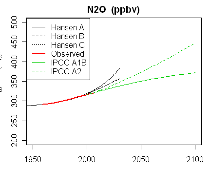
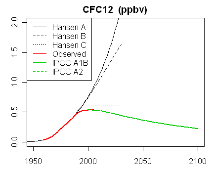
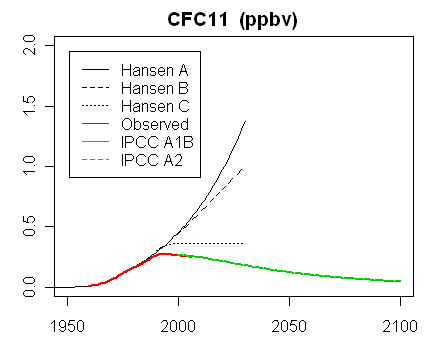
Hansen's descriptions of the scenarios are not always clear. But we have the numbers used, and then it is seen to be consistent, with the scenarios defined entirely in terms of gas concentrations.Graphs
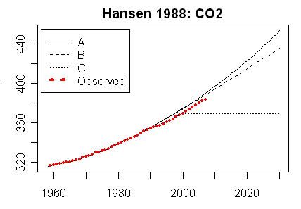
In the latest RealClimate, Gavin showed plots of the graphs and data for trace gases. Note how the data for CO2 sits right on scenario B. This is the Scen_1 data (click to enlarge):For comparison, Steve McIntyre showed graphs for his Scen_2, with data to 2008 only. There is no visual difference from scenario plots of Scen_1.
 |
 |
 |
 |
 |
Gavin also gave this plot of forcing, which demonstrates that when put together, the outcome is between scenarios B and C. This was also Steve McIntyre's conclusion back in 2008.
And here is another forcings graph, this time from Eli's posts in 2006 linked above (click to enlarge):
Subscribe to:
Posts (Atom)


