The GISS V4 land/ocean temperature anomaly was 1.16°C in April 2020, down from 1.19°C in March. That compares with a 0.054°C rise in the TempLS V4 mesh index.
There is a recent oddity with GHCN V4 monthly, in that in the last 24 hours a lot of station data has gone missing. This has happened before, and gets fixed (thanks, GHCN). It shows an effect in Moyhu data in a disagreement between the report data and the overall table. The latter uses the current data with gaps. I hope that GISS has not been affected by this. My reporting system rejects new data if the total number of stations reduces by more than a small threshold.
As usual here, I will compare the GISS and earlier TempLS plots below the jump.
Thursday, May 14, 2020
Monday, May 11, 2020
Plotting COVID19 daily data - finding peak rate and halving time.
This post is an update to my earlier post showing daily new cases and new deaths of Covid19 data from Johns Hopkins. The details are as for that post, but I want to explain two additions to the plots, which I think contain useful data. But first I'll show the updated plot (same as shown on the April 1 post; you need to click a radio button to get started). The explanation will follow:
The new items are the blue and green lines. The blue lines are just a 7-day moving average of the daily data. The data needs smoothing, and the 7-day average is chosen because the reporting of both cases and deaths often has a strong weekly influence (weekends). Following the blue lines often seems to tell something about whether the daily values are going up or down, even where the daily data is too noisy to tell.
The green lines, with the associated green axis on the right, are a more ambitious diagnostic. Our ABC has been promoting a "one number you need to watch" which is a little bit like the R reproduction number of epidemiology. They plot the ratio of current value to the average of the last five, and say that progress is being made when this number is less than 1.
I think that is useful, but far too noisy. It is related to the slope of the logarithm, and I would like to calculate that more scientifically. The particular reason for log is that the curves usually start with an exponential rise, and often end with an exponential decay. These will be linear for the logs, and can be well estimated by regression.
You can take it, then, that the green line is that estimate of slope of log, but I have scaled it to fit another interpretation, which is the number of doublings per week, or the reciprocal of the time to doubling. So a value of 1 means doubling once a week; 2 means doubling twice (4x). Negative values are halving; -1 means halving once a week, which would be a very good situation. A value of -0.5 means it halves once every two weeks. A significant place to watch is where it crosses from positive (increasing) to negative.
I'll say a little about the numerics of this. Clearly smoothing is required, which means that each point represents information from a stretch of data. My basic technique for a smoothed derivative is LOESS - a regression weighted close to each point. But before differentiating the logarithm, it is necessary to smooth in the linear domain. The reason is that a main kind of error is in the day to which the data is ascribed. Error here should have only a moderate effect, because smoothing will conserve the data and diminish the effect of the displacement. But smoothing the log does not conserve. A worst, and rather common case, is where no data is recorded at all, so the log would be infinite. Of course it is also possible in the tails that there really were no cases/deaths that day.
A preliminary linear smoothing will mitigate that, and I use again a seven day moving average, to attenuate the weekend effect. I then take the logarithm (base 2) and do the weighted linear regression on that, with the trend coefficient treated as the derivative. The weighting is a binomial distribution half-width 9.
You'll see that the green curves start out generally positive. In fact they don't really mean much until the red data shows several/day. I have tried to remove meaningless derivative data, but it isn't very exact, so I err on the side of inclusion. Data often rises to an early peak, where the green line crosses the zero horizontal, and then may seem to bump along on a plateau, where it oscillates. If the green line remains decidedly negative, then one can say that the epidemic is receding, and the average value represents the halvings/week.
To give an example of the interpretation, here is the US death toll data data:

At About March 25, the blue curve (smooth) was curving steadily upward, and the green curve was at about 1, which means doubling once a week. Then the blue curve shows a peak at about April 14. That is where the green curve crosses zero, a stationary point, neither up nor down. Later in April, the blue has a slow bumpy decline, and the green curve shows a value of about 0.9, which means halving about every 10 weeks. The green curve looks better at the end, but unfortunately this is the most uncertain part, since the derivative is estimated with one sided (old) data only.
Here is the plot of new cases for Germany:

Again there is a near exponential increase at the beginning, with a doubling more than weekly (green>1). Again a peak in the blue at about March 28th, where the green crosses zero. But then the blue goes decidedly downward, and the green settles to about 0.7, which means halving about every two weeks. The daily values have a bump at the end, which brings the green up to zero, suggesting the decline might have ended. Again, unfortunately, this is the least reliable part of the curve.
The new items are the blue and green lines. The blue lines are just a 7-day moving average of the daily data. The data needs smoothing, and the 7-day average is chosen because the reporting of both cases and deaths often has a strong weekly influence (weekends). Following the blue lines often seems to tell something about whether the daily values are going up or down, even where the daily data is too noisy to tell.
The green lines, with the associated green axis on the right, are a more ambitious diagnostic. Our ABC has been promoting a "one number you need to watch" which is a little bit like the R reproduction number of epidemiology. They plot the ratio of current value to the average of the last five, and say that progress is being made when this number is less than 1.
I think that is useful, but far too noisy. It is related to the slope of the logarithm, and I would like to calculate that more scientifically. The particular reason for log is that the curves usually start with an exponential rise, and often end with an exponential decay. These will be linear for the logs, and can be well estimated by regression.
You can take it, then, that the green line is that estimate of slope of log, but I have scaled it to fit another interpretation, which is the number of doublings per week, or the reciprocal of the time to doubling. So a value of 1 means doubling once a week; 2 means doubling twice (4x). Negative values are halving; -1 means halving once a week, which would be a very good situation. A value of -0.5 means it halves once every two weeks. A significant place to watch is where it crosses from positive (increasing) to negative.
I'll say a little about the numerics of this. Clearly smoothing is required, which means that each point represents information from a stretch of data. My basic technique for a smoothed derivative is LOESS - a regression weighted close to each point. But before differentiating the logarithm, it is necessary to smooth in the linear domain. The reason is that a main kind of error is in the day to which the data is ascribed. Error here should have only a moderate effect, because smoothing will conserve the data and diminish the effect of the displacement. But smoothing the log does not conserve. A worst, and rather common case, is where no data is recorded at all, so the log would be infinite. Of course it is also possible in the tails that there really were no cases/deaths that day.
A preliminary linear smoothing will mitigate that, and I use again a seven day moving average, to attenuate the weekend effect. I then take the logarithm (base 2) and do the weighted linear regression on that, with the trend coefficient treated as the derivative. The weighting is a binomial distribution half-width 9.
You'll see that the green curves start out generally positive. In fact they don't really mean much until the red data shows several/day. I have tried to remove meaningless derivative data, but it isn't very exact, so I err on the side of inclusion. Data often rises to an early peak, where the green line crosses the zero horizontal, and then may seem to bump along on a plateau, where it oscillates. If the green line remains decidedly negative, then one can say that the epidemic is receding, and the average value represents the halvings/week.
To give an example of the interpretation, here is the US death toll data data:
At About March 25, the blue curve (smooth) was curving steadily upward, and the green curve was at about 1, which means doubling once a week. Then the blue curve shows a peak at about April 14. That is where the green curve crosses zero, a stationary point, neither up nor down. Later in April, the blue has a slow bumpy decline, and the green curve shows a value of about 0.9, which means halving about every 10 weeks. The green curve looks better at the end, but unfortunately this is the most uncertain part, since the derivative is estimated with one sided (old) data only.
Here is the plot of new cases for Germany:
Again there is a near exponential increase at the beginning, with a doubling more than weekly (green>1). Again a peak in the blue at about March 28th, where the green crosses zero. But then the blue goes decidedly downward, and the green settles to about 0.7, which means halving about every two weeks. The daily values have a bump at the end, which brings the green up to zero, suggesting the decline might have ended. Again, unfortunately, this is the least reliable part of the curve.
Saturday, May 9, 2020
April global surface TempLS up 0.054°C from March.
The TempLS mesh anomaly (1961-90 base) was 1.010deg;C in April vs 0.947°C in March. This was similar to the rise in the NCEP/NCAR reanalysis base index, which was 0.045°C.
The prominent feature was a warm Arctic, extending into central Siberia, surrounded by a band of cool, in N America (except W USA) and from E Europe via N India to China. Warmish almost everywhere else, including W Europe.
I might comment here on my timing of posting. I maintain the latest numbers here, before and after posting. They become meaningful as soon as ERSST is posted, usually about the 4th. At that stage the large majority of the land data is also in (about 85%). But then the rate of new land data slows to a trickle, so there is a temptation to post at that point. In the previous two months, I did so, but the late data made a surprisingly large difference. This month, I held off for a while, but the result increased by only 0.01°C. I'll keep monitoring this.
Here is the temperature map, using the LOESS-based map of anomalies.
 As always, the 3D globe map gives better detail.
The prominent feature was a warm Arctic, extending into central Siberia, surrounded by a band of cool, in N America (except W USA) and from E Europe via N India to China. Warmish almost everywhere else, including W Europe.
I might comment here on my timing of posting. I maintain the latest numbers here, before and after posting. They become meaningful as soon as ERSST is posted, usually about the 4th. At that stage the large majority of the land data is also in (about 85%). But then the rate of new land data slows to a trickle, so there is a temptation to post at that point. In the previous two months, I did so, but the late data made a surprisingly large difference. This month, I held off for a while, but the result increased by only 0.01°C. I'll keep monitoring this.
Here is the temperature map, using the LOESS-based map of anomalies.
As always, the 3D globe map gives better detail.Sunday, May 3, 2020
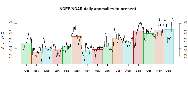
NCEP/NCAR reanalysis surface temperature up 0.045°C April 2020.
The Moyhu NCEP/NCAR index came in at 0.401°C in April, following 0.356°C in March, on a 1994-2013 anomaly base. It comes after a big drop from February, so temperatures are still around the mid-2019 average.
The main pattern is a warm Arctic/central Siberia, with a surrounding ring of cool, from Norway through Iran to China. Most of N America was cold. Antarctica was relatively warm.
The main pattern is a warm Arctic/central Siberia, with a surrounding ring of cool, from Norway through Iran to China. Most of N America was cold. Antarctica was relatively warm.
Subscribe to:
Posts (Atom)


