Monday, June 30, 2014

Infilling, climatology and anomalies

There's been a lot of grumbling lately about USHCN. For some reason Steven Goddard has gone viral, and has been on some right wing media. Judith Curry gives a summary, with links.

WUWT has had a varied role. Initially Anthony Watts wrote with Zeke some good posts on some flaws in SG's methods. Zeke has continued at Lucia's. I chipped in too.

Then it took an odd turn. Anthony got invested in disputing SG's claims, only moderately exaggerated, about the number of USCHN stations that actually reported each month. When he found that there were quite a lot, "zombie" stations became the enemy. And with that, infilling.

The background is that USHCN tries to do something that no-one else does - to give an average (for the US) in absolute °F (absolute=not an anomaly). That can be done, but needs care (unlike here). USHCN does it by ensuring that every month has an entry for each of its 1218 stations, which ideally never change. But in fact some do become defunct. It's up to 20-30%. So for them USHCN just estimates a value from neighbouring stations, and proceeds.

So that is the latest villainy. I think USHCN should use anomalies, and I suspect they in effect do, and just convert back. But there is nothing wrong with the infilling method. I've been arguing in many forums that the US average, for a month say, is a spatial integral, and they are doing numerical integration. Numerical integration formulae are usually based on integrating an interpolation formula. If you first interpolate extra points using that formula, it makes no difference. Any other good formula will also do.

I don't have many wins. So I thought I would give a simple and fairly familiar example which would show the roles of averaging, climatology, infilling and anomalies. It's the task of calculating an average for one year for one station. Since it's been in the news, and seems to be generally a good station, I chose Luling, Texas.

Update. From comments, I see that I should emphasise that I'm not, in this example, trying to calculate the temperature of the US, or any kind of trend. The issue is very simple. Given a temp record of this one place, and the 2005 monthly averages (with a missing), what can be said about the annual average for 2005  for that place.

Update: I have a new post with a graphics version here


To simplify, I'll round numbers, assume months of equal length. All data is raw, and in °C. Climatology for each month will be simply the average of all instances, and the anomaly is just the difference from that.

So here is the basic data for 2005, where all months are available:

JanFebMarAprMayJunJulAugSepOctNovDecAnn
200912.812.815.218.723.227.628.828.928.220.217.110.320.3
Climatology10.312.116.320.324.227.72929.126.221.215.411.220.2
2009 Anomaly2.40.7-1.1-1.6-0.9-0.1-0.2-0.22.1-11.6-0.90.1

Now suppose we decide too many days are missing in February, and it has to be dropped. And suppose, as WUWT seems to want, we do just that:

JanFebMarAprMayJunJulAugSepOctNovDecAnn
200912.8NA15.218.723.227.628.828.928.220.217.110.321
Climatology10.3NA16.320.324.227.72929.126.221.215.411.221
2009 Anomaly2.4NA-1.1-1.6-0.9-0.1-0.2-0.22.1-11.6-0.90

So the annual average has risen from 20.3°C to 21°C. That's a lot to follow from removing a month that wasn't unusually warm (for Feb). But if you look at the next line, most of that is accounted for by the change in climatology. It's average has risen by the same amount.

Let's note again that the anomaly average has changed only a small amount, from 0.1 to 0. That reflects that the omitted month was warmer than normal, but is a proportionate response. That's the benefit of anomalies. There is no climatology to make a spurious signal.

But we didn't want to change the annual climatology. That isn't supposed to change, at least not radically, from year to year.

Another way of seeing why just dropping is bad, which I find useful, is that ou can always replace the NA with the Ann average figure. That can't change the average. So this is exactly the same:


JanFebMarAprMayJunJulAugSepOctNovDecAnn
200912.82115.218.723.227.628.828.928.220.217.110.321
Climatology10.32116.320.324.227.72929.126.221.215.411.221
2009 Anomaly2.40-1.1-1.6-0.9-0.1-0.2-0.22.1-11.6-0.90

Infilling Feb with 21°C is obviously bad. And it shows up in the climatology. But that is what just dropping does.

Now suppose we infill, rather crudely, replacing Feb with the average of Jan and Mar. You know, fabricating data. We get:

JanFebMarAprMayJunJulAugSepOctNovDecAnn
200912.81415.218.723.227.628.828.928.220.217.110.320.4
Climatology10.313.316.320.324.227.72929.126.221.215.411.220.3
2009 Anomaly2.40.7-1.1-1.6-0.9-0.1-0.2-0.22.1-11.6-0.90.1

It's not a particularly good infill. But it is effective. The annual average has risen from 20.3 to 20.4. Much better than 21. And the climatology has changed, by the same small amount.

This is basically how USHCN could handle the loss of a month without losing anomalies. In fact, they would take steps to adjust for the known climatology error, to get a better infill. But an even simpler way! Just infill the anomalies, and add to the climatology:

JanFebMarAprMayJunJulAugSepOctNovDecAnn
200912.812.815.218.723.227.628.828.928.220.217.110.320.3
Climatology10.312.116.320.324.227.72929.126.221.215.411.220.2
2009 Anomaly2.40.7-1.1-1.6-0.9-0.1-0.2-0.22.1-11.6-0.90.1

That actually worked artificially well, because the Feb anomaly infill happened to be almost exact. But if you really really don't like infilling, setting the Feb anomaly to zero would do nearly as well. Or to the anomaly average without Feb.

JanFebMarAprMayJunJulAugSepOctNovDecAnn
200912.812.115.218.723.227.628.828.928.220.217.110.320.2
Climatology10.312.116.320.324.227.72929.126.221.215.411.220.2
2009 Anomaly2.40.0-1.1-1.6-0.9-0.1-0.2-0.22.1-11.6-0.90.0

Well, this is an analogy of how USCHN can average stations over a month. But one last thing - we don't even have to average the climatologies each time. We can just average the anomalies and add to the annual climatology.

So the moral is
  • Infilling didn't hurt.
  • What did hurt was omitting the climatology part of Feb. That is because Feb is known to be cold. Just omitting Feb is bad. Infilling absolute temp gave a reasonable treatment of the climatology.
  • But dealing with anomalies alone is even better.
  • And not "fabricating data" is by far the worst.
Let me put it all yet another way. We're saying we don't know about Feb, because maybe half the days have no reading. But what don't we know?

"Throw it out" means we don't know anything about Feb. It could have been 10°C, 20 or 30. But we do know more. It was winter. In fact, we know the average temp. And our estimate should at least reflect that knowledge. What we don't know is the anomaly. That's what we can throw out.

By "throw it out" again we're really replacing with an estimate, even if we don't say so. And the default is the average of remaining anomalies. But we could also just say zero, or the average of neighbours (infill). It won't matter much, as long as we don't throw out what we do know, which is the climatology.

Weighting

OK, I might as well work in another hobbyhorse. I've said in comments that infilling is harmless when averaging. It actually just reweights. Suppose you have the Feb data. The average us just a weighted sum, each month weighted 1/12. What if you don't know Feb, so you replace with an average of Jan and March. the annual average is still a weighted sum of data. The weights are:
1/8,0,1/8,1/12,1/12...
It's still an estimate based on the same data. Jan and Mar have been upweighted to cover the gap left by Feb.

Saturday, June 28, 2014

USHCN tempest over Luling, Texas


There's always something. This time it's over USHCN, in 2013 in Luling, Texas. And yes, I've been arguing. But it's actually quite interesting.

It started, as it seems to lately, with Steven Goddard, who has a new name. Paul Homewood joined in the excitement and looked into Luling, which he says is the first thing he came across. His posts are (here and here). And an account that is actually very helpful from tchannon.

The basic story is that in 2013 USHCN discarded the raw data from Luling, a Coop station in Texas, and replaced it with infill from neighbouring stations. That is the standard response to missing data. But the excitement was that the raw data was there and was quite a lot cooler. Here is the table that he calls "shocking":

Update: mesoman notes in a comment below that there was a cable fault which caused low temperature readings which was repaired on Jan 14th 2014. Looks like problem solved. The system did the right thing.

Actual
F
Actual
C
Bias Adjusted
C
Diff
Jan 2013 50.3 10.17 10.79 0.62
Feb 54.2 12.33 13.48 1.15
Mar 58.1 14.50 15.33 0.83
Apr 63.4 17.44 18.30 0.86
May 70.7 21.50 22.64 1.14
Jun 80.2 26.78 27.52 0.74
Jul 79.7 26.50 28.46 1.96
Aug 81.9 27.72 29.23 1.51
Sep 76.1 24.50 25.99 1.49
Oct 63.6 17.56 20.51 2.95
Nov 51.6 10.89 13.09 2.20
Dec 46.1 7.83 8.86 1.03
Annual 2013 64.7 18.17 19.52 1.35
Annual 1934 70.9 21.61 20.72 -0.91

There are nowadays lots of sources of information. All USHCN stations are now GHCN too, so you can look at the GHCN details. They don't help much. Paul linked the metadata, which I'll refer to. There are some other tabs there which may help.

An alternative account which is well worth checking is BEST, which I noted at WUWT and Paul's. It includes this useful plot of the difference between raw values and the regional average:


Note the recent dive and the red markings, which are what BEST understands to be station moves.

This starts to look like an explanation. A station move followed by a marked cooling relative to the region is exactly what homogenization is about. And if the program believes there was a move which changed things, then the right thing to do is exactly to replace the data with a regional estimate until there is enough history to estimate the effect of the change.

Paul posted an update, noting that the metadata did show a change of coordinates at that time, but with a note to say that no equipment had moved. They were just improving the accuracy. Still, it's quite likely that the computer program took the change as confirmation of the inhomogeneity of the sudden dip.

Blogger tchannon found lots of useful information at the site of the Foundation Farm which hosts the station. He noted some equipment issues which he thought might have triggered the computer's response.

If there wasn't an actual move, the sudden dip at Luling doesn't have a clear explanation. It's real, though. GHCN has the same raw data, and you can see my shaded plot of it here. These are plots of anomalies, which I have calculated as described here. The shaded anomaly plot is actually a very good way to spot issues with data, as I describe in that post and some of its links.

I have extracted some of the key months here. The extreme of Paul's table above was October, and here is what my plot shows:


Anomaly=-2.8°C

The black dots are stations with data. The deep blue dip is Luling. It is a clear outlier. On my plot you can shift-click for details and it shows the anomaly of -2.80°C. Not coincidentally, this lines up with the -3.95°C in Paul's table (I took the extreme case).

Here are some plots of other months. In each case the blue dip id Luling:

July 2013 Anomaly=-0.95°C

August Anomaly=-1.24°C

Sept 2013 Anomaly=-1.08°C

November Anomaly=-4.05°C

Dec 2013 Anomaly=-2.52°C

Dec 2012 Anomaly=2.31°C

November looks extreme, but it was a cold month everywhere there. I've included December 2012 to show that it does seem to be a recent issue that arose some time in 2013. Making the pics is a bit tedious, so I'll leave it there, but you can make your own here.

So something seems to be going on at Luling; it's not just a computer glitch.


Friday, June 27, 2014

TOBS nailed.


OK, that's a bit triumphalist. Sorry. But I've been arguing, at WUWT and elsewhere, about why adjustment of USHCN is necessary. And I get a chorus of - no you can't alter original data, not if it increases the trend. And I point in vain to my earlier analytic justifications for TOBS (here and here). See Zeke for context, and Victor Venema for a much fuller explanation of min/max thermometers and TOBS.

I think I eventually worked out the right counter, so I thought I'd write it down here before I forget.

  • The min/max data that you see in a record is not (usually) original data of daily min/max. It is typically a record of the location of min/max markers on a thermometer at a specific time of day (when it was then reset).
  • An assumption must then be made to connect that with records of specific days. In the old style, you might assume that a max marker at 5pm Tuesday (example) was the daily max for Tuesday. If it was at 9am, you'd assume it was the max for Monday (and at some time in between, you'd have to switch).
  • Repeat, this is an assumption. It is not original data. And it won't always be right. Many of those 5pm Tuesday readings would have been set the previous Monday. That would arise from a warm afternoon when 5pm, not the max for Monday, was warmer than all of Tuesday to 5pm.
  • This is double counting, and 5pm creates a warm bias. Warm afternoons can get counted twice. Cold mornings don't.
  • Repeating again, an assumption was made and is inevitable. It creates a bias. People raised objections about how the bias can't be measured exactly. I emphasised here that there was a huge amount of data to base an estimate on; that the analysis was straightforward. Oh no, they say, how do you know that people actually read when they said they did (answer - see DeGaetano in that link). Etc. But anyway, the key thing is there is a bias, and it's a scientific duty to estimate and allow for its effect. The objectors want to say it is zero. That's an estimate, baseless and bad. We can do much better.
  • The original data is not data about daily temperatures. To get that requires interpretation. And you have to do it right. Laziness won't wash. We can do better. Over the years, NOAA has done better. And yes, for reasons explained in link above, that had a warming effect.

Sunday, June 22, 2014

June SIPN Arctic Ice predictions


I haven't seen much mention of it, but the June Sea Ice Outlook has been published. SIPN is the new location for what used to be ARCUS SEARCH.

The standout is Wang, at 6.13 M sq km. That's from the CFS prediction, which Joe Bastardi has been promoting at WUWT. So WUWT comes in close behind. Then there is the usual scatter of predictions, max about 5.5 M sq km.

Meanwhile the ice itself is melting on a normal trajectory (for recent years); behind a bunch of three years 2010-2012, but ahead of 2007, say. More details here.


Saturday, June 21, 2014

Animated Earth Graphics


I'm a bit late to this one. Slate had a story last December, with links to earlier. My hat tip is to Robert Scribbler.

Followers of this blog will know that I experiment with new programming methods to try to visualise Earth data. So I was very interested to come across Cameron Beccario's nullschool site. It uses Javascript to display information from the NCEP Global Forecast System. As such, it emphasises what is current (now, the last few days, and the next few).

It is very systematically laid out. The GFS model gives data for many kinds of variable, and many levels of the atmosphere, and these are all laid out. It updates every three hours. There is also SST data, and ocean currents, less frequently. I found it a bit hard to navigate for lack of explanatory words, but it's logical.


The animated aspect is mainly an overlay of wind motion. It's important to remember that this is a static field. It shows as if particles are tracking the wind, but the wind doesn't change.

It shows a large variety of projections, which is interesting. I think there is nothing better than a sphere that you can change the viewpoint, and that is the default. He doesn't use WebGL, so it isn't a trackball, but functional enough.

He has made the code available. It is an assemblage of many utilities, which I find hard to follow, but seems very profesionally done.

It's a different emphasis to mine - I'm mainly trying to give access to historic data, while this is very much current. But I'm sure there is a lot to learn from it.

Here's the opening picture.
And here is wind with sea level pressure.
Ocean current animation
Currents with SST Anomaly
Tomorrow's temperature.

It's all on a 1° grid. You can magnify with the mouse wheel.


Thursday, June 19, 2014

Quality controlling GHCN V3 has a big effect on recent TempLS results

I've been spotting and fixing individual glitches in the GHCN V3 monthly averages that I use for monthly TempLS global average temperature anomaly calculation. Recent posts on that are here, here and here. As I've noted, a lot of the errors were present in the CLIMAT form. But some were within GHCN.

In my May TempLS posting I said that May seemed to be free from the big errors of some previous months. I'll note below that this was wrong, although there do seem to be fewer. Except for China, which turned out to have a lot of April data mixed in with May. China errors were not large enough to stand out individually, but together had a big effect.

It seems that the GHCN unadjusted file QCU, which I use, does not get the quality control that is advertised, but the adjusted file QCA does. Whether it is the stated QC process, or the cleanup needed for homogenisation, I don't know. But I wrote a program to make use of this. It notes where there is a QCU entry without a corresponding QCA. This need not be an error, so I check to see whether the QCU is then within 3 °C of a long term normal. If not, I exclude it. This would normally exclude a lot of good data, but the added condition of a missing QCA reduces that. And if some errors do get through, they won't be big ones.

This had a big effect on recent results, as I'll show. It is very much concentrated on the last twelve months. Whether that is because the initial error rate has grown, or because old errors get fixed with delay, I don't know. I do know that some very obvious errors back to 2010 remain.

I have only applied this to the last four years, because they are the ones I usually show. The most notable recent effect is that the drop of 0.14 °C from April to may has almost disappeared.

Here is the plot of the effect of fixing the errors. It shows after - before. It isn't pure for March and April 2014, because the "before" already had some fixing applied. The differences are fairly minor until April 2013, when there seems to have been a lot of stations in the US which did not get adjusted. Many had deviations slightly exceeding the 3°C threshold. It's not absolutely clear that these are errors, but they seem too numerous, and removing them makes a big difference. After that, the biggest changes are in 2014, with problems I discussed in earlier posts. In particular, the April average is now 0.609°C and May was 0.59°C - very little changed.

Update. I have added (at the end) a table of the data removed, and the reason.


I'll show comparison plots and discuss individual errors below the jump.

As I mentioned here, there was a big problem with China data. Most seemed to be copied from April. Whereas in other cases, I just removed suspect data, here I replaced it with long term averages for those stations. I mainly wanted to see what the effect would be.

There were a few others. Kazan in Russia was assigned an average of -79°C, when climatology says about 12. In this case, the CLIMAT entry had been removed. Aparri in the Philippines had 12.5°C instead of expected 28.3°C. And Cartagena, Colombia, had 39.1°C, about 10C too high. In this case, the mean exceed the max, so is clearly wrong.

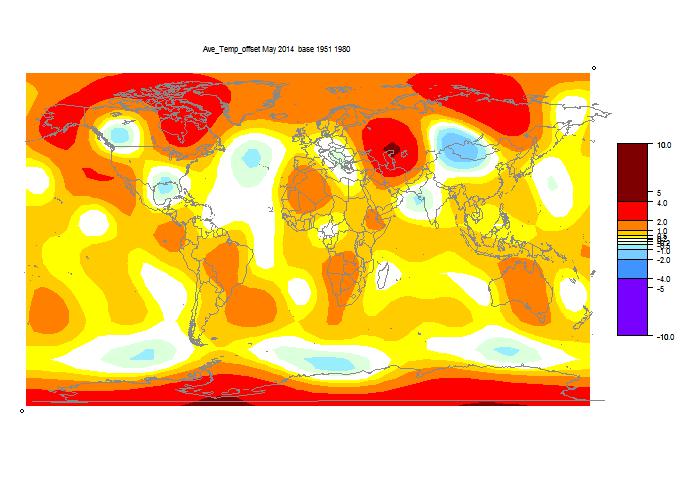
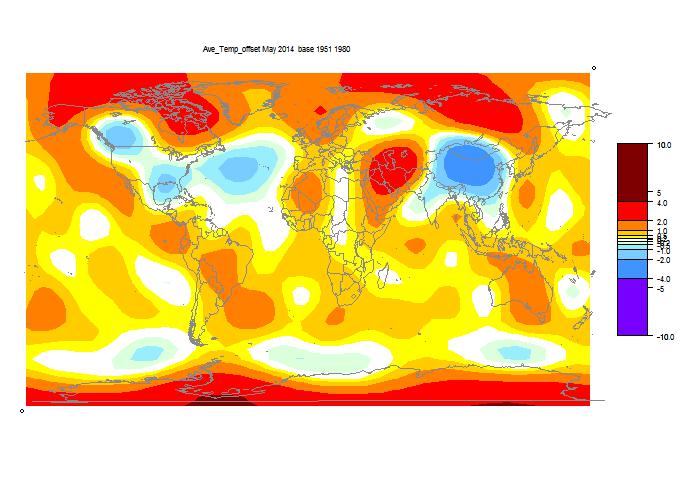
So here is the modified anomaly map (spherical harmonics) for the month:


And here was the original, with the big China error:


Here is the GISS version:


Here are the old and new plots for recent months:
The change brings TempLS closer to the others.

Conclusion

Obviously, I wish GHCN would fix this. I wrote about six weeks ago, but no reply, and nothing has happened. I realize that I may be the only person who is trying to use GHCN unadjusted as soon as they appear. But if they can be fixed for the adjusted file, then why not QCU?

I want to keep using QCU for TempLS. It's not that I doubt the value of the adjustments, but I think it is useful to have a demonstration that the unadjusted data really leads to much the same result. and it would do so more smoothly without these errors.

Update: A small mystery solved. I had noted that Port Hardy, on Vancouver Island, had been intermittently getting data from Clyde River, Nunavut. PH has GHCN number 40371109000, while CR is 40371090000.

Update:   Here is a table of the data removed. ÃŽ”T is the temperature difference between the reading and the normal for that station/month.

Wednesday, June 18, 2014

Another error in GHCN for May - from China CLIMAT form.


As I have noted in my usual posts for TempLS and GISS, Gavin Schmidt has tweeted that there is a problem with China data in the CLIMAT file, and the current GISS should be regarded as provisional.

When I looked into it I found that a large amount of the China May data was a copy of April's, and this was also in GHCN unadjusted. That explains why the TempLS map for May showed an intense cool spot over China, since TempLS uses that unadjusted data. It did not get into GHCN adjusted, and so GISS did not use China data.

How much does it matter? I did a repeat May calculation with TempLS using just the long term averages for China stations. That raised the global average anomaly from 0.47°C to 0.514°C. Oddly, it still left a cooler than average spot over China. Since the climatology I used does not allow for warming, it is likely that real China data will further raise the global average.


May GISS Temp up by 0.03°C


GISS has posted its May estimate for global temperature anomaly, and in contrast to TempLS (down by 0.14°C) it showed a small rise, from 0.73°C in April to 0.76°C in May. Getting warm.

The comparison maps are below the jump.

Update: Gavin says there is a problem with China CLIMAT data. I can't see anything obvious, but it could be the cause of the big cold spot TempLS found there (GISS's was much smaller).
Update: Now I see the problem. It seems that the May China report is identical to April. That's the cause of my cool spot, and would have brought the temperatures down.


Here is the GISS map:


And here, with the same scale and color scheme, is the earlier TempLS map:


Also cooler in NW Canada, NW China down to India, and N Atlantic. Warmer in European Russia, and warmer than TempLS showed in Australia - I thought it was warm too.

Previous Months

April
March
February
January 2014
December
November
October
September
August
July
June
May
April
March
February
January
December 2012
November
October
September
August
July
June
May
April
March
February
January
December 2011
November
October
September
August 2011

More data and plots

Tuesday, June 17, 2014

Google Maps portal to NOAA station histories.

Recently I posted a text portal to some NOAA NCDC data about station temperature histories. The portal had the use that it gave access by name from a convenient list. I was hoping to do something more advanced.

I have now scrubbed up an old Google Maps interface, which had fallen into some disrepair. It shows stations with markers, and if you click on them, a window pops up with information, which now includes a link to the appropriate NOAA station file.

There are various selection facilities. These are explained in more detail in the earlier post. You can select conditionals about dates, airport/urban etc, and then click a symbol button (eg yellow) to make stations with that condition show. Remember to uncheck the All button.

I have added a text search; you can enter a fragment from the name (all caps), and stations with that fragment will show. It may be best to first click "invisible" to clear the screen. You can combine text search with other conditionals. Use Ctrl+ and Ctrl- to fit well on the screen.

Update. I've put the portal (large) and some detailed information below the jump.


You have available all the Google Maps controls. On the right are the controls for this widget, in three sections. You should make selections from the middle section. For the selection to be effective, the left button should be checked. All regular buttons act as toggles, and the label reflects the current state; clicking moves to an opposite state. You can write numbers in the text boxes, and toggle the "<" sign to affect the interpretation. The clear button clears the choices, and All overrides.

When you click an action button, all stations which satisfy any one all of the chosen conditions will be re-rendered in that color. You may want to make a note of your choice, because the logic can get tangles after a few choices. Of course, you can use just use the button to restore.

There is a legacy movie facility, designed mainly to show in time sequence how the network has expanded (and shrunk). To work the movies, choose a time interval and a pause (time between frames in sec). Then click the movie button, where the label will switch to "Show". Then click an action button; currently selected stations will be rendered in that color in each year for which they have data. The years tick over just above the Movie button. Normally you'll start from no stations visible, and they'll become invisible again after data finishes. Even if they start colored, they will still disappear after data ends.

Here are some suggestions:
  • At start, the All button will show. Try just changing the colors with an action button. Invisible is useful here to clean the slate for subsets.
  • Try coloring by urban status. First All and yellow, then clicked the Mixed button, to show Not M. That means Mixed, the GHCN class between Urban and Rural, will stay yellow. Then, with Urban showing (and All not showing - toggle if it is), click the left radio button beside it, and then click pink. Urban stations will then be pink. Then change Urban to Rural, and click cyan. Now you will have a display showing the three different classes.
  • Then click Clear, and then set Duration to less than 70. Click Invisible, and you'll be left with the Urban/Rural coloring for stations with at least 70 years data.
  • Finally, a movie. Click Clear, All, Invisible. Then choose some movie years - say 1900-2011, and a pause of 1 sec. Click the Movie button; it changes to Show. Then click a color (Yellow, say) to run the movie. It doesn't matter what order you click buttons prior to the Action.
You can run a movie on, say, airports, but be aware that it is using current classifications, so you'll see 19th century airports.


Wednesday, June 11, 2014

TempLS global temp down 0.14°C in May


TempLS dipped in May; from 0.609°C to
0.471°C. RSS went up a little; UAH from 0.19°C to 0.33°C.

Update: There were problems with the GHCN unadjusted (QCU) dataset. When those are fixed (as best possible for now) there isn't much change at all.


This time there were no new obviously bad readings in GHCNm, though previous ones remain. Here is the spherical harmonics plot:


The main features were very cold in N China, and very warm around Iran.

Here is the map of the 4217 stations reporting:


Monday, June 9, 2014

NOAA GHCN station portal

NOAA has a rather unpublicized collection of visualisations of station data. I'll show Honolulu below the jump. It gives a visual summary of even monthly data, contrasts adjusted and unadjusted, including trends. You can enlarge in a new window.

Unfortunately, access seems to be only via an ftp directory in which the filenames are just number codes. Further it is broken into subdirectories which take a long time to load (just the filenames). So I thought I'd develop a portal. The one below is effectively just an extract of the inventory file, but with each station name linked  directly to its NOAA information.

I'm aiming to make something fancier with Javascript, to maybe select from a map etc. But the text version is a good start.

Update I'm glad to see the New NCDC has draggable graphs</a>. On looking further, I see they are using a service called multigraph.

Here is the station level information for Honolulu. It has been talked about lately because there has been recent decline, and in recent months the adjusted value has not been included. But it's actually of interest because the unadjusted data over the long term rises steeply, and the adjustment brings the trend down.


Now here is the list. As well as the station name and country, it shows the number of years of data, and the most recent year in which there is data. You can do text search (Ctrl-F) within the frame.


Friday, June 6, 2014

Nonsense with Illinois USHCN adjustments


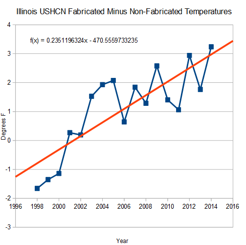
Zeke has been discussing USHCN adjustments and anomalies at Lucia's blog, specifically referring to Steve Goddard's continuing series of posts. SG has continued to get it wrong. Anyway, he bobbed up to point to this post, with the rather extraordinary claim that in Illinois, the adjustments make a difference of 23 °C/century (but only over the last 15 years). Zeke gave his own calc, which is quite different.

The claim is especially dubious because Illinois has a good record with fewer missing than USHCN generally, and his period is the last 15 years, relatively unaffected by adjustment.

So I did my own calc, using the code for the USCHN posts of here and here, but restricted to Illinois, where the 36 station numbers are from 110000 to 120000. I'll show plots below the jump. But this time I have no idea how he is getting it wrong, and he gives no code or detail. Illinois is much like USCHN, and there is little adjustment recently.


Here is SG's plot:


Here is my plot of the corresponding years.

F1-R1 is the correct way of calculating, averaging final-raw where both are known. SG-R1 is SG's method, where the average of all final, including interpolates, are differenced with the average of raw (a different set of stations). The red curve is the difference between green and blue. There is no big trend, as SG has, and the spread is much less.

Here is my plot of final-raw for the whole period. It corresponds to the whole USCHN story here

There is a spike in 2014, as explained earlier, caused by incomplete annual cycle, and some trouble before 1900. Otherwise very similar.

This time I have no idea where he has gone wrong.