I've been adding bits, as foreshadowed, to the latest data page, with another rearrangement. I have added the maintained monthly plotter, and I have used it as a framework for updated back trend plots - ie plots of trend from x-axis date to present, that I've used for the recessional of the Pause. It's here, with more detail at the original posts. There is a button to switch between modes - they use the same updated data. There is also a data button so you can see the original numerical data.
I did a calc of the new ERSSTv4 global average for Bob Tisdale's post, and I'll add that to the maintained set.
I have also included the WebGL maps (updated daily) of daily surface data, currently for days of this year, but I may extend. For recent days, it also shows the global average. I see that for the last week or so, these have been exceptionally warm, which balances cold earlier in the month.
So that's probably it for 2014. A Merry Christmas and Happy New Year to all readers.
Wednesday, December 24, 2014
Tuesday, December 16, 2014
December update on 2014 warmth.
NOAA has posted their report on November 2014 (h/t DK). It shows a global anomaly relative to 1901-2000 of 0.65°C. This is down from October's 0.74°C. TempLS grid was down 0.11°C, which looks like very good agreement, but is something of a break with the recent eerily close tracking.
They may take a few days to update the detailed MLOST file that I normally use (base 1961-90), so, with Christmas coming, I'll use a synthetic value by dropping the Oct value by 0.09°C too, so as to produce the last of the anticipatory posts about record prospects.
I'm following the format of an earlier post, with sequel here. You can click buttons to rotate through datasets (HAD 4, GISS, NOAA, TempLS mesh and grid, and HADSST3). I haven't shown the satellite troposphere indices, because these are nowhere near a record. The plot is cumulative sums of monthly ave relative to 2010, the next highest. I see that NOAA has a similar plot, but with average to date rather than total. This is just a scale difference, becoming small near end year.
Highlights are, first HADSST3, which is way ahead of 2010. In fact, for that, 1998 was higher, at 0.43°C, but that level too should be exceeded. This emphasises that high SST was the driver for 2014.
GISS is less clear; Nov 2014 was cooler while Nov 2010 was warm, so it's prospects receded slightly. Meanwhile, my NCEP/NCAR daily index showed the first week or so in December very cool, but then warmer. So GISS is no certainty. However, Dec 2010 was quite cool. NOAA is well ahead, and while there is no November data for HADCRUT 4, it is also well placed.
The plot is below the jump:
The index will be a record if it ends the year above the axis. Months warmer than the 2010 average make the line head upwards.
Use the buttons to click through.
![]()
They may take a few days to update the detailed MLOST file that I normally use (base 1961-90), so, with Christmas coming, I'll use a synthetic value by dropping the Oct value by 0.09°C too, so as to produce the last of the anticipatory posts about record prospects.
I'm following the format of an earlier post, with sequel here. You can click buttons to rotate through datasets (HAD 4, GISS, NOAA, TempLS mesh and grid, and HADSST3). I haven't shown the satellite troposphere indices, because these are nowhere near a record. The plot is cumulative sums of monthly ave relative to 2010, the next highest. I see that NOAA has a similar plot, but with average to date rather than total. This is just a scale difference, becoming small near end year.
Highlights are, first HADSST3, which is way ahead of 2010. In fact, for that, 1998 was higher, at 0.43°C, but that level too should be exceeded. This emphasises that high SST was the driver for 2014.
GISS is less clear; Nov 2014 was cooler while Nov 2010 was warm, so it's prospects receded slightly. Meanwhile, my NCEP/NCAR daily index showed the first week or so in December very cool, but then warmer. So GISS is no certainty. However, Dec 2010 was quite cool. NOAA is well ahead, and while there is no November data for HADCRUT 4, it is also well placed.
The plot is below the jump:
The index will be a record if it ends the year above the axis. Months warmer than the 2010 average make the line head upwards.
Use the buttons to click through.
Sunday, December 14, 2014
November was cooler - GISS down 0.11°C
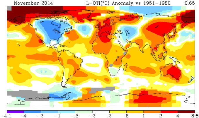
GISS has reported for November 2014, down from 0.76°C to 0.65°C. The title alludes to my post of 4 Dec, which reported a similar drop by TempLS Mesh. That drop has reduced somewhat as more data arrived. I have been following these monthly events with added interest, because it is the first real test of early TempLS mesh predictions (described here), and was foretold by another index I have been calculating (reanalysis NCEP/NCAR). This reports daily, and indicated a considerable cooling in November.
As usual, I have also done a TempLS Grid calc. As explained here, I expect the mesh calc to more closely emulate GISS, while the grid calc should be closer to the NOAA and HADCRUT indices. TempLS grid did show a greater reduction, from 0.631°C to 0.519°C.
When NOAA comes out, I'll post on the likelihood of a record this year. The NCEP/NCAR index has been quite cool in December as well, so a GISS record is in the balance. NOAA and HADCRUT are currently ahead by a greater margin, but TempLS suggests may see a greater reduction.
Details of the GISS map for the month, and comparison with TempLS, are below the jump.
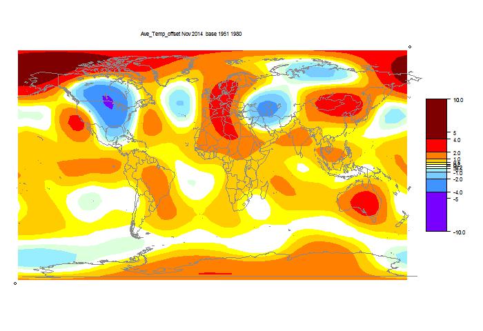
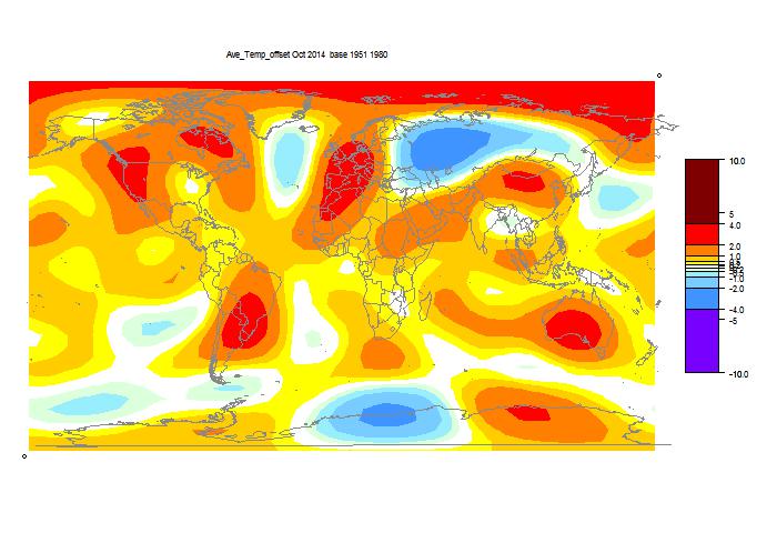
And here, with the same scale and color scheme, is the earlier mesh weighted TempLS map:
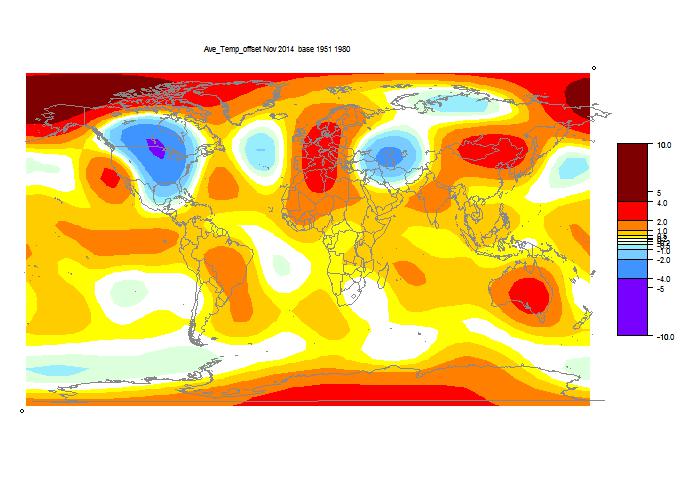
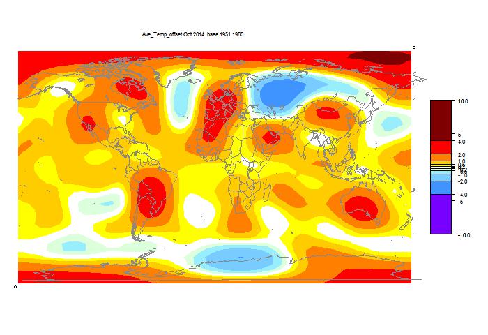
And finally, here is the TempLS grid weighting map:
As usual, I have also done a TempLS Grid calc. As explained here, I expect the mesh calc to more closely emulate GISS, while the grid calc should be closer to the NOAA and HADCRUT indices. TempLS grid did show a greater reduction, from 0.631°C to 0.519°C.
When NOAA comes out, I'll post on the likelihood of a record this year. The NCEP/NCAR index has been quite cool in December as well, so a GISS record is in the balance. NOAA and HADCRUT are currently ahead by a greater margin, but TempLS suggests may see a greater reduction.
Details of the GISS map for the month, and comparison with TempLS, are below the jump.

And here, with the same scale and color scheme, is the earlier mesh weighted TempLS map:

And finally, here is the TempLS grid weighting map:

Thursday, December 4, 2014
November was cooler - latest TempLS
Since I wrote in October about a new scheme for early mesh-based TempLS reporting, I've been looking forward to producing such an early result. Last month didn't work, because GHCN was late. But this month everything is on time. For me, there is added interest, because I developed the daily NCEP/NCAR based index, and it has been suggesting a perhaps unexpected drop in November temperature.
The early TempLS mesh report is now out, and it does show a corresponding drop, from 0.647°C (Oct) to 0.557°C (Nov, base 1961-1990). The Oct value also came back a little, which reduced the difference slightly.
It is indeed a very early report, and will change. 3108 stations, probably about 70% of final. There is essentially no data from Canada, China, Australia, and most of S America and Africa. So it's too early to have much faith in the regional map, but the cold in the US certainly showed up.
Both satellite indices showed small reductions, with RSS going from 0.274°C to 0.246°C, and UAH similar. In terms of a record warm 2014, I think the likelihood is essentially unchanged.
Update 8/12 With most GHCN data now in, TempLS has risen a bit, to 0.579°C. But the NCEP/NCAR measure went the other way. It stayed cold in November, with the average down to 0.106°C, and December (to 4th) has been cold too.
Wednesday, December 3, 2014
Reanalysis revisited
I have been working with climate reanalysis. I found some more resources, mainly through the Univ Maine Climate Change Institute. They have a collection of reanalysis offerings, some of which are just remappings of flat plots on the globe. But they have useful information collections, and also guides. A comprehensive guide page is here. They have a collection of GHCN daily data here, convenient, although not up to date. They have globe maps of daily temperature, as I do here, but again with a considerable lag. And they have a section on monthly reanalysis time series here, which is the focus of this post.
They let you draw graphs of annual data, and plots of each month over years, but frustratingly, not a monthly plot. This may be to avoid including seasonal variation; they are not anomalies. However, they do give tables of the monthly average temperature for various reanalysis methods, to only 1 decimal precision :(. Despite that limitation, it is useful for me, because I had wondered whether the convenience and currentness of the NCEP/NCAR data was undermined by its status as a first generation product. I now think not; the integrated global temperature anomaly is quite similar to more advanced products (MERRA is something of an outlier). More below the fold.
The first thing I wanted to check, since they give NCEP/NCAR v1, is whether they get the same answers as I did by integrating the grids. Again, CCI data only goes to 2012. Here is the plot for the most recent 8 years, set to 1994-2013 anpmaly base (actually to 2012 for the CCI version).
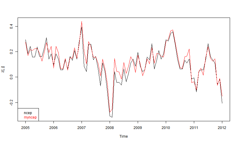
At first I was disappointed that they didn't overlay more closely. Then I remembered their 1 decimal accuracy, and then it seemed quite good agreement. You don't see 0.1 steps, because I've subtracted each month's mean. There may also be discrepancies because my numbers are likely more recent.
So then I plotted 5 reanalyses as shown by CCI. These are the main ones that go to near present (usually some time in 2012). You can read about them in the CCI guide. ERA is ERA-Interim. Ncepdoe is NCEP/DOE.
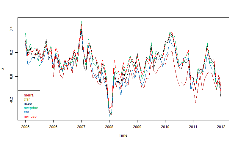
Again. quite good agreement if you allow for the limited precision. Surprising that MERRA, supposed to be one of the best, seems most deviant, even though others like CFSR are also well-regarded. It may of course be that MERRA is right. But anyway. there is nothing in the plot to disqualify NCEP/NCAR.
So I'll stick with it. It seems to be the most current, and I appreciate the 8 Mb download (for daily update). CFSR, for example, seems to come in multi-Tb chunks, which for me would be a multi-year task just to download. Resolution is not an issue for a global average.
They let you draw graphs of annual data, and plots of each month over years, but frustratingly, not a monthly plot. This may be to avoid including seasonal variation; they are not anomalies. However, they do give tables of the monthly average temperature for various reanalysis methods, to only 1 decimal precision :(. Despite that limitation, it is useful for me, because I had wondered whether the convenience and currentness of the NCEP/NCAR data was undermined by its status as a first generation product. I now think not; the integrated global temperature anomaly is quite similar to more advanced products (MERRA is something of an outlier). More below the fold.
The first thing I wanted to check, since they give NCEP/NCAR v1, is whether they get the same answers as I did by integrating the grids. Again, CCI data only goes to 2012. Here is the plot for the most recent 8 years, set to 1994-2013 anpmaly base (actually to 2012 for the CCI version).

At first I was disappointed that they didn't overlay more closely. Then I remembered their 1 decimal accuracy, and then it seemed quite good agreement. You don't see 0.1 steps, because I've subtracted each month's mean. There may also be discrepancies because my numbers are likely more recent.
So then I plotted 5 reanalyses as shown by CCI. These are the main ones that go to near present (usually some time in 2012). You can read about them in the CCI guide. ERA is ERA-Interim. Ncepdoe is NCEP/DOE.

Again. quite good agreement if you allow for the limited precision. Surprising that MERRA, supposed to be one of the best, seems most deviant, even though others like CFSR are also well-regarded. It may of course be that MERRA is right. But anyway. there is nothing in the plot to disqualify NCEP/NCAR.
So I'll stick with it. It seems to be the most current, and I appreciate the 8 Mb download (for daily update). CFSR, for example, seems to come in multi-Tb chunks, which for me would be a multi-year task just to download. Resolution is not an issue for a global average.
Monday, December 1, 2014
Maintained monthly active temperature plotter
This post follows on from a thought by commenter JCH. On the latest data page, I maintain an active graph of six recent temperature indices, set to a common anomaly base 1981-2010. But I actually maintain a file of about fifteen. JCH mentioned a difficulty of now getting recent data for HADCRUT, for example. So I thought I should add some user facilities to that active graph to make use of this data.
I tried dynamic plotting once previously with annual data - it is the climate plotter page. It hasn't been much used, and I think I may have tried to cram too much into a small space. So I've been experimenting with different systems. I've learnt more about Javascript since then.
So the first addition is a panel for choosing which datasets to show. It has a floating legend, with buttons for changing color, asking for regression (OLS), or smoothing (12-month boxcar). If you ask for regression, a similar panel pops up with again color, and start and end time text boxes. Initially it sets these to the visible screen, but you can type in other times. If you press on any color button, another panel pops up with color choices. The OLS trend in °C/Century for the stated interval, is in the red-lined box.
The original plot worked by mouse dragging. If you drag in the main space, the plot follows. But if you drag below or left of the axes, it stretches/shrinks along that axis. I've kept that, but added an alternative.
There is a faint line at about 45° from the origin. If you move the mouse in that region, you'll see faint numbers at each end of the x-axis. These are tentative years. If you click with Shift pressed, the plot adapts so that those become the endpoints. The scheme is similar to the triangle of the trend viewer, but backwards. Near the origin, you get short intervals in recent time; the scale of mouse move gives better resolution here. Move along the x-axis makes the start recede; along the diagonal, both recede keeping the interval short. In the upper triangle, it's similar with the y-limits. It's easier to try than to read.
The Redraw button is hardly needed, because there is much automatic redraw. The Regress button forces a recalc when you've manually edited the text boxes for intervals. Each pop-up window has an exit button; the Legend button is the way to bring it back (it toggles). Each pop-up is draggable (gently).
More on regression - you can at any stage amend the textboxes with dates, and then click either the regress button (main table) or the red-bordered cell containing the regression trend in C/Cen to get a new plot with the specified period. By default the period will be set to the visible screen, which may include months in the future (but trend will be calculated over actual data). Trend lines will be shown.
So here it is below the fold. It's still experimental, and feedback welcomed. When stable, I'll embed it in the page.
Sunday, November 30, 2014
Cooler November?
The main purpose of this post is to note that the daily NCEP data is now regularly updated here. As with TempLS mesh, there is a kind of Moyhu effect whereby when I set up a system like this and want to tell everyone about it, there is a hiatus in the data source. This time I think it is just Thanksgiving.
Anyway, the global story it tells is that there was a cool dip around Nov 13, at the height of the N America freeze, and a second a few days later. Currently (to Nov 24) the average anomaly for Nov is 0.157°C, compared with 0.281°C in October. I think this will pan out to November being about 0.1°C cooler than October in the surface temperature indices.
What does this mean for talk of a surface record 2014? I think it is neutral. To reach a record, month temperatures have to exceed on average the 2010 average, and it looks like November will be close to that number. For example, GISS Oct was 0.76; 2010 average 0.66. This may matter for GISS, which was only just above the average anyway to date. NOAA and HADCRUT have a greater margin.
Update: Three more days data arrived, and still cool. The month average is now down to 0.135°C, a drop of about 0.15 from October. That is negative for GISS record prospects.
Tuesday, November 25, 2014
Daily reanalysis NCEP/NCAR temperatures with WebGL.
In a previous post I described how a global index could be created simply by integrating the surface temperature data provided by NCEP/NCAR. This data is to within last few days, and I've described here how numerical data is maintained on the latest data page.
As gridded data, I then sought to display the daily temperature anomalies (base 1994-2013) with WebGL, and that is shown here. I'm also planning to maintain this, on the latest data page if it does not drag out loading. Currently the daily data is just for 2014, although that is easily extended.
So it's below the fold. As usual, the Earth is a trackball that you can drag, zoom (right mouse) and orient (button). I'm trying a new way of choosing dates. High on right there is a tableau of small squares, each representing one day. Click on this to choose. It's all a bit small, but to the left of the Orient button, you'll see printed the date your mouse is on. So just move until the right day shows, and click.
Because temperature ranges are large, it has been quite hard to get the colors right. You might like to look at the recent North American cold spell for shades of blue. Incidentally, I see that the global average has slipped again, so November looks like a much cooler month than recently.
Monday, November 24, 2014
Updates to latest data page
Blogger tells me that of the Moyhu pages, latest data is the most viewed. I'll be adding to it, so I thought I should improve the organization, and also the load time. I've also added my version of the reanalysis index for recent days and months.
It now has a table of contents and links. Tables are in frames with an "Enlarge" toggle button. I'm planning to add webGL plots (next post) for NCEP/NCAR (and maybe MERRA if I can get Carrick's ideas working) daily data. Again I have to not overburden download times.
It now has a table of contents and links. Tables are in frames with an "Enlarge" toggle button. I'm planning to add webGL plots (next post) for NCEP/NCAR (and maybe MERRA if I can get Carrick's ideas working) daily data. Again I have to not overburden download times.
Saturday, November 22, 2014
Update on 2014 warmth.
A month ago I posted plots to see whether some global indoces might show record warmth in 2014. The troposphere indices UAH and RSS are not in record territory. But others are. NOAA has just come out with an increased value for October, so a record there is very likely. The indices here all improved their prospects in October. HADCRUT is still to come.
In the previous post, I noted that the reanalysis data for November showed a considerable dip mid-month, corresponding to the North America freeze. November will probably be cooler than October - my guess is more like August.
Plots are below, showing the cumulative of the difference between month ave and 2010 annual average, divided by 12 (so final will be the difference in annual averages). NOAA and HADCRUT look very likely to reach a record, and also the TempLS indices. Cumulatively GISS is currently just above the 2010 average, but warm months are keeping the slope positive.
Update - just something I noticed. About 3 months ago I commented how closely NOAA and TempLS were tracking. TempLS has since produced a new version, mesh-based, which tracks GISS quite closely. But the relation between old TempLS, now called TempLS grid, and NOAA is still remarkably close. Last month, both rose by 0.042°C. The previous month, small rises - TLS by 0.012 and NOAA by 0.014.
This time I'll just give the active plot with the 2010 average subtracted. There is an explanatory plot in the earlier post. The index will be a record if it ends the year above the axis. Months warmer than the 2010 average make the line head upwards.
Use the buttons to click through.
![]()
In the previous post, I noted that the reanalysis data for November showed a considerable dip mid-month, corresponding to the North America freeze. November will probably be cooler than October - my guess is more like August.
Plots are below, showing the cumulative of the difference between month ave and 2010 annual average, divided by 12 (so final will be the difference in annual averages). NOAA and HADCRUT look very likely to reach a record, and also the TempLS indices. Cumulatively GISS is currently just above the 2010 average, but warm months are keeping the slope positive.
Update - just something I noticed. About 3 months ago I commented how closely NOAA and TempLS were tracking. TempLS has since produced a new version, mesh-based, which tracks GISS quite closely. But the relation between old TempLS, now called TempLS grid, and NOAA is still remarkably close. Last month, both rose by 0.042°C. The previous month, small rises - TLS by 0.012 and NOAA by 0.014.
This time I'll just give the active plot with the 2010 average subtracted. There is an explanatory plot in the earlier post. The index will be a record if it ends the year above the axis. Months warmer than the 2010 average make the line head upwards.
Use the buttons to click through.
Tuesday, November 18, 2014
A "new" surface temperature index (reanalysis).
I've been looking at reanalysis data sets. These provide a whole atmosphere picture of recent decades of weather. They work on a grid like those of numerical weather prediction programs, or also GCM's. They do physical modelling which "assimilates" data from a variety of sources. They typically produce a 200 km horizontal grid of six-hourly data (maybe hourly if you want) at a variety of levels, including surface.
Some are kept up to date, within a few days, and it is this aspect that interests me. They are easily integrated over space (regular grid, no missing data). I do so with some nervousness, because I don't know why the originating organizations like NCAR don't push this capability. Maybe there is a reason.
It's true that I don't expect an index which will be better than the existing. The reason is their indirectness. They are computing a huge amount of variables over whole atmosphere, using a lot of data, but even so it may be stretched thin. And of course, they don't directly get surface temperature, but the average in the top 100m or so. There are surface effects that they can miss. I noted a warning that Arctic reanalysis, for example, does not deal well with inversions. Still, they are closer to surface than UAH or RSS-MSU.
But the recentness and resolution is a big attraction. I envisage daily averages during each month, and WebGL plots of the daily data. I've been watching the recent Arctic blast in the US, for example.
So I've analysed about 20 years of output (NCEP/NCAR) as an index. The data gets less reliable as you go back. Some goes back to the start of space data; some to about 1950. But for basically current work, I just need a long enough average to compute anomalies.
So I'll show plots comparing this new index with the others over months and years. It looks good. Then I'll show some current data. In a coming post, I'll post the surface shaded plots. And I'll probably automate and add it to the current data page.
Update: It's on the data page here, along with daily WebGL plots.
I've been fosussing on NCEP/NCAR because
There are two surface temperature datasets, in similar layout:
SFC seems slightly more currently updated, but is an older set. I saw a file labelled long term averages, which is just what I want, and found that it ended in 1995. Then I found that the reason was that it was made for a 1996 paper. It seems that reanalysis data sets can hybridize technologies of different eras. SFC goes back to 1979. I downloaded it, but found the earlier years patchy.
Then I tried sig995. That's a reference to the pressure level (I think), but it's also labelled surface. It goes back to 1948, and seems to be generally more recent. So that is the one I'm describing here.
Both sets are on a 2.5° grid (144x73) and offer daily averages. Of course, for the whole globe at daily resolution, it's not that easy to define which day you mean. There will be a cut somewhere. Anywhere, I'm just following their definition. sig995 has switched to NETCDF4; I use the R package ncdf4 to unpack. I integrate with cosine weighting. It's not simple cosine; the nodes are not the centers of the grid cells. In effect, I use cos latitude with trapezoidal integration.
Here is an interactive user-scalable graph. You can drag it with the mouse horizontally or vertically. If you drag up-down to the left of the vertical axis, you will change the vertical scaling (zoom). Likewise below the horizontal axis. So you can see how NCEP fares over the whole period.
The mean for the first 13 days of November was 0.173°C. That's down a lot on October, which was 0.281°C. I think the reason is the recent North American freeze, which was at its height on 13th. You can see the effect in the daily temperatures:
Anyway, we'll see what coming days bring.
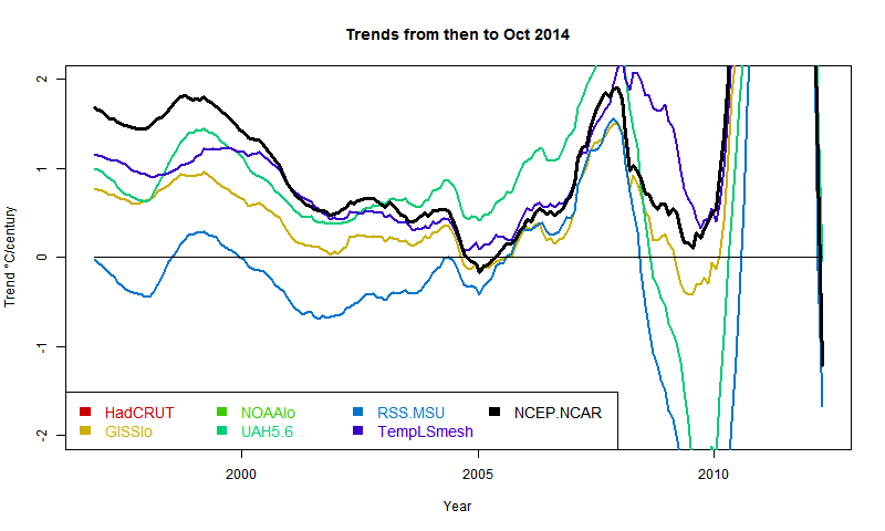
Update (following a comment of MMM). Below is a graph showing trends in the style of these posts - ie trend from the x-axis date to present, for various indices. I'll produce another post (this graph is mostly it) in the series when the NOAA result comes out. About the only "pause" dataset now, apart from MSU-RSS, is a brief dip by GISS in 2005. And now, also, NCEP/NCAR. However, the main thing for this post is that NCEP-NCAR drifts away in the positive direction pre 2000. This could be that it captures Arctic warming better, or just that trends are not reliable as you go back.
Some are kept up to date, within a few days, and it is this aspect that interests me. They are easily integrated over space (regular grid, no missing data). I do so with some nervousness, because I don't know why the originating organizations like NCAR don't push this capability. Maybe there is a reason.
It's true that I don't expect an index which will be better than the existing. The reason is their indirectness. They are computing a huge amount of variables over whole atmosphere, using a lot of data, but even so it may be stretched thin. And of course, they don't directly get surface temperature, but the average in the top 100m or so. There are surface effects that they can miss. I noted a warning that Arctic reanalysis, for example, does not deal well with inversions. Still, they are closer to surface than UAH or RSS-MSU.
But the recentness and resolution is a big attraction. I envisage daily averages during each month, and WebGL plots of the daily data. I've been watching the recent Arctic blast in the US, for example.
So I've analysed about 20 years of output (NCEP/NCAR) as an index. The data gets less reliable as you go back. Some goes back to the start of space data; some to about 1950. But for basically current work, I just need a long enough average to compute anomalies.
So I'll show plots comparing this new index with the others over months and years. It looks good. Then I'll show some current data. In a coming post, I'll post the surface shaded plots. And I'll probably automate and add it to the current data page.
Update: It's on the data page here, along with daily WebGL plots.
More on reanalysis
Reanalysis projects flourished in the 1990's. They are basically an outgrowth of numerical weather forecasting, and the chief suppliers are NOAA/NCEP/NCAR and ECMWF. There is a good overview site here. There is a survey paper here (free) and a more recent one (NCEP CFS) here.I've been fosussing on NCEP/NCAR because
- They are kept up to date
- They are freely available as ftp downloadable files
- I can download surface temperature without associated variables
- It's in NCDF format
There are two surface temperature datasets, in similar layout:
SFC seems slightly more currently updated, but is an older set. I saw a file labelled long term averages, which is just what I want, and found that it ended in 1995. Then I found that the reason was that it was made for a 1996 paper. It seems that reanalysis data sets can hybridize technologies of different eras. SFC goes back to 1979. I downloaded it, but found the earlier years patchy.
Then I tried sig995. That's a reference to the pressure level (I think), but it's also labelled surface. It goes back to 1948, and seems to be generally more recent. So that is the one I'm describing here.
Both sets are on a 2.5° grid (144x73) and offer daily averages. Of course, for the whole globe at daily resolution, it's not that easy to define which day you mean. There will be a cut somewhere. Anywhere, I'm just following their definition. sig995 has switched to NETCDF4; I use the R package ncdf4 to unpack. I integrate with cosine weighting. It's not simple cosine; the nodes are not the centers of the grid cells. In effect, I use cos latitude with trapezoidal integration.
Results
So here are the plots of the monthly data, shown in the style of the latest data page with common anomaly base 1981-2010. The NCEP index is in black. I'm using 1994-2013 as the anomaly base for NCEP, so I have to match it to the average of the other data (not zero) in this period. You'll see that it runs a bit warmer - I wouldn't make too much of that.NCEP/NCAR with major temperature indices - last 5 months  |
NCEP/NCAR with major temperature indices - last 4 years 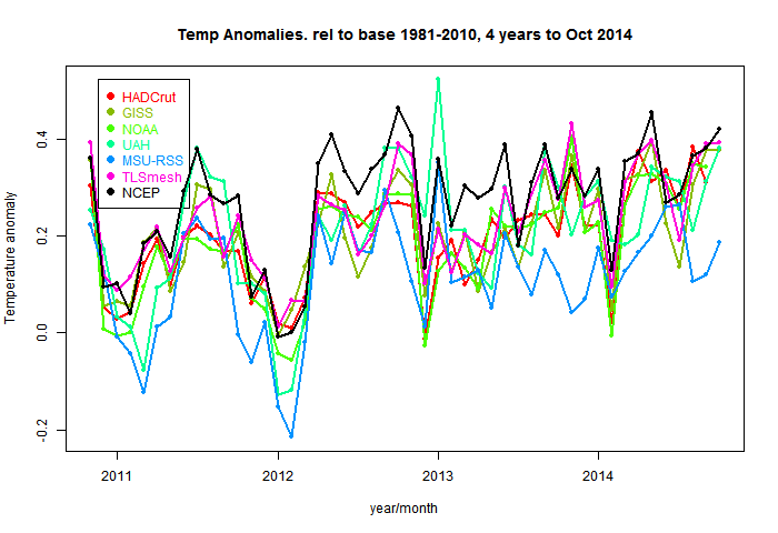 |
Here is an interactive user-scalable graph. You can drag it with the mouse horizontally or vertically. If you drag up-down to the left of the vertical axis, you will change the vertical scaling (zoom). Likewise below the horizontal axis. So you can see how NCEP fares over the whole period.
Recent months and days
Here is a table of months. This is now in the native anomaly bases. NCEP/NCAR looks low because it's base is recent, even hiatic.The mean for the first 13 days of November was 0.173°C. That's down a lot on October, which was 0.281°C. I think the reason is the recent North American freeze, which was at its height on 13th. You can see the effect in the daily temperatures:
| Date | Anomaly |
| 1 | 0.296 |
| 2 | 0.25 |
| 3 | 0.259 |
| 4 | 0.287 |
| 5 | 0.229 |
| 6 | 0.214 |
| 7 | 0.202 |
| 8 | 0.165 |
| 9 | 0.135 |
| 10 | 0.154 |
| 11 | 0.091 |
| 12 | 0.018 |
| 13 | -0.049 |
| 14 | 0.049 |
| 15 | 0.147 |
Anyway, we'll see what coming days bring.
Update (following a comment of MMM). Below is a graph showing trends in the style of these posts - ie trend from the x-axis date to present, for various indices. I'll produce another post (this graph is mostly it) in the series when the NOAA result comes out. About the only "pause" dataset now, apart from MSU-RSS, is a brief dip by GISS in 2005. And now, also, NCEP/NCAR. However, the main thing for this post is that NCEP-NCAR drifts away in the positive direction pre 2000. This could be that it captures Arctic warming better, or just that trends are not reliable as you go back.

Sunday, November 16, 2014
October GISS unchanged, still high
GISS has posted its October estimate for global temperature anomaly. It was 0.76°C, the same as the revised September (had been 0.77°C). TempLS mesh was also almost exactly the same (0.664°C). TempLS grid, which I expect to behave more like HADCRUT and NOAA, rose from 0.592°C to 0.634°C.
The comparison maps are below the jump.
Here is the GISS map:
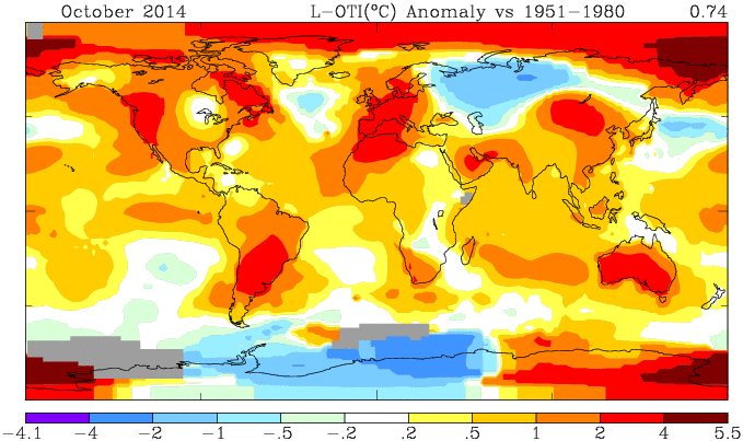
And here, with the same scale and color scheme, is the earlier mesh weighted TempLS map:
And finally, here is the TempLS grid weighting map:
List of earlier monthly reports
More data and plots
The comparison maps are below the jump.
Here is the GISS map:

And here, with the same scale and color scheme, is the earlier mesh weighted TempLS map:

And finally, here is the TempLS grid weighting map:

List of earlier monthly reports
More data and plots
Saturday, November 15, 2014
Lingering the pause
As I predicted, the Pause, as measured by periods of zero or less trend in anomaly global temperature, is fading. And some, who were fond of it, have noticed. In threads at Lucia's, and at WUWT, for example.
Now I don't think there's any magic in a zero trend, and there's plenty of room to argue that trends are still smaller than expected. Lucia wants to test against predictions, which makes sense. But I suspect many pause fans prefer their numbers black and white, and we'll hear more about periods of trend not significantly different from zero. So the pause lingers.
We already have. A while ago, when someone objected at WUWT to Lord M using exclusively the RSS record of long negative trend, Willis responded
"Sedron, the UAH record shows no trend since August 1994, a total of 18 years 9 months."
When I and Sedron protested that the UAH trend over that time was 1.38°C/century, he said:
"I assumed you knew that everyone was talking about statistically significant trends, so I didn’t mention that part."
And that is part of the point. A trend can fail a significance test (re 0) and still be quite large. Even quite close to what was predicted. I posted on this here.
I think we'll hear more of some special candidates, and the reason is partly that the significance test allows for autocorrelation. Some data sets have more of that than others. SST has a lot, and I saw HADSST3 mentioned in this WUWT thread. So below the fold, I'll give a table of the various datasets, and the Quenouille factor that adjusts for autocorrelation. UAH and the SSTs do stand out.
Here is a table of cases you may hear cited (SS=statistically significant re 0):
These trends are not huge, but far from zero.
So here is the analysis of autocorrelation. If r is the lag-1 autocorrrelation, used in an AR1 Arima model, then the Quenouille adjustment for autocorrelation reduces the number of degrees of freedom by Q=(1-r)/(1+r). Essentially, the variance is inflated by 1/Q. Put another way, since initially d.o.f. is number of months, all other things being equal, the period without statistical significance is inflated by 1/Q.
So here, for various datasets and recent periods, is a table of Q, calculated from r=ar1 coefficient from the R arima() function:
Broadly, SST has low Q, land fairly high, and Land/Ocean measures, made up of land and SST, are the expected hybrid. The troposphere measures, especially UAH, have lower Q, and so longer periods without statistically significant non-zero trend.
Now I don't think there's any magic in a zero trend, and there's plenty of room to argue that trends are still smaller than expected. Lucia wants to test against predictions, which makes sense. But I suspect many pause fans prefer their numbers black and white, and we'll hear more about periods of trend not significantly different from zero. So the pause lingers.
We already have. A while ago, when someone objected at WUWT to Lord M using exclusively the RSS record of long negative trend, Willis responded
"Sedron, the UAH record shows no trend since August 1994, a total of 18 years 9 months."
When I and Sedron protested that the UAH trend over that time was 1.38°C/century, he said:
"I assumed you knew that everyone was talking about statistically significant trends, so I didn’t mention that part."
And that is part of the point. A trend can fail a significance test (re 0) and still be quite large. Even quite close to what was predicted. I posted on this here.
I think we'll hear more of some special candidates, and the reason is partly that the significance test allows for autocorrelation. Some data sets have more of that than others. SST has a lot, and I saw HADSST3 mentioned in this WUWT thread. So below the fold, I'll give a table of the various datasets, and the Quenouille factor that adjusts for autocorrelation. UAH and the SSTs do stand out.
Here is a table of cases you may hear cited (SS=statistically significant re 0):
| Dataset | No SS trend since... | Period | Actual trend in that time |
| UAH | June 1996 | 18 yrs 4 mths | 1.080°C/Century |
| HADCRUT 4 | June 1997 | 17 yrs 3 mths | 0.912°C/century |
| HADSST3 | Jan 1995 | 19 yrs 9 mths | 0.921°C/Century |
These trends are not huge, but far from zero.
So here is the analysis of autocorrelation. If r is the lag-1 autocorrrelation, used in an AR1 Arima model, then the Quenouille adjustment for autocorrelation reduces the number of degrees of freedom by Q=(1-r)/(1+r). Essentially, the variance is inflated by 1/Q. Put another way, since initially d.o.f. is number of months, all other things being equal, the period without statistical significance is inflated by 1/Q.
So here, for various datasets and recent periods, is a table of Q, calculated from r=ar1 coefficient from the R arima() function:
| Dataset | 1990-2013 | 1995-2013 | 2000-2013 | 2005-2013 |
| HadCRUT 4 | 0.1078 | 0.1711 | 0.269 | 0.3092 |
| GISS Land/Ocean | 0.1378 | 0.2155 | 0.2907 | 0.3244 |
| NOAA Land/Ocean | 0.121 | 0.1949 | 0.3186 | 0.3396 |
| UAH5.6 | 0.0789 | 0.1132 | 0.1538 | 0.1837 |
| RSS.MSU | 0.0978 | 0.142 | 0.2 | 0.1814 |
| TempLS grid | 0.1349 | 0.1959 | 0.3298 | 0.3748 |
| BEST Land/Ocean | 0.1201 | 0.1799 | 0.2326 | 0.3081 |
| Cowtan/Way krig | 0.1032 | 0.1642 | 0.2215 | 0.2939 |
| TempLS mesh | 0.1266 | 0.1862 | 0.2698 | 0.3165 |
| BEST Land | 0.2923 | 0.3953 | 0.4608 | 0.4835 |
| GISS.Ts | 0.1465 | 0.2351 | 0.342 | 0.3978 |
| CRUTEM Land | 0.2041 | 0.31 | 0.4614 | 0.5105 |
| NOAA Land | 0.3451 | 0.4795 | 0.6438 | 0.6319 |
| HADSST3 | 0.036 | 0.0504 | 0.0736 | 0.0888 |
| NOAA SST | 0.0178 | 0.0251 | 0.0387 | 0.0514 |
Broadly, SST has low Q, land fairly high, and Land/Ocean measures, made up of land and SST, are the expected hybrid. The troposphere measures, especially UAH, have lower Q, and so longer periods without statistically significant non-zero trend.
Wednesday, November 12, 2014
Seasonal insolation
This post was started by some recent posting at WUWT. It's about the expected thermal effect of the Earth's eccentric orbit. It produces a variable total solar insolation for the planet, which one might expect to be reflected in temperatures. A few days ago, Willis contrasted the small solar cycle fluctuation which this much larger oscillation, suggesting that if we couldn't detect the orbital effect then the solar cycle couldn't be much. And just now, Stan Robertson at WUWT took up the idea, looking for the eccentricity in annual global anomaly indices.
I've also wondered the effect of eccentricity. But when you think about anomalies, it is clear that they subtract out any annual cycle. So the effect can't be found there. And in fact it's going to be hard to disentangle it from axis tilt effect. A GCM could of course run alternatively with a circular orbit, which would determine it.
Anyway, someone posted a plot of average daily insolation against time of year and latitude. That is, at TOA, or for an airless Earth. I was surprised that the maximum for the year was at the solstice at the relevant Pole. I found a good plot and the relevant maths in Wikipedia. So I'll show that below the jump, with a brief version of the math, and a plot of variation with latitude at the solstice. It isn't even monotonic.
So here is the plot, with caption also from Wiki.

 , the theoretical daily-average insolation at the top of the atmosphere, where θ is the polar angle of the Earth's orbit, and θ = 0 at the vernal equinox, and θ = 90° at the summer solstice; φ is the latitude of the Earth. The calculation assumed conditions appropriate for 2000 A.D.: a solar constant of S0 = 1367 W m−2, obliquity of ε = 23.4398°, longitude of perihelion of ϖ = 282.895°, eccentricity e = 0.016704. Contour labels (green) are in units of W m−2.
y axis is latitude, x axis is angle of orbit, starting at the March equinox. You can see the effect of orbit eccentricity in making the S pole warmer. That pole also shows clearly the non-monoticity; there is a pinch near the Antarctic circle.
So here is the Wiki math, using the above notation:
Solve

for ho
Solve

for δ
But here I find a vary rare math error in Wiki. The last term should not have an ω. So I removed it.
Now substituting

in

we have the solution.
I used this to plot the solstice curves:
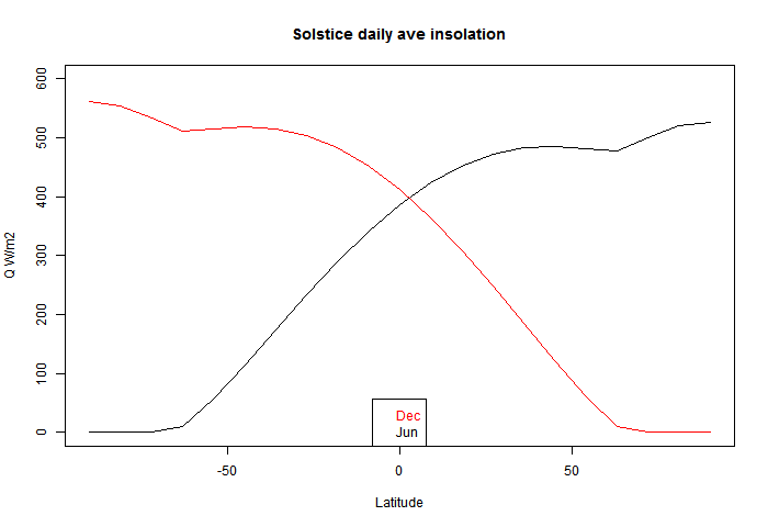
You can see that there is a discontinuity of (2nd - see PP in comments) derivative at the polar circles, where one goes into night, and the other gets the benefit of 24 hr insolation, which is enough to exceed even average daily tropical insolation (of course, without atmospheric losses).
I've also wondered the effect of eccentricity. But when you think about anomalies, it is clear that they subtract out any annual cycle. So the effect can't be found there. And in fact it's going to be hard to disentangle it from axis tilt effect. A GCM could of course run alternatively with a circular orbit, which would determine it.
Anyway, someone posted a plot of average daily insolation against time of year and latitude. That is, at TOA, or for an airless Earth. I was surprised that the maximum for the year was at the solstice at the relevant Pole. I found a good plot and the relevant maths in Wikipedia. So I'll show that below the jump, with a brief version of the math, and a plot of variation with latitude at the solstice. It isn't even monotonic.
So here is the plot, with caption also from Wiki.

 , the theoretical daily-average insolation at the top of the atmosphere, where θ is the polar angle of the Earth's orbit, and θ = 0 at the vernal equinox, and θ = 90° at the summer solstice; φ is the latitude of the Earth. The calculation assumed conditions appropriate for 2000 A.D.: a solar constant of S0 = 1367 W m−2, obliquity of ε = 23.4398°, longitude of perihelion of ϖ = 282.895°, eccentricity e = 0.016704. Contour labels (green) are in units of W m−2.
y axis is latitude, x axis is angle of orbit, starting at the March equinox. You can see the effect of orbit eccentricity in making the S pole warmer. That pole also shows clearly the non-monoticity; there is a pinch near the Antarctic circle.
So here is the Wiki math, using the above notation:
Solve

for ho
Solve

for δ
But here I find a vary rare math error in Wiki. The last term should not have an ω. So I removed it.
Now substituting

in

we have the solution.
I used this to plot the solstice curves:

You can see that there is a discontinuity of (2nd - see PP in comments) derivative at the polar circles, where one goes into night, and the other gets the benefit of 24 hr insolation, which is enough to exceed even average daily tropical insolation (of course, without atmospheric losses).
Monday, November 10, 2014
Update on GHCN and TempLS early reporting
About a month ago, I posted on a proposed new scheme for reporting monthly averages with a mesh version of TempLS. The idea was to report continuously as data (land source GCHN) came in. I wondered how reliable the very early estimates might be. I was quite optimistic.
So, wouldn't you know, November is the first month in my experience when GHCN didn't keep to their regular schedule. Normally there are daily updates from month start, with the largest in the first day or two. But this month, nothing at all until the 8th. Sure enough, my program faithfully produced an average (0.589°C) based on SST alone; it's been told now not to do that again.
Anyway, the data has arrived, and is up on the latest data page. October (with GHCN) was 0.664°C; almost exactly the same as September, which was pretty warm. For once, there was little cold in N America, and W Europe was warm. The main cold spot was Russia/Kazakhstan.
Saturday, November 8, 2014
GCM's are models
I'd like to bring together some things I expound from time to time about GCM's and predictions. It's a response to why didn't GCMs predict the pause? Or why can't they get the temperature right in Alice Springs?
GCM's are actually models. Suppose you were designing the Titanic. You might make a scale model, which, with suitably scaled dimensions (Reynolds number etc) could be a good model indeed. It would respond to various forcings (propellor thrust, wind, wave motion) just like the real boat. You would test it with various scenarios. Hurricanes, maybe listing, maybe even icebergs. It can tell you many useful things. But it won't tell you whether the Titanic will hit an iceberg. It just doesn't have that sort of information.
So it is with GCM's. They too will tell you how the Earth's climate will respond to forcings. You can subject them to scenarios. But they won't predict weather. They aren't initialized to do that. And, famously, weather is chaotic. You can't actually predict it for very long from initial conditions. If models are doing their job, they will be chaotic too. You can't use them to solve an initial value problem.
Friday, November 7, 2014
Climate blog index again
About a year ago, I described a Javascript exercise I began mid-2013, when Google Reader discontinued. I thought I might write my own RSS reader, with indexing capability. I found that feedly was a good replacement for Reader, so that didn't continue. However, I thought a more limited RSS index of climate blogs would be handy. A big motivation was just to have an index of my own comments (to avoid boring the public with repetition).
So I set up a page, and set my computer to reading the RSS outputs every hour. The good news is that that has happened more or less continuously. The bad news was that junk accumulated, and downloading was slow.
So I've done two new main things:
As with my blogroll, I've included blogs with broad readership; not necessarily the ones I recommend.
Here are some examples of selections:
Stoat, last two months (two months takes a few seconds to load)
My comments at WUWT, last two months
Posts by Bob Tisdale at WUWT in November
So I set up a page, and set my computer to reading the RSS outputs every hour. The good news is that that has happened more or less continuously. The bad news was that junk accumulated, and downloading was slow.
So I've done two new main things:
- Pruned the initial download. I had already reduced the initial offerring to just two days of comments. But I still downloaded details of all threads and commenters. More than half the commenters listed had only ever made one comment. They include of course various spammers, and typos. So I removed them, unless their comment was in the last month. I also divided the threads into current and dormant (no activity in two months). Current are downloaded at start; dormant can be added (button), or will come automatically if data more than two months ago is requested. It's faster, if not fast.
- I've added a facility where a string is shown that you can add to the URL to get it to go to the current state. That includes selected index items (commenter etc) and months. The main idea is that you can store a URL which will go straight to a list of your own comments over some period (remembering that each month takes a while to download). Examples below.
As with my blogroll, I've included blogs with broad readership; not necessarily the ones I recommend.
Here are some examples of selections:
Stoat, last two months (two months takes a few seconds to load)
My comments at WUWT, last two months
Posts by Bob Tisdale at WUWT in November
Wednesday, October 29, 2014
Calculating the environmental lapse rate
I have posted over the years on the mechanisms of the lapse rate - the vertical temperature gradient in the atmosphere. It started with one of my first posts on what if there were no GHE. My basic contention has been that lapse rates are a consequence of vertical air motions in a gravity field. Wind tends to drive the gradient toward the DALR - dry adiabatic lapse rate = -9.8 °K/km. Maintaining the gradient takes kinetic energy from the wind to operate a heat pump. The pump forces heat down, to make up for the flux transported up by the gradient. The pump effect is proportional to the difference between the actual lapse rate La and the DALR L. L is the stability limit, and a steeper gradient will convert the pump into an engine, with convective instability. This also pushes La (down) toward L.
I developed these ideas in posts here, here and here. But I have wondered about the role of infrared radiation (with GHGs), and why the actual gradient is usually below the DALR. The latter is often attributed to latent heat of water, and called the moist ALR. But that is only effective if there is actual phase change (usually condensation).
I now see how it works. The heat pump reduces entropy, proportionally to the energy it takes from the wind. The entropy can indeed be related to the gradient and the effective thermal conductivity; the largest component of that is a radiative mechanism. So the lapse rate rises to the maximum level that the wind energy can sustain, given the conductive leakage.
I'll write a simplified argument first. Consider a parcel of dry air, mass m, which rises vertically dist dz for a time, at ambient pressure P=Pa, starting at ambient temperature T=Ta. The motion is adiabatic, but it then comes to rest and exchanged heat with ambient.
The temperature inside the parcel drops at the same rate as the DALR, so the difference : d(T-Ta)/dz = -(L-La)
The density difference is proportional to this
d(ρ-ρa)/dz = -(L-La)*ρ/T
I'm ignoring second order terms in dz.
The net (negative) bouyancy force is
F = V g (ρ-ρa)
dF/dz = -V g (L-La)*ρ/T
The work done against bouyancy (power) is ? F dz = 1/2 V g (L-La)*ρ/T dz2
Note that this is independent of sign of z; the same work is done ascending as descending.
Because the temperature on arrival is different to ambient, heat has been transported. I could work out the flux, but it isn't very useful for macroscopic work. The reason is that not only is it signed, but separate motions convey heat over different segments, and there is no easy way of adding up. Instead, an appropriate scalar to compute is the entropy removed. Heat pumps do reduce entropy; that's why they require energy. Of course, entropy is created in providing that energy.
The simplest way to calculate entropy reduction is to note that the Helmholtz Free Energy U - TS (U=internal energy) is unchanged, because the motion is adiabatic. This means T dS and P dV (pressure volume work) are balanced. And P dV is from the buoyancy work. So:
T dS = -1/2 m g (L-La)*ρ/T dz2
where S is entropy
Assume there is a distribution of vertical velocity components v in a slice height dz. I can then re-express the work done as a power per unit volume: F v = 1/2 v.dx' g (L-La)*ρ/T
In Latex I'd use hats to indicate averages.
I've left in a dx' which was the old distance of rise, which determines the average temperature discrepancy between parcel and ambient. It's not obvious what it should now be. But I think the best estimate for now is the Prandtl mixing length. This is related to the turbulent viscosity, and in turn to the turbulent kinetic energy (per unit volume) TKE.
So now it gets a bit more handwavy, but the formula becomes
Average power/vol (taken from wind) ~ -g (L-La)/T * TKE
This follows through to the rate of entropy removal, which is
rate of entropy ~ -g (L-La)/T2 * TKE
(power divided by T)
Q = -k dT/dz
where k is a conductivity,
then the volume rate of creation of entropy is
dS/dt = -Q d(1/T) = -Q/T2dT/dz
= k La T-2
So what is k?. Molecular conductivity would contribute, but where GHG's are present the main part is infrared, which is transferred from warmer regions to cooler by absorption and re-emission. In the limit of high opacity, this follows a Fourier law in the Rosseland approximation
flux = 16 s G n2 T3 dT/dz
s Boltzmann's constant, G an optical parameter (see link), n refractive index. Three optical depths is often used as a rule of thumb for high opacity; we don't have that, but you can extend down by using fuzzy boundaries, where for eample there is a sink region where there is transmission direct to space.
Update: I forgot to say the main thing about G which is relevant here, which is that it is inversely proportional to absorptivity (with an offset). IOW, more GHG means less conductivity.
Update
I've made an error here. I assumed that the flow expansion was adiabatic. This is conventional, and relates to the time scale of the motion. But I've also assumed adiabatic for the entropy balance, and that is wrong. There is a through flux of energy, mainly as IR, as indicated. And that flux carries entropy with it. So the formula should be:
dS/dt = (k La - Q) T-2
where Q is the nett flow of heat. I'll correct below. It is significant, and may change the sign.
k La T-2 ~ g (L-La)/T2 * TKE
or
La - L ~ - (k La - Q)/g/TKE
Obviously, there is an unspecified constant of proportionality (with time units), which comes from the nature of turbulence. But I don't think it should vary greatly with, say, wind speed.
So what can we say about the discrepancy between environmental lapse rate La and theoretical DALR L (=g/cp)?
So what about moisture? That is what the difference between La and L is usually attributed to.
I think moisture is best accounted for within the DALR formulation itself. The DALR L is, again, L= -g/cp, where cp is the specific heat of the gas (air). But in the derivation, it is just the heat required to raise the temperature by 1 °C(OK, that is what sh means), and you could include the heat required to overcome phase change in that. That increases cp and brings down the lapse rate. The thing about the moist ALR is that water only has a big effect when it actually changes phase. That's a point in space and time. Otherwise moist air behaves much like dry. Of course, an environmental lapse rate is only measured aftre there has been much mixing
I developed these ideas in posts here, here and here. But I have wondered about the role of infrared radiation (with GHGs), and why the actual gradient is usually below the DALR. The latter is often attributed to latent heat of water, and called the moist ALR. But that is only effective if there is actual phase change (usually condensation).
I now see how it works. The heat pump reduces entropy, proportionally to the energy it takes from the wind. The entropy can indeed be related to the gradient and the effective thermal conductivity; the largest component of that is a radiative mechanism. So the lapse rate rises to the maximum level that the wind energy can sustain, given the conductive leakage.
I'll write a simplified argument first. Consider a parcel of dry air, mass m, which rises vertically dist dz for a time, at ambient pressure P=Pa, starting at ambient temperature T=Ta. The motion is adiabatic, but it then comes to rest and exchanged heat with ambient.
The temperature inside the parcel drops at the same rate as the DALR, so the difference : d(T-Ta)/dz = -(L-La)
The density difference is proportional to this
d(ρ-ρa)/dz = -(L-La)*ρ/T
I'm ignoring second order terms in dz.
The net (negative) bouyancy force is
F = V g (ρ-ρa)
dF/dz = -V g (L-La)*ρ/T
The work done against bouyancy (power) is ? F dz = 1/2 V g (L-La)*ρ/T dz2
Note that this is independent of sign of z; the same work is done ascending as descending.
Because the temperature on arrival is different to ambient, heat has been transported. I could work out the flux, but it isn't very useful for macroscopic work. The reason is that not only is it signed, but separate motions convey heat over different segments, and there is no easy way of adding up. Instead, an appropriate scalar to compute is the entropy removed. Heat pumps do reduce entropy; that's why they require energy. Of course, entropy is created in providing that energy.
The simplest way to calculate entropy reduction is to note that the Helmholtz Free Energy U - TS (U=internal energy) is unchanged, because the motion is adiabatic. This means T dS and P dV (pressure volume work) are balanced. And P dV is from the buoyancy work. So:
T dS = -1/2 m g (L-La)*ρ/T dz2
where S is entropy
Going macro
I've shown the work done and entropy generated by a single movement. I'll try to relate that to a continuum. I've used a particular artificial example to link work done with entropy removed. In fact, turbulence typically consists of eddy motions.Assume there is a distribution of vertical velocity components v in a slice height dz. I can then re-express the work done as a power per unit volume: F v = 1/2 v.dx' g (L-La)*ρ/T
In Latex I'd use hats to indicate averages.
I've left in a dx' which was the old distance of rise, which determines the average temperature discrepancy between parcel and ambient. It's not obvious what it should now be. But I think the best estimate for now is the Prandtl mixing length. This is related to the turbulent viscosity, and in turn to the turbulent kinetic energy (per unit volume) TKE.
So now it gets a bit more handwavy, but the formula becomes
Average power/vol (taken from wind) ~ -g (L-La)/T * TKE
This follows through to the rate of entropy removal, which is
rate of entropy ~ -g (L-La)/T2 * TKE
(power divided by T)
Temperature gradient as a source of entropy
If you have a steady temperature gradient, and a consequent heat flux Q determined by Fourier's Law:Q = -k dT/dz
where k is a conductivity,
then the volume rate of creation of entropy is
dS/dt = -Q d(1/T) = -Q/T2dT/dz
= k La T-2
So what is k?. Molecular conductivity would contribute, but where GHG's are present the main part is infrared, which is transferred from warmer regions to cooler by absorption and re-emission. In the limit of high opacity, this follows a Fourier law in the Rosseland approximation
flux = 16 s G n2 T3 dT/dz
s Boltzmann's constant, G an optical parameter (see link), n refractive index. Three optical depths is often used as a rule of thumb for high opacity; we don't have that, but you can extend down by using fuzzy boundaries, where for eample there is a sink region where there is transmission direct to space.
Update: I forgot to say the main thing about G which is relevant here, which is that it is inversely proportional to absorptivity (with an offset). IOW, more GHG means less conductivity.
Update
I've made an error here. I assumed that the flow expansion was adiabatic. This is conventional, and relates to the time scale of the motion. But I've also assumed adiabatic for the entropy balance, and that is wrong. There is a through flux of energy, mainly as IR, as indicated. And that flux carries entropy with it. So the formula should be:
dS/dt = (k La - Q) T-2
where Q is the nett flow of heat. I'll correct below. It is significant, and may change the sign.
Balancing it all - lapse rate determined
Now we have an entropy source term and a sink term. In steady state entropy can't accumulate, so they balance:k La T-2 ~ g (L-La)/T2 * TKE
or
La - L ~ - (k La - Q)/g/TKE
Obviously, there is an unspecified constant of proportionality (with time units), which comes from the nature of turbulence. But I don't think it should vary greatly with, say, wind speed.
So what can we say about the discrepancy between environmental lapse rate La and theoretical DALR L (=g/cp)?
- Proportional to k, the conductivity. So if GHGs transport heat in response to the temperature gradient, as they do, the lapse rate diminishes, away from L. With no GHG's, there is much less to separate L and La. Not so clear - see above correction.
- Inversely proportional to TKE (depends on wind speed). So stronger wind brings the lapse rate closer to L
- Proportional to (La -Q/k).
So what about moisture? That is what the difference between La and L is usually attributed to.
I think moisture is best accounted for within the DALR formulation itself. The DALR L is, again, L= -g/cp, where cp is the specific heat of the gas (air). But in the derivation, it is just the heat required to raise the temperature by 1 °C(OK, that is what sh means), and you could include the heat required to overcome phase change in that. That increases cp and brings down the lapse rate. The thing about the moist ALR is that water only has a big effect when it actually changes phase. That's a point in space and time. Otherwise moist air behaves much like dry. Of course, an environmental lapse rate is only measured aftre there has been much mixing
Thursday, October 23, 2014
Checking ENSO forecasts
I few days ago I commented here on the latest NOAA ENSO advisory:
""ENSO-neutral conditions continue.*
Positive equatorial sea surface temperature (SST) anomalies continue across most of the Pacific Ocean.
El Niño is favored to begin in the next 1-2 months and last into the Northern Hemisphere spring 2015.*""
I repeated this at WUWT, and someone said, but they have been saying that all year. So I ran a check on ENSO predictions.
The NOAA Climate Prediction Center posts a monthly series of CDBs (Diagnostic Bulletins) here. They are full of graphs and useful information. They include compilations of ENSO predictions (Nino3.4), nicely graphed by IRI. I downloaded the plots for each month of 2014, and overlaid with the observed value from this file.
It's an active plot, so you can click through the months. The year started out with a dip, mostly unforeseen. This coincided with the global cool in February. There was then a underpredicted recovery, and since then there has been a tendency for the index to be below predictions, esp June and July.
CPC warns that only modest predictive skill is to be expected, and that is fortified by the spread in forecasts. The index does indeed seem to move beyond the predicted range rather easily. It's not always overpredicted, though.
Here is the active plot. Just click the top buttons to cycle through the 9 months. The thick black overlay line are the monthly observations.
You'll see some minor discrepancies at the start. I don't think this is bad graphing - I assume minor changes to Nino3.4 between the monthly report and now. It looks like maybe a scaling error, but I don't think it is. I should note that I'm plotting the monthly value, while the foecasts are for three minth averages. I wanted to match the initial, which is one month. But Nino3.4 does not have much monthly noise, so I don't think averages would look much different.
Monday, October 20, 2014
More "pause" trend datasets.
In two recent posts (here and here), I have shown with some major indices how trends, measures from some variable time over the last two decades and now, have been rising. This is partly due to recent warmth, and partly to the shifting effect (on trend) of past events, as time passes.
This has significance for talk of a pause in warming. People like to catalogue past periods of zero or negative trend. A senior British politician recently referred to "18 years without warming". That echoes Lord Monckton's persistent posts about MSU-RSS, which does have, of all indices, by far the lowest trends over the period.
Here I want to show results about other indices. Cowtan and Way showed that over this period, the trend in Hadcrut was biased low because of non-coverage of Arctic warming. I believe that TempLS with mesh weighting would also account properly for Arctic trend, and this would be a good way to compare the two, and see the effect of full interpolation. I expected GISS to behave similarly; it does to a limited extent.
So a new active plot is below the jump. You can rotate between datasets and months separately. There is also a swap facility so you can compare the images. And I have individual discussion of interpolation data vs grid data groups.
Here is the main plot. Buttons to rotate months and datasets. Emphasised set is in thicker black, on the legend too. (For some reason, NOAA emphasises as red). There is a reserved group of images for which the swap buttons work. It's initially empty, and you need at least two. In non-swap mode, click push to add the current image. In swap mode, click pop to remove the currently visible from the set.
General comments much as before. There is a big contrast between satellite indices MSU-RSS (long pause) and UAH (short). Trends are rising as the months of 2014 progress. I'm extrapolating to November assuming continuation of current weather, as described in previous posts. Trends are generally rising, which means it is getting harder to find long periods of non-positive trend ("pause").
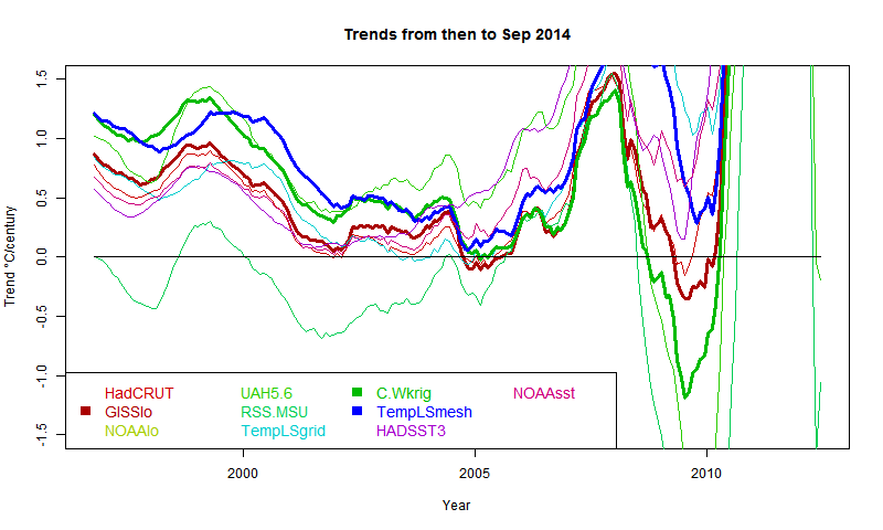
It shows C&W and TempLS tracking fairly closely from 1997 to 2008, with GISS generally a bit below.
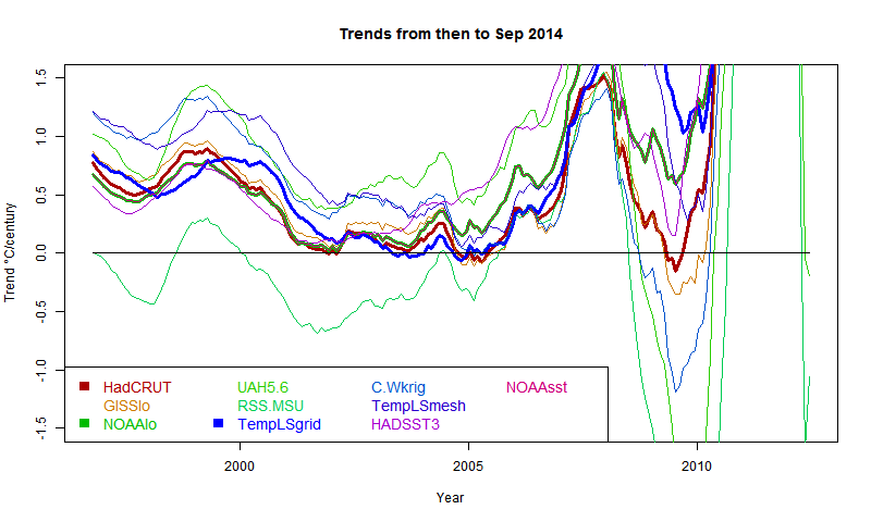
This has significance for talk of a pause in warming. People like to catalogue past periods of zero or negative trend. A senior British politician recently referred to "18 years without warming". That echoes Lord Monckton's persistent posts about MSU-RSS, which does have, of all indices, by far the lowest trends over the period.
Here I want to show results about other indices. Cowtan and Way showed that over this period, the trend in Hadcrut was biased low because of non-coverage of Arctic warming. I believe that TempLS with mesh weighting would also account properly for Arctic trend, and this would be a good way to compare the two, and see the effect of full interpolation. I expected GISS to behave similarly; it does to a limited extent.
So a new active plot is below the jump. You can rotate between datasets and months separately. There is also a swap facility so you can compare the images. And I have individual discussion of interpolation data vs grid data groups.
Here is the main plot. Buttons to rotate months and datasets. Emphasised set is in thicker black, on the legend too. (For some reason, NOAA emphasises as red). There is a reserved group of images for which the swap buttons work. It's initially empty, and you need at least two. In non-swap mode, click push to add the current image. In swap mode, click pop to remove the currently visible from the set.
| Data | Month | Swap |
General comments much as before. There is a big contrast between satellite indices MSU-RSS (long pause) and UAH (short). Trends are rising as the months of 2014 progress. I'm extrapolating to November assuming continuation of current weather, as described in previous posts. Trends are generally rising, which means it is getting harder to find long periods of non-positive trend ("pause").
Interpolation groups
As Cowtan and Way found, whether or not you see a pause depends a lot on whether you account for Arctic warming. TempLS typifies this - the grid version, like HADCRUT, effectively assigns to empty cells (of which Arctic has many) global average behaviour, missing the warming. TempLS mesh has full interpolation, like the kriging version of Cowtan and Way. So here is the comparison plot, with C&W, TempLS and GISS in dark colors:
It shows C&W and TempLS tracking fairly closely from 1997 to 2008, with GISS generally a bit below.
Grid surface data
And here for comparison are HADCRUT, NOAA Land/Ocean and TempLS grid. I expect these to be fairly similar. TempLS and NOAA have been very close lately, but over this longer range, TempLS is closer to HADCRUT.
External sources
| HadCRUT 4 land/sea temp anomaly |
| GISS land/sea temp anomaly |
| NOAA land/sea temp anomaly |
| UAH lower trop anomaly |
| RSS-MSU Lower trop anomaly |
| Cowtan/Way Had4 Kriging |
| HADSST3 |
| NOAA sea temp anomaly |
Sunday, October 19, 2014
Tails of the Pause.
I've been writing lately about matters which, I'm sorry to say, lack scientific gravity. One is the possible record warm 2014, and the other is the tailing of the Pause, as measured by periods of negative trend. My excuse is, people do talk about them, and there is interesting arithmetic which I can illustrate.
In my "pause" posts, I showed plots of trend of global temperature to present, plotted for periods shown on the x-axis, with trend shown at the starting point. A "pause" starts when, for some index, the axis is first crossed from pos to neg. The plots were active, and you could see the curves rising steadily over recent months. This meant the start of the pause moves forward, with eventual jumps where a previous excursion below the line no longer makes it.
Here is the recent active (buttons) plot to show that effect:
In this post, I'll quantify the rate of motion, and describe how much cooling would be required to reverse the trend. The effect of a new month's reading depends on its status as a residual relative to the regression line for the period - ie is it above or below the line, and by how much. But one reading is a different residual for each such period. I plot the present month as a residual, again referred to the start year, and also plot the rate of change of trend produced by the current (August) temperatures.
Note that y occurs only in integrals (which are from 0 to x), so when we differentiate β, no need to differentiate y. So, after some calculus algebra,
dβ/dx = (6/x^2)(y - y0 - βx/2)
where y0 is the mean over the period. Since the regression passes through this mean midway, the last part of this is the end residual.
ie dβ/dx = (6/x^2) * residual
That gives the factor that determines the rate.
So my first plot is the rate of rise, shown as a 3 month incrementwith August trends dotted
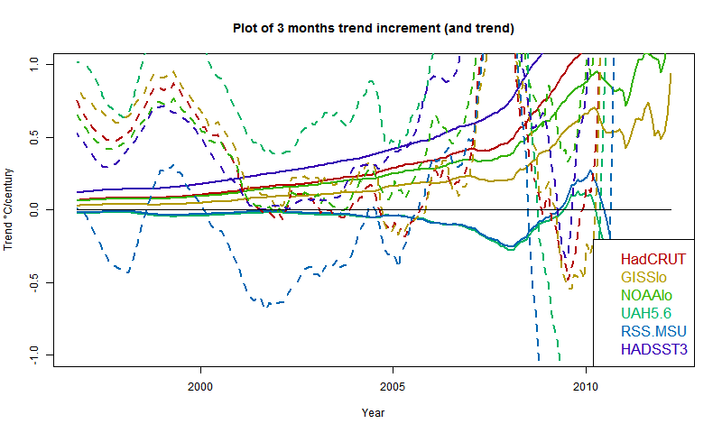
The satellite measures aren't going to move much without substantial warming. However, UAH is already high, RSS is low. Of the surface indices, HADSST3 is rising fast, GISS relatively slowly. However, three months of current warmth makes a big difference to the pause.
And here is the plot of residuals of August temp relative to past regressions:
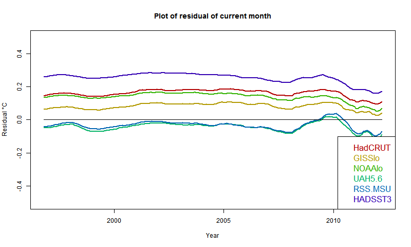
It confirms that UAH and RSS are near zero, so continuation of present temps won't change anything (though UAH warmed in Sept). Otherwise, GISS has the lowest residual, but positive everywhere; HADSST3 the highest. This of course partly reflects past coolness of HADSST3.
So if temperatures drop about 0.07°C from August, the rise for GISS would pause (but GISS rose in September). It would take a drop of more than 0.2°C for HADSST3.
In my "pause" posts, I showed plots of trend of global temperature to present, plotted for periods shown on the x-axis, with trend shown at the starting point. A "pause" starts when, for some index, the axis is first crossed from pos to neg. The plots were active, and you could see the curves rising steadily over recent months. This meant the start of the pause moves forward, with eventual jumps where a previous excursion below the line no longer makes it.
Here is the recent active (buttons) plot to show that effect:
In this post, I'll quantify the rate of motion, and describe how much cooling would be required to reverse the trend. The effect of a new month's reading depends on its status as a residual relative to the regression line for the period - ie is it above or below the line, and by how much. But one reading is a different residual for each such period. I plot the present month as a residual, again referred to the start year, and also plot the rate of change of trend produced by the current (August) temperatures.
Rate of change
This is more simply described with a continuum version. A time period runs from 0 to x, with readings y. If x increases, what is the change to trend β. The continuum formula is β = (x ∫ xy dx - x*x/2 ∫ y dx)/(x^4/12)Note that y occurs only in integrals (which are from 0 to x), so when we differentiate β, no need to differentiate y. So, after some calculus algebra,
dβ/dx = (6/x^2)(y - y0 - βx/2)
where y0 is the mean over the period. Since the regression passes through this mean midway, the last part of this is the end residual.
ie dβ/dx = (6/x^2) * residual
That gives the factor that determines the rate.
So my first plot is the rate of rise, shown as a 3 month incrementwith August trends dotted

The satellite measures aren't going to move much without substantial warming. However, UAH is already high, RSS is low. Of the surface indices, HADSST3 is rising fast, GISS relatively slowly. However, three months of current warmth makes a big difference to the pause.
And here is the plot of residuals of August temp relative to past regressions:

It confirms that UAH and RSS are near zero, so continuation of present temps won't change anything (though UAH warmed in Sept). Otherwise, GISS has the lowest residual, but positive everywhere; HADSST3 the highest. This of course partly reflects past coolness of HADSST3.
So if temperatures drop about 0.07°C from August, the rise for GISS would pause (but GISS rose in September). It would take a drop of more than 0.2°C for HADSST3.
Friday, October 17, 2014
Record warmth in 2014?
Not according to the satellite measures; they are showing quite a cool year so far. But surface measures, apparently propelled by SST, have been consistently high since March, and a record for calendar 2014 looks possible.
In August 2010, I showed a plot of the progress of the cumulative monthly anomaly sums, which will reach the final sum that determines the year average. 2010 did turn out to be the hottest year in many indices. It was different in that the El Nino was late 2009/10, so late 2010 was cooling. At this stage 2014 seems to be warming.
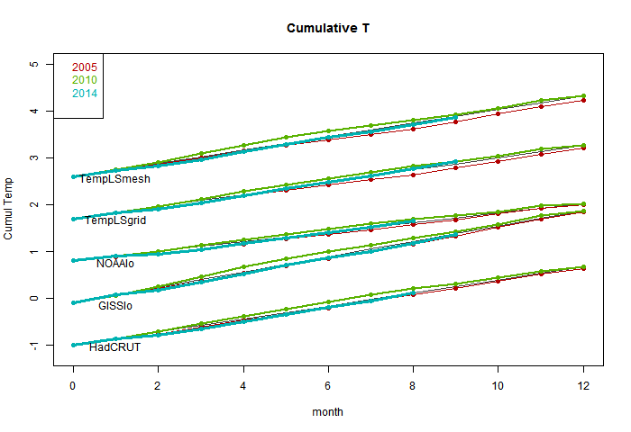
So I started to repeat that 2010-style plot, which is below the jump. It didn't work as well; the variation doesn't much show. But it puts the thing calculated in context - a cumulative sum that, if it exceeds 2010 at year end, will set a record. I've shown the progress of 2005 (a previous record), 2010 and 2014, with a line showing the 2010 average rate. The plots are spaced with an arbitrary offset.
But, more effectively, there is then an active plot with the average 2010 trend subtracted. The variation is clearer. The key thing is not so much whether the current total is above the line, but how it is trending, which is a measure of current warmth.
So here is the first plot. The TempLS measures were described in this recent thread. The absolute slope is an artefact of the anomaly base - GISS is earliest.
And here is the active plot with the 2010 average subtracted. Use the buttons to click through.
![]()
NOAA and TempLS grid are already above the line and heading up. Top candidates for a record. HADCRUT looks likely too. GISS and TempLS mesh only need a reasonable continuation of current warmth to end up positive (record). The slope is positive only when a month exceeds the average for 2010, so it doesn't take much cooling to turn down. We'll see.
In August 2010, I showed a plot of the progress of the cumulative monthly anomaly sums, which will reach the final sum that determines the year average. 2010 did turn out to be the hottest year in many indices. It was different in that the El Nino was late 2009/10, so late 2010 was cooling. At this stage 2014 seems to be warming.
So I started to repeat that 2010-style plot, which is below the jump. It didn't work as well; the variation doesn't much show. But it puts the thing calculated in context - a cumulative sum that, if it exceeds 2010 at year end, will set a record. I've shown the progress of 2005 (a previous record), 2010 and 2014, with a line showing the 2010 average rate. The plots are spaced with an arbitrary offset.
But, more effectively, there is then an active plot with the average 2010 trend subtracted. The variation is clearer. The key thing is not so much whether the current total is above the line, but how it is trending, which is a measure of current warmth.
So here is the first plot. The TempLS measures were described in this recent thread. The absolute slope is an artefact of the anomaly base - GISS is earliest.

And here is the active plot with the 2010 average subtracted. Use the buttons to click through.
NOAA and TempLS grid are already above the line and heading up. Top candidates for a record. HADCRUT looks likely too. GISS and TempLS mesh only need a reasonable continuation of current warmth to end up positive (record). The slope is positive only when a month exceeds the average for 2010, so it doesn't take much cooling to turn down. We'll see.
Thursday, October 16, 2014
QC for TempLS
I plan to do more with TempLS (see last post) so I want a stable quality control (data) scheme. GHCN unadjusted is a document of record, and there is weird stuff in there which it seems they don't like to touch. I've noted current examples earlier in the year. So I did a survey of the data since 1850. Here is R's summary of the monthly averages:
| Min. | 1st Qu. | Median | Mean | 3rd Qu. | Max. | NA's |
| -87.0 | 6.6 | 15.9 | 14.5 | 24.1 | 154.4 | 1166444 |
That's out of 10349232 months (of years with some data). Yes, the max is 154.4°C. There were 28 months with a min/max (not max) average >50°C.
To be fair, they use flags, and these oddities seem to be mostly where a decimal point slipped in the originating data. But they are big enough to have effects, so I have been using my own QC. On first look, I found the GHCN flags numerous and unhelpful, so I used a scheme where I checked with the adjusted file. This seemed to weed out the problem points without replacement. However, it excluded a lot of other points, so I allowed those if within 3°C of the appropriate mean.
I did that for the last five years of data and it worked well enough. But then I thought I should try for the whole record. I worked out how to extract the QC flags; here is a table of their occurrence:
| D | L | M | O | S | W | |
| 5511098 | 1124 | 647 | 22 | 3904 | 5448 | 1981 |
The first column is no flag. QC flags aren't that common, about 0.24% of the total. The letters mean, according to the readme:
- D - apparent duplicate
- L - isolated
- M - manual
- O - outlier (>5 sd)
- S - not so outlier (>2.5 sd), but no nearby data in agreement
- W - seems to be last month
O and S are the big ones, and as expected, the very high ones are flagged O.
So I decided to just omit all flagged data. In future, I'll do that to all GHCN unadjusted before use.
If you've been watching the latest data over the last day, you'll have seen me experimenting. I think it is stable now.
Monday, October 13, 2014
A catch-up on TempLS
I've been writing a lot about TempLS (my global temperature index) recently, and realizing that I don't have a unique reference that explains exactly what it is and what has recently been happening to it.
TempLS dates back to a period in early 2010 when there was a flurry of amateur efforts to replicate the monthly global surface temperature indices from the major producers (which some thought suspect). This post by Zeke (with links to earlier) gives an overview. Jeff Id and Romanm started it with a reconstruction that used a least squares method for aggregating a single cell, yielding offsets rather than requiring a fixed anomaly period. I thought that could be applied to the whole recon.
So I developed TempLS, which was basically a big OLS regression, based on GHCN unadjusted station monthly averages. It was quick to run, and I incorporated choice mechanisms which made it easy to calculate regional or special (eg rural, airport) averages. A rather complete summary of this stage of development is here. An important feature was the incorporation of SST data. This comes gridded, often 5°x5°, and so I simply entered these as stations.
I made a point of using unadjusted GHCN, because there were many claims that warming was an artefact of adjustment. I have myself no objections to adjustment, though I did show that it makes relatively little difference to the index.
TempLS combines weighted regression with spatial integration, much as BEST did later. It weighted initially by the inverse of grid density, estimated by stations/cell in a 5°x5° grid. I posted at one stage a very simple version for incorporation in Steven Mosher's RGHCNv3. You can regard this weighting as that which a spatial integration formula woud provide, with each grid estimated by its station average anomaly, or equivalently, each function value (observed average) assigned an area equal to its share of the cell.
Version 2 in August 2010 generalised the idea of regression, so that spatial variation (among others) could be included (and maps produced). The math basis was set out here.
Meanwhile I was experimenting with other kinds of weighting. The problem with cell averages, which I now cell grid weighting, is that many cells have no stations. These would be best represented by local data, but the weight that can be assigned is limited to one cell area, and near the poles, where there is a lot of sparseness, the cell areas actually diminish, so such regions are under-represented. In early 2011, I did a series on Antarctica (final and links). This developed various forms of mesh-based weighting. This means that every point is estimated based on local data. I tinkered with Voronoi tessellation, but have now settled with weighting that assigns to each node a weight equal to a third of the area of the triangles (from a convex hull, which provides an irregular triangular mesh) which touch it. This is equivalent to a finite element piecewise linear integration formula.
An interesting exercise, which I started in early days, is to see if some very small subset (60) of stations can give a reasonable world estimate. This is the latest in that series, with links back.
Version 2.1, which incorporates some revised verion, is described here. This is the last formal release with code.
Meanwhile, in July 2011 I started a regular cycle of posting a monthly average estimate, based on GHCN and SST - initially HADSST2, but I soon switched to ERSST. I tried to make sure to post ahead of the majors, so that a prediction record could be established. I then published a comparison with the GISS result for the month. A list of links to those posts is given here; each has a list to its preceding TempLS post. I also included the TempLS results with the other indices on my latest data page, and in the graphical comparisons there.
I posted a review of the comparison of TempLS with other indices in December 2012. It was clearly in the mainstream, closest to NOAA and HADCRUT. More recently, I posted a mini-review noting that the closeness to NOAA had become more pronounced.
I had thought of switching to mesh weighting for regular monthly, but was deterred by the hour+ it takes to do 1200 meshes to cover a century. But you don't need a new mesh each month; most historic months change the population of stations very rarely. So with a scheme of stored weights and detecting changes, I can do it, and I think I should. I expect the results to be now closer to GISS. I also expect that the results will compare well with the revision of Cowtan and Way; I'll post on that soon.
Appendix/Update
Carrick asked for more details on the use of meshes in integration. The FEM idea of integration is that you build up an interpolation which is exact at each node, and takes some polynomial form in between. They do it with basis functions, but we don't need to deal with that here. Just imagine that you have a linear interpolation on each triangle. They will match at the edges.
On the integration, first I'll formalize the trapezoid analogy. If you have two points z1,z2, with function values f1,f2, then the area of the trapezoid on the graph for the linear interpolation is (z2-z1)*(f1+f2)/2. Base length times mean height.
The corresponding formula in 3D is volume = base area * (f1+f2+f3)/3.
To prove it, let the linear approx be f=a.z+c. (a,z,vecs, . scalar product). Then f1 = a.z1+c etc.
To save writing determinants I'll invoke what I hope is a familiar proposition. The centroid z0=(z1+z2+z3)/3 is also the center of mass. ie ∫ z dA = z0 A, where A is the area of triangle (z1,z2,z3).
So ∫ f dA = a . ∫ z dA + ∫ c dA = (a . z0 + c)*A
= A * Σ_i ( a . z_i + c)/3 = A * (f1+f2+f3)/3
Now when you collect all the formulae for each triangle (FEM assembly), you get a big sum in which each node value f_i is multiplied by 1/3 of the sum of all the areas of triangles of which it is a node. That is the weighting I use (actually, no need to divide by 3).
<
Sunday, October 12, 2014
GISS September 0.77°C, up by 0.08°C
This my first report in the new style, where I record details of both mesh-weighted and traditional grid-weighted TempLS, along with the latest GISS. It is part-mechanical, but I annotate. TempLS numbers on the latest data page are constantly updated, but the monthly reports here won't change.
So the headline is, a very warm month. I think in GISS at least, 2014 may well be a record year. TempLS mesh showed a similar rise; TempLS grid dropped slightly. I expect the mesh version to more closely follow GISS, and the grid version to continue tracking NOAA. My next post will probably be an updated explanation of TempLS.
I've given both TempLS maps below. You can see again that TempLS mesh is closer to GISS than grid.
Anomaly base years: GISS 1951-80, TempLS 1961-90.
Here is the GISS map
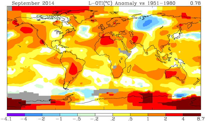
Here is the spherical harmonics based plot, mesh weighting
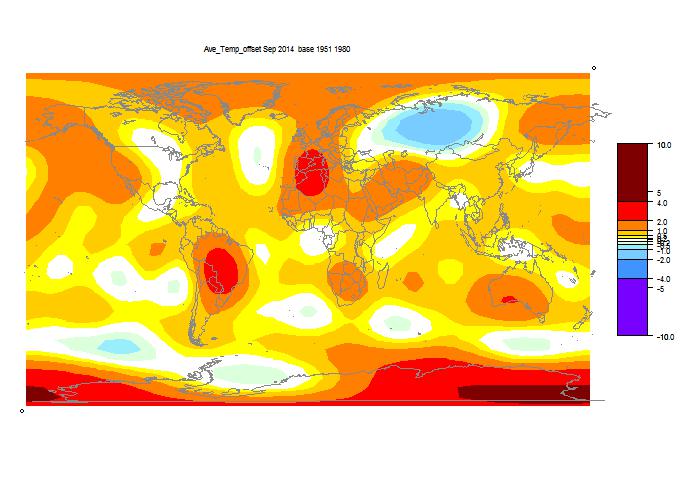
Here is the spherical harmonics based plot, grid weighting
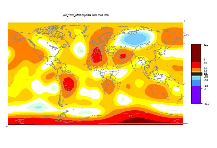
List of past reports
So the headline is, a very warm month. I think in GISS at least, 2014 may well be a record year. TempLS mesh showed a similar rise; TempLS grid dropped slightly. I expect the mesh version to more closely follow GISS, and the grid version to continue tracking NOAA. My next post will probably be an updated explanation of TempLS.
I've given both TempLS maps below. You can see again that TempLS mesh is closer to GISS than grid.
Comparison of GISS and TempLS, Sun 12 Oct 2014
| Anomaly °C | Apr | May | Jun | Jul | Aug | Sep |
| GISS | 0.71 | 0.78 | 0.61 | 0.52 | 0.69 | 0.77 |
| TempLS mesh | 0.641 | 0.669 | 0.58 | 0.477 | 0.627 | 0.673 |
| TempLS grid | 0.612 | 0.607 | 0.58 | 0.515 | 0.615 | 0.598 |
Here is the GISS map

Here is the spherical harmonics based plot, mesh weighting

Here is the spherical harmonics based plot, grid weighting

List of past reports
New ideas on TempLS reporting - mesh
For over three years now, I've been running my least squares based GMST index TempLS each month and reporting the results, with a second post comparing with GISS. See here and here for last August. The second has past links. I did a mini-review here recently, and there is a new summary of TempLS here.
I'm planning a change. For some time, I've believed that using mesh based weighting (see here and here, for example) is better than what I call grid-based weighting, where observations are weighted on a cell-based density estimate. I was deterred from changing because the mesh generation took a long time, but I've fixed that. I'll persist with the grid model because as I noted, it has uncanny agreement with NOAA, and also tracks HADCRUT well. But I think that it also has the faults of those, in dealing with empty cells. For TempLS it takes the form that stations in empty areas have a capped weight based on the size on one cell, which in the Arctic can be small.
The data cycle goes like this. ERSST posts a preliminary on about 3rd or 4th of month. It's actually complete, and the numbers are little different when updated in late month. GHCN starts the month with a rush of numbers from places with efficient electronic systems, and then stuff trickles in fairly slowly. Lately GHCN (unadjusted) has had early gyrations too. But notwithstanding, I think it is meaningful to to a mesh baed calc as soon as the SST comes in. Mesh is more robust to missing.
I've now posted an automatic report on the latest data page. It shows the current mesh-based report, with maps of temperatures and of reporting stations. I think I can maintain this, reporting with every new GHCN (most days). It would flip to the new month when the SST is posted. Obviously, early figures would be subject to change.
This would supersede my first monthly report on the grid results. I'd still publish the GISS comparison, and record the grid and mesh TempLS results there.
Update. GISS has produced a map for September, and it says the Sept temperature is 0.78°C, up from 0.70°C in August. This tracks the mesh TempLS rise from 0.628°C to 0.673°C (grid TempLS went down slightly). I expect that mesh TempLS will follow GISS more closely. I'll post the GISS comparison soon. The new number is not yet on their datafile. It's getting warm.
Saturday, October 11, 2014
TempLS global temp down 0.017°C in September
TempLS cooled slightly; from 0.615°C (July) to
0.598°C. That is still quite high, following the previous rise of about 0.1°C. Anomaly base is 1961-90. For the satellite indices, MSU rose slightly, and UAH quite a lot, from 0.19°C to 0.29°C.
GHCN had ups and downs lately. For a few days, almost all the land data for August except USA vanished. In Sept, China data has only just arrived. I think everything is OK now.
Here is the spherical harmonics plot:

Warm in Antarctica, around Paraguay and Algeria. Cool in mid-Russia.
4273 stations reported. Here is the map:
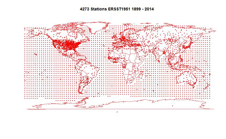
GHCN had ups and downs lately. For a few days, almost all the land data for August except USA vanished. In Sept, China data has only just arrived. I think everything is OK now.
Here is the spherical harmonics plot:

Warm in Antarctica, around Paraguay and Algeria. Cool in mid-Russia.
4273 stations reported. Here is the map:

Thursday, October 9, 2014
Portal for GHCN Daily
Many people are aware of GHCN Monthly. This is the large compilation of station monthly averages used for making global indices. I posted a portal here. Fewer know about GHCN daily, which is a very large compilation of daily records. Partly because of its size, it is less accessible. Each station record is in a separate file, and even listing the "all" directory takes a long time.
It is far less organized than GHCN Monthly. Many records are very short and incomplete. There is a mixture of TMAX, TMIN, precipitation, and various things like snow. Not easy. It is, however, for those who like that sort of thing, unadjusted. Very raw data.
So I've organised some links. I've split into US1, USC, Australia, Canada and others. US1 seems to have little or no temp data. USC is basically the Co-op network. The Australia record is huge, but a lot is rainfall. Canada is also large. So I've broken down those by states, and other countries are in the "World" list. Even there, some very significant countries are in the "Other" group at the end. Coverage is very uneven.
I've marked the files that have temp data (well, TMAX) with the years of record. As I mentioned, these can be short, and full of gaps at that. Entries without years probably don't have temperature. On the "Other" list, I've also marked where each country block begins.
So it's below the jump. You request by selecting from one of the menus. Clicking on a link will make the actual record pop up in a separate window or tab. I'm planning to create a permanent page for the various portals.
Update: I've added buttons that with Chrome will force the selection to take effect.
| US1 | ||||
Monday, October 6, 2014
Rising Trends
About a month ago, I wrote a post about how trends of global temperature calculated over recent past periods had been rising, and the periods of zero or negative trend, commonly quoted as evidence of the "pause", were likely to diminish rapidly if warm weather continued.
The weather has been warm, and with another month of data, that process has continued. I'll show the active plot below, in which you can see how the trends calculated over various periods back from now have changed since March, and are likely to change in the next three months if current warmth continues.
There has been a change to HadCRUT data since the last report. A new version of HadSST3 caused subsequent changes in HadCRUT4. I believe that are also fewer empty cells in HadCRUT4, which will help remove the cooling bias that Cowtan and Way identified. The changes to both HadSST3 and HadCRUT4 are noticeable.
In the active plot below, you can use the arrows to cycle through the months from March to November. Future data is padded by reflection - September is the same as August, October as July etc. In fact we have data for MSU and UAH in September. MSU was about the same, UAH a bit higher. I stuck with the padding for this post.
As before, what is plotted is, for each date, the trend of temperature from that date to August 2014. Of interest for pause talk is where the curves cross the x axis.
Wednesday, October 1, 2014
Analysis of short-centered PCA
There has been a lot of to and fro (see recent posts) about short-centered PCA - MBH style (background). My general view here is that there is an effect on the first principal component, but that merely moves to a particular alignment of basis vectors, and doesn't affect any reasonable reconstruction. And it all happened so long ago...
But still it's an interesting analytic problem, so I did some analysis. It particularly concerns the role of persistence, or autocorrelation. Increased autocorrelation tends to show more effect, because for a given number of proxies, it diminishes the effect of noise relative to the underlying short-centering operator (graphs below). But that underlying pattern is interesting, because it is much less dependent on autocorrelation. And the next PC's in succession are interesting, as I wrote about here.
You need an infinite quantity of proxies to see a pattern with white noise. But the pattern is the prototype for more difficult cases, so I'll develop it first. Much of what I have done recently is based on the work in the NAS report and its associated code. They compute and scale not only PCA first components from AR1() proxies, but also from the associated correlation matrices, which they scale and put on the same graph.
The algebra of short-centered averaging works like this. Define a N-vector h which has zeroes outside the short averaging period (M years at the end of N years of data), and values 1/M within, and another vector l which has 1's only. Then for a data vector x, length N, the valkue with short mean deducted is x-l*(h.x), or E*x, where E=I-l⊗h. I is the identity matrix, and ⊗ the dyadic product. For future reference, I'll note the dot products
l.l = N, l.h = 1, h.h = 1/M.
Then for a data vector X, Nxp, p the number of proxies, the PC's are the eigenvectors of XX*. The expected value of this, as a random noise vector, is p*K, where K is the autocorrelation matrix. For eigenvectors we can drop the p. The short-averaged version is E*X*X**E*. So for white noise, K is the identity I, and we need just the eigenvectors of E*E*.
Expanding, the eigenvalue equation is
(I-l⊗h - l⊗h + l⊗l h.h)*u = z u
or
(l⊗h + l⊗h - l⊗l h.h) u = (z-1) u
Since the matrix on the left now has range spanned by l and h, u must be in this space too. So we can set u = A*h+B*k, and there is a 2-dim eigenvalue for u in this space. I'll skip the 2-d algebra (just substitute u and work out the dot products), but the end results are two eigenvalues:
z=0, u=l
z=N/m, u= l-h
The latter is clearly the largest eigenvalue. There are also a set of trivial eigenvalues z-1=0; these correspond to the remaining unchanged eigenvalues of I.
So what has happened here? The short averaging has perturbed the correlation matrix. It has identified the vector u=l-h, which is 1 for years in 1:(N-M) and zero beyond, as the first principal component. This will appear in any reduced set of eigenvalues. All vectors orthogonal to it and l are still eigenvectors. So no new eigenvectors were created; u had been an eigenvalue previously. It just means that now whenever a subset is formed, it will come from a subset of the unperturbed set. They were valid bases for the space before; they still are.
You can see that relative to the HS effect, the noise is much greater when r=0.2 (it depends on proxy numbers). And I can't usefully show white noise, because the noise obliterates the effect. but the eigenvector is not very different.
Here are some plots of PC1 from r=0.1 to r=0.9. I've kept to the same scale. You can see the gradual change in the matrix eigenvector, and the gradual downscaling of the noise, which makes the eigenvalue pattern stand out more.
But still it's an interesting analytic problem, so I did some analysis. It particularly concerns the role of persistence, or autocorrelation. Increased autocorrelation tends to show more effect, because for a given number of proxies, it diminishes the effect of noise relative to the underlying short-centering operator (graphs below). But that underlying pattern is interesting, because it is much less dependent on autocorrelation. And the next PC's in succession are interesting, as I wrote about here.
White noise
You need an infinite quantity of proxies to see a pattern with white noise. But the pattern is the prototype for more difficult cases, so I'll develop it first. Much of what I have done recently is based on the work in the NAS report and its associated code. They compute and scale not only PCA first components from AR1() proxies, but also from the associated correlation matrices, which they scale and put on the same graph.
The algebra of short-centered averaging works like this. Define a N-vector h which has zeroes outside the short averaging period (M years at the end of N years of data), and values 1/M within, and another vector l which has 1's only. Then for a data vector x, length N, the valkue with short mean deducted is x-l*(h.x), or E*x, where E=I-l⊗h. I is the identity matrix, and ⊗ the dyadic product. For future reference, I'll note the dot products
l.l = N, l.h = 1, h.h = 1/M.
Then for a data vector X, Nxp, p the number of proxies, the PC's are the eigenvectors of XX*. The expected value of this, as a random noise vector, is p*K, where K is the autocorrelation matrix. For eigenvectors we can drop the p. The short-averaged version is E*X*X**E*. So for white noise, K is the identity I, and we need just the eigenvectors of E*E*.
Expanding, the eigenvalue equation is
(I-l⊗h - l⊗h + l⊗l h.h)*u = z u
or
(l⊗h + l⊗h - l⊗l h.h) u = (z-1) u
Since the matrix on the left now has range spanned by l and h, u must be in this space too. So we can set u = A*h+B*k, and there is a 2-dim eigenvalue for u in this space. I'll skip the 2-d algebra (just substitute u and work out the dot products), but the end results are two eigenvalues:
z=0, u=l
z=N/m, u= l-h
The latter is clearly the largest eigenvalue. There are also a set of trivial eigenvalues z-1=0; these correspond to the remaining unchanged eigenvalues of I.
So what has happened here? The short averaging has perturbed the correlation matrix. It has identified the vector u=l-h, which is 1 for years in 1:(N-M) and zero beyond, as the first principal component. This will appear in any reduced set of eigenvalues. All vectors orthogonal to it and l are still eigenvectors. So no new eigenvectors were created; u had been an eigenvalue previously. It just means that now whenever a subset is formed, it will come from a subset of the unperturbed set. They were valid bases for the space before; they still are.
Effect of autocorrelation.
I showed earlier DeepClimate's rendering of two AR1() cases from the NAS code: |  |
| AR(r=0.2), 5 PC1s from sets of 50 proxies. | AR(r=0.9) |
You can see that relative to the HS effect, the noise is much greater when r=0.2 (it depends on proxy numbers). And I can't usefully show white noise, because the noise obliterates the effect. but the eigenvector is not very different.
Here are some plots of PC1 from r=0.1 to r=0.9. I've kept to the same scale. You can see the gradual change in the matrix eigenvector, and the gradual downscaling of the noise, which makes the eigenvalue pattern stand out more.
 |  |
 |  |
 |  |
Next
My main ambition here was to get theoretical expressions for these eigenvalues. It is possible, and interesting, to convert the eigenvalue equation to a difference equation, which emphasises the Sturm-Liouville pattern for higher eigenvectors. For PC1, it just gives an expression for the rounding that you see. That's for another day.
Subscribe to:
Posts (Atom)


