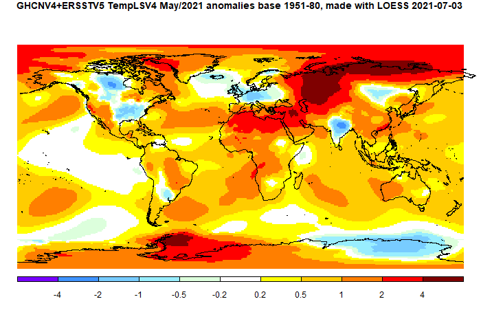
Cold patches in W Europe and Eastern US have been talked about. Also cold in India and N Canada. But it was warm in central Russia and much of the Arctic. Also in N Africa and the Middle East.
Here is the temperature map, using the LOESS-based map of anomalies.

This post is part of a series that has now run since 2011. The TempLS mesh data is reported here, and the recent history of monthly readings is here. Unadjusted GHCN is normally used, but if you click the TempLS button there, it will show data with adjusted, and also with different integration methods. There is an interactive graph using 1981-2010 base period here which you can use to show different periods, or compare with other indices. There is a general guide to TempLS here.
The reporting cycle starts with a report of the daily reanalysis index on about the 4th of the month. The next post is this, the TempLS report, usually about the 8th. Then when the GISS result comes out, usually about the 15th, I discuss it and compare with TempLS. The TempLS graph uses a spherical harmonics to the TempLS mesh residuals; the residuals are displayed more directly using a triangular grid in a better resolved WebGL plot here.
A list of earlier monthly reports of each series in date order is here:
I'm surprised you don't use a Mollweide projection as that is equal area and provides for less overall distortions.
ReplyDeleteYes. I did promise that I would, and I wrote the code to do it. Next month!
DeleteActually, it was Robinson that I planned. I don't like it as much, but it does allow comparison with GISS.
I prefer things that are equal area rather than ones that produce the inaccuracies that non-equal area ones do
DeleteYes, so do I. I once spent some time dabbling with low distortion near-equal area mappings based on platonic solid tesselations (eg here). That wwas a by-product of my efforts to make an equal area mesh on the sphere (fairly successful, eg here and here).
DeleteYou could always use an Atlantis Mollweide projection if you believe that the poles are f more interest than the equator
ReplyDeletehttps://map-projections.net/single-view/index.php?image=atlantis-landscape
From a programming point of view there is quite a simple way to transpose a sphere onto a Mollweide projection. Create strips that are 1 pixel vertically across the sphere arranged either side of an equator or similar. Subdivide those strip into pixels horizontally for the length of each strip. Map those to an area on the globe. Color the pixel as required. Display.
ReplyDeleteThanks, RLH
DeleteSounds like a neat idea. The programming solution I adopted is described in the Appendix here. Basically I derive a quadratic in lat^2 to map the latitudes, then scale the longitudes. The reason I did it that way is that it works equally for Mollweide and Robinson. The quadratic is accurate to well under a pixel. I also needed the algorithm to be invertible, so I could easily map back from Moll to sphere.