Friday, December 16, 2022

GISS November global temperature down by 0.26°C from October.

The GISS V4 land/ocean temperature anomaly was 0.73°C in November 2022, down from 0.97°C in October. This fall is a little more than the 0.217°C rise reported for TempLS.

As usual here, I will compare the GISS and earlier TempLS plots below the jump.

Wednesday, December 7, 2022

November global surface TempLS down 0.217°C from October.

The TempLS FEM anomaly (1961-90 base) was 0.592°C in November, down from 0.809°C in October. October was getting warm, but the drop makes November the coldest month since February 2021. The NCEP/NCAR reanalysis base index fell likewise by 0.219°C.

The main cold locations were the western USA (plus BC, Alberta) and Australia, and also Antarctica. Another cold spot in Canada's Arctic islands. But there was a band of warmth from W Europe to China. Perhaps significant for the near future was a not so cold E Pacific.

Here is the temperature map, using now the FEM-based map of anomalies.


As always, the 3D globe map gives better detail. There are more graphs and a station map in the ongoing report which is updated daily.

Wednesday, November 16, 2022


GISS October global temperature up by 0.07°C from September.

The GISS V4 land/ocean temperature anomaly was 0.96°C in October 2022, up from 0.89°C in September. This rise is similar to the 0.094°C rise reported for TempLS.

As usual here, I will compare the GISS and earlier TempLS plots below the jump.

Monday, November 7, 2022

October global surface TempLS up 0.094°C from September.

The TempLS FEM anomaly (1961-90 base) was 0.817°C in October, up from 0.723°C in September. The NCEP/NCAR reanalysis base index rose likewise by 0.104°C.

The main feature is a band of warmth right through northern latitudes of N America and Eurasia, exienting through the Mediterranean to N Africa. There were cool spots in far East Siberia and the SE US. Cool in Australia except for far North, and still cool in the tropical Pacific.

Here is the temperature map, using now the FEM-based map of anomalies.


As always, the 3D globe map gives better detail. There are more graphs and a station map in the ongoing report which is updated daily.

Saturday, October 15, 2022

GISS September global temperature down by 0.06°C from August.

The GISS V4 land/ocean temperature anomaly was 0.88°C in September 2022, down from 0.94°C in August. This drop is very similar to the 0.061°C fall reported for TempLS.

As usual here, I will compare the GISS and earlier TempLS plots below the jump.

Monday, October 10, 2022

September global surface TempLS down 0.061°C from August.

The TempLS FEM anomaly (1961-90 base) was 0.728°C in September, down from 0.789°C in August. The NCEP/NCAR reanalysis base index rose by 0.156°C, an unusually large discrepancy.

The main feature is a band of cold from E Europe through N Siberia, with just below a band of warmth from the Mediterranean through N of China. N America was mostly warm. Still cool in the tropical E Pacific.

Here is the temperature map, using now the FEM-based map of anomalies.


As always, the 3D globe map gives better detail. There are more graphs and a station map in the ongoing report which is updated daily.

Thursday, September 15, 2022

GISS August global temperature up by 0.02°C from July.

The GISS V4 land/ocean temperature anomaly was 0.95°C in August 2022, up from 0.93°C in July. This rise is similar to the 0.016°C rise reported for TempLS.

As usual here, I will compare the GISS and earlier TempLS plots below the jump.

Thursday, September 8, 2022

August global surface TempLS up 0.016°C from July.

The TempLS FEM anomaly (1961-90 base) was 0.792°C in August, up from 0.776°C in July. Temperature has been steady the last three months. The NCEP/NCAR reanalysis base index fell by 0.003°C.

The main feature is warmth through Europe, N America and China. There is a cold region centered on Mongolia. Antarctica was fairly warm. The other extensive cool area was central and SE Pacific (La Nina).

Here is the temperature map, using now the FEM-based map of anomalies.


As always, the 3D globe map gives better detail. There are more graphs and a station map in the ongoing report which is updated daily.

Monday, August 15, 2022

GISS July global temperature down by 0.02°C from June.

The GISS V4 land/ocean temperature anomaly was 0.9°C in July 2022, down from 0.92°C in June. This drop is less than the 0.054°C fall initially reported for TempLS, although later data has pared that fall back to 0.016°C, very close to GISS.

As usual here, I will compare the GISS and earlier TempLS plots below the jump.

Monday, August 8, 2022

July global surface TempLS down 0.054°C from June.

The TempLS FEM anomaly (1961-90 base) was 0.736°C in July, down from 0.790°C in June. The NCEP/NCAR reanalysis base index fell by 0.026°C.

The main feature is the lack of cold places, similar to last month. Coolest was northern Australia. Warm in W Europe, and almost all other land. Even Antarctica was warm.

Here is the temperature map, using now the FEM-based map of anomalies.


As always, the 3D globe map gives better detail. There are more graphs and a station map in the ongoing report which is updated daily.

Monday, August 1, 2022

Claim: A new bombshell report found that 96% of ConUS NOAA temperature is corrupted (false)

Anthony Watts has a new report on US temperature stations. He had 2 pinned posts - the announcement here and a 1hr Heartland video presentation here. The subheading to the announcement reads:

"Official NOAA temperature stations produce corrupted data due to purposeful placement in man-made hot spots
Nationwide study follows up widespread corruption and heat biases found at NOAA stations in 2009, and the heat-bias distortion problem is even worse now"

Dramatic stuff. As Victor Venema pointed out, it is the tenth anniversary of another dramatic announcement, when Anthony said he was suspending everything to rush out a paper on the bad siting of stations. The paper still has not appeared.

In this post, I'll comment briefly on the report, but mainly will discuss the more complete refutation, which is that the resulting ClimDiv US average is very close indeed to that derived from the independent purpose-built network USCRN.

The report.

It is mainly taken up with photos of various sites that WUWT observers found fault with. But the bare statistics are that they looked at 128 stations, out of a total of well over 10,000 that are currently being used, and found 5 that they deemed satisfactory. That gave rise to the headline claim "MEDIA ADVISORY: 96% OF U.S. CLIMATE DATA IS CORRUPTED".

The report is a sequel to an earlier similar study in 2009 which has been fairly central to WUWT's operations. But, aside from the question of whether the stations sighted were really as bad as they claim, there is a further question of whether they are representative. On the face of it, no. The earlier report was in the days of USHCN (pre-ClimDiv), which was a set of 1218 stations from which the national average was derived. This time, 80 of the sample were from that set, leaving only 48 from the remaining 10000+ stations. That might not be so bad, were it not that there is a history, much discussed in the report, of those stations in the earlier report. There is plenty of scope for that to be a biased sample, and there is nothing in the report to show how bias was avoided. However, this is not the main reason for doubting the report.

Comparison with USCRN

USCRN is a network since about 2005 which has about 115 stations in the continental US (conUS) built in an array intended to be representative for the region, including an avoidance of urban activity. WUWT generally thinks well of this (as do we all). The announcement said:
"“By contrast, NOAA operates a state-of-the-art surface temperature network called the U.S. Climate Reference Network,” Watts said. “It is free of localized heat biases by design, but the data it produces is never mentioned in monthly or yearly climate reports published by NOAA for public consumption."

Given that fondness, it was natural that people should ask how ClimDiv, from the supposedly corrupted stations, compared with USCRN. Well, that is interesting. There is a very close match, as the NOAA Temperature Index page shows:


You can see little bits of blue (ClimDiv) peeping out from behind the USCRN, but mostly they totally run together. This may be a bit clearer with the annual data:


Now this comparison is not made anywhere in the report or associated writings. The monthly plot is even featured on the front page (right panel) of WUWT, but the ClimDiv part has been removed.

What is hinted in the report is that the correspondence was achieved by unstated adjustments. Here is Anthony's response to my posting the plot:

"They use the USCRN data to ADJUST nClimDiv data to closely match. And there is only 17 years of it, which means the past century of data is still as useless and corrupted as ever."

The rest of this post is mainly discussing that. No evidence is given, of course, and it's wrong. But it's also absurd. The heading quoted above says that NOAA is deliberately biasing the stations to inflate warming, and yet, the explanation goes, after all that they throw out that effort and adjust to the USCRN.

As for the 17 years, the survey itself was in 2022. It tells about current conditions, and if they are so bad, it is now that they bad results should be appearing. Faults of more than 17 years ago will not be illuminated by scrutinising current stations.

Is the averaging process adjusted?

I do my own calculations here. I described two years ago how I used the monthly average station data provided by both USCRN and GHCN (proxy for ClimDiv) to emulate the NOAA calculations. The one-month calculation, with comparative maps, is here, and the time series calculation is here. The key graph which corresponds to the NOAA monthly graphs, is here. Note that my results are in °C, while NOAA's are in °F.


In the legend, USCRN and CLIMDIV are my rendering of the NOAA data as in the earlier plots. MoyCRN is my calculation of the average from the station USCRN data. GHCN_u is the calculation using the ConUS GHCN V4 unadjusted station data, and GHCN_a uses GHCN V4 adjusted data.

And they all move along together, whether derived from USCRN, ClimDiv/GHCN, calculated by NOAA or me, and whether or not adjusted with GHCN. Again the different behaviour is a bit clearer with a 12 month running mean plot:


So is the station data rigged?

Presumably that would be the claim. It isn't, of course, and as said above it would be completely pointless to do so. But it actually can't be. All the daily data is available within a few days at most of being read. It would be quite impractical to adjust the ClimDiv on even that timescale to match USCRN which would probably be not yet available. And of course the posted daily data comes from data which is mostly posted promptly hourly.

Plus the ClimDiv comes from 10000 or so different operators. They can't all be in the conspiracy, and they can see what is happening to their data. The conspiracy notion is ridiculous.

What if ClimDiv and USCRN were both wrong?

I pushed this line of argument, and this is where it tended to come down to. Don't trust any of 'em. But the causes of error would be quite different - supposedly various bad siting issues for ClimDiv (of many kinds)

Update - difference plot and trend

Prompted by comments, I have plotted the difference USCRN-ClimDiv. Note that the range is much less than the earlier plots. 


Now there is structure to the difference, and a statistically significant upward trend, as Mark B noted in comments. However, it does not indicate "corrupted data due to purposeful placement in man-made hot spots". It goes the other way - ClimDiv is warming more slowly than USCRN!

Appendix - calculation method

I'll give a quick summary of my spatial averaging method here; more details are in my earlier post. It is much less elaborate than NOAA's, but I think quite accurate. I create a fine grid - 20km is a good compromise, 10 km takes longer. Many cells have no station data, especially of course with USCRN. Then I apply the principle that stations without data are assigned a temperature equal to the average of the neighbours. Of course, the neighbours may also be unknown, but I can write down a large sparse matrix expressing these relations, and solve it (conjugate gradients). This is equivalent to solving the Laplace equation fixed at cells with data.

A test of the method is whether it can give spatial maps like those of NOAA. It can - I did that in my earlier post. Here is my comparison for January 2020:


Of course, another test is the good congruence of the time series above.


Saturday, July 16, 2022

GISS June global temperature up by 0.08°C from May.

The GISS V4 land/ocean temperature anomaly was 0.91°C in June 2022, up from 0.83°C in May. This rise is a little less than than the 0.112°C rise reported by TempLS.

As usual here, I will compare the GISS and earlier TempLS plots below the jump.

Saturday, July 9, 2022

June global surface TempLS up 0.112°C from May.

The TempLS FEM anomaly (1961-90 base) was 0.787°C in June, up from 0.675°C in May. The NCEP/NCAR reanalysis base index rose by 0.016°C.

The main feature is the lack of cold places. Coolest was a band from Argentina through to the ENSO region. Warmest was W Europe, with a mid-latitude band of warmth through to China. Antarctica was warm.

Here is the temperature map, using now the FEM-based map of anomalies. 


As always, the 3D globe map gives better detail. There are more graphs and a station map in the ongoing report which is updated daily.

Thursday, June 16, 2022

GISS May global temperature down by 0.01°C from April.

The GISS V4 land/ocean temperature anomaly was 0.82°C in May 2022, down from 0.83°C in April. This drop is a little less  than the 0.033°C fall reported for TempLS.

I should mention a difficulty with this month's results, which is part of a recent pattern. GHCNV4 has at least 10000 stations reporting eventually each month, and a large number now arrive within the first few days. I have set a threshold of 8500 for reporting.

However, recently the progress has not been monotonic. It passed the threshold on 5 July, then slipped back to 8162, then up to 8565 on 7 July, then back again to around 8200, where it has remained. I haven't analysed to see what stations are involved. I don't know if this is a problem for GISS or not. The fluctuation in the average is only a few hundredths, so I expect that when it does settle down, it won't be far from the figure I posted on the 7th.

I should mention too that I have found that the version of TempLS FEM that I announced here has needed some tweaking. As I said then, a key feature of most of my infilling now is that I add to the process for filling cells that have data a Laplace operator, with a small coefficient that ensures that averaging is used to infill. I had however make the coefficient too small, so there were instabilities. These did not affect the average much, but were evident in the graphics. I have fixed that for this comparison below, and for the currently posted FEM averages.

As usual here, I will compare the GISS and earlier TempLS plots below the jump.

Tuesday, June 7, 2022

May global surface TempLS down 0.033°C from April.

The TempLS FEM anomaly (1961-90 base) was 0.664°C in May, down from 0.697°C in April. That makes it the coolest May since 2018, and the eighth warmest in the record. The NCEP/NCAR reanalysis base index fell by 0.064°C.

There was a band of warmth through Central Asia to arctic W Siberia, and another in E Siberia. Adjacent to the first was a band of cold in European Russia. W Europe was warm; N America was mixed, with W Canada cool and Nunavut and Greenland cold. Antarctica was mixed,

Here is the temperature map, using now the FEM-based map of anomalies. This is the first use of this method in a monthly report, and I must say that I will be nervously waiting to see how well it agrees with the GISS map in a week or so.


As always, the 3D globe map gives better detail. There are more graphs and a station map in the ongoing report which is updated daily.

Thursday, June 2, 2022

Moving to FEM variant of TempLS global temperature average.

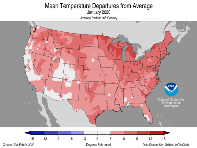
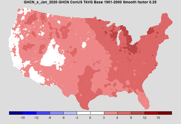
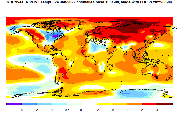
TempLS is my least squares based global temperature anomaly calculating program which I use to post each month's anomaly as station data from GHCNV4 unadjusted and ERSST become available. I have four different methods for the basic step of integrating the temperatures based on the irregular sampling points. Of these, the FEM method is most recent, and is described here.

There isn't a pressing need for a new method. The existing methods agree with each other to a few hundredths of a degree, and I think are capable of equal accuracy. The mesh method was the first of the advanced methods I used, and has remained the workhorse. It is the slowest, but speed is not really an issue. It takes about an hour to process all data since 1900. But all methods are based on representing the integral as the weighted sum of temperatures, and the weights depend only on the location of stations. The station set in months before the last few years rarely changes, and so the weights can be stored. It is calculation of the weights that consumes most time. With stored weights, all methods take only a minute or two to process the complete data set.

However, the FEM method is tidier and easier to maintain. An issue with the mesh method is that it does not make a very good map of temperatures, and so I import LOESS data for that. The FEM method can easily be tweaked to produce very good maps. And it is a lot faster.

Overview of methods

As described in the TempLS Guide and other articles linked there, TempLS works by fitting a linear model to the measured temperature
Tsmy=Lsm+Gmy
Subscript s for station, m for month, y for year. The L's are called offsets, but they play the role of normals, being independent of year. G, depending on time but not s, is the global temperature anomaly. L and G are determined by minimising a weighted sum of squares, weighted to represent a spatial integral. This fitting is common to all methods; the differences are just in the determination of the weights.

Grid method and infilling

The method everyone starts with is just to form a grid, and assign to each cell the average temperature of the measurements within. The weights are the cell areas. The fitted function is thus piecewise constant, and discontinuous, which is not desirable. But the main weakness is that some cells may have no data. The primitive thing is just to omit them from the average (Hadcrut did that until the recent V5). But the obligation is to give the best estimate of each cell, and omitting just says that those cells behave like the average of the others, which may be far from the truth.

This can be made into a good method with infilling. I use Laplace equation solution, which in practice says that each missing cell value is the average of its neighbors. That requires iterative solution. But then it is accurate and fast. I use a grid which is derived from a gridded cube projected on the sphere (cubed sphere).

Irregular mesh

My next method was to join up the stations reporting in each month in a triangular mesh (convex hull), and interpolate linearly within each triangle. That leads to a continuous approximating function, which is good. The meshing is time consuming (a full run takes over an hour on my PC), but does not have to be repeated for historic months for which there is no change in stations. The weights work out to be the areas of triangles of which each station is part.

This method is excellent for averaging, but gives poorly resolved maps of temperature. For that I had been using results from the next method, LOESS.

LOESS method.

This uses a regular icosahedral mesh to get evenly spaced nodes. The node values are then inferred from nearby station values by local weighted regression (first order, LOESS). Finally the node values are integrated on the regular mesh.

The method is fairly fast, and there is a lot of flexibility in deciding how far to search for neighboring points. An oddity of the method is that it can yield negative weights, which can be a problem for the model fitting (but usually isn't).

The FEM method

Details here. It isn't strictly FEM, but uses the basis functions of FEM on a regular icosahedral mesh. I generally use linear functions, but higher order can be more efficient. For linear each basis function is a pyramid centered at a node and going from one to zero on the far side of each triangle. The parameters are the nodal values, which are also the multipliers of the basis functions.


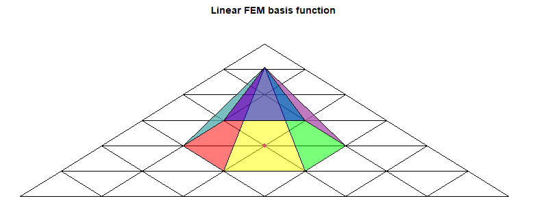
The objective is to find those parameters b that minimise ∫(T(x)-b.B(x))2dx over the sphere, where B is the vector of basis functions. T(x) of course is known only at sample points, so the discrete sum to minimise is
w(i)(T(xi)-bjBj(xi))2
I am using here a summation convention, where indices that are repeated are summed over their range. The weights w(i) are those to approximate the integral; the suffix is bracketed so that it is not counted in the pairing (summation). The weights here are less critical; I use those from the primitive grid method.

The minimum is where the derivative wrt b is zero, giving the familiar regression expression:
w(i)(T(xi)-bjBj(xi))Bj(xi)=0
or
Bkiw(i)Bjibj=Bkiw(i)T(xi) where Bki is short for Bk(xi)
Bkiw(i)Bji may be shortened to BwBkj. It is a symmetric matrix, and positive definite if the w(i) are positive. Solving for b:
bk=(BwB-1)kjBjiw(i)T(xi)
BwB has a row and column for each basis function, so it can be a manageable matrix. But I tend to use the preconditioned conjugate method, without explicitly forming BwB. It usually converges well, and so is faster. I'll say more about this in the appendix

There are two ways this equation for b is used:
  • The expression for the global integral of T is akbk, where the a's are the integrals of each basis function. So the integral can be written as a scalar product WiT(xi). The weights W are just what is needed for the final stage of TempLS iteration, and so are given by
    ak(BwB-1)kjBjiw(i)
    This is evaluated from left to right.
  • For mapping the anomaly, evaluation goes from right to left, starting with known anomalies in place of T. The result is the basis function multipliers b, which can then be used to interpolate values, and so colors, to pixel points.
In either case, the key step is the solving with BwB. The rest is just scalar products.

Summary

I am planning to use the FEM method for global temperature calculation because with the same operators I can also do interpolation for fine-grained graphics. The method is accurate, but so are others; it is also fast. Higher order FEM would be more efficient, but first order is adequate.

Appendix 1 - sparse multiplication

I'll describe here two of the key tools that I have developed in R, which are fast and simplify the coding. The first is a function spmul, which multiplies a sparse matrix A by a vector b.

The matrix A is represented by a nx3 matrix C, with a row for each non-zero element of A. The row contains first the row number of the element, then the column number, and finally the value, The length of b must match the number of columns of A.

The rows of C can be in any order. spmul starts by reordering so that C[,1] is in ascending order, so each bunch of equal values corresponds to a row of A. To get the row sums of A, the operator cumsum is applied to C[,3]. Then the values at the ends of each row bunch are extracted and differenced (diff). That gives the vector of row sums.

The same steps are used to multiply A by b, except the values are first multiplied by b[C[,2]].

There is a twist that A may have empty rows, with no entry in C. That can mostly be handled by using the values in reordered C[,1] to place results in a vector initially filled with zeroes. But if final rows of A are missing, this won't work, because C does not tell how many rows there should be. This can be given as an optional extra argument to spmul.

Preconditioned conjugate gradient method

This is described in wiki here. I follow that, except that instead of argument A being a matrix, it is a function operating on a vector (the function must of course be self-adjoint and positive definite). In that way the sequence Bkiw(i)Bji can be given as a function to be evaluated within the algorithm.

My preconditioning is actually minimal - diagonal at best, although even no preconditioning works quite well.


Monday, May 16, 2022

GISS April global temperature down by 0.23°C from March.

The GISS V4 land/ocean temperature anomaly was 0.82°C in April 2022, down from 1.05°C in March. This drop is rather more than the 0.146°C fall reported for TempLS. While Templs returned to about February temperature, GISS was rather lower (Feb 0.89°C)

As usual here, I will compare the GISS and earlier TempLS plots below the jump.

Thursday, May 5, 2022

April global surface TempLS down 0.15°C from March.

The TempLS mesh anomaly (1961-90 base) was 0.693°C in April, down from 0.843°C in March. That brings it back to the level of February, undoing the sudden rise to March. The NCEP/NCAR reanalysis base index fell by a very similar 0.163°C.

The most prominent feature is the coolness of N America (except SW) and E Europe. Central Asia was very warm, but unusually in recent times, the Arctic was not. The oceans were mostly warm except for the ENSO region.

Here is the temperature map, using the LOESS-based map of anomalies. As promised last month, you now have a choice of proections. Robinson shows by default, but if you click the buttons at the bottom, you can cycle through Mollweide and ordinary let/lon.


As always, the 3D globe map gives better detail. There are more graphs and a station map in the ongoing report which is updated daily.

Wednesday, April 20, 2022

Global projections for TempLS temperature reporting.

A couple of years ago I described here my way of implementing equal area projections for global data, and in particular the Mollweide and Robinson projections. Robinson would not have been a high priority, except that GISS ofers it for its temperature projections, so I can use that for comparison.

Events intruded, and I didn't implement it for routine use immediately, and when I later did, then of course mission creep crept in, and I thought of ways to use the pixel mapping methods for the actual integration (not that I am lackimg options).

However, it really should be done. The rectangular lat/lon method that I use conveys the necessary information in an easily understood way, and I will still be using it for some internal purposes, but it overweights behaviour near the poles visually. I calculated. Here is a table of the % by pixel of colors in my plots for March 2022, shown also below. Color 11 is the warmest (>4°C)

Color: 2 3 4 5 6 7 8 9 10 11
Lat/Lon0.190.551.855.110.3913.5124.7421.6313.638.41
Robinson0.220.662.175.5510.6814.1828.0123.1311.224.18
Mollweide0.230.652.235.5610.6813.9528.5423.2311.153.77

March was a month in which the Arctic was very warm, and you can see that there were more than twice s many of the warmest pixels in the lat/lon projection (approx 8% vs 4%). The other projections are close to the true % on the sphere.

I plan to show the three projections in a single frame, with navigation buttons. Robinson will show initially, but you can cycle to Mollweide or lat/lon using the buttons below.


Friday, April 15, 2022

GISS March global temperature up by 0.16°C from February.

The GISS V4 land/ocean temperature anomaly was 1.05°C in March 2022, up from 0.89°C in February. This increase is very similar to the 0.146°C increase reported for TempLS.

As usual here, I will compare the GISS and earlier TempLS plots below the jump. A difference this time is that I'll show the Robinson projection for both. I'll post soon about usig different projections for TempLS,

Wednesday, April 6, 2022

March global surface TempLS up 0.146°C from February.

The TempLS mesh anomaly (1961-90 base) was 0.845°C in March, down from 0.699°C in February. That makes it the fifth warmest March in the record. The NCEP/NCAR reanalysis base index rose by the same 0.146°C.

The most prominent feature is warmth through Asia, the Arctic and much of N America and N Europe. There is a acold area centred on Turkey. The oceans were mostly warm except for the ENSO region.

Here is the temperature map, using the LOESS-based map of anomalies. As I mentioned in a comment last month, I plan to switch to a Robinson projection (to match GISS) but I'm not quite there yet.


As always, the 3D globe map gives better detail. There are more graphs and a station map in the ongoing report which is updated daily.

Tuesday, March 15, 2022


GISS February global temperature down by 0.01°C from January.

The GISS V4 land/ocean temperature anomaly was 0.9°C in February 2022, down from 0.91°C in January. This small drop is very similar to the 0.017°C decrease (now 0.022°C) reported for TempLS.

As usual here, I will compare the GISS and earlier TempLS plots below the jump.

Tuesday, March 8, 2022

February global surface TempLS down 0.017°C from January.

The TempLS mesh anomaly (1961-90 base) was 0.704°C in February, down from 0.721°C in January. That makes it the seventh warmest February in the record. The NCEP/NCAR reanalysis base index fell by 0.025°C.

The most prominent feature is the cold in N America and China, and the warmth almost everywhere else in Eurasia. The Eastern Sahara and Australia were also cool.

Here is the temperature map, using the LOESS-based map of anomalies.


As always, the 3D globe map gives better detail. There are more graphs and a station map in the ongoing report which is updated daily

Wednesday, February 16, 2022

GISS January global temperature up by 0.07°C from December.

The GISS V4 land/ocean temperature anomaly was 0.93°C in January 2022, up from 0.86°C in December. This rise is similar to the 0.08°C increase (now 0.068°C) reported for TempLS.

As usual here, I will compare the GISS and earlier TempLS plots below the jump.

Monday, February 7, 2022

January global surface TempLS up 0.08°C from December.

The TempLS mesh anomaly (1961-90 base) was 0.724°C in January, up from 0.644°C in December. That makes it the fifth warmest January in the record. The NCEP/NCAR reanalysis base index fell by 0.06°C.

The most prominent feature is the cold in NE N America, and the warmth almost everywhere in Eurasia. In fact most of the land area was warm, except for the Sahara and Antarctica.

You may notice that Moyhu had another hiatus in December/January, which caused me to miss the annual summary. I won't try to catch up there at this stage. There may be other gaps during the year, but Moyhu will return.

Here is the temperature map, using the LOESS-based map of anomalies.


As always, the 3D globe map gives better detail.