Tuesday, December 31, 2013

November GISS Temp up by 0.17°C


This post is late because, as I mentioned in my last post, I've been travelling. So it isn't breaking news. GISS LOTI went from 0.60°C in October to 0.77°C in November. This is almost exactly the same as the TempLS rise. But GISS had been more volatile in earlier months.

The November reading attracted interest as being the warmest November on record. And pushback on the basis that, well, uncovered steam pipes in Russia etc. These rationalizations never explain why the steam pipes did not equally affect previous Novembers.

Still, GISS and TempLS agree that Russia was indeed the hot spot. Here is the GISS map for Oct 2013:


And here, with the same scale and color scheme, is the earlier TempLS map:


Previous Months


October
September
August
July
June
May
April
March
February
January
December 2012
November
October
September
August
July
June
May
April
March
February
January
December 2011
November
October
September
August 2011

More data and plots


Tuesday, December 10, 2013

TempLS global temp up 0.16°C in November


After months of nothing much, TempLS showed a rise in November, from 0.494°C (Oct) to 0.658°C. By contrast, satellite indices went down.

Here is the spherical harmonics plot of the temperature distribution:


Russia was the hot spot, with N America, esp W Canada, quite cold.

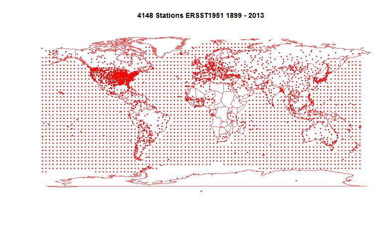
Here is the map of the 4148 (more than usual) stations reporting:


I will be quite busy over Christmas, so light blogging. I'll report on GISS if it comes soon.

Wednesday, November 20, 2013

Pausebusting NOAA


In previous posts here, here and here, I have been discussing issues in infilling cells in the HADCRUT 4 dataset, following a new much-discussed paper by Kevin Cowtan and Robert Way in QJRoyMetSoc. They used satellite data and kriging to extend the data; I looked at a much simpler approach of infilling with latitude averages from the same data (rather than the implicit infilling with global average). I found that it gave rather similar results, although with more limited effect.

Now I want to try it with the similar NOAA gridded data set which is used for their index. They give a detailed description at this download site. It is a similar 5°x5° grid, so the same analysis should work.

I show below first plots of both HADCRUT 4 and NOAA coverage. NOAA has greatly fewer gaps, but also fairly extensive omissions near the poles. Then I show the latitude breakdowns, with seasons. I have included the C&W and UAH plots for comparison.

Coverage plots

This is an active plot - you can choose dataset and view. It counts data in each cell/month from 1979 to 2012. Red is for no data, cyan is complete, and there is shading for intermittent data.


NOAA N
NOAA S
HAD 4 N
HAD 4 S

NOAA coverage is more extensive than HADCRUT, with some odd inclusions (eg central Greenland) and omissions (S Pole). Still, I found using the latitude average method described in previous posts with smoothing parameter r=0.1, that I had to include an extra level of bands to get enough data for lat 85-90S.

Latitude average trends

This is a similar active plot to the one in the previous post. NOAA data replaces HADCRUT 4, and I have increased the width of those curves, since they are new. UAH and the C&W hybrid HADCRUT 4 result are included for comparison.


Annual
DJF
MAM
JJA
SON

(Update - again I made an error with latitude sign (the problem is that HADCRUT orders from N Pole, NOAA from S) So NOAA were reversed, Fixed now.)
The background stripes indicate the latitude bands; N pole is on the right. There's a faint red vertical marking multiples of 30°. In the centre is a little figure showing the global totals, on the same scale.

Here is a table of the global trends, 1997-2012 in C/decade:


SeasonNOAANOAA AvHADCRUT 4HAD 4 Lat AvUAHC&W Hybrid
DJF-0.0519-0.0049-0.04890.00970.02760.0536
MAM0.06880.11230.0660.10190.06390.1276
JJA0.06290.07890.08920.09660.120.1187
SON0.10840.13470.10810.12770.15750.1688
Annual0.04850.08140.05390.08440.09360.1187

The results of NOAA and HADCRUT 4 are very similar, in effect on trend and in seasonal variation. Both show a substantial trend increase in trend over this period, as a result of simply using the appropriate latitude average to infill rather than the global.


Tuesday, November 19, 2013

Seasonal trends for infilled HADCRUT


I have been posting on ways of dealing with cells in the HADCRUT 4 surface temperature anomaly grid which have no data. This follows a new much-discussed paper by Kevin Cowtan and Robert Way in QJRoyMetSoc. They used satellite data and kriging to extend the data, particularly into polar regions. The result that created particular interest concerned trends in a recent period, 1997-2012, which has been characterised as a "pause", partly because HADCRUT showed little trend. C&W found that the trend was significantly greater with this extra care.

I have been discussing this, in posts here and here. In the second post, I showed that simply infilling missing cells each month with the average for the latitude band, rather than implicitly by the global average (the effect of omission) also gave a substantially greater trend over this period.

Interest has been expressed in the seasonal nature of this change. The Arctic amplification is expected to be predominantly a winter effect (Serreze). So here are plots of the various infills (None, my lat av, C&W and also UAH for comparison) over the four seasons, and annually. I have taken William Connolley's suggestion of plotting against sin latitude to avoid overemphasising the polar bands (Mercator-style).


Here is the plot. It's an active plot - you can choose your season. The "HAD4 Lat" is my infill with latitude band averages, with parameter r=0.1, as described here. The other datasets were introduced and plotted here.


Annual
DJF
MAM
JJA
SON

The background stripes indicate the latitude bands; N pole is on the right. There's a faint red vertical marking multiples of 30°. In the centre is a little figure showing the global totals, on the same scale. DJF etc indicate the seasons by initial of the months.

Here is a table of the global trends, 1997-2012:

SeasonHADCRUT 4HAD 4 Lat AvUAHC&W Hybrid
DJF-0.04890.00970.02760.0536
MAM0.0660.10190.06390.1276
JJA0.08920.09660.120.1187
SON0.10810.12770.15750.1688
Annual0.05390.08440.09360.1187

An interesting aspect is that, while the Arctic does have a marked maximum in NH winter, that is a minimum season of of global trends, and quite markedly so. There is a substantially negative trend in the adjacent N latitudes, from about 40-60°. It is interesting to speculate on whether these are related. The global trend was also negative for this season in the original HADCRUT, but the infilling, particularly with the C&W hybrid, had the greatest effect.

The Antarctic region does not have a marked seasonality in the trend, and nor does any other (they don't have big trends at all).


Monday, November 18, 2013

Coverage, Hadcrut 4 and trends

This post is inspired by the new paper by Kevin Cowtan and Robert Way in QJRoyMetSoc, which I wrote about in my previous post. The key issue that they identified was bias due to lack of coverage in regions that were warming rapidly, specifically near the poles.

HADCRUT gathers temperature anomalies each month in a 5°x 5° lat/lon grid. Where gridcells have no data, they are omitted. As I said then, this is not a neutral decision. Whenever you average over a continuum with fixed divisions and have missing values which you omit, that is equivalent to replacing those points by the average of the data you have. That is often not a good choice, and if there is anyway of better estimating the missing values, it should be used. I did my own analysis of coverage here and here.

C&W use a quite elaborate scheme for deriving those infills, involving satellite data and kriging. I wondered how much could be achieved by a very simple improvement. The main bias is believed to be latitude-based; specifically, that polar regions behave differently to the rest. So I sought to replace the missing cells by a latitude band average rather than global. I'm not using kriging or satellite data.

I think this is useful because the new paper has been greeted as a "pausebuster" because it shows a much less reduced trend in recent years. So I'm focussing on the 16 year global trend since Jan 1997 (to end 2012), also treated in C&W. I think a simple demonstration of the coverage correction would reinforce C&W's much more thorough and elaborate treatment.

Coverage and latitude averages


This image from the C&W site gives an idea of the coverage issue. There is a lot of missing data outside the polar regions, but it is not clear whether that biases the trend. But the polar regions are warming rapidly, and to in effect treat the missing cells as global average does create a bias.

I formed a latitude average for each month for a 5° band using the following weighting rules. Cells in that band with data have weight 1. Cells in adjacent bands have weight r, where r is typically 0.1-0.2. Cells in the band adjacent to that have weight r^2. Others are not used.

The point of this is that where there is good coverage, the average will be close to the band average. But if the central band has few data cells, the adjacent band cells, though downweighted, will be more significant by their numbers, avoiding the high variance that would come from relying on just the few cells in the central band. And if both those bands have few entries, then the third level comes into play. This is really only relevant to the N pole band, where the two bands above 80° are sparse.

I then simply infill missing data for each month with the latitude band average value, and compute trends for the resulting complete set.

I expect the result to vary little with r - this will be shown.

Results

The trend over the period 1997-2012, in °C/decade was:

HAD 4 cited C&W 0.046
HAD 4 with global average infill0.0539
HAD 4 with lat av infill r=0.050.0854
HAD 4 with lat av infill r=0.10.0846
HAD 4 with lat av infill r=0.20.0821
GISS cited by C&W0.080
C&W hybrid0.1187

So this simple infill almost doubles the trend, but does not go as far as the C&W hybrid method. It is, however, close to GISS, which interpolates to avoid missing cells.

The graph by latitude band is


Here is a graph to show the small variations with different r (parameter for spreading estimate of latitude band average)


Conclusion

This shows that the trend is indeed biased by coverage. Using a latitude average estimate to replace missing values is at least as justifiable as the default global average. No special interpolation techniques are used, nor any alternative datasets. The change is substantial, though not as complete as C&W. However, the plot of trend by latitude bands is quite similar to the hybrid method.

October GISS Temp down by 0.13°C

GISS LOTI went from 0.74°C in September to 0.61°C in October. TempLS was fairly steady, satellites mixed.

GISS has been unusual lately among surface indices. You can see it here. While TempLS and NOAA have been fairly steady over the last five months, GISS went down, then up, and is back to where it started.


Here is the GISS map for Oct 2013:

And here, with the same scale and color scheme, is the earlier TempLS map:


Previous Months


September
August
July
June
May
April
March
February
January
December 2012
November
October
September
August
July
June
May
April
March
February
January
December 2011
November
October
September
August 2011

More data and plots


Sunday, November 17, 2013

Cowtan and Way trends


A new paper by Kevin Cowtan and Robert Way in QJRoyMetSoc is getting a lot of discussion. See Real Climate here, SkS here and here, Lucia here and here, Cliamte Etc here.

The authors say:
"A new paper published in The Quarterly Journal of the Royal Meteorological Society fills in the gaps in the UK Met Office HadCRUT4 surface temperature data set, and finds that the global surface warming since 1997 has happened more than twice as fast as the HadCRUT4 estimate."

Some eyebrows have been raised at the size of the trend change from improving a relatively small area. I was surprised, too. So I did some calculations to see.

Update: The R code for calc and plotting is here. The data is provided by the authors here.

The need for the change

Met station coverage of the Earth is uneven. When grid averages are taken, and then combined for a hemisphere or global average, quite a lot of cells have no data. What to do?

The default is to leave them out of the average. But that is not a neutral decision. In arithmetical effect, they have been replaced by the average value of the cells with observations. And this may be a poor approximation. It should be improved with whatever information is available.

The particular issue with Hadcrut is data at the poles. In computing trends, missing cells are given the global average trend, but the poles are warming much faster. This is a big bias.

Cowtan and Way used UAH satellite data to get that improvement. I won't go into detail here about how they did it, but I'll just look at the dataset results. They looked in particulat at a period from 1997-2012 (16 years) which is commonly discussed as a pause. They showed trends including their hybrid method, which uses UAH-based infill:
DatasetHADCRUT 4     UAH            C&W hybrid
Treend C/dec0.046     0.0940.119
Actually, I don't think they cited the UAH trend, but I calculated it from the data they used.

So the new trend isn't that much greater than UAH. But to see just how modifying polar trends made the difference, I'll show the latitude averages for the 5° ranges.

Latitude averages


In computing these for the HAD 4 data, I replaced data-free cells with the global average for that month. So they aren't a good guide (for HAD 4) to actual trends, but, as described above, they do correspond to what effectively goes into the global average, so you can see the effect of changes. Here's the plot:


(An earlier version of this plot had the sign of latitude wrong)

As you'll see, the Antarctic and Arctic trends for the hybrid are large, but not so very much larger than UAH. I am still a little surprised that this is so, but it's not unbelievable.

Appendix

Here are the numerical results as plotted:
LatitudeHAD 4UAHC&W hybrid
87.50.1390.8191.509
82.50.190.9871.692
77.50.3730.8971.452
72.50.6170.6411.196
67.50.570.4950.825
62.50.2360.3170.353
57.50.0410.120.088
52.5-0.0830.05-0.035
47.5-0.0560.013-0.034
42.50.115-0.0280.102
37.50.0610.0260.066
32.50.0670.1310.074
27.50.0850.1040.086
22.50.0510.0680.091
17.50.0740.0090.09
12.50.085-0.0150.093
7.50.056-0.0080.059
2.5-0.003-0.027-0.011
-2.5-0.031-0.017-0.044
-7.5-0.039-0.037-0.04
-12.5-0.01-0.039-0.004
-17.5-0.002-0.0280.01
-22.50.050.0360.063
-27.50.0880.0620.093
-32.50.1370.0660.141
-37.50.0820.0530.094
-42.50.0460.1260.074
-47.5-0.0790.202-0.048
-52.5-0.1140.215-0.039
-57.5-0.170.154-0.041
-62.50.040.102-0.009
-67.50.080.1520.099
-72.50.0790.5690.566
-77.50.1220.4370.646
-82.50.0860.2990.685
-87.50.1010.2230.901
Global0.0540.0940.119


Wednesday, November 13, 2013

TempLS global temp very small increase in October


The TempLS monthly global anomaly for October 2013 was 0.502°C, compared with 0.493° in September. TempLS has been very stable for the last five months. UAH showed a modest decrease.

Here is the spherical harmonics plot of the temperature distribution:
Update 18/Nov I see that by mistake I had link graphics for April in place of October. Fixed.


NW USA cold, SW Europe and central Asia warm..
And here is the map of stations reporting:


Thursday, October 31, 2013

September GISS Temp up by 0.13°C


GISS LOTI went from 0.61°C in August to 0.74°C in September. because of the US shutdown, the report was exceptionally late, and in fact the surface indices were reported in the reverse of the usual order, with HADCRUt first. GISS showed the highest rise; NOAA 0.03°C, HADCRUT 4 and TempLS less than 0.01°C. But the satellite indices showed rises comparable to GISS.


Here is the GISS map for September 2013:


And here, with the same scale and color scheme, is the earlier TempLS map for September:

And here is the WebGL map of actual station temps during the month.

Previous Months

August
July
June
May
April
March
February
January
December 2012
November
October
September
August
July
June
May
April
March
February
January
December 2011
November
October
September
August 2011

More data and plots

Monday, October 28, 2013

New page - climate blog index


I described here an experiment I tried in July (when Google Reader faded). I selected about a dozen popular climate blogs, for which I regularly looked at the RSS files (every two hours). They aren't all blogs that I agree with, but they are ones at which I sometimes comment.

A database of posts and comments has accumulated, and I've done some organising to make that accessible without a huge initial download. So I've scrubbed it up and promoted it to a page, visible upper right.

It's just a table of blog names, thread titles, dates and authors (comments and posts). The dates are linked to the source. You can order by each column, or you can subset by each of those properties (in combination, if you want). You can, for example, put up a linked list of all your own comments on those sites over a time period.

It starts with just the current and previous month. But you can vary the time range (more data =slower). More details are at the page.

Monday, October 21, 2013

TempLS global temp up 0.01°C in September


GHCN now seems to be OK after the shutdown. There was a tiny increase from August (0.49°C) to September (0.504°C). UAH seems to be the only other index reporting to date - it showed a much larger increase.

Here is the spherical harmonics plot of the temperature distribution:


Warm spots in Canada and Australia; cold in Siberia and E Europe..


And here is the map of stations reporting:


Monday, October 14, 2013

Shutdown - TempLS delayed


GHCN has been updating, as has ERSST. But when I look into GHCN, oddly, there are only US data, no ROW. So no TempLS post yet.

FWIW, the data that is there suggests a slight fall in Sept.


Sunday, October 6, 2013

The Shutdown and updating

Just a note on how the US government shutdown affects updated data here. Hopefully all will be fixed when it ends.
  • NOAA SST data isn't getting through, so the SST movies and WebGL trackball daily plots have no October data.
  • The NASA and NOAA websites are down, so there probably won't be a monthly index update for the duration. UAH is out and RSS should be OK.
  • GHCN data is getting through, so TempLS should be OK - may be the only one until HADCRUT comes out. The monthly updates of surface temp should be OK.
  • JAXA is unaffected.

Monday, September 23, 2013

Active ocean acidification calculator.


I wrote a post a few weeks ago on ocean acidification. The message was that there is more to acidification than pH, and that it's basically an issue of equilibrium between carbonate species. Difficulties of measuring pH can be avoided.

In the course of discussion, I said I would try to develop an active calculator to display some of the principles.

It calculates equilibrium adjustments, and I expect that is a rather specialised interest. I'm putting it forward to demonstrate
  • that any two of the species are sufficient to determine the others - pH is not essential and can be treated as just a following variable
  • CO2 when dissolved is almost completely reacted (at usual pH)
The main process of interest is the addition of CO2, which causes carbonate to go down. This affects the solubility of CaCO3. I haven't shown that equilibrium, because it only makes sense where solid CaCO3 is present. The calculator has two modes. You can show the effect of adding a fixed amount of any reagent, or you can specify any two. Details and gadget below the jump.

The gadget

There are four species (H+,CO2,HCO3- and CO3--). For details of the chemistry, see my previous post. I also have two combinations, dissolved inorganic carbon (DIC) and total alkalinity (TA). These are conserved during the reaction as total C and nett charge. There are six bars, four in gold for the species, and two for the combinations. They are scaled on a negative log scale (like pH). You can click on each bar to vary each constituent. But first you need to set a constraint using the radio buttons at the top. The default setting is marked "Add". Here you can only vary the species (gold). Your click will indicate what the concentration would have been if the change (+ or -) happened without reaction. But in fact your addition is added appropriately to DIC and TA, and then the equilibrium adjusts with these held constant. Sometimes almost all what you have added reacts, and you see only a small change in that variable. If you click another radio button, you move to "set" mode. The column you have marked is held fixed, and the column you click (a different one) will move to the value you have set (if possible - see below). "Set" is a slight misnomer - it's better seen as the values the other components are known to have when the "set" values have been measured. The blue bars show the current state, with log values beside. The absolute values show in the table on the right, with the pK values. The intent, not yet implemented, is that you can vary these.

Update: You can now vary pK1 and pK2 (but see Notes below). Modify the text box and click the new "Accept Data". You can use this to look at totally different equilibria if you want. To make it monoprotic, just set pK2 to, say, 15.

Numerics

I'm using a Newton-Raphson process to solve the equations. This is fast and accurate, but may not necessarily converge. On the right there is a purple box which tells you whether your request has converged or failed. If failed, for whatever reason, no change has been made and you can try again. Some requests are impossible. For example, no carbon species can exceed DIC. But sometimes the Newton process just had trouble with the size of change you asked for. Try getting there in two steps.

Graph

A Bjerrum plot is shown (from the previous post). It shows equilibrium concentrations normalised against DIC vs pH. A thin gold bar moves to show where you currently are on the plot.

Here it is:


Notes

The constants pK1 and pK2 come from Zeebe's review article referred to in my previous post. I do not distinguish between CO2 and H2CO3, and the constants reflect that. [CO2] means the combined value. A pK1 based on carbonic acid alone would be lower, but you would then need the equilibrium between CO2 and H2CO3.


Monday, September 16, 2013

Adjusting temperature series stats for autocorrelation.


I've been writing a lot lately on autocorrelation for temperature time series. This is basically a methods post.

I've often referred to a post by Hu McCulloch, in which he reproves a scientist for quoting just a OLS regression for a monthly series with OLS CI's, and shows how the CI's are much larger if the residuals are assumed to be not white noise but AR(1) correlated. He gives a useful set of formulae, and describes in particular the Quenouille AR(1) correction to the trend uncertainty. This seems to be the current standard, and it is what I use in my trend viewer.

Stats program R has an arima(xreg=) function which will give trends with error estimate for general ARIMA models. It solves a slightly different optimisation for regression, with a different trend for each ARIMA type. But for AR(1), the results are similar to the Quenouille approach.

So why bother with approximations? I'm interested for two reasons, in connection with the trend viewer. In my weekly updates, I do about 5 million regressions. That takes a bit over an hour, but only because I avoid the individual regression summations, instead using differences of cumulative sums calculated for each dataset. You can't to that in a package. arima() would take many hours.

The other reason is that to provide interactive output, I have to be able to repeat the calculation in Javascript. Time isn't an issue there, but programming simplicity is.

In this post, I'll describe some extensions which allow Quenouille style corrections to more complex ARMA() models. I also give corrections to the OLS trend. The trend corrections are O(1/N) (N=#data) and I believe the error is then O(1/N^2), and for the CI's, O(1/N). Those errors are for the approximation to the stochastic model - whether it is the right model is a greater uncertainty.

With these formulae the complete procedure is
  1. Do a normal OLS regression.
  2. Calculate the residuals and estimate the first few autocorrelations (one lag for A(1)m 2 for AR(2) and ARMA(1,1) etc)
  3. Use the Yule-Walker equations to estimate the ARMA parameters. That just solves a few linear equations in the AR() parameters.
  4. Correct the trend and uncertainty using thge formulae given here.

Fitting stochastic models

I'm talking about fitting to regression residuals, so it is simpler to have a regression already done, although I described a method for simultaneously fitting regression and residual model. An ARMA model for regression residuals can be written: A(L)d=M(L)ε Here A is a polynomial in the lag operator L, A=1-A1*L-A2*L^2... applied to the time series d (so L d_i = d_{i-1}) M(L) is a similar polynomial in L: M(L)=1+M1*L+... ε is a vector of iid random variables The series d is taken to be the residuals of a regression on data y: d=y-a-b*x. The notation ARMA(j,k) means that A is of order j and M of order k. The effect of applying the polynomial A to d can also be represented by the lower triangular matrix (AR(2) example) A=
...0-A2-A1100...
...00-A2-A110...
...000-A2-A11...
This is of course a fragment - if d has length n then A is (n-j) x n and is Toeplitz. M also corresponds to such a matrix. The regression equation can be written M-1L d = ε Comprehensive programs like the R arima() will minimise d* K* K d where K = M-1L over coefficients a and b, and return the appropriate uncertainties. The alternative described above is to minimise d* d, and then adjust the coefficients and their uncertainty.

Finding and adjusting trend

The regression of the ARMA model gives trend b = y* KK x/ x* KK x, (KK = K* K) assuming K x has zero mean. But KK is symmetric, and also near Toeplitz, deviating near the top left and bottom right corners. The i'th row of KK (far from corners) is symmetric about the i'th value (with unsymmetric truncation). But the arithmetic progression x can be split into a constant xi and a part x-xi that is antisymmetric about i. The latter yields a zero sum with that row of KK, so the result is R*x_i, where R is the (constant near centre) rowsum of KK. So KK * x ≈ R * x This argument gives b = y* KK x/ x* KK x ≈ y* x/ x* x which is the OLS value. That's why only a small adjustment is needed - it is due to end effects. In the case of AR(n) models, the deviation of KK from Toeplitz only affects the top n and bottom n rows, so it is a fairly simple matter to add up the missing terms. The corrections to the OLS trend for the various models are, for time (=x) series y of length N:
OLS or AR(0) b
AR(1)b+(3*b+6*(y_N*A1+y_1)/(1-A1)/(x_N-x_1))/N
AR(2)b+6*(b+(y_1*(1-A1)+y_2+A2*y_(N-1)+y_N*(A1+A2))/(1-A1-A2)/(x_N-x_1))/N
And here are the results comparing these approximations with values computed with the R arima() program, setting xreg and using method="CSS".The corrected values are much closer than the OLS trend. Trends are from 1980 to July 2013.

DataHadcrut4GISSLONOAAUAHMSU.RSS
OLS1.56431.56261.48781.41011.2979
AR(1)1.57431.56611.49361.42571.307
AR(1) approx1.57421.56621.49361.42571.3073
AR(2)1.59461.59091.50721.47051.3392
AR(2) approx1.59591.59071.50791.46961.3389

Trend uncertainties.


The original adjustment for AR(1) autocorrelated regression residuals was given by Quenouille (1952), and has been widely used. In an earlier post, I gave the corresponding approximations for ARMA(1,1) and AR(2). I'll exrend to AR(3) and give the derivations here. Note that whereas for the trend we were looking for an O(1/N) adjustment, here it is O(1) - ie much bigger.

So it is sufficient to find an uncertainty adjustment for either the OLS trend or the true AR() trend. OLS is simpler.

Our ARMA model is
A(L)d=M(L)ε ε is iid
or, reverting to matrices
d=A-1M ε
The variance of the OLS trend b is then estinated by
var(b)= x*C x/x* x
where x is time (mean removed) and C is the estimated covariance of d. In the model, C=M*A*-1A-1M.
Now C is symmetric, and apart from end effects, Toeplitz, reflecting stationarity. That means that each row is symmetric about the diagonal. So when the i'th row of C multiplies x, the effect of the part that is odd about xi makes no contribution. But the even part is just the constant . So the effect of applying C to x is just to multiply by the constant rowsum of C (apart from O(1/N) end effects). The ignoring of end effects here requires that there is only moderate autocorrelation, so C is diagonally dominant.

Each row of C is just the diagonal value (zero-lag variance of d) multiplied by the acf. That diagonal value divided by x*x. So the correction required to the variance of b is just (with our 1/N caveats) the sum of the autocovariance function.

Now it is good to go back to polynomials. The (Toeplitz) matrix product M*M is equivalent to the polynomial M(L-1)*M(L). And the acf is almost just the set of coefficients of the Laurent series got by expanding M(L-1)*M(L)/(A(L-1)*A(L)) in powers of L. A Laurent series is just a power series with both positive and negative powers.

I say almost, because the zero'th order coefficient of that series is not 1. So we have to find it and divide by it. This could be done with messy series expansion calcs, but it is neater with complex analysis, replacing L by z.

The Laurent series may converge in an annulus in the complex plane, and here it converges on the unit circle. To get the central coeficient, divide by z and integrate on that contour. It's a rational function, so that just means summing the residues inside the unit circle.

How to do that? For the previous post I did the algebra by hand, but for AR(3) I resorted to Mathematica, and I'll describe that process. I write A(z)=(1-az)(1-bz)(1-cz), so
1/A(1/z)/A(z)/z=z2/((z-a)(z-b)(z-c)(1-az)(1-bz)(1-cz))
I don't need to ever find the roots a,b,c, and they don't have to be real. To get the residue at a, I define f(a,b,c)=a2/((a-b)(a-c)(1-a^2)(1-ba)(1-ca))
Then I ask Mathematica to Simpliify[f[a,b,c]+f[b,c,a]+f[c,a,b]]
It comes back with a polynomial in the numerator and factors in the denominator, symmetric of course in a,b,c. The factors in the denominator I can reassemble as values of A(z) at specific points. The numerator I can recognise symmetrics like ab+bc+ca, and re-express these as coefficients of A.
Let A0 be the result - the zero'th order coefficient of 1/A(1/z)/A(z). Then the numbers in the acf are just the Laurent coefficients of 1/A(1/z)/A(z)/A0, and the sum - the Quenouille correction - is just 1/A(1)/A(1)/A0.

So here are some results. First the formulae for the Quenouille factors for adjustment of trend uncertainty:

AR(1)(1+A1)/(1-A1)=A(-1)/A(1)
ARMA(1,1)A(-1)/A(1)*(1+M1)2/(1+M12+2*M1*A1))
AR(2)A(-1)/A(1)*(1+A2)/(1-A2)))
AR(3)A(-1)/A(1)*(1+A2+(A1-A3)*A32)/((1-A2-(A1+A3)*A32))

And here are the numerical results for the monthly data, period 1980-July 2013. First the OLS trend and standard error; then the various models, with in each case the R arima() trend and se, and then the se as calculated by the above Quenouille-style approx.

ResultHADCRUT4GISSNOAAUAHMSU-RSS
OLS trend β1.70201.70921.75001.40861.5676
OLS s.e. β0.04630.06510.05140.06650.0641
AR(1) trend β1.69841.70841.74491.41611.5678
AR(1) s.e. β0.07850.09360.07650.11010.0978
AR(1) Quen s.e.0.07810.09330.07620.10960.0974
ARMA(1,1) trend β1.69531.70251.74231.41881.5687
ARMA(1,1) s.e. β0.09460.11320.09360.11890.1027
ARMA(1,1) Quen s.e.0.09400.11230.09300.11820.1022
AR(2) trend β1.68541.68311.73631.42211.5756
AR(2) s.e. β0.09290.11030.08990.12280.1045
AR(2) Quen s.e.0.09250.11060.08940.12170.1037
AR(3) trend β1.68931.68531.73951.40981.5673
AR(3) s.e. β0.09080.10600.09010.10730.0971
AR(3) Quen s.e.0.09000.10590.08930.10600.0961

Conclusion

For autocorrelated data, the ordinary OLS trend analysis will get the trend near right with a O(1/N) error, which can be calculated. But the standard error will be substantially underestimated. There are at least three options
  • Use a package like arima() in R, which probably uses a general optimisation algorithm
  • Use the Newton-Raphson-style algorithm that I described here (I'm planning an update with more systematic code). This is fast and does everything at once. It is easy to code in R, but not so much in, say, Javascript.
  • Calculate and correct the OLS trends, using Yule-Walker equations to estimate model coefficients.
The approximations will deteriorate with vary high autocorrelation. Then the best remedy is to instead use, say, annual averages. Little information will be lost, and the autocorrelation will reduce.


Sunday, September 15, 2013

August GISS Temp up by 0.09°C


GISS LOTI went from 0.53°C in June to 0.62°C in August. This rise. similar to last month's fall, was larger than TempLS and contrasts with satellite measures, which declined.


Here is the GISS map for August 2013:


And here, with the same scale and color scheme, is the earlier TempLS map for August:


And here is the WebGL map of actual station temps during the month.

Previous Months

July
June
May
April
March
February
January
December 2012
November
October
September
August
July
June
May
April
March
February
January
December 2011
November
October
September
August 2011

More data and plots

Wednesday, September 11, 2013

TempLS global temp up 0.04°C in August

The TempLS monthly anomaly for August 2013 was 0.500°C, compared with 0.461° in July. This continues a sequences of small changes.

Here is the spherical harmonics plot of the temperature distribution:


Warm spots in East Europe, N Canada. Australia also continued its long warm spell. S America cool.


And here is the map of stations reporting:


Monday, September 9, 2013

More on global temperature spectra and trends.


In my previous post, I looked at ARIMA models and their effect on uncertainty of temperature trend, using autocorrelation functions. I was somewhat surprised by the strength of apparent periodicity with a period of 3-4 years.

It is plausible to connect this with ENSO, so in this post I want to probe a bit with FFT's, removing ENSO and other forcings in the spirit of Foster and Rahmstorf. But first I'd like to say something about stat significance and what we should be looking for.

Statistical significance is to do with sampling. If you derive a statistic from a sample of a population, how much would it vary if you re-sampled. How this applies to time series statistics isn't always clear.

If you measure the average weight of people on a boat, and you are interested in whether that boat will float, then yo don't need statistical significance. You only need to measure accurately. But if you want to make inferences about a class of people on boats, then you do. And you need to define your population carefully, and decide to worry about variables like age and sex.

A trend is just a statistic;  is a measure of growth. You can quote a trend (for a fixed period) for something that is growing exponentially, not of course expecting it to be constant over other times. Trend is a weighted average, and the same issue of statistical significance applies. You can quote a trend for 20 Cen temperature anomaly without worrying about its properties as a sample, or that it was not very linear. But if you want to make inferences about climate, you do need to treat it as a sample, and form some model of randomness. That involves the study of residuals, or deviation from linearity, and so apparently non-random deviation from linearity also becomes important, because you have to distinguish the two.

The autocorrelation functions of the previous post illustrate (and help to solve) the issue. Short term lags form the basis of the stochastic models we use (ARIMA). But once we get beyond lag ten or so, there is behaviour that doesn't look like those models. Instead it is due to periodicities, and quadratic terms etc.

Now in that case, the (lag stochastic/secular) regions were not well separated, and it is likely that the secular effects are messing with the ARIMA models.

So, coming back to what "sampling" means here. It's a notion of, what if we could rerun the 20th cen? Of course, with GCM's we can. But would the secular effects repeat too? ENSO is a case in point. It has aspects that can be characterised - periods etc. But they aren't exactly predictable. Phase certainly isn't. Should they have some kind of stochastic representation?

We can defer that by using what we know of that instance of ENSO forcing (and volcanic and solar) to try to focus more on the ARIMA part of the acf's. I'll do that here by looking at the Foster and Rahmstorf residuals.


Power spectra

But first I'll revisit the previous analysis and its apparent periodicity. Here are the acf's:


HADCRUT
GISS
NOAA
UAH
MSU-RSS

And here are the corresponding power spectra, which are the discrete Fourier transforms of the acf's


HADCRUT
GISS
NOAA
UAH
MSU-RSS


You can see the prominent peak at about 0.22 yr-1 (45 months) which Is likely ENSO related.

Removal of forcings

Foster and Rahmstorf (2011) used known forcings (ENSO, volcanic and solar) to regress against temperature, and showed that the residuals seemed to have a much more even trend. I did my own blog version here. But for this exercise I used the F&R residuals described by Tamino.

First, here are the power spectra. The marked frequency at about 0.22 yr-1 (or its harmonic at 0.44 yr-1) is still often dominant, but its magnitude is reduced considerably:


HADCRUT
GISS
NOAA
UAH
MSU-RSS

And here are the acf's. The critical thing is that the oscillation near zero is reduced, and intrudes less on the peak at zero, which is smaller, and should be freer of secular influences.


HADCRUT
GISS
NOAA
UAH
MSU-RSS

Here are the acf's with models fitted. It is no longer the case that ARMA(1,1) is clearly better than AR(1), and both taper close to zero before the acf goes negative. For the satellite indices, there is little difference between the models. In all cases, the central peaks of the acf's are much less spread, indicating much tighter CIs.


HADCRUT
GISS
NOAA
UAH
MSU-RSS

Finally, here is the table of model fit results:

ResultHADCRUT4GISSNOAAUAHMSU-RSS
OLS trend β1.70201.70921.75001.40861.5676
OLS s.e. β0.04630.06510.05140.06650.0641
AR(1) trend β1.69841.70841.74491.41611.5678
AR(1) s.e. β0.07850.09360.07650.11010.0978
AR(1) Quen s.e.0.07810.09330.07620.10960.0974
AR(1) ρ0.48020.34450.37350.46130.3948
ARMA(1,1) trend β1.69531.70251.74231.41881.5687
ARMA(1,1) s.e. β0.09460.11320.09360.11890.1027
ARMA(1,1) Quen s.e.0.09400.11230.09300.11820.1022
ARMA(1,1) ρ0.69010.64330.66720.56960.4849
ARMA(1,1) MA coef-0.2744-0.3378-0.3447-0.1353-0.1058


As Foster and Rahmstorf found, the trends are not only quite large, but have much reduced standard errors, whatever model is chosen.

Conclusion

Subtracting out the regression contributions of the forcings (ENSO, volcanic and solar) does reduce the long-lag oscillatory contributions to the acf, though they are not eliminated. This enables a better separation between those and the stochastic effects.


Thursday, September 5, 2013

Uncertainty of temperature trends.

This post follows a previous one. There have been intermittent controversies about quoted trends for temperature series. One from about four years ago was well-described by Hu McCulloch, with a good summary of the theory. The issue is that the simple OLS regression gives generally good trend measures, but the associated uncertainty is greatly underestimated if the residuals are correlated in time. Monthly series are usually quite correlated; annual series much less so, but they have higher uncertainties due to fewer degrees of freedom. The effect of correlated residuals is often likened to a reduced number of dof.

The standard remedy has been the one recommended by McCulloch (but long used before); an AR(1) regression model, though usually implemented as the OLS trend with a Quenouille correction (1952) to the confidence intervals of the trend. This post introduces an extension of the Quenouille approx to ARMA(1,1).

The Quenouille approximation is fine, but in 2011 Foster and Rahmstorf argued that AR(1) was inadequate, and ARMA(1,1), with an extra parameter, better described the observed autocorrelation functions.

This has some practical consequences, because ARMA(1,1) was then adopted by the Skeptical Science trend calculator and is being cited as the basis for various numbers of "years without statistically significant warming". However, other such quotes, like the famous "none since 1995" quote of Phil Jones, are based on the more standard AR(1) model.

My trend viewer uses AR(1) with Quenouille. Since I'm regularly updating now, the inconsistency may be an issue. So I decided to further examine the choice of model.


Some linear algebra of regression and ARIMA

This builds on an earlier post showing how autoregressive models could be fitted exactly by solving polynomial equations. Suppose we have a vector y of temperatures over consecutive time periods (months), and a matrix X of regressors, the first column just o\1's, and the second (and last) the times of each y. The 3-col matrix Y is just (y,X).

Then the OLS regression problem is to fit to the stochastic model
d = Y B = ε; B=(1, -b), b=(α,β)
The RHS ε is a vector of random variables, which are assumed iid (indentically independently distributed). b are the coefficients, d the residuals. The OLS fit is X* (Y B) = 0.

An AR(1) model brings in a lag matrix L. Ly is just y with every element moved back 1. It is just a square matrix with 0 everywhere except for a 1 just below each points on the diagonal. The stochastic model is just (I - ρL)d = ε.

The operator on d has these properties: it is banded (just two diagonals), and Toeplitz. Toeplitz means that each row is almost a copy of the one above, shifted one place to the right (so just one new element on the left). Here it expresses stationarity - ie the relation between variables doesn't change between timesteps (except that time moves on a step).

A shift of two places is just expressed by the matrix L2. The general ARMA model is
A d = M ε
where A and M are just low order polynomials in L. The notation ARMA(a,m) just lists the order of these polynomials. There are a+m parameters.

Again ε is assumed iid, so the correct fitting is the LS solution of M-1A d = 0. However, in terms of the coefficients b, this is little different from the OLS fit. The significant difference comes in the uncertainty attributed to the coefficients.

The OLS formula X* Y B=X* ε expresses the coefficients b as stochastic variables (the solution values correspond to mean ε=0),
b= (X*X)-1X* ε + mean(b)
so Covar(b) = (X*X)-1 X*K X (X*X)-1
where K=Covar(ε).


Autocorrelation


Continuing the idea that stationarity implies Toeplitz matrices, it is reasonable to expect that K can be modelled by a Toeplitz matrix, in which each row is a copy of the autocovariance, centered on the diagonal. And the covariance of b is then made up from the zero, first and second central moments of the acv. We could calculate it that way, but noise from the ragged ends is a problem. That's why ARMA models are used.

But in the ARMA models, we have a similar Toeplitz matrix which is
(A-1M)* A-1M
so it is reasonable to compare these with the acv. I'll normalise so central values are 1, which makes the acv an acf.

Here is a plot of the acf's of five major temperature indices from 1980 to present, using the R acf() command. It's an active plot - you can press the buttons for the case you want:


HADCRUT
GISS
NOAA
UAH
MSU-RSS


There are some marked features in these acf's, to an extent that I found surprising. The gerneral pattern is that the part close to zero represents the structure of randomness, while further away it is dominated by systematic variations - periodicities and other non-random deviations from linearity. There is a marked periodicity at about 45 months. It's in the data, and shows up in a FFT. Here it shows up as a sort of sinc function. Naturally the acf models can't follow it, nor should they. It would be better to take out some of these low frequency effects. I'll say more about that in a future post that looks at AIC considerations.

Now AR(1) fits a geometric progression, forcing a match to the first lag. As Foster and Rahmstorf say, this tends to underestimate, and ARMA(1,1) gives an extra degree of freedom which allows the later decay to vary to match the slower decay observed. So here are the same acf's but with the two models added. The coefficients are calculated using the R arima() command with the CSS optimisation, and the model acf's produced by ARMAacf().


HADCRUT
GISS
NOAA
UAH
MSU-RSS


But now you can see that, while the ARMA(1,1) is a good match until the acf gets close to zero, it of course stays positive while the acf goes negative. The central moments of the acf include the negative parts, so it's reasonable to say that the ARMA(1,1) approx overshoots, while the earlier undershoot of the AR(1) approx starts to look better.

What about other models? Here is HADCRUT 4 modelled with AR(2) and AR(3) as well.

A family of Quenouille approximations


If you center the time sequence so that it has zero mean, then the trend variance is proportional to the zero'th moment (area) under the acf within the range. Since the ARMA model acf's generally tend rather rapidly to zero relative to the trend range, it's a good approximation to take the whole acf area. If ρ is the parameter of the AR(1) model, then the acf G(i,j) = |ρ|i-j, and if you sum over all j for fixed i, the area is (1+ρ)/(1-ρ).

For general ARMA with polynomials A(L), M(L), L=lag, there are corresponding approx factors. I'll describe the general theory in a coming post (it involves complex analysis), but for ARMA(1,1)
with M(L)=1+mL, A(L)=1-rL,
Q=(1+r)/(1-r)*(1+m)^2/(1+2*m*r+m^2)

Results

The coefficients are calculated using the R arima() command with the CSS optimisation. The period is from 1980 to June 2013. Trends are quoted in °C/century. Note that I give standard errors only - you need to multiply these by 2 to get a conventional confidence interval.


ResultHADCRUT4GISSNOAAUAHMSU-RSS
OLS trend β1.56621.56831.48421.41391.3039
OLS s.e. β0.06560.07050.06210.09160.0900
AR(1) trend β1.57071.57941.49251.44901.3269
AR(1) s.e. β0.14520.13710.13310.25090.2372
AR(1) Quen s.e.0.14480.13670.13270.25040.2371
AR(1) ρ0.65910.57970.64090.76380.7480
ARMA(1,1) trend β1.58011.59561.50381.47141.3474
ARMA(1,1) s.e. β0.21260.19850.19110.32980.3393
ARMA(1,1) Quen s.e.0.21150.19760.19010.32900.3387
ARMA(1,1) ρ0.85950.83080.84660.87140.8861
ARMA(1,1) MA coef-0.3785-0.4007-0.3690-0.2677-0.3329

Conclusions and next steps

I think AR(1) probably underestimates the variability of the trend and ARMA(1,1) probably overestimates it. I think it is possible to use the area under the ACF directly without use of a model, but it will require tapering, which may introduce similar ambiguity.

One quantitative way of deciding when increasing the number of model parameters should end is the Akaike information criterion. Up to ARMA(1,1) there is no sign of overfitting.

I'll expand on the topic of the extended Quenouille approx in a future post. The mathematics is interesting, and the results are elegant. But it requires the model coefficients (as it does for AR(1)), so increasingly it only sidesteps a smaller part of the work. I described in an earlierautocorrelation post how these could be obtained by polynomial solution; I have a more systematic version which I'll post soon.

Saturday, August 31, 2013

Significant warming

I'm seeing more frequently conflation of "no recent warming" with "no statistically significant warming". At WUWT I saw a comment by Willis Eschenbach:
"the UAH record shows no trend since August 1994, a total of 18 years 9 months."
This surprised me, because I knew UAH had risen quite a lot, so I noted that the trend was actually 1.38°C/century over that period. I was reproved
"Not statistically significant is the same as no trend far as we’re concerned."
and indeed Willis came in later to say
"I assumed you knew that everyone was talking about statistically significant trends, so I didn’t mention that part."

Phil Jones was famously hassled about whether there had been statistically significant warming since 1995, which lead to lots of "no warming" stuff. And there were even Keenan-inspired questions of the Met Office in the HOuse of Lords.

You'll notice this talk is coming from skeptics. Scientists don't spend a lot of time worrying about whether trends are "significant". There's good reason for that.

Significance tests can't prove anything. They seek to disprove a null hypothesis. And the question of whether the temperature trend was zero is of little interest. No-one expects that it would have been. So the question of disproving that is not important to them. And I can't imagine why skeptics think it is important to disprove that the trend was zero.

Lucia writes a lot about significance tests, but she always tests trends which, rightly or not, she associates with AGW sources. That makes sense - disproving those could mean something.

Anyway, Willis' example above illustrates what is wrong with equating no warming with no significant warming. It's quite possible for warming exactly in line with AGW predictions to be sytatistically insignificant, because of the number of observations and their noisiness. Now a theory can't do better than get it right. So in this post, I'll show how, under various measures of significance, various trends do not become significant until sustained for quite a lot of years. That's not because there's any doubt about whether they are happening.

I'll also look at the effect of measures. I'm planning a few posts on significance and autocorrelation. This arises partly because I'm now maintaining current data in my triangle trend plots. SkS has a trend calculator, and they give significantly different trend levels. The reason is that they use a different time series model. They give wider confidence intervals which lead to longer quoted periods of "no significant warming". I'll discuss the implications, and possible other methods.


Models of statistical significance

I'll say more about the maths of this in an upcoming post. For the moment, I'll just identify three models of linear regression residuals:
  • Naive OLS
    Assumes that after linear regression, the residuals are independently distributed. Markedly untrue for monthly surface temperature data. Not bad for annual averages.
  • Autocorrelated residuals.
    With an AR(1) model, the one most commonly used (if not naive). Often in conjunction with a Quenouille approximation to get the uncertainty. This is quite good for moderate autocorrelation, and if the model is inadequate, it is probably not because of that approx. My trend viewer uses it.
  • ARMA(1,1) model, as described by Forster and Rahmstorf. This has an extra degree of freedom, which allows the autocorrelation model to flatten when the lag-1 correlation indicates a steep slope. It is used by the SkS calculator.
Each extra parameter tends to increase the uncertainty of the trend, because it implies greater relations between the data points and hence fewer degrees of freedom.

Methods

I'm using the R arima function. The actual call for a time series T is:
 h=arima(T,k,xreg=time(T)/100)
where k is c(0,0,0) for OLS, c(1,0,0) for AR(1) and c(1,0,1) for ARMA(1,1).
h is a structure with a vector of coefficients h$coefs and a covariance matrix h$var.coef. The last coef is the trend, and the last diagonal in the cov matrix is taken to be the variance. In fact there's no simple variance for a multiple parameter model, but the matrix is diagonally dominant.

Significant trends

I'll plot the 95% uncertainty levels of trend (1.96σ), for periods ending Jul 2013 and starting in years going back in time, for each of the five common datasets, HADCRUT4, GISS Land/Ocean, NOAA Land/Ocean. UAH T2LT and MSU RSS T2LT. For any given uncertainty level, trends starting to the right of the line are not significant. I'll also plot the actual trends, in the same color; where the two curves cross is where the period of significantly positive trend starts. I'll do this for each of the three model types.

But first, because it's easier to explain, I'll show just one data set, UAH T2LT, with the three models. The black curve is the trend for the period from the starting date on the x axis to now (July 2013). The colored curves are the 1,96σ levels for each of the models for the residuals. Where the black curve is above the color, the trend from that year is significant. Where they cross is the most recent month for which it could be said that there has been no significant trend. A complication is that it may cross more than once.

Because the se for the ARMA(1,1) model is larger than the others, it gives a longer period of "no statistically significant trend". However, it's worth noting that the crossing point is at quite a high level; nearly 1 °C/century. That's a general pattern, because generally the trend curves have a negative slope in this region. It illustrates the point above - the trend may not be significant, but may also be fairly close to what was predicted.

It's interesting that the CI does not monotonically decrease with increasing period, but has a small spike around 1997. The error of the trend actually increases here (going back) because of the big 1998 spike with dips on each side. We;ll see that this is mainly a feature of the satellite measures.

I've marked a horizontal at 2 °C/century, which is often said to be an AGW predicted level for this time. You can see that the multi-parameter models which give a long period of no significance, would say that even this level, agreeing with prediction, was insignificant for nearly a decade.

Now here are a series of plots showing the trends, CI's and crossing points for each data set - one plot for each stochastic model:


The same pattern - as parameters are added the CI's widen and the "no warming" period extends back, but the actual degree of warming becomes increasingly positive.

Conclusion

I don't think scouting around for a period free of significant trend is a useful activity, because it doesn't actually prove that the theory made a bad prediction. For that you have to test the deviation from the prediction.

But if you really want to do it, you have to deal with the fact that there are different models which give substantially different answers. And models that allow long periods mark as insignificant periods that are increasingly in line with what was predicted.

In my next post, I'll look at the Akaike Information Criterion, which gives at least some objective criterion for choosing models. I'm also hoping to present a model-free approach.

Friday, August 23, 2013

More maintained data vizualization pages

Most of the data vizualization pages that you see on the right now have a scheme for automatic updating. I have added this capability to two of them:

Monthly GHCN plots, with WebGL and shading. These will be updated approx weekly.
Temperature trend viewer, also updated weekly.

These pages are updated daily

Latest Ice and Temperature.
Collection of High Resolution NOAA SST with WebGL.
Regional Hi-Res SST movies..


Friday, August 16, 2013

July GISS Temp down by 0.12°C


GISS LOTI went from 0.66°C in June to 0.54°C in July. This just about cancels the previous month's rise. It's also the second month where GISS moved much more than TempLS. Satellite lower troposphere temperatures fell by comparable amounts.


Here is the GISS map for July 2013:


And here, with the same scale and color scheme, is the earlier TempLS map for July:


Previous Months

June
May
April
March
February
January
December 2012
November
October
September
August
July
June
May
April
March
February
January
December 2011
November
October
September
August 2011

More data and plots


Wednesday, August 14, 2013

Temperature drives CO2?


For years now, we have been seeing graphs of CO2 and temperature records, with an observation that the pattern of CO2 lags temperature change. The claim is then that temperature drives CO2, not the other way around. Often this is expanded to the proposition that the rapid recent increase in air CO2 has nothing to do with the huge amount that we have emitted.

In the past, indeed CO2 has responded to sea temperature changes. That is no surprise. And CO2 has not been driving temperature. The reason is that nothing has been driving CO2. Unless something pushes up (or down) CO2, it can't force anything. And for millenia, the total amount of carbon cycling through various forms on the Earth's surface has been fairly constant.

None of this has anything to do with our present situation. We are looking at the response to burning 370 Gigatons of carbon (so far). There's no doubt what is driving that CO2 production. And it's a new introduction to the surface total. It is about 2/3 of what the atmosphere held 150 years ago, so it's big. We are about to find out how CO2 drives temperature.

Below the break, I'll look at some recent expressions of the Temp drives CO2 meme.

Ice ages

This is the traditional form. You see a plot like this:

with the observation that CO2 peaks and rises lag temperature rises by a few hundred years. That article starts:
"There are still people who insist that changes in CO2 can explain the pattern of glacial and interglacial periods."
but doesn't say who they are. Know anyone? It's not the IPCC! In the AR3, in 2001 with the evidence very recent, they weren't sure, but had no trouble with the idea that CO2 lags temperature:
" From a detailed study of the last three glacial terminations in the Vostok ice core, Fischer et al. (1999) conclude that CO2 increases started 600 ± 400 years after the Antarctic warming. However, considering the large uncertainty in the ages of the CO2 and ice (1,000 years or more if we consider the ice accumulation rate uncertainty), Petit et al. (1999) felt it premature to ascertain the sign of the phase relationship between CO2 and Antarctic temperature at the initiation of the terminations."

Fluctuations in recent CO2

For a while now, variants of graphs matching short-term changes in CO2 with temperature have been circulated, popularized particularly by Murry Salby in various lectures (though not written documents). An apostle is a commenter called Bart, or Bartemis. In a typical version, the annual difference of CO2 is said to be predicted by the difference between average temperature anomaly and an "equilibrium value", which is a fudge parameter. Plots like this are shown:

It shows Southern Hemisphere temperature compared with the annual difference of the CO2 series, with an offset to get them to match. It shows a good correspondence of the El Nino peaks, and some ability to trach the other short term ups and downs.

Why the SH, you might ask? Bart says it's not a cherry pick, but is because the SH has most ocean. And yes, the global temp is not so good:

The peaks still line up, but the trends drift apart. NH is worse. The reason is that the SH had a particular ability to match the fairly modest rate of temp rise with the longer termCO2 difference trend, while keeping the scaling right. Other plots don't. It's hard to see that as an ocean effect.

It illustrates the main issue. Diffencing the CO2 curve emphasises the short term fluctuations in what is otherwise a rather boring CO2 history. But it is the long term AGW rise that is of interest, and differencing suppresses that. The trend would have been there as a constant, except that the two curves are arbitrarily displaced to match, so even that has gone. The wiggle matching in no way explains the main effect - the 30% or so increase in CO2 since we've been emitting.

This is clearly shown in the equivalent AR3 plot of differenced CO2:

Now the differences are not displaced, and are clearly positive. It's that steady positive value that is to be explained. And the AR3 shows the explanation - the emissions, which are much steadier, but rise with the air increases, and always exceed them. The question is not how the CO2 got into the atmosphere, but where some of it went.

Predicting CO2

That wiggle matching has been going on for a while, but Bart also has a plot which does try to do the right thing - to integrate his differential form and predict CO2 rise from temperature (his plots here). He calls it "very high fidelity":


But is it? I've reproduced the last plot, the differences in red, here, along with a quadratic regression in black:

Here the CO2 curve is just 24-month smoothed, and the temperatures were modified as integrated 0.184*(GISSLO-0.424). These are slightly different to Bart's. I used his numbers first, but the curve was rather different; with these parameters it looks the same. There may have been some rounding. In any case, the point is that the quadratic regression fits much better than the GISS derived version.

But the quadratic version could have been expressed as integrated 8.832E-5*(t-429) where t is time in months from the start (Feb 1959). It's of the same form as the GISSLO fit, but using t instead of GISSLO. So simple date is a better predictor than temperature!

Well, not quite. In fairness, I should optimise the coefficients by regressing against GISS as I did against time. That gives the green curve in the above plot. It's very close to the time regression. So a better conclusion is that GISS is no better that time. On the longer term, there is absolutely no basis for saying that temperature drives CO2.

Conclusion

Short term temperature fluctuations, like ENSO, cause short term CO2 fluctuations of a few ppmv. And very large longer term fluctuations, like Ice Age terminations, cause larger fluctuations of up to 100 ppmv. All dwarfed by the current increase, which is clearly driven by our emissions.

Differencing the recent CO2 history shows up short term fluctuations, which show this matching. But this says nothing about the effect of our steady emissions, which differencing and translating removes. When the differenced version is integrated as a predictor, it offers no benefit.


IPCC derivative