This is a continuation of my
earlier post on ConUS temperatures. I'll compare the time series results with those of the NOAA datasets
ClimDiv and
USCRN. My series are labelled GHCN_a, for the calculation using GHCNM V4 adjusted, GHCN_u for unadjusted, and MoyCRN for my calculation using CRN data. The data is as in the previous post. I'll start with the period 2005-2019, since this is where there is USCRN data. I'll use that period for the anomaly base throughout. Here is a graph of the various time series:

They are so close that the differences are hard to see. It is easier with a 12-month running mean, mainly because the y-axis doesn't have to cover such a large range:
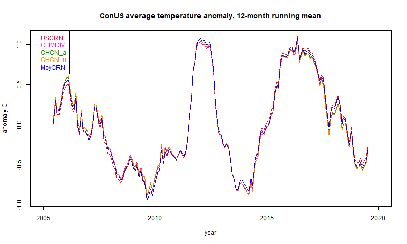
You can see that they are still very close, with some small difference between CRN and the other data. I can quantify this with a table of standard deviation of differences (unsmoothed data):
| 2005-2019 | USCRN | CLIMDIV | GHCN_a | GHCN_u | MoyCRN
|
| USCRN | 0 | 0.091 | 0.098 | 0.103 | 0.058
|
| CLIMDIV | 0.091 | 0 | 0.027 | 0.029 | 0.092
|
| GHCN_a | 0.098 | 0.027 | 0 | 0.01 | 0.096
|
| GHCN_u | 0.103 | 0.029 | 0.01 | 0 | 0.099
|
| MoyCRN | 0.058 | 0.092 | 0.096 | 0.099 | 0
|
| Trend | 3.103 | 1.957 | 1.958 | 1.76 | 2.616 |
The very close results are between GHCN adjusted and unadjusted. Here the stations and the methods are the same, so the only difference is the adjustment of the data. And it is very small. The difference between the GHCNs and NOAA's ClimDiv is larger, but still very small.
The two CRNs show a larger difference again, but the largest is between the CRN groups and the others. As I said in the last post, I don't think this reflects different accuracy of the stations; CRN are presumably better. It reflects the dominance of location uncertainty in the spatial averages. That is, how much spread would you see if you measured at different places. Or, how well do you real think the infilling represents the unmeasured regions. Of course, the different coverage gives a check; I showed in the last post a difference plot in one month between the sparse CRN and the dense ClimDiv.
I have also shown the trends, in °C/century. These are very uncertain on such a short period, and you might be surprised at their size, since the plot doesn't reflect that by eye. But a trend of 2 °C/Cen rises only 0.3°C in this period. The closeness reflects that shown in the sd table. I don't think much should be made of the fact that CRN shows a higher trend.
Over a longer period, the CRN results do not cover, and the other data diverge more. The different adjustment policies start to show. Here is the period since 1900. I'm now using a 5 year running mean to make the differences clearer:

Now there is an obvious difference between the adjusted and unadjusted. My GHCN_a still agrees quite well with ClimDiv. Again the differences can be quantified in the reduced table of standard deviations:
| 1900-2019 | CLIMDIV | GHCN_a | GHCN_u
|
| CLIMDIV | 0 | 0.064 | 0.257
|
| GHCN_a | 0.064 | 0 | 0.23
|
| GHCN_u | 0.257 | 0.23 | 0
|
| Trend | 0.84 | 0.828 | 0.371 |
The trends (in °C/Cen) again tell the story. Adjustment makes a big difference, as was noted back in USHCN V1. USHCN did both homogenisation and explicit TOBS adjustment, and I believe ClimDiv, which replaced it, does the same. GHCN relies on the pairwise homogenisation to cover the TOBS effect, and on this accounting it seems to do that very well.
Of course, some would say that this means that more than half the (modest) ConUS warming is created by adjustments. The proper scientific view is that unadjusted readings had a spurious cooling bias, which should be corrected. The sources of this are real and known:
- TOBS - it makes a substantial difference whether daily reading of a a min-max thermometer is done in the afternoon, where it tends to double-count warm days, or in the morning, where it double counts cool minima. The times of reading are known, and the pettern is a shift toward morning reading. This is a quantifiable cooling bias, and must be adjusted for. It isn't optional.
- Measurement changes - firstly improved screening, and then MMTS, both produced lower readings. These can be identified as abrupt changes relative to neighbours, and again must be corrected.
Next steps
I plan to set this analysis up as a regular calculation, as with TempLS global, and post the results on the data page. I have now done a similar analysis for Australia, which I'll also write about. I'll also work on a page of maps of past months, and possibly seasons and years.


 As always, the