The GISS V4 land/ocean temperature anomaly was 1.19°C in March 2020, down from 1.25°C in February. That compares with a 0.15deg;C fall first reported in the TempLS V4 mesh index (now 0.09°C with later data).
As usual here, I will compare the GISS and earlier TempLS plots below the jump.
Tuesday, April 14, 2020
Sunday, April 5, 2020
March global surface TempLS down 0.151°C from February.
The TempLS mesh anomaly (1961-90 base) was 0.898deg;C in March vs 1.049°C in February. This was less than the fall in the NCEP/NCAR reanalysis base index, which was 0.2°C.
The prominent feature, as with the winter months, was a band of warmth stretching from Eastern Europe through to E Siberia and China. While most of the US was warm, N Canada was cold, as was Antarctica and South Asia.
Here is the temperature map, using the LOESS-based map of anomalies.
 As always, the 3D globe map gives better detail.
The prominent feature, as with the winter months, was a band of warmth stretching from Eastern Europe through to E Siberia and China. While most of the US was warm, N Canada was cold, as was Antarctica and South Asia.
Here is the temperature map, using the LOESS-based map of anomalies.
As always, the 3D globe map gives better detail.Saturday, April 4, 2020
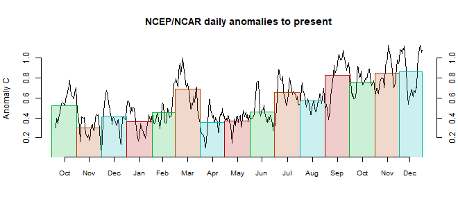
NCEP/NCAR reanalysis surface temperature down 0.2°C March 2020.
The Moyhu NCEP/NCAR index came in at 0.356°C in March, following 0.554°C in February, on a 1994-2013 anomaly base. It marks the end of a three month period of warmth. It began with a deep dip, of a kind that is common historically, but rare recently. There was only a partial recovery, and it was the coolest month since last June..
As with the warm months, the main feature was a band of warmth from Eastern Europe right across Russia and Siberia. But Canada and the adjacent Arctic was cold, as was Antarctica. South Asia,, too, was cool. The warm blob to the East of New Zealand persists.
As with the warm months, the main feature was a band of warmth from Eastern Europe right across Russia and Siberia. But Canada and the adjacent Arctic was cold, as was Antarctica. South Asia,, too, was cool. The warm blob to the East of New Zealand persists.
Wednesday, April 1, 2020
Covid19 - graphs of daily data - turning the corner?
Everyone seems to want to write about Covid-19 lately. Unlike most of the world, I am not an expert on epidemiology. But I have been anxiously looking at graphs of recent data to see if the social distancing measures are turning the tide. Like most people, I look at the Worldometer site. But I'd sometimes like to drill down a bit, and also to get all the graphs in one place. The main source of collected information seems to be the Johns Hopkins Github repository. So I looked into it.
My interest is in the point of inflection of the growth curves. So I have plotted here not the cumulative totals but the daily increments. They are noisier but give an earlier marker of change.
So here are the graphs. I hope to keep them updated daily. You can choose to see daily new cases or deaths. Just click on the radio button next to a country name. The buttons on the yellow backed line let you choose states or provinces of the named country. The bottom table (nations) entries are arranged in diminishing order of total cases as at the most recent day. Be aware that the y scale changes to fit each data displayed.
Some details:
Hong Kong is currently included with China, which is how the source does it. I'll probably separate it in the future. HK is mainly responsible for the recent rise in China cases - you can see it listed as a province of China.
Johns Hopkins separated US data from their global time series table, saying that they would post a corresponding US table. But AFAICS, they haven't yet done that. So I had to add up the US data from the daily reports (by county!), which may lead to some minor discrepancies. One is that I have omitted the numbers from the Princess cruise ships which were listed separately.
I have omitted some data that Johns Hopkins recorded for the Diamond Princess and Grand Princess cruises. They handled it in a messy way, splitting it up among countries and states. This will cause some minor discrepancies with WorldOMeter data. I have also not included in the US total some minor regions like Northern Marianas.
Subscribe to:
Posts (Atom)


