This is another in my series on a close examination of the GHCN V4 database of station monthly average temperatures. The previous post described a system for displaying time series graphs and numerical data for named stations (with search). This post draws attention to an older system, where a triangle mesh is shown for each month, with the reporting stations as nodes, and shaded according to temperature anomaly (TAVG) for that month. The shading is such that it is correct for each node (with complications where some are nearly coincident), so it reveals a lot about the low-level structure of he data. There is enough homogeneity that the overall pattern shows through. I had thought about replacing it with a LOESS-based map, which would actually be a lot easier, and is better for the overall picture. I'll probably put that up at some stage, but I think the low-level info of this plot justifies its place.
The page for this facility (link on right - "WebGL Map of...") is ancient, more or less for the duration of GHCN V3. The original post from 2012 is here. The plot is now based on the Moyhu WebGL facility. That means that as well as being able to drag the plot around as a trackball, you can click on the small map for quick centering. The overlay of mesh and points can be toggled off and on with the checkboxes beside the small map. The table beside that lets you choose a month. With the top bar you choose the decade, next the year, and then the month. When the right date shows below, click "Fetch and Show". When the right data is showing, the date will be on top left. There are now zoom buttons, as well as zooming but dragging vertically on the globe with right button down. The Subset button lets you speed up response by choosing a subset, but I don't think you'll need that here. You may notice that I have shifted from Rainbow to GISS-like colors and ranges.
When you click on the sphere, it shows the code name, name and anomaly of the nearest station. The anomalies are as calculated by TempLS V4 mesh, and the base period is 1961-90. The color scale is centered to the mean for the month, so it varies as you go back in time.
I'm using unadjusted data, and there are a number of stations that stick out as different. I actually developed the viewer to see what is going on there, and I'll write about that next.
Friday, May 31, 2019
Wednesday, May 29, 2019
Viewer for GHCN V4, with search and active graph
I have made an active viewer for the GHCN V4 database of station monthly average temperatures, as used in TempLS and other indices. I was prompted to do so after adapting the GHCN webGL page to use GHCN V4. I think the results are generally good, and I'll write more about that soon. But there are a few stations that stand out as having very odd anomalies. The viewer shows adjusted and unadjusted temperature data for each of the 27380 stations in current GHCN V4. I'll link the page more permanently through the data portal page on the right panel.
The main viewing mechanism is an active graph, from which you can download station data. The pink rectangle below the graph (below) has a search box. You can put in a part of the station name. The GHCN 4 convention is that stations are in all caps, with underscores replacing spaces. The search will return up to 20 names; each line giving the full name (to 18 chars), the GHCNv4 station number, and the approximate year range of the data. To the left of each line is a radio button. Clicking this will download the data for that station and show an active graph.
Below the graph is a table of checkboxes with names of months. There is a column of unadjusted, and one of adjusted. Check the boxes to determine which graphs are shown. There is a legend box below the graph, which shows the selected names and color. You can drag this onto the polot to act as a legend.
The graph is active (like this one). That means that you can drag with mouse the location of the plot. If you swipe horizontally below the x-axis it will shrink or expand the x-range, and similarly behind the y-axis. So you can adjust the plot to see best what you want.
The Data button above the checkboxes creates a new window with a printout of the data that is showing. You can save this, or copy and paste.
I should note that I have excluded any data with a quality flag; sometimes this is quite a lot. Anyway, here is the plot:
The main viewing mechanism is an active graph, from which you can download station data. The pink rectangle below the graph (below) has a search box. You can put in a part of the station name. The GHCN 4 convention is that stations are in all caps, with underscores replacing spaces. The search will return up to 20 names; each line giving the full name (to 18 chars), the GHCNv4 station number, and the approximate year range of the data. To the left of each line is a radio button. Clicking this will download the data for that station and show an active graph.
Below the graph is a table of checkboxes with names of months. There is a column of unadjusted, and one of adjusted. Check the boxes to determine which graphs are shown. There is a legend box below the graph, which shows the selected names and color. You can drag this onto the polot to act as a legend.
The graph is active (like this one). That means that you can drag with mouse the location of the plot. If you swipe horizontally below the x-axis it will shrink or expand the x-range, and similarly behind the y-axis. So you can adjust the plot to see best what you want.
Update If you don't like a color you can change it. Just click the button of that color in the legend to randomly choose from a palette of 64.
The Data button above the checkboxes creates a new window with a printout of the data that is showing. You can save this, or copy and paste.
I should note that I have excluded any data with a quality flag; sometimes this is quite a lot. Anyway, here is the plot:
Tuesday, May 21, 2019
Higher resolution graphics for monthly surface anomaly.
Update: Following suggestions in comments, I have made a new tableau in which the new LOESS plots are compared not only with MERRA but with the ECWMF reanalysis ERA5. I think that where LOESS and MERRA disagree, ERA5 is often in the direction of LOESS. But you be the judge. There are the same 12 months of 2016 in the set.
I have for several years posted a monthly plot of global surface temperature anomalies, calculated by TempLS, and followed up a week or so later comparing it with the corresponding plot from GISS NASA. I use the same style. I chose GISS because it is, IMO, the best of the major organisation plots.The TempLS plot uses spherical harmonics (SH) to give a smoothed stable plot to anomalies defined at scattered points. It has worked well, but the smoothing restricts to contours of a rather limited curvature, and of course restricts resolution. There is also an issue, noted in my previous post, that the spatial distribution of the anomalies calculated on a fixed interval, like GISS 1951-80, does not quite correspond to mine, which are derived on another basis (least squares fitting) and adjusted to the time interval by adding constants that make the means match. Ensuring that correspondence has some minor effects.
I have a new method of averaging using LOESS on a regular array of nodes derived from a regular icosahedron. This also makes possible a plot of the anomalies based on this local averaging which has apparently higher resolution than the SH based plot. The problem with SH is that resolution is limited by the areas of weakest coverage, while LOESS is truly local, and gives good coverage where the coverage is good, which for GHCN V4 is most of the world. I want to show that the apparent higher resolution is real by comparing with NASA'a MERRA reanalysis, which is posted to approx 1/2 ° resolution.
One might ask - why not just use MERRA? I don't present MERRA as the gold standard of accuracy. But in any case, it isn't available with the immediacy of surface data. I got the MERRA data from KNMI Explorer, where it is current up to end 2016. So my comparisons are for that period.
State of the art
The traditional style of mapping anomalies is to just show the lat/lon grid used colored by temperature. Here you see HADCRUT and NOAA: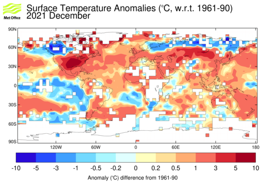 |  |
In fact HADCRUT has been smoothed and is actually not such a bad plot, except for the white blanks. The NOAA plot (actually land only, from here) is mainly cited by contrarians to claim poor coverage. NOAA assists them here by posting a map from early in the month (Jan 11 here) and then not updating as more data comes in. But both have a similar failing. They treat the arbitrary grid segments as telling something about the data. But they would tell something different if a different grid size was chosen. You don't suddenly become ignorant about temperature because an arbitrary grid boundary has been reached. NOAA seems to realise this, because their corresponding land/ocean plot looks like this:

They have done a lot of infilling. I've never seen an explanation of the basis used, but here I mainly want to focus on resolution, which is still poor. The corresponding GISS plots come with two stated interpolation lengths:
 |  |
On left is 250 km, right 1200km. The left should have higher resolution, but is again marred by grey blocks where it is deemed that information ceases at a cell boundary. The right fills more area with more smoothing, and is the one I use, though it still has some grey.
The new method, compared
Details of the new method are:- The anomaly data is first converted to the 1951-80 base, using the distribution described here.
- An array of
576223042 regularly spaced nodes is created on the Earth's surface, based on dividing the regular icosahedron, with a transformation on each triangle to preserve equal area triangles (described here). - A first order LOESS (local regression) based on nearest 20 stations is used to interpolate each month's anomaly data onto these nodes (described here)
- Using the regular icosahedral grid, those data are then interpolated onto the image of a 1° lat/lon array, projected onto the sphere
- The data thus interpolated is then used to made a 2D lat/lon plot, using, as I usually do, the GISS temperature levels and colors.
- The two graphs I usually post - GISS 1200 km and TempLS Spherical Harmonics, both 1951-80 base, with TempLS converted regionally
- the new method is bottom right, and on right, the MERRA plot (data from KNMI), also converted regionally from 1981-2010 to 1951-80.
The LOESS bottom left plot looks to have more detail than the top plots. See, for example, the US plot. To test whether the appearance of resolution is real, compare with the adjacent MERRA plot. I'll mention these points in the December plot:
- First the weakest point - LOESS shows a big cold spot in Alaska, which is not really in either MERRA or GISS. However, if you look at the 250km GISS plot above, there is a cold spot there too.
- For Canada and ConUS, the extra detail of LOESS does seem to align with MERRA
- The extra detail of the hot spot over NW China seems to line up
- MERRA has a lot of detail about Antarctica, where GISS is very patchy. TempLS SH is sounder there, but LOESS moves a little more in the direction of MERRA
- LOESS, like GISS and MERRA, has an El Nino jet, where SH is rather wavery.
I plan to use the new graphics scheme for the WebGL page for past monthly anomalies. That page is currently hard to maintain because GHCN V4 keeps introducing new stations, which means the data does not match the stored meshes. LOESS will fix that, as well as being better.
Update - including ERA 5
In comments, Bryan Oz4caster and Zeke Hausfather recommended using the ECWMF reanalysis ERA5, perhaps in preference to MERRA. I certainly think it is a good idea to have another reanalysis, so that where TempLS disagrees with MERRA, which if any is wrong. So I downloaded ERA5 from KNMI, and made another tableau below. This time the two reanalyses are on the right, and I have duplicated TempLS LOESS on the left. For ERA5 I have used 0.5° grid spacing, similar to MERRA.My general impression is that MERRA sometimes seems overly dramatic, and ERA5 is more in line with LOESS on such occasions. Looking at December, the cool in western Canada is similar between LOESS and ERA5. The blobs of warmth around Mongolia in ERA5 and LOESS are similar; MERRA a little different. But there still isn't any support for the cold spot in Alaska.
Monday, May 20, 2019
Changing anomaly base in spatial plotting.
This post tries to give a more exact treatment to comparing global temperature graphs with different anomaly bases. It is preparatory to one where I try out a new style of graphics which I think has better resolution than the spherical harmonics (SH) based graphs that I use now, and compare with GISS. I want to compare with high resolution graphics from reanalysis, but first there is something I need to improve.
Temperature anomalies are created by subtracting from each reading of temperature an estimate of the normal, or expected value, for that time and location. Various estimates can be used, as long as they are consistent. Often used is a temperature over a three-decade interval. I use a least squares method, but normalise it to zero average over the 1961-90 period. That last step, though, is an adjustment at global level.
Comparing anomalies with different base periods is normally done by aligning the global average over those period. This works well at that level. But it does not align the anomalies in different spatial regions, where the local averages may have changed differently in those periods. In comparing GISS with 1951-80 basis with TempLS, with actually a least squares basis, I have just added an adjustment constant for each month. I set out the process here, giving a table of changes to make for all the popular conversions. But more is needed for spatial alignment, although the actual effect on say a month anomaly plot is small.
But the change that matters is what shows on a spatial plot, and rather than do every station, it is sufficient to approximate the difference with spherical harmonics. This is the method I normally use to show TempLS monthly maps. Since the issue is what the regional temperature difference actually is, rather than the individual measurement methods, it is sufficient to work out coefficients by just one method. I naturally use TempLS.
Once the SH approximation for each month is made, there is no further reference to which stations are reporting. Since the operations are linear, for each tri-decade we can just average the 121 coefficients, and then difference to give the change between bases. Then to regenerate the temperature map, it is just necessary to compute the values of the harmonics at whatever points are being used to make the map, for example a lat/lon grid, and then combine these using the difference coefficients.

The mean should be approximately zero, since TempLS was set to have mean zero in this range. It isn't quite zero, because the mean represents the SH-enhanced mesh integral. It may not be obvious from the plot (in GISS intervals and colors) that the mean is zero, but the area of the very warm part is small relative to the large areas of S Hemisphere cool.
This plot gives an idea of the magnitude of differences to expect. They can be large. Now I'll show the practical effect, for the most recent month, April 2019.
The top two maps are those I displayed. Left is the SH representation of normal least squares TempLS, and right is the GISS plot, which is based on actual means of months in 1951-80. So below it I have put the plot of TempLS calculated on this basis, as described above. Bottom left is the map of expected corrections in going from TempLS to a true 1951-80 base, less the spatially constant offset that was used.
There isn't that much difference between top left and bottom right, or GISS for that matter. But the bottom right is closer to GISS in some respects, and that can be explained by the bottom left. The cool spot above NW Canada is much reduced at bottom right, in better agreement with GISS, and that is the effect of the warming correction shown bottom left. The cold of the W Sahara almost disappears, as it does in GISS. Bottom right shows the warm correction there. Same in Saudi Arabia. Finally the hot spot in NE Siberia is made even hotter, in broad agreement with GISS, although the shape there is slightly different. Generally the ocean corrections are too small to notice.
I'll use the corrected versions in new monthly reports. But mainly I am setting this out because I am planning to use what I think will be a better resolution map. I will show that, in the next post, in comparison with reanalysis, and for that I need the extra accuracy.
Temperature anomalies are created by subtracting from each reading of temperature an estimate of the normal, or expected value, for that time and location. Various estimates can be used, as long as they are consistent. Often used is a temperature over a three-decade interval. I use a least squares method, but normalise it to zero average over the 1961-90 period. That last step, though, is an adjustment at global level.
Comparing anomalies with different base periods is normally done by aligning the global average over those period. This works well at that level. But it does not align the anomalies in different spatial regions, where the local averages may have changed differently in those periods. In comparing GISS with 1951-80 basis with TempLS, with actually a least squares basis, I have just added an adjustment constant for each month. I set out the process here, giving a table of changes to make for all the popular conversions. But more is needed for spatial alignment, although the actual effect on say a month anomaly plot is small.
Practicalities - spherical harmonics again.
However, it isn't obvious how to do that. The problem with three decade bases is that not all stations have data in those times. That is why I use least squares. To make a comparison between two periods, you would, in principle, have to limit to stations where you can calculate averages in both periods. Even if that were possible, it would be a pity to have to in effect redo two temperature anomaly constructions just to change base.But the change that matters is what shows on a spatial plot, and rather than do every station, it is sufficient to approximate the difference with spherical harmonics. This is the method I normally use to show TempLS monthly maps. Since the issue is what the regional temperature difference actually is, rather than the individual measurement methods, it is sufficient to work out coefficients by just one method. I naturally use TempLS.
Method and numbers
I first calculate a spherical harmonics fit for the TempLS anomalies for each month since 1900. It is like a Fourier fit, but using regression. The integration method is the mesh method. I specify order 10, which actually gives 121 functions in the SH basis. For each order n, one of the functions is just cos latitude multiplied by sine of n times the longitude, so this gives a measure of the spatial frequency. More details of spherical harmonics are here.Once the SH approximation for each month is made, there is no further reference to which stations are reporting. Since the operations are linear, for each tri-decade we can just average the 121 coefficients, and then difference to give the change between bases. Then to regenerate the temperature map, it is just necessary to compute the values of the harmonics at whatever points are being used to make the map, for example a lat/lon grid, and then combine these using the difference coefficients.
Results
First, here is a map of the TempLS values for mean April between 1961 and 1990, plotted with negative sign. It would be similar for other months, since it mainly represents changes over a thirty year period.The mean should be approximately zero, since TempLS was set to have mean zero in this range. It isn't quite zero, because the mean represents the SH-enhanced mesh integral. It may not be obvious from the plot (in GISS intervals and colors) that the mean is zero, but the area of the very warm part is small relative to the large areas of S Hemisphere cool.
This plot gives an idea of the magnitude of differences to expect. They can be large. Now I'll show the practical effect, for the most recent month, April 2019.
 |  |
 |  |
The top two maps are those I displayed. Left is the SH representation of normal least squares TempLS, and right is the GISS plot, which is based on actual means of months in 1951-80. So below it I have put the plot of TempLS calculated on this basis, as described above. Bottom left is the map of expected corrections in going from TempLS to a true 1951-80 base, less the spatially constant offset that was used.
There isn't that much difference between top left and bottom right, or GISS for that matter. But the bottom right is closer to GISS in some respects, and that can be explained by the bottom left. The cool spot above NW Canada is much reduced at bottom right, in better agreement with GISS, and that is the effect of the warming correction shown bottom left. The cold of the W Sahara almost disappears, as it does in GISS. Bottom right shows the warm correction there. Same in Saudi Arabia. Finally the hot spot in NE Siberia is made even hotter, in broad agreement with GISS, although the shape there is slightly different. Generally the ocean corrections are too small to notice.
I'll use the corrected versions in new monthly reports. But mainly I am setting this out because I am planning to use what I think will be a better resolution map. I will show that, in the next post, in comparison with reanalysis, and for that I need the extra accuracy.
Friday, May 17, 2019
GISS April global down 0.12°C from March.
The GISS land/ocean temperature anomaly fell 0.12°C in April. The anomaly average was 0.99°C, down from March 1.11°C. It compared with a 0.097°C fall in TempLS V4 mesh. As with TempLS, because March was so warm, dhe drop still meant that last month was the second warmest April in the record.
The overall pattern was similar to that in TempLS. Warm in all of Eastern Asia, especially Siberia. Warm in Europe, NW Canada and Alaska, and much of Africa. Mostly cool in Antarctica.
As usual here, I will compare the GISS and previous TempLS plots below the jump. I am planning to post in the next few days about a better style of TempLS plotting
Saturday, May 11, 2019
April global surface TempLS down 0.097°C from March.
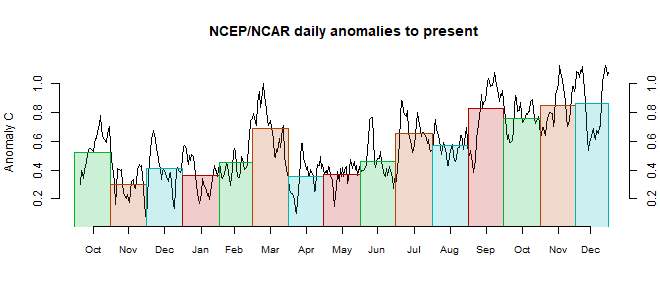
The TempLS mesh anomaly (1961-90 base) was 0.872deg;C in April vs 0.969°C in March. As with the very similar drop (0.086) in the NCEP/NCAR reanalysis base index, that still makes it a very warm April, the second warmest in the record. It was the warmest month since March 2017.
GHCN V4 results were a little later this month. I've noticed a reversion to the V3 custom of reporting by country; earlier it seemed that most countries were represented at an earlier stage. I'm a bit late reporting, too, because I found that the preliminry results changed from day to day. But I think all the main countries are in now.
This time the very warm Arctic region was in NE Siberia, with a rather cool spot NW of Canada. Europe was warm, and China, especially W. Africa was warm, the Middle East rather cool.
Here is the temperature map, using a spherical harmonics approximation to the mesh results.

And here is the map of stations reporting:

GHCN V4 results were a little later this month. I've noticed a reversion to the V3 custom of reporting by country; earlier it seemed that most countries were represented at an earlier stage. I'm a bit late reporting, too, because I found that the preliminry results changed from day to day. But I think all the main countries are in now.
This time the very warm Arctic region was in NE Siberia, with a rather cool spot NW of Canada. Europe was warm, and China, especially W. Africa was warm, the Middle East rather cool.
Here is the temperature map, using a spherical harmonics approximation to the mesh results.
And here is the map of stations reporting:
Friday, May 3, 2019
April NCEP/NCAR global surface anomaly down 0.086°C from March
The Moyhu NCEP/NCAR index fell from 0.582°C in March to 0.496°C in April, on a 1994-2013 anomaly base. March was a warm spike, though, so that still leaves April as the second warmest April in the record.
It was very warm in the Arctic, including over NE Siberia and Greenland, but once again cold over the Canadian Archipelago. Cold in Spain and the W Sahara. There was warmth From Mongolia through to N India and Thailand. Quite cool in the Middle East, from Egypt through to Iran.
The BoM ENSO Outlook is remains at Alert - but "...This indicates that if El Niño does develop, it is likely to be short-lived and weak." Still, it's already warm. .
Subscribe to:
Posts (Atom)


