I have written a lot about that before. The basic idea is to place points evenly on one of the five platonic solids, and then map them onto the sphere. The platonic solids are at least somewhat similar in shape to the sphere. I wrote here about using the cube (called a cubed sphere), and here with general ideas about gridding, with emphasis on the icosahedron .
A problem is that projection from the regular solid to the sphere does not preserve equal spacing. The central parts of the face are spread out by being projected further, while the areas near the vertices are actually compressed, since the face is inclined to the surface normal to the projection. For the cube, the area ratio is about 3:1; for the icosahedron it is about 2:1. In the cube post I explained a mapping that could be applied to the faces before projection, which would counter the disparity. I wrote here about how this could be applied to get an equal area projection (at the cost of cuts) for earth mapping.
I had some trouble extending this to the icosahedron, because I couldn't see a general mapping scheme with the right properties. But I now do see one based on homogeneous coordinates (also called projective or trilinear), which is simple and effective. I talk a bit about homogeneous coordinates, so I should digress to say a bit more about them. I'll put this digression in blue, so you can skip if you want.
Homogeneous coordinates
Every point x in a triangle is represented by three numbers (u1,u2,u3), which must add to 1. You can get x back, given the vertices (x1,x2,x3)x = u1x1 + u2x2 + u3x3
and that illustrates an important role. They can interpolate properties known at the vertices by a similar formula. I'll make three points about them:
- The coordinates are often explained by areas. If you divided the triangle into three by connecting x to the vertices, then the proportion of area in the triangle opposite node 1 is its coordinate, etc.
- The coordinates are the real 3D coordinates of the equilateral triangle joining the unit points on the axes ((1,0,0), (0,1,0),(0,0,1)). The requirement to add to 1 is just the requirement that they lie on the plane through those 3 points. And since you can map those unit vertices onto the general triangle given by nodes (x1,x2,x3), you can map the interior points by multiplying by the same matrix. And it is the inverse of that matrix that takes an arbitrary triangle into the unit triangle. That is how you can calculate the homogeneous coordinates.
- The finite element method also has the idea of an interpolation, or basis, function. You multiply the nodal values by the values of the basis function at an interior point to get the interpolate. So homogeneous coords are just a special case of linear basis functions for one particular shape. That enables generalisation of the mapping idea I will explain.
Mapping for uniformity
A mapping before projection has some basic requirements:- It must keep points within the face.
- It must comply with the symmetries of the face. The reason for this is that points on the edges will be mapped within each face that they belong to. Symmetry is needed so they do not get sent to different places.
I chose a function of the form u/(1+a*u), because it is easily inverted (u/(1-a*u)). It is possible to determine a theoretically to make various match-ups, or just trial and error, since there is no perfect outcome. I found a value of 0.28 worked well. It means that instead of mapped triangles varying by a factor of 2, they only vary by 5%, which I think is good enough.
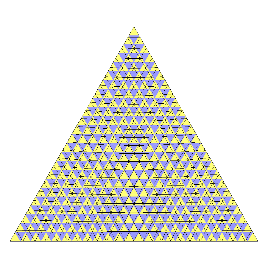
Here is a mapping of what is done. The icosahedron has 20 equilateral triangle faces. Each edge is divided into N equal parts. Connecting them with lines parallel to the edges makes N^2 with corresponding nodes. In this diagram, the purple triangles are the original regular grid, and the lines show the mapped grid. You'll see that the line triangles are larger near the corners, and smaller near the centre.


Nice work Nick. Interesting results. Have you looked at the DWD ICON weather model (here)? It uses a global icosahedral grid at about 13 km resolution. The ICON output can be seen here.
ReplyDeleteI would guess that the ICON surface air temperature initial condition grid could be analyzed in similar fashion to the reanalyses performed with the GFS and ECMWF weather models, although I have not seen any such effort so far. If it were available, it would be interesting to compare with your effort.
Thanks, Bryan
DeleteNo, I hadn't seen that. I knew GFDL was using a cubed sphere, which is similar. I don't think that anyone should be using lat/lon for modelling work nowadays.I see here that they get an area ratio ranging from 1.38:1 to 1.53:1. It may be good enough for what they need, but the simple transformation described here gets it down to about 1.05:1.
If anyone wants to see the ICON model in action, there is a nice app here
DeleteYou can choose between the ICON and GFS weather model..
Nick, thanks for the link to the detailed ICON paper and it's impressive that you get 1.05.
DeleteOlof, thanks for the VentuSky link. I have never seen a depiction of forecast lightening like they have. The wind depiction reminds me of NullSchool, but I don't see an option for orthographic projection. However, the interface is very easy to use and intuitive.
"The wind depiction reminds me..."
DeleteYes, it's similar, and not quite what it seems. It's just a visualisation attached to a static wind field. It shows how air would move if the wind remained constant, which of course it doesn't. We used to make visualisations like this in CFD before we could dynamically solve the Navier-Stokes equations.
The NullSchool type wind depiction can be very misleading, especially in regard to actual air movement, but I find it helpful for visualizing convergence and divergence in wind fields and when overlayed on shaded temperature it helps for visualizing cold and warm air advection. It should be possible to create a dynamic wind animation visualization over time (instead of for a static time) that would more accurately represent the wind movement, but I have yet to see one using real-time forecast output. The time steps might need to be fairly short (sub hourly) to get a smooth animation.
DeleteMany years ago I wrote a program to plot surface wind and air quality data along with air parcel trajectories and plume simulations based on hourly vector average wind measurements. I found very quickly that hourly wind vectors plotted to scale look very tiny when viewed at large scales, but most of my work was for urban and regional scales where it worked quite well for visualizing air motion relative to air pollution.