There has been much discussion of a paper by
Marcott et al, which is a proxy temperature reconstruction of low resolution proxies going back to 11300 BP. They are distinguished by not requiring calibration relative to measured temperatures.
There has been discussion in make places, but specially at
CA and
WUWT, where it isn't popular. Steve McIntyre at CA has done a similar emulation.
The complaints are mainly about some recent spikes. My main criticism of the paper so far is that they do plot data in recent times with few proxies to back it. It shows a "hockey stick" which naturally causes excitement. I think they shouldn't do this - the effect is fragile, and unnecessary. Over the last century we have good thermometer records and don't need proxy reinforcement. Indeed the spikes shown are not in accord with the thermometer record, and I doubt if anyone thinks they are real.
Anyway, I thought I would try for a highly simplified recon to see if the main effects could be emulated. R code is provided.
Update I have posted an active viewer for the individual proxies.
Update - I've done another recon using the revised Marcott dating - see below. It makes a big difference at the recent end, but not much elsewhere.
Further update - I've found why the big spike is introduced. See next post.
Data
The data is an XL
spreadsheet. It is in a modern format which the R utility doesn't seem to read, so I saved it, read it in to OpenOffice, and saved it in an older format. There are 73 sheets for the various proxies, over varying time intervals. The paper and SM have details. I'm just using the "published dates" and temperatures. The second sheet has the lat/lon information.
Marcott et al do all kinds of wizardry (I don't know if they are wizards); I'm going to cut lots of corners. Their basic "stack" is a 5x5 degree grid; I could probably start without the weighting, but I've done it. But then I just linearly interpolate the data to put it onto regular 20-year intervals strating at 1940 (going back). They also use this spacing.
Weighting
The trickiest step is weighting. I have to count how many proxies are in each cell at any one time, and down-weight where there are more than one per cell. The Agassiz/Renland was a special issue with two locations; I just used the first lat/lon.
After that, the recon is just the weighted average.
Update - I should note that I am not using strict area weighting, in that I don't account for the reduced area of high latitude cells. I thought it was unreasonable to do so because of the sparsity. An Arctic proxy alone in a cell is likely to be surrounded by empty cells, as are proxies elsewhere, and so downweighting it by its cell area just has the effect of downweighting high latitudes for no good reason. I only downweighted where multiple proxies share a cell. That is slightly favorable to Arctic, since theoretically they can be closer without triggering this downweight. However, in practice that is minor, whereas the alternative of strict area weighting is a real issue.
Graphics
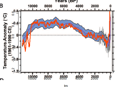
I made a png file with a transparent background, and pasted it over the Marcott Fig 1B, which is the 5x5 recon over 11300 years. There was a lot of trial and error to get them to match. I kept both axes and labels so I could check alignment.
I'll probably add some more plots at shorter scales. The fiddly alignment takes time.
The plot
Mine is the orange curve overwriting their central curve and blue CI's.

Discussion
The most noticeable think is that I get a late rise but not a spike. Again I'm not doing the re-dating etc that they do.
Another interesting effect is that the LIA dips deeper earlier, at about 500 BP, and then gradually recovers, while M et al get the minimum late.
Overall, there is much less smoothing, which is probably undesirable, given the dating uncertainty of the proxies. There is a big dip just after 10k BP, and a few smaller ones.
Aside from that, it tracks pretty well.
Re-dating
Update:
I ran the code again using the revised dating put forward by Marcott et al. It's mostly Marine09, but not always. It doesn't make much difference to the curve overall, but does make a big difference at the recent end. Here is the revised overlay plot:
And here are the orange plots shown separately, published dates left, revised dates right:
I'll look into the difference and post again.
The code
There is a zip file with this code, the spreadsheet in suitable format, and other input files
here. I've done some minor editing for format to the spreadsheet, which may help.
Update - Carrick reported that Mac users can't use the xlsRead utility. I've modified the code so that it immediately writes the input to a R binary file, which I have put (prox.sav) in the zip file. So if you have this in the directory, you can just set getxls=F below.
#setwd("C:/mine/blog/bloggers/Id")

# A program written by Nick Stokes www.moyhu.blogspot.com, to emulate a 5x5 recon from

#A Reconstruction of Regional and Global Temperature for the Past 11,300 Years

# Shaun A. Marcott,  Jeremy D. Shakun,  Peter U. Clark,    and Alan C. Mix

#Science 8 March 2013: 339 (6124), 1198-1201. [DOI:10.1126/science.1228026]

#https://www.sciencemag.org/content/339/6124/1198.abstract


# Need this package:

getxls=F  # set to T if you need to read the XL file directly

if(getxls) library("xlsReadWrite")

# The spreadsheet is at this URL "https://www.sciencemag.org/content/suppl/2013/03/07/339.6124.1198.DC1/Marcott.SM.database.S1.xlsx"

# Unfortunately it can't be downloaded and used directly because the R package can't read the format. You need to open it in Excel or OpenOffice and save in an older format.


loc="Marcott.SM.database.S1.xls"

prox=list()

# Read the lat/lon data

if(getxls){

lat=read.xls(loc,sheet=2,from=2,naStrings="NaN",colClasses="numeric")[2:77,5:6]

}  else load("prox.sav") # If the XL file has already been read

o=is.na(lat[,1])

lat=as.matrix(lat[!o,])

w=rep(0,36*72)

wu=1:73; k=1;

for(i in 1:73){

j=lat[i,]%/%5;

j=j[1]+j[2]*36+1297;

if(w[j]==0){w[j]=k;k=k+1;}

wu[i]=w[j];

}

# Read and linearly interpolate data in 20 yr intervals (from 1940)

m=11300/20

tm=1:m*20-10

g=list()

h=NULL

if(getxls){

for(i in 1:73){

prox[[i]]=read.xls(loc,sheet=i+4,from=2,naStrings="NaN",colClasses="numeric")[,5:6]

}

save(prox,lat,file="prox.sav")

}


for(i in 1:73){

u=prox[[i]]

g[[i]]=approx(u[[1]],u[[2]],xout=tm) # R's linear int

y=g[[i]]$y

y=y-mean(y[-25:25+250]) # anomaly to 4500-5500 BR # period changed from 5800-6200

h=cbind(h,y)

}

r=NULL  #  Will be the recon

# now the tricky 5x5 weighting - different for each time step

for(i in 1:nrow(h)){

o=!is.na(h[i,])  # marks the data this year

g=h[i,o];

u=wu[o]; n=match(u,u); a=table(n); d=as.numeric(names(a));

e=u;e[d]=a;wt=1/e[n]; #wt=weights

r=c(r,sum(g*wt)/sum(wt))

}

# Now standardize to 1961-90, but via using M et al value = -0.04 at 1950 BP

r=r-r[98]-0.04

# now tricky graphics. my.png is the recon. ma.png is cut from fig 1b of the paper. You have to cut it exactly as shown to get the alignment right

png("myrecon.png",width=450,height=370)

par(bg="#ffffff00")  # The transparent background

par(mar=c(5.5,5,2.5,0.5))  # changed to better align y-axis

plot(tm,r,type="l",xlim=c(11300,0),ylim=c(-1.2,0.8),col="#ff4400",lwd=3,yaxp=c(-1.2,0.8,5))

dev.off()

# Now an ImageMagick command to superpose the pngs

# You can skip this if you don't have IM (but you should)

system("composite myrecon.png ma.png recons.png")


