Wednesday, July 31, 2019

Why is this June hotter seen with GHCN V4 than V3? - and lots of active graphics.

This post is a follow-up to one a few days ago on differences seen calculating monthly global averages using TempLS and version 4 of GHCNrather than V3. It followed a post of Clive Best, who has a similar program, and was finding differences. I too found that June 2019 rose about 0.07°C while using GHCN V3 did not show a rise. I think overall differences are small, but I wanted to look at the underlying arithmetic.

So, as foreshadowed, I adapted my program to use its LOESS based calculation and graphics, in which I could calculate differences. But there was mission creep, as I found that being able to put disparate data on the same equally spaced grid made a lot of other things possible. So I showed also the effects of homogenisation. It does answer the question of why V4 made a difference this month, but there is a lot more to learn.

First let me tell the many uses of the main graphic, which is shown below. It is the familiar WebGL trackball Earth. You can drag it about and zoom. Click on the little map to quickly center at a chosen point. But importantly for this inquiry, you can control the content. The checkboxes top right let you switch on/off the display of V3 and V4 or SST nodes, or the shading (called "loess"), or even the map. And the radio buttons on the right give the choice of five data sets for June 2019, which are
  • Un V4-V3 which is the difference of TempLS anomalies using unadjusted GHCN data from V4 and V3.
  • Adj V4-V3 the corresponding difference using adjusted GHCN data (QCF, pairwise homogenised)
  • V4 Un - Adj the difference between unadjusted and adjusted data, for a V4 calculation
  • V3 Un - Adj same for V3
  • V4 Unadjusted just the TempLS anomalies using V4. It is the LOESS version of my regularly updated mesh plot.
So I'll show the plot here, with below an expanded discussion of what can be learnt from it.


Sunday, July 28, 2019

Comparison of surface temperature indices going from GHCN V3 to V4.

I have written quite lot about TempLS V4, which was prompted by the need to make use of the extended global land temperature database GHCN V4. However, the reality was that there really wasn't much difference, IMO. However, I saw that Clive Best, in posting his June average, had given chief prominence to the value calculated with V3, and this showed a drop of 0.04°C. Now Clive's method of triangulation is similar to my TempLS mesh, although I use ERSST V5 for ocean rather than his HADSST3. And we usually get very similar results. However, this result was rather different from my 0.067°C rise. Other indices generally agreed with mine.

Looking further, it turns out that calculating with V4 gave a rise of 0.04°C, closer to the finding of others. But he was inclined to emphasise the difference, leading up to a striking tweet in which he said that transition from V3 to V4 was responsible for a 0.2°C discrepancy. So maybe that needs more attention.

An extra oddity came when his post was reposted at GWPF, where their spin was that "The global averaged surface temperature for June 2019 was 0.62C, back down to where it was before the 2015/16 El Nino" or, on Twitter, "Global Temperature Falling Again". This was rightly mocked on Twitter.

So, I ran TempLS again with V3, unadjusted and adjusted. It isn't clear to me which version Clive was using. But I regularly use unadjusted, and I think this gives the best guide to the changes in the dataset, as opposed to the effect of homogenisation.

The first thing to say is that I did get a very small change with V3, at 0.004°C rise. That is about 0.063°C less than with V4, a similar difference to Clive. As we'll see that is a moderately large discrepancy by past experience, although not an outlier. Anyway, let's see some graphs.

Wednesday, July 17, 2019

Comparison between global temperature indices following GHCN V4; changes since 2015

I had noticed that recently the concordance of GISS with the more advanced TempLS methods seemed to have improved, and I wondered whether there might be a general improvement associated with the adoption of GHCN V4, with the big increase in land stations. In 2015, I posted a study of the extent to which a rather large set of indices mutually agreed. It included land, SST and troposphere measures. I may revisit that. But for the moment, I want to look in a similar way at just the surface (land and ocean) indices. Since they seek to measure the same thing, differences can be attributed to method rather than physics.

In that earlier post, my measure was the standard deviation (sd) of differences between monthly index values over the most recent 35 years. That was to fit with the satellite data, which is not used here. But I will stick with the period (updated), because while there doesn't seem to be much sensitivity to the choice, I want to concentrate on method differences rather than data, which might diverge at longer times ago. Data sources are listed here. The sd measure is not affected by different anomaly bases.

So here, as an overview, is the current set of standard deviations, according to the color scale in the key on the right. Red means better agreement.

The best agreement is between the various methods of TempLS, as described most recently here, with an overview here. It is so much better that I have used a color out of the rainbow scale to show it. Differences of the three advanced methods have sd's of about 0.01°C. That is about a third of the nearest difference between indices from different sources.

The next best agreement (0.027°C) is between TempLS grid and NOAA Land/Ocean. I commented,also in 2015, on how NOAA and TempLS grid were eerily close; I showed comparison graphs. That closeness has persisted, and is a reason why I keep posting TempLS grid, which I otherwise think is a very primitive method. So the fact that NOAA is so close makes me worry about that index. But anyway, it is now even closer. I have modified the grid method to use a cubed sphere mesh, which I think is much better than lat/lon.

Almost as good is the agreement between GISS and the advanced TempLS methods. As I shall show, this has improved with V4. TempLS LOESS and Infill have lowest sd, at about 0.031; mesh is a little more at 0.035°C.

The five non-TempLS indices are shown in the top corner. Their levels of agreement are much lower. The Cowtan and Way kriging index has an sd of 0.45 with both GISS and BEST, but less agreement with NOAA and HADCRUT. The best agreement (0.039) is between HADCRUT and NOAA; these have always seemed to act as a separate grouping. GISS and BEST agree about as well (0.045) as the do with C&W. BEST has the greatest disagreement, with both NOAA and HADCRUT.

I posted the data back in 2015, so now I'll use it to show how these concordances have changed. In the following plot, the current sd is divided by the sd reported in 2015. A red value indicates reducing sd (improvement). TempLS LOESS is omitted because it did not exist in 2015.

The biggest changes are associated with TempLS, where methods have improved, particularly with Infill. In 2015 this was a heuristic method, which seemed to give a large improvement. But now I solve a diffusion equation to convergence, which seems to be better again. The sd with GISS is about halved, and is, by a hair, the best agreeing of any TempLS. Because it shifts further towards the other advanced TempLS methods, it moves away from the grid method, and so also from NOAA, which shows as decreasing agreement. The improved agreement (4x) with TempLS mesh is the greatest change of all.

The other marked changes are with BEST. 2015 was still fairly early in its life cycle, and most noticeable is the increasing disagreement with NOAA and HADCRUT. But it also doesn't agree with anything very well.

The other indices, interacting with each other and with TempLS mesh, show little change. T mesh was stable over that period. There is some deterioration of agreement between HADCRUT and GISS, which could be due to the introduction of ERSST 4 and 5, which adjust for the introduction of drifter buoys in SST measurement. HADSST is just bringing out V4 which may implement that.

Here is a more detailed quantification of the changes. There are 9 plots, showing for each index the sd's of the differences with the others (green). Overlaid in transparent blue is the corresponding sd from 2015. For TempLS LOESS, I have used the 2015 sd's of TempLS mesh. Use the arrows below to cycle through the plots.
In the first plot (GISSlo) the TempLS advanced indices (TM, TL, TI) show best agreement, and also improvement (faint blue is 2015). Agreement with HADCRUT is worse. Of the other plots:
  • HA HADCRUT - almost everything is worse, especially BEST. The best agreement is with NOAA and TempLS grid.
  • NO NOAA - not much change, except for lower agreement with BEST. But not a high level of agreement.
  • BE BESTlo - again much increased, and high, disagreement with NOAA/HADCRUT. Otherwise small changes toward more agreement.
  • CW Cowtan and Way - much improved agreement with TempLS; fair agreement unchanged elsewhere.
  • TM TempLS mesh - good and improved agreement with GISS and TempLS grid. Very good agreement with TempLS LOESS and Infill, with Infill much improved (due to Infill method improvement).
  • TL TempLS LOESS - as for mesh. LOESS did not exist in 2015.
  • TI TempLS Infill - very good and improved agreement with TM and TL. Also improved wrt GISS and CW; HA, NO, TG somewhat worse.
  • TG TempLS grid - mostly substantially improved, and not bad, except for BEST and CW. Slightly worse relative to BEST and TI. The good, and further improved, agreement with NOAA has been noted.
Overall, I think it is important to note that even the worse disagreements are not so bad - about 0.075°C. There is a marked tendency to clump, with HADCRUT/NOAA/TempLS grid as one group, and GISS+TempLS(TM, TI, TL) as another, with BEST and CW more loosely attached.


To put the size of these differences in context, they range from 0.01, which I called very good, to about 0.075, which was about the worst. But I did a quick similar analysis between HADCRUT, UAH and RSS. The result is here:

The best agreement there is between the satellite measures, as about 0.1°C. Agreement between surface and satellite is in the range 0.125 to 0.145°C


I have posted the data for this post on a zipfile, with readme.txt, here.

Tuesday, July 16, 2019

GISS June global up 0.07°C from May.

The GISS V4 land/ocean temperature anomaly rose 0.07°C in June. The anomaly average was 0.93°C, up from May 0.86°C. It compared with a 0.067°C rise in TempLS V4 mesh. As with TempLS, it was the warmest June in the record, also by a considerable margin (0.11°C).

The overall pattern was similar to that in TempLS. Hot in most of Europe, extending into Africa and the Middle East. Cool in W Siberia, but hot in the NE. Cool in US/Canada, but warm in S America. Antarctica was mostly cool.

As usual here, I will compare the GISS and earlier TempLS plots below the jump.

Wednesday, July 10, 2019

Revised June global surface TempLS up 0.067°C from May.

I made an error in the previously posted TempLS for June. The rise is now 0.067°C instead of 0,096°C. The June anomaly was 0.782°C instead of 0.811°C. The difference in global average is actually small, and 2019 was still easily the warmest June in the record, but by 0.07°C, not 0.1°C.

Although the overall difference is small, the error was major - my calculation used May SST values, not June. Teething problems with the V4 system. Fortunately, the hemisphere effects more or less balanced, but the map looks different. I had noted  earlier that there was a marked hemisphere difference. I did look further into that, which revealed the error, but I should have twigged sooner. Land is unaffected, and so most of my previous comments still hold.

Here is the revised temperature map, using the LOESS-based map of anomalies.


The original map is preserved on my tweet here.

Saturday, July 6, 2019

June global surface TempLS up 0.096°C from May.

Update - see revision here. The average is down by just 0.03°C, but SSTs were wrong month, and the map now looks different (correct version below).

The TempLS mesh anomaly (1961-90 base) was 0.811deg;C in June vs 0.715°C in May. This contrasted with the drop (0.056) in the NCEP/NCAR reanalysis base index. It was the hottest June in the record, 0.1°C higher than June 2016.

I am now showing TempLS LOESS as the alternative (rather than grid); I think it is about as good a method as mesh. It showed a rise of 0.114°C.

There was a marked global pattern (caused by error - see update), with tropics and SH mostly warm, and the extratropical NH cool, with the notable exception of Europe, which was very warm indeed, and NE Siberia likewise. The mostly cool Antarctica was also an exception.
Here is the temperature map, using the LOESS-based map of anomalies.


And here is the map of stations reporting:


Wednesday, July 3, 2019

June NCEP/NCAR global surface anomaly down 0.056°C from May

The Moyhu NCEP/NCAR index fell from 0.41°C in May to 0.354°C in June, on a 1994-2013 anomaly base. That is the third successive fall since the high point in March, and brings the temperature back to between January and February. Still warmer than June 2018 or 2017, and close to June 2016.

It was mostly cool in N America, warm in Europe (except near Atlantic). Quite warm in NE Siberia/Alaska, and mixed, but mostly cold, in Antarctica.

The BoM ENSO Outlook has been reset from Watch:
"The ENSO Outlook has been reset to INACTIVE. The immediate likelihood of El Nino developing has passed with ENSO-neutral the most likely scenario through the southern winter and spring."


Tuesday, July 2, 2019

Fake charge of "tampering" in GISS

I was commenting on an interesting post (part of a series) at Clive Best's blog. He's been looking at the differences between Hadcrut 3, of about 2012 vintage, and current Hadcrut 4.6. There are some, and I may blog about that. The most obvious difference is that the number of stations in the inventory has nearly doubled. But Clive was focussing on changes to locations that were common to both. I did some analysis, part reported here.

As is apt to happen, there were undercurrents that data is being manipulated for some underhand purpose, and Clive was entertaining the idea that the Pause was being suppressed. Not jumping to conclusions, though, but some were more inclined to. There has indeed been a noticeable increase over those years in the trend during the Pause period. This is overdue, since Cowtan and Way showed in 2013 that HADCRUT's deficiency in Arctic stations was responsible for the difference in Pause trend between theirs and other indices.

Anyway, among dark talk about Hadcrut suppressing the Pause, Paul Matthews commented that GISS had done the same thing, and between 2017 and 2019. This surprised me, because I follow GISS, and compare it with TempLS, and did not know of such changes, which if present would presumably relate to transition from GHCN V3 to V4. Gavin Schmidt has also said that the effect of this was very small.

So I followed Paul's link, which led to a Tony Heller post titled 
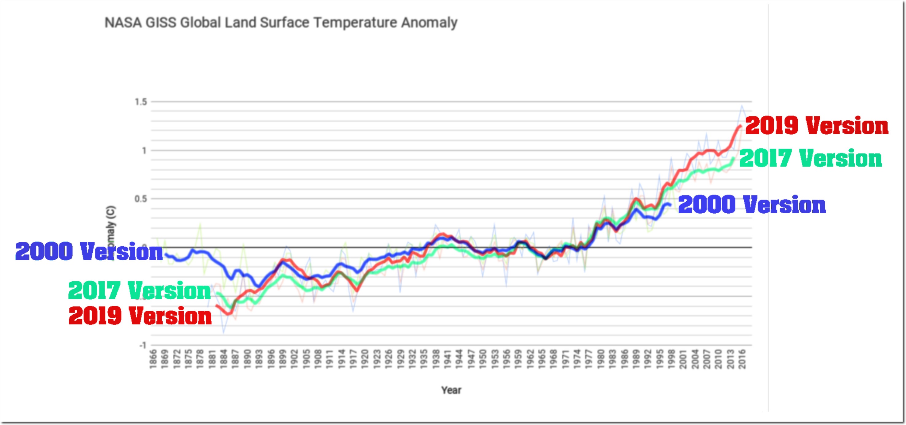
"Tampering Past The Tipping Point". It showed the following plot (followed by many more):


And as usual there, the plot and post seem to have circulated widely. You can see a long Twitter listing here of tweets linking to it. So what is it based on?

As often with Heller's posts, it isn't about what most of his audience thinks it is, but they don't seem to worry about fine points. It isn't the GISS land/ocean (LOTI) that gets widely circulated and discussed. The heading says "GISS Global Land Surface anomaly". But GISS doesn't have a Land Surface anomaly index, unlike NOAA or HADCRUT (CRUTEM). So my first thought was that he was plotting the "Met Stations Only" index, Ts. He has done that before, and the years quoted (2000 and 2017) do correspond, more or less, to what is supplied on the GISS History Page (scroll down to where "Met Stations" appears in the headings). I'll digress a little to explain this index.

GISS Ts index

GISS Ts is no longer shown on the main page, although it did have more prominence in V3. Now it is relegated to the History Page, with the introduction:
"For historical reasons we also maintain a calculation of the anomalies that would result if one only used the meteorological station data. This estimate is not affected by issues in ocean data processing, but because the land is warming faster than the ocean, it has a larger trend than the land-ocean index that is now our standard product. That too has been remarkably stable over the years:"
And with that, they give, as they do with LOTI, a plot of the data as it had been presented at various stages of GISS history, going back in fact to 1981. You can see both plots of the curves together, and their differences from current. And indeed the differences are small, especially recently.

The "historical reasons" are that, until about 1995, there didn't exist a dataset of sea temperatures of anything like the duration of the land record. So when Hansen and Lebedeff in 1987 published the ancestor of the GISS index, they used whatever station data they could get to estimate surface temperature over the oceans as well as land. Islands had a big role there. This index, called Ts, or GLB.Ts, was their main product until the mid '90's, when it was gradually supplanted by LOTI, using ocean sea surface temperatures (SST) as needed, as they became available backward in time.

Update. As CCE notes in comments, with GISS V4, the Ts index is not only relegated to the History page; it is not calculated in V4 at all. The numbers I have used are the latest V3.

GISS Land

However, Paul insisted that there was a land index, and pointed to the Analysis Graphs and Plots page. If you scroll down to the heading "Annual Mean Temperature Change over Land and over Ocean" and open, it shows a plot of anomalies over land and over ocean, and below it gives links to data.

Now this is something different to GISS Ts. It also uses station data, but to estimate the average for land only. All such averages are area-weighted, but here is is just by land area. So from being very heavily weighted, island stations virtually disappear, since they represent little land. And the weighting of coastal stations is much diminished, since they too in Ts were weighted to represent big areas of sea.

The important message here is that Ts and Land are not the same, which I will now show with some graphs. Data is sourced and linked at the bottom.

Recent History, 2017 and 2019

Tony Heller provided a spreadsheet with his post, and it had the GISS data for versions of Ts up to 2017, and the Land data for 2019. I have described details of this here and following. But GISS Ts does of course go to present (May 2019), which is regularly posted here. And you can get past versions of the Land average plots with data on the Wayback Machine - here is version of Jan 2017. So let's look at annual Ts, with 5 year running smoothing:


They are actually very similar. I'll givea combined difference plot later. What about Land?


Not quite as close, but also similar. The main difference is that pre-1900 is warmer in the current version, reducing the trend since 1880 from 1.05 °C/century to 1.0 °C/century. The trend of Ts also reduced slightly. Not much sign of data tampering here! In fact, given the number of extra stations in GHCN V4, there is remarkably little change.

Now I'll plot the Ts and Land averages superimposed on Tony Heller's "tampering" plot. But because the 2017 and 2019 versions are so similar, the plot gets cluttered. To make better use of space, I have truncated some of the big colorful annotations. I'll plot just the 2017 version of Ts and the 2019 version of Land. Not coincidentally, these are the versions of each found in Tony's spreadsheet.


They superimpose exactly! What has been presented as a "tampering" is in fact a plot of two different datasets, representing two different things. To emphasise that, I'll now plot 2019 versions of both Land and Ts:


Also a very good fit. The difference between the red and the green curve isn't "tampering" over time. It's the same difference if you take the current versions. They are just two different datasets representing two different things.

Getting it right.

As mentioned, I originally set this out in comments at Clive Best's site, where Paul Matthews first raised the Tony Heller post. I then noted that at that (Heller's) site, a commenter Genava had observed that the 2019 data plotted was different from the 2019 Ts data, which was the index of the 2001 and 2017 versions. That was on June 27. It got no response until Paul, probably prompted by my mention, said that the 2019 data was current Land data. I don't think he appreciated the difference between Land and Ts, so I commented June 28 to try to explain, as above. Apart from a bit of routine abuse, that is where it stands. No-one seems to want to figure out what is really plotted, and comments have dried up. Meanwhile the Twitter thread castigating "tampering" just continues to grow.

Data

The data plotted are year versions of the GISS Ts Met Stations Only index and the GISS annual data for Land Averages. The sources are, in ascii format:
GISS T2 current (2019) version
GISS T2 historic, includes 2017 version in zip file
Land average current, csv format
Land Average 2017 wayback version, txt

The data I used are in a .csv file here.