Monday, December 24, 2012
Merry Christmas, and plans for the New Year
Merry Christmas to all, and hopefully, relief from floods and snow. Different problems here.
Last year I produced a graphics gallery at Christmas, and I was hoping to have an update here. But there are some new things coming, so I'll do it when they are out. They are mostly to do with my new enthusiasm for large data sets selectively downloaded in response to user requests (via XMLHTTPRequest). I tried here combining the Google Maps survey of station with the machinery of the climate plotter. I'd like to do the same with the globe plots. I'll add globe plots of GHCN temperature for at least a century of year averages, and over decades, and combine that with the trend data to make a universal globe plot.
I'm also thinking about how to put monthly data in the climate plotter. There are issues about handling seasonality, and there are the mechanics of keeping it updated. But I think that can be mechanised.
I'll also do some analysis of the ISTI data when it is out of beta.
Wishing you all well for the New Year.
Saturday, December 15, 2012
November GISS Temp unchanged from October
This isn't breaking news - I'm running late this month. But I wanted to give the usual comparison with TempLS. The GISS land/sea monthly anomaly was 0.68°C September; October had been readjusted down to this after initially 0.69°C. Time series and graphs are shown here
As usual, I compare the previously posted TempLS distribution to the GISS plot.
Here is GISS:

And here is the previous TempLS spherical harmonics plot:
.
Previous Months
OctoberSeptember
August
July
June
May
April
March
February
January
December 2011
November
October
September
August 2011
More data and plots
Friday, December 14, 2012
Universal station locator and history plotter
This is next in the series of things that can be done with XMLHTTPRequest. It merges the capability of the Google Maps display of stations with the machinery of the climate plotter. But the key new thing is that the station location information can be backed up with a store of temperature histories, which can be plotted on demand.
So what we have is a map which allows you to choose a category of stations to show with markers. The usual Google Maps interactivity works. You can choose from different data sets - currently there are GHCN, CRUTEM 4 and the new (and beta) ISTI. BEST will be there soon [Update - it's there now]. Mouse over the markers shows the name. But if you click, you not only get station information as before, but a plot of the annual temperatures in the record (for that data set). You can add to the plot, to, say, compare the records of different data sets. Or you can compare GHCN adjusted with unadjusted, or stations at different locations. And you can smooth and regress. There is an information window that shows the numbers.

How to use it - choosing stations
The map controls are in the table bottom right. Families of controls are indicated by background color. The marker buttons in the top row (None, yellow, pink) are the ones that create actions, in line with the current state of the other selection buttons.The world is divided into regions, because the larger sets (BEST and ISTI) will make everything about the map very slow if everything is shown. I'd suggest beginning by choosing a single region. The region numbering is shown by a small map under the plot space. You should also choose one or more datasets - GHCN is shown by default, but can be unset. Gadj means GHCN adjusted. You'll probably only want one station for each color. BEST is coming, but not there yet.
You can also choose a subset of those stations. You have to unset the All checkbox, and set the checkbox of the choices you want. The inequality buttons toggle.
When you have chosen a color, marker representing your choices will appear. The choice "None" makes them disappear - often useful. Mouseover the markers to see the names, and when you click, detailed information will appear in the frame bottom left, and a curve will be plotted, or added to the plot. A handle for the curve will be added to the section headed.
Managing the plot
The x and y axes are active. You can click on the pink bars to translate. The step is equal to the distance from the green marker in the middle. The blue bars translate too, but with a fixed point, so the scale changes. On the y-axis, the top stays still, and the bottom point translates (and in between proportionately). For the x-axis, it's the right end that stays still.There is a column of controls headed Prop/value. To use these you set a value on the rightt, select handles of curves that you want to apply the change to on the left, and then click the prop button to make it happen. For regression you choose type and years (all is default). Colors you can choose from the vertical bar between plot and map. The offset is not incremental - it is what it shows.
There are more usage details on the climate plotter page.
Methods
The plot shows annual values. These were taken from the monthly data by averaging (unweighted by days). Missing values were infilled by the monthly average for that station. If more than three months were missing, the year was omitted. I've also omitted sites with less than three eligible years.
Wednesday, December 12, 2012
November TempLS Global Temp down 0.02°C
I see GISS has already posted (no change) - you have to be early to get ahead of them lately. But I'll produce the normal pair of posts with TempLS results and then comparison.
The TempLS analysis, based on GHCNV3 land temperatures and the ERSST sea temps, showed a monthly average of 0.52°C for November, down from 0.54 °C in October. I had reported 0.52 °C for October, but late data raised it a bit. These are small changes. There are more details at the latest temperature data page.
Below is the graph (lat/lon) of temperature distribution for November. I've also included a count and map of the stations that have reported to this date.
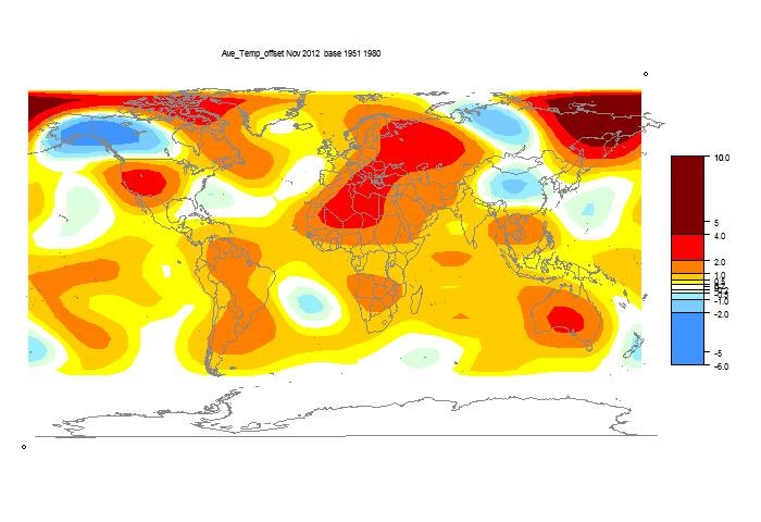
This spherical harmonics plot is done with the GISS colors and temperature intervals, and as usual I'll post a comparison when GISS comes out.
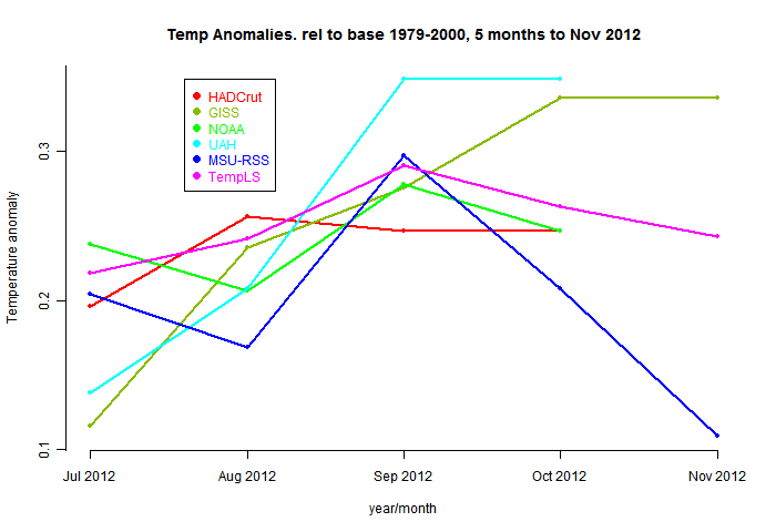
And here, from the data page, is the plot of the major indices for the last four months:
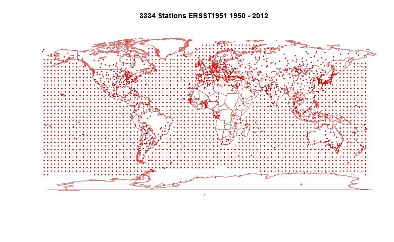
Here is the map of 3334 "stations" which contributed to this report. That's even lower than last month. So I probably couldn't have done this analysis any earlier.
Saturday, December 8, 2012
TempLS correlation with other indices.
Since June 2011 I've been posting monthly TempLS global averages, before the other surface indices appear. The purpose of this haste is partly to see how well it performs in comparison, uninfluenced by "peeking". Here is a recent monthly comparison, with links to earlier months. I post the data here.
So it's now time for a review on how well TempLS tracks. Along the way, I found some interesting results on how the main indices track each other.
Data plot
The data sources are:HADCrut 4
Gistemp Land/Ocean
NOAA Global Land Ocean
RSS MSU Lower Troposphere
UAH Lower Troposphere
and TempLS. The data is tabulated here
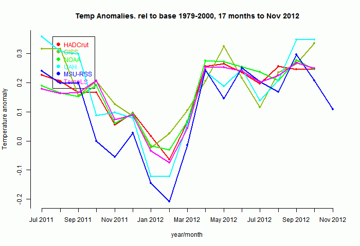
So here's a plot of the indices for those 17 months, set to a common anomaly base period of 1979-2000. Generally the surface-based (non-satellite) follow each other pretty closely:
Now to show more detail of the differences, I'll plot the monthly differences between TempLS and the others. I'll arbitrarily zero the plots in a staggered way to make a point:
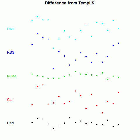
Now it becomes clearer. TempLS tracks NOAA very well, HADCrut 4 a little less, GISS less again, and the lower troposphere indices rather poorly.
There is, of course, a good reason for this. TempLS and NOAA use very similar datasets - GHCN land data, and ERSST. TempLS uses unadjusted GHCN, but there is very little adjustment in this time frame.
Quantification
I wanted to see also how the other indices track each other, and to give a statistically testable measure. An obvious one is just the standard deviation of the scatter seen in the figure above. Here is a table of that measure for each pairing:Standard Deviations of differences (°C)
| Had | Gis | NOAA | RSS | UAH | TLS | |
| Had | 0 | 0.0579 | 0.0274 | 0.0836 | 0.0721 | 0.0248 |
| Gis | 0.0579 | 0 | 0.0692 | 0.0825 | 0.1017 | 0.0653 |
| NOAA | 0.0274 | 0.0692 | 0 | 0.0925 | 0.0756 | 0.0183 |
| RSS | 0.0836 | 0.0825 | 0.0925 | 0 | 0.0561 | 0.0867 |
| UAH | 0.0721 | 0.1017 | 0.0756 | 0.0561 | 0 | 0.0754 |
| TLS | 0.0248 | 0.0653 | 0.0183 | 0.0867 | 0.0754 | 0 |
The differences are marked - 0.0183°C for NOAA vs 0.0653°C for GISS, relative to TempLS.
Another measure is the correlation coefficient ρ for the monthly changes. This has the advantage that it can be easily tested for significance, with the formula for t-value:
t = ρsqrt((n-2)/(1-ρ*ρ))
where n is number of months. As usual, t is significantly above zero at 95% confidence if it exceeds 1.96. Actually, the significance is diminished by autocorrelation etc. Still, in cases of interest it clears that level by a wide margin.
Correlation coefficients of monthly changes
| t-value of monthly changes
|
The correlation of TempLS with all the indices is significantly positive, although with GISS barely so, over this period
Here's a graphical representation of the correlation. The circle areas are proportional to the t-value of the pairing. Big means close tracking. In fact, the area is proportional to ρ*sqrt(1/(1-ρ*ρ)); there's no difference for one plot, but it means that when I compare to different periods, the circles do not inflate with the longer period.
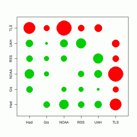
The best correlations are in fact between TempLS and HADCrut and NOAA, which likely indicates the commonality of their data sources. There is also quite good tracking between the satellite indices. It seems that the different methods used have less effect than the different data sets.
Longer periods
I looked at the 17 months for which TempLS made predictions. But comparisons between other indices are valid beyond that period. As indeed are comparisons with TempLS, because in calculating the monthly values I actually didn't peek.The story is very similar. All the correlations are now highly significant. I'll just show below the circle plot for periods of five and ten years:
| Correlations over 5 years | Correlations over 10 years |
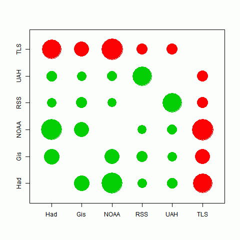 |
Conclusions
There are interesting patterns of correlation between the various temperature indices. Those using similar datasets correlate very well. GISS, which uses a more diverse set, behaves rather differently.TempLS fits very well into the NOAA/HADCrut grouping.
Thursday, December 6, 2012
Using present expectation anomalies for station data.
As I foreshadowed in a recent post, for plotting recent monthly data I wanted to shift from anomalies based on a past period (1961-1990) to one based on the present. For each station and each month, I would use the present value of a weighted linear regression as the expectation, and the anomaly would be the deviation from that.
The reason was mainly that I suspected that irregular happenings in the history of the stations was distorting the anomaly base, and creating noise in the anomaly plot which isn't needed. In my most recent post I traced the prominent deviations due to Nitchequon and Shahr-e-kord to gaps in the record and noted big (and probably correct) adjustments made by GHCN.
I've done it, and the monthly maps now use this basis. I think it has been very successful in removing this source of error. Of course, it also means that the anomalies do not give any measure of AGW. For that the right source is the trend map.
Below the jump, I'll illustrate the improvement.
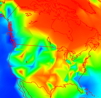
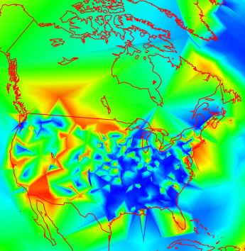
I haven't updated some earlier maps (June 2012, Nov 2011), so you can use these for comparison. Here is a snapshot of North America for June:
 |  | |
| June 2012 using anomaly base 1961-1990 | June 2012 using anomaly from present estimate |
Not only is the Nitchequon dip in Quebec gone, but the US is very much smoother. I have often commented previously how these plots seem less smooth in the US; that may well be due to a greater frequency of station changes. Anyway, it's much less true now.
It also shows more emphatically how spatially correlated are the changes in individual station monthly averages.
Wednesday, December 5, 2012
Visualizing the need for homogenization
I've put up two recent posts which show temperature results for individual stations using a shaded mesh. One shows monthly anomalies relative to 1961-1990, or 1975, and the other shows trends. There's an interesting spatial consistency, with exceptions.
The exceptions may be climate. But they may also be the effects of things happening to stations. This is what homogenization is designed to overcome, and I think there are some good illustrations here.
I usually use GHCN unadjusted readings, mainly because people like to argue over adjustments, and I think for the headline effects they don't make much difference. But these spatial plots show that they can, and it's probably for the good.
Nitchequon
I mentioned in the monthly post the strange behaviour of this cold place in Quebec. Here are a couple of snapshots: |  |
| October 2012 | June 2012 |
But it's likely that that is because it was never as warm (in 1975 etc) as we thought. Here is the unadjusted GHCN history:
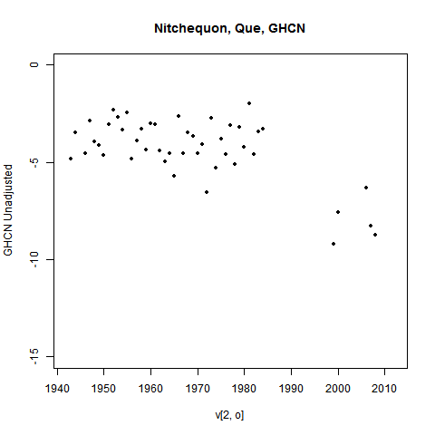
You can see a lot of missing years from 1984 to 2000 and even later. I've omitted years with less than 9 months of data, but that isn't the issue. Most of those years had none at all. And there's a lot of scope for something to have changed during the gap.
The GHCN adjustment process picked this up. Here's what they have:
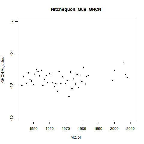
Those past temperatures have been adjusted down. That would stop Nitchequon standing out as a place of ongoing (relative) cold.
Ideally, I'd show you the plot with recalc anomaly base. But I haven't done that, because as foreshadowed, I'm moving away from using a past basis at all.
Update - see below for another example
Trends
Trends are more subject to measurement vagaries, especially long term trends. And this tends to show up as visible inhomogeneity. My trend plot now offers the option of using adjusted data.Here is a picture of 30 year trends (to present) in N America
It's a bit more irregular in the US that Canada (this often seems to happen), but not too much. But going further back, to 1892, you get this:
Data is rather sparse in Canada now, but the US shows a lot of variability. How much is due to measurement vagaries?
Well, here are the corresponding adjusted plots:
 |  |
| Adjusted GHCN 1982-2011 | Adjusted GHCN 1892-2011 |
You can see that the shorter term makes not much difference, but the longer term smoothes a lot. This is of course not surprising - it's what homogenization should do. I'm just noting that it does, and there did appear to be a problem.
Still, it's not always like that. Here's what homogenization does in Europe for 1892-2011:
 |  |
| Unadjusted GHCN 1892-2011 | Adjusted GHCN 1892-2011 |
It wasn't bad before adjustment, and may be worse after.
No real conclusions here, though I do notice a pattern suggesting that inhomogeneity is more of a problem in the US. But you can try your own cases.
Update - another Nitchequon
I went looking for more examples. Some really stand out. Here are the last three months of a place listed as SHAHRE... in W Iran (It is the city of Shahr-e-kord).
 |  |  |
| October 2012 | Sep 2012 | Aug 2012 |
I've shown the last with mesh lines. The pattern continues back. And the cause is evident in the data, this time shown on one plot:
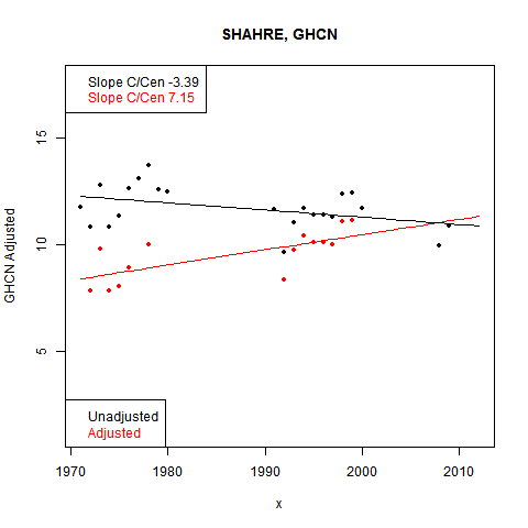
Again, big gaps in the data, and the base period adjusted down in GHCN.
Station trends - more
This is the second in the series of large datasets made available by XMLHTTPRequest. I had shown a globe map of station trends. I was limited to 3 time periods and even then there was some awkwardness because I had to use a single mesh to save download time.
Now I can do many periods, each with its own mesh. The resulting plot is shown below. All the periods end at present - I could do selected past periods too, but couldn't think of a scheme for preselecting.
I originally called this a cherrypickers guide, because it shows out the locations where the trends have been negative. But it also puts it in proportion - there are more positive trends than negative. The color scheme often obscures that, because I center the rainbow colors on the midpoint of the data, which is often well above the zero trend, which is down among the blues. I think the spatial homogeneity is worth noting. Nearby stations tend to warm and cool together.
Anyway, the plot is below the jump. Or you can go here to see it in a separate window. As with monthly data, you can select different time ranges, ask to see the nodes and mesh - just refresh when you've selected. Click on the small map to reorient the globe. Click on the main globe to bring up the data for the nearest station.
Update: I've put up corresponding data using GHCN adjusted. Check the box and refresh to see it.
How it works
The flat map at top right is your navigator. If you click a point in that, the sphere will rotate so that point appears in the centre.The buttons below allow modification. Set what you want, and press refresh. You can show stations, and the mesh, and magnify 2×, 4×, or 8× (by setting both). You can click again to unset (and press refresh).
Then you can click in the sphere. At the bottom on the right, the nearest station name, lat/lon and trend will appear. It's easier to do this with stations displayed.
Data details
These are as for the previous post.Tuesday, December 4, 2012
On Anomalies for Stations
I've recently posted a map (one of a series) of monthly temperature anomalies for individual stations. I've been thinking about what kind of anomaly is really appropriate here.
Some skeptics don't like anomalies, and say only real temperatures should be plotted. But then the plot is dominated by the variations in altitude and latitude. In January it's cold in Moscow and warm in Booligal. We knew that. If you hear that it was 15°C in Rome last month, you'll ask "but what is it normally?".
You need the anomaly, because that's the real information in the month's readings. And a plot should show that. The anomaly is the difference between what is observed and what you expect.
But what expectation? More below the jump.
Indices like GISS and HADCrut use a thirty period to calculate averages on which to base anomalies. That's the expectation, so deviation from it includes global warming. That has to be related to a fixed period.
I used that for the map anomalies. There is a practical difficulty that a station with October 2012 readings and a substantial history may not have enough information in, say, 1961-1990. This is the period that I used. So a reasonable thing to do is to use other information and get a regression estimate for 1975. That will avoid bias from a warming trend.
What do we really want?
The idea of that was that the anomaly will include global warming since 1975. And indeed, recent anomalies are mostly positive. However, this isn't obvious, because by graphing scheme shifts the color map relative to the range. So because of warming, small positive anomalies are shown with bluish colors. That would be the same whatever base period was used.
Looking at a monthly map, global warming isn't news. Even relative warming like that in the Arctic isn't new. Seeing a reddish Arctic month after month may not be what we need. Because it's all pushed into the upper color range, there isn't much new information.
Consistency
One thing that I think is important in these plots is that you get an idea of spatial consistency. Where it's hot, most stations nearby are hot. The colors are fairly smooth. This is only true if the anomaly base is also consistent.There is a station Nitchequon, in NW Quebec, which shows up with consistent low anomalies relative to neighbors. Otherwise Canada has mostly good consistency. I suspect the anomaly base is wrong. Nitchequon has a fairly long record, including quite a lot in 1961-90, but is missing many years from 1985 to 2005. Temperatures after the break are much lower than before. The adjusted version moves these later numbers way up. I'm using unadjusted GHCN. That's not so important in absolute terms, but, unadjusted, it does produce the marked dip in the plot.
Incidentally, I think the Nitchequon story does show how inhomogeneities can really stand out to be identified.
Expectation?
What does the expected value really mean? I could produce a value that allowed for ENSO, solar forcing etc. This might well be a lower variance estimate. But I think most users would expect to see those effects reflected in the anomalies, not removed from them. So there is a middle ground to be found.My current thinking.
I think that I should plot anomalies relative to the current mean values (for month) with adjustment for trend. That would be the expected value. It has the advantage that it would avoid issues with past jumps, as at Nitchequon. And it does show the information that is new with each month.I think the best way to do it is with a weighted least squares fit to a linear model, as with TempLS. I'd fit a model for each station:
Tmy=Lm+Jy
The L's are offsets constant for each month (m) ("monthly averages") and J is a linear progression over years (y). The weighting would be an exponential decay back in time, with a time constant of maybe thirty years. This would give higher weight to recent data. The anomaly would be the residual.
I'll think about it a bit more, but I'll probably redo the data for the previous post.
Update - it has now been done as described here.
Monday, December 3, 2012
Monthly station surface temperature shown on globe
I've been discovering new things in Javascript. I have been much constrained by data download time. JS frowns on interactive downloading - you generally have to download all data initially, as part of the code. However, there is a newish feature, XMLHTTPRequest, which allows download in response to user choices (with restrictions on domains). This means I can make very large datasets available to select from. I've also found new ways of compacting them, which I'll write about later.
My initial exercise was the plot that I have sometimes shown for recent months (eg June). It's based solely on the data reported for that month (plus the anomaly base). But now you can select any month you like (currently only for this century). The data is downloaded when you ask, so there isn't a huge initial wait. It's a plot based purely on the station data for GHCN V3 unadjusted and ERSST. For SST a "station" is a 4°x4° lat/lon cell. A triangle mesh is fitted and used for color shading between stations.
As before, you can rotate the globe by selecting focus points on the top right map. You can magnify, display stations and mesh, and click to print numerical data (on the right). There are more details of that below.
The plot is below. You can also click here to see it in a separate tab/window. More discussion and user guidance follows.
The buttons below allow modification. Set what you want, and press refresh. You can show stations, and the mesh, and magnify 2×, 4×, or 8× (by setting both). You can click again to unset (and press refresh).
When you select a month/year, you also have to refresh. Using the navigator automatically refreshes.
Then you can click in the sphere. At the bottom on the right, the nearest station name and anomaly will appear. Lat/Lon and date are also shown. You may want to have stations displayed when you click.
Anomalies are relative to the 1961-1990 period. Where stations did not have enough data there, I took extra years and did a linear regression, and used the 1975 value.
Update - as foreshadowed in later posts, I've now switched to a weighted linear regression estimate of present month value as the basis for the anomaly. The weight function is an exponential with a time constant of thirty years. The results are smoother.
As mentioned, I'm using GHCN v3 for station data. I've downloaded late Nov 2012, and I probably won't update past months regularly, but I'll try to add future months as they appear. I'll update older data occasionally, since late stations will appear. I have taken a more conservative approach to GHCN - anything with a quality flag is not shown. That loses some good data, and I may review.
ERSST shows frozen sea as -1.8°C, the temperature below the ice. I've eliminated these readings, as they don't reflect climate.
The shading is not ideal, but is what HTML 5 provides. It gets two nodes in the triangle exactly right, and I've done the best I could with the third. Where there are big variations, you'll sometimes see nodes with adjacent shading which differs in some triangles. Usually the majority is correct.
My initial exercise was the plot that I have sometimes shown for recent months (eg June). It's based solely on the data reported for that month (plus the anomaly base). But now you can select any month you like (currently only for this century). The data is downloaded when you ask, so there isn't a huge initial wait. It's a plot based purely on the station data for GHCN V3 unadjusted and ERSST. For SST a "station" is a 4°x4° lat/lon cell. A triangle mesh is fitted and used for color shading between stations.
As before, you can rotate the globe by selecting focus points on the top right map. You can magnify, display stations and mesh, and click to print numerical data (on the right). There are more details of that below.
The plot is below. You can also click here to see it in a separate tab/window. More discussion and user guidance follows.
How it works - details
The flat map at top right is your navigator. If you click a point in that, the sphere will rotate so that point appears in the centre.The buttons below allow modification. Set what you want, and press refresh. You can show stations, and the mesh, and magnify 2×, 4×, or 8× (by setting both). You can click again to unset (and press refresh).
When you select a month/year, you also have to refresh. Using the navigator automatically refreshes.
Then you can click in the sphere. At the bottom on the right, the nearest station name and anomaly will appear. Lat/Lon and date are also shown. You may want to have stations displayed when you click.
Data details
Anomalies are relative to the 1961-1990 period. Where stations did not have enough data there, I took extra years and did a linear regression, and used the 1975 value.
Update - as foreshadowed in later posts, I've now switched to a weighted linear regression estimate of present month value as the basis for the anomaly. The weight function is an exponential with a time constant of thirty years. The results are smoother.
As mentioned, I'm using GHCN v3 for station data. I've downloaded late Nov 2012, and I probably won't update past months regularly, but I'll try to add future months as they appear. I'll update older data occasionally, since late stations will appear. I have taken a more conservative approach to GHCN - anything with a quality flag is not shown. That loses some good data, and I may review.
ERSST shows frozen sea as -1.8°C, the temperature below the ice. I've eliminated these readings, as they don't reflect climate.
The shading is not ideal, but is what HTML 5 provides. It gets two nodes in the triangle exactly right, and I've done the best I could with the third. Where there are big variations, you'll sometimes see nodes with adjacent shading which differs in some triangles. Usually the majority is correct.
Saturday, November 24, 2012
Climate data postings
For a couple of years I've been running a daily script to track new monthly temperature indices and also sea ice data. The script posts them on the data page.
I'm upgrading this - I now use wget to monitor the data sites. A by-product is that I have a listing of the times as posted by the source, and I thought I could add that to the site, newest first. I've put that table at the head of the list on the data page. Time zone is US Eastern (eg NY). Here's how it looks at the moment:
| Date | Name | Size Kb | Source |
| Nov 22 08:56 | GHCN V3 station temps | 12196 | source |
| Nov 20 13:53 | HadCRUT 4 land/sea temp anomaly | 209 | source |
| Nov 20 00:59 | NOAA land/sea temp anomaly | 29 | source |
| Nov 19 15:42 | GISS land/sea temp anomaly | 16 | source |
| Nov 18 00:06 | HADSST2 mean | 4145 | source |
| Nov 18 00:05 | CRUTEM CRU global mean Station anomaly | 30 | source |
| Nov 09 07:48 | UAH lower trop anomaly | 65 | source |
| Nov 05 12:58 | RSS-MSU Lower trop anomaly | 37 | source |
| Nov 04 21:21 | ERSST NOAA SST grid | 3274 | source |
Indices are in black - spatial data (large) in brown. I can fairly easily add new sources to the list. I've chosen one representative file from each source, expecting that others of interest are likely to be posted at the same time. The list will be maintained on the data page. I also plan to post a history file (when there is some history). Some sources like GISS update their monthly postings frequently, so the date you see here may not be the first posting for the month.
Saturday, November 10, 2012
October GISS Temp up 0.08°C
The GISS land/sea monthly anomaly rose from 0.61°C September to 0.69°C in October. This came out just as I posted TempLS, which was unusually early in the month for GISS. Furthermore, GHCN is rather tardy in its posting, so there are fewer stations than usual for the time of the month. TempLS went down by 0.02°C from September. Time series and graphs are shown here
As usual, I compare the previously posted TempLS distribution to the GISS plot.
Here is GISS:

And here is the previous TempLS spherical harmonics plot:
.
Previous Months
SeptemberAugust
July
June
May
April
March
February
January
December 2011
November
October
September
August 2011
More data and plots
October TempLS Global Temp down 0.02°C
The TempLS analysis, based on GHCNV3 land temperatures and the ERSST sea temps, showed a monthly average of 0.52°C for October, down from 0.54 °C in September. There are more details at the latest temperature data page.
Below is the graph (lat/lon) of temperature distribution for October. I've also included a count and map of the stations that have reported to this date.
This spherical harmonics plot is done with the GISS colors and temperature intervals, and as usual I'll post a comparison when GISS comes out.
And here, from the data page, is the plot of the major indices for the last four months:

Here is the map of 3514 "stations" which contributed to this report. Reporting seems to be slow this month - there are about 500 less than usual for this time.

Thursday, October 18, 2012
New ISTI dataset - duplicates
This is my third post on the new beta release of the ISTI temperature database. In the first post, a Google Maps display, I noticed a number of stations which appeared to be duplicates. So I thought I'd check more comprehensively.
I first ordered the inventory alphabetically by name. A complication here is that 430 have no name. Some still showed up as duplicates.
The next step was to collect pairs of adjacent stations whose data began in the same or adjacent year. Then I did a rough distance check and retained pairs for which the sum of lat and longitude differences (absolute value) was less than 1°. That's within about 70 km at most near the equator, requiring greater closeness near the poles. In fact most pairs at this stage have near identical coordinates.
That left 1077 pairs. I've made a list as a zipped CSV file here.
There will be some missing. I suspect Vienna/Wien are duplicates, but are missed alphabetically. The two Trondheims I noticed are assigned coords too far apart. And of course, my test doesn't prove duplication - just flags for checking.
Tuesday, October 16, 2012
New ISTI temperature dataset - station trends map
This is my second post on the new beta release of the ISTItemperature database. The first post was a Google Maps interactive map of the stations. This time we have an interactive global trend map in the style I did for GHCN.
Again, the dataset is large, and takes a few seconds to load, so I have put it below the fold. It is a globe that shows individual station trends with shading on a triangular mesh. The shading color is accurate at the stations themselves. You can display the stations and mesh, and click to pick up the numerical information. There is a little navigator map that lets you reorient the globe as you wish. Maps are available for periods of 30, 45 and 60 years to present. You can magnify 2x, 4x or 8x.
I should emphasise that these are trends for individual stations - there is no modelling or smoothing, except for the triangle shading interpolation. I find that valuable in that it shows the spatial correlation (or lack of). I was interested to see if the larger ISTI set gave a similar result to GHCN.
I think it does. A notable feature of all these plots, whether for period averages or trends, is that the US seems more of a patchwork than ROW. This is of course partly the higher density of stations, but I think there really is less coherence. Perhaps there is a quality issue (associated with the large numbers).
Anyway, the map is below the jump. There is some further discussion of the methods in this plot from last November. Below the map I've written a little about the numerics..

 Click on this map to orient the world plot.
|
How the trends are calculated.
The trends are calculated using monthly data over calendar years (So I didn't use 2012 months). There is a tricky issue with seasonality. If you take the trend of a year from autumn to autumn, monthly, you'll get an uptrend even if the year ends as it began. The calendar year is mostly winter to winter or summer to summer, so the effect is much diminished. I allowed for this using the method from TempLS. Instead of just one intercept, I fit (OLS) twelve monthly offsets (means) as well as the slope. This subtracts out the seasonal variation and gives the underlying trend.Sea Temperatures
As usual I've added SST's by taking a published gridded set and putting artificial stations at the grid centres. Previously I've used ERSST, this time I used HADSST2. The emphasis is on the land data, but the mesh goes haywire without ocean nodes. The HAD grid is coarser, so the ocean trends are more patchy. Because of the arbitrary placement of stations at 5x5 grid centres, it can happen that they appear on land. Please excuse.Update There are some odd hotspots in southern oceans for the longer time periods. This is an artefact. It is caused by an arrangement I have which enables me to use the same mesh for all three time intervals (meshes take time to download). I use a single mesh with a node for every station with any admissible trend - a station has to have 80% of months reporting to be assigned a trend over a period. Where for a time period a station doesn't have a trend, I assign an interpolated value for coloring purposes. The station is not shown, so the effect should be a minor upset in the shading only. However, there are in those parts some stations which do not have any connected stations with trends (for that time interval - worst at 60 years). Then the interpolation goes wrong, and the shading shows artificial heat. I don't think it happens anywhere on land.
Subscribe to:
Posts (Atom)


