I've put up two recent posts which show temperature results for individual stations using a shaded mesh. One shows monthly anomalies relative to 1961-1990, or 1975, and the other shows trends. There's an interesting spatial consistency, with exceptions.
The exceptions may be climate. But they may also be the effects of things happening to stations. This is what homogenization is designed to overcome, and I think there are some good illustrations here.
I usually use GHCN unadjusted readings, mainly because people like to argue over adjustments, and I think for the headline effects they don't make much difference. But these spatial plots show that they can, and it's probably for the good.
Nitchequon
I mentioned in the monthly post the strange behaviour of this cold place in Quebec. Here are a couple of snapshots: |  |
| October 2012 | June 2012 |
But it's likely that that is because it was never as warm (in 1975 etc) as we thought. Here is the unadjusted GHCN history:
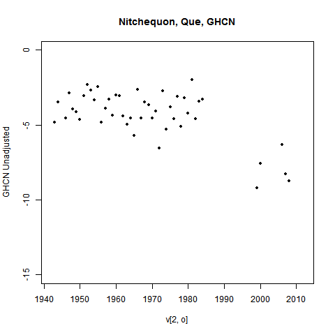
You can see a lot of missing years from 1984 to 2000 and even later. I've omitted years with less than 9 months of data, but that isn't the issue. Most of those years had none at all. And there's a lot of scope for something to have changed during the gap.
The GHCN adjustment process picked this up. Here's what they have:
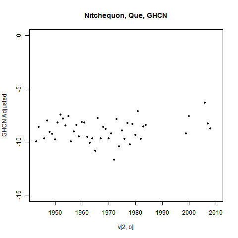
Those past temperatures have been adjusted down. That would stop Nitchequon standing out as a place of ongoing (relative) cold.
Ideally, I'd show you the plot with recalc anomaly base. But I haven't done that, because as foreshadowed, I'm moving away from using a past basis at all.
Update - see below for another example
Trends
Trends are more subject to measurement vagaries, especially long term trends. And this tends to show up as visible inhomogeneity. My trend plot now offers the option of using adjusted data.Here is a picture of 30 year trends (to present) in N America
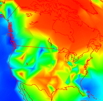
It's a bit more irregular in the US that Canada (this often seems to happen), but not too much. But going further back, to 1892, you get this:
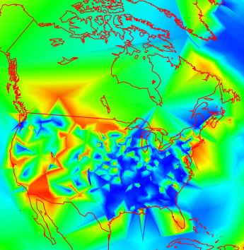
Data is rather sparse in Canada now, but the US shows a lot of variability. How much is due to measurement vagaries?
Well, here are the corresponding adjusted plots:
 |  |
| Adjusted GHCN 1982-2011 | Adjusted GHCN 1892-2011 |
You can see that the shorter term makes not much difference, but the longer term smoothes a lot. This is of course not surprising - it's what homogenization should do. I'm just noting that it does, and there did appear to be a problem.
Still, it's not always like that. Here's what homogenization does in Europe for 1892-2011:
 |  |
| Unadjusted GHCN 1892-2011 | Adjusted GHCN 1892-2011 |
It wasn't bad before adjustment, and may be worse after.
No real conclusions here, though I do notice a pattern suggesting that inhomogeneity is more of a problem in the US. But you can try your own cases.
Update - another Nitchequon
I went looking for more examples. Some really stand out. Here are the last three months of a place listed as SHAHRE... in W Iran (It is the city of Shahr-e-kord).
 |  |  |
| October 2012 | Sep 2012 | Aug 2012 |
I've shown the last with mesh lines. The pattern continues back. And the cause is evident in the data, this time shown on one plot:
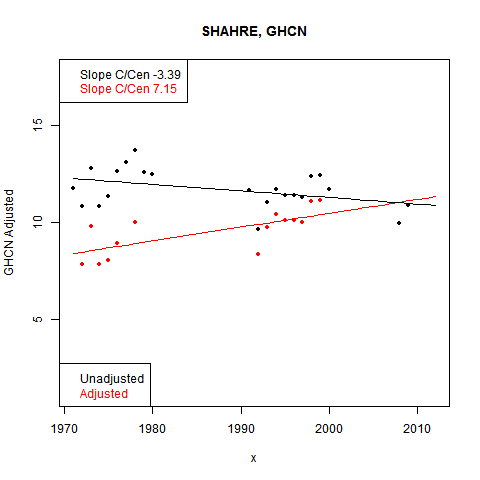
Again, big gaps in the data, and the base period adjusted down in GHCN.


Unfortunately "Nitchequon" is no longer Nitchequon. Canada has recycled some WMO station numbers, but this is not reflected in the GHCN data. You have data in this case from two different stations, a considerable distance apart. In most such recycled cases GHCN has only the data for the original station, but in the case of Nitchequon the later data from Pangnirtung appears as part of a "Nitchequon" record. See A few more GHCN problems for further details.
ReplyDeleteThanks, Peter,
DeleteIt's quite a muddle, and your link really helps to sort it out. Interestingly, Nitchequon also stands out as being perhaps the only station in the GHCN inventory not named in all caps. So it looks like it has been getting special attention.
I did implement the suggestion made earlier of using current estimates as anomaly basis, and that diminished the problems with Nitchequon, but some remained. There are now only a few years of N data in the near-present period, and they lead to highly variable monthly averages. So in some months, Nitch still shows out. I plan to up the filter requirement on the number of recent months for data to be allowed. That should exclude it.
Nick: ( I followed your link here from Lucia's.) The data are the data. You and all of the other "data homogenizers" are simply guessing about which data are wrong and possibly doing so with a bias. I assume you have read Feynman's story about bias in experiments determining the mass of the electron in Cargo Cult Science. (It's available on the web, if you haven't.) He says physicists have learned to avoid bias by never arbitrarily discarding any data, but climate scientists don't seem to have learned this lesson. From a scientific perspective, "guesses" are hypotheses and before a scientist accepts a hypothesis, he needs to find some way to test that hypothesis. Otherwise, you have an obligation to consider all of the data and describe any concludion based on a subset of the data as a hypothesis. When you don't, you are practicing religion or philosophy, not science.
ReplyDeleteAs it turns out, oneillp tells us that certain aspect of your hypothesis about Nitchequon were partially correct (the spatial homogeneity at this location is misleading) and partially incorrect ("it was never as warm (in 1975 etc) as we thought").
If you look at the map labeled "June 2012", there are other deep blue regions that are large enough to be believable. Why did Nitchequon in September have to be wrong?
Every large data set is going to have two and even three sigma "outliers" in it which are purely due to chance. If you look for them, you will find them. If you look at every month of the year, rather than annual averages, you have twelve times as many opportunities to discover such "outliers". And the standard deviation based on an n of about 30 (square root 5.5) instead of 365 (square root 60) introduces another factor of 10 into the expected deviations. If you look at all possible beginning and ending dates (as you have in the past), you will find even more. And all of them will be perfectly normal scatter in the data. And if you correct mostly one tail of the distribution, you will bias your results.
Before you correct such data, you need real statistical evidence that such outliers are as improbable as you assume they are. With data homogenization algorithms introducing a correction every two decades into the record in most of the world and every decade in the US, how can we determine the true scatter in the data. The only thing we can really trust to tell us about true spontaneous scatter in the data is the USCRN, but one doesn't hear much about that data set.
Correcting the US land record for documented changes in time of observation is scientific, because a hypothesis was made and tested experimentally. We understand how much uncertainty is introduced by the correction process. When data homogenization adds +0.2 degC/century (my estimate) to the global land trend for the last century, that increase is an unproven hypothesis. We don't have the slightest idea how much uncertainty is introduced by this correction and how much the natural scatter in the data (which is used to calculate uncertainty intervals) has been artificially diminished by homogenization.
Frank
Frank,
ReplyDeleteMy point mainly was that Nitchequon shows up month after month as a cold spot, not just September. And I think it is not disproved that "it was never as warm..." - the place where it was warmer is different from the place currently being reported.
My contention is that you can afford some false positive rate in corrections, as long as it is not itself excessively biased. The intent isn't to get improved station values - it's to get an improved regional or global average.
The immediate practical problem for me was that places like Nitch were showing up because of the time interval between the anomaly base and present. That's when the site change occurred. My remedy is not adjustment but rebasing, so the best estimate of current temp is the reference. It's not magic - but it attenuates the effect of past glitches as much as possible.
My contention is that it was "exactly as warm in Nitchequon as we thought it was". We have no reason to believe that the thermometer was wrong or that the observations were taken under inappropriate conditions. The data were data. It was wrong to combine the pre-1990 record for "Nitchequon" with the post-1990 record and believe in the resulting cooling trend. That trend was mostly created by a long suspicious period with NO DATA, not incorrect data. Unfortunately, we can say exactly the same thing about the adjusted record - to my eye, most of the warming trend is created during the data gap. If so, the adjusted warming trend would have been created by neighboring stations, not a station in Nitchequon. To say that Nitchequon, before or after homogenization, adds anything meaningful to our understand of warming in Quebec is a joke. What homogenization does is: 1) disguise the poor quality of some of our data, 2) artificially reduce the standard deviation of the trend, and 3) possibly create a "rural" station whose trend was obtained derived in part from urban stations.
ReplyDeleteThe majority of the breakpoints found by homogenization algorithms appear to be unreasonably sharp drops in temperature (which are adjusted by reducing temperature before the breakpoint, even though we have no evidence determining which side of the breakpoint is erroneous). What if some of these breakpoints represent station maintenance that restores the original observing conditions after a period of deteriorating performance? A gradual loss of enclosure reflectivity or gradual clogging of ventilation, for example, could introduce a warming bias that would be hard to detect. Cleaning could introduce an easily detectable breakpoint in the cold direction. Even though cleaning restored the original observing conditions, such a breakpoint would be automatically corrected by algorithms, introducing a warm bias in the trend. The same thing would happen if urban development gradually degraded observing conditions and a short distance move (to a local park, for example) restored something close to original observing conditions. BEST would make the same mistake - they would keep the gradual biased trends as observing conditions deteriorated and split at the breakpoint when initial conditions were restored.
By automatically correcting all data homogeneities, we are assuming the record doesn't contain any (undetectable) gradual changes that are suddenly corrected. You contend that "some" false-positive correction rate is tolerable, but I suggest that you have no evidence how big "some" is without a way of knowing which breakpoints should be corrected.
Instead of illustrating a need for homogenization, your post illustrates the need to investigate outliers and test hypotheses that might result in their correction or deletion from the record for failing to meet predetermined standards. And, of course, you need to investigate in an unbiased way. If your map were color coded in terms of standard deviations above or below the mean trend, it would be as easy to pick out the outliers trends on both the warm side and cool side. When there are large areas of bright red, you can't tell whether any of them are outliers. Ideally you would use several latitude bands, so that Arctic amplification and high variability don't prevent you from identifying warm outliers in the regions that are red.
Homogenization is a last resort, which produces a correction to the trend that is merely an untested hypothesis, not a scientific conclusion.
Frank
" To say that Nitchequon, before or after homogenization, adds anything meaningful to our understand of warming in Quebec is a joke."
ReplyDeleteFrank, this part is true. Some mistake has been made by some organisation, and the record would be better without N.
That doesn't mean the dataset should be discarded. What is needed is to identify such situations from the data and to ameliorate the effect. The effect of homogenisation is to substitute information of neighbouring stations in the N record. The effect of this is to simply downweight N in favour of those stations, as far as this period is concerned. If N had been removed from the record, those stations would have been upweighted anyway, by area weighting. Homogenization simply implements that change in proportion to the perceived inhomogeneity. And you can see from the record that it does so fairly completely.
That's all it does. It says that in the area where the N record would normally be influential, we'll discount it and rely on neighboring data instead. Exactly as you would have done if you knew from metadata that the N data was unreliable and discarded it.