For years now, we have been seeing graphs of CO2 and temperature records, with an observation that the pattern of CO2 lags temperature change. The claim is then that temperature drives CO2, not the other way around. Often this is expanded to the proposition that the rapid recent increase in air CO2 has nothing to do with the huge amount that we have emitted.
In the past, indeed CO2 has responded to sea temperature changes. That is no surprise. And CO2 has not been driving temperature. The reason is that nothing has been driving CO2. Unless something pushes up (or down) CO2, it can't force anything. And for millenia, the total amount of carbon cycling through various forms on the Earth's surface has been fairly constant.
None of this has anything to do with our present situation. We are looking at the response to burning 370 Gigatons of carbon (so far). There's no doubt what is driving that CO2 production. And it's a new introduction to the surface total. It is about 2/3 of what the atmosphere held 150 years ago, so it's big. We are about to find out how CO2 drives temperature.
Below the break, I'll look at some recent expressions of the Temp drives CO2 meme.
Ice ages
This is the traditional form. You see a plot like this: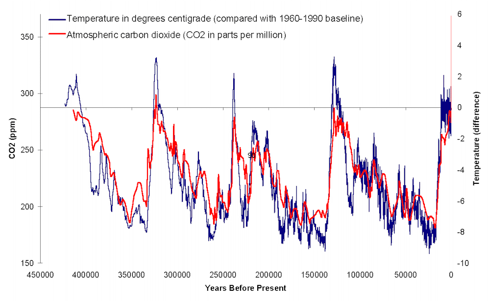
with the observation that CO2 peaks and rises lag temperature rises by a few hundred years. That article starts:
"There are still people who insist that changes in CO2 can explain the pattern of glacial and interglacial periods."but doesn't say who they are. Know anyone? It's not the IPCC! In the AR3, in 2001 with the evidence very recent, they weren't sure, but had no trouble with the idea that CO2 lags temperature:
" From a detailed study of the last three glacial terminations in the Vostok ice core, Fischer et al. (1999) conclude that CO2 increases started 600 ± 400 years after the Antarctic warming. However, considering the large uncertainty in the ages of the CO2 and ice (1,000 years or more if we consider the ice accumulation rate uncertainty), Petit et al. (1999) felt it premature to ascertain the sign of the phase relationship between CO2 and Antarctic temperature at the initiation of the terminations."
Fluctuations in recent CO2
For a while now, variants of graphs matching short-term changes in CO2 with temperature have been circulated, popularized particularly by Murry Salby in various lectures (though not written documents). An apostle is a commenter called Bart, or Bartemis. In a typical version, the annual difference of CO2 is said to be predicted by the difference between average temperature anomaly and an "equilibrium value", which is a fudge parameter. Plots like this are shown: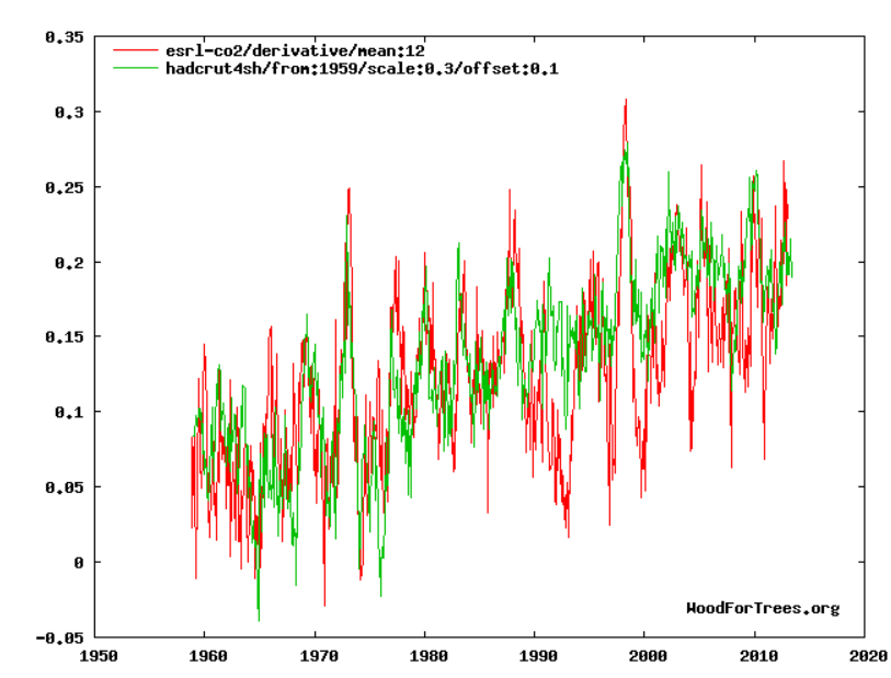
It shows Southern Hemisphere temperature compared with the annual difference of the CO2 series, with an offset to get them to match. It shows a good correspondence of the El Nino peaks, and some ability to trach the other short term ups and downs.
Why the SH, you might ask? Bart says it's not a cherry pick, but is because the SH has most ocean. And yes, the global temp is not so good:
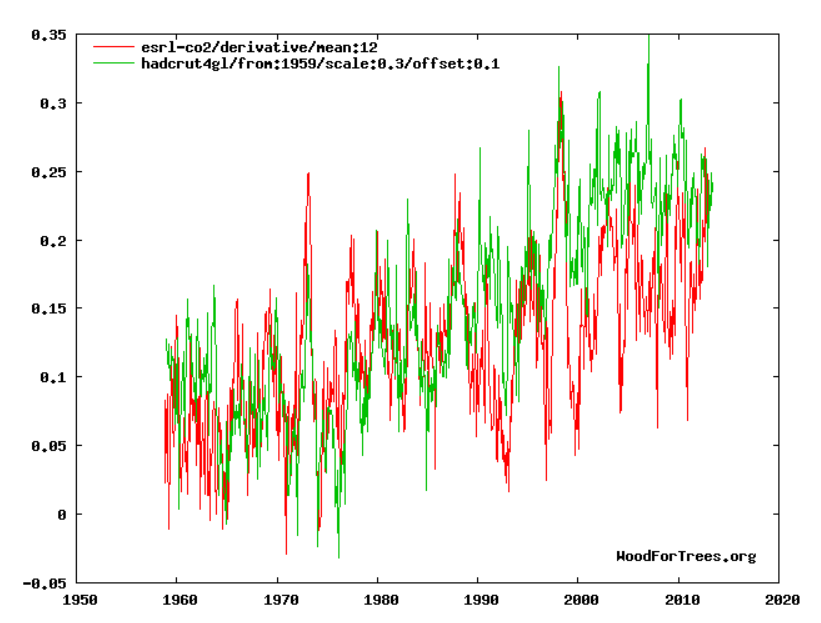
The peaks still line up, but the trends drift apart. NH is worse. The reason is that the SH had a particular ability to match the fairly modest rate of temp rise with the longer termCO2 difference trend, while keeping the scaling right. Other plots don't. It's hard to see that as an ocean effect.
It illustrates the main issue. Diffencing the CO2 curve emphasises the short term fluctuations in what is otherwise a rather boring CO2 history. But it is the long term AGW rise that is of interest, and differencing suppresses that. The trend would have been there as a constant, except that the two curves are arbitrarily displaced to match, so even that has gone. The wiggle matching in no way explains the main effect - the 30% or so increase in CO2 since we've been emitting.
This is clearly shown in the equivalent AR3 plot of differenced CO2:
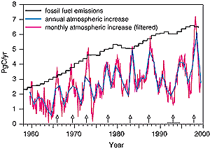
Now the differences are not displaced, and are clearly positive. It's that steady positive value that is to be explained. And the AR3 shows the explanation - the emissions, which are much steadier, but rise with the air increases, and always exceed them. The question is not how the CO2 got into the atmosphere, but where some of it went.
Predicting CO2
That wiggle matching has been going on for a while, but Bart also has a plot which does try to do the right thing - to integrate his differential form and predict CO2 rise from temperature (his plots here). He calls it "very high fidelity":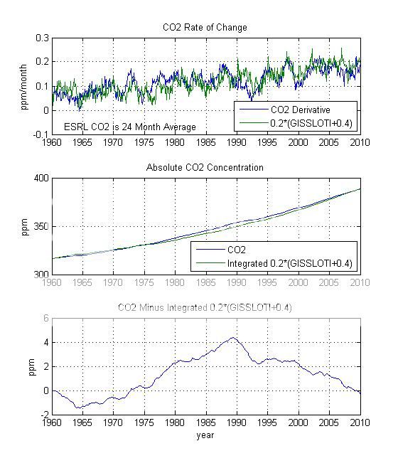
But is it? I've reproduced the last plot, the differences in red, here, along with a quadratic regression in black:
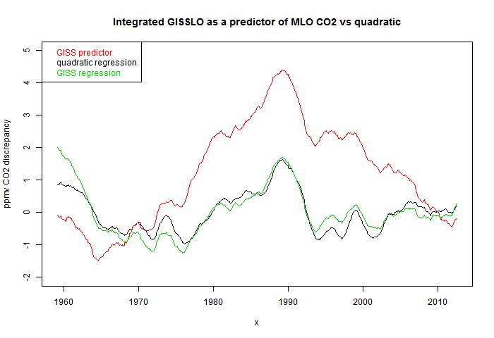
Here the CO2 curve is just 24-month smoothed, and the temperatures were modified as integrated 0.184*(GISSLO-0.424). These are slightly different to Bart's. I used his numbers first, but the curve was rather different; with these parameters it looks the same. There may have been some rounding. In any case, the point is that the quadratic regression fits much better than the GISS derived version.
But the quadratic version could have been expressed as integrated 8.832E-5*(t-429) where t is time in months from the start (Feb 1959). It's of the same form as the GISSLO fit, but using t instead of GISSLO. So simple date is a better predictor than temperature!
Well, not quite. In fairness, I should optimise the coefficients by regressing against GISS as I did against time. That gives the green curve in the above plot. It's very close to the time regression. So a better conclusion is that GISS is no better that time. On the longer term, there is absolutely no basis for saying that temperature drives CO2.
Conclusion
Short term temperature fluctuations, like ENSO, cause short term CO2 fluctuations of a few ppmv. And very large longer term fluctuations, like Ice Age terminations, cause larger fluctuations of up to 100 ppmv. All dwarfed by the current increase, which is clearly driven by our emissions.Differencing the recent CO2 history shows up short term fluctuations, which show this matching. But this says nothing about the effect of our steady emissions, which differencing and translating removes. When the differenced version is integrated as a predictor, it offers no benefit.
IPCC derivative


What I find interesting is "they" look at the ice core records and state co2 lags temperature by hundreds of years, and then claim current co2 is being driven by the current temperature (effectively zero lag).
ReplyDeleteOnly one of these is correct and since the ice records do show a significant delay (just how accurate are these record?) then with this delay in a few decades we are going to see a massive increase in co2 caused by the rapid temp rise from the 1970s!
I've seen worse - people say - 800 years huh? How long since the MWP?
DeleteBut there's also a scale issue, which Ferdinand Engelbeen keeps reminding. Ice cores give about 8 ppmn per deg C rise.
Back in 2009 i posted this series of plots:
Deletehttp://www.climateandstuff.blogspot.co.uk/2009/08/i-recently-posted-this-on-ca-httpwww.html
(hopefully the plots are still there (current location bars imageshack!))
Ice cores - co2 dust ch4 plotted
Regarding the Antarctic ice core lag, Pedro et al. 2012 looked at multiple Antarctic datasets to provide a better constraint at ~ 200 years +/- 200. Also, Shakun et al. 2012 pointed out that the lag disappears or even reverses when looking at temperature records from other parts of the world.
ReplyDelete"There are still people who insist that changes in CO2 can explain the pattern of glacial and interglacial periods."
When addressing this point I think it needs to be appreciated that glacial and interglacial periods are usually understood, in the scientific literature, in terms of boundary conditions and quasi-equilibrium states. In this framework what can be seen is that the main reason for the difference between a glacial and an interglacial is probably the change in atmospheric CO2 concentration. Hence, it is often stated that CO2 changes can explain glacial/interglacial cycles, even though it's understood that CO2 didn't throw the first punch - the amplitude of the cycles wouldn't have been anything like what they were without CO2 poking its nose into proceedings. I undertand what you mean but I thought it might be confusing for people to read your categorical denial of the statement above when glacial and interglacial periods are often discussed in terms of CO2 changes.
Paul,
DeleteI agree that it's often said, with justification, that CO2 feedback amplifies the temperature changes. But this quote said "changes in CO2 can explain the pattern of glacial and interglacial periods", and I don't think anyone says that.
"And CO2 has not been driving temperature." I'm sorry, but during the last 40 years this has been the case. Maybe you're talking about some other period than 'past'. This just to emphasize the accuracy needed to avoid the selective quoting that's been occurring recently in some circles WRT articles on physics concernig the climate on Earth and the specially the anthropogenic influence on volumes of the gases absorbing energy that would, without, leave the troposphere of the Earth's atmosphere... (recently here means about ;-P 1970s-currently). Probably most of the readers here know this too. I've been thinking to do a Watts-type analysis of some text that talks of science almost correctly, thus this minor note. No need to reply, I think I know what you truly mean, though the text might be selectively read otherwise.
ReplyDeleteREAD ONLY THIS ;-P:
One possible type caught my eye (phrase meaning I don't know what 'diffencing' is and suspect this should be 'differencing'.)
"Diffencing the CO2 curve emphasises the short term fluctuations in what is otherwise a rather boring CO2 history."
Good article. Reminds me that one of the first articles/blog posts I ever did back in 2007 was on CO2 as a forcing and feedback: http://www.yaleclimatemediaforum.org/2007/10/common-climate-misconceptions-co2-as-a-feedback-and-forcing-in-the-climate-system/
ReplyDeleteIf you are going to plot southern hemisphere temperatures you should plot the variation in southern hemisphere CO2. CO2 variation in the southern hemisphere shows essentially no annual cycle. There is also a 1-2 year lag between the NH and the SH)
ReplyDeleteEli,
DeleteSH was Bart's choice. The plot shows year-year differences, by month, so it removes the annual cycle anyway.
It shows the yearly differences by month for the derivative of the Co2 concentrations averaged over 12 months. Curiously the noise in the averaged derivative spectra is about the same as the noise in the unaveraged monthly spectra. since the CO2 in the Southern Hemisphere lags that in the North, the curves using the correct CO2 concentrations for the SH would be displaced if there is any meaning anyhow.
ReplyDeleteAbout that Samoa plot that Eli linked to. I have also linked to that plot, but got back the comment that it was actually a filtered data set -- indicating that someone removed the seasonal component.
ReplyDeleteThis is what I get when I look at the residual of Samoa against Mauna Loa. The two are very similar when the Mauna Loa seasonal is filtered out.
http://imageshack.us/a/img692/3111/dso.gif
It may indeed be the case that Samoa has no seasonal component, since it appears right in the middle of the Indo-Pacific Warm Pool.
SH CO2 shows almost no annual cycle. If you go down to Antactica, there no almost about it. The linear trends in the SH are about 2 years behind those in the NH. The annual cycle is pretty much biological in the NH with the summer bloom. Has nothing to do with the warm pool. If you want a spectacular annual cycle look at the records from Alert, CA.
ReplyDeleteThe seasonal component of Mauna Loa follows the average SST oscillation between 9N and 21S latitudes, while that for Samoa the seasonal variation is largely flat.
ReplyDeleteWhen the even smaller residual of each curve is calculated against the upward trend, the seasonally filtered Mauna Loa data matches the Samoa set. This is the global seasonal modifier to CO2 I am guessing.