In contrast to the reanalysis, though, it did make it the warmest July in the record, and by a significant margin - 0.744°C in 2016 was next. The prospect of July being warmest has started a number of "hottest month ever" stories. I don't join in that, because it is only true if you add the seasonal cycle that makes NH summer the global peak. There are good reasons why we quote anomalies rather than absolute temperatures, so deviating for this claim can only cause confusion. In any case the seasonal cycle is predictable; the news is the anomaly. And July was nowhere near the highest anomaly of all months. Last March, for example, was 0.982°C.
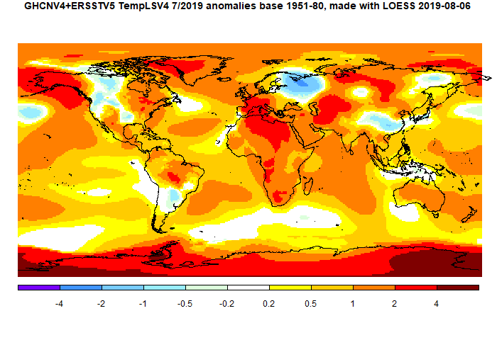
Interestingly, the increase was due mostly to an SST rise, as was last month. Rising SST tends to continue for longer periods. On land, Much of North America was cool, except Alaska, and some of E Canada. S Europe was warm, but there was a cool spot in NW Russia. There was a warm band through central Asia to Iran and on to the Sahara. Antarctica was mostly warm.
Update 15 Aug Readers following the TempLS report may have noticed some unexpected variations in the July average. About 4 days ago the mesh version dropped to about the June level, and more seriously, the SST dropped back. TempLS LOESS was unaffected, as were the maps and graphics. The reason was that I had been tinkering with the cross product library routine that the mesh area weighting uses. I have fixed that, and now the surprise is that August is now 0.061°C warmer that July, rather than the posted 0.033°C. But I think that is genuine - it had been drifting higher before the sudden drop.
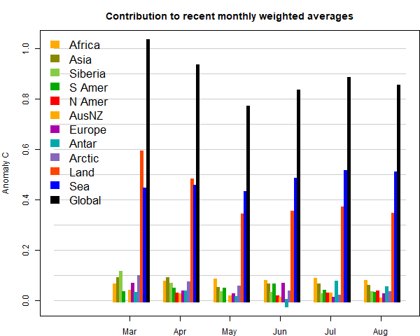
I'll show the bar chart of contributions; these are basically temperatures weighted by area. Africa and Antarctica were most responsible for the rise.

Here is the temperature map, using the LOESS-based map of anomalies.

This post is part of a series that has now run since 2011. The TempLS mesh data is reported here, and the recent history of monthly readings is here. Unadjusted GHCN is normally used, but if you click the TempLS button there, it will show data with adjusted, and also with different integration methods. There is an interactive graph using 1981-2010 base period here which you can use to show different periods, or compare with other indices. There is a general guide to TempLS here.
The reporting cycle starts with a report of the daily reanalysis index on about the 4th of the month. The next post is this, the TempLS report, usually about the 8th. Then when the GISS result comes out, usually about the 15th, I discuss it and compare with TempLS. The TempLS graph uses a spherical harmonics to the TempLS mesh residuals; the residuals are displayed more directly using a triangular grid in a better resolved WebGL plot here.
A list of earlier monthly reports of each series in date order is here:


Interesting. So I'm guessing that GISS will show its highest July anomaly ever as well. It appears that the ERA5 July global surface air temperature anomaly started all the "warmest July ever" banners I'm seeing all over the place (0.5631C for 2019 vs 0.5268C for 2016 ref 1981-2010). The July 2019 CFSR/CDAS anomaly like the NCAR R1 did not exceed July 2016. Within uncertainty, I suspect they are all really too close to call, but do indicate that global temperature is not dropping back to the 2002-2014 "hiatus" level so far.
ReplyDeleteBryan,
DeleteYes, I think it is very likely, because TempLS led by a good margin, nearly 0.07°C. Actually, I think the main news this month is SST; I may do another post on it. SST is not only a July record, but is higher than any month outside the 2015.6 El Nino; the peak there was late 2015. And it is only about 0.05°C short of that peak. You can see SST either on the main table (click Land/SST), or in the active graph.
I am also generally in favor of working on an anomaly basis only*. I do think there's a interesting question regarding the seasonal cycle, however: I'd think that July temperatures will shift less with global warming than March temperatures. My reasoning is that there is more warming in winter than in summer, and the Northern Hemisphere is more responsive than the Southern due to more land area, so on a global scale, we'd see larger winter anomalies (my backup reasoning is that there's more seasonal snow albedo response in Northern Hemisphere spring). So a large anomaly is more unlikely in July than in January... but yeah, I think "largest anomaly ever" (in January) is much more newsworthy than "largest absolute global monthly temperature". (the story is different for individual locations: I do think exceeding the highest temperature measured for a given thermometer is more newsworthy than exceeding the highest anomaly for that thermometer)
ReplyDelete-MMM
*as an example of the kind of confusion that can ensue from mixing anomalies and absolutes, I point to https://wattsupwiththat.com/2019/07/30/hidden-noaa-temperature-data-reveals-that-6-of-the-last-9-months-were-below-normal-in-the-usa-and-noaa-cant-even-get-june-right/... though I am always surprised, given how much time that man spends thinking about temperatures, that he continually gets confused about fairly straightforward anomaly issues.
It may be that my view is soured by the fact that it is winter here, and July is never going to be the hottest month. But that is actually a point in favour of anomalies vs absolute. Not only are the homogeneous enough to meaningfully average, but (related) they mean something to everyone. When NOAA says that it was 67.8°F in ConUS, that isn't helpful to folks in Florida or Maine. But if they say it was 0.2°F above normal (ie an average month) then that is likely to make sense to many more people.
Delete