Clive sought to establish a link by finding a common set of V3 and V4, and seeing whether the difference persisted. I wasn't sure of this, because while there may be a common inventory, the stations in any one month won't correspond. I proposed a test in which the locations of GHCN V3 stations reporting in a month would have values interpolated (by mesh) from the V4 result. But they would then be analysed using the V3 mesh. I suspected that the result would be closer to V3 than V4, which would indicate that the difference was due to the reduced coverage, rather than a discrepancy between the temperature levels of the measures.
I'm reporting on that here. To summarise what I did - I had results from a run of the mesh method for both V3 and V4, reported here. From the V4 directory, I copied the node locations Z4, the anomalies A4, the weights W4, and I rebuilt the mesh M4. TempLS does integration by calculating weights, so the global average is the scalar product W4.A4. From the V3 directory, I copied the locations Z3 and weights W3. Then I linearly interpolated A4 onto Z3, using the mesh M4, giving result Aa. The "hybrid average" is then the scalar product W3.Aa, and it is being compared with W4.A4 and W3.A3.
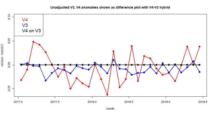
So here is the first plot. I am presenting them as difference plots, because, as you can see from the plots here, the differences are small and hard to see against the full range of variation of the anomalies. Here is a plot of the last 30 months, with unadjusted data.

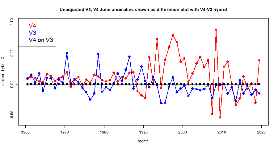
The V4 plot seems to jump around more, and clearly the V3 plot is a better match. In reality, the V3 anomaly fluctuates just as much as V4, if not more, but the hybrid tracks better with V3. I'll show another plot of the last 60 Junes:

There are more interesting features here. back to about 1990, the hybrid fairly closely tracks V3, with quite a lot of variability between V3 and V4, mostly with V4 warmer. But before 1990 V4 calms down, and only occasional spurts from V3, now not tracked by the hybrid. It's hard to know what to make of this; except for V3 excursions, both V4 and V3 seem in agreement with the hybrid, and so with each other.
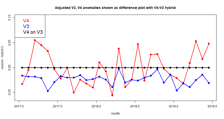
The story is slightly different with adjusted data, V3 and v4. Here is the plot of the last 30 months:

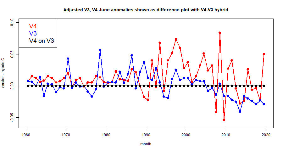
The V3 difference still jumps around a lot less, but there is a fairly persistent offset of up to 0.02°F. This might reasonably be attributed to an effect of homogenisation. Finally, here are the adjusted data averages differenced over the last 60 Junes.

The adjusted pattern reflects the same interesting features as the unadjusted, with big differences between V4 and V3, and the hybrid mostly tracking V3, but with a departure during the last decade. Before 1990, less variation generally, with no obvious tendency for the hybrid to preferentially track V3.
The purpose of this post was to give some quantitative backing to the effects on the average that might be expected from the patterns shown in the last post. The adherence of the unadjusted data hybrid to v3 does not support the idea that there is a recent decades bias in the V4 measured data relative to V3. The performance of adjusted data does suggest a small effect arising from the V4 data, with some rather interesting behaviour going back before 1990 (for Junes).


NIck,
ReplyDeleteI found that the discrepancy between V4C and V3C only begins around 2000, with V4C being warmer. Your last plot shows the same effect.
What I did was keep only exactly the same stations in V4C and V3C, namely only those with the same the WMO ID. Essentially this throw away 90% of V4 stations and 50% of V3 stations, leaving 3500 identical stations. However the recorded temperatures were taken from the V4 and V3 their respective qca.dat files. I then recalculated temperature series using spherical triangulation and compared the two. In my opinion they should have produced the same result, but they didn't. The V4 plot was closer to the full V4 result while the V3 plot still followed the full V3 result. Therefore the processing of the raw measurement data by the two versions are different. How are we to know which one is correct?
Clive,
DeleteYou had 3500 identical stations, but were they identically reporting? If V4 has a different subset in one month from V3, there is no expectation of identical results. That is why I sought to interpolate reported V4 results on reporting V3 locations.
In particular I wonder whether there are still significantly fewer of the 3500 V3 stations (fewer than V4) reporting in the period you mention?
There is a diversion in the adjusted results for June following 2010, which I noted. Maybe other months would show something different. I'll do a full run at some stage.
After seeing your top figure, I redid the analysis using the V4/V3 unadjusted (raw) data. Now they are more closer to agreement !
Deletehttp://clivebest.com/blog/wp-content/uploads/2019/07/V4UV3-stations-v-V3U.png
Therefore the the real difference is between V3C and V4C which shows these 3500 stations have been adjusted warmer in V4 than they are in V3. Now that could be because there are more near neighbours resulting in different adjustments or because V4 uses a different algorithm than V3.
Clive,
DeleteThanks, I read your post. I agree that something to do with homogenisation has raised temperatures by a small amount recently in V4; I think this is surprising, because adjustment of recent data should be small. Just looking at the June plot, there is a lot of adjustment of V4 in Africa, but mixed; China is mostly up. The Arctic seems barely adjusted at all in V4, but it was adjusted down in V3, so this would elevate the difference.
I'll try to repeat that graphic with a few more months.