In my
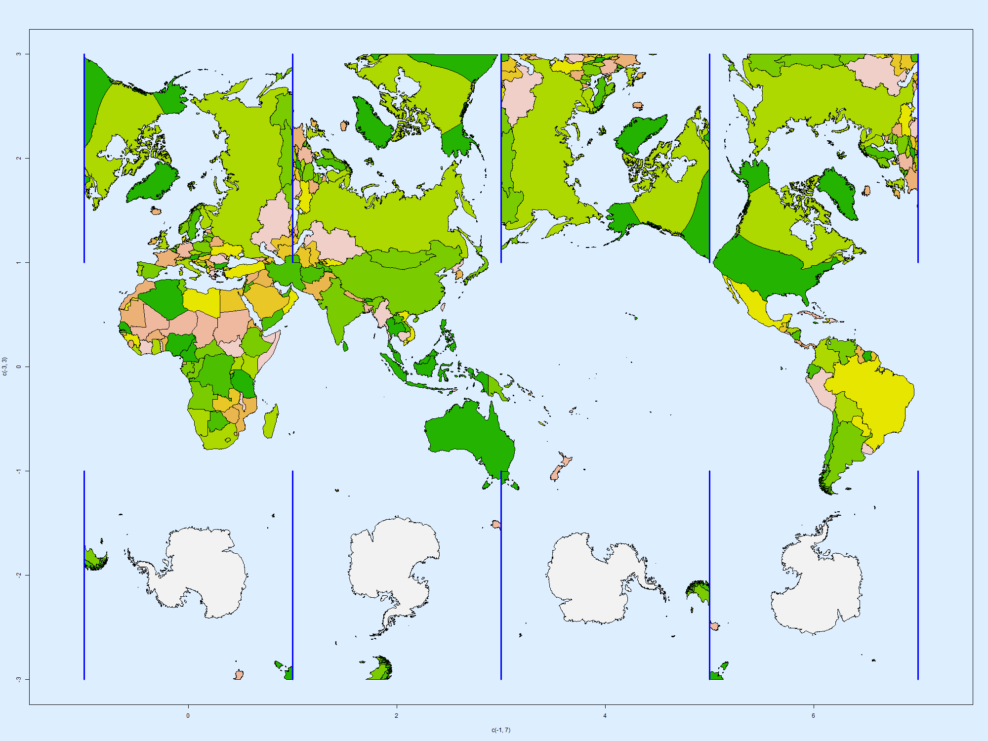
last post, I showed an equal area world map projection that was a by-product of the cubed sphere gridding of the Earth's surface. It was an outline plot, which makes it a bit harder to read. Producing a colored plot was tricky, because the coloring process in R requires an intact loop, which ends where it started, and the process of unfolding the cube onto which the map is initially projected makes cuts.
So I fiddled more with that, and eventually got it working. I'll show the result below. You'll notice more clearly the local distortion near California and Victoria. And it clarifies how stuff gets split up by the cuts marked by blue lines. I haven't shown the lat/lon lines this time; they are much as before.


0 comments:
Post a Comment