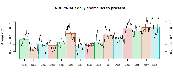
The most notable feature was a band of cool from India north to the Arctic ocean. Generally Russia did not continue the remarkable warmth of the year to May. There was a warm band from Iran to Norway, through E Europe, and a cool strip north of the Mediterranean. Antarctica seems mostly warm.

This post is part of a series that has now run for some years. The NCEP/NCAR integrated average is posted daily here, along with monthly averages, including current month, and graph. When the last day of the month has data (usually about the 3rd) I write this post.
The TempLS mesh data is reported here, and the recent history of monthly readings is here. Unadjusted GHCN is normally used, but if you click the TempLS button there, it will show data with adjusted, and also with different integration methods. There is an interactive graph using 1981-2010 base period here which you can use to show different periods, or compare with other indices. There is a general guide to TempLS here.
The reporting cycle starts with a report of the daily reanalysis index on about the 4th of the month. The next post is this, the TempLS report, usually about the 8th. Then when the GISS result comes out, usually about the 15th, I discuss it and compare with TempLS. The TempLS graph uses a spherical harmonics to the TempLS mesh residuals; the residuals are displayed more directly using a triangular grid in a better resolved WebGL plot here.
A list of earlier monthly reports of each series in date order is here:


NCEP reanalysis is only getting worse now from month to month. I don't know why they even keep updating it. It's complete bunk over Eurasia.
ReplyDeleteThis month, at least, TempLS agreed with the global average cooling seen in NCEP/NCAR. Last month it showed significantly less cooling, although GISS and NCEP were closer. But for Eurasia, yes, it showed widespread cooling in June, whereas TempLS showed just a band of cool in W Russia extending down to India. That was fairly major.
DeleteMy main reason for tracking NCEP/NCAR is to follow the daily progress within a month. In comparing months, especially over a long period, I think thermometer indices are preferable.
NCEP used to be okay, even for trend analysis (tho never as good as observations). Guess my issue rn is that I have absolutely no trust in NCEP anymore until they fix these rather wild bugs.
Delete