Anyway, early December had a spike in warmth, so the index rose from 0.408°C in November to 0.587°C, on a 1994-2013 anomaly base. That makes it the warmest month of the year, just exceeding the earlier peak in March. New data might change that order. I don't usually make long term comparisons because of lack of homogeneity of reanalysis, but 2019 seems to be the second warmest year after 2016.
Europe, west and central Asia were warm, but cool in E China and E Siberia. Australia was famously hot, and there is a big blob of warmth in the Pacific east of NZ. US was warmish, but Canada mostly cold. Antarctica was warm, Arctic mixed.
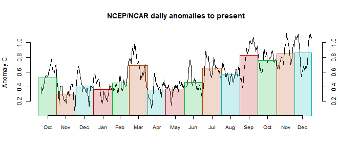
This post is part of a series that has now run for some years. The NCEP/NCAR integrated average is posted daily here, along with monthly averages, including current month, and graph. When the last day of the month has data (usually about the 3rd) I write this post.
The TempLS mesh data is reported here, and the recent history of monthly readings is here. Unadjusted GHCN is normally used, but if you click the TempLS button there, it will show data with adjusted, and also with different integration methods. There is an interactive graph using 1981-2010 base period here which you can use to show different periods, or compare with other indices. There is a general guide to TempLS here.
The reporting cycle starts with a report of the daily reanalysis index on about the 4th of the month. The next post is this, the TempLS report, usually about the 8th. Then when the GISS result comes out, usually about the 15th, I discuss it and compare with TempLS. The TempLS graph uses a spherical harmonics to the TempLS mesh residuals; the residuals are displayed more directly using a triangular grid in a better resolved WebGL plot here.
A list of earlier monthly reports of each series in date order is here:


0 comments:
Post a Comment