Tuesday, August 10, 2010

Underestimate of variability in McKitrick et al


A new paper by McKitrick, McIntyre and Hermann is being discussed. David Stockwell and Jeff Id have threads, and there is now one at Climate Audit and at James Annan.

An earlier much-discussed paper by Santer et al comparing models with tropical tropospheric temp observations contended that there was no significant difference between model outputs and observation. MMH say that this is an artefact of Santer using a 1979-2000 period, and if you look at the data now available, the differences are highly significant.

In discussion at the Air Vent, I've been contending that MMH underestimate variability in their significance test. They take account of the internal variability of both models and observations, so that each model and obs set has associated noise. But they do not allow for variance between models. I said that this restricts their conclusion to the particular set of model runs that they examined, and this extra variability would have to be taken into account to make statements about models in general.

However, it's clear to me now that this problem extends even to the analysis of the sample that they looked at. They list, in Table 1, the data series and their trends with standard error. The first 23 are models. In Figs 2 and 3 they show the model mean with error bars. I looked at the mid-trop (MT) set; in Table 2 they give the mean as 0.253, sd 0.012, and indeed, with error bars 0.024 that is what Fig 3 seems to show.


So I plotted Table 1 as a histogram. Here's how it showed, with the mean and error bars from Table 2 MMH marked in red.
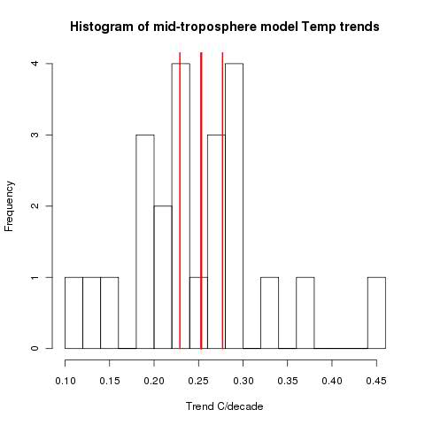


The key thing to note is what James Annan also noted. The models are far more scattered than the supposed distribution indicates. The models themselves are significantly different from the model mean.

Update: Of course, the error bars are for the mean, not the distribution. But the bars seem very tight. A simple se of the mean of the trends would be about 0.022. And that does not allow for the uncertainty of the trends themselves.

Update 2: As Deep Climate points out below, that last update figure is wrong. A corrected figure is fairly close to what is in MMH's table.
However, Steve McIntyre says that the right figure to use is the within-groups variance - some average of the se's of the trends of each model. That does seem to be the basis for their figure. I think both should be used, which would increase the bound by a factor of about sqrt(2).



Wednesday, August 4, 2010

Reduction of station numbers in GHCN


As I noted in the previous post, a new post has appeared at WUWT  which talks a lot about the reduction in station numbers in GHCN that occurred between about 1990 to present. This post is based on a paper by Ross McKitrick.

The stream of articles that advance various theories about this reduction don't take proper account of the way GHCN was actually compiled. It was initially a historical process, where in the early 90's with grant funding people gathered together batches of historic records, recently digitised, into a database. After V2 came out, in 1997, at some stage NOAA undertook the task of continuing monthly updates from CLIMAT forms. This made it, for the first time, a recurrent process.

Update: Carrot Eater, in comments, has pointed to a very useful and relevant paper by Peterson, Dann and Phil Jones. As he says, the process wasn't quite as I've surmised. I should also have included a reference to Peterson's overview paper.


The big reduction followed changes of policy in going to a recurrent process. As a batch process, it didn't really matter if the geographic spread was uneven. If the records were available, they could be included. But as a recurrent process, it makes sense to spread the effort of updating reasonably evenly worldwide.

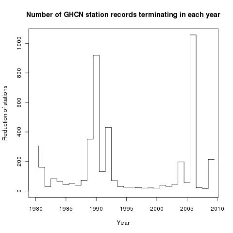
If you look carefully at the time sequence of station terminations, it looks like this:


It clearly consisted of a few major culling events. In the next table, the years with more than 100 stations ending are shown with a breakdown by country:


This makes the pattern clear. Australia, Canada, China, S Africa, Turkey and USA had been overrepresented, and were culled in specific events. Canada in 1989/90, Turkey and China 1990, S Africa 1991, Australia 1992 and the USA in 2004 and 2006. The case of the US is special, because the USHCN database is also used.

So when it is said that the reductions produced a reduction in average altitude or latitude, that reflects the fact that some of these countries are relatively high, and are (mostly) from temperate latitudes.

Of course, explaining how and why the reduction happened doesn't remove the possibility of biasing a trend estimate. That's another story.


Tuesday, August 3, 2010

GE visualisation of changes to GHCN stations 1990-2007

At WUWT there is a post about Ross McKitrick's discussion of supposed defects in GHCN, focussing heavily on changes in the stations in the dataset between about 1990 and 2005+. So I've made some KMZ files so interested people can see in detail what those changes were.

This post follows three recent previous posts here about KMZ files for GHCN type datasets:
Briefly, a KMZ file is a compressed file of data which you can read into Google Earth. You can just click on the filename in a file browser, or use the GE open facility (or Ctrl-O). When you open it, you will see a subset of the GHCN stations marked with placers (pushpins). These show (when you get close) the station names, and indicate other properties thus:
  • Color - rural stations are green, urban yellow. Orange is a small town.
  • Size. Big pins have >50 yrs data. 70% pins have >20 yrs, and 40% have less.
  • Balloon - clicking on a station gives a balloon with several data items, including years of reporting.

The files


You can find the files on the data repository. They are in a zip file KMLGHCNends.zip which you can download (scroll down). The individual files are:
  • GHCN1900end.kmz, which has stations that dropped out of the database between 1991 and 2000
  • GHCN2000end.kmz, which has stations that dropped out of the database between 2001 and 2007
  • GHCN1900st.kmz, which has stations that were added between 1991 and 2000
  • GHCN2000st.kmz, which has stations that were added between 2001 and 2007
There weren't many stations added, so you might want to skip the last two files.

Below the jump, I'll add some still pictures from GE.


Here are the US stations that were dropped from GHCN between 1991 and 2000:


Australia was very densely represented pre-1990, so many did not continue:


African stations in W Africa and S Africa were not continued:


Arctic losses were not large:


Europe lost a few stations, including a bunch of short-record ones in Yugoslavia


Between 2001 and 2007 the big change was US numbers - tied in with the interaction with USHCN, which GISS incorporates separately.


Tuesday, July 27, 2010

GHCN KML visualisation by years

This post complements Ron Broberg's nifty movie of the progress of GHCN stations over the years, and in particular, his decadal stills. I've made KML files for the decade years (1880, 1890,...) of all stations that have records (at least one) in those years, for visualisation in Google Earth. You can read them into GE and see in detail how the network of stations varied over time. These files also have the description balloons etc.

They are in a zip file called KMLGHCNyears.zip on the doc repository. Each is a kmz file. Just click on the file name in  a file browser or use "open" in GE.


Earlier posts on KML and GHCN etc:

If it's hot in Washington, how about Montreal?

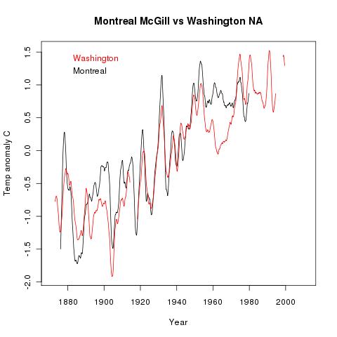
In one of Steve Goddard's posts at WUWT, there was some mocking of interpolation in GISS. "Is the temperature data in Montreal valid for applying to Washington DC.? " was asked.

Well, it turns out, yes it is, using anomalies. I looked in the raw GHCN data at McGill Montreal (71627/003), which has the only long GHCN record there, vs Washington NA (WMO 72405/000),  which also has a very long record. I used a 4-year tapered smoothing filter (triangle) on the monthly data. Here's how it turned out:


Anomalies are relative to each station mean over the period. Notice the slip at about 1915, where Montreal seems to go up about half a degree relative to Washington. It could well be a station move or change. This is just the sort of thing GISS type algorithms can pick up, even so far apart. But this is unadjusted data.

Monday, July 26, 2010

Still more KML and Google Earth

Some more updates and capabilities. I've added descriptions to the markers. If you click on any station marker in GE, a balloon pops up with:
  • Name
  • Country
  • WMO number
  • Rural/Town/Urban (also indicated by marker color)
  • Airport (if true), Population, in 1000's (if given)
  • Years over which data exists (may have gaps)
  • Total years of data (excluding gaps)
You can also see this data by drilling down on a LH panel (long list).

I've also moved to using KMZ files, as is recommended. These are just zip files, each containing the appropriate KML file. GE will read them directly.

The docs repository file is still called KMLfiles.zip, and now includes the R code I used and a Readme.txt file.


Sunday, July 25, 2010

More Google Earth station data

I've learnt more about KML since the previous post, so I've thought of more it could do. I've amended the files in the KMLfiles zipfile on the docs repository so that the pushpins (and names) are colored according to the "Urban" criterion in the inventory file. The colors are:
  yellow for urban (C)
  green for rural (A)
  reddish orange for small town (B)
[Update - I've also varied the pushpin size according to total numbers of years in station record. Scale 1 if >50 yrs, 0.7 for 20-50 and 0.4 if <20 yrs.]

So you can see how well the rurals are spread, and, if you like, zoom in to see whether you think the classification is right.

I've also added another file, GHCN2009.kml, which has only GHCN stations that have reported since end 2008 (same pushpin colors). One GE catch in reading multiple files - the pushpins aren't cleared when you read in a new file. Below the jump -  what a local view (GSOD) looks like: