GISS was down from 0.88°C in May to 0.69°C in June.The GISS report is here; they say it was the fourth warmest June on record. The drop was somewhat more than the 0.12°C in TempLS. The most recent month that was cooler than that was November 2014.
The overall pattern was similar to that in TempLS. The big feature was cold in Antarctica, to which both GISS and TempLS msh are sensitive, more so than HADCRUT or NOAA. Otherwise, as with TempLS, it was warm in Europe, extending through Africa and the Middle East, and also through the Americas. Apart from Antarctica, the main cold spot was NW Russia.
So far, July is also cold, although with some signs of warming a little from June. As usual, I will compare the GISS and previous TempLS plots below the jump.
Saturday, July 15, 2017

Saturday, July 8, 2017
June global surface temperature down 0.12°C
TempLS mesh was down from 0.704°C in May to 0.586°C in June. This follows the slightly larger fall of 0.16°C in the NCEP/NCAR index, and falls in the satellite indices, which had risen in May. The June anomaly (1961-90 base) is now a little below mid-2015 values, and is the coolest month since Nov 2014. In fact, it is similar to the 2014 annual average, which was still a record in its day.
The big turnaround was in the Antarctic, which went from quite warm to very cool. This is reflected in the TempLS grid values, which are less sensitive to the poles; T grid actually warmed. This pattern tends to be reflected in the main indices, with GISS generally picking up the polar changes; NOAA and HADCRUT less so. Otherwise as with the reanalysis, Europe was warm, NW Russia cold, Arctic neutral, warm spots in the Americas. Here is the map, and I'll show below that the breakdown, which emphasises the Antarctic turnaround. :

Breakdown plot:

The big turnaround was in the Antarctic, which went from quite warm to very cool. This is reflected in the TempLS grid values, which are less sensitive to the poles; T grid actually warmed. This pattern tends to be reflected in the main indices, with GISS generally picking up the polar changes; NOAA and HADCRUT less so. Otherwise as with the reanalysis, Europe was warm, NW Russia cold, Arctic neutral, warm spots in the Americas. Here is the map, and I'll show below that the breakdown, which emphasises the Antarctic turnaround. :
Breakdown plot:
Tuesday, July 4, 2017
New RSS TLT V4 - comparisons
As mentioned in my previous post, RSS has a new V4 TLT out - announcement here. I'm now using it in place of V3.3. The J Climate paper describing it is here:
A satellite-derived lower tropospheric atmospheric temperature dataset using an optimized adjustment for diurnal effects
Carl A. Mears and Frank J. Wentz
Remote Sensing Systems, 444 Tenth Street, Santa Rosa, CA, 95401
I quoted from the abstract in my previous post.
The changes are described in those links, and are not surprising, given the previous datasets (eg TMT, TTT) that have come out in V4. I thought here I would just show a comparison of recent changes in both UAH and RSS - they are rather complementary. In the graph below, I have converted RSS from 1979-1999 to the UAH base of 1981-2010. I use reddish for UAH, bluish for RSS (12 month running mean):

The effect of the change is clearer if a common measure is subtracted - I use the average of the four sets here for that:

Now you can see what has happened. RSS TLT V4 is close to UAH V5.6, and UAH V6 is close to the old RSS V3.3 (which RSS described as having a known cooling bias). As they noted, the new RSS V4 shows more uniformity over time. The overall picture is that TLT measures are not stable; much less so than surface measures, as I noted here.
Contrary to some (mainly sceptic) opinion, satellite measures are not naturally superior. Measuring the temperature at various levels of the troposphere is a worthwhile endeavour, but it is not a substitute for surface. In fact, I think TLT has had undeserved prominence, and I rather thought RSS should drop it altogether. It is an attempt to get as close to surface as possible, but it isn't very close, and sacrifices much reliability in trying to get there. I notice the John Christy now usually quotes UAH TMT.
The reason for loss of reliability is that the MSU is trying to make deductions from a microwave signal which is a mix of various layers in the troposphere, with a large background noise generated at the surface. It is hard to discriminate, and harder as you try to see closer to the surface. They try to get around this by taking two measures designed for higher levels (TMT and, for UAH, a tropopause level TP), and forming a linear combination which is designed to subtract out the higher troposphere and stratosphere levels. But as with any such differencing, errors increase.
People have the idea that satellites just have to be better, because they can survey the whole Earth with one instrument. But that is far from true. The downsides are described in this UAH overview and the various RSS papers, and include:
Those are just some of the problems which lead to such large version changes.
Update: From a tweet from Carl Mears, here is a useful FAQ on the changes.
Further: David asked below about comparison with radiosondes. That FAQ has a diagram showing the comparison:
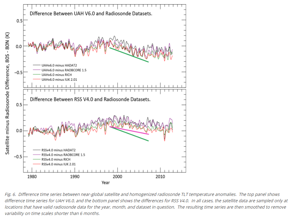
It is sat - sondes, so when you see in this century that the plot goes down, it means that radiosondes are showing more warming that satellites. With UAHV6.0 it is a lot more; with RSS TLT V4 it is closer, but sondes still show more warming. As the FAQ says:
"Note that all satellite data warm relative to radiosondes before about 2000, and then cool after about 2000. We don't know if this overall pattern is due to problems with the radiosonde data, with the satellite data or (most likely) both."
A satellite-derived lower tropospheric atmospheric temperature dataset using an optimized adjustment for diurnal effects
Carl A. Mears and Frank J. Wentz
Remote Sensing Systems, 444 Tenth Street, Santa Rosa, CA, 95401
I quoted from the abstract in my previous post.
The changes are described in those links, and are not surprising, given the previous datasets (eg TMT, TTT) that have come out in V4. I thought here I would just show a comparison of recent changes in both UAH and RSS - they are rather complementary. In the graph below, I have converted RSS from 1979-1999 to the UAH base of 1981-2010. I use reddish for UAH, bluish for RSS (12 month running mean):
The effect of the change is clearer if a common measure is subtracted - I use the average of the four sets here for that:
Now you can see what has happened. RSS TLT V4 is close to UAH V5.6, and UAH V6 is close to the old RSS V3.3 (which RSS described as having a known cooling bias). As they noted, the new RSS V4 shows more uniformity over time. The overall picture is that TLT measures are not stable; much less so than surface measures, as I noted here.
Contrary to some (mainly sceptic) opinion, satellite measures are not naturally superior. Measuring the temperature at various levels of the troposphere is a worthwhile endeavour, but it is not a substitute for surface. In fact, I think TLT has had undeserved prominence, and I rather thought RSS should drop it altogether. It is an attempt to get as close to surface as possible, but it isn't very close, and sacrifices much reliability in trying to get there. I notice the John Christy now usually quotes UAH TMT.
The reason for loss of reliability is that the MSU is trying to make deductions from a microwave signal which is a mix of various layers in the troposphere, with a large background noise generated at the surface. It is hard to discriminate, and harder as you try to see closer to the surface. They try to get around this by taking two measures designed for higher levels (TMT and, for UAH, a tropopause level TP), and forming a linear combination which is designed to subtract out the higher troposphere and stratosphere levels. But as with any such differencing, errors increase.
People have the idea that satellites just have to be better, because they can survey the whole Earth with one instrument. But that is far from true. The downsides are described in this UAH overview and the various RSS papers, and include:
- There is only one instrument, or at most a few, while at the surface there are thousands, creating lots of redundancy. One consequence is that with satellites there is a big problem with the inevitable changeovers. Surface stations needd some adjustment when the instruments or environments change but that is minor compared with changing the whole instrument base every few years.
- The instrument doesn't read a thermometer at every level. It has to resolve a mixed incoming microwave beam, confounded with surface noise. You can get some resolution with frequency bands, and a little more with differing angles of view. But it is really squinting, and in the end you have to solve an inverse problem, which takes adventurous mathematics.
- The instrument gives a snapshot just twice a day. At surface, even the old min/max thermometers, though read only once, continuously monitored the minn and max for 24 hours, and of course now we have thousands of stations recording at high frequency. A problem with twice a day is that you have to make adjustments for what time of day it is, because of diurnal variation. And that diurnal pattern depends on the level (not clearly known), season etc. A hard enough problem, but the big one is
- diurnal drift. It isn't the same time every day, due to orbit changes, and they seem to have trouble deciding exactly what time it is. Roy Spencer says of V6:
For example, years ago we could use certain AMSU-carrying satellites which minimized the effect of diurnal drift, which we did not explicitly correct for. That is no longer possible, and an explicit correction for diurnal drift is now necessary. The correction for diurnal drift is difficult to do well, and we have been committed to it being empirically–based, partly to provide an alternative to the RSS satellite dataset which uses a climate model for the diurnal drift adjustment. -
It is a long standing bugbear, and much of the RSS change also seems to be in the drift correction. From their paper abstract:
Previous versions of this dataset used general circulation model output to remove the effects of drifting local measurement time on the measured temperatures. In this paper, we present a method to optimize these adjustments using information from the satellite measurements themselves. The new method finds a global-mean land diurnal cycle that peaks later in the afternoon, leading to improved agreement between measurements made by co-orbiting satellites.
Those are just some of the problems which lead to such large version changes.
Update: From a tweet from Carl Mears, here is a useful FAQ on the changes.
Further: David asked below about comparison with radiosondes. That FAQ has a diagram showing the comparison:
It is sat - sondes, so when you see in this century that the plot goes down, it means that radiosondes are showing more warming that satellites. With UAHV6.0 it is a lot more; with RSS TLT V4 it is closer, but sondes still show more warming. As the FAQ says:
"Note that all satellite data warm relative to radiosondes before about 2000, and then cool after about 2000. We don't know if this overall pattern is due to problems with the radiosonde data, with the satellite data or (most likely) both."
Monday, July 3, 2017
June NCEP/NCAR down 0.16°C
In the Moyhu NCEP/NCAR index, the monthly reanalysis average fell from 0.40°C in May to 0.241°C in June, 2017. This makes it the coolest month for nearly two years - since 0.164°C in July 2015. Even so, it was still the third warmest in the record for that index, though I comment caution in compare values decades, because of lack of homogeneity. It was only just behind 2013 (0.249) for second place. It's the first time for nearly two years that a month fell behind an earlier corresponding month other than 2016.
The main cool spot was Antarctica, and the main reason for the drop was that, as well, the Arctic dropped back to average, with Siberia mixed. Europe was warm.
in other (tropospheric) news, RSS has brought out a V4 version of TLT, described in a J Climate paper by Wentz and Mears here. I'll start using it for this month's reporting. I was actually wondering whether they would, since the trend seems to be more toward quoting TMT and TTT. AS has been the pattern with V4, the low trend that RSS V3.3 showed until recently, which gave rise to umpteen pause stories, has come closer to other records, mainly, they say, due to a revised diurnal correction. Here is their abstract:
I have updated the data link in the source table.
The main cool spot was Antarctica, and the main reason for the drop was that, as well, the Arctic dropped back to average, with Siberia mixed. Europe was warm.
in other (tropospheric) news, RSS has brought out a V4 version of TLT, described in a J Climate paper by Wentz and Mears here. I'll start using it for this month's reporting. I was actually wondering whether they would, since the trend seems to be more toward quoting TMT and TTT. AS has been the pattern with V4, the low trend that RSS V3.3 showed until recently, which gave rise to umpteen pause stories, has come closer to other records, mainly, they say, due to a revised diurnal correction. Here is their abstract:
A satellite-derived lower tropospheric atmospheric temperature dataset using an optimized adjustment for diurnal effects
Carl A. Mears and Frank J. Wentz
Remote Sensing Systems, 444 Tenth Street, Santa Rosa, CA, 95401
Temperature sounding microwave radiometers flown on polar-orbiting weather satellites provide a long-term, global-scale record of upper-atmosphere temperatures, beginning in late 1978 and continuing to the present. The focus of this paper is a lower-tropospheric temperature product constructed using measurements made by the Microwave Sounding Unit channel 2, and the Advanced Microwave Sounding Unit channel 5. The temperature weighting functions for these channels peak in the mid to upper troposphere. By using a weighted average of measurements made at different Earth incidence angles, the effective weighting function can be lowered so that it peaks in the lower troposphere. Previous versions of this dataset used general circulation model output to remove the effects of drifting local measurement time on the measured temperatures. In this paper, we present a method to optimize these adjustments using information from the satellite measurements themselves. The new method finds a global-mean land diurnal cycle that peaks later in the afternoon, leading to improved agreement between measurements made by co-orbiting satellites. The changes result in global-scale warming (global trend (70S-80N, 1979-2016) = °0.174 C/decade), ~30% larger than our previous version of the dataset (global trend, (70S-80N, 1979-2016) = 0.134C/decade). This change is primarily due to the changes in the adjustment for drifting local measurement time. The new dataset shows more warming than most similar datasets constructed from satellites or radiosonde data. However, comparisons with total column water vapor over the oceans suggest that the new dataset may not show enough warming in the tropics.
I have updated the data link in the source table.
Tuesday, June 27, 2017
Temperature station distribution - equal area plot
I have been experimenting with maps that are a byproduct of my systematising a cubed sphere grid. I thought it would give a better perspective on the distribution of surface stations and their gaps, especially with the poles. So here are plots of the stations, land and sea, which have reported April 2017 data, as used in TempLS. The ERSST data has already undergone some culling.

It shows the areas in proportion. However, it shows multiple Antarctica's etc, which exaggerates the impression of bare spots, so you have to allow for that. One could try a different projection - here is one focussing on a strip including the America's:

So now there are too many Africa's. However, between them you get a picture of coverage good and bad. Of course, then the question is to quantify the effect of the gaps.
It shows the areas in proportion. However, it shows multiple Antarctica's etc, which exaggerates the impression of bare spots, so you have to allow for that. One could try a different projection - here is one focussing on a strip including the America's:
So now there are too many Africa's. However, between them you get a picture of coverage good and bad. Of course, then the question is to quantify the effect of the gaps.
Friday, June 23, 2017
World map equal area projection - more
In my last post, I showed an equal area world map projection that was a by-product of the cubed sphere gridding of the Earth's surface. It was an outline plot, which makes it a bit harder to read. Producing a colored plot was tricky, because the coloring process in R requires an intact loop, which ends where it started, and the process of unfolding the cube onto which the map is initially projected makes cuts.
So I fiddled more with that, and eventually got it working. I'll show the result below. You'll notice more clearly the local distortion near California and Victoria. And it clarifies how stuff gets split up by the cuts marked by blue lines. I haven't shown the lat/lon lines this time; they are much as before.
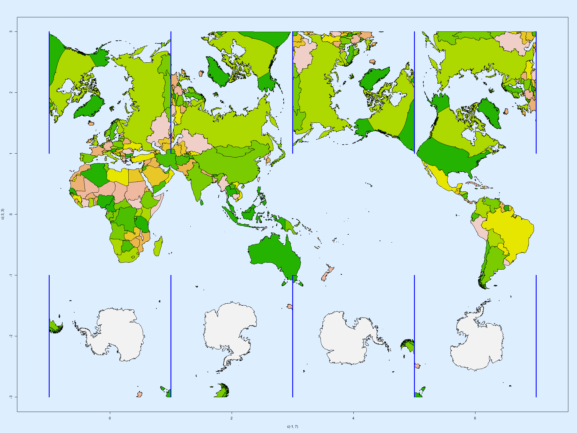
So I fiddled more with that, and eventually got it working. I'll show the result below. You'll notice more clearly the local distortion near California and Victoria. And it clarifies how stuff gets split up by the cuts marked by blue lines. I haven't shown the lat/lon lines this time; they are much as before.
Monday, June 19, 2017
World map projection using cubed sphere
This post follows on from the previous post, which described the cubed sphere mapping which preserves areas in taking a surface grid from cube to sphere. I should apologise here for messing up the links for the associated WebGL plot for that post. I had linked to a local file version of the master JS file, so while it worked for me, I now realise that it wouldn't work elsewhere. I've fixed that.
If you have an area preserving plot onto the flat surfaces of a (paper) cube, then you only have to unfold the cube to get an equal-area map of the world on a page. It necessarily has distortion, and of course the cuts you make in taking apart the cube. But the area preserving aspect is interesting. So I'll show here how it works.

I've repeated the top and bottom of the cube, so you see multiple poles. Red lines are latitudes, green longitudes. The blue lines indicate the cuts in unfolding the cube, and you should try to not let your eye wander across them, because there is confusing duplication. And there is necessarily distortion near the ends of the lines. But it is an equal area map.
Well, almost. I'm using the single parameter tan() mapping from the previous post. I have been spending far too much time developing almost perfectly 1:1 area mappings. But I doubt they would make a noticeable difference. I may write about that soon, but it is rather geekish stuff.
If you have an area preserving plot onto the flat surfaces of a (paper) cube, then you only have to unfold the cube to get an equal-area map of the world on a page. It necessarily has distortion, and of course the cuts you make in taking apart the cube. But the area preserving aspect is interesting. So I'll show here how it works.
I've repeated the top and bottom of the cube, so you see multiple poles. Red lines are latitudes, green longitudes. The blue lines indicate the cuts in unfolding the cube, and you should try to not let your eye wander across them, because there is confusing duplication. And there is necessarily distortion near the ends of the lines. But it is an equal area map.
Well, almost. I'm using the single parameter tan() mapping from the previous post. I have been spending far too much time developing almost perfectly 1:1 area mappings. But I doubt they would make a noticeable difference. I may write about that soon, but it is rather geekish stuff.
Subscribe to:
Posts (Atom)


 Posts
Posts

