The GISS V4 land/ocean temperature anomaly was 1.19°C in March 2020, down from 1.25°C in February. That compares with a 0.15deg;C fall first reported in the TempLS V4 mesh index (now 0.09°C with later data).
As usual here, I will compare the GISS and earlier TempLS plots below the jump.
Tuesday, April 14, 2020

Sunday, April 5, 2020
March global surface TempLS down 0.151°C from February.
The TempLS mesh anomaly (1961-90 base) was 0.898deg;C in March vs 1.049°C in February. This was less than the fall in the NCEP/NCAR reanalysis base index, which was 0.2°C.
The prominent feature, as with the winter months, was a band of warmth stretching from Eastern Europe through to E Siberia and China. While most of the US was warm, N Canada was cold, as was Antarctica and South Asia.
Here is the temperature map, using the LOESS-based map of anomalies.
 As always, the 3D globe map gives better detail.
The prominent feature, as with the winter months, was a band of warmth stretching from Eastern Europe through to E Siberia and China. While most of the US was warm, N Canada was cold, as was Antarctica and South Asia.
Here is the temperature map, using the LOESS-based map of anomalies.
As always, the 3D globe map gives better detail.Saturday, April 4, 2020
NCEP/NCAR reanalysis surface temperature down 0.2°C March 2020.
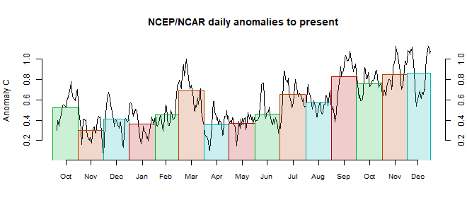
The Moyhu NCEP/NCAR index came in at 0.356°C in March, following 0.554°C in February, on a 1994-2013 anomaly base. It marks the end of a three month period of warmth. It began with a deep dip, of a kind that is common historically, but rare recently. There was only a partial recovery, and it was the coolest month since last June..
As with the warm months, the main feature was a band of warmth from Eastern Europe right across Russia and Siberia. But Canada and the adjacent Arctic was cold, as was Antarctica. South Asia,, too, was cool. The warm blob to the East of New Zealand persists.
As with the warm months, the main feature was a band of warmth from Eastern Europe right across Russia and Siberia. But Canada and the adjacent Arctic was cold, as was Antarctica. South Asia,, too, was cool. The warm blob to the East of New Zealand persists.
Wednesday, April 1, 2020
Covid19 - graphs of daily data - turning the corner?
Everyone seems to want to write about Covid-19 lately. Unlike most of the world, I am not an expert on epidemiology. But I have been anxiously looking at graphs of recent data to see if the social distancing measures are turning the tide. Like most people, I look at the Worldometer site. But I'd sometimes like to drill down a bit, and also to get all the graphs in one place. The main source of collected information seems to be the Johns Hopkins Github repository. So I looked into it.
My interest is in the point of inflection of the growth curves. So I have plotted here not the cumulative totals but the daily increments. They are noisier but give an earlier marker of change.
So here are the graphs. I hope to keep them updated daily. You can choose to see daily new cases or deaths. Just click on the radio button next to a country name. The buttons on the yellow backed line let you choose states or provinces of the named country. The bottom table (nations) entries are arranged in diminishing order of total cases as at the most recent day. Be aware that the y scale changes to fit each data displayed.
Some details:
Hong Kong is currently included with China, which is how the source does it. I'll probably separate it in the future. HK is mainly responsible for the recent rise in China cases - you can see it listed as a province of China.
Johns Hopkins separated US data from their global time series table, saying that they would post a corresponding US table. But AFAICS, they haven't yet done that. So I had to add up the US data from the daily reports (by county!), which may lead to some minor discrepancies. One is that I have omitted the numbers from the Princess cruise ships which were listed separately.
I have omitted some data that Johns Hopkins recorded for the Diamond Princess and Grand Princess cruises. They handled it in a messy way, splitting it up among countries and states. This will cause some minor discrepancies with WorldOMeter data. I have also not included in the US total some minor regions like Northern Marianas.
My interest is in the point of inflection of the growth curves. So I have plotted here not the cumulative totals but the daily increments. They are noisier but give an earlier marker of change.
So here are the graphs. I hope to keep them updated daily. You can choose to see daily new cases or deaths. Just click on the radio button next to a country name. The buttons on the yellow backed line let you choose states or provinces of the named country. The bottom table (nations) entries are arranged in diminishing order of total cases as at the most recent day. Be aware that the y scale changes to fit each data displayed.
Some details:
Hong Kong is currently included with China, which is how the source does it. I'll probably separate it in the future. HK is mainly responsible for the recent rise in China cases - you can see it listed as a province of China.
Johns Hopkins separated US data from their global time series table, saying that they would post a corresponding US table. But AFAICS, they haven't yet done that. So I had to add up the US data from the daily reports (by county!), which may lead to some minor discrepancies. One is that I have omitted the numbers from the Princess cruise ships which were listed separately.
I have omitted some data that Johns Hopkins recorded for the Diamond Princess and Grand Princess cruises. They handled it in a messy way, splitting it up among countries and states. This will cause some minor discrepancies with WorldOMeter data. I have also not included in the US total some minor regions like Northern Marianas.
Friday, March 13, 2020
GISS February global up by 0.09°C from January.
The GISS V4 land/ocean temperature anomaly was 1.26°C in February 20120 up from 1.10°C in January. That compares with a 0.053deg;C rise first reported in the TempLS V4 mesh index (now 0.073°C with later data). It was the second warmest February in the GISS record, just 0.11°C behind than the El Niño 2016, for which February was the peak.
As usual here, I will compare the GISS and earlier TempLS plots below the jump.
As usual here, I will compare the GISS and earlier TempLS plots below the jump.
Friday, March 6, 2020
USA Temperatures; comparison of Moyhu results with NOAA.
This is a continuation of my earlier post on ConUS temperatures. I'll compare the time series results with those of the NOAA datasets ClimDiv and USCRN. My series are labelled GHCN_a, for the calculation using GHCNM V4 adjusted, GHCN_u for unadjusted, and MoyCRN for my calculation using CRN data. The data is as in the previous post. I'll start with the period 2005-2019, since this is where there is USCRN data. I'll use that period for the anomaly base throughout. Here is a graph of the various time series:
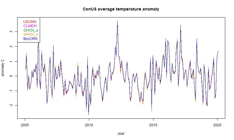
They are so close that the differences are hard to see. It is easier with a 12-month running mean, mainly because the y-axis doesn't have to cover such a large range: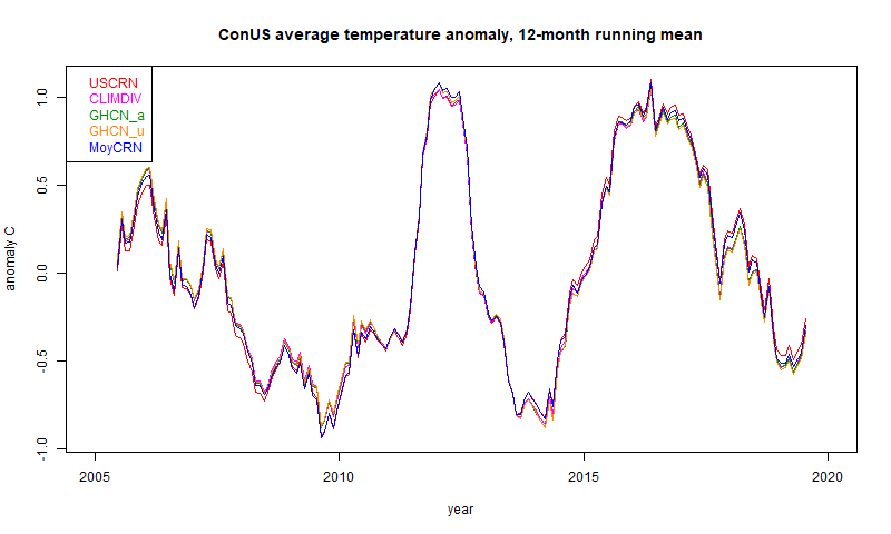
You can see that they are still very close, with some small difference between CRN and the other data. I can quantify this with a table of standard deviation of differences (unsmoothed data):
The very close results are between GHCN adjusted and unadjusted. Here the stations and the methods are the same, so the only difference is the adjustment of the data. And it is very small. The difference between the GHCNs and NOAA's ClimDiv is larger, but still very small.
The two CRNs show a larger difference again, but the largest is between the CRN groups and the others. As I said in the last post, I don't think this reflects different accuracy of the stations; CRN are presumably better. It reflects the dominance of location uncertainty in the spatial averages. That is, how much spread would you see if you measured at different places. Or, how well do you real think the infilling represents the unmeasured regions. Of course, the different coverage gives a check; I showed in the last post a difference plot in one month between the sparse CRN and the dense ClimDiv.
I have also shown the trends, in °C/century. These are very uncertain on such a short period, and you might be surprised at their size, since the plot doesn't reflect that by eye. But a trend of 2 °C/Cen rises only 0.3°C in this period. The closeness reflects that shown in the sd table. I don't think much should be made of the fact that CRN shows a higher trend.
Over a longer period, the CRN results do not cover, and the other data diverge more. The different adjustment policies start to show. Here is the period since 1900. I'm now using a 5 year running mean to make the differences clearer:

Now there is an obvious difference between the adjusted and unadjusted. My GHCN_a still agrees quite well with ClimDiv. Again the differences can be quantified in the reduced table of standard deviations:
The trends (in °C/Cen) again tell the story. Adjustment makes a big difference, as was noted back in USHCN V1. USHCN did both homogenisation and explicit TOBS adjustment, and I believe ClimDiv, which replaced it, does the same. GHCN relies on the pairwise homogenisation to cover the TOBS effect, and on this accounting it seems to do that very well.
Of course, some would say that this means that more than half the (modest) ConUS warming is created by adjustments. The proper scientific view is that unadjusted readings had a spurious cooling bias, which should be corrected. The sources of this are real and known:
They are so close that the differences are hard to see. It is easier with a 12-month running mean, mainly because the y-axis doesn't have to cover such a large range:
You can see that they are still very close, with some small difference between CRN and the other data. I can quantify this with a table of standard deviation of differences (unsmoothed data):
| 2005-2019 | USCRN | CLIMDIV | GHCN_a | GHCN_u | MoyCRN |
| USCRN | 0 | 0.091 | 0.098 | 0.103 | 0.058 |
| CLIMDIV | 0.091 | 0 | 0.027 | 0.029 | 0.092 |
| GHCN_a | 0.098 | 0.027 | 0 | 0.01 | 0.096 |
| GHCN_u | 0.103 | 0.029 | 0.01 | 0 | 0.099 |
| MoyCRN | 0.058 | 0.092 | 0.096 | 0.099 | 0 |
| Trend | 3.103 | 1.957 | 1.958 | 1.76 | 2.616 |
The very close results are between GHCN adjusted and unadjusted. Here the stations and the methods are the same, so the only difference is the adjustment of the data. And it is very small. The difference between the GHCNs and NOAA's ClimDiv is larger, but still very small.
The two CRNs show a larger difference again, but the largest is between the CRN groups and the others. As I said in the last post, I don't think this reflects different accuracy of the stations; CRN are presumably better. It reflects the dominance of location uncertainty in the spatial averages. That is, how much spread would you see if you measured at different places. Or, how well do you real think the infilling represents the unmeasured regions. Of course, the different coverage gives a check; I showed in the last post a difference plot in one month between the sparse CRN and the dense ClimDiv.
I have also shown the trends, in °C/century. These are very uncertain on such a short period, and you might be surprised at their size, since the plot doesn't reflect that by eye. But a trend of 2 °C/Cen rises only 0.3°C in this period. The closeness reflects that shown in the sd table. I don't think much should be made of the fact that CRN shows a higher trend.
Over a longer period, the CRN results do not cover, and the other data diverge more. The different adjustment policies start to show. Here is the period since 1900. I'm now using a 5 year running mean to make the differences clearer:
Now there is an obvious difference between the adjusted and unadjusted. My GHCN_a still agrees quite well with ClimDiv. Again the differences can be quantified in the reduced table of standard deviations:
| 1900-2019 | CLIMDIV | GHCN_a | GHCN_u |
| CLIMDIV | 0 | 0.064 | 0.257 |
| GHCN_a | 0.064 | 0 | 0.23 |
| GHCN_u | 0.257 | 0.23 | 0 |
| Trend | 0.84 | 0.828 | 0.371 |
The trends (in °C/Cen) again tell the story. Adjustment makes a big difference, as was noted back in USHCN V1. USHCN did both homogenisation and explicit TOBS adjustment, and I believe ClimDiv, which replaced it, does the same. GHCN relies on the pairwise homogenisation to cover the TOBS effect, and on this accounting it seems to do that very well.
Of course, some would say that this means that more than half the (modest) ConUS warming is created by adjustments. The proper scientific view is that unadjusted readings had a spurious cooling bias, which should be corrected. The sources of this are real and known:
- TOBS - it makes a substantial difference whether daily reading of a a min-max thermometer is done in the afternoon, where it tends to double-count warm days, or in the morning, where it double counts cool minima. The times of reading are known, and the pettern is a shift toward morning reading. This is a quantifiable cooling bias, and must be adjusted for. It isn't optional.
- Measurement changes - firstly improved screening, and then MMTS, both produced lower readings. These can be identified as abrupt changes relative to neighbours, and again must be corrected.
Next steps
I plan to set this analysis up as a regular calculation, as with TempLS global, and post the results on the data page. I have now done a similar analysis for Australia, which I'll also write about. I'll also work on a page of maps of past months, and possibly seasons and years.Thursday, March 5, 2020
February in ConUS - surface anomalies mostly warm - new graphics.
This post follows one here where I described a new way of calculating an average temperature for a region like ConUS (USA, lower 48 states) and showed comparative graphics for January 2020. I use GHCN V4 data, and there is now enough out to do a February post. It was warm like January, in most parts. I'll link below to a set of numerical data for ConUS for all months since 1900.
I use 2005-2019 as the base period for anomalies, to make possible comparison with USCRN. But I won't show USCRN here, because the greater station numbers in GHCN give a better result. Probably in production I'll revert to the WMO base of 1981-2010. I use GHCN unadjusted here; visually, it makes no difference. Here is the result for February 2020:

I realised that I could also usefully compare this graphic with the WebGL global plots that I show as the data comes in. These are the most detailed early depictions of the data. Here is a zoomed extract from that source:

Both plots have the property that the color at each station is correct at that point, and elsewhere is interpolated. The WebGL plot is based on triangular mesh with linear interpolation; the new plot uses the Laplace infilling, which is smoother.
Next I'll show the corresponding plots for 2019. At some stage I'll set up a page which goes back further. This one is done in the usual style where the buttons below let you cycle through the months.
Historical results and comparisons.
I'll post soon with an analysis of comparison with other data. I'll post a link to the table here. The table shows the NOAA data for ClimDiv and USCRN, and my corresponding averages using data from GHCN V4 adjusted, unadjusted and USCRN. All results have been set to anomaly base 2005-2018.
Subscribe to:
Posts (Atom)


 Posts
Posts

