Wednesday, October 29, 2014

Calculating the environmental lapse rate

I have posted over the years on the mechanisms of the lapse rate - the vertical temperature gradient in the atmosphere. It started with one of my first posts on what if there were no GHE. My basic contention has been that lapse rates are a consequence of vertical air motions in a gravity field. Wind tends to drive the gradient toward the DALR - dry adiabatic lapse rate = -9.8 °K/km. Maintaining the gradient takes kinetic energy from the wind to operate a heat pump. The pump forces heat down, to make up for the flux transported up by the gradient. The pump effect is proportional to the difference between the actual lapse rate La and the DALR L. L is the stability limit, and a steeper gradient will convert the pump into an engine, with convective instability. This also pushes La (down) toward L.

I developed these ideas in posts here, here and here. But I have wondered about the role of infrared radiation (with GHGs), and why the actual gradient is usually below the DALR. The latter is often attributed to latent heat of water, and called the moist ALR. But that is only effective if there is actual phase change (usually condensation).

I now see how it works. The heat pump reduces entropy, proportionally to the energy it takes from the wind. The entropy can indeed be related to the gradient and the effective thermal conductivity; the largest component of that is a radiative mechanism. So the lapse rate rises to the maximum level that the wind energy can sustain, given the conductive leakage.

I'll write a simplified argument first. Consider a parcel of dry air, mass m, which rises vertically dist dz for a time, at ambient pressure P=Pa, starting at ambient temperature T=Ta. The motion is adiabatic, but it then comes to rest and exchanged heat with ambient.

The temperature inside the parcel drops at the same rate as the DALR, so the difference : d(T-Ta)/dz = -(L-La)

The density difference is proportional to this
d(ρ-ρa)/dz = -(L-La)*ρ/T
I'm ignoring second order terms in dz.

The net (negative) bouyancy force is
F = V g (ρ-ρa)
dF/dz = -V g (L-La)*ρ/T

The work done against bouyancy (power) is ? F dz = 1/2 V g (L-La)*ρ/T dz2

Note that this is independent of sign of z; the same work is done ascending as descending.

Because the temperature on arrival is different to ambient, heat has been transported. I could work out the flux, but it isn't very useful for macroscopic work. The reason is that not only is it signed, but separate motions convey heat over different segments, and there is no easy way of adding up. Instead, an appropriate scalar to compute is the entropy removed. Heat pumps do reduce entropy; that's why they require energy. Of course, entropy is created in providing that energy.

The simplest way to calculate entropy reduction is to note that the Helmholtz Free Energy U - TS (U=internal energy) is unchanged, because the motion is adiabatic. This means T dS and P dV (pressure volume work) are balanced. And P dV is from the buoyancy work. So:
T dS = -1/2 m g (L-La)*ρ/T dz2
where S is entropy

Going macro

I've shown the work done and entropy generated by a single movement. I'll try to relate that to a continuum. I've used a particular artificial example to link work done with entropy removed. In fact, turbulence typically consists of eddy motions.

Assume there is a distribution of vertical velocity components v in a slice height dz. I can then re-express the work done as a power per unit volume: F v = 1/2 v.dx' g (L-La)*ρ/T
In Latex I'd use hats to indicate averages.

I've left in a dx' which was the old distance of rise, which determines the average temperature discrepancy between parcel and ambient. It's not obvious what it should now be. But I think the best estimate for now is the Prandtl mixing length. This is related to the turbulent viscosity, and in turn to the turbulent kinetic energy (per unit volume) TKE.

So now it gets a bit more handwavy, but the formula becomes
Average power/vol (taken from wind) ~ -g (L-La)/T * TKE

This follows through to the rate of entropy removal, which is

rate of entropy ~ -g (L-La)/T2 * TKE
(power divided by T)

Temperature gradient as a source of entropy

If you have a steady temperature gradient, and a consequent heat flux Q determined by Fourier's Law:
Q = -k dT/dz
where k is a conductivity,
then the volume rate of creation of entropy is
dS/dt = -Q d(1/T) = -Q/T2dT/dz
= k La T-2

So what is k?. Molecular conductivity would contribute, but where GHG's are present the main part is infrared, which is transferred from warmer regions to cooler by absorption and re-emission. In the limit of high opacity, this follows a Fourier law in the Rosseland approximation
flux = 16 s G n2 T3 dT/dz
s Boltzmann's constant, G an optical parameter (see link), n refractive index. Three optical depths is often used as a rule of thumb for high opacity; we don't have that, but you can extend down by using fuzzy boundaries, where for eample there is a sink region where there is transmission direct to space.
Update: I forgot to say the main thing about G which is relevant here, which is that it is inversely proportional to absorptivity (with an offset). IOW, more GHG means less conductivity.
Update
I've made an error here. I assumed that the flow expansion was adiabatic. This is conventional, and relates to the time scale of the motion. But I've also assumed adiabatic for the entropy balance, and that is wrong. There is a through flux of energy, mainly as IR, as indicated. And that flux carries entropy with it. So the formula should be:
dS/dt = (k La - Q) T-2
where Q is the nett flow of heat. I'll correct below. It is significant, and may change the sign.

Balancing it all - lapse rate determined

Now we have an entropy source term and a sink term. In steady state entropy can't accumulate, so they balance:
k La T-2 ~ g (L-La)/T2 * TKE
or
La - L ~ - (k La - Q)/g/TKE
Obviously, there is an unspecified constant of proportionality (with time units), which comes from the nature of turbulence. But I don't think it should vary greatly with, say, wind speed.

So what can we say about the discrepancy between environmental lapse rate La and theoretical DALR L (=g/cp)?
  • Proportional to k, the conductivity. So if GHGs transport heat in response to the temperature gradient, as they do, the lapse rate diminishes, away from L. With no GHG's, there is much less to separate L and La. Not so clear - see above correction.
  • Inversely proportional to TKE (depends on wind speed). So stronger wind brings the lapse rate closer to L
  • Proportional to (La -Q/k).

So what about moisture? That is what the difference between La and L is usually attributed to.

I think moisture is best accounted for within the DALR formulation itself. The DALR L is, again, L= -g/cp, where cp is the specific heat of the gas (air). But in the derivation, it is just the heat required to raise the temperature by 1 °C(OK, that is what sh means), and you could include the heat required to overcome phase change in that. That increases cp and brings down the lapse rate. The thing about the moist ALR is that water only has a big effect when it actually changes phase. That's a point in space and time. Otherwise moist air behaves much like dry. Of course, an environmental lapse rate is only measured aftre there has been much mixing

Thursday, October 23, 2014

Checking ENSO forecasts

I few days ago I commented here on the latest NOAA ENSO advisory:
""ENSO-neutral conditions continue.*
Positive equatorial sea surface temperature (SST) anomalies continue across most of the Pacific Ocean.
El Niño is favored to begin in the next 1-2 months and last into the Northern Hemisphere spring 2015.*""


I repeated this at WUWT, and someone said, but they have been saying that all year. So I ran a check on ENSO predictions.

The NOAA Climate Prediction Center posts a monthly series of CDBs (Diagnostic Bulletins) here. They are full of graphs and useful information. They include compilations of ENSO predictions (Nino3.4), nicely graphed by IRI. I downloaded the plots for each month of 2014, and overlaid with the observed value from this file.

It's an active plot, so you can click through the months. The year started out with a dip, mostly unforeseen. This coincided with the global cool in February. There was then a underpredicted recovery, and since then there has been a tendency for the index to be below predictions, esp June and July.

CPC warns that only modest predictive skill is to be expected, and that is fortified by the spread in forecasts. The index does indeed seem to move beyond the predicted range rather easily. It's not always overpredicted, though.

Here is the active plot. Just click the top buttons to cycle through the 9 months. The thick black overlay line are the monthly observations.


You'll see some minor discrepancies at the start. I don't think this is bad graphing - I assume minor changes to Nino3.4 between the monthly report and now. It looks like maybe a scaling error, but I don't think it is. I should note that I'm plotting the monthly value, while the foecasts are for three minth averages. I wanted to match the initial, which is one month. But Nino3.4 does not have much monthly noise, so I don't think averages would look much different.


Monday, October 20, 2014

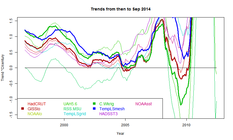
More "pause" trend datasets.

In two recent posts (here and here), I have shown with some major indices how trends, measures from some variable time over the last two decades and now, have been rising. This is partly due to recent warmth, and partly to the shifting effect (on trend) of past events, as time passes.

This has significance for talk of a pause in warming. People like to catalogue past periods of zero or negative trend. A senior British politician recently referred to "18 years without warming". That echoes Lord Monckton's persistent posts about MSU-RSS, which does have, of all indices, by far the lowest trends over the period.

Here I want to show results about other indices. Cowtan and Way showed that over this period, the trend in Hadcrut was biased low because of non-coverage of Arctic warming. I believe that TempLS with mesh weighting would also account properly for Arctic trend, and this would be a good way to compare the two, and see the effect of full interpolation. I expected GISS to behave similarly; it does to a limited extent.

So a new active plot is below the jump. You can rotate between datasets and months separately. There is also a swap facility so you can compare the images. And I have individual discussion of interpolation data vs grid data groups.
Here is the main plot. Buttons to rotate months and datasets. Emphasised set is in thicker black, on the legend too. (For some reason, NOAA emphasises as red). There is a reserved group of images for which the swap buttons work. It's initially empty, and you need at least two. In non-swap mode, click push to add the current image. In swap mode, click pop to remove the currently visible from the set.


DataMonthSwap


General comments much as before. There is a big contrast between satellite indices MSU-RSS (long pause) and UAH (short). Trends are rising as the months of 2014 progress. I'm extrapolating to November assuming continuation of current weather, as described in previous posts. Trends are generally rising, which means it is getting harder to find long periods of non-positive trend ("pause").

Interpolation groups

As Cowtan and Way found, whether or not you see a pause depends a lot on whether you account for Arctic warming. TempLS typifies this - the grid version, like HADCRUT, effectively assigns to empty cells (of which Arctic has many) global average behaviour, missing the warming. TempLS mesh has full interpolation, like the kriging version of Cowtan and Way. So here is the comparison plot, with C&W, TempLS and GISS in dark colors:

It shows C&W and TempLS tracking fairly closely from 1997 to 2008, with GISS generally a bit below.

Grid surface data

And here for comparison are HADCRUT, NOAA Land/Ocean and TempLS grid. I expect these to be fairly similar. TempLS and NOAA have been very close lately, but over this longer range, TempLS is closer to HADCRUT.

External sources


HadCRUT 4 land/sea temp anomaly
GISS land/sea temp anomaly
NOAA land/sea temp anomaly
UAH lower trop anomaly
RSS-MSU Lower trop anomaly
Cowtan/Way Had4 Kriging
HADSST3
NOAA sea temp anomaly


Sunday, October 19, 2014

Tails of the Pause.

I've been writing lately about matters which, I'm sorry to say, lack scientific gravity. One is the possible record warm 2014, and the other is the tailing of the Pause, as measured by periods of negative trend. My excuse is, people do talk about them, and there is interesting arithmetic which I can illustrate.

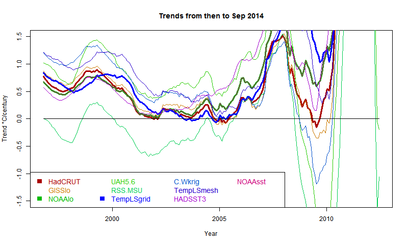
In my "pause" posts, I showed plots of trend of global temperature to present, plotted for periods shown on the x-axis, with trend shown at the starting point. A "pause" starts when, for some index, the axis is first crossed from pos to neg. The plots were active, and you could see the curves rising steadily over recent months. This meant the start of the pause moves forward, with eventual jumps where a previous excursion below the line no longer makes it.

Here is the recent active (buttons) plot to show that effect:


In this post, I'll quantify the rate of motion, and describe how much cooling would be required to reverse the trend. The effect of a new month's reading depends on its status as a residual relative to the regression line for the period - ie is it above or below the line, and by how much. But one reading is a different residual for each such period. I plot the present month as a residual, again referred to the start year, and also plot the rate of change of trend produced by the current (August) temperatures.

Rate of change

This is more simply described with a continuum version. A time period runs from 0 to x, with readings y. If x increases, what is the change to trend β. The continuum formula is β = (x ∫ xy dx - x*x/2 ∫ y dx)/(x^4/12)
Note that y occurs only in integrals (which are from 0 to x), so when we differentiate β, no need to differentiate y. So, after some calculus algebra,
dβ/dx = (6/x^2)(y - y0 - βx/2)
where y0 is the mean over the period. Since the regression passes through this mean midway, the last part of this is the end residual.
ie dβ/dx = (6/x^2) * residual
That gives the factor that determines the rate.

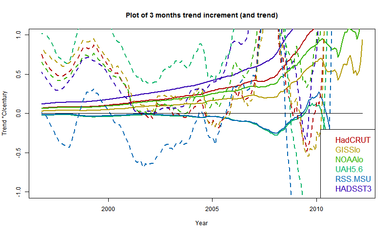
So my first plot is the rate of rise, shown as a 3 month incrementwith August trends dotted


The satellite measures aren't going to move much without substantial warming. However, UAH is already high, RSS is low. Of the surface indices, HADSST3 is rising fast, GISS relatively slowly. However, three months of current warmth makes a big difference to the pause.

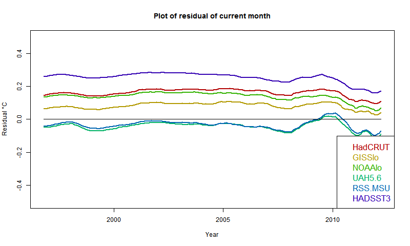
And here is the plot of residuals of August temp relative to past regressions:


It confirms that UAH and RSS are near zero, so continuation of present temps won't change anything (though UAH warmed in Sept). Otherwise, GISS has the lowest residual, but positive everywhere; HADSST3 the highest. This of course partly reflects past coolness of HADSST3.

So if temperatures drop about 0.07°C from August, the rise for GISS would pause (but GISS rose in September). It would take a drop of more than 0.2°C for HADSST3.


Friday, October 17, 2014

Record warmth in 2014?

Not according to the satellite measures; they are showing quite a cool year so far. But surface measures, apparently propelled by SST, have been consistently high since March, and a record for calendar 2014 looks possible.

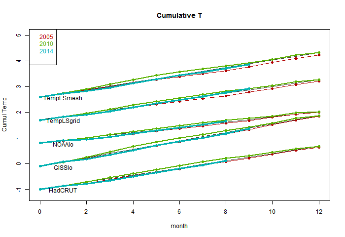
In August 2010, I showed a plot of the progress of the cumulative monthly anomaly sums, which will reach the final sum that determines the year average. 2010 did turn out to be the hottest year in many indices. It was different in that the El Nino was late 2009/10, so late 2010 was cooling. At this stage 2014 seems to be warming.

So I started to repeat that 2010-style plot, which is below the jump. It didn't work as well; the variation doesn't much show. But it puts the thing calculated in context - a cumulative sum that, if it exceeds 2010 at year end, will set a record. I've shown the progress of 2005 (a previous record), 2010 and 2014, with a line showing the 2010 average rate. The plots are spaced with an arbitrary offset.

But, more effectively, there is then an active plot with the average 2010 trend subtracted. The variation is clearer. The key thing is not so much whether the current total is above the line, but how it is trending, which is a measure of current warmth.

So here is the first plot. The TempLS measures were described in this recent thread. The absolute slope is an artefact of the anomaly base - GISS is earliest.


And here is the active plot with the 2010 average subtracted. Use the buttons to click through.


NOAA and TempLS grid are already above the line and heading up. Top candidates for a record. HADCRUT looks likely too. GISS and TempLS mesh only need a reasonable continuation of current warmth to end up positive (record). The slope is positive only when a month exceeds the average for 2010, so it doesn't take much cooling to turn down. We'll see.


Thursday, October 16, 2014

QC for TempLS


I plan to do more with TempLS (see last post) so I want a stable quality control (data) scheme. GHCN unadjusted is a document of record, and there is weird stuff in there which it seems they don't like to touch. I've noted current examples earlier in the year. So I did a survey of the data since 1850. Here is R's summary of the monthly averages:


Min. 1st Qu. Median Mean 3rd Qu. Max. NA's
-87.0 6.6 15.9 14.5 24.1 154.41166444

That's out of 10349232 months (of years with some data). Yes, the max is 154.4°C. There were 28 months with a min/max (not max) average >50°C.

To be fair, they use flags, and these oddities seem to be mostly where a decimal point slipped in the originating data. But they are big enough to have effects, so I have been using my own QC. On first look, I found the GHCN flags numerous and unhelpful, so I used a scheme where I checked with the adjusted file. This seemed to weed out the problem points without replacement. However, it excluded a lot of other points, so I allowed those if within 3°C of the appropriate mean.

I did that for the last five years of data and it worked well enough. But then I thought I should try for the whole record. I worked out how to extract the QC flags; here is a table of their occurrence:

DLMOSW
5511098112464722390454481981

The first column is no flag. QC flags aren't that common, about 0.24% of the total. The letters mean, according to the readme:
  • D - apparent duplicate
  • L - isolated
  • M - manual
  • O - outlier (>5 sd)
  • S - not so outlier (>2.5 sd), but no nearby data in agreement
  • W - seems to be last month

O and S are the big ones, and as expected, the very high ones are flagged O.

So I decided to just omit all flagged data. In future, I'll do that to all GHCN unadjusted before use.

If you've been watching the latest data over the last day, you'll have seen me experimenting. I think it is stable now.


Monday, October 13, 2014

A catch-up on TempLS

I've been writing a lot about TempLS (my global temperature index) recently, and realizing that I don't have a unique reference that explains exactly what it is and what has recently been happening to it.

TempLS dates back to a period in early 2010 when there was a flurry of amateur efforts to replicate the monthly global surface temperature indices from the major producers (which some thought suspect). This post by Zeke (with links to earlier) gives an overview. Jeff Id and Romanm started it with a reconstruction that used a least squares method for aggregating a single cell, yielding offsets rather than requiring a fixed anomaly period. I thought that could be applied to the whole recon.

So I developed TempLS, which was basically a big OLS regression, based on GHCN unadjusted station monthly averages. It was quick to run, and I incorporated choice mechanisms which made it easy to calculate regional or special (eg rural, airport) averages. A rather complete summary of this stage of development is here. An important feature was the incorporation of SST data. This comes gridded, often 5°x5°, and so I simply entered these as stations.

I made a point of using unadjusted GHCN, because there were many claims that warming was an artefact of adjustment. I have myself no objections to adjustment, though I did show that it makes relatively little difference to the index.

TempLS combines weighted regression with spatial integration, much as BEST did later. It weighted initially by the inverse of grid density, estimated by stations/cell in a 5°x5° grid. I posted at one stage a very simple version for incorporation in Steven Mosher's RGHCNv3. You can regard this weighting as that which a spatial integration formula woud provide, with each grid estimated by its station average anomaly, or equivalently, each function value (observed average) assigned an area equal to its share of the cell.

Version 2 in August 2010 generalised the idea of regression, so that spatial variation (among others) could be included (and maps produced). The math basis was set out here.

Meanwhile I was experimenting with other kinds of weighting. The problem with cell averages, which I now cell grid weighting, is that many cells have no stations. These would be best represented by local data, but the weight that can be assigned is limited to one cell area, and near the poles, where there is a lot of sparseness, the cell areas actually diminish, so such regions are under-represented. In early 2011, I did a series on Antarctica (final and links). This developed various forms of mesh-based weighting. This means that every point is estimated based on local data. I tinkered with Voronoi tessellation, but have now settled with weighting that assigns to each node a weight equal to a third of the area of the triangles (from a convex hull, which provides an irregular triangular mesh) which touch it. This is equivalent to a finite element piecewise linear integration formula.

An interesting exercise, which I started in early days, is to see if some very small subset (60) of stations can give a reasonable world estimate. This is the latest in that series, with links back.

Version 2.1, which incorporates some revised verion, is described here. This is the last formal release with code.

Meanwhile, in July 2011 I started a regular cycle of posting a monthly average estimate, based on GHCN and SST - initially HADSST2, but I soon switched to ERSST. I tried to make sure to post ahead of the majors, so that a prediction record could be established. I then published a comparison with the GISS result for the month. A list of links to those posts is given here; each has a list to its preceding TempLS post. I also included the TempLS results with the other indices on my latest data page, and in the graphical comparisons there.

I posted a review of the comparison of TempLS with other indices in December 2012. It was clearly in the mainstream, closest to NOAA and HADCRUT. More recently, I posted a mini-review noting that the closeness to NOAA had become more pronounced.

I had thought of switching to mesh weighting for regular monthly, but was deterred by the hour+ it takes to do 1200 meshes to cover a century. But you don't need a new mesh each month; most historic months change the population of stations very rarely. So with a scheme of stored weights and detecting changes, I can do it, and I think I should. I expect the results to be now closer to GISS. I also expect that the results will compare well with the revision of Cowtan and Way; I'll post on that soon.

Appendix/Update

Carrick asked for more details on the use of meshes in integration. The FEM idea of integration is that you build up an interpolation which is exact at each node, and takes some polynomial form in between. They do it with basis functions, but we don't need to deal with that here. Just imagine that you have a linear interpolation on each triangle. They will match at the edges.

On the integration, first I'll formalize the trapezoid analogy. If you have two points z1,z2, with function values f1,f2, then the area of the trapezoid on the graph for the linear interpolation is (z2-z1)*(f1+f2)/2. Base length times mean height.

The corresponding formula in 3D is volume = base area * (f1+f2+f3)/3.

To prove it, let the linear approx be f=a.z+c. (a,z,vecs, . scalar product). Then f1 = a.z1+c etc.

To save writing determinants I'll invoke what I hope is a familiar proposition. The centroid z0=(z1+z2+z3)/3 is also the center of mass. ie ∫ z dA = z0 A, where A is the area of triangle (z1,z2,z3).

So ∫ f dA = a . ∫ z dA + ∫ c dA = (a . z0 + c)*A
= A * Σ_i ( a . z_i + c)/3 = A * (f1+f2+f3)/3

Now when you collect all the formulae for each triangle (FEM assembly), you get a big sum in which each node value f_i is multiplied by 1/3 of the sum of all the areas of triangles of which it is a node. That is the weighting I use (actually, no need to divide by 3).
<