Yet another fevered analysis on adjustments from Willis Eschenbach, this time on GIStemp in Alaska. As usual, everything that he doesn't understand means someone is fudging ("Fudged Fevers").
Ironically, there was huge pressure from sceptics that led to GISS to completely release their code and data some years ago. They may have hoped that the fudge fans would at least look at what is in the code first to find where it's done. But no.
The adjustment in question is GISS's way of dealing with the Urban Heat Island effect. The sceptic chorus is that measured warmth is an artefact of measurements being taken near cities, at airports or whatever. There is indeed a UHI, and here's what GISS does about it.
GIStemp information
Update Apparently an issue now is whether GISS erred badly in classifying Matanuska AES as urban according to satellite-observed night brightness. I have added below a satellite map pic of Matanuska AES. It's not far from Wasilla. It is in fields, but about 1 km from a major freeway intersection, and about a mile from what looks like a car sales lot.
GISS adjustment principle
They now estimate the urban status from satellite brightness. This is a good idea, because brightness correlates well with energy usage, which in turn matches the waste heat that causes UHI. It's also more precise, because you can see where the stations are relative to the brightness. And their adjustment has the general effect of removing the trends from urban stations and replacing them with a trend inferred from nearby rural stations.
The weighted average they use tapers with distance, and reaches out to 1000 km from each urban station. If more rural stations are available, they will reduce the radius to 500 km. When they have the trend of this average, they make a difference of that with the urban station and add it. The resulting station has its original ups and downs, but the trend of the rural stations. And when you make a global average and look at the trend, the ups and dowwns are smoothed away, and the global trend is made up entirely of rural stations.
Well, almost. They allow for the possibility that stations which now have bright lights may have been rural at some time in the past. So instead of fitting a simple line, they allow the line to have a "knee" with a slope change.
The Alaskan examples.
Willis chose two stations - Anchorage (a city) and Matanuska, which was rural until recently. Both these are now classified from the brightness test as urban.
His Anchorage plot

is actually straightforward. It slopes downward uniformly, suggesting a regular UHI warming. If the correction is made, the global warming trend would be less. He queried the steps, but this just reflects the fact that station temperatures in GISS are rounded to the nearest 0.1C (and stored as integers). His main complaint was that the slope did not curve with the population growth. Indeed it is a little surprising that the algorithm did not insert a "knee". However, it makes little difference to the inferences that are made about global warming, since inexactitude about when UHI was at its peak tends to even out over many stations. Other cities had their peak growth in those years.
His complaints then focussed on Matanuska. Here's his plot:
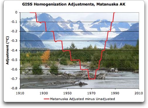
Here the complaint is of the steepness of the rise, which reflects an anti-UHI adjustment, and, I think, the fact that in the end no nett adjustment is made.
A GISS emulation.
I've written a poor man's GIStemp adjustment program - you can find the code here. It reads data from the GHCN v2.mean and the GISS v2.inv inventory file. You choose a "target" urban centre. It first scans the v2.inv to work out which stations are within Rad distance - Rad is usually 1000 or 500 km. It then scans the big v2.mean file to locate the rows that come within range, and in the process works out monthly averages for each station over its data range. With duplicates, the rule is that for any year it takes only one value per station, which is the first one encountered. Note that these averages do not relate to a fixed time period. If we were looking further afield, that would be a problem, but it's OK for the neighborhood of a single city.
The next loop looks over the same rows from v2.mean, but now we know which ones to choose. An anomaly is made by subtracting, for each station including the city, the monthly mean. That makes it possible to replace missing values by zeroes, which avoids seasonal distortion. Then the distance-weighted annual average of rurals is created, and from it, the annual values for the city is subtracted to make corr[], the correction vector.
Next the line-with-knee fit is done, using lm(), Every possible knee location is tested, and the one with minimum RSS chosen. Finally it is all plotted.
Matanuska.

OK, here's our Matanuska plot. It shows the city reading in red, the rural average in green, and the difference in black. Note that if we added the black curve as a "correction" to the red one, it would completely replace it by the green curve. No info from Matanuska would go into the global index. If UHI had been suspected, it's gone.
But in fact GISS fits the line segments as shown, and adds that. That has the same effect on trend, but leaves short-term signals. I'm not sure what the benefit of that is.
Comparing this plot with GISS, the knee comes a bit later, and the late rise is even steep er (a HS?). The earlier downslope is less pronounced.
Commenters at WUWT asked why this location was being adjusted at all, as it isn't obviously a big city. The answer is that GISS uses the objective satellite brightness criterion, and I'm sure those folks at WUWT would object if GISS replaced that with subjective judgements. But it may indeed be a false positive - does that matter? Not much; as long as enough rural stations remain, it doesn't matter unduly if a few were removed without necessity.
Update: Matanuska on the map:

Anchorage.

Here's a difference - I do get a slight knee. But it isn't very pronounced. As a numerical matter, the change of RSS with the knee/no knee options is quite small. Otherwise again we see the fairly long descent, corresponding to the expected UHI correction.
Let me emphasise again that this GISS correction does not leave Anchorage with a merely modified trend - it replaces the trend with that of rural stations.
Code and algorithm.
Again, the R code is here. I'll write more about the algorithm soon, and with details from the GIStemp code. For the moment though, I'll just reprint some comments I posted at WUWT.
On the GISTEMP code
The relevant parts of the code are in directory STEP2 of the GISTEMP source. The first thing to note is the file v2.inv in ./input_files. It lists the station data, and for the two Alaska stations:
42570273000 ANCHORAGE/INT__________________ 61.17 -150.02__ 40____8U__173FLxxCO 1A 5WATER__________ C__ 53
42570274001 MANTANUSKA AES__________________61.57 -149.27__ 46__225R__ -9FLxxCO30x-9TUNDRA__________C__ 18
The second last number gives the GHCN brightness rating - C is highest. So both will be adjusted.
The adjustment is done in the subroutine adj() of padjust.f. Temperatures are held as integers, to tenths of a degree - 121 is 12.1C. The relevant code fragment is:
____ do iy=iy1,iy2
________sl=sl1
________if(iy.gt.knee) sl=sl2
________iya=iy
________if(iy.lt.iy1a) iya=iy1a
________if(iy.gt.iy2a) iya=iy2a
________iadj=nint( (iya-knee)*sl-(iy2a-knee)*sl2 )
iy is the year. You'll see that there is provision for a "knee" and two slopes (switching at the knee). There are also limits beyond which the adjustment will be held stationary.
So the effect of the "nint" is that the adjustment is piecewise linear, and forced to the nearest integer value - ie 0.1C.
So now you can see where those plots come from. Anchorage has no knee, but just a steady slope adjustment, made stepwise by the nint. Mantanuska has a knee, and a steep slope following the knee.
The rationale seems to be that a broad slope correction is made to match the city to have the trend of its rural surrounds. The knee is presumably to allow for a transition in the past from rural to urban.
More on the GISS Fortran
More on the algorithm used. In PApars.f they compute, as they stated, for each urban station (in the do 200 loop) the AVG() of yearly distance weighted average values of nearby urban stations. They then calculate the difference between that and the urban values URB(). This information is passed to getfit() in t2fit.f (via the common block FITCOM).
In getfit, the line-with-knee fit to AVG-URB is laboriously computed by trying every possible knee (within 5 yrs of the end of range), and choosing the value with least residual SS (in trend2(), tr2.f). The resulting slopes and knee are what ends up in the adj() routine set out in my previous post, and with the jaggedness of integer conversion become the plots shown in the head post here.
Thinking a bit more about the method GISS is using. The plots Willis has shown are just approximators to the difference between the "urban" station and the weighted average of surrounding "rural" stations. If you think there's something extreme about them, it's probably not in the adjustment arithmetic - it reflects the actual behaviour of that difference. There's nothing particularly bad about a LS fit of a bent two-line segment.
Adjustment vs Omission
So what does the adjustment achieve? Suppose you put more effort into getting a better approximator to the difference. In fact, you could just use the exact difference. That would completely replace the urban station result with the average of surrounding rural. The eventual global trend would then be just provided by rural stations. That is good if you have enough of them.
So why include the urban stations in the calc at all? They have an odd effect - by putting them in, and then replacing them by the average of local rural stations, you upweight the effect of those local stations in the global average. This probably wouldn't matter much, and the effect is further muted anyway by the gridding.
The piecewise linear approx leaves a small residual effect of the urban stations in the global average, but only contributing short-term variation. The trend effect has been removed. And since the short-term effects are almost totally lost in the averaging, it seems to me that there's little difference between GISS UHI adjusting and leaving out urban stations completely.
Update - Orland Ca Steven, in comments, asked for a run of Orland Ca, which is another station classified urban, but arguably not. Here's the plot:

Further update
I've plotted the number of rural stations used in the Orland calc, along with the weighted sum, in each year. The weighted sum counts each one multiplied by the linear distance taper factor (range 1:0).


I rather knew that the first person to do the work Willis should have done, and easily could have done, would be somebody other than Willis.
ReplyDeleteIf your plot has an elbow for Matanuska (and your text implies that it does), I can barely see the line segment after the elbow. It's very faint.
The possibility of a knee is allowing an overfit of the Matanuskas trend difference. Eyeballing it, a single slope with no elbow would be fine. The uptick at the end is no different from the variations around the mean trend, but since it's at the end, the algorithm uses the uptick. If more recent data came in, the position of the elbow would probably change.
In any event, different fits appear to have very similar objective functions. You get a slightly different fit than GISS does. Would that difference have any bearing on the final result? I doubt it.
If I had any suggestion for a further work (and I'm not asking you to do it; just saying), it would be to check to see if it accomplishes the desired goal. The provided code could be tweaked a bit to give an average temperature record for the area in three cases: without Anchorage or Matanuska, or with both unadjusted, or with both adjusted. If it worked as intended, then the 'without' and 'with adjusted' series should have about the same long term trends. We could then see what we gain by bothering to include Anchorage at all.
The 'with unadjusted' series would include Anchorage UHI and whatever Matanuska has to offer. However, there are so many rural stations in the sample that I bet the Anchorage unadjusted UHI wouldn't make much difference to the combined average, anyway.
CE,
ReplyDeleteI've put up a new plot, larger and with a color change. The trouble is that at the right end, the fitted curve lies almost on top if the fittee.
I don't know how well this program will scale up to regional calculations. The anomaly calc would then need to be a fixed period.
The optimisation that leads to the elbow has a very flat top, as I think you are suggesting. It's easily changed by slight modifications to the data.
Nick, I don't find the code that inputs v2.mean and outputs v2.mean.txt. Is it posted somewhere and I'm just missing it?
ReplyDeleteThanks,
w.
carrot eater said...
ReplyDelete"I rather knew that the first person to do the work Willis should have done, and easily could have done, would be somebody other than Willis."
And I rather knew that the first person arrogant enough to decide what someone else should have done would be carrot eater ...
I said in my post that the problem was a computer program making inappropriate adjustments. Now the exact nature of those inappropriate adjustments may be super important to you, carrot eater. And if so, I invite you to write a post on the question. Nick has done so, and I commend him for it.
For me, the issue was not the exact nature of how the adjustments were made. I was concerned that a computer program, for whatever reasons, had adjusted a perfectly valid record which contains no evidence of anything wrong. That's what I found important.
You may find other issues important, that's fine.
But for you to set yourself up as judge and jury of what I should find important is merely puerile arrogance. It does not redound to your credit.
Willis,
ReplyDeleteYes, there's a sed script here to create v2.mean.txt
Willis, your post asked a number of questions which were easily answered with a bit more work or reading, or asking a colleague.
ReplyDeleteFirst question: Why is Matanuska being adjusted? Hmm. Is it classified rural? Yes, so that isn't it. Does it have nightlights? Perhaps surprisingly, yes. Does GISS use that criterion for that part of the world? Hey look at that, now they do. So Matanuska loses its trend, whatever it was. Is the new trend really in line with the neighbors? Let's check.
But instead of doing a bit of work, you prefer to write posts accusing people of fudging or having faulty programs. I'm rather less than impressed by that pattern. It's one thing to ask questions. It's another thing to not even attempt to answer them, and then jump straight to publishing grandiose conclusions.
We can reasonably argue over whether the satellite nightlight test is returning too many false positives or false negatives. But you never even established that it was a false positive. For that, you'd have to show that the trend at Matanuskas did not diverge upwards from the neighbors. Only looking at pictures doesn't tell you that.
(though I'll allow, from the pictures, this site is quite unlikely to have urban warming); the GHCN rural rating seems like it would have been a fair guide in this case.
ReplyDeletecarrot eater said...
ReplyDeleteWillis, your post asked a number of questions which were easily answered with a bit more work or reading, or asking a colleague.
First question: Why is Matanuska being adjusted? Hmm. Is it classified rural? Yes, so that isn't it. Does it have nightlights? Perhaps surprisingly, yes. Does GISS use that criterion for that part of the world? Hey look at that, now they do. So Matanuska loses its trend, whatever it was. Is the new trend really in line with the neighbors? Let's check.
carrot eater, thanks for your response. I was not asking what the GISS excuse for it being adjusted was. I assumed they had one. I was not aware that the GISS guidelines for nightlights had just changed, but even if I had known, that to me is not a reason to blindly adjust anything. This is particularly true given the astoundingly bad errors in the nightlights numbers. All their "reason" demonstrate is abysmally poor quality control.
I was asking if there was any objective reason for adjusting it. It is demonstrably rural. There is no indication of problems with the equipment, and in any case, they would not lead to the type of adjustment GISS has done. All we can say is that it is slightly different from an average of its neighbours ... so what?
So despite your claim, I still have not had anyone give me a reasonable explanation of why it was adjusted.
It's been clearly explained to you that GISS is using nightlights as the screen for whether a station is possibly urban. As GISS is using objective methods, with "The computer code.. published and verified", just as you demanded, there is no human involvement to overrule that screening.
ReplyDeleteThe real question here is whether nightlights are a good screen for UHI. A criterion like this is bound to deliver some false positives and false negatives; one must judge how bad this is. False positives like the case here are not a big deal, if the area remains well sampled. It's the false negatives that are a worry. To your credit, you did point out reasonably that in poor countries, big cities could be very dim. This would suggest an OR test: either nightlights or population should get you classed as urban.
Maybe this will be discussed in their upcoming paper. I think they should have not implemented the change until the paper was published. In a previous paper, they do say "the satellite brightness analysis could be extended to the rest of the world..It is not expected that the brightness-population relation deduced for the United States would be valid in other parts of the world. However, we anticipate that nighttime brightness would have a useful positive correlation with energy use and with human impacts on local temperature, indeed, it may be a more appropriate variable than population."
Hopefully they looked at these issues more carefully since then, but until the paper comes out, we won't know. Again, I think making the change before publishing is a mistake.
As for taking criticism: when you submit a paper to a journal, the reviewers may recommend some extra analysis or discussion in order to improve the paper. It's part of the process, and it does usually help improve the quality. If a paper manages to get published with half-baked analysis or overblown conclusions, the paper will rightly be criticized or ignored. WUWT authors don't actually publish, yet feel free to scathingly criticise other published works, as well as calling into questions the motives and character of scientists. So why should WUWTers be immune from critical suggestions? If you can dish it, you should take it, and sometimes considering it will lead to higher quality and better understanding.
There's something else that occurred to me if we're looking for a perfect UHI criterion. It isn't really urban heating that matters; it's the trend in urban heating. A place that went from rural to urban in the last fifty years is more significant than an established stable town.
ReplyDeleteNot that you can measure that with lights, or any other way that I can usefully think of. But it puts the argument in perspective.
I'll try to get a post together that orders the stations by light status, then by population. I looked at the stations near where I live and found that, while GHCN's population figures were patchy, the brightness criterion seemed quite reasonable, with the main issue being false positives (small towns as C).
I've added an update above with a sat map of the AES. I can see how by brightness it could rate as urban. It's near a freeway junction (1 km) and a big car yard. Picture here
ReplyDeleteNick Stokes: The adjustment in question is GISS's way of dealing with the Urban Heat Island effect. The sceptic chorus is that measured warmth is an artefact of measurements being taken near cities, at airports or whatever. There is indeed a UHI, and here's what GISS does about it.
ReplyDeleteI think Phil Jones wouldn't agree with you that the UHI is important. Or at least he didn't used to (Jones, 1990 for example).
I believe he leaves this correction entirely out of CRUTEMP3. Discussion of the UHI was also railroaded out of AR4 (possibly at Jone's behest). And there are warmingists who will argue that there is no UHI effect, no doubt, because that's pretty much what AR4 says...
Don't get me wrong, though, I like the fact GISTemp tries to correct for it, but I do think the algorithm and the structure of the underlying methodology needs work.
Let's start with a definition of the ideal quantity we are trying to measure. What we'd like to have is a dense enough network of temperature measurements so that there is no spatial aliasing in the sampled temperature field. If a building were a heat source, it would show up as a heat source. That is a real effect. If a city looks hot compared to the surrounding rural areas, again that is real, not an artifact.
And for your global average, what you are really striving at is the global average over this densely sampled surface temperature field. You could difference it if you want before averaging, but for "ideal data" (no missing data), differences and averaging are both linear operations and commute with each other: Anomalization has no effect on the outcome for this ideal case.
So anyway, urban regions represent real heat sources, and urbanization is a real climate forcing. The purpose of the UHI correct should not be to replace the temperature field of the urban region with the temperature field that would have been there had the region not been urbanized, but rather to correct for bias errors associated with urbanization.
Formally we can define these bias errors as the difference between the temperature of the urban site minus the spatial average of the temperature field for that region. This difference will be non zero—especially in the case of trends—if you have changes in the microclimate around the instrument (e.g., placement of new parking lots, addition of new buildings, etc),.
Having said all that, I don't believe satellite brightness is at all a good proxy for changes in microsite forcings, and I don' think the adjustment for the increase in mean urban temperature is warranted, except in so much as urban sites are over sampled in the global land average.
In practice, you don't need a really fine grid for measuring in urban regions. This is because there is a lot of advection of air across an instrument over a month, and even on a daily basis, you have a sampling radius of hundreds of kilometers. (This argument is an explanation for why neighboring sites are so strongly correlated, especially along fixed lines of latitude.)
For the purpose of measuring the effect of the UHI, probably the best approach would be to compare the ground based sensors to the mean temperature of the region using e.g. satellite IR measurements or other similar high-resolution methods... so what I am suggesting as a definition is both physically meaningful and indeed even (fairly) readily measurable.
While I criticized GISTemp for the way it utilized satellite brightness measurements, one could correlate these against e.g. IR measurements to calibrate satellite brightness. The "correction" one would like to use this for it to correct for the potential oversampling of urban areas in the global mean average. Hot spots associated with human activity are real, but you should be careful not to over-represent them in the global average.
Anyway, thanks for the interesting post.
Nick Stokes:
ReplyDeleteYes, that's why I try to say 'UHI trend', as opposed to just 'UHI'. A lot of urban areas have UHI, but they've had the same amount of UHI for a long time now, so it doesn't really have any effect for our purposes here.
That's why Jones looked at UHI in China. If there's one place on earth where a lot of rural stations turned into urban stations, that's it. If UHI trends are going to be a problem anywhere, China is it.
carrot eater:That's why Jones looked at UHI in China. If there's one place on earth where a lot of rural stations turned into urban stations, that's it. If UHI trends are going to be a problem anywhere, China is it.Discussing the China data and Phil Jones together is in rather bad taste isn't it?
ReplyDeletej/k
By the way, Nick: I think the new release of GHCN will have more data than the current one. So sometime this year will be a nice comparison of where data was added, as well as maybe somewhat different results due to new methodology.
ReplyDeleteWillis, there is absolutely no defense for presenting data you haven't bothered to understand and asserting that the work being done is faulty. It's not just lazy, it's defamatory and shreds whatever is left of your credibility after falsifying temperature data.
ReplyDeleteIn the future please remember; ignorance of science is no defense for your moronic, hysterical allegations.
Anonymous said...
ReplyDelete"Willis, there is absolutely no defense for presenting data you haven't bothered to understand and asserting that the work being done is faulty. It's not just lazy, it's defamatory and shreds whatever is left of your credibility after falsifying temperature data.
In the future please remember; ignorance of science is no defense for your moronic, hysterical allegations."
I can see why you want to remain anonymous, so none of your friends realize you're off your meds.
What I asked, and what neither you nor anyone has answered, is for a reason why the recent Matanuska data is adjusted downwards and upwards. And by "reason", I don't mean "to make it the same as its neighbors". That's a justification, not a scientific reason.
I mean a real, physical, science-based reason that we should adjust a basically rural station downwards in the twenties to the seventies, and upwards in the recent years.
I've asked everyone that question, and no one has an answer. Me, I'm into science. I want a verifiable scientific reason before I start fudging the data. If you have one for the adjustments made to Matanuska, bring it on. If not, then what are you drooling and raving about?
Yes, I don't understand any scientific reason for that adjustment. That's why I asked.
PS - If you don't have the balls to sign your opinion, why should we care what you think?
Give me a break.
ReplyDeleteYour physical, science-based reason is that the station trips a flag for being urban. The flag is intentionally set to pick up small towns that otherwise would not be classed as urban, just to be extra-careful in avoiding UHI.
You can say this classification is right or wrong, but you cannot honestly go around saying that nobody has told you this, or that you don't know it.
carrot eater said...
ReplyDelete"Give me a break.
Your physical, science-based reason is that the station trips a flag for being urban. The flag is intentionally set to pick up small towns that otherwise would not be classed as urban, just to be extra-careful in avoiding UHI.
You can say this classification is right or wrong, but you cannot honestly go around saying that nobody has told you this, or that you don't know it.
I didn't say nobody told me this, you should see a doctor, those hallucinations appear to be getting worse.
If Matanuska trips the "urban" flag incorrectly (as is shown by aerial photographs, the site is in fact rural), that's not a problem. Happens all the time.
But what real scientists do is quality control. They check their work. They find out where an automated procedure has gone over the line without a valid scientific reason, and they fix it.
Next, you say the flag is set low to be "extra-careful in avoiding UHI". On the basis of that, it increases, not decreases but increases, any UHI in the record ... yeah, that's real scientific all right.
Finally, when are you going to grow a pair and post under your own name? Nick Stokes stands behind his ideas, as do I.
But I suppose if my ideas were as warped as yours, I wouldn't have the nerve to sign my name to them either, I'd pretend to be a rabbit too ...
Nice work Nick,
ReplyDeleteOne of the sites that has always interested me is Orland California. I used to drive through the area every year, so I was kind familiar with it. GISS adjustment never seemed to make much sense on this site which is unmoved for 100 years. And there is good population data all the way back before 1900. it would interesting to see what your approach says about that site. I say this becuase I do have access to pristine rural area data close to orland from about 1982 to present. State of califorina data ( wind insolation soil temp ) It's always good to test a algorithm blindly
Let me see if I can explain one of the issues.
ReplyDeleteNightlights in one case I found classified an urban site as rural
( Nightlight = Dark And pop< some figure) takes care of that.
Nightlights also rated some rural sites as small towns.
Take the case of orland. ( as I recall) it was classified as dim.
When you compare it to rural sites it gets adjusted up. This makes no sense especially when you look at the site.
That opens the question : are the rural sites really rural or are they
infected with microsite bias.
Don't know.
Anyways, this is a really interesting question. Suggest that everybody read imhoff
Steven, Thanks. I did the Orland plot which I've put as an update at the end of the main post. It shows Orland warmer than its rural neighbors back before 1900. However, there weren't many of them then - less than 10 i9n the early years. So the adjustment, which seeks to remove the Orland trend, has a warming effect uo till 1960, then cooling. The cooling is what you'd expect if it was really urban.
ReplyDeleteIt isn't easy for me to to the equivalent Eschenbach graph of actual adjustments made.
I take it by imhoff you mean this recent paper? Do you know of a non-paywall version?
Nick
ReplyDeleteImhoff, M.L., W.T. Lawrence, D.C. Stutzer, and C.D. Elvidge. A technique for using composite DMSP/OLS “city lights”
satellite data to map urban area
http://www.ngdc.noaa.gov/dmsp/pubs.php
( good resource with other papers )
#
www.isprs.org/proceedings/XXXVI/8-W27/smalletal.pdf -
#
Essentially the study looks at How well nightlights captures Population density. The issue I was concerned about was Blooming, amongst other things. Further, it seemed that if one was "after" population density then why not just use population density. I pointed folks to the sedac data as an example of a more direct measure of density.
A couple spot checks of nighlights with places I knew ( shasta, orland, mineral california) was enough for me to question the methods
ability to pick out density accurately.
Anyways, From the review above:
Specifically, the area and intensity of illumination is known to vary significantly with
energy availability, economic development and density of settlement...
"Previous analyses have revealed a consistent disparity between various spatial measures of urban
extent and the spatial extent of lighted areas in the night lights datasets ... Specifically, the lighted areas detected by the OLS are consistently larger than the
geographic extents of the settlements they are associated with. The larger spatial extent of lighted
area, relative to developed land area, is sometimes referred to as “blooming”. The blooming is the
result of three primary phenomena, including: 1) the relatively coarse spatial resolution of the OLS
sensor and the detection ofdiffuse and scattered light over areas containing no light souce , 2) large
overlap in the footprints of adjacent OLS pixels, and the accumulation of geolocation errors in the
compositing process (Elvidge et al., 2004). In the context of this study, blooming refers to spurious
indication of light in a location that does not contain a light source. "
WRT Orland. Orland loos to be an example of blooming. The 1 sq km
surrounding the site has a density of 137 people. The area is flat
with single story dwellings located more than 100 feet away from the sensor. The site is on the outskirst of a small town, population 7K
The density of the town is roughly 950 per sq km. The total town is 6.6sq km.
here are some selected population figures for the town.
2000 : 6K
1990: 5K
1980: 3.5K
1970 3K
1912 1K
1910 800
1880 292
The sensor in question has not moved.
If its 137 people per sq km there today and the other 5.6KM contain
over 6000 residents, its probably safe to assume that in 1970 when the town population was half of what it is today that the density was lower than 137. and in 1960 what magically happened? Nothing. But that is the kneepoint.
bottom line is that This adjustment proceedure has nothing to do with the physical process of UHI. Orland is rural, has probably always been rural. For some reason its temps prior to 1960 showed a cooling
while other sites ( judged as rural today) showed a warming.
Now, Orland and two other stations very close by are used by the agriculture department of the state of california. All the stations in this system have to meet fairly rigid standards for placement. They are located in open fields and collect more than just temps
Does the orland adjustment matter? That's the wrong question.
The question is
1. does nightlights pick out rural/small town/urban with More accuracy
than other methods? No evidence of this.
2. Does hansen's UHI adjustment proceedure make sense?
No.
The next question is what sites was Orland compared to?
And what happened in this area from 1880 to 1960?
Any guesses?
Steven,
ReplyDeleteThanks for the Imhoff ref. Here is a paywall ref - I couldn't find a free.
I can't say much nore about Orland, but I can about the rural stations. There's a lot of them; in fact, they broke my array limit. 121 in all - I've plotted the number for each year in an update above, along with the weighted sum. That sum is the numbers each multiplied by the wt function (0;1) tapering with distance.
Thanks Nick I'll have a look.
ReplyDeleteRon Did some nice work pulling a density database out of columbia.
It's nice to see people on the warmist side taking an interest in this and actually doing numbers. The baggage of hansen and jones ( even if unjustified in your view) is a great thing to drop
How do I put this. you, ron, zeke have more credibility than Jones,hansen, tamino. At least in my mind.
Are those all the rural stations that adjust Orland?
ReplyDeleteHmm.
Can you dump a list. looks wrong.
I guess the other question is this. Does it really make sense to
weight this stations with rural stations from 500km away? like
how many many do you need? is 20 better than 10?
Whats the sensitivity of 500Km to the adjustment?
Clearly something is messed up with this.
Steven,
ReplyDeleteHere's a list. Number, distance (km), name. My count of 121 rural stations was wrong - there was irrelevant stuff in the vector whose length I used. The graphs I posted should be right, except that I counted Orland itself, so the numbers for each year are inflated by one. It didn't add to the weighted sum.
1 966 VICTORIA MARINE,BC
2 815 SAN CLEMENTE/ISLAND NAAS
3 763 SAN NICHOLAS/ISLAND
4 905 CUYAMACA
5 782 SANTA CATALINA/CATALINA ARPT
6 869 NEEDLES FAA AP
7 978 LEES FERRY
8 850 ZION NATIONAL PARK
9 883 ALTON
10 957 SELIGMAN
11 972 GRAND CANYON NATL PARK 2
12 653 FAIRMONT
13 635 SANDBERG/WSMO
14 607 TEJON RANCHO
15 642 MERCURY/DESER
16 466 LEMON COVE
17 908 MANTI
18 958 HIAWATHA
19 922 LOA
20 868 SCIPIO
21 820 DESERET
22 481 TONOPAH/AIRPORT
23 385 MINA
24 318 YOSEMITE PARK HEADQUARTERS
25 749 MODENA
26 335 HOLLISTERUSA
27 904 MORGAN COMO SPRINGS
28 952 WOODRUFF
29 944 LAKETOWN
30 875 MALAD CITY
31 750 OAKLEY
32 910 IDAHO FALLS/42 NW WB
33 959 DUBOIS/FAA AIRPORT
34 493 BEOWAWE USA
35 439 AUSTIN
36 313 LOVELOCK/FAA AIRPORT
37 422 GOLCONDA
38 262 CEDARVILLE
39 27 WILLOWS 6W
40 206 ORLEANS
41 248 HAPPY CAMP RS
42 312 BLY 3NW
43 334 SEXTON SUMMIT
44 332 PROSPECT 2SW
45 350 CRATER LAKE NPS HQ
46 412 FREMONT 5NW
47 952 LIFTON PUMPING STATION
48 977 BORDER 3N
49 539 DANNER
50 674 ARROWROCK DAM
51 703 CAMBRIDGE
52 504 BURNS,OR.
53 357 PAISLEY
54 482 MALHEUR REFUGE HDQ
55 573 DAYVILLEUSA
56 711 MEACHAM
57 493 MCKENZIE BRIDGE RS
58 518 CASCADIA
59 597 THREE LYNX
60 634 HEADWORKS PORTLAND WTRB
61 640 DUFUR
62 649 MORO
63 889 FENN RANGER STN
64 933 WILBUR
65 744 WESTON USA
66 964 STEHEKIN 4NW
67 998 CONCONULLY
68 777 RAYMOND 2S
69 840 STAMPEDE PASS/WSMO
70 854 CEDAR LAKE
71 931 QUILLAYUTE,WA
72 981 TATOOSH ISLAND WASHINGTON
73 875 ELBERTA
74 987 OLGA 2SE
75 779 LONGMIRE RAINIER NPS
76 841 GRAPEVIEW 3SW
77 702 HOLLISTER
78 746 HAZELTON
79 718 GOODING/2 S
80 674 GLENNS FERRY
81 114 NEVADA CITY USA
82 206 ELECTRA PH
83 139 BLUE CANYON
84 143 LAKE SPAULDING
"1. does nightlights pick out rural/small town/urban with More accuracy
ReplyDeletethan other methods? No evidence of this.
2. Does hansen's UHI adjustment proceedure make sense?"
These two are basically the same question. On 2, Hansen is essentially deleting a station if it gets flagged as urban. People get mesmerized by precisely how this is implemented, but they forget that's what it's doing. So the focus reverts back to question 1.
The advantage of nightlights is that it's a lot easier to collect the data. How well it works is a continuing question.
Carrot WRT2
ReplyDeleteIm talking about a situation like Orland. Its 137 people per sq km.
by that measure a small town. By nightlights dim. By inspection
probably rural/small town.
When can be fairly confident that prior to 1960 the area was more rural
as the town population ( today 7k) was less than 3K ( 6.6sqkm)
And definately prior to 1940 it was rural as the census shows electrification at less than 100%. and at the turn of the century with less than 1000 people its even more rural. yet, it gets cooled by comparing its record to the record at catalina island!
not sure how you fix this problem
it gets cooled by comparing its record to the record at catalina island!
ReplyDeleteIt probably didn't. I haven't looked up the criterion GISS uses to switch from 500 to 1000 km, but they almost certainly would have found that 500km gave enougfh stations.
And even at 1000km, catalina would have very little weight in the average,
"yet, it gets cooled by comparing its record to the record at catalina island!"
ReplyDeleteBut this is what I'm talking about. Regardless of the correctness of your diagnosis of what the adjusting stations were, you're mesmerized by the mechanics of the thing. Which makes you forget that the mechanics are essentially tossing the station out.
Now, there could be times where the two-legged thing doesn't do a good job of canceling the station. But you aren't even saying that here.
here's One problem with Orland. A couple miles to the south of the USCHN site is a another site. A site that records data hourly. It's in a field.
ReplyDeleteA few miles north of the USCHN station is another hourly logger in a field.
and then 10s of Km away is a third hourly logger in a field.
From 1987 to today I can compare these 4. correlations on the tmax (97+%) Tmin(97+) and Tave 98%+ the trends for all 4
gerber, durham, orland1, orland ushcn are all within .003F per month.
Anyways, I'm not sure what the urban adjust gets you except an additional data point which really insn't a sample of the temp. but a munged piece of what ever you wanna call it
Steven:
ReplyDeleteAnyways, I'm not sure what the urban adjust gets you except an additional data point which really...
Yes, that's my view too. They might as well just leave the urban stations out. Especially in Cali, where there are plenty of rurals.
They're saying, let's take out the urban trend and try to salvage the rest. I think that salvaging does no harm, but no real good.
it'd be more interesting to look at this in a data-sparse part of the world. leaving the urbans in lets you keep the short term variations; this is already redundant anywhere in the US but maybe someplace else it helps reduce the noise a bit
ReplyDeleteNick,
ReplyDeleteI think we agree. personally I think I'd approach the problem by selecting the tightest screen I could to eliminate urban stations. Just to avoid all the crowing about stuff that in the end doesnt matter much.
As CE notes that is going to give you ( perhaps) a noisey product, but
for somepeople you simply cant have enough stations ( I hate those nonsense arguments.. arrg)
Then I suppose after you have these golden stations you can start the process of adding more stations.. There is no point in oversampling the US.
Nick, In the past at CA folks have started to discuss the jones approach
to calculating a error due to spatial coverage. I pointed Roman at some stuff from Shen.
That might make an interesting post.. How many stations are required?
or rather error due to spatial coverage versus number of stations..
although number of stations is not the right term.
Shen's paper looked at a couple things ( dont trust me) one was doing
and estimate based on GCM and the other was an estimate based on
decomposing hadcrut.. I think it was something like looking at EOFs
needed to capture the global climate feild..
Anyway with the ISH database I'm wondering if that could be used to
estimate the number required..
neat problem.
GISS does it too, using a GCM. It's where the green error bars come from. NCDC also uses a model field, I think.
ReplyDeleteISH is an interesting alternative. I wonder if it has enough density in the SH though to serve as a perfect field. Large chunks of Africa barely bother to issue SYNOPs, so that may not help, either.
It's worth pointing out that until Jan 16 this year night lights were only used to identify urban and somewhat urban sites in the US.
ReplyDeleteCE
ReplyDeleteWhere is the GISS formula for calculating the error due to spatial coverage? Trying to get my mind wrapped around the problem..
Eli,
ya we know. It was one of those things that dopes like me asked stupid questions about "why does nightlights only get used in the USA where you have the best population data. made no sense, since nightlights was supposed to be a proxy of density.
Still, this is a really cool problem. climate science will NOT change, but its a really cool problem. Glad folks are looking at it.
Ideally, we would fund
1. site surveys
2. SPOT aquistion. just do a 3D DTM. cost is not that bad.
50 years from now it will come in handy.
Steven, the reason they did it first in the US is they had good demographic data to cross check it against. It's in one of their papers (2001??) In other words caution
ReplyDeleteEli,
ReplyDeleteI've read Imhoff 97 and I'm not the least bit convinced that nightlights serves as a better indicator of urbanity than population and population is not 'all that' as well.
Lets just start with basics. UHI is a meso scale phenomena. You dont rule it out by looking at the pixel that is "coincident" with the station.
1. The station locations are demonstrably wrong in many cases.
2. The UHI feild meso scale.
You could I suppose use Nightlights to ELIMINATE sites. but you can't reliably use it to QUALIFY sites as rural.
A good qualification will involve a manual check of every station.
1. Check the population
2. check the nightlights
3. check the urban density.
4. look at the satillite photo
5. look at the land use ( global records go back a long way)
6. Look at the "land under irrgation" satillite products.
7. Look at the Spot 3D products.
8. look at the site photos.
Detailed work.
Nick,
ReplyDeleteNot to beat a dead horse but there are also rules for throwing out the two legged fit and doing a simple linear fit.
BTW, you should post up your stuff or link to it on jeffid temp page
http://noconsensus.wordpress.com/2010/03/28/new-surface-temperature-page/
Not to beat a dead horse but there are also rules for throwing out the two legged fit and doing a simple linear fit.
ReplyDeleteYes, I think such a rule could be applied here. It doesn't actually matter when you aggregate. The linear fit that you force should have the same contribution as the two-legged. But it looks better.
BTW, you should post up your stuff or link to it on jeffid temp page
Yes. I'm currently working on a coupled global trend method. If that works. I'll post and then link everything.
FYI: Its Mantanuska, with an "Mant" not a "Mat". Typos can be frustrating for those of us who go back to look at the raw data and fail to find the station... =)
ReplyDeleteDear Anon,
ReplyDeleteNo, it's Matanuska. The misspelling is in the GHCN list.