Monday, September 22, 2014

Mesh peel

I've long been interested in what can be done with irregular triangular meshes. And lately I've been using them a lot, in apps like this. If you have a set of data on the Earth with no special pattern, like temp measurements, then the best way for both analysis and graphics is to create an irregular mesh of triangles joining the points. Here is an HTML 5 version which allows you to display the mesh.


In earlier times in finite elements, problems on meshes were often solved with direct solvers, which greatly benefit from a banded matrix. This depends on node numbering. On a regular grid, you'd number by rows; in an irregular mesh something of that can be achieved by an advancing front, which passes through every node, and numbering is by order encountered.

I have found two current requirements for a front. One is in a shorter way of defining the mesh, for web transmission. And the other is in WebGL. For the latter, I've developed a more easily visualized method, which, as you might guess, leads to pretty pictures. And yes, WebGL. It describes the mesh as a peel. The rind is one triangle thick - each triangle has two nodes on one side, and one on the other. Well, mostly. Details below.
Update: I found that the original mesh had some incorrectly oriented triangles. The method assumes consistent orientation, so it's rather surprising that the algorithm ran to completion. Anyway, it looks much more regular now.

Mesh specification

You can't avoid listing the lat/lon of the nodes. The simple and usual way of listing the connecting lines is by listing each triangle. But there are typically about twice as many triangles as nodes, so each node gets mentioned six times in total, on average.

If you can reproduce the motion of a moving front, you only specify each node once, when it is encountered. Since the front passes through each triangle, about half the triangles are created without listing a new node (infilling), although a few bits of info are needed to indicate the kind of infill. This is what I currently do, and it is a big plus for the apps mentioned above. But the front does not advance in an easily visualized way, and so for WebGL I need something else.

The WebGL issue

I've described the use of WebGL elsewhere, for example here. Because it's highly parallel, it tends to be very verbose, since it sends copies of everything rather than use pointers. So every time you mention a node, it is by coords and color - 7 floats. And as above, the default spec by triangles mentions each node about six times.

WebGL mitigates this with two structures - TRIANGLE_FAN and TRIANGLE_STRIP. The first is just a ring of triangles around a node. The second is a strip of rectangles with diagonals (all the same way). The saving is that in each, nodes are mentioned once, in each strip, say. That's twice in total, instead of six.

The strip sounds a bit limiting, but there are various ways you can stop and start. You can add degenerate triangles.

So my ambition here is to develop a front that works like peeling an orange with one continuous rind. I don't have the strip in WebGL working yet. But I do have pictures.

The algorithm (briefly)

It works by in effect rolling a triangle from start to finish. Not the same triangle, but moving from one to another in a series of fans. I rotate anticlockwise. There is always a front dividing "old" and "new", and when the fan reaches "old", it switches pivots, and starts another fan.

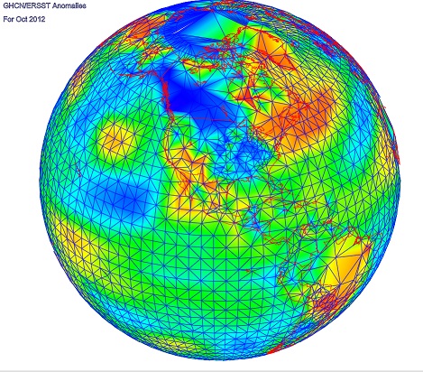
The picture below shows this with shading. The "old" side of the peel is blue, the new is red. There is a blue line joining the centroids of the triangle in number order. Sometimes the rolling gets stuck; it tries a new pivot, but can't move. You'll see those as solid blue triangles in the pic. It escapes by backtracking to the nearest pivot that can move. It's also possible that the front can form a pocket, leaving behind a set of triangles. There's provision for it to check and go back and fill in those areas. There will be a cost in describing that, but it doesn't happen often.

The result

So here is a picture of about 4000 stations (GHCN/ERSST) that reported in some recent month (I've lost track of which). The mesh comes from R's convhull(). There is a red triangle in the Mediterranean where it starts, and end in a white triangle in the W Pacific. I think it is quite interesting how it adapts to very different density in, say, US vs Africa or Antarctic. It's like a big spiral, and as mentioned above, the "old", or inside edge is blue, outer red. The usual WebGL facilities - Earth is a trackball - right button drag up or down to zoom.


Tuesday, September 16, 2014

August GISS Temp up by 0.18°C

GISS has posted its August estimate for global temperature anomaly. It rose from 0.52°C in July to 0.7°C in August. TempLS rose by 0.1°C, which I commented was in line with the rise in SST. GISS once again is jumpier, and like TempLS is back to the high levels of April/May.

The comparison maps are below the jump.
Here is the GISS map:


And here, with the same scale and color scheme, is the earlier TempLS map:


Previous Months


July
June
May
April
March
February
January 2014
December
November
October
September
August
July
June
May
April
March
February
January
December 2012
November
October
September
August
July
June
May
April
March
February
January
December 2011
November
October
September
August 2011

More data and plots


Monday, September 15, 2014

Trend Map to show why Cowtan&Way is needed.

Nearly a year ago, Cowtan and Way published an important paper on modifying HADCRUT 4. HADCRUT is a global index put out by the UK Met Office and UEA. It uses gridding, and has many grid cells which have no data. These are just not included in the average. The arithmetic effect of this is that the empty cells are given the value of the remaining cells in the average, which for HADCRUT is the hemisphere average.

Normally this might not matter much, because the missing areas are on average, average. But recently the Arctic, with much missing area, has been warming rapidly, and HADCRUT has been missing that. One C&W remedy was to use kriging interpolation. Another was to make a hybrid with UAH satellite tropospheric measures, which covers lot of the missing region. Importantly, they got similar results, with a trend that seemed to allow properly for the Arctic warming.

I wrote follow-up posts on C&W here, here and here. One observation was that latitude averaging would be better than hemispheric, since infilling with the latitude average was likely to be closer. And that gave results somewhat similar to C&W.

I'm going to develop this. But meanwhile, I want to show visually just what C&W does. I have made a WebGL active plot, which shows with shading the trends over various user-chosen time intervals. For HADCRUT, I explicitly infilled cells with the Hemisphere average. I show C&W with kriging - no infill is needed. So for HADCRUT areas with little data will show with the hemisphere average trend. With WebGL it is inonvenient to color cells as rectangles, so I have used shading. The plot and discussion are below.
Update: I have converted to showing grid cells as rectangles, which I think is clearer

Here is the plot:


You can select a dataset (currently HADCRUT 4 or C&W kriging), a start year and and end year. We're limited in years by the C&W data. Click "Plot New" when you have made a selection. As usual, the earth is a trackball which you can drag; the orient button will set it to map orientation, keeping your current center in place. You can right click and drag up/down to zoom.

For discussion, I'll show here two images for the period 2003-2012:


HADCRUT 4 Trends 2003-2012C&W Kriging Trends 2003-2012

You can see in the HADCRUT plot a set of reddish strips. Those are cells with data. The remaining greenish area consists of cells that have been assigned the hemisphere average, and so reflect that lower trend. That is arbitrary, and you can see the contrast. The Cowtan and Way plot on the right has infilled with Kriging interpolation. The colors don't quite correspond, but you can see how the hemisphere infill is replaced by local values.
Update. I should add a caution here. With HADCRUT, I infilled empty cells with hemisphere averages for each month. Where there is no data over the period, you see the color of the hemisphere average. Where there is, you see the correct trend. But where there is a mix of infill and data over the period, you see a mixed trend. I think some of the yellow strips around the Pole reflect that.

If you want to compare, I suggest running two browsers side by side. Use Ctrl- to shrink to fit two on the screen.

I'll post soon on other ways of interpolating; Kriging is fine, but I think any reasonable scheme will do. TempLS can do it with linear interpolation on a regular triangular mesh.

Update: Oale in comments has sent along this difference graphic, highlighting the difference between the plots:


Thursday, September 11, 2014

Extended Trend Viewer

I have been maintaining regularly an active trend viewer. A reduced image looks like this:


The triangle shows with color shading the trend from any starting year to end year, in a range that you can choose (from 1999, 1989, 1960 or 1900 to now). There are settings that show just trend, trend with significance masked, or CI's (upper or lower) or t-values. And there are now 15 datasets - monthly temperature series.

Each triangle has an accompanying plot of the time series. The active aspect is that you can choose a time range, and numerical information about the trend will be shown, and colored markers will show the trend line on the graph. You can choose either by clicking in the triangle, or using controls in the graph.

I have now added four new data sets. They are from Cowtan and Way, BEST Land/Ocean, NOAA SST, and a new TempLS set. I'll describe each in detail, and give links to the sources.

Cowtan and Way


Kevin Cowtan's home page is here. They took HADCRUT 4, which uses a grid but omits cells that have no data, and used different schemes for estimating the empty regions. The motivation is that recently there has been warming in the Arctic which HADCRUT was not detecting properly. They used kriging interpolation, and hybrid schemes making use of satellite data. I'm showing the kriging results here.

BEST Land/Ocean

Berkeley Earth started with land only, and that remains their prime product. They only update their land/ocean data annually. They use HADSST3 for ocean, and as with all land/ocean indices, this has a dominant effect.

NOAA SST

I'd really like to be able to show the OI V2 SST, which is kept very current. But although it's easy to download spatial data, for some reason the global index can only be got interactively. So I'm showing the regular product which comes out late in the month.

TempLS

TempLS is my least squares global temperature index  program. My recent post gives some background, and a comparison. It is basically an area weighted regression, and I have been using a traditional scheme whereby the weight is assigned according to each stations share of its gridcell area. This gives similar performance to actual gridded schemes, and that recent post was to show how well it follows NOAA.

But this has the same faults that Cowtan and Way were trying to fix. No weight is assigned to allow for empty cell area, of which there is much in the Arctic. TempLS offers various weighting scheme, one of which is essentially finite element integration on an irregular triangular mesh. This has no problems with empty cells, and no problem with cells getting small at the poles. I have felt that Cowtan and Way's kriging was overkill, and that any interpolation (here linear) would do much the same. This is an opportunity to test. I'll write more on this soon.

Sources

Here is a table of links to the data files.

HadCRUTHadCRUT 4 land/sea temp anomaly
GISSloGISS land/sea temp anomaly
NOAAloNOAA land/sea temp anomaly
UAH5.6UAH lower trop anomaly
RSS-MSURSS-MSU Lower trop anomaly
TempLSgridTempLS grid weighting
TempLSmeshTempLS mesh weighting
BESTloBEST Land/Ocean
C&WkrigCowtan/Way Had4 Kriging
BESTlaBEST Land
GISS TsGISS Ts Met stations temp anomaly
CRUTEMCRUTEM CRU global mean Station anomaly
NOAAlaNOAA land temp anomaly
HADSST3HADSST3
NOAAsstNOAA sea temp anomaly


Wednesday, September 10, 2014

TempLS global temp up 0.1°C in August

TempLS rose in August; from 0.515°C (July) to 0.613°C. This largely reflects the strong rise in SST. It's often forgotten that a land/ocean index is mostly SST. Anyway, TempLS is back up to about where it was in May. The tropospheric indices went down by a little over 0.1°C.

Here is the spherical harmonics plot:
 

Warm in MidEast and W Russia, and in Sahara. Not very cold anywhere. 4225 stations reported. I'm not sure what happened to the map - it came out as a polar projection. Anyway, here it is:
 

Saturday, September 6, 2014

Fragility of the "pause"

This post relates to a technical meaning of the pause, often dwelt on on skeptic sites. Some number of years for which the global temperature trend to present has been negative or zero. Of course the pause itself should be more broadly defined as a period where the trend is substantially less than some expected value. But the zero trend seems to attract people, so I thought some prognosis of it might be interesting.

Actual zero trend tends to get mixed up with trend not significantly different from zero. I'll stay away from the latter as I think it is a misuse of statistical significance (SS). If you have SS, you can infer something. If you don't, you can only infer that a test has failed. Maybe too much noise; maybe an inadequate test.

Werner Brozek runs monthly articles at WUWT. He looks at a variety of indices, and notes the number of years of zero trend. He also looks at SS tests, which I think are misplaced. Anyway, something is happening there. The pause given by most indicators is shrinking.

Lord Monckton runs monthly posts with titles like Global Temperature Update – No global warming for 17 years 11 months. He is always referring to the MSU-RSS index, which is not surface, but lower troposphere. Dr Spencer, who manages the other LT index from UAH, wrote about how UAH and RSS are diverging, and advised:
"But, until the discrepancy is resolved to everyone’s satisfaction, those of you who REALLY REALLY need the global temperature record to show as little warming as possible might want to consider jumping ship, and switch from the UAH to RSS dataset."
Lord M is following that advice, as we shall see. Indeed, from 18 years ago to present, RSS has zero trends. But as you'll see below, all other indices have trends from 0.5°/Century to 1°/Century. No 18 year pause there.

Anyway, I took a number of indices (most sources, graphs and some tables here), and plotted for each index the trend from time x in the past to now (July 2014). I've plotted the last 18 years, to match Lord M, skipping post-2012 since short trends are large and variable and mess up scales. Here is a resulting plot:


The skeptic convention is that the pause goes back to the earliest crossing of the x axis. So for example HADCRUT 4 would be "paused" since about 2001, and you can see Lord M's 18 years for RSS. You can also see why he likes RSS. It really is an outlier. Interestingly, UAH is almost an outlier in the other direction, with a pause of about six years. The surface measures are fairly consistent.

The ups and downs of the curves follow peaks and valleys in the temperature curve itself, and I've shown faintly the UAH time series near the bottom (12-month centered running mean). A high temp lowers the trends in later times. To get a broader view, I'd recommend the Moyhu trend viewer. Here for example is HADCRUT 4 - in the original you can click on both the triangular plot and the time series to find out various numerical information. The top corner looks like this:


The right end is where trends ending at present are found, and as you go down, the starting point gets earlier (difference in years shown on axis). As you go left, the end point gets earlier. The diagonal shows trends of 1 year duration. So the plot above represents colors along the right edge. Brown represents zero trend, and you can see a bluish (negative) area bottom right, where the brown boundary tangles with the edge. The brown points on the edge correspond to the crossing points (red HAD4 crossing the x xis) in the graph.

You'll see something similar in other plots that you can get by pressing buttons. The key thing is that we are reaching the edge of that region. It will soon be left behind, and won't leave any brown on the axis. The pause will contract dramatically.

Here is a movie plot that shows that. I have plotted how the trend plot would look if you started in March 2014, April etc. And I have padded the future with reflected temperatures - August supposed to be the same as July, September =June etc. This enables us to see how the arithmetic pans out if the present warmth continues. There are in fact data for UAH and MSU-RSS for August, which I have used (both went down). Click the buttons at the top to flick through.


You'll see from March onward, all the plots are moving up, so the pause has tended to shorten. Not so much for RSS, though, as Lord M has been repetitively noting. Now the interesting thing is that projecting through to November, all the indices except RSS have cleared the axis, and UAH still has the 2010 dip. Even HADCRUT clears, though only just. No more pause at all for surface indices!


Thursday, September 4, 2014

SST alarmism - seas are warm

I was reading Bob Tisdale at WUWT, an article titled: "Alarmism Warning – Preliminary Monthly Global Sea Surface Temperatures at Record High Levels".
With explanation: "An “alarmism warning” indicates alarmism is imminent."
And continuing:
"We’re not just talking a record high for the month of August…we’re talking a record high for any month during the satellite era."

Now I'm always anxious to alert readers to imminent alarmism, so I advise reading Bob warily. But I thought I should find out more, and as usual, Bob has an impressive pile of graphs. Here's my take.

Bob breaks it down into regions, emphasising the North Pacific as the standout for warmth, with North Atlantic second. For good detail on that, Moyhu has a WebGL plot (choose your day), and for the N Pacific (and elsewhere), current movies. But I'm more interested in the global SST.

Actually, Bob's plots there are comprehensive. But I'd like to show longer and shorter scales, and a comparison with Hadcrut 4 surface temp and UAH lower troposphere. So here is a composite plot. You can switch between year ranges (1850-now, 1980-now, and 2005-now) and smoothing (none, running annual mean). For all but the longest range, NOAA SST means OI SST, anomaly relative to 1971-2000, and includes August 2014. For the long range, it is this file.


I have arbitrarily subtracted 0.2°C from the Hadcrut 4 anomalies, for better plot match. The idea is to show that SST is usually the leading indicator of a change, with GMST lagging, and TLT often the last.

In fact, GMST has been quite high (records in May and June) but drifting down lately; TLT (UAH and RSS) has not been very high, and also little recent rising tendency (UAH went down in August). Details here.

So who knows? SST is certainly high, though. And if El Nino does come...