Friday, August 23, 2013

More maintained data vizualization pages

Most of the data vizualization pages that you see on the right now have a scheme for automatic updating. I have added this capability to two of them:

Monthly GHCN plots, with WebGL and shading. These will be updated approx weekly.
Temperature trend viewer, also updated weekly.

These pages are updated daily

Latest Ice and Temperature.
Collection of High Resolution NOAA SST with WebGL.
Regional Hi-Res SST movies..


Friday, August 16, 2013

July GISS Temp down by 0.12°C


GISS LOTI went from 0.66°C in June to 0.54°C in July. This just about cancels the previous month's rise. It's also the second month where GISS moved much more than TempLS. Satellite lower troposphere temperatures fell by comparable amounts.


Here is the GISS map for July 2013:


And here, with the same scale and color scheme, is the earlier TempLS map for July:


Previous Months

June
May
April
March
February
January
December 2012
November
October
September
August
July
June
May
April
March
February
January
December 2011
November
October
September
August 2011

More data and plots


Wednesday, August 14, 2013

Temperature drives CO2?


For years now, we have been seeing graphs of CO2 and temperature records, with an observation that the pattern of CO2 lags temperature change. The claim is then that temperature drives CO2, not the other way around. Often this is expanded to the proposition that the rapid recent increase in air CO2 has nothing to do with the huge amount that we have emitted.

In the past, indeed CO2 has responded to sea temperature changes. That is no surprise. And CO2 has not been driving temperature. The reason is that nothing has been driving CO2. Unless something pushes up (or down) CO2, it can't force anything. And for millenia, the total amount of carbon cycling through various forms on the Earth's surface has been fairly constant.

None of this has anything to do with our present situation. We are looking at the response to burning 370 Gigatons of carbon (so far). There's no doubt what is driving that CO2 production. And it's a new introduction to the surface total. It is about 2/3 of what the atmosphere held 150 years ago, so it's big. We are about to find out how CO2 drives temperature.

Below the break, I'll look at some recent expressions of the Temp drives CO2 meme.

Ice ages

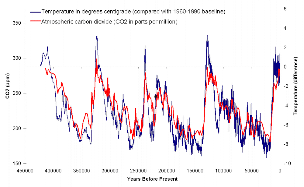
This is the traditional form. You see a plot like this:

with the observation that CO2 peaks and rises lag temperature rises by a few hundred years. That article starts:
"There are still people who insist that changes in CO2 can explain the pattern of glacial and interglacial periods."
but doesn't say who they are. Know anyone? It's not the IPCC! In the AR3, in 2001 with the evidence very recent, they weren't sure, but had no trouble with the idea that CO2 lags temperature:
" From a detailed study of the last three glacial terminations in the Vostok ice core, Fischer et al. (1999) conclude that CO2 increases started 600 ± 400 years after the Antarctic warming. However, considering the large uncertainty in the ages of the CO2 and ice (1,000 years or more if we consider the ice accumulation rate uncertainty), Petit et al. (1999) felt it premature to ascertain the sign of the phase relationship between CO2 and Antarctic temperature at the initiation of the terminations."

Fluctuations in recent CO2

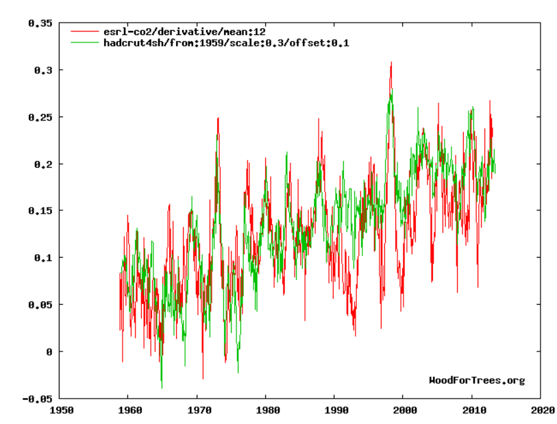
For a while now, variants of graphs matching short-term changes in CO2 with temperature have been circulated, popularized particularly by Murry Salby in various lectures (though not written documents). An apostle is a commenter called Bart, or Bartemis. In a typical version, the annual difference of CO2 is said to be predicted by the difference between average temperature anomaly and an "equilibrium value", which is a fudge parameter. Plots like this are shown:

It shows Southern Hemisphere temperature compared with the annual difference of the CO2 series, with an offset to get them to match. It shows a good correspondence of the El Nino peaks, and some ability to trach the other short term ups and downs.

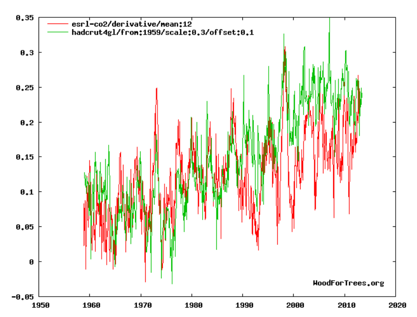
Why the SH, you might ask? Bart says it's not a cherry pick, but is because the SH has most ocean. And yes, the global temp is not so good:

The peaks still line up, but the trends drift apart. NH is worse. The reason is that the SH had a particular ability to match the fairly modest rate of temp rise with the longer termCO2 difference trend, while keeping the scaling right. Other plots don't. It's hard to see that as an ocean effect.

It illustrates the main issue. Diffencing the CO2 curve emphasises the short term fluctuations in what is otherwise a rather boring CO2 history. But it is the long term AGW rise that is of interest, and differencing suppresses that. The trend would have been there as a constant, except that the two curves are arbitrarily displaced to match, so even that has gone. The wiggle matching in no way explains the main effect - the 30% or so increase in CO2 since we've been emitting.

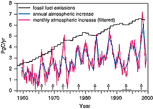
This is clearly shown in the equivalent AR3 plot of differenced CO2:

Now the differences are not displaced, and are clearly positive. It's that steady positive value that is to be explained. And the AR3 shows the explanation - the emissions, which are much steadier, but rise with the air increases, and always exceed them. The question is not how the CO2 got into the atmosphere, but where some of it went.

Predicting CO2

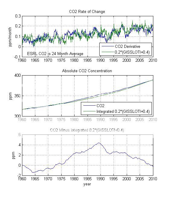
That wiggle matching has been going on for a while, but Bart also has a plot which does try to do the right thing - to integrate his differential form and predict CO2 rise from temperature (his plots here). He calls it "very high fidelity":


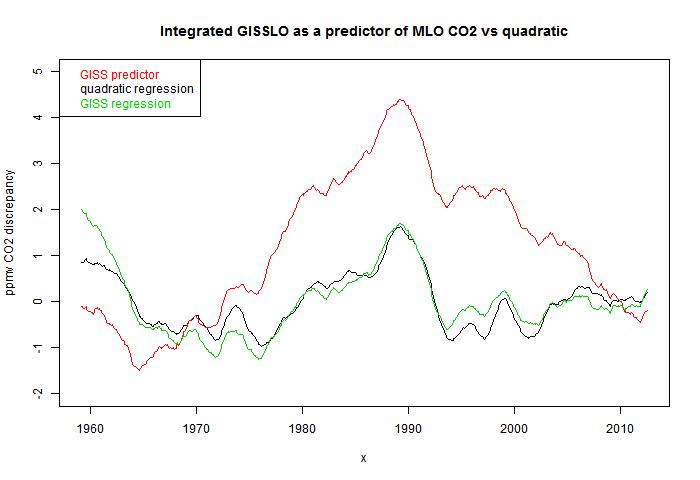
But is it? I've reproduced the last plot, the differences in red, here, along with a quadratic regression in black:

Here the CO2 curve is just 24-month smoothed, and the temperatures were modified as integrated 0.184*(GISSLO-0.424). These are slightly different to Bart's. I used his numbers first, but the curve was rather different; with these parameters it looks the same. There may have been some rounding. In any case, the point is that the quadratic regression fits much better than the GISS derived version.

But the quadratic version could have been expressed as integrated 8.832E-5*(t-429) where t is time in months from the start (Feb 1959). It's of the same form as the GISSLO fit, but using t instead of GISSLO. So simple date is a better predictor than temperature!

Well, not quite. In fairness, I should optimise the coefficients by regressing against GISS as I did against time. That gives the green curve in the above plot. It's very close to the time regression. So a better conclusion is that GISS is no better that time. On the longer term, there is absolutely no basis for saying that temperature drives CO2.

Conclusion

Short term temperature fluctuations, like ENSO, cause short term CO2 fluctuations of a few ppmv. And very large longer term fluctuations, like Ice Age terminations, cause larger fluctuations of up to 100 ppmv. All dwarfed by the current increase, which is clearly driven by our emissions.

Differencing the recent CO2 history shows up short term fluctuations, which show this matching. But this says nothing about the effect of our steady emissions, which differencing and translating removes. When the differenced version is integrated as a predictor, it offers no benefit.


IPCC derivative

Monday, August 12, 2013

TempLS global temp down 0.03°C in July


The TempLS monthly anomaly for July 2013 was 0.469°C, compared with 0.499° in June. This continues a sequences of small changes. Satellite indices decreased more.

Here is the spherical harmonics plot of the temperature distribution:


Warm spots in East US and N Europe. Australia also continued its long warm spell. Arctic rather cool.


And here is the map of stations reporting:


Monday, August 5, 2013

Buffers, pH and ocean acidification

This post is a followup to some recent discussion of ocean acidification at Climate etc, which provoked scorn from Stoat, and in turn snark from WUWT.

Inevitably, the first comments are along the lines of "can't be acidification until pH7" (never with a reference). I blogged on that here. I'd like to take up two points from that - Lewis acidity and buffers. The general aim of this post is to put pH in context. It's over-used.

Lewis Acid

Early definitions of acidity relied on the properties of hydrogen ions, and of course pH is central. But in 1923, Lewis generalised the notion of acidity to the sharing of electron pairs, which needn't involve hydrogen.

That's an important simplification. In fact, H+ has very little final role in the seawater reactions. You can express them as:
CO2 + CO3-- + H2O ⇌ 2HCO3-
Ca++ + CO3-- ⇌ CaCO3
No protons, but the Lewis acid CO2 reacts with the base CO3--, shifting the solubility equilibrium.

Buffers

Buffering is often thought of as pH buffering, but again I'll aim to generalise. In fact, it's just a consequence of ternary equilibrium:
H + A ⇌ HA
The Law of Mass Action gives the equilibrium relation:
[H][A]/[HA] = K
If K is of moderate size, and [H] is small relative to [A] and [HA], then whether the reaction moves back or forward, [H] remains relatively fixed because the dominant species don't change much in proportion.

The familiar pH version arises when HA is a weak acid and [A] a weak base. Then [H+] is small, and relatively fixed (buffered) by the equilibrium.

A common sceptic scoff at acidification is, how could so few H+ ions make a difference? At one level it's right - they can't directly. But what buffering means is that if [H+] changes, then something else has changed, by a lot. And that is what is likely to cause changes.

Sea-water reactions

These were listed above:
CO2 + CO3-- + H2O ⇌ 2HCO3-
Ca++ + CO3-- ⇌ CaCO3(aragonite)
I'll ignore the effects of hydration of both H+ and CO2

There is an excellent review article by Zeebe which sets this out in much more detail, and I'll refer to it later.

The effect is that when CO2 is added, the first equilibrium shifts to the right, CO3-- is diminished, shifting the second equilibrium to the left. The equations can be combined:
CO2 + CaCO3 + H2O ⇌ 2HCO3- + Ca++
This emphasises that ultimately each extra molecule of CO2 tends to dissolve a molecule of CaCO3, if equilibrium shifts to the right.

pH Equilibrium relations

The equilibria can also be expressed as the more traditional diprotic acid-base expressions

CO2 + H2O ⇌ HCO3-+ + H+; pKa=5.94

HCO3- ⇌ CO3--+ + H+: pKa=9.13
The pKa values are the log10 of the equilibrium constants.
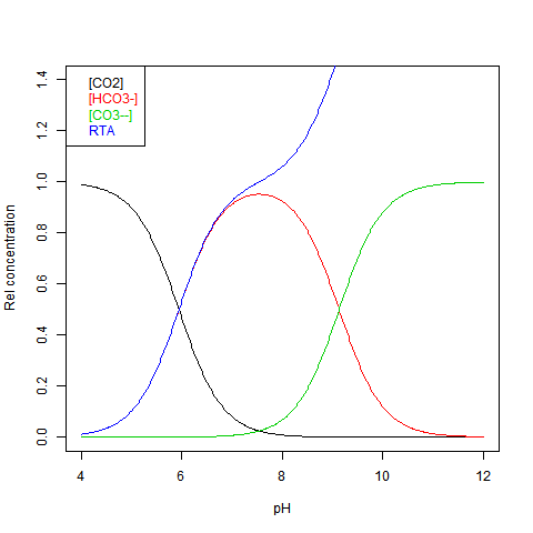
The equilibrium can be shown against pH as Bjerrum plot. This shows relative concentrations normalised against DIC = dissolved inorganic carbon. This is just the sum:
DIC=[CO2]+[HCO3-]+[CO3--] Here is the plot:

RTA stands for Relative (to DIC) Total Alkalinity - see next.

Equilibrium relations - some numbers

I'm following the Zeebe review article here. Typical values for dissolved species:
  • DIC 2.05E-3 M (M = 1 mol/l ~ mol/kg)
  • Total Alkalinity=[HCO3-]+2*[CO3--] = 2.35E-3 M
  • ratio %: [CO2]:[HCO3-]"[CO3--]=0.5:89:10.5 at pH 8.2
  • So [CO2]=1E-5 M, [HCO3-]=1.82E-3 M, [CO3--]=2.1E-4 M
  • At pH 8,2, [H+]=6.3E-9 M; [OH-]=1.6E-6 M;

Sea Water measurement

Eli had a post arising from these threads on pH measurement. It's hard. However, there is a new method, probably less accurate, but suitable for continuous monitoring. It uses an ion-selective field FET, SeaFET, which can be set in place for months at a time. But, as insisted here, pH is over-emphasised. It follows the major species, and they can be used to measure it. Two quantities easily measured by flask analysis are all you need. One is DIC. This can be measured gravimetrically. The other is Total Alkalinity (TA) TA=HCO3-]+2*[CO3--] This can be determined by acid titration with an indicator that changes about pH=4.5, which removes almost all bicarb and carb. The titration also picks up borate and hydroxide, and [H+] needs to be subtracted, but these are small effects which I will ignore here. All you need are the values of DIC and TA - both easily obtained by flask analysis. The point is they are present in much larger concentrations, and are more stable.

Use of equilibrium relations

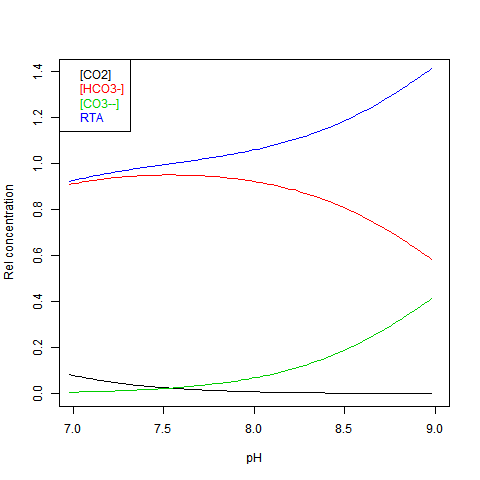
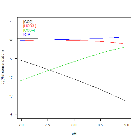
Given DIC for normalisation and any other concentration (in particular TA), you can read a pH value from the Bjerrum plot, and deduce everything else. But here are some more convenient log plots. Firstly with pH again on the x-axis, but log10 on the y-axis. Note that both log([CO3--]) and log([CO2]) vary close to linearly
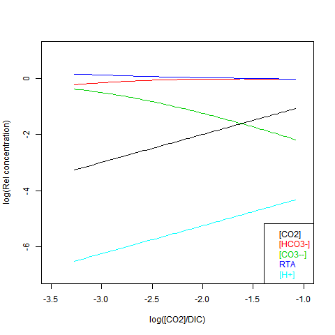
Now shifting the relative total alkalinity RTA to the x-axis. This allows the other values to be read explicitly:
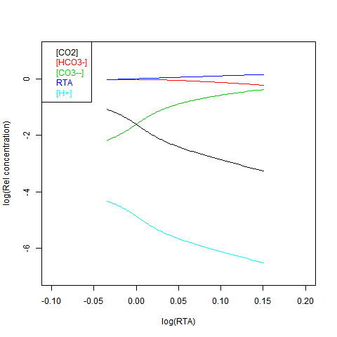
 
RTA is easily obtained, but doesn't preserve the linear relations. Here is log([CO2]) on the x-axis:

Solubility equilibrium

The end problem is dissolution of CaCO3 structures. Two reasons are sometimes given why this may not matter

  • Biological deposition is complex - not just a solubility product
  • The oceans are supersaturated relative to aragonite formation (the CaCO3 form used by most organisms).
Deposition is complex, though I have trouble believing that reducing [CO3--] won't make it harder. But in any case, the structure once formed has to resist solution, at all times, when conditions are fluctuating. Another reason advanced for unconcern is that pH continuously monitored shows fluctuations large relative to the long term changes wrought by CO2 increase. It's not clear whether these track changes in carbonate, but if they do, then clearly the structures are intermittently exposed to dissolving conditions much worse than average. And dissolving once is enough.

Discussion

What I hope these plots will show is that pH is just one of a number of co-varying quantities, and because of the small number of ions represented, is far from the most important. You can use it to track the reaction if convenient, but you don't have to. It's an intermediate - the nett reaction is CO2 neutralising CO3--, producing HCO3-. This then affects the CaCO3 solubility equilibrium. The secondary role of pH is relevant to the following things that have been said in the acidification discussions:
  • "Acidification requires pH<7
    pH is just an indicator of the carbonates equilibrium. pH 7 has no relevance.
  • The number of H+, even with acidification, is too small to matter
    True, H+ are not the problem
  • pH measurements are sparse and inaccurate
    But not TA/DIC, which is enough.


Sunday, July 14, 2013

June GISS Temp up by 0.12°C

GISS LOTI went from 0.55°C in May to 0.67°C in June. Since TempLS rose by only a small amount, this is an unusually large discrepancy. Satellite lower troposphere temperatures also rose by even greater amounts.


Here is the GISS map for June 2013:


And here, with the same scale and color scheme, is the earlier TempLS map for June:


Previous Months

May
April
March
February
January
December 2012
November
October
September
August
July
June
May
April
March
February
January
December 2011
November
October
September
August 2011

More data and plots


Thursday, July 11, 2013

TempLS global temp up 0.02°C in June


The TempLS monthly anomaly for June 2013 was 0.498°C, compared with 0.48° in May. Satellite indices rose by about 0.2°C, but from a low base.

Here is the spherical harmonics plot of the temperature distribution:


The pattern is oddly similar to last month, with a cold spot in central Asia and warmth each side, and W Europe and India cold. But the Alaska warmth shows up.


And here is the map of stations reporting: