I've put up two recent posts which show temperature results for individual stations using a shaded mesh. One shows
monthly anomalies relative to 1961-1990, or 1975, and the other shows
trends. There's an interesting spatial consistency, with exceptions.
The exceptions may be climate. But they may also be the effects of things happening to stations. This is what homogenization is designed to overcome, and I think there are some good illustrations here.
I usually use GHCN unadjusted readings, mainly because people like to argue over adjustments, and I think for the headline effects they don't make much difference. But these spatial plots show that they can, and it's probably for the good.
Nitchequon
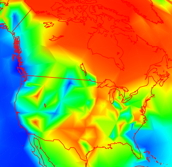
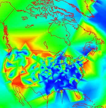
I mentioned in the monthly post the strange behaviour of this cold place in Quebec. Here are a couple of snapshots:
 |  |
| October 2012 | June 2012 |
You can see the big blue dip in NW Quebec. That's caused by Nitchequon. The plots are of anomalies wrt 1961-1990. The same thing is seen in most recent months. It always seems unusually cold in Nitchequon.
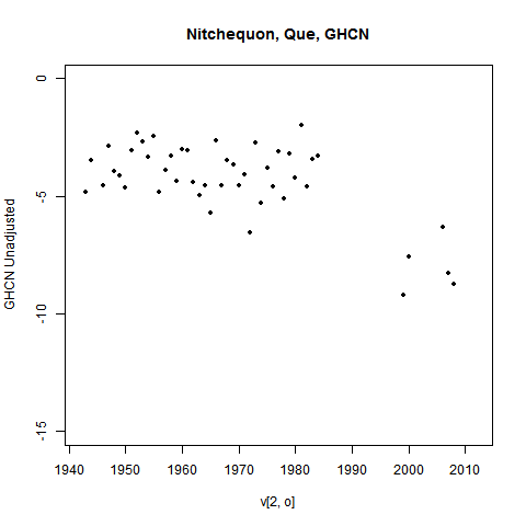
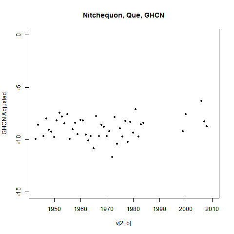
But it's likely that that is because it was never as warm (in 1975 etc) as we thought. Here is the unadjusted GHCN history:

You can see a lot of missing years from 1984 to 2000 and even later. I've omitted years with less than 9 months of data, but that isn't the issue. Most of those years had none at all. And there's a lot of scope for something to have changed during the gap.
The GHCN adjustment process picked this up. Here's what they have:

Those past temperatures have been adjusted down. That would stop Nitchequon standing out as a place of ongoing (relative) cold.
Ideally, I'd show you the plot with recalc anomaly base. But I haven't done that, because as
foreshadowed, I'm moving away from using a past basis at all.
Update - see below for another example
Trends
Trends are more subject to measurement vagaries, especially long term trends. And this tends to show up as visible inhomogeneity. My trend plot now offers the option of using adjusted data.
Here is a picture of 30 year trends (to present) in N America

It's a bit more irregular in the US that Canada (this often seems to happen), but not too much. But going further back, to 1892, you get this:

Data is rather sparse in Canada now, but the US shows a lot of variability. How much is due to measurement vagaries?
Well, here are the corresponding adjusted plots:
 |  |
| Adjusted GHCN 1982-2011 | Adjusted GHCN 1892-2011 |
You can see that the shorter term makes not much difference, but the longer term smoothes a lot. This is of course not surprising - it's what homogenization should do. I'm just noting that it does, and there did appear to be a problem.
Still, it's not always like that. Here's what homogenization does in Europe for 1892-2011:
 |  |
| Unadjusted GHCN 1892-2011 | Adjusted GHCN 1892-2011 |
It wasn't bad before adjustment, and may be worse after.
No real conclusions here, though I do notice a pattern suggesting that inhomogeneity is more of a problem in the US. But you can try your own cases.
Update - another Nitchequon
I went looking for more examples. Some really stand out. Here are the last three months of a place listed as SHAHRE... in W Iran (It is the city of
Shahr-e-kord).
 |  |  |
| October 2012 | Sep 2012 | Aug 2012 |
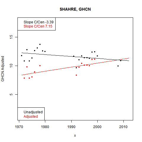
I've shown the last with mesh lines. The pattern continues back. And the cause is evident in the data, this time shown on one plot:

Again, big gaps in the data, and the base period adjusted down in GHCN.


