Tuesday, October 16, 2012

New ISTI temperature dataset - station trends map


This is my second post on the new beta release of the ISTItemperature database. The first post was a Google Maps interactive map of the stations. This time we have an interactive global trend map in the style I did for GHCN.

Again, the dataset is large, and takes a few seconds to load, so I have put it below the fold. It is a globe that shows individual station trends with shading on a triangular mesh. The shading color is accurate at the stations themselves. You can display the stations and mesh, and click to pick up the numerical information. There is a little navigator map that lets you reorient the globe as you wish. Maps are available for periods of 30, 45 and 60 years to present. You can magnify 2x, 4x or 8x.

I should emphasise that these are trends for individual stations - there is no modelling or smoothing, except for the triangle shading interpolation. I find that valuable in that it shows the spatial correlation (or lack of). I was interested to see if the larger ISTI set gave a similar result to GHCN.

I think it does. A notable feature of all these plots, whether for period averages or trends, is that the US seems more of a patchwork than ROW. This is of course partly the higher density of stations, but I think there really is less coherence. Perhaps there is a quality issue (associated with the large numbers).

Anyway, the map is below the jump. There is some further discussion of the methods in this plot from last November. Below the map I've written a little about the numerics..


your browser does not support the canvas tag


Click on this map to orient the world plot.


Show Stations

Show Mesh


Magnification


Trend period


Station


How the trends are calculated.

The trends are calculated using monthly data over calendar years (So I didn't use 2012 months). There is a tricky issue with seasonality. If you take the trend of a year from autumn to autumn, monthly, you'll get an uptrend even if the year ends as it began. The calendar year is mostly winter to winter or summer to summer, so the effect is much diminished. I allowed for this using the method from TempLS. Instead of just one intercept, I fit (OLS) twelve monthly offsets (means) as well as the slope. This subtracts out the seasonal variation and gives the underlying trend.

Sea Temperatures

As usual I've added SST's by taking a published gridded set and putting artificial stations at the grid centres. Previously I've used ERSST, this time I used HADSST2. The emphasis is on the land data, but the mesh goes haywire without ocean nodes. The HAD grid is coarser, so the ocean trends are more patchy. Because of the arbitrary placement of stations at 5x5 grid centres, it can happen that they appear on land. Please excuse.

Update There are some odd hotspots in southern oceans for the longer time periods. This is an artefact. It is caused by an arrangement I have which enables me to use the same mesh for all three time intervals (meshes take time to download). I use a single mesh with a node for every station with any admissible trend - a station has to have 80% of months reporting to be assigned a trend over a period. Where for a time period a station doesn't have a trend, I assign an interpolated value for coloring purposes. The station is not shown, so the effect should be a minor upset in the shading only. However, there are in those parts some stations which do not have any connected stations with trends (for that time interval - worst at 60 years). Then the interpolation goes wrong, and the shading shows artificial heat. I don't think it happens anywhere on land.


Monday, October 15, 2012

New ISTI Temperature database - stations in Google Maps with GHCN


A few days ago, Peter Thorne of NOAA noted in a comment that a new Initiative ISTI, with NOAA involvement, has released a large new database of surface temperatures. It's on a similar scale to BEST, and I'll do comparisons in due course. But as an initial step, I thought it would be useful to gather a Google maps presentation, as I did for GHCN.

The beta release is here. I used the recommended merge (3 Oct version). The data combines TMIN, TMAX and TAVG (and is big!); I extracted the TAVG. There were 39430 stations in the inventory.

This is a big set for the GM application, so I've divided it into 8 regions with about 5000 each. You can look at them all at once if you like, but it will run very slowly. Selecting one or two regions is much better. There is a little map at the right of the display showing where they are. Because the data takes several seconds to download, I've put the map beneath the fold.

The idea of the map is that it shows stations with tags with information that you can pop up by clicking. But the main use is that you can filter by categories. You can choose ranges of start date (of data), end date, duration and altitude. The mechanics are that you make these selections, select regions, and then press one of the colors (for tag). What you've asked for will appear in that color, additional to what was there before. A special (and useful) color is invisible. The range choices combine with "or" logic, so you get "and" by making what you don't want go away. Because it is "or", you need to suppress the "All" button to make other choices. The buttons toggle. The middle columns with gt and lt signs also toggle.

I've included GHCN stations for comparison. There is a checkbox for each database. To compare you'll probably want to display in one color with one box ticked, and in another with the other box ticked (only one at a time). The green pin is useful here, in case of overlaps.

The map starts out blank, waiting for you to choose a region (or two). It's below the jump:


Usage

The map initially shows no markers. You need to select regions. I'd recommend starting with just one. If you click one of the marker colors, you'll then see a mass of markers in that region. You can filter some out with the invisible button - remember to toggle the "All" button when making selections. You could filter out, say, all stations starting after 1850. The selections are only operative if the left radio button is on.

You can ask for a different selection and a different color. It is the color request that creates actions. This second request doesn't erase markers already showing, though it will change the colors of those that qualify.

Note that choosing a small number of regions helps with performance, but other choices which reduce tags on screen do not help (the tags are there but invisible).

Worked example

I was curious about whether ISTI had more really old data than GHCN. As I found earlier, BEST v1 has a similar number of stations overall, but little new before 1850. So I did this:
  1. Set Region 6
  2. Unset All, set StartYr, and change the textbox to 1800.
  3. Under Actions, click Yellow.
  4. Unset ISTI, set GHCN
  5. Under Actions, click Pin.
So I see a lot of yellow tags in Europe, some with green pins, and some green pins on their own. Clicking on the pins brings up info including start dates. Some things I notice:
  • In UK, GHCN has Gordon Castle, Greenwich and Manchester. ISTI doesn't, but has a Central England, which may cover the last two.
  • Both have a Trondheim in the right place, with similar dates (ISTI 1761-2012, GHCN 1761-1981). But ISTI has TRONDHEIM_VAERNES, about 2.5° further E, from 1762-2011. Duplicate?
  • GHCN has Lund, 1753-1773. ISTI not.
  • ISTI has two Budapest records, both starting in 1780. GHCN has one.
    ISTI has San Fernando, from 1786, GHCN not.
  • ISTI has two Prague records (PRAHA-KLEMENTINUM,PRAHA-RUZNY), one starting in 1771, the other in 1775. GHCN has Praha-Ruzyne.
  • ISTI has a record for Vienna and one for Wien. Both start in 1775.
  • ISTI has OBERSCHLEISSHEIM and UCCLE (Belg), GHCN not.

So ISTI has a few extras in that period in Europe, some of which may be duplicates.


Saturday, October 13, 2012

September GISS Temp up 0.03°C


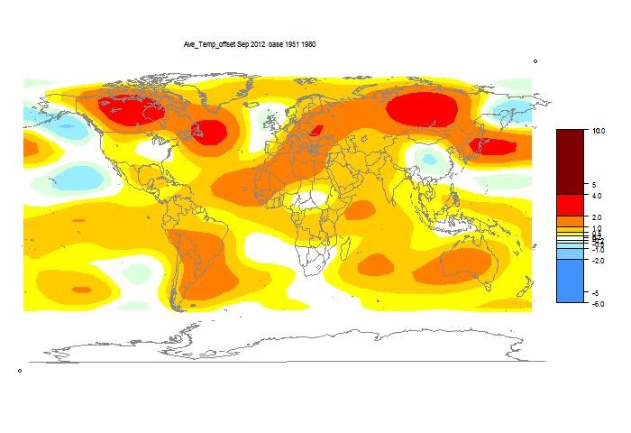
The TempLS analysis, based on GHCNV3 land temperatures and the ERSST sea temps, showed a monthly average of 0.53°C for September, up from 0.49 °C in August. Last month also showed a higher rise with late data. There are more details at the latest temperature data page.

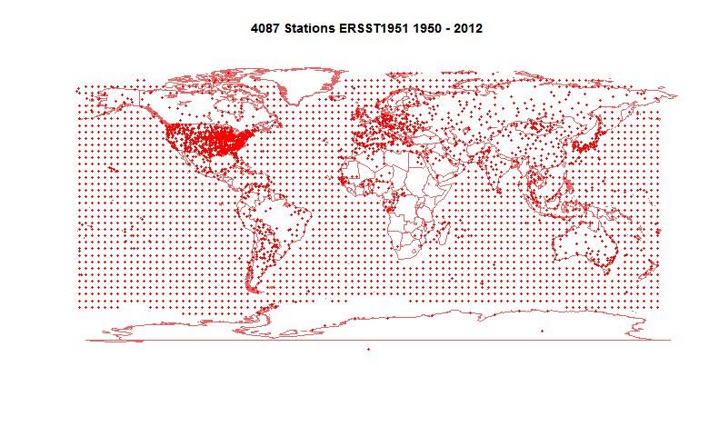
Below is the graph (lat/lon) of temperature distribution for September. I've also included a count and map of the stations that have reported to this date.


This spherical harmonics plot is done with the GISS colors and temperature intervals, and as usual I'll post a comparison when GISS comes out.

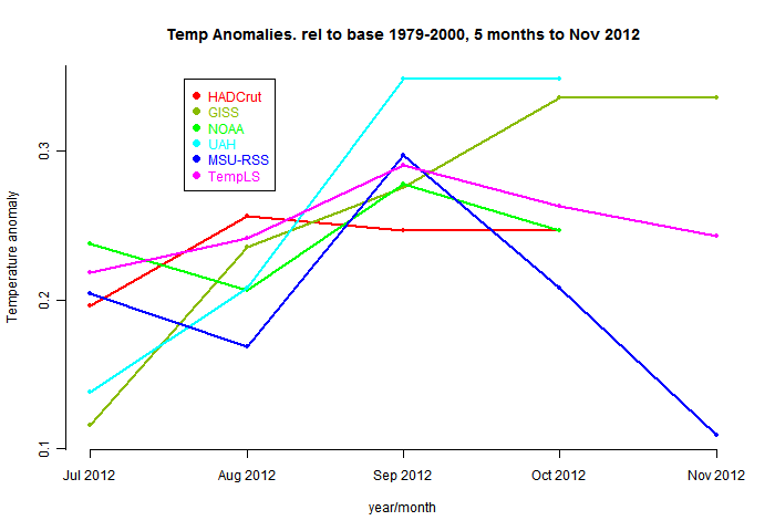
And here, from the data page, is the plot of the major indices for the last four months:


Here is the map of 4087 "stations" which contributed to this report.


Thursday, October 11, 2012

Fancy graphics and climate data

Over the last two years I've been exploring various ways of using interactivity to make climate data more accessible and attractive. I've been trying to maintain a gallery, but that takes time, and the effort has been lagging.

So I want to write a post which just summarizes the techniques used, to act mainly as a catalogue with pointers.

Here is a table of headings


KML, Google EarthSpaghetti graphs
Trend plotsEarth projections
HTML 5 and triangle meshesWebGL
Google MapsClimate Plotter

KML, Google Earth

The first thing I tried was writing Google Earth files, using their API language KML (of the XML family). This was really just to organise the data provided by the various surface temperature collectors (GHCN, GSOD, CRUTEM, BEST etc. I could show the stations with various colored and sized pins; summary information would appear in balloons on clicking. Then I found an even more useful capability with folders. GE lets you turn the folders on and off. So if I list stations in folders according to their decade of commencement, for example, the user can show a plot with and range of decades he wants.

The downside is that the user needs to download the KML files, or KMZ (a zipped equivalent). They are not excessively big. I have a collection here.

Anyway, the posts on this are here:


Fun with Google Earth, GSOD and KML

More Google Earth station data

Still more KML and Google Earth

GHCN KML visualisation by years

GE visualisation of changes to GHCN stations 1990...

A KMZ file for the BEST stations

A combined KMZ file for BEST, GHCN, GSOD and CRUTE...

Spaghetti graphs

I then looked at different ways of making "spaghetti" graphs (many tangled curves) more readable. I began with just color experiments, then fancy patterns, then a GIF animation (more here and here). But a suggestion from Eli, with advice from TheFordPrefect, got me using Javascript.

The user could, by hovering the mouse, select individual components of the plot in black contrast. Another such plot here included a general R program for generating code from a CSV data file. And this ice extent plot doesn't pick out curves but lets you focus on time ranges.

Trend plots

This series started with a ordinary graphic which showed, in a color triangle, how the total of possible trends from a single time series, over any time interval could be visualised. However, this was then adorned with JS facilities for choosing different datasets,. Then options were added so that the time series would be simultaneously plotted and the interval in question, and its trend, displayed. This would be updated by clicking on the colored triangle, or by controls on the time series graph. Numerical information, including later confidence limits, could be displayed. Here is a list:
A JS gadget for viewing temperature trends.
A picture of statistically significant warming.Observed SST and model trends
Significant trend differencesSignificant trends in Foster/Rahmstorf
Combined GMST trend viewer

Earth projections

I've never been happy with the various projections which attempt to render the whole earth on a page. I have preferred spherical projections, even though it requires several views. But JS creates a Google Earth like possibility - a spherical projection in which you can adjust the viewpoint.

Every month recently I have published a flat projection of a spherical harmonics fit to the temperatures anomalies, so this was a clear candidate. The globe views were typically from the corners of a surrounding cube. Examples are here:

A Javascript worldview for surface temp.April 2012 temperatures up 0.2°C

HTML 5 and triangle meshes

HTML 5 Canvases are relatively new. They offer huge flexibility for interactive graphing. This was developed in the climate plotter to be described, but the first application was to shading global plots. The canvas lets you prescribe colors at the corners of a triangle and it will then shade continuously between them, or at least between two of them. Getting all three right is harder to manage, unlike with Gouraud shading that does it automatically.

The big merit of this is that I can show temperature anomalies with no model fitting, so that colors will be correct at the stations. With the above caveat, it may be that only two thirds will be exactly right, but that's enough to see what is going on. When that is done, the mesh and stations can be shown, and the user can click to bring up station names and details. Again, a spherical projection is used, and can be user-rotated to an arbitrary view. I provide a navigator map (flat projection) on which you can click to choose the point to focus on. Examples are here:

Nov temps displayed with HTML 5Cherrypicker's guide to station trends
Visualizing 2011 temperature anomalies

WebGL

This new facility, described in a recent post, makes available the full power of GL, and is potentially an improvement on HTML5 with spherical triangle meshing. However, support from browsers is still patchy, and the JavaScript that implements it is more difficult to modify - GL has its own style that it is perilous to disrupt. Some day it will be the best option.

Google Maps

This is a different style of using Javascript. It creates the facilities of GE with KML, but in a browser window. Google makes its API available, and as in Maps style the globe can be traversed and flags shown of coded colors, with balloons of information in response to clicking etc. Control is by the familiar JS gadgets of radio buttons etc.

Google Maps display of GHCN stations, with Javas...

Climate Plotter

I think the most advanced use of Javascript and HTML 5 is with the Climate Plotter. This interactively draws plots from a store of annual climate data. You can form regressions (of just about anything with anything); you can plot against an image background. You can interactively rescale, show different axes with different units; adjust anomaly basis intervals. The history is here:


Interactive JS climate plotter (update)Interactive climate plotting news.
Interactive JS plotter Ver 2


Snafu with comments

Probably in conjunction with my introducing the Captcha system, my system imposed moderation. I didn't realise this, and so the queue built up. My apologies here, especially to Girma. I've released all the comments. I've also removed the Captcha for the moment. I'll try to make sure moderation is not re-imposed.