The main purpose of this post is to note that the daily NCEP data is now regularly updated here. As with TempLS mesh, there is a kind of Moyhu effect whereby when I set up a system like this and want to tell everyone about it, there is a hiatus in the data source. This time I think it is just Thanksgiving.
Anyway, the global story it tells is that there was a cool dip around Nov 13, at the height of the N America freeze, and a second a few days later. Currently (to Nov 24) the average anomaly for Nov is 0.157°C, compared with 0.281°C in October. I think this will pan out to November being about 0.1°C cooler than October in the surface temperature indices.
What does this mean for talk of a surface record 2014? I think it is neutral. To reach a record, month temperatures have to exceed on average the 2010 average, and it looks like November will be close to that number. For example, GISS Oct was 0.76; 2010 average 0.66. This may matter for GISS, which was only just above the average anyway to date. NOAA and HADCRUT have a greater margin.
Update: Three more days data arrived, and still cool. The month average is now down to 0.135°C, a drop of about 0.15 from October. That is negative for GISS record prospects.
Sunday, November 30, 2014
Tuesday, November 25, 2014
Daily reanalysis NCEP/NCAR temperatures with WebGL.
In a previous post I described how a global index could be created simply by integrating the surface temperature data provided by NCEP/NCAR. This data is to within last few days, and I've described here how numerical data is maintained on the latest data page.
As gridded data, I then sought to display the daily temperature anomalies (base 1994-2013) with WebGL, and that is shown here. I'm also planning to maintain this, on the latest data page if it does not drag out loading. Currently the daily data is just for 2014, although that is easily extended.
So it's below the fold. As usual, the Earth is a trackball that you can drag, zoom (right mouse) and orient (button). I'm trying a new way of choosing dates. High on right there is a tableau of small squares, each representing one day. Click on this to choose. It's all a bit small, but to the left of the Orient button, you'll see printed the date your mouse is on. So just move until the right day shows, and click.
Because temperature ranges are large, it has been quite hard to get the colors right. You might like to look at the recent North American cold spell for shades of blue. Incidentally, I see that the global average has slipped again, so November looks like a much cooler month than recently.
Monday, November 24, 2014
Updates to latest data page
Blogger tells me that of the Moyhu pages, latest data is the most viewed. I'll be adding to it, so I thought I should improve the organization, and also the load time. I've also added my version of the reanalysis index for recent days and months.
It now has a table of contents and links. Tables are in frames with an "Enlarge" toggle button. I'm planning to add webGL plots (next post) for NCEP/NCAR (and maybe MERRA if I can get Carrick's ideas working) daily data. Again I have to not overburden download times.
It now has a table of contents and links. Tables are in frames with an "Enlarge" toggle button. I'm planning to add webGL plots (next post) for NCEP/NCAR (and maybe MERRA if I can get Carrick's ideas working) daily data. Again I have to not overburden download times.
Saturday, November 22, 2014
Update on 2014 warmth.
A month ago I posted plots to see whether some global indoces might show record warmth in 2014. The troposphere indices UAH and RSS are not in record territory. But others are. NOAA has just come out with an increased value for October, so a record there is very likely. The indices here all improved their prospects in October. HADCRUT is still to come.
In the previous post, I noted that the reanalysis data for November showed a considerable dip mid-month, corresponding to the North America freeze. November will probably be cooler than October - my guess is more like August.
Plots are below, showing the cumulative of the difference between month ave and 2010 annual average, divided by 12 (so final will be the difference in annual averages). NOAA and HADCRUT look very likely to reach a record, and also the TempLS indices. Cumulatively GISS is currently just above the 2010 average, but warm months are keeping the slope positive.
Update - just something I noticed. About 3 months ago I commented how closely NOAA and TempLS were tracking. TempLS has since produced a new version, mesh-based, which tracks GISS quite closely. But the relation between old TempLS, now called TempLS grid, and NOAA is still remarkably close. Last month, both rose by 0.042°C. The previous month, small rises - TLS by 0.012 and NOAA by 0.014.
This time I'll just give the active plot with the 2010 average subtracted. There is an explanatory plot in the earlier post. The index will be a record if it ends the year above the axis. Months warmer than the 2010 average make the line head upwards.
Use the buttons to click through.
![]()
In the previous post, I noted that the reanalysis data for November showed a considerable dip mid-month, corresponding to the North America freeze. November will probably be cooler than October - my guess is more like August.
Plots are below, showing the cumulative of the difference between month ave and 2010 annual average, divided by 12 (so final will be the difference in annual averages). NOAA and HADCRUT look very likely to reach a record, and also the TempLS indices. Cumulatively GISS is currently just above the 2010 average, but warm months are keeping the slope positive.
Update - just something I noticed. About 3 months ago I commented how closely NOAA and TempLS were tracking. TempLS has since produced a new version, mesh-based, which tracks GISS quite closely. But the relation between old TempLS, now called TempLS grid, and NOAA is still remarkably close. Last month, both rose by 0.042°C. The previous month, small rises - TLS by 0.012 and NOAA by 0.014.
This time I'll just give the active plot with the 2010 average subtracted. There is an explanatory plot in the earlier post. The index will be a record if it ends the year above the axis. Months warmer than the 2010 average make the line head upwards.
Use the buttons to click through.
Tuesday, November 18, 2014
A "new" surface temperature index (reanalysis).
I've been looking at reanalysis data sets. These provide a whole atmosphere picture of recent decades of weather. They work on a grid like those of numerical weather prediction programs, or also GCM's. They do physical modelling which "assimilates" data from a variety of sources. They typically produce a 200 km horizontal grid of six-hourly data (maybe hourly if you want) at a variety of levels, including surface.
Some are kept up to date, within a few days, and it is this aspect that interests me. They are easily integrated over space (regular grid, no missing data). I do so with some nervousness, because I don't know why the originating organizations like NCAR don't push this capability. Maybe there is a reason.
It's true that I don't expect an index which will be better than the existing. The reason is their indirectness. They are computing a huge amount of variables over whole atmosphere, using a lot of data, but even so it may be stretched thin. And of course, they don't directly get surface temperature, but the average in the top 100m or so. There are surface effects that they can miss. I noted a warning that Arctic reanalysis, for example, does not deal well with inversions. Still, they are closer to surface than UAH or RSS-MSU.
But the recentness and resolution is a big attraction. I envisage daily averages during each month, and WebGL plots of the daily data. I've been watching the recent Arctic blast in the US, for example.
So I've analysed about 20 years of output (NCEP/NCAR) as an index. The data gets less reliable as you go back. Some goes back to the start of space data; some to about 1950. But for basically current work, I just need a long enough average to compute anomalies.
So I'll show plots comparing this new index with the others over months and years. It looks good. Then I'll show some current data. In a coming post, I'll post the surface shaded plots. And I'll probably automate and add it to the current data page.
Update: It's on the data page here, along with daily WebGL plots.
I've been fosussing on NCEP/NCAR because
There are two surface temperature datasets, in similar layout:
SFC seems slightly more currently updated, but is an older set. I saw a file labelled long term averages, which is just what I want, and found that it ended in 1995. Then I found that the reason was that it was made for a 1996 paper. It seems that reanalysis data sets can hybridize technologies of different eras. SFC goes back to 1979. I downloaded it, but found the earlier years patchy.
Then I tried sig995. That's a reference to the pressure level (I think), but it's also labelled surface. It goes back to 1948, and seems to be generally more recent. So that is the one I'm describing here.
Both sets are on a 2.5° grid (144x73) and offer daily averages. Of course, for the whole globe at daily resolution, it's not that easy to define which day you mean. There will be a cut somewhere. Anywhere, I'm just following their definition. sig995 has switched to NETCDF4; I use the R package ncdf4 to unpack. I integrate with cosine weighting. It's not simple cosine; the nodes are not the centers of the grid cells. In effect, I use cos latitude with trapezoidal integration.
Here is an interactive user-scalable graph. You can drag it with the mouse horizontally or vertically. If you drag up-down to the left of the vertical axis, you will change the vertical scaling (zoom). Likewise below the horizontal axis. So you can see how NCEP fares over the whole period.
The mean for the first 13 days of November was 0.173°C. That's down a lot on October, which was 0.281°C. I think the reason is the recent North American freeze, which was at its height on 13th. You can see the effect in the daily temperatures:
Anyway, we'll see what coming days bring.
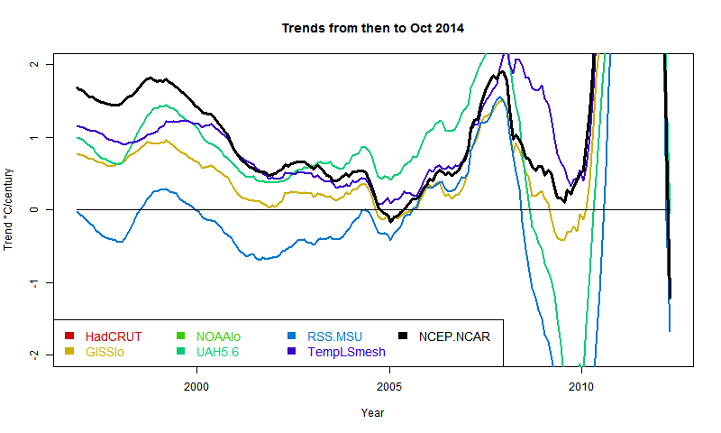
Update (following a comment of MMM). Below is a graph showing trends in the style of these posts - ie trend from the x-axis date to present, for various indices. I'll produce another post (this graph is mostly it) in the series when the NOAA result comes out. About the only "pause" dataset now, apart from MSU-RSS, is a brief dip by GISS in 2005. And now, also, NCEP/NCAR. However, the main thing for this post is that NCEP-NCAR drifts away in the positive direction pre 2000. This could be that it captures Arctic warming better, or just that trends are not reliable as you go back.
Some are kept up to date, within a few days, and it is this aspect that interests me. They are easily integrated over space (regular grid, no missing data). I do so with some nervousness, because I don't know why the originating organizations like NCAR don't push this capability. Maybe there is a reason.
It's true that I don't expect an index which will be better than the existing. The reason is their indirectness. They are computing a huge amount of variables over whole atmosphere, using a lot of data, but even so it may be stretched thin. And of course, they don't directly get surface temperature, but the average in the top 100m or so. There are surface effects that they can miss. I noted a warning that Arctic reanalysis, for example, does not deal well with inversions. Still, they are closer to surface than UAH or RSS-MSU.
But the recentness and resolution is a big attraction. I envisage daily averages during each month, and WebGL plots of the daily data. I've been watching the recent Arctic blast in the US, for example.
So I've analysed about 20 years of output (NCEP/NCAR) as an index. The data gets less reliable as you go back. Some goes back to the start of space data; some to about 1950. But for basically current work, I just need a long enough average to compute anomalies.
So I'll show plots comparing this new index with the others over months and years. It looks good. Then I'll show some current data. In a coming post, I'll post the surface shaded plots. And I'll probably automate and add it to the current data page.
Update: It's on the data page here, along with daily WebGL plots.
More on reanalysis
Reanalysis projects flourished in the 1990's. They are basically an outgrowth of numerical weather forecasting, and the chief suppliers are NOAA/NCEP/NCAR and ECMWF. There is a good overview site here. There is a survey paper here (free) and a more recent one (NCEP CFS) here.I've been fosussing on NCEP/NCAR because
- They are kept up to date
- They are freely available as ftp downloadable files
- I can download surface temperature without associated variables
- It's in NCDF format
There are two surface temperature datasets, in similar layout:
SFC seems slightly more currently updated, but is an older set. I saw a file labelled long term averages, which is just what I want, and found that it ended in 1995. Then I found that the reason was that it was made for a 1996 paper. It seems that reanalysis data sets can hybridize technologies of different eras. SFC goes back to 1979. I downloaded it, but found the earlier years patchy.
Then I tried sig995. That's a reference to the pressure level (I think), but it's also labelled surface. It goes back to 1948, and seems to be generally more recent. So that is the one I'm describing here.
Both sets are on a 2.5° grid (144x73) and offer daily averages. Of course, for the whole globe at daily resolution, it's not that easy to define which day you mean. There will be a cut somewhere. Anywhere, I'm just following their definition. sig995 has switched to NETCDF4; I use the R package ncdf4 to unpack. I integrate with cosine weighting. It's not simple cosine; the nodes are not the centers of the grid cells. In effect, I use cos latitude with trapezoidal integration.
Results
So here are the plots of the monthly data, shown in the style of the latest data page with common anomaly base 1981-2010. The NCEP index is in black. I'm using 1994-2013 as the anomaly base for NCEP, so I have to match it to the average of the other data (not zero) in this period. You'll see that it runs a bit warmer - I wouldn't make too much of that.NCEP/NCAR with major temperature indices - last 5 months  |
NCEP/NCAR with major temperature indices - last 4 years 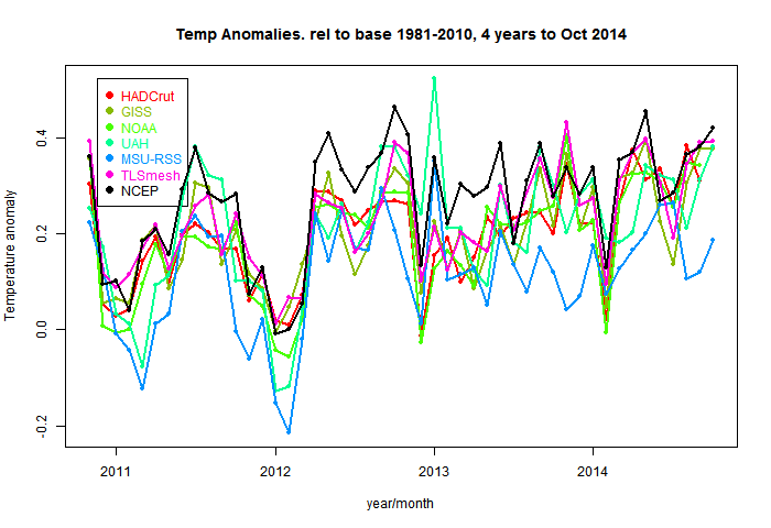 |
Here is an interactive user-scalable graph. You can drag it with the mouse horizontally or vertically. If you drag up-down to the left of the vertical axis, you will change the vertical scaling (zoom). Likewise below the horizontal axis. So you can see how NCEP fares over the whole period.
Recent months and days
Here is a table of months. This is now in the native anomaly bases. NCEP/NCAR looks low because it's base is recent, even hiatic.The mean for the first 13 days of November was 0.173°C. That's down a lot on October, which was 0.281°C. I think the reason is the recent North American freeze, which was at its height on 13th. You can see the effect in the daily temperatures:
| Date | Anomaly |
| 1 | 0.296 |
| 2 | 0.25 |
| 3 | 0.259 |
| 4 | 0.287 |
| 5 | 0.229 |
| 6 | 0.214 |
| 7 | 0.202 |
| 8 | 0.165 |
| 9 | 0.135 |
| 10 | 0.154 |
| 11 | 0.091 |
| 12 | 0.018 |
| 13 | -0.049 |
| 14 | 0.049 |
| 15 | 0.147 |
Anyway, we'll see what coming days bring.
Update (following a comment of MMM). Below is a graph showing trends in the style of these posts - ie trend from the x-axis date to present, for various indices. I'll produce another post (this graph is mostly it) in the series when the NOAA result comes out. About the only "pause" dataset now, apart from MSU-RSS, is a brief dip by GISS in 2005. And now, also, NCEP/NCAR. However, the main thing for this post is that NCEP-NCAR drifts away in the positive direction pre 2000. This could be that it captures Arctic warming better, or just that trends are not reliable as you go back.
Sunday, November 16, 2014
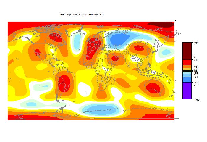
October GISS unchanged, still high
GISS has posted its October estimate for global temperature anomaly. It was 0.76°C, the same as the revised September (had been 0.77°C). TempLS mesh was also almost exactly the same (0.664°C). TempLS grid, which I expect to behave more like HADCRUT and NOAA, rose from 0.592°C to 0.634°C.
The comparison maps are below the jump.
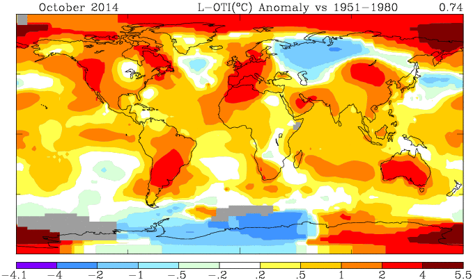
Here is the GISS map:
And here, with the same scale and color scheme, is the earlier mesh weighted TempLS map:
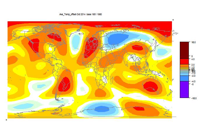
And finally, here is the TempLS grid weighting map:
List of earlier monthly reports
More data and plots
The comparison maps are below the jump.
Here is the GISS map:
And here, with the same scale and color scheme, is the earlier mesh weighted TempLS map:
And finally, here is the TempLS grid weighting map:
List of earlier monthly reports
More data and plots
Saturday, November 15, 2014
Lingering the pause
As I predicted, the Pause, as measured by periods of zero or less trend in anomaly global temperature, is fading. And some, who were fond of it, have noticed. In threads at Lucia's, and at WUWT, for example.
Now I don't think there's any magic in a zero trend, and there's plenty of room to argue that trends are still smaller than expected. Lucia wants to test against predictions, which makes sense. But I suspect many pause fans prefer their numbers black and white, and we'll hear more about periods of trend not significantly different from zero. So the pause lingers.
We already have. A while ago, when someone objected at WUWT to Lord M using exclusively the RSS record of long negative trend, Willis responded
"Sedron, the UAH record shows no trend since August 1994, a total of 18 years 9 months."
When I and Sedron protested that the UAH trend over that time was 1.38°C/century, he said:
"I assumed you knew that everyone was talking about statistically significant trends, so I didn’t mention that part."
And that is part of the point. A trend can fail a significance test (re 0) and still be quite large. Even quite close to what was predicted. I posted on this here.
I think we'll hear more of some special candidates, and the reason is partly that the significance test allows for autocorrelation. Some data sets have more of that than others. SST has a lot, and I saw HADSST3 mentioned in this WUWT thread. So below the fold, I'll give a table of the various datasets, and the Quenouille factor that adjusts for autocorrelation. UAH and the SSTs do stand out.
Here is a table of cases you may hear cited (SS=statistically significant re 0):
These trends are not huge, but far from zero.
So here is the analysis of autocorrelation. If r is the lag-1 autocorrrelation, used in an AR1 Arima model, then the Quenouille adjustment for autocorrelation reduces the number of degrees of freedom by Q=(1-r)/(1+r). Essentially, the variance is inflated by 1/Q. Put another way, since initially d.o.f. is number of months, all other things being equal, the period without statistical significance is inflated by 1/Q.
So here, for various datasets and recent periods, is a table of Q, calculated from r=ar1 coefficient from the R arima() function:
Broadly, SST has low Q, land fairly high, and Land/Ocean measures, made up of land and SST, are the expected hybrid. The troposphere measures, especially UAH, have lower Q, and so longer periods without statistically significant non-zero trend.
Now I don't think there's any magic in a zero trend, and there's plenty of room to argue that trends are still smaller than expected. Lucia wants to test against predictions, which makes sense. But I suspect many pause fans prefer their numbers black and white, and we'll hear more about periods of trend not significantly different from zero. So the pause lingers.
We already have. A while ago, when someone objected at WUWT to Lord M using exclusively the RSS record of long negative trend, Willis responded
"Sedron, the UAH record shows no trend since August 1994, a total of 18 years 9 months."
When I and Sedron protested that the UAH trend over that time was 1.38°C/century, he said:
"I assumed you knew that everyone was talking about statistically significant trends, so I didn’t mention that part."
And that is part of the point. A trend can fail a significance test (re 0) and still be quite large. Even quite close to what was predicted. I posted on this here.
I think we'll hear more of some special candidates, and the reason is partly that the significance test allows for autocorrelation. Some data sets have more of that than others. SST has a lot, and I saw HADSST3 mentioned in this WUWT thread. So below the fold, I'll give a table of the various datasets, and the Quenouille factor that adjusts for autocorrelation. UAH and the SSTs do stand out.
Here is a table of cases you may hear cited (SS=statistically significant re 0):
| Dataset | No SS trend since... | Period | Actual trend in that time |
| UAH | June 1996 | 18 yrs 4 mths | 1.080°C/Century |
| HADCRUT 4 | June 1997 | 17 yrs 3 mths | 0.912°C/century |
| HADSST3 | Jan 1995 | 19 yrs 9 mths | 0.921°C/Century |
These trends are not huge, but far from zero.
So here is the analysis of autocorrelation. If r is the lag-1 autocorrrelation, used in an AR1 Arima model, then the Quenouille adjustment for autocorrelation reduces the number of degrees of freedom by Q=(1-r)/(1+r). Essentially, the variance is inflated by 1/Q. Put another way, since initially d.o.f. is number of months, all other things being equal, the period without statistical significance is inflated by 1/Q.
So here, for various datasets and recent periods, is a table of Q, calculated from r=ar1 coefficient from the R arima() function:
| Dataset | 1990-2013 | 1995-2013 | 2000-2013 | 2005-2013 |
| HadCRUT 4 | 0.1078 | 0.1711 | 0.269 | 0.3092 |
| GISS Land/Ocean | 0.1378 | 0.2155 | 0.2907 | 0.3244 |
| NOAA Land/Ocean | 0.121 | 0.1949 | 0.3186 | 0.3396 |
| UAH5.6 | 0.0789 | 0.1132 | 0.1538 | 0.1837 |
| RSS.MSU | 0.0978 | 0.142 | 0.2 | 0.1814 |
| TempLS grid | 0.1349 | 0.1959 | 0.3298 | 0.3748 |
| BEST Land/Ocean | 0.1201 | 0.1799 | 0.2326 | 0.3081 |
| Cowtan/Way krig | 0.1032 | 0.1642 | 0.2215 | 0.2939 |
| TempLS mesh | 0.1266 | 0.1862 | 0.2698 | 0.3165 |
| BEST Land | 0.2923 | 0.3953 | 0.4608 | 0.4835 |
| GISS.Ts | 0.1465 | 0.2351 | 0.342 | 0.3978 |
| CRUTEM Land | 0.2041 | 0.31 | 0.4614 | 0.5105 |
| NOAA Land | 0.3451 | 0.4795 | 0.6438 | 0.6319 |
| HADSST3 | 0.036 | 0.0504 | 0.0736 | 0.0888 |
| NOAA SST | 0.0178 | 0.0251 | 0.0387 | 0.0514 |
Broadly, SST has low Q, land fairly high, and Land/Ocean measures, made up of land and SST, are the expected hybrid. The troposphere measures, especially UAH, have lower Q, and so longer periods without statistically significant non-zero trend.
Wednesday, November 12, 2014
Seasonal insolation
This post was started by some recent posting at WUWT. It's about the expected thermal effect of the Earth's eccentric orbit. It produces a variable total solar insolation for the planet, which one might expect to be reflected in temperatures. A few days ago, Willis contrasted the small solar cycle fluctuation which this much larger oscillation, suggesting that if we couldn't detect the orbital effect then the solar cycle couldn't be much. And just now, Stan Robertson at WUWT took up the idea, looking for the eccentricity in annual global anomaly indices.
I've also wondered the effect of eccentricity. But when you think about anomalies, it is clear that they subtract out any annual cycle. So the effect can't be found there. And in fact it's going to be hard to disentangle it from axis tilt effect. A GCM could of course run alternatively with a circular orbit, which would determine it.
Anyway, someone posted a plot of average daily insolation against time of year and latitude. That is, at TOA, or for an airless Earth. I was surprised that the maximum for the year was at the solstice at the relevant Pole. I found a good plot and the relevant maths in Wikipedia. So I'll show that below the jump, with a brief version of the math, and a plot of variation with latitude at the solstice. It isn't even monotonic.
So here is the plot, with caption also from Wiki.

 , the theoretical daily-average insolation at the top of the atmosphere, where θ is the polar angle of the Earth's orbit, and θ = 0 at the vernal equinox, and θ = 90° at the summer solstice; φ is the latitude of the Earth. The calculation assumed conditions appropriate for 2000 A.D.: a solar constant of S0 = 1367 W m−2, obliquity of ε = 23.4398°, longitude of perihelion of ϖ = 282.895°, eccentricity e = 0.016704. Contour labels (green) are in units of W m−2.
y axis is latitude, x axis is angle of orbit, starting at the March equinox. You can see the effect of orbit eccentricity in making the S pole warmer. That pole also shows clearly the non-monoticity; there is a pinch near the Antarctic circle.
So here is the Wiki math, using the above notation:
Solve

for ho
Solve

for δ
But here I find a vary rare math error in Wiki. The last term should not have an ω. So I removed it.
Now substituting

in

we have the solution.
I used this to plot the solstice curves:
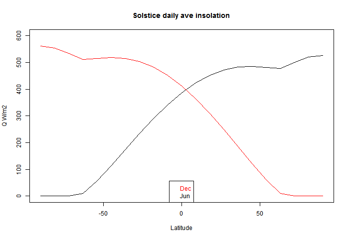
You can see that there is a discontinuity of (2nd - see PP in comments) derivative at the polar circles, where one goes into night, and the other gets the benefit of 24 hr insolation, which is enough to exceed even average daily tropical insolation (of course, without atmospheric losses).
I've also wondered the effect of eccentricity. But when you think about anomalies, it is clear that they subtract out any annual cycle. So the effect can't be found there. And in fact it's going to be hard to disentangle it from axis tilt effect. A GCM could of course run alternatively with a circular orbit, which would determine it.
Anyway, someone posted a plot of average daily insolation against time of year and latitude. That is, at TOA, or for an airless Earth. I was surprised that the maximum for the year was at the solstice at the relevant Pole. I found a good plot and the relevant maths in Wikipedia. So I'll show that below the jump, with a brief version of the math, and a plot of variation with latitude at the solstice. It isn't even monotonic.
So here is the plot, with caption also from Wiki.
, the theoretical daily-average insolation at the top of the atmosphere, where θ is the polar angle of the Earth's orbit, and θ = 0 at the vernal equinox, and θ = 90° at the summer solstice; φ is the latitude of the Earth. The calculation assumed conditions appropriate for 2000 A.D.: a solar constant of S0 = 1367 W m−2, obliquity of ε = 23.4398°, longitude of perihelion of ϖ = 282.895°, eccentricity e = 0.016704. Contour labels (green) are in units of W m−2.y axis is latitude, x axis is angle of orbit, starting at the March equinox. You can see the effect of orbit eccentricity in making the S pole warmer. That pole also shows clearly the non-monoticity; there is a pinch near the Antarctic circle.
So here is the Wiki math, using the above notation:
Solve
for ho
Solve
for δ
But here I find a vary rare math error in Wiki. The last term should not have an ω. So I removed it.
Now substituting
in
we have the solution.
I used this to plot the solstice curves:
You can see that there is a discontinuity of (2nd - see PP in comments) derivative at the polar circles, where one goes into night, and the other gets the benefit of 24 hr insolation, which is enough to exceed even average daily tropical insolation (of course, without atmospheric losses).
Monday, November 10, 2014
Update on GHCN and TempLS early reporting
About a month ago, I posted on a proposed new scheme for reporting monthly averages with a mesh version of TempLS. The idea was to report continuously as data (land source GCHN) came in. I wondered how reliable the very early estimates might be. I was quite optimistic.
So, wouldn't you know, November is the first month in my experience when GHCN didn't keep to their regular schedule. Normally there are daily updates from month start, with the largest in the first day or two. But this month, nothing at all until the 8th. Sure enough, my program faithfully produced an average (0.589°C) based on SST alone; it's been told now not to do that again.
Anyway, the data has arrived, and is up on the latest data page. October (with GHCN) was 0.664°C; almost exactly the same as September, which was pretty warm. For once, there was little cold in N America, and W Europe was warm. The main cold spot was Russia/Kazakhstan.
Saturday, November 8, 2014
GCM's are models
I'd like to bring together some things I expound from time to time about GCM's and predictions. It's a response to why didn't GCMs predict the pause? Or why can't they get the temperature right in Alice Springs?
GCM's are actually models. Suppose you were designing the Titanic. You might make a scale model, which, with suitably scaled dimensions (Reynolds number etc) could be a good model indeed. It would respond to various forcings (propellor thrust, wind, wave motion) just like the real boat. You would test it with various scenarios. Hurricanes, maybe listing, maybe even icebergs. It can tell you many useful things. But it won't tell you whether the Titanic will hit an iceberg. It just doesn't have that sort of information.
So it is with GCM's. They too will tell you how the Earth's climate will respond to forcings. You can subject them to scenarios. But they won't predict weather. They aren't initialized to do that. And, famously, weather is chaotic. You can't actually predict it for very long from initial conditions. If models are doing their job, they will be chaotic too. You can't use them to solve an initial value problem.
Friday, November 7, 2014
Climate blog index again
About a year ago, I described a Javascript exercise I began mid-2013, when Google Reader discontinued. I thought I might write my own RSS reader, with indexing capability. I found that feedly was a good replacement for Reader, so that didn't continue. However, I thought a more limited RSS index of climate blogs would be handy. A big motivation was just to have an index of my own comments (to avoid boring the public with repetition).
So I set up a page, and set my computer to reading the RSS outputs every hour. The good news is that that has happened more or less continuously. The bad news was that junk accumulated, and downloading was slow.
So I've done two new main things:
As with my blogroll, I've included blogs with broad readership; not necessarily the ones I recommend.
Here are some examples of selections:
Stoat, last two months (two months takes a few seconds to load)
My comments at WUWT, last two months
Posts by Bob Tisdale at WUWT in November
So I set up a page, and set my computer to reading the RSS outputs every hour. The good news is that that has happened more or less continuously. The bad news was that junk accumulated, and downloading was slow.
So I've done two new main things:
- Pruned the initial download. I had already reduced the initial offerring to just two days of comments. But I still downloaded details of all threads and commenters. More than half the commenters listed had only ever made one comment. They include of course various spammers, and typos. So I removed them, unless their comment was in the last month. I also divided the threads into current and dormant (no activity in two months). Current are downloaded at start; dormant can be added (button), or will come automatically if data more than two months ago is requested. It's faster, if not fast.
- I've added a facility where a string is shown that you can add to the URL to get it to go to the current state. That includes selected index items (commenter etc) and months. The main idea is that you can store a URL which will go straight to a list of your own comments over some period (remembering that each month takes a while to download). Examples below.
As with my blogroll, I've included blogs with broad readership; not necessarily the ones I recommend.
Here are some examples of selections:
Stoat, last two months (two months takes a few seconds to load)
My comments at WUWT, last two months
Posts by Bob Tisdale at WUWT in November
Subscribe to:
Comments (Atom)


