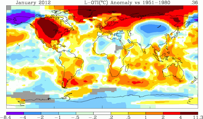
As usual, I compared the previously posted TempLS distribution to the GISS plot. Unusually, there was a significant discrepancy, which turned out to be a kind of Y2012 issue in my code.
Update - on further checking the error was simple - I had plotted Jan 2011.
Here is GISS:

It's broadly similar to the one I posted here, but it gets the USA and N Africa quite wrong. So I went back to check. I was aware of the date issue, because my plot was dated Jan 2011, as I noted. I thought that was the only effect, but I was wrong (in fact, the whole plot was Jan 2011). When I re-ran, ,aking sure my script now detected the year as well as the month, I got:

This now matches well. The white blob far NW is where the cold runs off the color scale. The date error did not affect the monthly average number, only the plot.
Previous Months
DecemberNovember
October
September
August
More data and plots


OT but thought this was interesting:
ReplyDeletehttp://www.desmogblog.com/heartland-institute-exposed-internal-documents-unmask-heart-climate-denial-machine
Thanks, Robert,
ReplyDeleteYes, it is interesting. The funds are substantial. Craig Idso gets $11,600 per month from Heartland? That amounts to a very substantial salary.
I'm a little surprised Idso makes that much... He's not what I would consider to be the most prominent. The most interesting thing for me is the "anonymous donor" who gave over 14 million dollars in the last 6 years.
ReplyDeleteGreat work,it's important
ReplyDelete