Below is the graph (lat/lon) of temperature distribution for January (It's Jan 2012, despite the title).
Update - despite my confidence here, it is actually Jan 2011 - a sort of Y2012 error (I had the year hard-coded). The correct plot, with GISS comparison, is here.

This is done with the GISS colors and temperature intervals, and as usual I'll post a comparison when GISS comes out. There was a cold region mid-Asia whic h goes outside the standard color range.
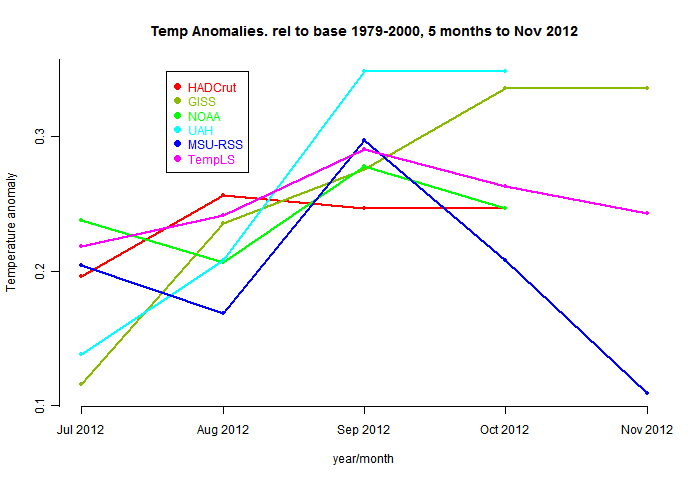
And here, from the data page, is the plot of the major indices for the last four months:


0 comments:
Post a Comment