This post is inspired by the new
paper by Kevin Cowtan and Robert Way in QJRoyMetSoc, which I wrote about in my
previous post. The key issue that they identified was bias due to lack of coverage in regions that were warming rapidly, specifically near the poles.
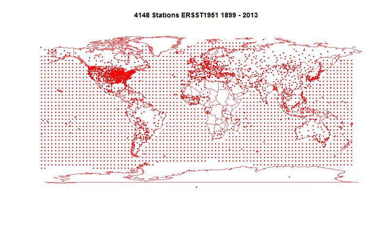
HADCRUT gathers temperature anomalies each month in a 5°x 5° lat/lon grid. Where gridcells have no data, they are omitted. As I said then, this is not a neutral decision. Whenever you average over a continuum with fixed divisions and have missing values which you omit, that is equivalent to replacing those points by the average of the data you have. That is often not a good choice, and if there is anyway of better estimating the missing values, it should be used. I did my own analysis of coverage
here and
here.
C&W use a quite elaborate scheme for deriving those infills, involving satellite data and kriging. I wondered how much could be achieved by a very simple improvement. The main bias is believed to be latitude-based; specifically, that polar regions behave differently to the rest. So I sought to replace the missing cells by a latitude band average rather than global. I'm not using kriging or satellite data.
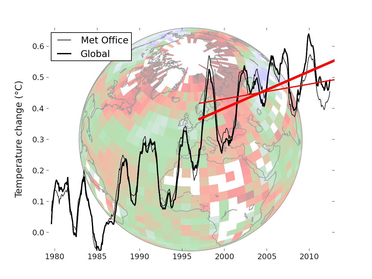
I think this is useful because the new paper has been greeted as a "pausebuster" because it shows a much less reduced trend in recent years. So I'm focussing on the 16 year global trend since Jan 1997 (to end 2012), also treated in C&W. I think a simple demonstration of the coverage correction would reinforce C&W's much more thorough and elaborate treatment.
Coverage and latitude averages
This image from the
C&W site gives an idea of the coverage issue. There is a lot of missing data outside the polar regions, but it is not clear whether that biases the trend. But the polar regions are warming rapidly, and to in effect treat the missing cells as global average does create a bias.
I formed a latitude average for each month for a 5° band using the following weighting rules. Cells in that band with data have weight 1. Cells in adjacent bands have weight r, where r is typically 0.1-0.2. Cells in the band adjacent to that have weight r^2. Others are not used.
The point of this is that where there is good coverage, the average will be close to the band average. But if the central band has few data cells, the adjacent band cells, though downweighted, will be more significant by their numbers, avoiding the high variance that would come from relying on just the few cells in the central band. And if both those bands have few entries, then the third level comes into play. This is really only relevant to the N pole band, where the two bands above 80° are sparse.
I then simply infill missing data for each month with the latitude band average value, and compute trends for the resulting complete set.
I expect the result to vary little with r - this will be shown.
Results
The trend over the period 1997-2012, in °C/decade was:
| HAD 4 cited C&W | 0.046 |
| HAD 4 with global average infill | 0.0539 |
| HAD 4 with lat av infill r=0.05 | 0.0854 |
| HAD 4 with lat av infill r=0.1 | 0.0846 |
| HAD 4 with lat av infill r=0.2 | 0.0821 |
| GISS cited by C&W | 0.080 |
| C&W hybrid | 0.1187 |
So this simple infill almost doubles the trend, but does not go as far as the C&W hybrid method. It is, however, close to GISS, which interpolates to avoid missing cells.
The graph by latitude band is

Here is a graph to show the small variations with different r (parameter for spreading estimate of latitude band average)

Conclusion
This shows that the trend is indeed biased by coverage. Using a latitude average estimate to replace missing values is at least as justifiable as the default global average. No special interpolation techniques are used, nor any alternative datasets. The change is substantial, though not as complete as C&W. However, the plot of trend by latitude bands is quite similar to the hybrid method.


