But what I really want to talk about is a new style of presentation. The last few posts have tracked my learning curve with Javascript; now I'm coupling it with the canvas feature of HTML 5. This means I can do client-side graphics - much more flexible and interactive
What this means for November GHCN temperatures is that I can show the anomalies directly - without cell aggregation or smoothing with orthogonal functions. This is done by a triangular mesh and HTML5's neat linear color gradient function. Every station has it's anomaly directly represented with the correct color.
I found this very interesting, as it shows graphically how correlated the anomalies are. Most of the color picture is actually quite smooth. There are exceptions, and because these can be associated with large triangles, it gives an exaggerated effect there. But for the most part, large scale patterns show through well.
So here's the plot of November average temperature anomalies, in °C. It is of course interactive - you can rearrange it, magnify, show the stations, click to see station detail and numbers etc. Use Ctrl+. Ctrl- to get it the right size for your screen. The mechanics are explained below the jump.
How it works
The flat map at top right is your navigator. If you click a point in that, the sphere will rotate so that point appears in the centre. The buttons below allow modification. Set what you want, and press refresh. You can show stations, and the mesh, and magnify 2×, 4×, or 8× (by setting both). You can click again to unset (and press refresh).Then you can click in the sphere. At the bottom on the right, the nearest station name and anomaly will appear. You may want to have stations displayed here. You'll see two faint numbers next to "stations". This indicates how much your clicked missed the station by (in pixels). It's not really a test of your mousing, but of my getting the alignment right (fiddly).
I'm continuing to work on the shading. The HTML5 function is good, but it works by RGB linear interpolation. The rainbow scheme that I use isn't linear (linear schemes are monochromatic and boring), so they get out of alignment. This sometimes means that one of the corners of the triangle does not get quite the right color. That can happen when there is a lot of change within a triangle.
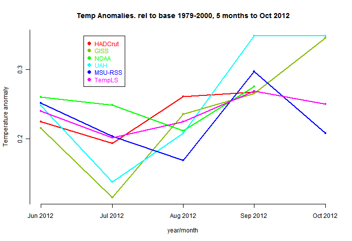
Comparative plot of recent months, and the usual spherical harmonics fit.

and the Spherical Harmonics map

Previous Months
OctoberSeptember
August
More data and plots