Saturday, November 24, 2012

Climate data postings


For a couple of years I've been running a daily script to track new monthly temperature indices and also sea ice data. The script posts them on the data page.

I'm upgrading this - I now use wget to monitor the data sites. A by-product is that I have a listing of the times as posted by the source, and I thought I could add that to the site, newest first. I've put that table at the head of the list on the data page. Time zone is US Eastern (eg NY). Here's how it looks at the moment:

DateNameSize KbSource
Nov 22 08:56 GHCN V3 station temps 12196 source
Nov 20 13:53 HadCRUT 4 land/sea temp anomaly 209 source
Nov 20 00:59 NOAA land/sea temp anomaly 29 source
Nov 19 15:42 GISS land/sea temp anomaly 16 source
Nov 18 00:06 HADSST2 mean 4145 source
Nov 18 00:05 CRUTEM CRU global mean Station anomaly 30 source
Nov 09 07:48 UAH lower trop anomaly 65 source
Nov 05 12:58 RSS-MSU Lower trop anomaly 37 source
Nov 04 21:21 ERSST NOAA SST grid 3274 source

Indices are in black - spatial data (large) in brown. I can fairly easily add new sources to the list. I've chosen one representative file from each source, expecting that others of interest are likely to be posted at the same time. The list will be maintained on the data page. I also plan to post a history file (when there is some history). Some sources like GISS update their monthly postings frequently, so the date you see here may not be the first posting for the month.


Saturday, November 10, 2012

October GISS Temp up 0.08°C


The GISS land/sea monthly anomaly rose from 0.61°C September to 0.69°C in October. This came out just as I posted TempLS, which was unusually early in the month for GISS. Furthermore, GHCN is rather tardy in its posting, so there are fewer stations than usual for the time of the month. TempLS went down by 0.02°C from September. Time series and graphs are shown here


As usual, I compare the previously posted TempLS distribution to the GISS plot.

Here is GISS:


And here is the previous TempLS spherical harmonics plot:


.

Previous Months

September
August
July
June
May
April
March
February
January
December 2011
November
October
September
August 2011

More data and plots

October TempLS Global Temp down 0.02°C


The TempLS analysis, based on GHCNV3 land temperatures and the ERSST sea temps, showed a monthly average of 0.52°C for October, down from 0.54 °C in September. There are more details at the latest temperature data page.

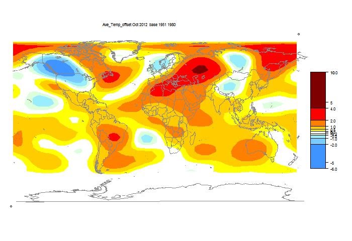
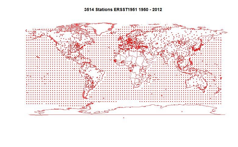
Below is the graph (lat/lon) of temperature distribution for October. I've also included a count and map of the stations that have reported to this date.


This spherical harmonics plot is done with the GISS colors and temperature intervals, and as usual I'll post a comparison when GISS comes out.

And here, from the data page, is the plot of the major indices for the last four months:


Here is the map of 3514 "stations" which contributed to this report. Reporting seems to be slow this month - there are about 500 less than usual for this time.


Thursday, October 18, 2012

New ISTI dataset - duplicates

This is my third post on the new beta release of the ISTI temperature database. In the first post, a Google Maps display, I noticed a number of stations which appeared to be duplicates. So I thought I'd check more comprehensively.

I first ordered the inventory alphabetically by name. A complication here is that 430 have no name. Some still showed up as duplicates.

The next step was to collect pairs of adjacent stations whose data began in the same or adjacent year. Then I did a rough distance check and retained pairs for which the sum of lat and longitude differences (absolute value) was less than 1°. That's within about 70 km at most near the equator, requiring greater closeness near the poles. In fact most pairs at this stage have near identical coordinates.

That left 1077 pairs. I've made a list as a zipped CSV file here.

There will be some missing. I suspect Vienna/Wien are duplicates, but are missed alphabetically. The two Trondheims I noticed are assigned coords too far apart. And of course, my test doesn't prove duplication - just flags for checking.

Tuesday, October 16, 2012

New ISTI temperature dataset - station trends map


This is my second post on the new beta release of the ISTItemperature database. The first post was a Google Maps interactive map of the stations. This time we have an interactive global trend map in the style I did for GHCN.

Again, the dataset is large, and takes a few seconds to load, so I have put it below the fold. It is a globe that shows individual station trends with shading on a triangular mesh. The shading color is accurate at the stations themselves. You can display the stations and mesh, and click to pick up the numerical information. There is a little navigator map that lets you reorient the globe as you wish. Maps are available for periods of 30, 45 and 60 years to present. You can magnify 2x, 4x or 8x.

I should emphasise that these are trends for individual stations - there is no modelling or smoothing, except for the triangle shading interpolation. I find that valuable in that it shows the spatial correlation (or lack of). I was interested to see if the larger ISTI set gave a similar result to GHCN.

I think it does. A notable feature of all these plots, whether for period averages or trends, is that the US seems more of a patchwork than ROW. This is of course partly the higher density of stations, but I think there really is less coherence. Perhaps there is a quality issue (associated with the large numbers).

Anyway, the map is below the jump. There is some further discussion of the methods in this plot from last November. Below the map I've written a little about the numerics..


your browser does not support the canvas tag


Click on this map to orient the world plot.


Show Stations

Show Mesh


Magnification


Trend period


Station


How the trends are calculated.

The trends are calculated using monthly data over calendar years (So I didn't use 2012 months). There is a tricky issue with seasonality. If you take the trend of a year from autumn to autumn, monthly, you'll get an uptrend even if the year ends as it began. The calendar year is mostly winter to winter or summer to summer, so the effect is much diminished. I allowed for this using the method from TempLS. Instead of just one intercept, I fit (OLS) twelve monthly offsets (means) as well as the slope. This subtracts out the seasonal variation and gives the underlying trend.

Sea Temperatures

As usual I've added SST's by taking a published gridded set and putting artificial stations at the grid centres. Previously I've used ERSST, this time I used HADSST2. The emphasis is on the land data, but the mesh goes haywire without ocean nodes. The HAD grid is coarser, so the ocean trends are more patchy. Because of the arbitrary placement of stations at 5x5 grid centres, it can happen that they appear on land. Please excuse.

Update There are some odd hotspots in southern oceans for the longer time periods. This is an artefact. It is caused by an arrangement I have which enables me to use the same mesh for all three time intervals (meshes take time to download). I use a single mesh with a node for every station with any admissible trend - a station has to have 80% of months reporting to be assigned a trend over a period. Where for a time period a station doesn't have a trend, I assign an interpolated value for coloring purposes. The station is not shown, so the effect should be a minor upset in the shading only. However, there are in those parts some stations which do not have any connected stations with trends (for that time interval - worst at 60 years). Then the interpolation goes wrong, and the shading shows artificial heat. I don't think it happens anywhere on land.