Tuesday, August 7, 2012

Arctic Storm


Neven has been tracking a big storm in the Arctic. This now seems to be having, as he predicted, an effect on the ice melt. The recent IJIS JAXA numbers show a very big drop over two days. In fact, there is almost the same ice extent now as on the same day of 2007, and less than any other year (in the period of readings since 2002) and the storm is far from spent. This is rather ominous, because in 2007 the most rapid melting was up to the first week in August, with slower melting thereafter.

I should caveat that the IJIS latest day reading is often adjusted down the next day. Neven doesn't usually show it. I'm less cautious, but you should bear this in mind.

Update 8/8. Yesterday's high JAXA melt figure held up, and another big one today, makes 2012 pass 2007 to show the least ever JAXA ice extent for 8/8. Each of the last three days well exceeds any other day's melting in the JAXA record.


Friday, July 13, 2012

June GISS Temp down 0.08°C - ice news

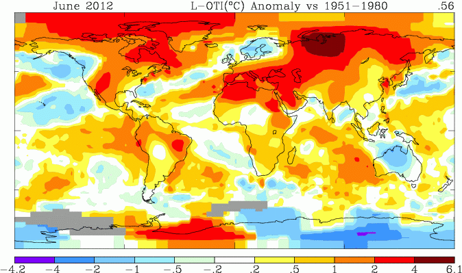
I thought I might be out on a limb when TempLS showed slight cooling from May to June. Both satellite measures showed significant warming. But GISS showed cooling, from 0.64 °C to 0.56 °C. Time series graphs are shown here

Meanwhile, Arctic ice has been melting. Still a little behind last year, but keeping pace.

As usual, I compare the previously posted TempLS distribution to the GISS plot.


Here is GISS:

And here is the previous TempLS spherical harmonics plot:


.

Previous Months

May
April
March
February
January
December 2011
November
October
September
August 2011

More data and plots

Tuesday, July 10, 2012

June TempLS down slightly from May


The TempLS analysis, based on GHCNV3 land temperatures and the ERSST sea temps, showed a monthly average anomaly of 0.50°C for June, down slightly from 0.52 °C in May. UAH seems to be the only other result out, showing a 0.08 C increase. There are more details at the latest temperature data page.

I'll show here the usual spherical harmonics plot of area distribution of temperature. But I'll also show a more elaborate interactive plot of station temperatures. This gives a good guide as to what data is currently in, as well as a basis for comparing the spherical harmonics smoothing. It's the same style I showed last November
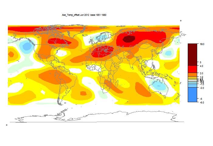


Above is the spherical harmonics plot done with the GISS colors and temperature intervals, and as usual I'll post a comparison when GISS comes out. And next is the interactive plot, with some brief usage guidance below.



your browser does not support the canvas tag


Refresh

Show Stations

Show Mesh


Magnification

Station


How it works

The flat map at top right is your navigator. If you click a point in that, the sphere will rotate so that point appears in the centre.
The buttons below allow modification. Set what you want, and press refresh. You can show stations, and the mesh, and magnify 2×, 4×, or 8× (by setting both). You can click again to unset (and press refresh).

Then you can click in the sphere. At the bottom on the right, the nearest station name and anomaly will appear. You may want to have stations displayed here. You'll see two faint numbers next to "stations". This indicates how much your clicked missed the station by (in pixels).