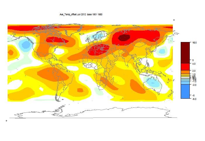
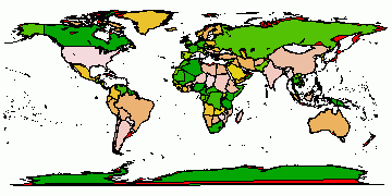
The TempLS analysis, based on GHCNV3 land temperatures and the ERSST sea temps, showed a monthly average anomaly of 0.50°C for June, down slightly from 0.52 °C in May. UAH seems to be the only other result out, showing a 0.08 C increase. There are more details at the latest temperature data page.
I'll show here the usual spherical harmonics plot of area distribution of temperature. But I'll also show a more elaborate interactive plot of station temperatures. This gives a good guide as to what data is currently in, as well as a basis for comparing the spherical harmonics smoothing. It's the same style I showed last November

Above is the spherical harmonics plot done with the GISS colors and temperature intervals, and as usual I'll post a comparison when GISS comes out. And next is the interactive plot, with some brief usage guidance below.


|
How it works
The flat map at top right is your navigator. If you click a point in that, the sphere will rotate so that point appears in the centre.The buttons below allow modification. Set what you want, and press refresh. You can show stations, and the mesh, and magnify 2×, 4×, or 8× (by setting both). You can click again to unset (and press refresh).
Then you can click in the sphere. At the bottom on the right, the nearest station name and anomaly will appear. You may want to have stations displayed here. You'll see two faint numbers next to "stations". This indicates how much your clicked missed the station by (in pixels).


Hi Nick - not much change but June averaged to cooler in the US than I was remembering so maybe not surprising.
ReplyDeleteBut on your latest temps page you put the UAH temp in the RSS slot - needs fixing right?
Arthur,
DeleteYes, I thought the US would look hotter. The station map shows more contrasts, with hot mid-west, cool far SE and NW. The spherical harmonics plot tends to average that out.
The RSS figure is right - UAH hasn't updated the online table, despite the figure being announced on Roy's blog. This is a common lag, and it would upset my system if I tried to manually enter it. So both LT measures give a rise of .08-.1 C. Other surface measures will be interesting.
Does tracking channel 5 accomplish anything? I noticed for a few days in June channel 5 was at its highest levels ever, but it finally fell away; still, I suspect June, just like May, will be the 2nd warmest in the NOAA record.
ReplyDeleteJCH,
DeleteWell, both MSU and UAH were up by about 0.1C in June. And lately surface and TLT have moved pretty much together, with some swings in MSU-RSS. I'll be interested to see if TempLS is consistent with other land indices.
JCH: I suspect June, just like May, will be the 2nd warmest in the NOAA record.
ReplyDeleteThis is a point I bring up occasionally, but monthly records are practically meaningless.
What you're doing is splitting a record that is composed of measurements of the form T_i + n_i where T_i is the long term (low frequency component) of temperature variability and n_i can be thought of as a high-frequency noise/weather noise. For example, you might consider T_i to be the 13-month average of temperature centered on the measurement "i", and n_i the deviation from that. If you looked at the spectra for these two signal components S(T) and S(n) would largely be non-overlapping.
Anyway, the split looks likes this: i = (12 * k + j) where k = year and j = month. You then have:
T_(12*k + j) + n_(12*k+j)
And what you are doing is selecting the monthly records with j = fixed, denote this T_kj + n_kj + for the temperature for month j and year k.
If you look at the spectra for T_kj with j held fixed, as you'd expect you'll recover the original spectrum, but the spectra for n_kj with j held fixed you'll find has been spread throughout the entire frequency band. This is an aliasing effect associated with taking individual months without low-pass filtering them first.
To illustrate this here is a figure of the time series broken out the way i've described it.
here is are the spectra for the "low" and "high" frequency components. [They overlap as much as they do because I used a simple 13-month average... had I gone to a Butterworth filter, the two spectra would nearly be independent...but I wanted something that is easy for other people to check.]
and here is the effect of decimation. All of the noise that was between 0.5 year^-1 and 6 year^-1 has now been shifted to 0 to 0.5 year^-1. And it's huge compared to the quantity we really care about, which is T_kj.
Put another way, if you look at the ranking of the 13-month average, you'll find a lot more records come from the last 10-years than if you look at the ranking of the original series.
The take home message is bad analysis methods obscure underlying patterns in data. And while we like to talk about "unadulterated" monthly records, they don't have much probative value, since they essentially involve decimation of a time series that contains frequencies that are above the Nyquist limit for the decimated series; (This error would get you flunked out, or at least yelled at, in a first semester signal processing course.)
Hey Carrick, it came in 4th warmest, and I totally swear off ever looking at one lone month ever again!
ReplyDeleteJCH, you don't know how relived that makes me feel. ;-)
ReplyDeleteSeriously though, since we know it's been warming, which do you think would show more the effect of warming more properly... monthly series from the raw data or from a 13-month smoothed version of it?
Food for thought.