Thursday, September 15, 2011

Feedback, frequency and Bart's comments at CA

More discussion of this thread at CA. PaulM suggested continuing discussion here, and to facilitate that, I've copied some of the key subthreads on this page. There are related threads here and here. Tallbloke also has a thread here

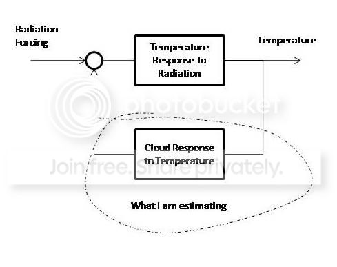
In one of his recent comments Bart posted this diagram of the system he was modelling:

It's a standard feedback system - just two boxes. But to me it raises this query - how can you isolate the box that you want? Electrically, if you look at input-output of box T2, you can't avoid the fact that T1 is in parallel with it. So you's disconnect the box and do the impulse response or whatever out of circuit. It seems to me that weve been trying to do that analysis in circuit, and getting tripped up with causality issues.

Tuesday, September 13, 2011

August GISS - Very small rise - TempLS map comparison

GISS rose from 0.59°C (Jul) to 0.61°C (Aug). The rise came partly because they adjusted July down by 0.01 0.59°C. TempLS had measured no change (actually down 0.006°C). I'll show the comparison of world distributions below the jump:


Here is the GISS plot of temperature distribution for August 2011:


And here is the TempLS version, using the GISS base years and levels.colors:


This TempLS output suppresses polar plots, mainly because the projection is haywire. I'll produce another of the whole-world versions which should show this.


FFT, impulse response, clouds, GMST


There has been a lot of interest in the thread at CA which started out looking at correlations between a figure that notionally expresses (unreliably) the part of TOA radiant energy flux attributable to clouds and surface temperature. There is a contention, favored by Spencer and Lindzen, that ST may be affecting clouds, which is a kind of feedback, which in fact is spoken of as a forcing.

There's lots to be said about whether these notions are true, but in this post I want to talk about a kind of analysis proposed by commenter Bart at that site.

Instead of looking at correlations, he proposed in effect to find an impulse response function which will transform temperature (T) into that quantity ΔR_cloud (or dR) by convolution:
\[ dR(t) = \int_{-\infty}^\infty h(t-\tau) T(\tau) d\tau\]

You can this of this as being like applying a smoothing filter but it doesn't smooth - it turns T into dR. The basic idea is that Fourier transformation turns that convolution into a product. Then you can work out the FT \(\hat{h}\) from
\[\hat{h} = \hat{dR}/ \hat{T}\]
invert the FT, and it's done. Along the way there are lots of complex variables, but the answer comes out real.


The papers

Discussion has been stirred by a recent paper SB11 by Spencer and Braswell 2011, discussed here,here,here, and a
 response D11 by Dessler. But the CA thread was about an earlier paper D10 by Dessler (discussed here. The links here will lead you to other papers in the series.

The data

The data file is flux.csv here. It covers about 10 years. Col 9 is the surface temp (Hadcrut3), col 5 is TOA flux measured by CERES, and col 8 is a notional clear sky value. The cloud effect dR is got by subtracting col 8 from col 5. Dessler points out that this is biased, because it in effect extrapolates from clear patches of sky to the whole atmosphere, and the air there is much drier than the global average. So there is less wv IR absorption. He used reanalysis data which corrects for this (but may bring other problems).

Causality

The idea of impulse response comes from a known causal relation. You hit a gong with a hammer - you get a response (afterwards). But fitting an impulse response by FFT does not require any kind of causality. You could replace dR by births in Utah.

So convolving with h will pull in temp numbers from the past and from the future. It could well be that past values of dR affect present T - in fact, this is the conventional view. It's not actually clear how to decide, once you've found h (as you always can) what it means.

FFT, truncation and periodicity

This became a subtopic at CA. I've expressed the concept of impulse response with an infinite integral. But there are two dual problems. You can't compute over an infinite range. And you have to have a finite sample width.

While the relation we explore goes on indefinitely, we only see it for a short time. In FT terms, it helps to pretend that we really have indefinite data, but we've multiplied by a gate function to get the window that we see. The reason that it helps is that the gate function multiplication turns up as a convolution in the frequency domain, which explains a lot of things. And you can choose the form of gate function. Instead of a sharp termination, you can taper. This means some loss of data utility, but avoids spurious effects in the medium/high frequency range.

FFT is a way of implementing the discrete Fourier Transform (DFT). This neatly deals with both sampling and range issues but implementing the FT as a Fourier Series. Here's how I think about that.

You're trying to do something about an infinite line in space (denoting time). But you only see a period of 500 km. Suppose you regard it as part of a circle. The Equator is a familiar one. So you put your data on that and sample over longitudes.

But you'll think of this as a line segment, measured by longitude. And you need an IDL (Date Line). You'll probably put this just to one side of the data period.
(This analogy would work better if we started Lon at 0 at the IDL,  ie Lon+180)

Then you say that the rest of the data on the equator is zero(padding). You divide into discrete longitude intervals, say 8192. And you sample frequency by starting with a sinusoid with period the Earth's circumference, and then its 8192 harmonics.

The impulse response will also be expressed on the equator, and will wrap around. And the convolution integral will be evaluated wrapped around as well.

It's a bit harder to think of frequencies as being periodic. We go through the range from a wavelength of 40,000 km down to 5 km. And 5km is about our sampling length. Surely that 5km wave is very different to the 40,000 km and couldn't be adjacent in a periodic measure?

The answer is beats - or strobing. The trig functions are the underlying theory, but numerically all that counts is what is sampled. Those highest frequencies almost match the sampling frequency, but not quite. The difference is what is sampled, and it is indeed a low negative frequency.

The impulse response


Let's now look at the impulse response. The first thing you'll notice is that it's very noisy, and isn't really localised. Why?

You might expect it to be local because for most of its range it produces a zero response on convolution. Zero values would do that.

But in fact it just need to be orthogonal to the T data. That's just one vector in a 8192-dimensional space. h can wriggle as much as it likes, with only that very modest constraint.

So we'll need to smooth it to see anything. Smoothing generally violates that orthogonality, so it won't work exactly as a impulse function afterward. Maybe the smoothing could respect the orthoginality? Yes, more sophisticated filters would help. Here it's just triangular. So here are plots. In terms of the equator notion, I've shifted the date line to the other side of the world from where we have data, and I'm looking at a central window in  the plot. Smoothed on the right with a 10-month triangle filter.


The smoothed version was smoothed across the "date line". The behavious is somewhat different on each side, which I'd like to understand better. So these are the impulse responses that will be used for convolutions.

Bart's h taper.

I don't want to make too much of this, as I don't think it's responsible for any majorly incorrect results. But it doesn't help, and messes up interpretation of the results. In Equator terms, suppose we did have data for 500 km to the E of the IDL. Then Bart said, OK the impulkse response doesn't mean anything far away, so we'll taper it off over S America, But his taper continued right around to the IDL. The roll-off was a Hann filter, which is quite good. But the revised smoothed plot now looks like:


Regenerating with convolution

As commenter Steve noted at CA, the test is how well do these work when actually convolved with T

There are some subtleties here in the conventions used with convolve functions. Basically, which way around h is to be used, and taking account of the fact that we are on a circle. R has a convolve function, and you need the options type="circular" and conj=F.

But then, the original unaltered h does give exactly dR. That's not proving anything except that the algebra worked. The smoothed version is rather different, and to me says that we need better smoothing. And the Bart truncation makes a significant difference - probablymore than smoothing.

In these plots, look to the legends for the colors. Because the red reconstructed dR is exact (to plotting accuracy) I've widened the black dR so it doesn't totally disappear under the red.


Regression coefficients


The Dessler-style analysis does regression to say that dR is proportional to T, and the proportionality becomes identified as a feedback factor. Here that is as if the h was compressed into a big spike, and you'd look at the area underneath. That's effectively what Bart is doing when he does another FFT and looks at the zero value. He got -9.4 W/m2/°C. If it weren't for the taper, that FFT is reundant; he could have looked at the f=0 value of the \(\hat(h)\) derived originally. Without the taper, that returns -12.22 W/m2/°C. As he points out, decidedly negative. That's in the direction of the SB and LC interpretations, though it doesn't necessarily contradict Dessler.

But that gives an important clue to what these numbers mean. The data has mean zero. The low frequency end of the FT is actually a moment-generating function. It returns the moments of the data set, and at VLF, that means the first - the regression slope.

So this number -12.22 W/m2/C is actually found by doing time regressions of dR and T over the 10-yr window. If you do this, you get

OLS grad of temp is 0.000412 °C/month
and the grad of dR is -0.005039 W/m2/month
So if you divide the dR slope by the T slope, you get, exactly,
-.005039/.000412= -12.22 W/m2/C

But you'd get such a number from any two series. . It doesn't imply feedback on its own. To do that, you have to have several points showing an association of change in dR with change in T.

Enough for now

There's lots more to say - this is interesting material. I'd like to talk about different ways of dealing with the original data (Hann tapering). I'd like to see what can be said about the mid-range frequencies, where some evidence might be found. Maybe even get into Laplace transforms, which do allow you to take account of causality.

This stuff can generate a huge number of graphs. And I've been dabbling with Javascript tricks to make that more user-friendly. But that's foir another day.


Monday, September 12, 2011

Impulse responses and the Spencer/Dessler Cloud models

I've been involved in discussions at this CA thread, which has gone into FFT analysis of the relation between temperature and cloud contribution to TOA energy flux, as discussed a lot re papers from Dessler and Spencer and Braswell.

I should hasten to add that the analysis at CA is based on the use of all CERES data, which Dessler did not do. He gave good reasons for his choice to use reanalysis instead. Consequently, I don't think this alternative approach is telling us anything useful about clouds. However, there is interesting maths.

Commentator Bart there proposed a model in which an impulse function is found by FFT which, when convolved with surface temp (Hadcrut3) will reproduce that "cloud forcing" function, in his notation dR (for δR_cloud). He has produced a lot of Matlab analysis. His contention is that the low frequency behaviour of the impulse response shows strong negative feedback. I don't now agree with that - I think he is looking at very low frequency results which can't be supported by the short period (about 10 years) of data. Furthermore the integral of the impulse response that he cites is the low frequency limit where it becomes just the ratio of the time gradients of the two data sets as determined by OLS regression.

Anyway, I translated his code into R and did some comparison calculations, which I put n a page attached to this blog. I'm now transferring it to this post, in case people want to comment. I'm hoping to write a more detailed analysis soon. The data being used, referred to in the code as flux.csv, is here.


I have converted Bart's matlab code to R - see below. I've only done as far as the impulse response so far.
I'm testing a Hanning window - a cos^2 function which tapers to zero at both ends of the data.

When you FFT a finite set of data, it's as if you did the full set with a gate function. You have to accept low frequency problems with finite data, but the gate adds HF signal as well. A Hanning window tapers much faster in the freq domain, and mitigates this extra problem.

First a check that my R code is getting Bart's result. I've commented out the taper line:


Now after applying the Hanning taper to temp and dR

Update. Steve at CA asked to see if these impulse responses could be convolved with the temp to give dR, which is really what they are for. It's a useful check. In R, you have to use type="circular" and conj=F in the convolve() options. That done, it works. In the plots below, black is the original dR (cloud radiance), red uses the unsmoothed impulse response, and the cyan is the smoothed impulse response. I made the black wider so you can see the red superimposed.

The plot on the right is the same, but smoothed with a 10 month triangle filter. This was done without the Hann tapering of the data. I should clarify that the smoothed impulse response referred to here is the top graph. I have not showed the unsmoothed response - perhaps Bart has. 

Update I've added in dark gold the result of convolving with the taper (w) that Bart used on h. This taper makes h effectively one-sided in time.


Here's the R code. I've tried to follow Bart's notation and steps.
Update - the code originally here deviated in minor ways - I've added fixes

data=read.csv("flux.csv",skip=0);
data[is.na(data)]=0;
temp=data[,9];
dR=data[,5]-data[,8];
N=length(dR);
h=abs(1:N-64.5)/62.5
h[h>1]=1;Ha=cos(h*(pi/2))^2;  #  Hanning Window
temp=temp*Ha; dR=dR*Ha; #  Tapering
dT=1/12;
Nsamp=8192/2;
Npad=Nsamp-N;
X=fft(c(temp,rep(0,Npad)))+1.0e-9;
Y=fft(c(dR,rep(0,Npad)));
h = Re(fft(Y/X,inv=T))/dT/Nsamp;
Nc=Nsamp/8;
w=c(rep(1,Nc),(1-cos(pi*(1:Nc-1)/(Nc-1)/2)),rep(0,Nsamp-6*Nc))
hw=h*w;
f1=c(1:15,15:1); f1=f1/sum(f1);
hs=filter(h,f1)
t=(0:599)*dT
png("impresHanning.png");
plot(t,hs[1:600],type="l",ylab="Impulse Response W/m2/C/yr",xlab="Years",main="Cloud-Temperature System Smoothed Impulse Response/Hanning")
dev.off()


Late final extra

Carrick asked to see the mag plot of h. I've followed Bart's scheme, with log axes. It's weighted towards low frequencies. This h has neither my Hann taper of data nor Bart's h truncation. Mag and phase:


Friday, September 9, 2011

August GMST - TempLS no change

OK, that's the new TempLS result. The other surface indices haven't reported yet. Here is the plot comparing indices for the last four months, with all index anomalies relative to 1979-2000. Update - the linked image here is periodically updated, so it shows new figures as they arrive. GISS for July has been added.

And here is how the warmth was spread around:

Update - I haven't been properly clear here on anomaly bases. For the time series plots I used 1979-2000, so I could plot them all on one graph. For the spatial plot, I actually used the default - the average for the whole period, which was 1960-2011. Since I'm using GISS colors, it would be better to use the GISS period which is 1951-80. That will require exrending the calc back 10 years. It doesn't make much difference to the color plot; the change will be small relative to the range of monthly means, and one could simply adjust the color scale zero, leaving the plot unchanged.

There's a lot more to say about how this was done. Obviously, I'm using fairly early information. But the coverage is pretty good. We'll soon see how it holds up against the major indices. Details below the jump.


I used a combination of GHCN V3 and ERSST v3b. I ws waiting for HADSST2, which the previous month was based on, mainly because I am more familiar with it. But the ERSST data came out on Aug 3, and seems fairly complete. Maybe some numbers will change. The GHCN file was ghcnm.v3.0.0.20110809, dated 9 Aug, though apparently posted on 10th.

The ERSST data has 2x2° resolution. That's a bit more than I need, and would tend to swamp the land stations, so I amalgamated cells to 4x4°. Total land and sea station numbers were good - 4000 (2102 sea, 1898 land), compared with 4084 in June and 4262 in May. It seems that when all stations have reported, totals currently are about 4500 (land and sea).

Here is the plot of the last 48 months. You can find these plots and the numbers (not set to the 1979-2000 base) at the regular current data site.


Some more details - I used, in TempLS V2.2, the weighting scheme that I've called type zero, with equal area cells. I ran the reconstruction from 1960, to get the normals. The shaded plot is made using 140 spherical harmonics.

Here is the pattern of stations that have reported so far. As previously, the equal area cells used for weighting are shown in blue if they contain stations that reported in July, else yellow. You can click to enlarge.


Update. Reader MP has some very interesting plots of lower troposphere temperatures from UAH. They include July 2011, and so make an interesting comparison. See the comments for a link to the images; he has sent me a quicktime video, which I have emdedded below. It shows the month-to-month patterns very well.


video


Wednesday, August 31, 2011

JAXA Ice extent and JS

Everyone's eyes seem to be on the progress of the Acrtic ice melt. I've been posting daily data and plots here from the IJIS Site. I include an expanded section of the current region. However, there are different time regions that peoiple might like to look at more closely (eg September), and rather than a lot of different plots, I thought a JS-enhanced interactive plot might help. I'll use it on the daily site, but you can try it here.

There is an extra legend, top middle, describing four different time periods. Just click on the one you want to see.


Tuesday, August 16, 2011

A Javascript worldview for surface temp.

You may have noticed that I generally prefer simple spherical (orthographic) projections for displaying global fields. Even though it takes several projections to convey all the information.

But I use lat/lon maps for comparisons, and more recently, Hammer projections for comparison with NOAA and MP.

Spherical projections take up space, but this can be resolved by creating a poor man's Google Earth (OK, GE is free) with Javascript. In the plot below, of the July temperature data using GISS's colors and baseline (1951-80), you'll see a pattern of squares, top left. This corresponds to eight views. The directions are as if the earth was encased in a cube, with one apex above the N pole. The views are from the directions of the eight corners. N Pole is the square at the top, the next three are around near the Tropic of Cancer, etc. Just click - the red square marks where you are.
Picture below the jump


Below the jump - same for NOAA


This time, for variety, I've positioned the views differently. The viewing cube is tangent to the pole, so the foci are points along a N and S latitude, at about 40°. The squares to click on follow that pattern.(Due to a slight inadequacy in the current JS, please don't click on this one before clicking on the top one).